Posts filed under Ink Reviews

Laban Hermes Sky Blue Ink Review

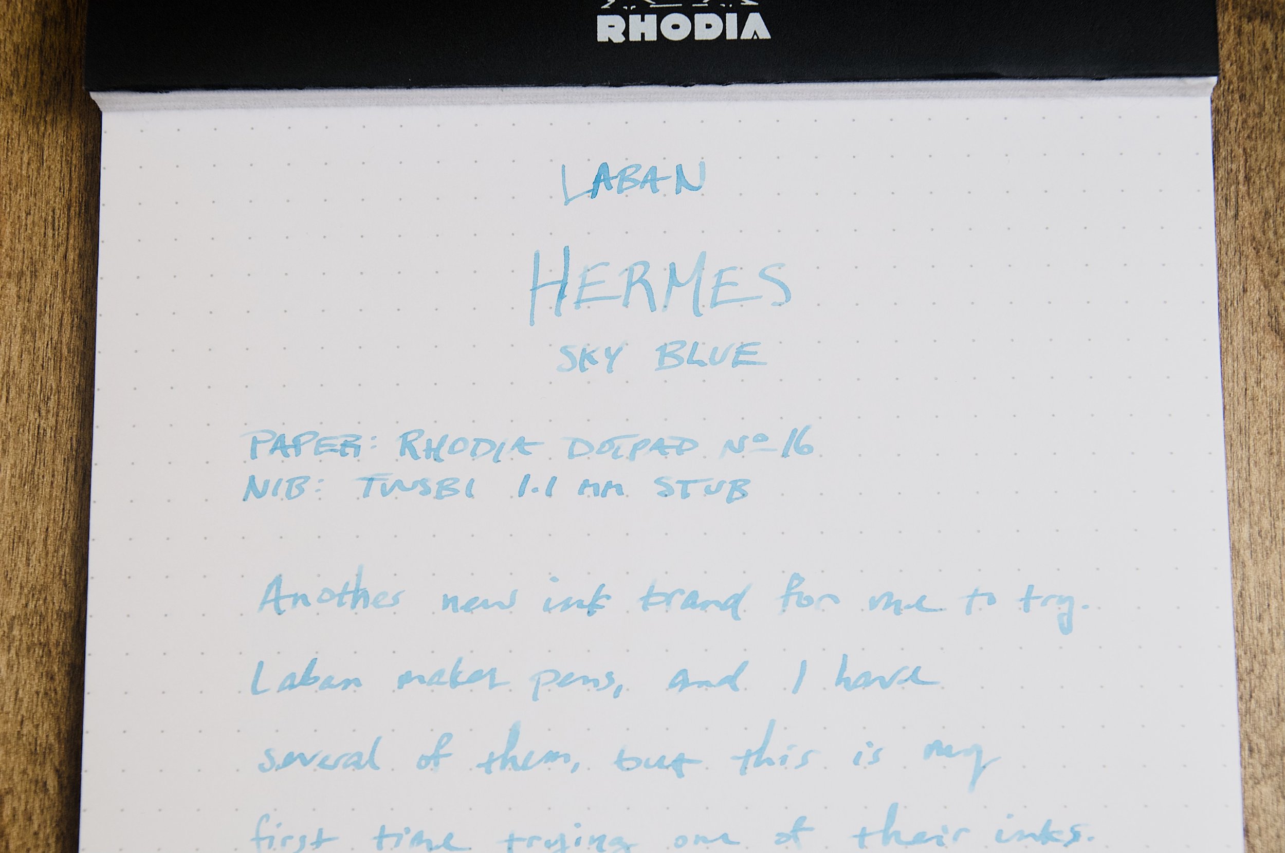
Laban Hermes Sky Blue ink is an addition to my "didn't know they made ink too" list, but this is a list that I'm always happy to see expand. We definitely don't have a shortage of ink choices these days.

My only exposure to Laban in the past has been their fountain pens and other ballpoint/rollerball writing instruments. They're a luxury brand on the more affordable side that offer a lot of unique and attractive designs. Until recently, I thought that's all they did. But it turns out they also make their own ink.

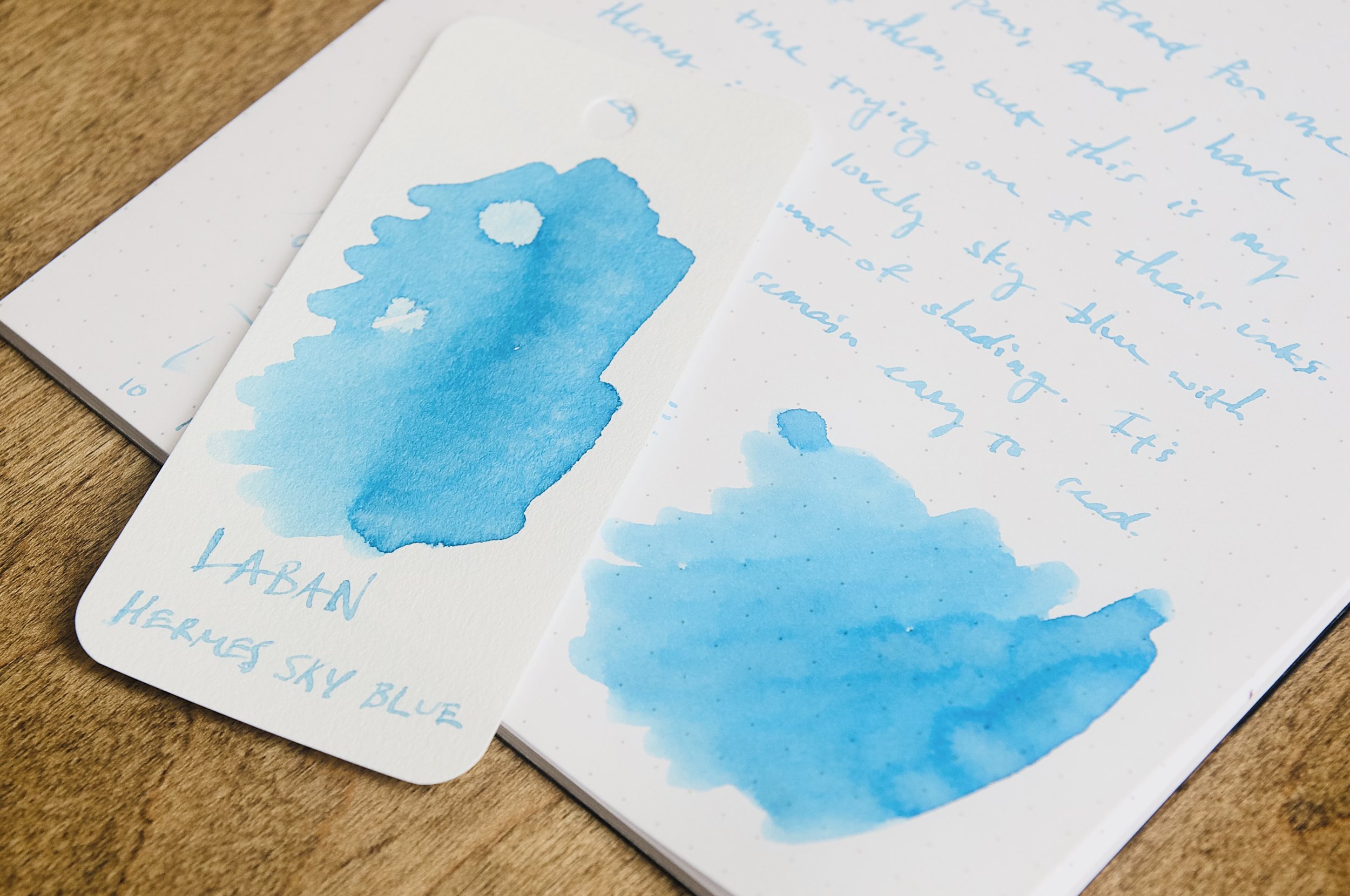
Hermes is just one ink out of the Greek Mythology collection, all of which are bold and striking colors. Hermes is a bright sky blue that really pops off the page. It's just dark enough to be easy to read while still obviously being sky blue. Compared to other sky blues from other ink makers, it's definitely on the lighter side.

The ink shades easily from the pervasive sky blue to a lighter sky blue as it dries. It's not a large amount of shading, but it provides some character and flair to the ink. Once the ink dries, I can detect a very small amount of bright sheen in some angles. It's not enough to even name the color of the sheen, but it does add a dynamic look to the dried ink on the page.

Dry time is pretty average when comparing to other inks. Typical strokes from a medium nib are dry in around 15-20 seconds, while larger strokes from a wider nib take between 20 and 30 seconds to dry. Nothing to write home about, but decent. For left-handed writers, this won't be a great option since it doesn't dry fast enough to avoid hand smudges while writing.

The flow of this ink is a little on the dry side. It's not enough to make the nib feel dry or scratchy, but it does mean nib/feed combos that lean to the dry side might struggle to supple enough ink. It does fine in the nibs I've tried, but I can definitely tell that the ink feeds slower than most inks. Not a good choice for a nib that you know is already a little scratchy, but it feels fine in a well-tuned nib.

One thing I noticed pretty quickly is that this ink can behave a little erratically on different types of papers. It does well when writing on coated papers (like Rhodia), but can be splotchy or invisible in some areas on uncoated paper. There's a good example of this on the swatch card in the photos. There are a couple of spots on the card that look much lighter than the rest. This is likely due to some sort of small imperfection in the paper stock that the ink refused to soak into for some reason. I've noticed it on other papers that aren't coated, so it must be something in the ink formula that makes it less resilient on different paper types. Not a dealbreaker, but an oddity that needs to be pointed out.

At $25 for a 50ml bottle, Hermes Sky Blue is priced a bit higher than other inks of the same size. Not to single anyone out, but for comparison's sake, a 50ml bottle of Robert Oster ink is $18, and that's an ink brand that almost always delivers flawless performance. I'd rate the behavior of Hermes Sky Blue behind the Robert Oster inks I've used, so that's worth considering given the price. I'd be happier and more willing to recommend it if it were closer to the $15-20 mark. Since I've only tried one ink from Laban, I can't say yet if their other inks are on par with this performance, but I certainly hope they behave a little better than Hermes Sky Blue. I'm definitely keeping my eye on them and looking forward to trying other inks from their lineup.

(Vanness Pens provided this product at a discount to The Pen Addict for review purposes.)


Enjoy reading The Pen Addict? Then consider becoming a member to receive additional weekly content, giveaways, and discounts in The Pen Addict shop. Plus, you support me and the site directly, for which I am very grateful.

Membership starts at just $5/month, with a discounted annual option available. To find out more about membership click here and join us!

Posted on October 2, 2024 and filed under Laban, Ink Reviews.

Robert Oster Dragon's Night Ink Review

(Jeff Abbott is a regular contributor at The Pen Addict. You can find more from Jeff online at Draft Evolution and Twitter.)

Just in time for the shorter days and longer nights, it's a lusciously dark violet-blue ink from Robert Oster that also has a faint hint of copper sheen. Dragon's Night is a gorgeous dark ink that has just enough character to keep it interesting for long writing sessions.

It's not uncommon for Robert Oster inks to have a little flare on top of the base color, and this one is no different. There's a medium amount of shading — just enough to be noticeable under normal writing conditions. But there's also a hidden copper/red sheen that comes out in rare lighting conditions. This isn't a crazy sheening effect that's hard to ignore like some inks. It's subtle, and even when it does occur it isn't widespread. It's small and reminds me of glistening stars or floating embers rising from a small fire.

I had a hard time finding other ink swatches to compare this with because it's a unique combination (in my ink collection at least) of dark purple/violet, dark blue, and blue-black shades. When writing, it usually looks like a violet-black with lots of blue undertones. I've realized that my ink collection has lots of purples, but not many violets, which also means I prefer the warmer purple shades to the bluer violet. Either way, this is an ink color that I'm more than happy to use.

While it's not a particular fast-drying ink, I've found that it's dry to the touch at around 20 seconds in a medium nib. Could be faster, but could also be much slower.

Writing with this ink is an absolute pleasure. It has a good amount of lubrication for the nib and starts easily in whatever pen I throw it in. Despite being so dark, it also doesn't show through to the opposite side of the page much.

I'm a little disappointed that the copper sheen doesn't present itself more readily. It's really shy and I had a lot of trouble creating the optimal conditions to make it come out. In normal writing, it's rare that you'll see the sheen, but it will make you smile when it does appear.

Given the light sheen, it's a good thing the base color and medium shading behavior is so nice with this ink. Definitely purchase this ink due to the color and not with any expectation of sheening!

I've always been really happy with the many Robert Oster inks I've used, and Dragon's Night is no exception, as long as you have the right expectations. This is a violet-black that will be in heavy rotation over the next few months!

Dragon's Night is available in a 50ml bottle for $18, or you can pick up a 4ml sample vial to try out first. It's a good bang for the buck in terms of value, and I'd happily recommend it to anyone that likes the dark, moody violet shade.

(Vanness Pens provided this product at a discount to The Pen Addict for review purposes.)


Posted on September 18, 2024 and filed under Robert Oster, Ink Reviews.

Sailor x Tinterías Cilantro and Refried Beans - Round 3 of Inky Goodness

(Kimberly (she/her) took the express train down the fountain pen/stationery rabbit hole and doesn't want to be rescued. She can be found on Instagram @allthehobbies because there really are many, many hobbies!.)

After my reviews of the first two Sailor x Tinterías inks and the second set, I couldn’t wait to get the third batch of the Deliciosa inks. I practically pounced on Jeffrey Coleman at the Chicago show to snag a set. (Jeffrey produces Tinterías, a Spanish podcast about pens, ink and stationery. You can find him on Instagram as @drcoleman1102 and also through the podcast account @tinteriaspodcast.)

This third batch of inks continues the Deliciosa theme of food-based ink names - Cilantro and Refried Beans. Just a reminder that, despite their yummy sounding names, the inks aren’t meant for eating/drinking :-). These two inks were launched in September 2023 and come in 50ml square glass bottles like the Sailor Manyo series.

As in the past, all swatches were done on Col-O-Ring cards using a Kakimori steel dip nib, while writing samples were done with a TWSBI Go with a Medium nib and a Lamy Vista with a steel Medium nib. The TWSBI Go is a wetter writer and the Lamy is a drier writer, so these two give me a good idea of how an ink will look from different pens. The notebook used for writing samples is from Endless Recorder with 68 gsm Tomoe River paper. Dry times for the Vista is shown with “(V)” and the Go will be below that and might also be shown with “(T)”. Dry times may be a bit slower on 52gsm TR or faster on paper like Cosmo Air Light, Rhodia, copy paper, or with drier or finer nibs, etc.

Cilantro is a medium spring green, not too bright or yellow, but also not a kelly green either - more like a grassy green. Refried Beans is a little harder to describe - it’s a medium light brownish orange, or maybe it’s an orangey brown. Search for images of refried beans, especially ones that are more orange in tone, and you’ll have an idea of what inspired this ink color.

Writing sample of Cilantro on 68 gsm Tomoe River Endless Notebook. You get a bit more shading from the Vista compared to the Go, which leaves a slightly more saturated line. Note that I had two “swipes” for the Go’s 30 second test because I accidentally let the timer go too far the first time, oops.

I was surprised at (1) how much yellow was present and (2) how “bunched up” the remaining pink, green and turquoise colors were. Thinking that maybe the colors would separate out more if I gave it more room, I repeated the test on a 4” strip of chromatography paper with the same results (so no picture.)

Inks similar to Sailor Cilantro: Robert Oster Forest Green (a bit too yellow/olive), Ferris Wheel Press Moonlit Jade (similar color in writing sample, but also has shimmer), Akkerman Dutch Masters 10 Van Huysum’s Sapgroen (too bright and too yellow), and Robert Oster Green Lime (a bit too “regular green.”)

Writing sample of Refried Beans on 68 gsm Tomoe River Endless Notebook. As with Cilantro, there is more shading from the Vista than the Go. Note that I had two “swipes” for the Go’s 45 second test because I accidentally swiped 15 seconds too early, oops, I did it again 🙂.

What was really neat to see is the bit of chromashading effect of Refried Beans from the Vista which is difficult to capture in photos.

Even though the swatches make the ink look slightly brownish, it’s actually a pink undertone that makes this different from many orange inks. I was also surprised to see the hint of green and turquoise at the very top.

Inks similar to Sailor Refried Beans: Robert Oster Brisbane (too yellow), Robert Oster Antelope Canyon (good color match but a bit darker), Montblanc James Purdey & Sons Single Malt (a touch too red), Robert Oster Campfire (similar to Antelope Canyon but a touch too brown.)

Both inks had average flow, although Refried Beans felt a wee bit drier than Cilantro. What was even more surprising was that Refried Beans took longer to dry, even though it felt drier when writing. I was surprised at how quickly Cilantro had dried, even in the TWSBI Go, since it is a darker ink. I think that Sailor Cilantro would work well in most pens and nib sizes, while Refried Beans might not be as readable in very fine or dry nibs. The Medium nib from the Lamy Vista is probably about as fine as I would go, unless I was using a gusher of a pen like a Pelikan, which is what I will probably use next time. Also, the Refried Beans ink really needs paper like Tomoe River or Cosmo Air Light to show off the subtle chromashading.

Sailor Deliciosa Inks

The Deliciosa line of inks on 68 gsm TR.

These inks, as well as the last two, are currently still available for purchase on the Tinterías website. They sell for $30 each (shipping is not included). I don’t know if there will be more inks coming up but if they are, I’m going to get my inky lil hands on them!

(Disclaimer: Inks were purchased directly from Jeffrey Coleman at the 2024 Chicago Pen Show at regular price. All other inks and notebooks are my own.)


Enjoy reading The Pen Addict? Then consider becoming a member to receive additional weekly content, giveaways, and discounts in The Pen Addict shop. Plus, you support me and the site directly, for which I am very grateful.

Membership starts at just $5/month, with a discounted annual option available. To find out more about membership click here and join us!
Posted on September 13, 2024 and filed under Sailor, Ink Reviews.