Posts filed under Ink Reviews

Wearingeul Sedna Ink Review

Wearingeul Sedna Ink Review

(Jeff Abbott is a regular contributor at The Pen Addict. You can find more from Jeff online at Draft Evolution and Twitter.)

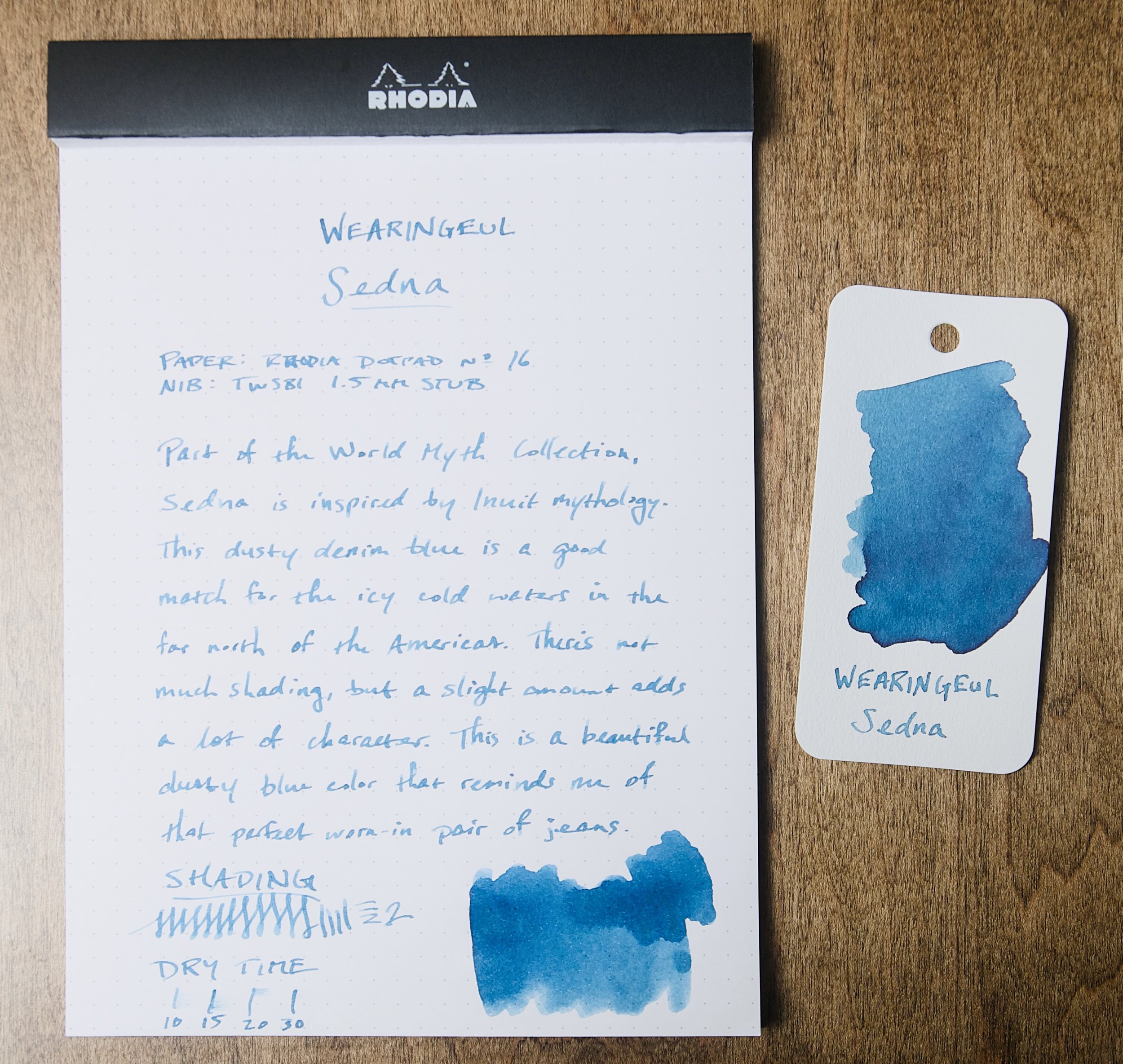
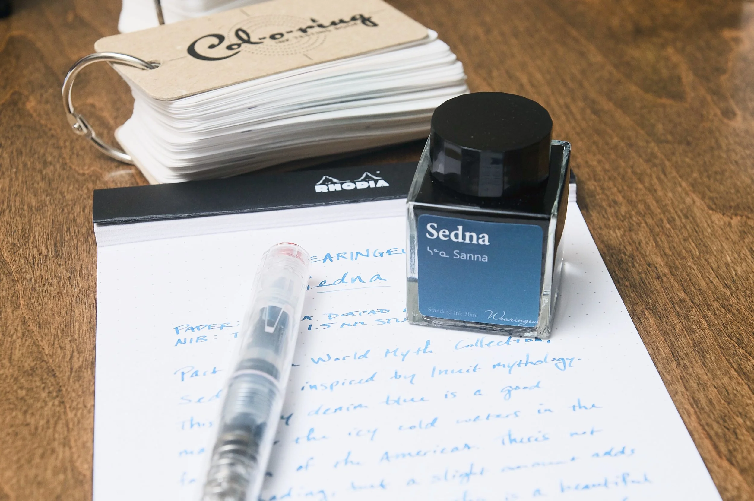
It's not often that I come across products that are inspired by mythology, and even less often that the mythology in question is Inuit. With Wearingeul's Sedna ink, that's exactly what inspired this dusky blue ink. Sedna is actually the Inuit goddess of the sea and marine animals, so this cold blue fits perfectly with the choppy, cold seas of the north.

I've had the privilege of using several Wearingeul inks in the past, and I've always been impressed by their behavior and colors. The South Korean ink maker does a fantastic job, and I'm always excited to try new inks.

Sedna is part of the World Myth Collection, which draws inspiration from several mythical and religious deities from around the world. With Sedna, I'm really happy that it prompted a research session to learn about the background of the name choice and the Inuit culture and beliefs. And taking notes with a namesake ink feels appropriate in this case.

Sedna is a medium blue with a cool tone and dusty gray undertones. It definitely reminds me of the cold sea, but it simultaneously reminds me of my favorite pair of worn-in denim jeans. It's a cozy color that also manages to impart some mystique due to the unique color and slight shading.

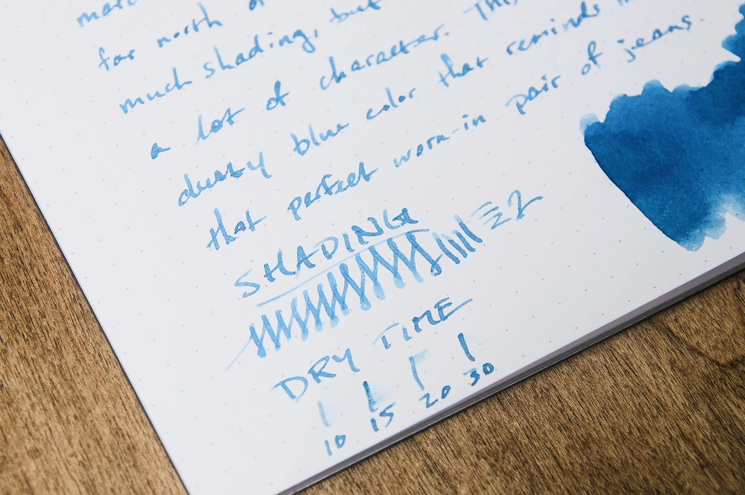
Wearingeul Sedna Ink Dry Time

Aside from the slight shading, this ink is a pretty normal performer. It dries in about 30 seconds in most cases, though it can take longer when using it with a wet nib and coated paper. In my swatch samples, I was able to detect a small amount of dark green/red sheening on the surface, but this only happened when I was heaping ink onto the same place on the page. I wouldn't expect to ever see the sheening effect in practice.

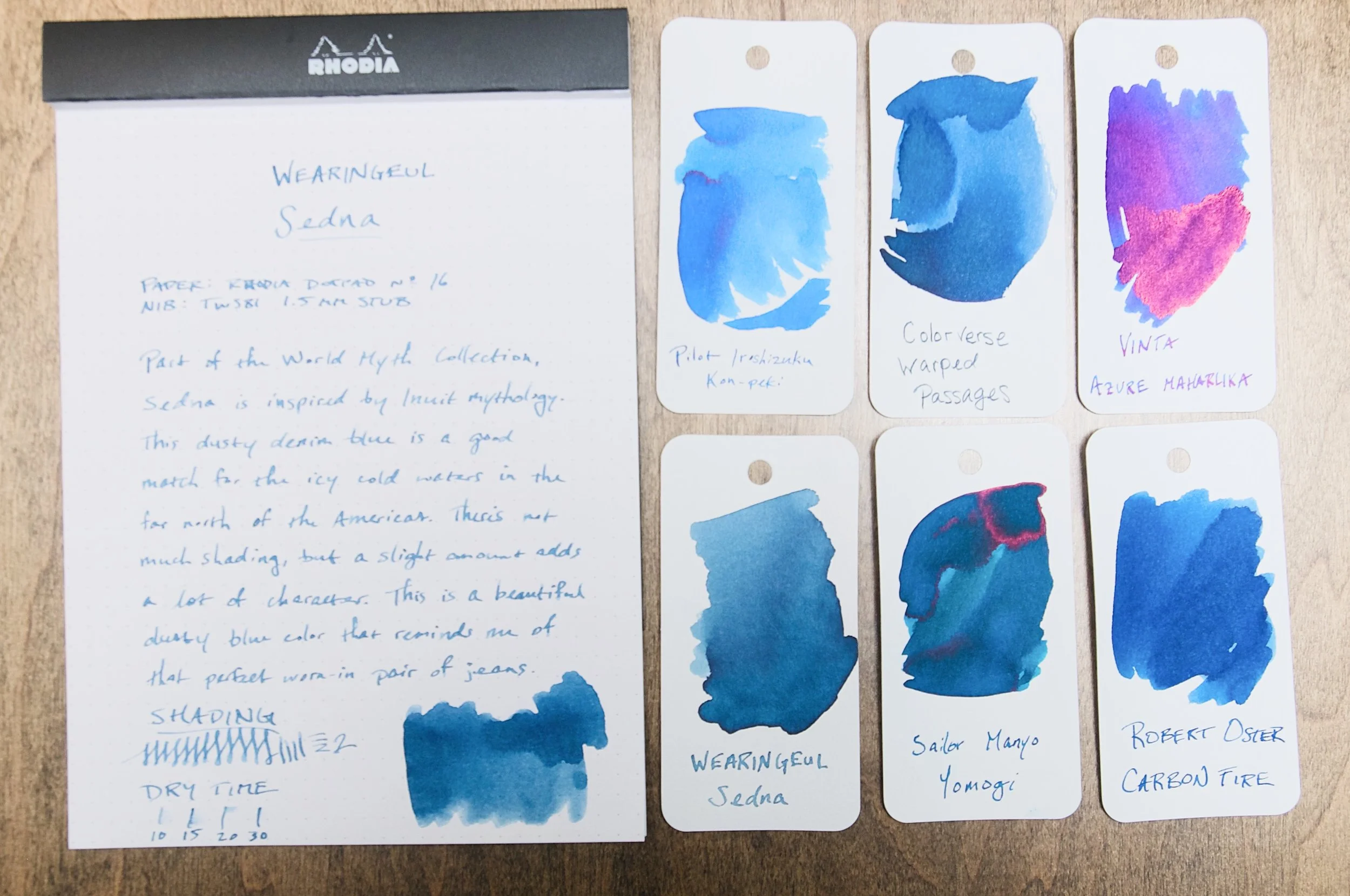
Wearingeul Sedna Ink Comparison

Normally, I lean pretty hard toward the lighter, brighter hues of blue ink — or in the opposite direction to darker, moodier blue-blacks. With this middle-of-the-road shade, I've been surprisingly picking it up more often than not over my other pens just because the unique shade of blue makes me happy for some reason. Just like how I can get rid of that old pair of jeans because I still like how they feel.

If you'd like to pick up a bottle of this ink, you can purchase a 30ml bottle for $22 from Vanness. And, I'd recommend checking out the other World Myth inks in the collection. With Wearingeul, it's safe to assume that you'll get a great ink, so it's just a matter of choosing the colors that speak to you.

(Vanness Pens provided this product at a discount to The Pen Addict for review purposes.)


Enjoy reading The Pen Addict? Then consider becoming a member to receive additional weekly content, giveaways, and discounts in The Pen Addict shop. Plus, you support me and the site directly, for which I am very grateful.

Membership starts at just $5/month, with a discounted annual option available. To find out more about membership click here and join us!

Posted on January 1, 2025 and filed under Ink Reviews, Wearingeul.

Benu Talisman Dream Bean Fountain Pen Review

What’s the most important feature of a fountain pen? Design, nib, filling system, weight, balance … all of those things are important. But the most important feature, I’d argue, is happiness. Yes, all of those features combined contribute to the overall feel of any writing instrument, but does it make you happy when you pick it up and use it?

The Benu Talisman Dream Bean makes me happy. Downright giddy, in fact. And I can’t explain why.

Maybe it’s the Dream Bean itself? After all, these giant seeds are notorious for their ability to “induce lucid dreams that enable communication with the spirit world,” and some of their dust is infused into the barrel material.

That probably explains a lot of it.

The Talisman is one of my favorite Benu Fountain Pen shapes. My preference lies in the more traditional lines of the exterior barrel, which this pen has. It also has different notches and facets shaped into the barrel, giving it a unique look when the light hits different areas. I also like the tactile feel of these divots, not just on the barrel, but in the cap as I hold it in my hand when writing.

Brown and Black are the primary colors of the Dream Bean material, which is further infused with fine sparkles of Green, Gold, and Red. The glitter doesn’t take over the barrel, which is a feature of some other Benu models, so this more subtle one - subtle for Benu that is - may be more up your alley. It’s kind of perfect for the season, too, with full-on Christmas Pudding vibes.

What has turned up the happiness on this pen is how much I am enjoying the nib. It is a stock Fine Steel Schmidt nib, which is normally great out of the box, but something about this one sings. It suits my handwriting well, giving it the edge of a fineliner, which are some of my favorite pens to write with. I can go pages and pages with ease when my letters look as good as this.

I chose Teranishi Guitar Antique Black to ink this pen with, and I nailed it. The Black and Brown tones of the ink pair perfectly with the Black and Brown tones of the pen. Who knew? I knew, and now I’m thinking I need to add my own shimmer to this ink to go full Dream Bean on the page.

I wish I could explain in more detail why I am getting along with this pen so well, but it boils down to what I said up top: it makes me happy.

The Benu Talisman Dream Bean Fountain Pen is $162, along with 11 other stunning Talisman models. If you enjoy fun pens as much as I do, then everything Benu does should be on your radar. Happiness achieved!

(Luxury Brands provided this product at no charge to The Pen Addict for review purposes.)


Enjoy reading The Pen Addict? Then consider becoming a member to receive additional weekly content, giveaways, and discounts in The Pen Addict shop. Plus, you support me and the site directly, for which I am very grateful.

Membership starts at just $5/month, with a discounted annual option available. To find out more about membership click here and join us!

Posted on December 2, 2024 and filed under Benu Pen, Teranishi, Fountain Pens, Ink Reviews, Pen Reviews.

Sailor x Dromgoole’s Apricot Jam & Mint Jelly Ink Review

(Kimberly (she/her) took the express train down the fountain pen/stationery rabbit hole and doesn't want to be rescued. She can be found on Instagram @allthehobbies because there really are many, many hobbies!.)

I was super excited to see this Dromgoole’s Instagram post about their inky collaboration with Sailor and next thing I know, a set of the inks shows up in the mail for review! How awesome is that?!

This is Dromgoole’s first ink with Sailor and they are named Apricot Jam and Mint Jelly. Just a reminder that, despite their tasty sounding names, the inks aren’t meant for eating/drinking :-). These two inks were launched this past Saturday on October 19, 2024 and come in 20ml square glass bottles like the Sailor Shikiori and 50 States series.

Sailor x Dromgoole’s Apricot Jam (top) and Mint Jelly - I love the cute artwork!

As in the past, all swatches were done on Col-O-Ring cards using a Kakimori steel dip nib, while writing samples were done with a TWSBI Go with a Medium nib and a Lamy Vista with a steel Medium nib. The TWSBI Go is a wetter writer and the Lamy is a drier writer, so these two give me a good idea of how an ink will look from different pens. The notebook used for writing samples is the Endless Recorder with 68 gsm Tomoe River paper. Dry times for the Vista are shown with “(V)” and the Go will be below that and might also be shown with “(T)”. Dry times may be a bit slower on 52gsm TR or faster on paper like Cosmo Air Light, Rhodia, copy paper, or with drier or finer nibs, etc.

Apricot Jam is described as a “golden yellow with hints of orange”, but it is more orange with wetter pens. Even in drier pens, like the Lamy, the orange is more than just a hint. It’s also not a bright orange (like Sailor Apricot or Kin-mokusei), but more of a golden orange with a tinge of brown. It is a readable ink whether you use it in drier or wetter pens. The ink dried pretty quickly as well.

Writing sample of Apricot Jam on 68 gsm Tomoe River Endless Notebook.

You get more shading from the drier-writing Vista compared to the wetter Go. The ink is quite a bit lighter when writing in cursive too.

Apricot Jam’s chromatography definitely had a lot of yellow, with a bit of pink (giving it the orange color), but what surprised me the most was the edge of green and turquoise at the very upper edge!

Inks similar to Sailor Apricot Jam: Callifolio Inti (very close but just a hint of brown in person), Nahvalur Mango Sorbet, Robert Oster 2023 CA Pen Show Sunset, Robert Oster Ng Special ‘16, KWZ El Dorado.

Mint Jelly is described as “shades of minty green” but when I swatched it, I was surprised at the color and double checked it against the IG post to make sure I had the right color. I also checked the box/bottle art which matches the ink. I had expected more of a light/pastel green or a bright spring green since that’s what Google says mint jelly looks like. The Mint Jelly ink, on the other hand, is more of a light but moody/dusty green.

Writing sample of Mint Jelly on 68 gsm Tomoe River Endless Notebook.

The ink is much lighter with the Vista than the Go, especially with cursive vs print.

I did this chromatography twice because that blue-gray line did not want to budge and I wanted to make sure I didn’t make a mistake! There is just a hint of yellow that moved up a little, which gives this ink its greenish color.

Inks similar to Sailor Mint Jelly: Pennonia Zuzmo Lichen (a bit too green and peachy). Kyo-no-oto 08 Urahairo (also too green, but probably the closest), Troublemaker Sea Glass (too dark), and the remaining 3 - Sailor Ink Studio 162, Troublemaker Petrichor, Colorverse December 7, 1787 - were too blue.

Sailor x Dromgoole’s Apricot Jam and Mint Jelly inks on 68 gsm TR.

Both inks had just a wee bit drier than average flow, with Mint Jelly a touch drier than Apricot Jam. As expected, the dryness is more noticeable in the Lamy. Both Apricot Jam and Minty Jelly had similar dry times around 30 seconds (or faster). Apricot Jam was fine in both pens but I didn’t love Mint Jelly from the Lamy. It was a very nice color in the Go though. I really like that both of these aren’t the typical orange and green inks that are out there and I especially love that they are lovely shaders too.

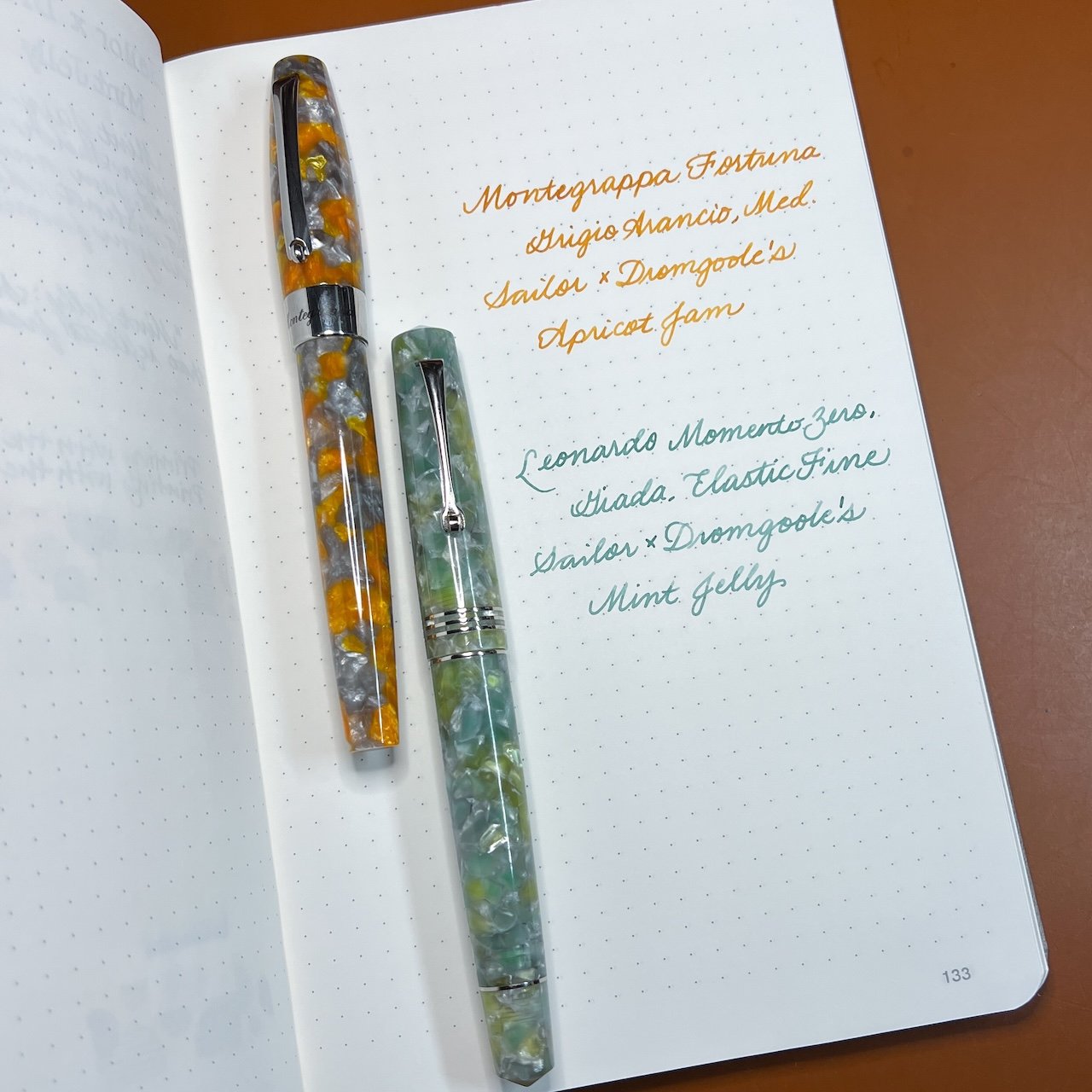
I inked up the Montegrappa Mia, Grigio Arancio, Medium nib with Apricot Jam, and paired the Leonardo Momento Zero, Giada, Elastic Fine nib with Mint Jelly.

Only 500 bottles of each color were made with no current plans for restocking. Apricot Jam and Mint Jelly are currently available on their website or in store for $20 each (shipping is not included). I hope there will be more inky collaborations to come!

(Disclaimer: Thank you to Dromgoole’s who provided these inks at no charge for review purposes. All other inks and notebooks are my own.)

Posted on October 25, 2024 and filed under Sailor, Ink Reviews.