Posts filed under Ink Reviews

Diggin’ These Amarillo Vibes

(Kimberly (she/her) took the express train down the fountain pen/stationery rabbit hole and doesn't want to be rescued. She can be found on Instagram @allthehobbies because there really are many, many hobbies!.)

I know, I know, I just did an ink review a couple weeks ago - Sugar Turtle Studio’s Slowpoke inks - but I just got these from the Bossman at the Philly Pen Show and I just HAD to check them out asap! These aren’t the first inks with Amarillo Stationery’s name on it (they’ve collaborated with Pennonia for three inks) but this is their first private label release, which is exciting.

The Amarillo Vibes set of inks launched a few weeks ago on January 13, 2025 and come in 30ml glass bottles. Despite the bottles looking like those of Birmingham Pen Company, Erick Gama (the guy behind Amarillo Stationery) confirmed that the inks are NOT made by them. Good luck getting him to spill the beans!

Rotating the boxes gives you a fun look at the inspiration behind these inks!

The boxes don’t have the ink names on them, but there are colored swatch stickers to identify them.

I love the doodle art on the bottles!

Here are the bottles with their Col-O-Ring swatch cards.

As in the past, all swatches were done on Col-O-Ring cards using a Kakimori steel dip nib, while writing samples were done with a TWSBI Go with a Medium nib and a Lamy Vista with a steel Medium nib. The TWSBI Go is a wetter writer and the Lamy is a drier writer, so these two give me a good idea of how an ink will look from different pens. The notebook used for writing samples is the Endless Recorder with 68 gsm Tomoe River paper. Dry times for the Vista are shown with “(V)” and the Go will be below that and might also be shown with “(T)”. Dry times may be a bit slower on 52gsm TR or faster on paper like Cosmo Air Light, Rhodia, copy paper, or with drier or finer nibs, etc.

The Amarillo Vibes series includes Blue Suntan, Teal Waistband, Toasty Joggers, and Urng Kicks (pronounced like a mix “urn” and “orange”). I will admit that it took me way too long to figure out where these names came from (this is what I get for not reading the posts and listings until I started swatching, lol).

Amarillo Blue Suntan Amarillo Blue Suntan is inspired by Amarillio’s “skin”, which is a light-to-medium dusty blue. It has nice shading, especially in drier pens.

Writing sample of Blue Suntan on 68 gsm Tomoe River Endless Notebook.

You get a bit more shading from the drier-writing Vista compared to the wetter Go. As expected, the ink is a bit darker and a touch more saturated in the Go, but the main color is still the same. (Some inks can look very different in drier/wetter pens.)

Blue Suntan’s chromatography has both light blue and grey tones. There is just a wee hint of pink just above the ink line.

Inks similar to Amarillo Blue Suntan: Kyo-no-oto 07 Hisoku (closest in color but is a drier ink), Graf von Faber-Castell Deep Sea Green (which is less green than the name implies), Kobe 68 Nishimaiko Pearl Blue and Colorverse Tar Heel (a bit too light), Sailor Mayo Koke (too green and too dark.)

Amarillo Teal Waistband.

Teal Waistband takes its inspiration from Amarillo’s teal equator belt. It is slightly darker and greener compared to Blue Suntan.

Writing sample of Amarillo Teal Waistband on 68 gsm Tomoe River Endless Notebook. The writing is a bit more teal, while the swatches are more green.

Like Blue Suntan, Teal Waistband is a bit darker and slightly more saturated with the Go, but the underlying teal color is the same.

Hard to believe how bright the turquoise is on the strip. The hint of yellow gives the ink its slight greenness, but the amount of pink was definitely a surprise. I wasn’t able to see any of the pink in the writing samples or swatches.

Inks similar to Amarillo Teal Waistband: Waterman Harmonious Green (too green), Jacques Herbin Vert Metropolitain (touch too green and dark), Wearingeul Tick Tock Croc and Diamine Velvet Emerald were the closest, and Iroshizuku Sui-goku (a bit too bright.)

Amarillo Toasty Joggers on 68 gsm TR. Toasty Joggers is described as “yellow/brown color with a hint of pink”, but depending on the light, can look a bit orangey too.

Writing sample of Toasty Joggers on 68 gsm Tomoe River Endless Notebook. It is a very readable yellow/brown, even in a drier pen like the Vista, but might be a touch on the light side for a Japanese Fine or Extra Fine.

The Vista shows a bit more yellow than the Go, which shows it a bit more brown leaning. The pink isn’t obvious like a sheen or chromashader, but more as an undertone.

A mix of yellow and brown, but the chromatography is also showing that “hint of pink”, which can give it a bit of a dusty orange feel.

Inks similar to Amarillo Toasty Joggers: Jacques Herbin Tour Eiffel and Franklin-Christoph Honeycomb were the two closest, Diamine Three Kings (too yellow) and Tono & Lims Toyoma (too light and not quite brown enough.)

Amarillo Urng Kicks on 68 gsm TR.

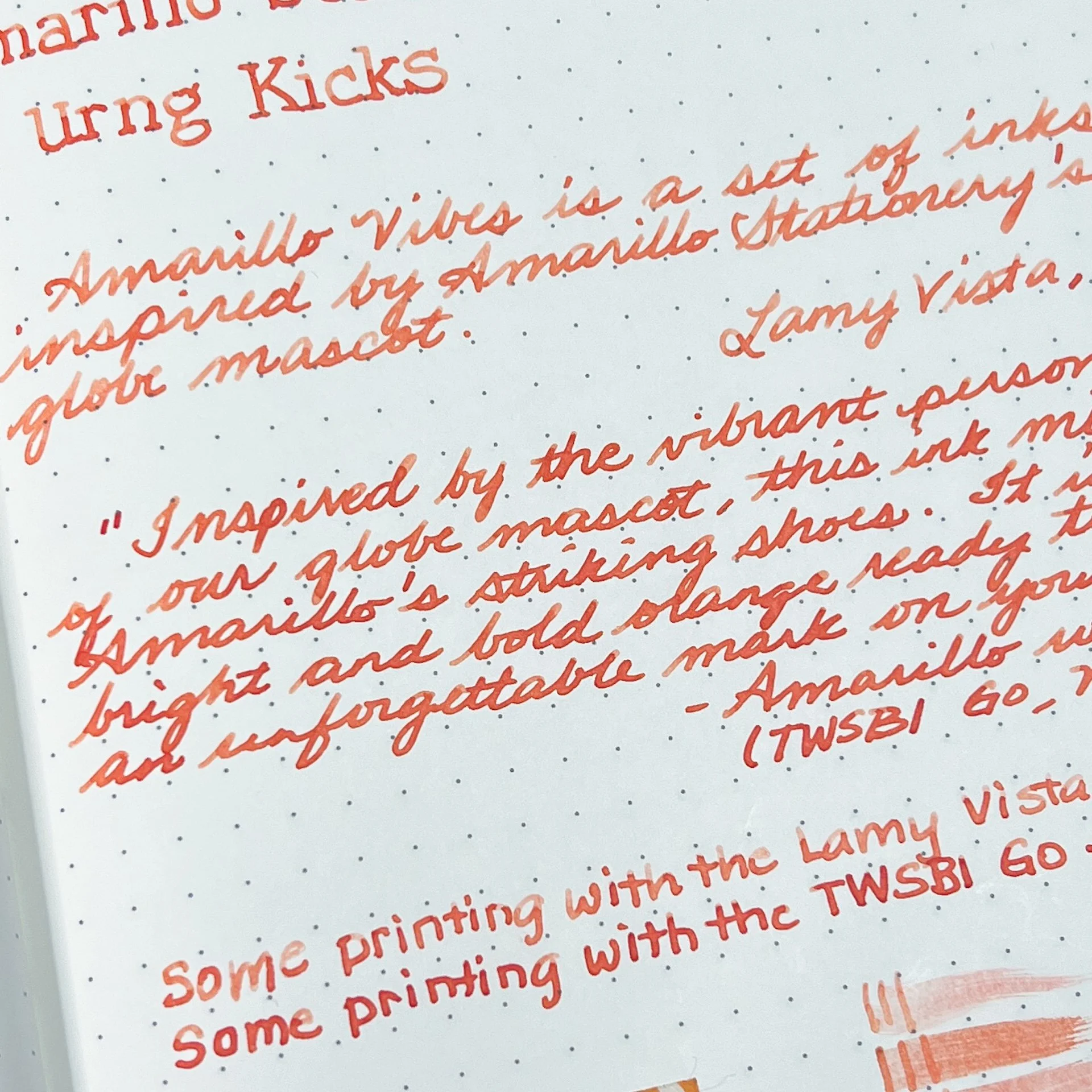
Urng Kicks is inspired by Amarillo’s shoes and is described as “a bright and bold orange”.

Writing sample of Amarillo Urng Kicks on 68 gsm Tomoe River Endless Notebook.

Unlike the other inks, Urng Kicks is a fair bit lighter with the Vista than the Go, with shading prominent in both print and cursive. It looks a bit more coral in the Vista’s drier nib, and more of a red-orange with the Go.

A fair amount of pinkish red and a bright streak of yellow at the top.

Inks similar to Amarillo Urng Kicks: Van Dieman’s Golden Nugget Pumpkin (a bit too red and saturated), Bungubox Omaezaki Sunset (the closest), Diamine Celebration (good match colorwise but too light). It was hard to find matching inks as others were either too orange, too red, or too pink.

Swatches of Blue Suntan, Teal Waistband, Toasty Joggers, and Urng Kicks on 52 gsm TR in a 2021 Hobonichi Weeks.

Swatches on 68 gsm TR in the Endless Recorder.

All 4 inks behaved well and wrote nicely. Dry times weren’t bad at all, but I did expect Blue Suntan and Urng Kicks to dry faster than they did, given how much shading it had from the Vista. Toasty Joggers was the fastest to dry around 30 seconds, while the other two were 45-60 with a wet writer.

The Amarillo Vibes ink series is currently available on the Amarillo Stationery website for $18/bottle (shipping is not included.)

(Disclaimer: Thank you to Erick Gama of Amarillo Stationery for providing these inks for review. All other inks and notebooks are my own, including the Amarillo patch and sticker which I bought from their website last year.)

Posted on January 31, 2025 and filed under Amarillo Stationery, Ink Reviews.

Wearingeul Verethragna Ink Review

Wearingeul Verethragna Ink Review

(Jeff Abbott is a regular contributor at The Pen Addict. You can find more from Jeff online at Draft Evolution and Twitter.)
A few weeks ago, I reviewed Wearingeul's Sedna ink, which is part of their World Myth Collection. This week, I'm back with another ink from that same collection, but this one is from the other side of the world.

Verethragna is a Zoroastrian deity that represents strength and victory, among other things. Reading up on this subject made me remember the world history classes I took in college, and it's also incredible to read about anything so ancient. In the case of the ink, though, it's a lot more straight-forward.

Wearingeul Verethragna

Wearingeul Verethragna is a subdued medium purple shade with mild shading and a dry flow. I typically prefer more saturated and punchy purple inks, but this one has a dusty, reserved tone that I've really enjoyed. It doesn't pop like the bright purples I normally prefer, but it's beautiful in a quieter way.

Despite the ink being a little on the dry side, it flows easily and encourages me to slow down and be more deliberate in the lines I make. It can certainly keep up with a fast writing pace, but the color becomes a good deal lighter with faster strokes.

Wearingeul Verethragna

The ink does shade a bit, but it's not dramatic. It shades plenty enough to set itself apart as a fountain pen ink and provides a pleasant amount of color fluctuation. To my eyes, I can't detect any other tones in this in besides purple and gray. There aren't any other effects (like sheening) present.

Like the other Wearingeul inks I've tried, this one also performs well when it comes to how it behaves on paper. I haven't seen any feathering or bleeding on the different papers I've tried. The edges of the nib strokes remain crisp and sharp.

Wearingeul Verethragna Comparison

Dry time for this ink is a little higher than I'd like considering it's a bit on the dry side in terms of flow. It typically dries between 20 and 30 seconds, though it's a little faster in smaller nibs. In a European EF nib, the ink was smudge-proof in as little as 15 seconds.

Being a part of the World Myth collection means that this is a limited offer. Vanness is already showing low stock for this ink, so act quickly if it strikes your fancy. Verathragna is currently on sale for $23 for a 30ml bottle. Like other Wearingeul inks, this is a great value proposition and one you won't regret if you like the color or the inspiration. Despite this being a more subdued purple, I've found myself reaching for it more than my standard bright purples lately. It's certainly a beautiful color, and I've really enjoyed using it during these past few cold and gray weeks.

(Vanness Pens provided this product at a discount to The Pen Addict for review purposes.)


Enjoy reading The Pen Addict? Then consider becoming a member to receive additional weekly content, giveaways, and discounts in The Pen Addict shop. Plus, you support me and the site directly, for which I am very grateful.

Membership starts at just $5/month, with a discounted annual option available. To find out more about membership click here and join us!

Wearingeul Verethragna Writing
Posted on January 22, 2025 and filed under Wearingeul, Ink Reviews.

Diamine x Sugar Turtle Studio, Slowpoke Series 1

A few months back, I did a review of Sugar Turtle Studio’s four Diamine inks and recently remembered that I still had more of their inks in my review bin, so here we are! Tom Forsythe of Sugar Turtle Studio released another collaboration with Diamine - a 3 ink set called “Slowpoke Series 1”, his first ink series!

The Sugar Turtle Slowpoke Series 1 is a set of 3 inks: Lollygag, Dawdle, and Trudge. This set of inks launched last summer and come in Diamine’s 30ml plastic bottles.

I love the design of this box! The 3 animals give you a hint as to the colors of the inks inside!

These inks are all snug in their drawer!

The side of the box also shows a “swatch” of the 3 colors, also pictured on Col-O-Ring swatch cards. As you can see, the colors don’t quite match the ink themselves.

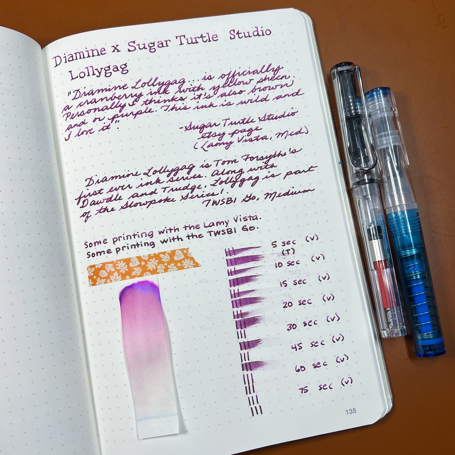
As in the past, all swatches were done on Col-O-Ring cards using a Kakimori steel dip nib, while writing samples were done with a TWSBI Go with a Medium nib and a Lamy Vista with a steel Medium nib. The TWSBI Go is a wetter writer and the Lamy is a drier writer, so these two give me a good idea of how an ink will look from different pens. The notebook used for writing samples is the Endless Recorder with 68 gsm Tomoe River paper. Dry times for the Vista are shown with “(V)” and the Go will be below that and might also be shown with “(T)”. Dry times may be a bit slower on 52gsm TR or faster on paper like Cosmo Air Light, Rhodia, copy paper, or with drier or finer nibs, etc.

Tom describes Lollygag as a “cranberry ink with yellow sheen”, but I think of it more as a magenta ink with a greenish sheen. The sheen is not overpowering in writing samples, despite how it looks in larger swatches.

Writing sample of Lollygag on 68 gsm Tomoe River Endless Notebook.

You get a bit of shading from the drier-writing Vista compared to the wetter Go. You can just see a hint of green sheen with the Go’s writing sample. In both cases, the ink is fairly saturated.

Lollygag’s chromatography looked a lot like one would expect, a lot of pink and a bright flash of magenta and purple at the top.

Inks similar to Diamine Lollygag: Vinta Malayan Apple Makopa, Troublemaker Magallanes Street (both are a touch brighter and pinker), Colorverse Purple Cosmo (more of a gold sheen and more purple), Van Dieman’s Aurora Australis (much more overpowering matte green sheen, the underlying color is a bit more purple and less pink.)

Dawdle is described as “blue-leaning gray…a Blue-Black”. Looking at the label and the cute koala, I was expecting a muted purple. When I swatched it, it looks a bit blue-black with a touch of purple in it, but I wouldn’t call it purple either. I checked the bottle to make sure I swatched the right one as well as checking the website’s swatches to make sure I had the right color.

Writing sample of Diamine Dawdle on 68 gsm Tomoe River Endless Notebook. Seeing the ink from two different pens is key - now the two descriptions make more sense!

The ink is much lighter with the Vista than the Go, especially with cursive vs print. Definitely a blue-leaning gray (or gray-leaning blue?) in a drier pen like the Vista, and more of a moody blue-black from a wetter pen.

I didn’t expect to see such a bright turquoise blue at the top, as well as the pink in the middle. The gray towards the bottom was what I expected from this gray-blue ink.

Inks similar to Diamine Dawdle: Montblanc Midnight Blue (less gray), Diamine Silent Night (slightly more blue), and Diamine Chilly Nights (shimmer). Not surprising that the two closest matches are also from Diamine.

Diamine Trudge on 68 gsm TR. Trudge is described as “deep teal with red sheen”. I was expecting more of a blue leaning teal, but it’s slightly more green leaning on the Col-O-Ring swatch card.

Writing sample of Diamine Trudge on 68 gsm Tomoe River Endless Notebook. I accidentally wrote with the Go for the first paragraph (instead of the second). Comparing the writing sample to the TWSBI Go’s blue barrel, it is a bit more of a green-leaning teal.

As usual, the ink is much lighter with the Vista than the Go, with shading more prominent in print. The red sheen doesn’t show up much with the Vista, so if that’s your jam, make sure you’re using a wetter pen.

A mix of blue and green for this teal, but the chroma is also showing a fair amount of blue, including that electric blue at the top.

Inks similar to Diamine Trudge: Diamine Garland, Diamine Smoke on the Water, Pure Pens John Frost (I believe their inks are also made by Diamine), Diamine Season’s Greetings. Not surprising that all of the matches are from Diamine. The other inks that I had that were “similar”, were actually more blue leaning and not weren’t close when I put them next to these swatches.

Swatches of Lollygag, Dawdle, and Trudge on 52 gsm TR in a 2021 Hobonichi Weeks.

Swatches on 68 gsm TR in the Endless Recorder.

All 3 inks behaved well and wrote nicely. Dry times weren’t too bad, but Dawdle was the fastest to dry 30 seconds, while the other two were 45-60 with a wet writer.

The Diamine x Sugar Turtle Studio Slowpoke Series 1 set is currently available on their website or in their Etsy shop for $25/set (shipping is not included). Given that this is Series 1, I hope this means that a second series will be coming soon!

(Disclaimer: Brad bought these inks from Sugar Turtle Studio. All other inks and notebooks are my own.)


Enjoy reading The Pen Addict? Then consider becoming a member to receive additional weekly content, giveaways, and discounts in The Pen Addict shop. Plus, you support me and the site directly, for which I am very grateful.

Membership starts at just $5/month, with a discounted annual option available. To find out more about membership click here and join us!

Posted on January 17, 2025 and filed under Sugar Turtle Studio, Ink Reviews.