Posts filed under Nibs

Franklin-Christoph Steel Flex Nib Review

My flex nib writing style will never be confused for the glorious strokes of Azizah at Gourmet Pens, or the frolicking fun of Ana at The Well-Appointed Desk. But my style is my style, and I love the flair that flex nibs add to my block print writing style.

The latest flex nib to cross my path is the Franklin-Christoph #6 Steel Extra Fine, and it’s a good one. Now, you know my stance on nearly all modern flex nibs - they should be classified as soft nibs, not flex, for the most part - and this F-C nib is no different. But, as with other modern flex nibs I’ve tested, that doesn’t mean it isn’t excellent in it’s own right.

The F-C steel flex nib is characterized by the lengthy slit running up almost 90% of the exposed nib, along with slight scallops carved out of the wings. This type of steel nib is not new to the market, but it is the first time one has crossed my desk.

From strictly a flex perspective, there is a good amount of line variation, but not a massive range like you get from vintage flex nibs or dip nibs. Nor should there be. That’s the expectation from those nibs - not this one. And that is the expectation you should have going into any modern flex nib purchase.

For my handwriting style, this nib helps my letters pop off the page. My heavy hand spreads the tines on the downstroke for wide lines, then relaxes for thinner lines from side to side. For a nib marked as EF I would like to see a finer fine line, but that’s a minor complaint for a nib that writes so well.

I compared this nib to two other soft nibs in my collection - the Aurora Optima Flex, and the Pilot Falcon - to get a feel for how similar or different they are. I assumed the Falcon would be an outlier, and it was. It has a much finer fine line, and a narrow wide line, but it might have the widest range if you know how to use it properly.

The other two are shockingly similar. I’ve talked about how much I enjoy writing with the Aurora flex nib due to how cool it makes my handwriting look, and the Franklin-Christoph is similar to that. Shockingly similar I’d say. They both begin with a fine line and expand to a broad line. There is definitely a good amount of variation - you just begin from a wider place than with a nib like the Falcon.

I added a Sailor King of Pen stock medium nib to the comparison to show a baseline of how these soft nibs make my handwriting appear. It’s noticeable to me in person, but may not translate as well in pictures.

So what’s my verdict on the Franklin-Christoph #6 Steel Extra Fine nib, from a non-flex friendly writer? It’s pretty great. I think I’ve already convinced myself to pick up one or two more and have them ground even finer to see what I can really do with the nib. Do I have a flexy future?

(Franklin-Christoph provided this product at a discount to The Pen Addict for review purposes.)


Enjoy reading The Pen Addict? Then consider becoming a member to receive additional weekly content, giveaways, and discounts in The Pen Addict shop. Plus, you support me and the site directly, for which I am very grateful.

Membership starts at just $5/month, with a discounted annual option available. To find out more about membership click here and join us!

Posted on January 27, 2020 and filed under Franklin-Christoph, Nibs, Flex Nib, Pen Reviews.

Franklin-Christoph S.I.G. Flex Nib Review

I’ve had my Franklin-Christoph S.I.G. Flex Nib in regular use for a couple of months now, and I find two statements to be true about it’s performance:

  • It is an awesome feeling nib.
  • There is little line variation.

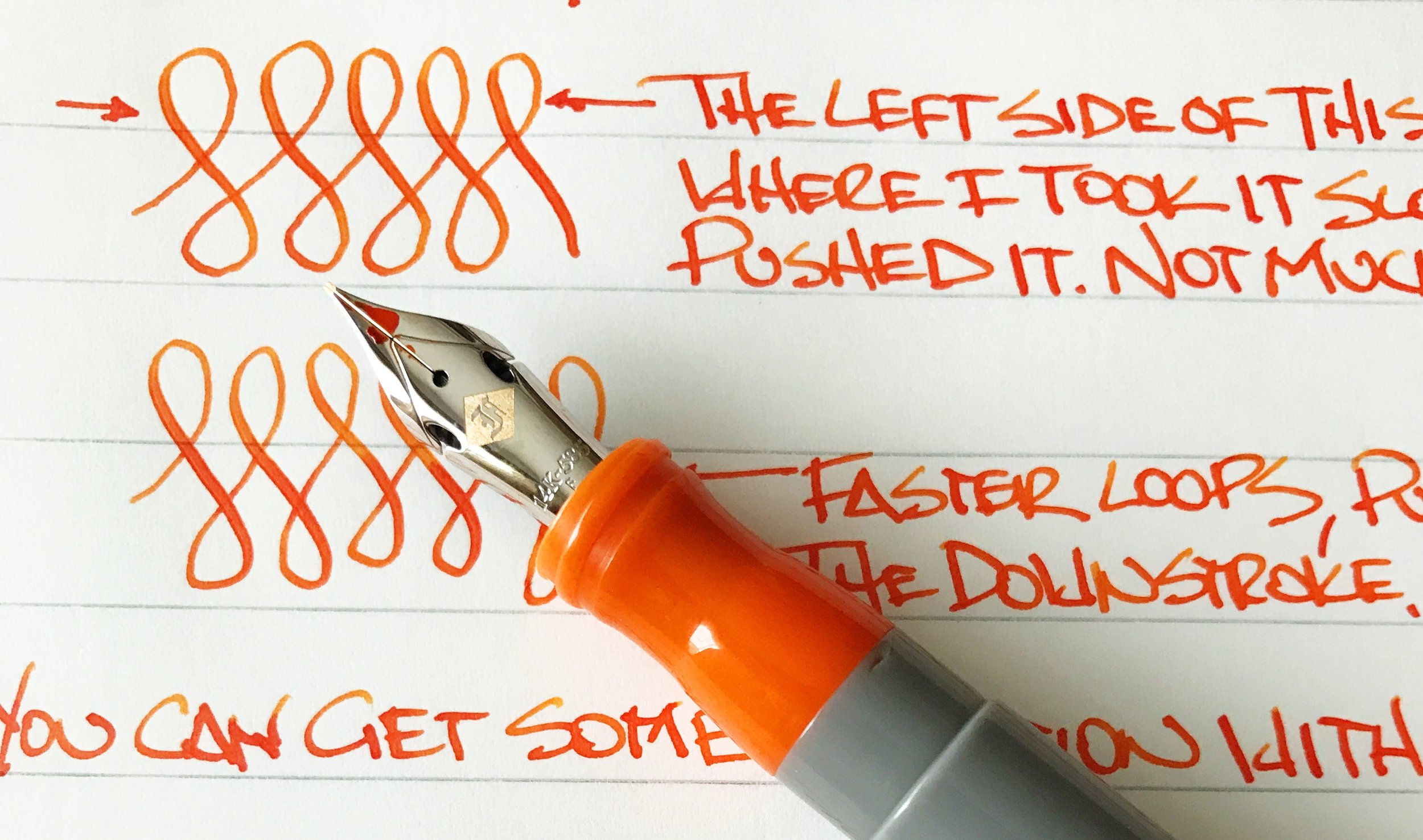
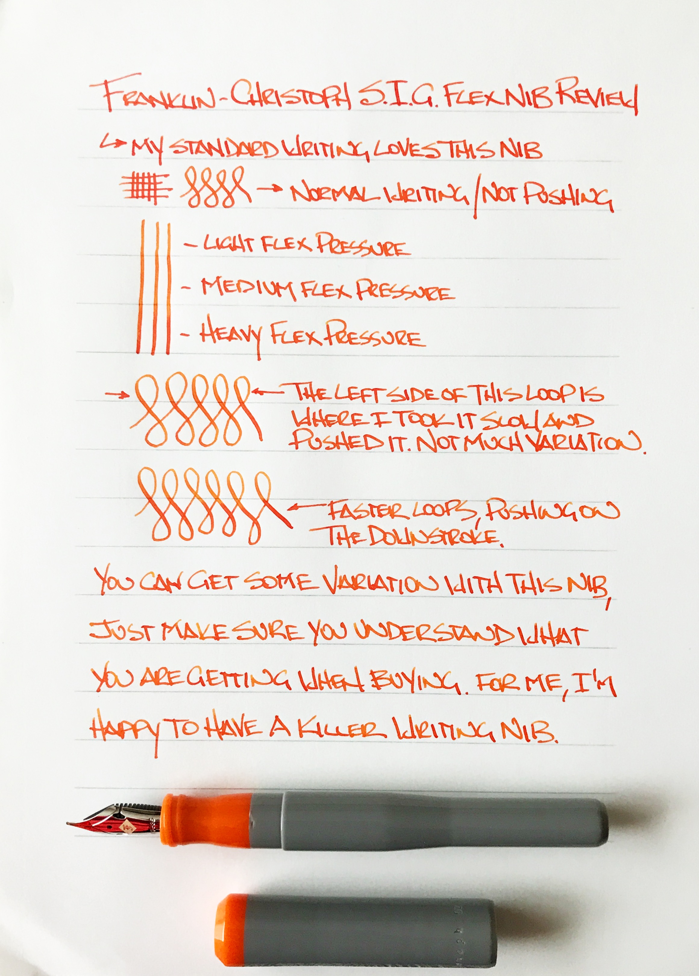
When I have talked about this nib in other places I keep saying it is not a flex nib. That’s not exactly true. It does flex in the literal sense, as in the tines spread and the nib bends, but it does not provide what I consider to be flex nib output, meaning noticeable line variation when pushed. Not with light pressure, not with heavy pressure. But that doesn’t keep this nib from being great in my book.

What this nib provides is bounce, not flex. You can push the nib and watch the tines spread. It is a fantastic feel, and a great writing experience. Just don’t expect much line variation. My fine S.I.G. grind goes from a medium width line to a mediumer line. And I’m ok with that because my line looks great and the nib feels great.

S.I.G. stands for Stub Italic Gradient, which is a nib grind done by F-C’s in house nib meister Jim Rouse. It is perfect for someone like me who enjoys a cursive italic grind but without the sharp edges is often comes with. This grind smooths those edges out while keeping the horizontal and vertical line variation that I enjoy so much.

To achieve flex in this nib, Jowo (the nib manufacturer) added cutouts above the shoulders of the nib. In theory, this allows the tip to be pushed when writing for added flex. The output just isn’t as impressive as the look. Nib meisters have added cutouts and slits to nibs for years to provide added flex. Jowo, and other nib manufacturers, are now adding this feature as a stock offering, which is a good sign that they are listening to us consumers. Just don’t be confused about what you are actually purchasing.

If you are looking for line variation as found with a traditional flex nib, this is not the nib for you. If you are looking for a wonderful writing nib with a ton of character and fun, then check out the S.I.G. flex nib. I’m completely enamored with mine and enjoy using it. I may even add a second one to the lineup one day.

(This nib was purchased at full price with my own funds.)


Enjoy reading The Pen Addict? Then consider becoming a member to receive additional weekly content, giveaways, and discounts in The Pen Addict shop. Plus, you support me and the site directly, which I am very grateful for.

Membership starts at just $5/month, with a discounted annual option available. To find out more about membership click here and join us!

Posted on September 11, 2017 and filed under Franklin-Christoph, Fountain Pens, Nibs, Pen Reviews.

Sailor Specialty Nibs Review

(Susan M. Pigott is a fountain pen collector, pen and paperholic, photographer, and professor. You can find more from Susan on her blog Scribalishess.)

Ever since I discovered the Sailor Specialty Nibs page at Classic Fountain Pens, I spent hours looking at each nib and its characteristics, fascinated by the different shapes and styles. The prices always threw me for a loop, though, so I just looked and coveted.

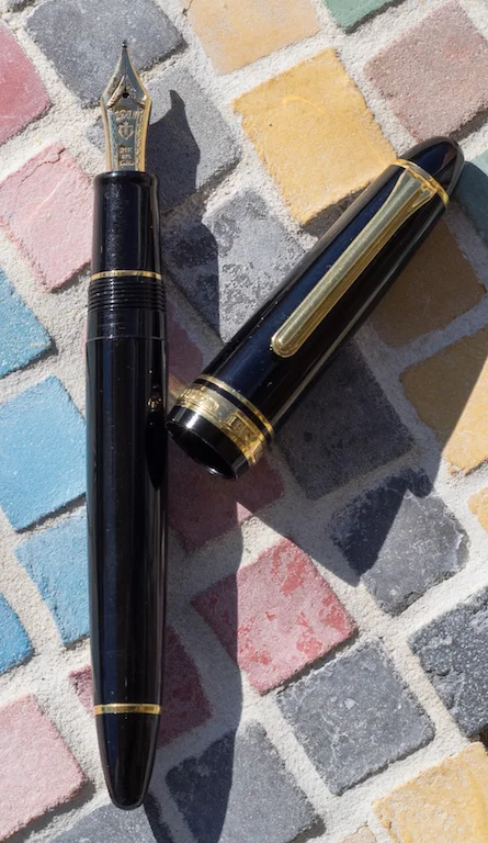
I finally found a pretty good price on a Sailor Pro Gear with a Cross Point nib on Engeika. It took several weeks to arrive, but the wait was worth it.

I loved the lush broad lines it made–so glorious with sheening and shading inks. But I couldn't write with the nib upside down. You're supposed to be able to write fine lines with it, but mine just cuts into the paper.

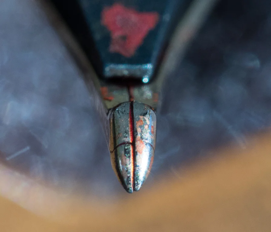
I discovered why, after taking macro shots of the nib: the tines are misaligned. This doesn't affect the broad strokes, but it definitely makes the nib unusable for fine lines. I'm going to have to send the nib in for work.

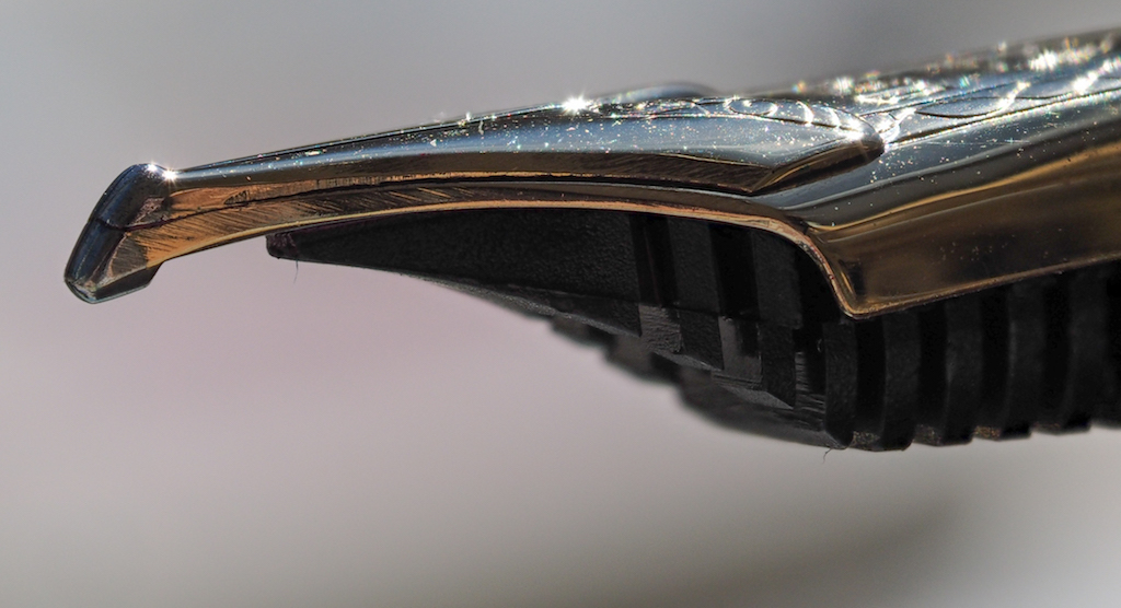
In the meantime, a person on Fountain Pen Geeks offered a Sailor 1911 with a Cross Concord nib for a steal. I knew the Concord, with its beak-like nib, could write fine on one side and do the luscious lines on the other, so I bought the pen.

So, now I have two Sailor Specialty Nibs.

The two nibs are similar in what they can do: write fine strokes with the nib in one position and broad strokes in the other. The Cross Point nib in the normal position writes broad strokes.

Cross Point Nib

Cross Point Nib

The Cross Concord is the opposite. Personally, I prefer the Cross Concord because I can pick it up and immediately use it like a normal fountain pen. If I want the broad strokes I turn it upside down. With the Cross Point, you have to hold the pen with the nib upside down if you want to write fine strokes.

Cross Concord Nib

Cross Concord Nib

Because my Cross Point's tines are misaligned, I can't compare the two pens' fine strokes. But I can compare the broad ones. They are similar in width (if not exactly the same). You can vary the width of the line of both nibs depending on the angle you hold the pen. If you wish, you can even mimic brush strokes with the nibs.

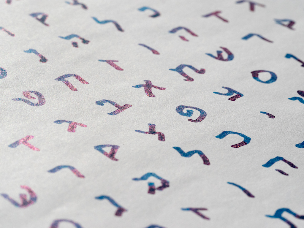
The Sailor Specialty Nibs are clearly designed for Japanese calligraphy, not western writing. But, I've found they work great for writing Hebrew. I'm no calligrapher, but I love the nice thick lines I can make for Hebrew lettering.

Yes, there are Hebrew/Arabic nib grinds for this purpose, but they aren't all that versatile if you write primarily in cursive. With the Sailor nibs, I can write Hebrew letters with the broad side and turn the nib over and write cursive English.

These nibs are also great for drawing. I'm no artist, but I could see how people who like to sketch with ink would love these pens. You can paint with the broad side and sketch details with the fine.

The nibs themselves are works of art. The double-layer nibs, the scroll work, the beautiful 21K gold, all combine to make for an exquisite nib. You can get the specialty nibs with an extra bar on top that increases the ink flow, but I think it ruins the aesthetic of the nib. So far, I've had no need for increased ink flow.

The one negative about these nibs is that they are limited to Sailor pens. It's not that I have anything against Sailors, it's just that their converters are tiny. They just don't hold much ink (0.5ml). Even the Sailor Realo (a piston fill pen) doesn't hold much more (0.9ml). When you're doing broad, juicy strokes, you can blow through a small converter of ink very quickly.

Another limitation of Sailor pens is the lack of choices in pen color. Finding a Sailor with a specialty nib in any color other than black is difficult, and you have to be willing to pay a premium. If you want one of the fancier Sailors with a specialty nib expect to pay close to $1,000.

I purchased my boring black Pro Gear from Engeika for $390. The Sailor 1911 with a Cross Concord would normally be $535, but I got it for around $300 as well.

Pros

  • These specialty nibs really are special. No other manufacturer makes anything like them.
  • They are extremely versatile. You can write fine and broad and in between and use them for sketching.
  • These nibs are great for certain types of calligraphy and even for Hebrew (which I know is very important to most people).
  • Sailor specialty nibs make great ink testers because they show off the ink in both fine and super broad strokes.

Cons

  • The nibs are only available on Sailor pens which have small ink capacity.
  • Sailor pens with specialty nibs are quite expensive.
  • You don't have much choice in colors unless you're willing to pay almost $1,000.
  • Sailor recently suspended orders on these nibs so quantities are currently limited.
Posted on February 12, 2016 and filed under Pen Reviews, Sailor, Nibs.