Posts filed under Notebook Reviews

William Hannah Intentions Pages Review

(Susan M. Pigott is a fountain pen collector, pen and paperholic, photographer, and professor. You can find more from Susan on her blog Scribalishess.)

Early in September, I began thinking about what planner I wanted to use in 2019. I’ve been using the Hobonichi A5 Cousin (review here) for several years now, and although I love it, I wanted to use my William Hannah A5 notebook more (review here). I thought about replacing my Hobonichi with the William Hannah notebook, so I ordered a set of calendar pages and something new called “Intentions Pages.”

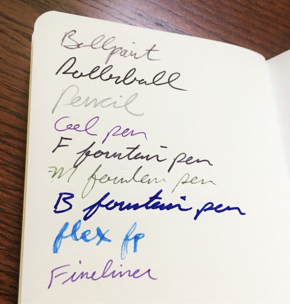
William Hannah paper is amazing. It’s super thick (100gsm) and luxurious. There’s almost no show through, even with the wettest inks.

However, when my calendar and Intentions Pages arrived, I immediately discovered a problem. I couldn’t fit even one month of daily calendar pages and Intentions Pages in my notebook. The paper is just too thick! I like to have an entire semester’s worth of daily and monthly pages in one calendar for work, and my William Hannah couldn’t hold that much. So, I ordered another Hobonichi to use at work.

But, I immediately fell in love with the William Hannah Intentions Pages. What are Intentions Pages, you ask? Well, the Monthly Intentions Pages help you think through your goals for each month and to reflect upon them when the month is over.

The front page asks you to consider the following things:

  • This month’s goals (what and why?) - There’s plenty of room to write five substantive goals in the spaces provided.
  • What will I do more of this month? - Here you can write down a list or a paragraph of things you’d like to do more, which I think is an excellent thing to contemplate at the beginning of each month.
  • What will I do less of this month? - This is also a helpful question. I always find that I waste too much time doing things that don’t contribute to my goals or that take away from my happiness.

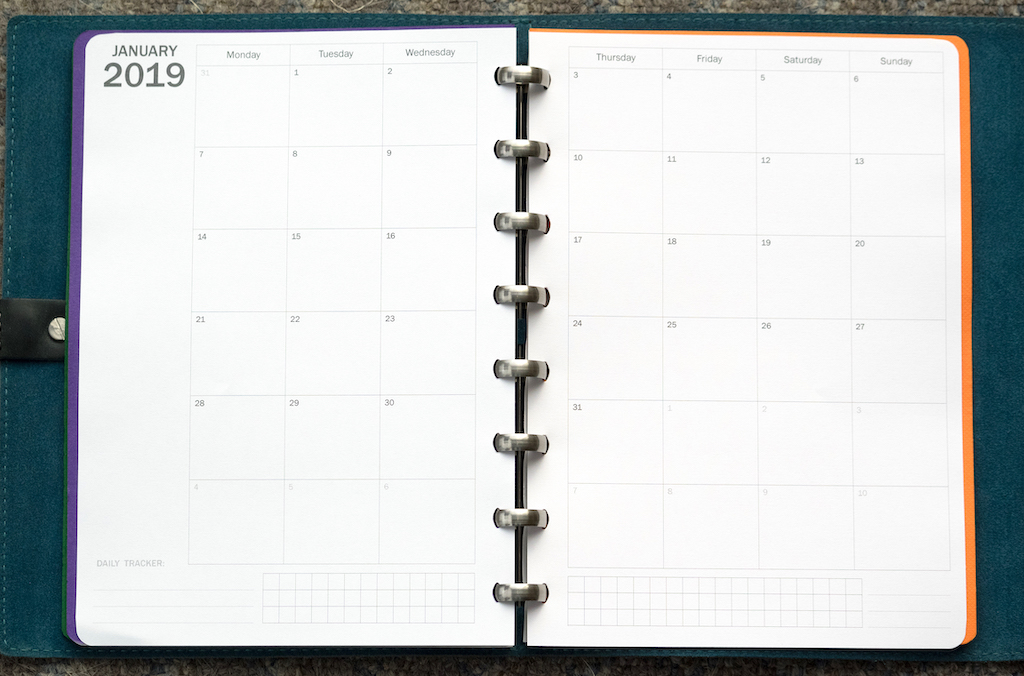
The next two pages provide a monthly grid where you can write important dates. There’s also a daily tracker at the bottom of the pages.

The back page asks the following reflection questions:

  • How would I summarise the month? - A large portion of the page is devoted to this question so you can write out your thoughts in paragraph form.
  • What will I do differently in the future? - The rest of the page challenges you to think about what needs to change in the coming days and months.

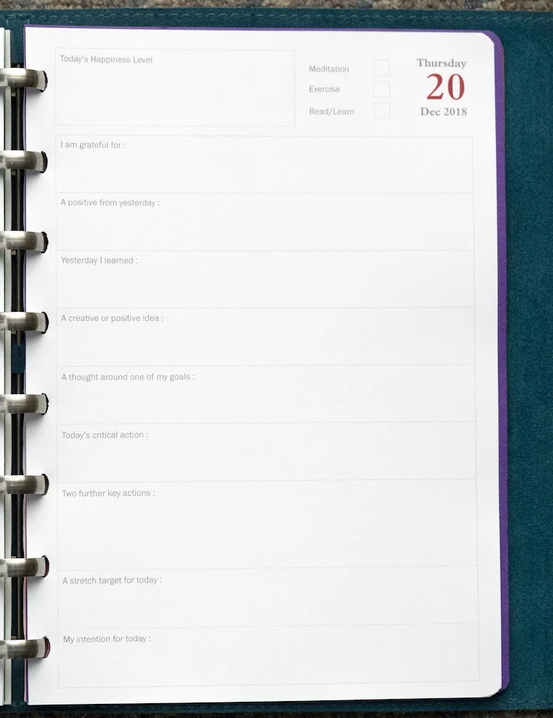
Daily Intentions Pages provide a guide for thinking through your goals, evaluating your mood, and contemplating other questions each day.

The front page has the following items:

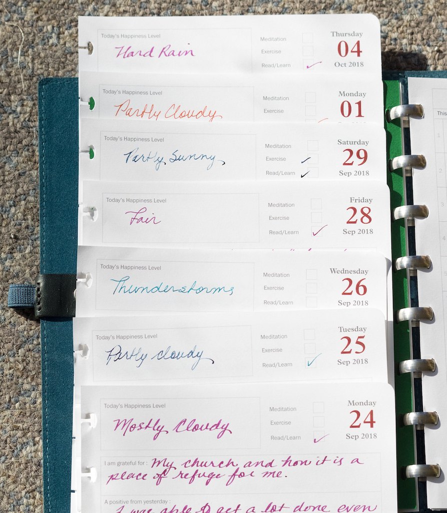
  • A box where you can record the day’s “Happiness Level.” - You can either write down your mood or draw something to represent your happiness level in this box. I do this at the end of the day.
  • Check boxes to record meditation, exercise, and reading or learning (daily practices that all of us could benefit from, though I’ve been terrible at finding time to exercise or meditate this fall).
  • The remainder of the page lists the following items to consider at the beginning of each day:
  • I am grateful for
  • A positive from yesterday
  • Yesterday I learned
  • A creative or positive idea
  • A thought around one of my goals
  • Today’s critical action
  • Two further key actions
  • A stretch target for today
  • My intention for today

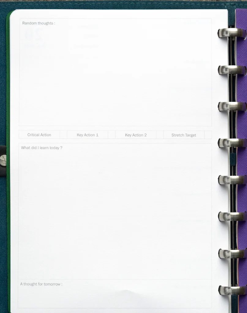
The back page provides a checklist for your critical action, key actions, and stretch target. There’s also room for the following:

  • Random Thoughts
  • What did I learn today?
  • A thought for tomorrow

I put my Monthly Intentions Pages at the beginning of the month followed by a month’s worth of Daily Intentions Pages. This much fits perfectly into my William Hannah notebook.

I’ve been doing Intentions Pages since September, and they’ve helped me to track my mood, record what I am grateful for, contemplate creative and positive ideas, record what I’ve been learning, and analyze how I’m progressing on my monthly and daily goals.

This fall has been one of the worst semesters I’ve ever experienced. We had major cuts at my university, and many of my friends and colleagues lost their jobs. In addition, my mentor of many years died. So, I had to deal with more grief and stress than normal. The Intentions Pages helped me work through my rollercoaster thoughts and emotions and also reminded me to record grateful, creative, and positive thoughts each day. This was really good for me because many days I didn’t feel positive or grateful, but when I dug down deep, I could find things that brought me a tiny bit of cheer.

I recorded my mood in terms of weather, because I discovered using a weather metaphor was easier for me than trying to come up with words to describe my mood each day. I have to admit that most days this fall were gloomy, often with thunder and rain. But, there were some sunny days as well.

Even though I was disappointed that my William Hannah notebook didn’t work out as my daily calendar, the Intentions Pages were a wonderful surprise. I journal regularly, but the Intentions Pages provide me with a structured set of questions and prompts that I work through every day. My William Hannah notebook sits next to me on the side table in the living room where I drink my coffee each morning and cuddle my kitties in the evening. I’ve been pretty faithful recording my intentions each day, and I think it’s benefitted me greatly.

You can purchase William Hannah A5 notebooks at William Hannah. Intentions Pages come in monthly (£8.00=$10.00 for 2019) and daily format (£10.00=$12.70 per 50-day pack).

(I purchased my William Hannah notebook and Intentions Pages with my own funds.)


Enjoy reading The Pen Addict? Then consider becoming a member to receive additional weekly content, giveaways, and discounts in The Pen Addict shop. Plus, you support me and the site directly, for which I am very grateful.

Membership starts at just $5/month, with a discounted annual option available. To find out more about membership click here and join us!

Posted on December 21, 2018 and filed under William Hannah, Notebook Reviews.

Yamamoto Ro-Biki Notebook Review

(Sarah Read is an author, editor, yarn artist, and pen/paper/ink addict. You can find more about her at her website and on Twitter.)

We pocket notebook lovers are so spoiled for choice these days that it takes something extra special to turn our heads. Well, these Yamamoto Ro-Biki Notebooks have my head spinning in circles. With these tall, narrow pages--perfect for lists--you can make a nice long list of all the cool things about them.

To begin with aesthetics, these are just gorgeous notebooks. The cover design is elegant in a way that is both fun and professional looking so the notebook can travel between work and play with ease. The colors are rich neutrals. This star map version with the navy background and parchment-colored constellations and script looks like it might have time travelled from a hundred years ago, or been found in a stationery lover's time capsule.

The cover is light cardstock that has been treated with wax. The texture feels a bit grabby at first, but it soon burnishes into a beautiful gloss that looks almost like vintage leather.

The binding is sewn with a lot of sturdy stitches. Inside the cover is a white endpaper, and then 60 pages of cream colored recycled paper. Like most recycled papers, it's not entirely impervious to liquid ink, but it performed very well. My broad fountain pen and flex nib caused some bleed-through, but all the other pens I tested barely showed through at all--not even my firehose of a TWSBI. The front of the page shows no feathering, even with the wetter nibs and inks. Unless you're really laying the ink down, these would work fine with fountain pens.

Branding on the notebook is very minimal--only the subtlest brand is printed on the back bottom in black ink on the blue background.

The dimensions are 3.6" x 8.3", so they're not quite the right dimensions for the regular sized Traveler's Notebook covers, but I think they would still work with it. The height is the same--these are just a bit narrower. I don't think the paper performs quite as well as the Midori paper of the Traveler's Company notebooks, and they are, at $9.00, about $1.75 more expensive. They have more sheets of paper, though. And the irresistibly stunning covers.

I like what I've seen from Yamamoto notebooks so far, and I'm looking forward to what they do next.

(JetPens provided this product at no charge to The Pen Addict for review purposes.)


Enjoy reading The Pen Addict? Then consider becoming a member to receive additional weekly content, giveaways, and discounts in The Pen Addict shop. Plus, you support me and the site directly, for which I am very grateful.

Membership starts at just $5/month, with a discounted annual option available. To find out more about membership click here and join us!

Posted on December 20, 2018 and filed under Yamamoto, Notebook Reviews.

Tomoe River Notebook by Sakae Technical Paper: A Review

(Susan M. Pigott is a fountain pen collector, pen and paperholic, photographer, and professor. You can find more from Susan on her blog Scribalishess.)

I remember when finding Tomoe River paper was difficult. Only one or two retailers offered it in the US, and you had to get an order in promptly or you were out of luck. Now Tomoe River paper is available from multiple retailers in a variety of notebook styles.

Today I’m reviewing the Tomoe River Notebook by Sakae Technical Paper. It is a cardboard-bound notebook with white, dot-grid, 52gsm paper in A5 size. The notebook contains 368 thread-bound pages.

This is a beautifully-made notebook. The thick cardboard cover is textured with a subtle logo on the front. It comes with a plastic cover that protects the notebook from the elements, which is an especially nice touch. The notebook lays flat when open.

The paper is smooth with a light dot-grid pattern on pure white paper. I really like the white paper (I’m accustomed to cream Tomoe River paper) because ink colors look more accurate on white paper.

I tested the paper in several ways: writing reviews, practicing calligraphy, testing pens, and doing swatches. It performed beautifully, though, like all Tomoe River paper, show through is obvious. Bleed through, however, is rare. I only encountered it with my three-tined music nib and a Sharpie.

General Writing

The paper works well for general writing. I wrote a couple of Pen Addict reviews using the notebook, and I have absolutely no complaints about how the paper feels under a nib. It’s absolutely smooth and it doesn’t catch at your nib. Plus, it lays flat when open.

You can see the show through from the review written with a Danitrio fine nib.

Calligraphy Practice

I love this notebook for calligraphy practice. The dot grid provides guidance, and you can write in portrait or landscape.

Thicker lines show through much more obviously than regular writing.

Pen Testing

I used several different fountain pens and other writing instruments to test the paper. It handled all the fountain pens perfectly except for the widest and wettest nib: a Waterman three-tined music nib. I dipped the Waterman, so the number 10 I wrote was especially wet. That was the only ink that bled through (and just a tiny bit).

I also tried several other pens, rollerballs, brush pens, various ballpoints, and a pencil. The only pen that showed through quite obviously was the Sharpie.

Swatches

Last, I tested the paper by doing ink swatches. I love how ink swatches look on this paper. The colors are true, and the dot grid shows in the swatches. Obviously, with such wet ink, you have a great deal of show through (but no bleed through on any of the inks I tested).

As you can see, the paper is lovely and it shows off ink well. However, if you are bothered by show through, you won’t like this notebook (or any Tomoe River paper, for that matter). The thing about Tomoe River paper is that it is super thin and yet ink doesn’t tend to bleed or feather. However, that thinness means that writing will show through. The easy solution is to use only one side of the paper if you’re bothered by show through. I journal on both sides of my Seven Seas Writer (also Tomoe River paper), and I’m not bothered by the show through at all. I love how the paper gets all crinkly and the ink colors meld together in a collage of words.

A few things are missing from this notebook that some writers might want, such as a ribbon marker, pockets on the inside of the cover, and page numbers. But, if you like a sleek, classy looking notebook without any added bulk, the Tomoe River Notebook by Sakae Technical is a great choice.

You can purchase this notebook at Jet Pens for $49.00. Although this notebook is very nice, it is almost twice as expensive as the Seven Seas Writer ($26.00), which has 468 pages (it comes in dot-grid, white or lined cream). The Seven Seas does not have a plastic cover, however, and it is much thicker.

(JetPens provided this product at no charge to The Pen Addict for review purposes.)

Posted on December 14, 2018 and filed under Tomoe River, Notebook Reviews.