Posts filed under Pen Reviews

Sailor 1911 Standard Royal Amethyst Fountain Pen Review

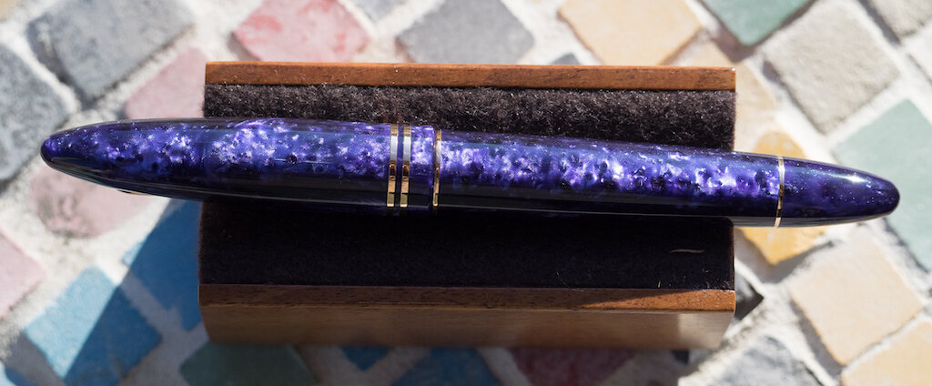
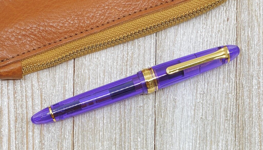
Sailor has perfected the art of the limited edition release. Case in point: The 1911 Royal Amethyst, designed in conjunction with Goldspot. It’s one of the prettiest releases I’ve seen since, well, their last release. That’s how much I love these pens.

As great as I find all of Sailor’s fountain pens, I’ll admit it took me a while to come around on the 1911 model. I was a Pro Gear guy, through and through. The smaller Slim size, or the larger Regular (don’t worry, I’ll yell about their naming conventions in a minute,) that was my Sailor. Until one certain 1911 changed me completely.

I didn’t buy the Royal Tangerine on launch. Shocker, I know. It is one of the most on-brand pens ever made, but it was a 1911. I’m a Pro Gear guy, remember?

I hemmed and hawed, but then the opportunity to try one out - from Goldspot, coincidentally - crossed my desk. I said yes, of course, and that one 1911 Standard changed everything I thought about one of Sailors primary product lines.

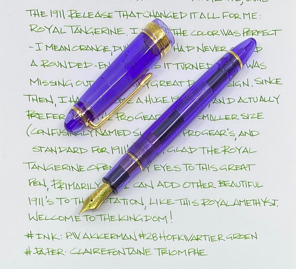
Ok, time to yell before we move on. Sailor’s naming convention for their two most popular pen designs needs to be synced up. The two smaller, 14k gold nib models are called the Pro Gear Slim and the 1911 Standard. The two larger, 21k gold nib models are called the Pro Gear Regular and the 1911 Large.

The two smaller pens and the two larger pens inhabit the same Sailor pricing spectrum, respectively. So why is a large one called Regular, and a small one called Standard? Your guess is as good as mine. As long as I have been using Sailor fountain pens, I still have to check if I’m using the correct descriptor for the pen I am using. Can we get a petition started for the two small pens to be called Slim, and the two large pens called Large? That would make my life so much easier Sailor!

Rant over - time to tell you why the size and shape of the 1911 Standard works so well for me: It is the perfect every day carry sized fountain pen. It reminds me a lot of the size and shape of the Pelikan 200/400 series of fountain pens. They are small, lightweight pens, but feel substantial and impressive when writing. Sailor’s 14k gold nibs provide a wonderful feel on the page, and the barrel of the pen molds into my hand like it was made for it.

I adore every moment I spend writing with this pen, and I am comfortable taking it anywhere and everywhere with me. The 1911 Standard is my choice of the two smaller Sailor pens, while the Pro Gear Regular is my choice for their larger models.

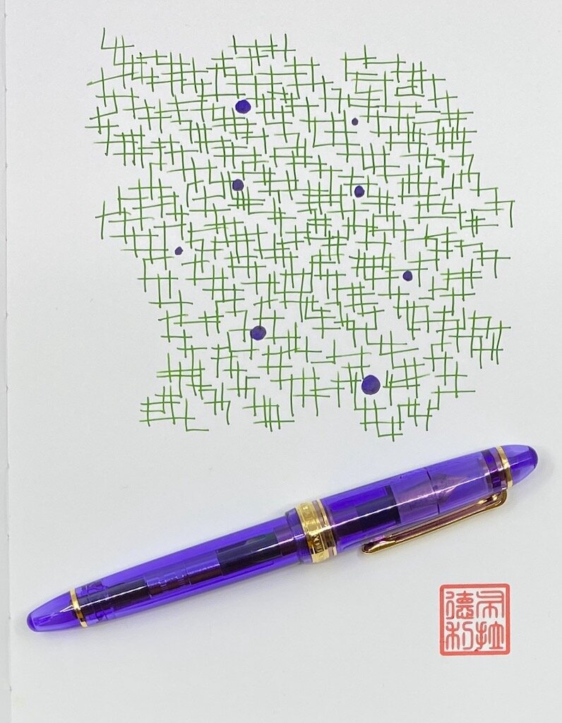
Knowing I was going to love this pen the moment I unboxed it, my biggest concern was what ink I was going to fill it with? My first thought was Bungubox Imperial Purple, making this pen the Royal Imperial Highness of the Purply Kingdom. I slept on that choice though, and I’m glad I did. As it turns out, Akkerman #28 Hofkwartier Groen is the perfect ink for me, and this pen.

Why? The vibrant purple and gold of this pen invoke the colors of my hometown, Baton Rouge, Louisiana. And February in Louisiana means only one thing: Mardi Gras. With this pen lacking only green to complete the trifecta of colors that represent the season, I knew I had picked the right one.

And the Sailor 1911 Standard is the right one for me. It took me a while to get there, but I’m glad I had the opportunity to have my mind changed.

(Goldspot provided this product at no charge to The Pen Addict for review purposes.)


Enjoy reading The Pen Addict? Then consider becoming a member to receive additional weekly content, giveaways, and discounts in The Pen Addict shop. Plus, you support me and the site directly, for which I am very grateful.

Membership starts at just $5/month, with a discounted annual option available. To find out more about membership click here and join us!

Posted on February 10, 2020 and filed under Sailor, Fountain Pens, Pen Reviews.

Franklin-Christoph Steel Flex Nib Review

My flex nib writing style will never be confused for the glorious strokes of Azizah at Gourmet Pens, or the frolicking fun of Ana at The Well-Appointed Desk. But my style is my style, and I love the flair that flex nibs add to my block print writing style.

The latest flex nib to cross my path is the Franklin-Christoph #6 Steel Extra Fine, and it’s a good one. Now, you know my stance on nearly all modern flex nibs - they should be classified as soft nibs, not flex, for the most part - and this F-C nib is no different. But, as with other modern flex nibs I’ve tested, that doesn’t mean it isn’t excellent in it’s own right.

The F-C steel flex nib is characterized by the lengthy slit running up almost 90% of the exposed nib, along with slight scallops carved out of the wings. This type of steel nib is not new to the market, but it is the first time one has crossed my desk.

From strictly a flex perspective, there is a good amount of line variation, but not a massive range like you get from vintage flex nibs or dip nibs. Nor should there be. That’s the expectation from those nibs - not this one. And that is the expectation you should have going into any modern flex nib purchase.

For my handwriting style, this nib helps my letters pop off the page. My heavy hand spreads the tines on the downstroke for wide lines, then relaxes for thinner lines from side to side. For a nib marked as EF I would like to see a finer fine line, but that’s a minor complaint for a nib that writes so well.

I compared this nib to two other soft nibs in my collection - the Aurora Optima Flex, and the Pilot Falcon - to get a feel for how similar or different they are. I assumed the Falcon would be an outlier, and it was. It has a much finer fine line, and a narrow wide line, but it might have the widest range if you know how to use it properly.

The other two are shockingly similar. I’ve talked about how much I enjoy writing with the Aurora flex nib due to how cool it makes my handwriting look, and the Franklin-Christoph is similar to that. Shockingly similar I’d say. They both begin with a fine line and expand to a broad line. There is definitely a good amount of variation - you just begin from a wider place than with a nib like the Falcon.

I added a Sailor King of Pen stock medium nib to the comparison to show a baseline of how these soft nibs make my handwriting appear. It’s noticeable to me in person, but may not translate as well in pictures.

So what’s my verdict on the Franklin-Christoph #6 Steel Extra Fine nib, from a non-flex friendly writer? It’s pretty great. I think I’ve already convinced myself to pick up one or two more and have them ground even finer to see what I can really do with the nib. Do I have a flexy future?

(Franklin-Christoph provided this product at a discount to The Pen Addict for review purposes.)


Enjoy reading The Pen Addict? Then consider becoming a member to receive additional weekly content, giveaways, and discounts in The Pen Addict shop. Plus, you support me and the site directly, for which I am very grateful.

Membership starts at just $5/month, with a discounted annual option available. To find out more about membership click here and join us!

Posted on January 27, 2020 and filed under Franklin-Christoph, Nibs, Flex Nib, Pen Reviews.

Leonardo Furore Deep Purple with Rose Gold Trim: A Review

(Susan M. Pigott is a fountain pen collector, pen and paperholic, photographer, and professor. You can find more from Susan on her blog Scribalishess.)

I love Leonardo fountain pens. I reviewed a Momento Zero awhile back, and subsequently I bought another Momento Zero in Hawaii resin. I suspect more Leonardo pens are in my future.

Although I much prefer the shape of the Momento Zero, I kept returning to Casa della Stilografica to gaze at the beautiful resin of the Furore in Deep Purple. I was especially entranced with the model with rose gold trims. After repeated visits, I finally pulled the trigger and splurged on the Furore with a 14k rose gold stub nib (1.3mm).

The pen arrived in record time from Casa della Stilografica. I couldn’t help from exclaiming, “Fra-jee-lay!” when I saw the package (you know, A Christmas Story). It was a box from Italy after all. And, apparently, “Furore” is pronounced “Foo-róh-ray,” so I was basking in Italian pronunciation anyway. The Furore box looks like an Italian countryside--floral and colorful.

I love it when I open a new fountain pen and gasp. I gasped upon seeing the Furore’s purple resin. The purple is dark in some places and sparkles in others with lighter purple flecks. You can arrange the cap so the lighter purple flecks align.

Or you can cap the pen so there are alternate dark and light portions.

Usually I’m OCD about getting pen patterns aligned, but with the Furore, I like having alternating light and dark patterns.

The barrel is engraved with “Leonardo Officina Italiana” and the pen number, mine is No. 327.

The pen is cigar-shaped, though the ends are much narrower than, say, a Montblanc 149. In fact, I might call the Furore “torpedo-shaped.”

The rose-gold trims are lovely and complement the purple perfectly. The clip has a tiny roller on it, making it easy to clip the pen onto a notebook or shirt pocket. Two rings adorn the cap and two more adorn the top and bottom of the barrel.

The pen is a cartridge/converter filler. Like other Leonardo pens, you can fill the converter by removing the blind cap on the bottom of the barrel so that it functions more like a piston.

Or, you can remove the barrel to expose the entire converter. I love Leonardo converters. They are well made and sturdy--far superior to the cheap plastic converters that come with so many other fountain pens.

The 14k rose-gold nib is glorious with the simple Leonardo branding and a generous 1.3mm stub.

The feed offers excellent ink flow, and the stub has nice line variation.

It’s a satisfying, smooth, wet nib.

I honestly can’t tell a difference between the gold stub nib and the steel stub I have on my Leonardo Momento Zero Hawaii. That’s how good the steel nibs are. I suppose the gold nib might have a little more give to it, but, frankly, if you are torn between gold and steel, I think the steel nibs are just as good as the gold.

I purchased my Leonardo Furore from Casa della Stilografica. You can get this pen in various trims--gold, rose gold, and HT (rhodium), and you can choose steel or 14k nibs. A Furore with a steel nib costs €145.90 (= $161.29 at current conversion rates) and the gold nib costs €309.24 (= $341.96 at current conversion rates). I highly recommend Casa della Stilografica. They have all the varieties of Leonardo pens (unlike many American dealers who have more limited options), plus, their customer service is top notch.

My Leonardo Furore in Deep Purple is one of my happy pens. What I mean by that is this is a pen that makes me happy when I look at it and even happier when I use it. It’s a color that delights me, and the stub nib suits my writing style perfectly.

(I purchased the Leonardo Furore in Deep Purple with my own funds.)


Enjoy reading The Pen Addict? Then consider becoming a member to receive additional weekly content, giveaways, and discounts in The Pen Addict shop. Plus, you support me and the site directly, for which I am very grateful.

Membership starts at just $5/month, with a discounted annual option available. To find out more about membership click here and join us!

Posted on January 24, 2020 and filed under Leonardo, Fountain Pens, Pen Reviews.