Posts filed under Pen Reviews

Faber-Castell Textliner Highlighter Metallic Review

(Sarah Read is an author, editor, yarn artist, and pen/paper/ink addict. You can find more about her at her website and on Twitter. And check out her latest book, Out of Water, now available where books are sold!)

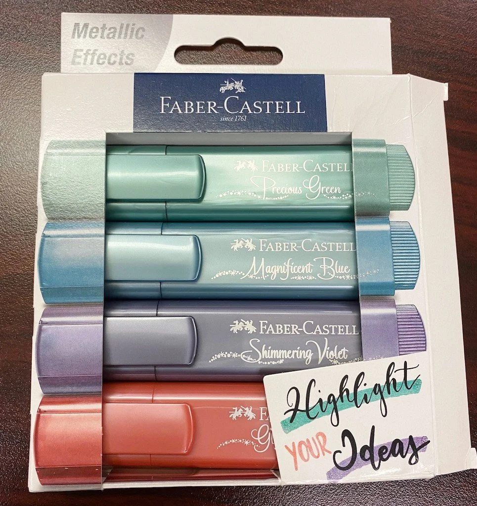
Anything that can add a little festivity to homework reading is a good investment, in my opinion. Faber-Castell are among my favorite highlighters, so I was very excited to try these metallic shimmering varieties.

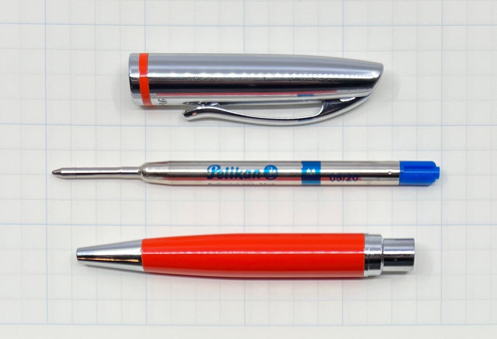
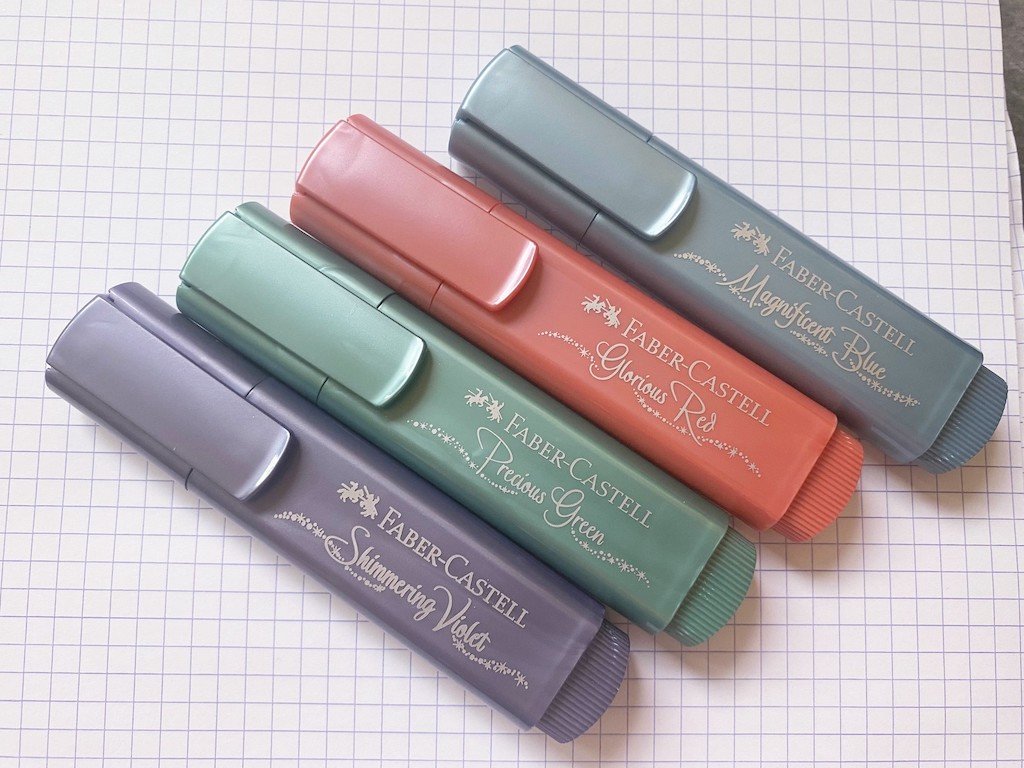
Faber-Castell highlighter bodies are a unique shape with broad bodies in a flattened oval silhouette. They are surprisingly comfortable to hold, as the narrow end of the oval rests against your hand and you hold it along its broader edge. The flat shape stops it from rolling off of desks, and even allows it to function as a decent bookmark. The clips are also broad and very bendy plastic. They aren't very strong and don't hold many sheets of paper, but they're fine for clipping to a thin book cover or a few pages of reading. The snap cap posts securely to the narrowed end of the marker.

The highlighter's chisel tip creates a 5 mm highlight when used on the broad side, and a narrower line when you use the tip of the chisel, so it's handy for highlighting large and smaller text.

What really makes these highlighters unique, of course, is the shimmer ink. I've used glitter markers before, but never in highlighter form. I would say these are marginally successful at the glitter effect. The four colors in this set are Shimmering Violet, Magnificent Blue, Precious Green, and Glorious Red, all pastel versions of classic jewel tones. They're all a little different in how they handle the glitter. Green shows no sign of glitter, red shows a hint, blue has so much that it has a mirror effect that's hard to read in bright light, and violet has the perfect balance. Part of that will be in how the shimmer particles are distributed and suspended in the ink. The package does say to make sure they are stored horizontally, which I was careful to do, but there still seems to be some issues with particle distribution, just as there often is with shimmer inks in fountain pens. The difficulty here is that it's harder to take apart and troubleshoot a felt tip marker than it is a fountain pen.

Another issue I had with these is that the ink is more flowy than normal highlighter ink. Regular highlighters generally feel a bit dry, even squeaky, which is a feature not a bug. The last thing you want is highlighter bleed-through, where it looks like the wrong side of the page is highlighted. Unfortunately, these bleed through a bit more than normal highlighters. They even cause a bit of paper buckling from the wetness of the ink. Caveat: these results were mostly on regular copy paper, which is what most of my school readings are printed on. They did not show any bleed-through or buckling on Rhodia paper. So if you're highlighting your own notes in a good notebook, you likely won't have any problems.

Apart from these issues, I do like them, maybe more as markers than as highlighters. The colors themselves are beautiful and not too bright or hard on the eyes. I think they'll be great for use in planners. The set of four costs $7.50; there's a set of 8 for $15; and individual colors are available for $1.75. That's a great deal for how long these highlighters last. I read and highlight many hundreds of pages every week and the Faber-Castell Textliners last longer than every other highlighter I've tried (I have tried all of them, as far as I know).

If you need to add some sparkle to your notes, I do recommend these so long as you have good paper, or don't mind a bit of destruction to your cheap paper.

(JetPens provided this product at no charge to The Pen Addict for review purposes.)


Enjoy reading The Pen Addict? Then consider becoming a member to receive additional weekly content, giveaways, and discounts in The Pen Addict shop. Plus, you support me and the site directly, for which I am very grateful.

Membership starts at just $5/month, with a discounted annual option available. To find out more about membership click here and join us!

Posted on October 21, 2021 and filed under Faber-Castell, Highlighter, Pen Reviews.

Monami 153 Neo Fountain Pen Review

(Jeff Abbott is a regular contributor at The Pen Addict. You can find more from Jeff online at Draft Evolution and Twitter.)

The Monami 153 Neo is a modern fountain pen that features a hexagonal barrel shape and a petite nib to match the sleek aesthetic. The edges that make up the hexagonal points are smooth and rounded off so that it feels good in the hand — not too jagged. It looks great, feels great in the hand, and comes in at under $30 — so how does it write?

The 153 Neo is actually a solid fountain pen. The price tag might make some people weary about the quality and longevity of a pen that should realistically hold up to a lot of abuse. In this case, I think the Neo does a good job of providing value and ruggedness in a stylish package.

The exterior of the pen is sleek and minimal. The only branding to be found is on the top of the cap — a small logo that appears to be etched into the metal. There's also a very small "Monami" brand etched into one side of the split clip. The branding doesn't jump out at all, and you actually have to look closely to find the Monami brand name. One thing that really bugs me about this pen is how the logo isn't etched dead center on the top of the cap. It's off quite a bit, and I think this shows that Monami isn't 100% focused on fit and finish with their products. When the branding and design is so minimal, you really can't afford any mistakes without losing some of that appeal. It definitely makes the pen feel cheaper.

The clip is strong enough to be useful but still easy to use. It reminds me of the Lamy Safari and AL-Star clip, but flattened. I really like that they went with a blasted matte finish on the clip instead of something shiny and polished. It keeps the attention on the body, which is what I think is most interesting about this pen.

The hexagonal body shape isn't a new concept. In fact, on first opening this pen and inspecting what was inside, I was a little annoyed to find what I assumed to be a knock-off Caran d'Ache 849. The inspiration is undeniable, but I think that the changes that Monami incorporated make it stand apart just enough to avoid any accusations. Still, it's way too similar to the 849 in my book. I doubt there's any kind of patent on pens that have a hexagonal barrel — plenty of companies do it well — but the 153 Neo just feels like a copy cat when put side by side with a 849.

Regardless of design inspirations, it's a solid body and cap. The cap pulls off easily and posts securely. Since it's a friction fit cap, there's also a mechanism built in that ensures the lines of the pen body and cap always line up perfectly. I always try to make my Caran d'Ache 849 line up when I put the cap on, so I appreciate that I can skip that step with this pen.

The body and cap have a semi-gloss finish that provides just enough shine to attract your eyes without taking away from the color and shape of the pen. The grip section, however, is a matte color with a more tactile feel than the shiny exterior. The grip is another area where I have some complaints about quality. There are obvious seams on the grip from the injection molding process. It would be one thing if the seams were aligned to the hexagonal joints, but they happen on the flat parts of the grip section, adding an awkward line that feels out of place. I think this could have been removed with some more fit and finish, but that's not something Monami chose to do.

Another problem I have with the grip section material (and this is a big one) is how it stained immediately when I submerged the nib and section into an ink bottle. This is usually no big deal, right? Just wipe away the excess ink after you fill it and you're good to go. With the Monami, the lowest part of the section that was submerged in the ink still has an obvious blue-green stain from the Iroshizuku syo-ro ink I used. To be fair, syo-ro is a really gentle ink and I've never had any staining issues with it before. I think this is directly due to the material and finish that Monami used on the grip section. Thank goodness I didn't dip the section any further into the bottle, or it would be an even bigger stain! I'm sure I could remove the stain with some rubbing alcohol or some other kind of cleaner, but that's really difficult to do when there's ink in the pen. It's so close to the section and nearly impossible to clean without more ink spilling out onto the rag or whatever I use to clean it. This is frustrating, but the pen is still completely usable. I should experiment with other inks to see if they also stain the section, but I'm not sure it's worth it. It's already stained now, so what does it matter?

Moving down to another positive attribute of this pen: the nib! The steel nib is an EF and writes beautifully. It makes a small mark without being scratching, and the ink flow is perfect. There's a Monami brand and some minimal decoration stamped onto the nib, along with an "EF" to indicate the tip size. Unfortunately, EF is the only nib option for this pen.

I've really enjoyed writing with this pen. The size and weight are perfect for my hand, and the tactile grip section is great at providing grip without getting slippery after a few moments of use. I love how the cap always lines up with the body when capped or posted, and I love the lines that run up and down the body to create some visual interest on an otherwise plain pen.

Can I recommend it? Nope. It comes with a couple of black ink cartridges and a converter, so that's nice — but this doesn't come close to the feeling I get when opening up a new Pilot Metropolitan, Lamy Safari, Kaweco Sport, or even one of the new entry level TWSBIs. I'm not able to get over what I feel is a blatant copy of the iconic Caran d'Ache design combined with the staining issue on the grip section. If it weren't for the material choice in the grip, I'm not sure I'd mind as much. But at $26, the competition is excellent and you don't have any room for these kinds of mistakes. Plus, any of those pens listed above offer more color choices and nib sizes.

My advice? Go with one of the pens I mentioned above; if you want a hexagonal fountain pen, go with the classic 849 instead. They're almost twice the price as this Monami, but the quality is easily triple. And again, lots of colors and nib sizes to choose from!

(JetPens provided this product at no charge to The Pen Addict for review purposes.)


Enjoy reading The Pen Addict? Then consider becoming a member to receive additional weekly content, giveaways, and discounts in The Pen Addict shop. Plus, you support me and the site directly, for which I am very grateful.

Membership starts at just $5/month, with a discounted annual option available. To find out more about membership click here and join us!

Posted on October 20, 2021 and filed under Monami, Fountain Pens, Pen Reviews.

Pelikan Jazz Ballpoint Pen Review

Pelikan Jazz Ballpoint Pen Review

I am thoroughly enjoying the Pelikan Jazz Ballpoint pen. That shouldn’t come as a surprise given that I enjoy ballpoint pens, and Pelikan makes great products. It should be good! But, what I realized with the Jazz is not only that it’s good, but it’s good enough to make me think I’ve been missing out.

Ballpoint pens are continually underrated. Why is that? The problem with ballpoints is that we have all used terrible ones. Scratchy, skippy, dry, messy, sticky. There are some bad adjectives to describe some of these pens we have used in the past.

But modern ballpoints, using superior refill technology, are fantastic. Even great.

Pelikan Jazz Ballpoint Pen

The Pelikan Jazz is a new pen to me, and reasonably new to Pelikan’s lineup as a whole. It has classic Pelikan design elements, like the clip, but comes in fun, modern colors like this Orange model. There is even a full pastel lineup, which is what make me take a second look at these pens to begin with.

Pelikan Jazz Ballpoint

This is a twist-to-deploy pen, but it keeps tricking me into thinking it uses a knock-type mechanism. The barrel “cap” overlaps the lower barrel, and when I see a design like that, I want to push the cap down to engage and retract the refill. It’s not a problem whatsoever, but that hasn’t stopped me from continuously trying to click it.

The twist takes about half a turn to let loose the Pelikan 337 refill. It ships with a medium (1.0 mm) blue cartridge, in the Parker-style (or international G2) shape, so you can swap it to your hearts content. But I’m not sure you would want to.

Pelikan Jazz Ballpoint Writing

This refill is excellent. I expect 1.0 mm ballpoint refills to be smooth, and this one delivered. The lines were solid, and the color was rich. There was little tip residue to be found, although as with many good ballpoint refills, it did pop up from time to time. I never had to wipe it off.

After all of this praise, this must be an expensive pen, right? Well, compared to a Bic Stic, yes. But at $12, compared to other pens in this category, it is priced perfectly. It’s an upgrade to the basic ballpoints in your desk drawer, with enough style and quality to justify the price point.

If you couldn’t tell, I’m kind of enamored with it. I like having it around to pick up and use on a whim for just about any task. It may be worth grabbing another simply because I’m having so much fun with this one.

(Goldspot provided this product at no charge to The Pen Addict for review purposes.)


Enjoy reading The Pen Addict? Then consider becoming a member to receive additional weekly content, giveaways, and discounts in The Pen Addict shop. Plus, you support me and the site directly, for which I am very grateful.

Membership starts at just $5/month, with a discounted annual option available. To find out more about membership click here and join us!

Pelikan Jazz Ballpoint Review
Posted on October 18, 2021 and filed under Pelikan, Ballpoint, Pen Reviews.