Posts filed under Pen Reviews

Parker 51 Teal Ballpoint Pen Review

(Jeff Abbott is a regular contributor at The Pen Addict. You can find more from Jeff online at Draft Evolution and Twitter.)

The Parker 51 is one of the most popular and well-known vintage fountain pens from the 20th century, and for good reason. Along with Esterbrook, these pens were ubiquitous and high-quality tools that many people carried and relied on every day. Go to any pen show today, and you'll see a fair few Parker 51s on the show tables.

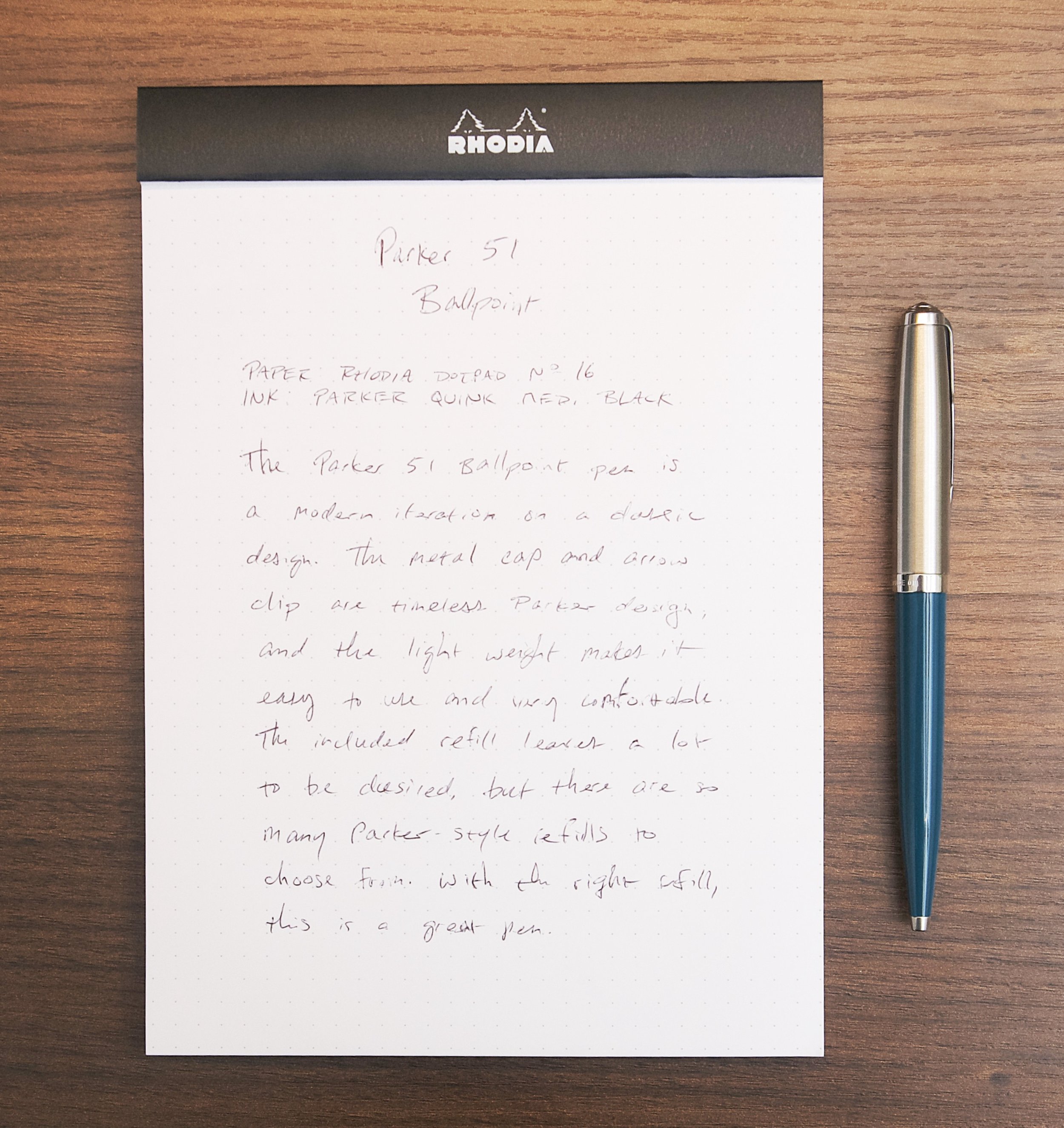
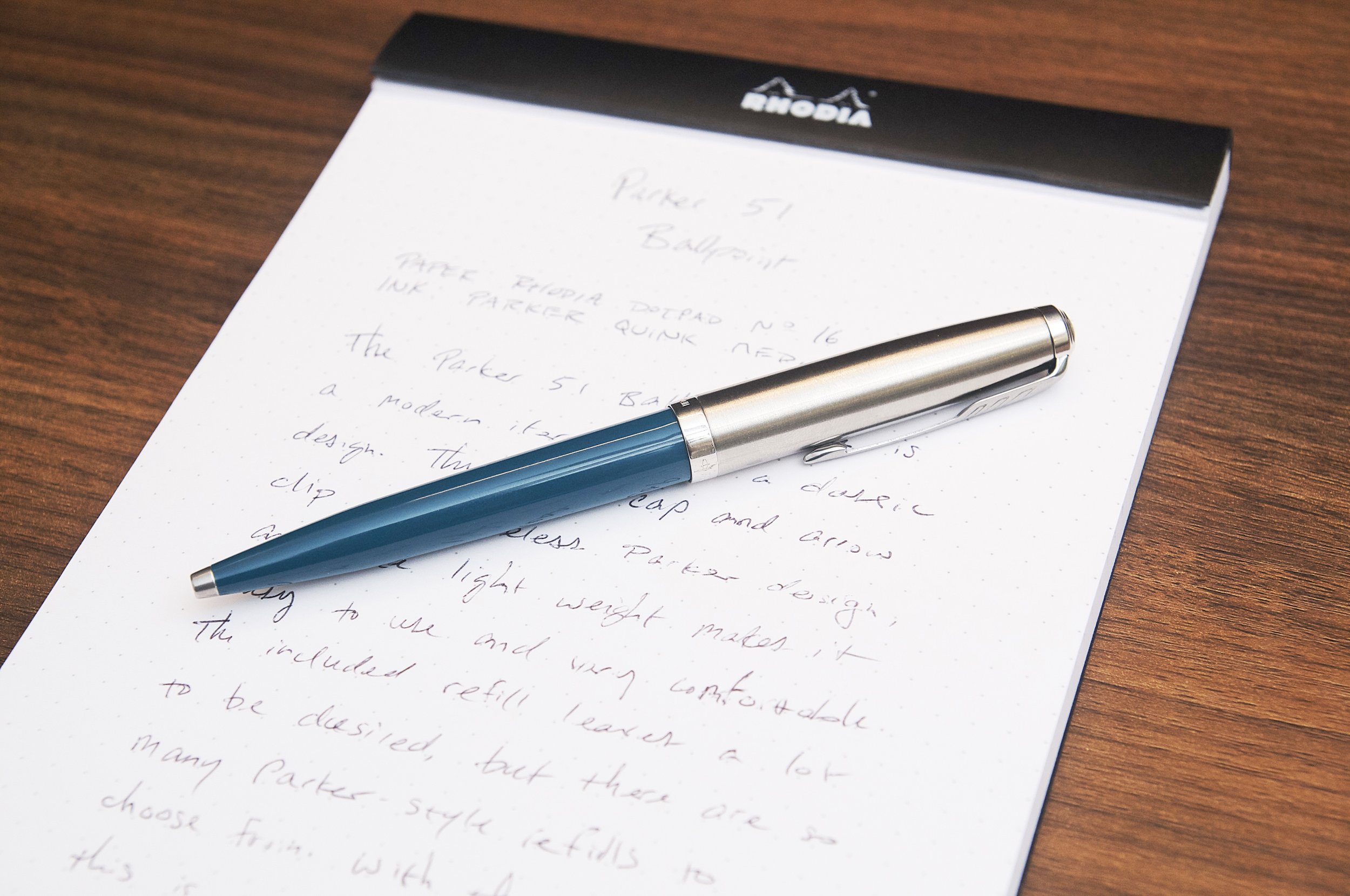
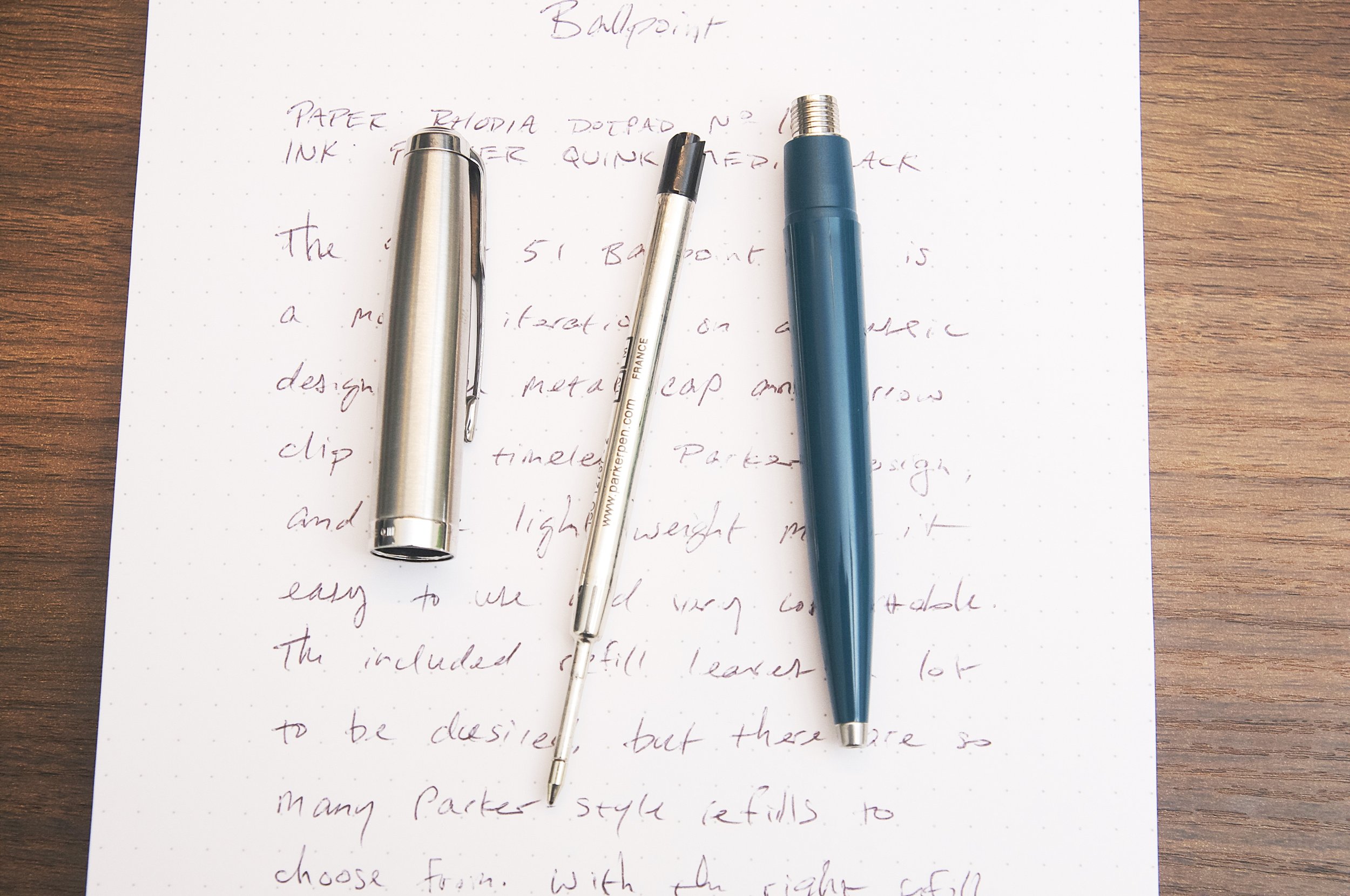
The pen we're looking at today isn't the vintage fountain pen, though. This is a modern ballpoint pen that takes a few style cues from the classic fountain pen design that made Parker famous. The Parker 51 Teal ballpoint pen is lightweight and elegant, and definitely makes you think of the classic Parker 51 that it borrows its name from. It uses a typical Parker style refill and comes with Parker's Quink refill with black ink.

The biggest similarity to the original Parker 51 is the cap. It's nearly identical to the fountain pen version in style, except the cap doesn't come off the ballpoint pen. Instead, the cap is a twist mechanism to extend and retract the refill tip. The body of the pen is made of a lightweight acrylic material that looks less like the original due to the smaller diameter and long taper to the tip. Twisting the cap is a smooth and satisfying motion. When retracted the refill, you don't even have to twist it manually. Just get it started, and it will finish retracting on its own due to the spring at the tip of the barrel.

Writing with the pen is also a nice experience. The grip is comfortable and the pen is easy to control thanks to the light weight and good balance. The metal cap adds just enough heft to the tall end of the pen to provide a great sense of balance when holding the pen in a 3-finger grip.

And this is where we run into my first complaint with the pen. I just said that writing with the pen is a nice experience, but that's only true if you swap out the refill first. The included Parker Quink refill is garbage and should be immediately discarded. The ink is difficult to start, splotchy once it's running, and is a very unsatisfying light-black hue. Even jotting down quick notes is frustrating due to how terrible the ink flow is. I have to redraw characters way too often due to bad ink flow. In an age where many manufacturers have fantastic ballpoint ink refill options, I really don't understand how Parker are still producing Quink refills that write so poorly. An updated, fantastic Quink refill would be an exceptional nod to the heritage of Parker.

Throw in a better refill, and this is a great pen that I've really enjoyed using. It feels more premium than a Parker Jotter, and it's also easier to control since it's a bit longer and has a larger diameter. At least, it's better for my hands and how I grip the pen. In fact, it's really similar in length to the Jotter XL, which is also a great pen (assuming you replace the refill).

Luckily, there are so many great refill options for this category. Parker style refills are abundant, and there are some truly fantastic ballpoint (and gel!) refills that you should try out and keep on hand.

My next complaint with this pen is the price. I understand that this pen has some additional prestige given the Parker 51 name, but I don't believe the pen delivers enough aesthetic or usability value to justify a retail price of $79. The Parker Jotter can be had for around $20, and the larger Jotter XL is around $35, and they're all metal. You get the same refill with all three, so just factor in the cost of a replacement refill as part of the overall total. When using this pen, it feels like a $40 pen.

Vanness Pens sells the Parker 51 ballpoint for just $63, which is way better than the suggested retail from Parker. If you're a big fan of the Parker 51 pen and this throwback ballpoint speaks to you, you'll be really happy with it because they did a great job of translating the classic design to a modern ballpoint package. If you're looking for a good ballpoint pen that uses Parker style refills, look elsewhere. The Jotter or Jotter XL are a great place to start, but the world is your oyster when it comes to Parker style pens. So many great options to choose from!


Enjoy reading The Pen Addict? Then consider becoming a member to receive additional weekly content, giveaways, and discounts in The Pen Addict shop. Plus, you support me and the site directly, for which I am very grateful.

Membership starts at just $5/month, with a discounted annual option available. To find out more about membership click here and join us!

Posted on August 16, 2023 and filed under Parker 51, Ballpoint, Pen Reviews.

Gravitas Pocket Fountain Pen in Teal Splash Review

(Jeff Abbott is a regular contributor at The Pen Addict. You can find more from Jeff online at Draft Evolution and Twitter.)

The Gravitas Pocket fountain pen is no stranger around here, but there's nothing like an injection of some fun colors to spice up something you've already seen. Teal Splash features a black pen with beautiful blobs of teal scattered over the body to make this pen really stand out.

If you're new to the Gravitas Pocket, here is the summary. It's a short pen that looks and feels similar to a Kaweco AL Sport, but with plenty of unique design choices that bring this pen close to the top of my pocket pen list. The cap unscrews and posts to the back of the pen to make it a more comfortable length for writing, and it takes short international cartridges due to the short body. You can fit some converters into this pen, but they have to be short — a standard converter won't fit.

Where this pen departs from the ordinary is obvious once you take a closer look. The cap features a flat edge that keeps the pen from rolling away, while the rest of the cap and body are round. The tips taper from a cylinder to a point in a really pleasing distance, and there's no branding outside of a tiny Gravtias logo debossed on the lower part of the cap.

Once you uncap the pen, you'll notice the grip section is much larger than the typical pocket pen. This makes for a really comfortable writing experience once you've posted the cap. The grip section also has micro grooves cut into it that provides a soft but tactile grip. The grip also flares out a bit at the end to provide a nice butt for your fingers to rest while writing. Overall, it's a really comfortable pen.

There's a nice feature on both sets of threads for this pen — both for the cap and the section. There's a small o-ring at the base of both of these threads that make for a snug and secure fit when the section or cap are tightened down. I don't know if this is technically necessary for the pen to function properly, but it definitely feels nice.

Something different for me on this model is the nib. This unit has a titanium flex nib that really fits my writing style. When writing with soft pressure, it puts down a line that is similar to any European fine nib. The line is crisp and the ink flows well. But, if you want to add some flourish, just apply a little pressure to the nib to make those tines spread and really distribute the ink. This flex nib isn't as dramatic as some I've used, but this one is so incredibly easy to use. I'm guessing part of this experience is due to the soft titanium material as well as the shape, but it sure is fun to use.

While flexing is easy, you have to be careful not to flex too hard or else the feed can't deliver enough ink and you'll end up with some railroading. This will vary a bit depending on what ink and paper you're using, but it's something to keep in mind. In my use, using soft and moderate pressure to flex the nib is no problem. It's only when I try to max out the tine spread that the railroading happens.

The nib is a #6 size that Gravitas produces in-house. There aren't any markings on it, and I really appreciate the dull finish of the titanium against the shiny black grip and speckled body.

Finally, the finish on the outside of the pen. I absolutely love this edition of the Pocket fountain pen. Teal Splash is a perfect name, and I really enjoy looking at the splatter patterns that adorn the pen. The regular pen is so sleek and unassuming, but this treatment kicks it up a notch to an eye-catching piece of art when it's on your desk.

The Gravitas Pocket Fountain Pen in Teal Splash starts at €120, but the model featured here is €135 due to the titanium flex nib option. In my opinion, the €15 difference is totally worth it for this nib. Gravitas is definitely one of the brands I suggest you check out if you haven't already. If the pen featured here doesn't fit your fancy, there are so many other models and options to pick from, and they all feature top-notch quality and craftsmanship.

(Gravitas provided this product at no charge to The Pen Addict for review purposes.)


Enjoy reading The Pen Addict? Then consider becoming a member to receive additional weekly content, giveaways, and discounts in The Pen Addict shop. Plus, you support me and the site directly, for which I am very grateful.

Membership starts at just $5/month, with a discounted annual option available. To find out more about membership click here and join us!

Posted on August 9, 2023 and filed under Gravitas, Fountain Pens, Pen Reviews.

Pairings Party: Andhand Method Fountain Pen, Van Dieman’s Mandarin Duck Wing

You know a party is a success when you are pleasantly surprised throughout the event. That has been the case with the Andhand Method Fountain Pen, inked with Van Dieman’s Mandarin Duck Wing, over these past several weeks.

Andhand reached out to me earlier this year, offering up the Method for me to check out. I received the Brass model, with a #5 Medium Steel Schmidt nib, and I have to say that they made a metal barrel pen that fits my needs perfectly.

The key for me with brass pens is overall weight. They can’t be too heavy for me to write with comfortably for medium and long writing sessions. In conjunction with overall weight, the balance of that weight has to be managed correctly with the design of the pen. Many metal pen designs don’t consider the effect back-weighting has on the writing experience. The Method pen nails the balance - unposted, of course - making for a proper writing experience.

How did they accomplish this? This is a smaller barrel, closer to my favorite ystudio Brassing Fountain Pen than some of the bigger, bolder brass pens on the market. Big, heavy, brass pens certainly have their place, and their fans. My preferences lie in the smaller and lighter builds, and Andhand did a great job with that here.

Aside from being happy with the weight, balance, and overall feel of the Method, the cap design impressed me. The cut out facets add a nice visual touch to the design, but what I enjoyed even more was the snap cap. That’s right, no metal threads on the barrel to dig in to your fingers! The section is long enough to grip comfortably, with a slight taper down from the barrel seam to the nib.

Aside from Brass, the Method Fountain Pen comes in a ystudio-esque Black + Brass - both for £110 - and a Stainless Steel model for £130. The Stainless model checks in a few grams lighter, too: 48g vs 52g for the Brass.

Given the all-Brass design and color of my Method, I had the run of the rainbow for my ink choice, so why did I choose a more muted shade in Van Dieman’s Mandarin Duck Wing? Because I like to test ink colors outside of my normal usage zone.

Written on the Mitsubishi Bank Paper Notebook from The Paper Mind.

Reddish-browns rank far down my list of color choices, but I have been more than happy with Mandarin Duck Wing. Impressed, even. For starters, the color is a little more brown than red, which I prefer, and the performance is outstanding. Flow has been perfect, no matter if I have been using the pen several times throughout the day, or a week between uses. That is a compliment to the cap design of the metal barrel pen, too, sealing the nib off well from the elements.

It shows off a bit of shading on most pages I’ve tested it on (Midori, Mitsubishi Bank, PLOTTER,) and has a medium dry time. There is no sheen present, and the ink is not waterproof. It bears repeating just how consistent the flow is. I will definitely be trying this ink in finer nibs to see if the performance is similar.

If you like metal pens that are properly sized and weighted, then you should check out the Method Fountain Pen from Andhand. I like the Brass one that they sent me well enough to consider ordering the Stainless Steel model, which is a favorite material of mine. And which Mandarin Duck part should you ink it up with? I went with the brownish-red Wing, but feel free to check out the classic blue Mandarin Duck Breast, or the bright green/teal of Mandarin Duck Nape. All bottles are $14.95 for 30 ml. Any combination of the above would make a great Pairings Party.

(Andhand provided this pen at no charge, and Vanness Pens provided this ink at a discount to The Pen Addict for review purposes.)


Posted on July 31, 2023 and filed under Andhand, Van Dieman's, Ink Reviews, Pen Reviews.