Posts filed under Pen Reviews

Pentel Floatune Rollerball Pen Review

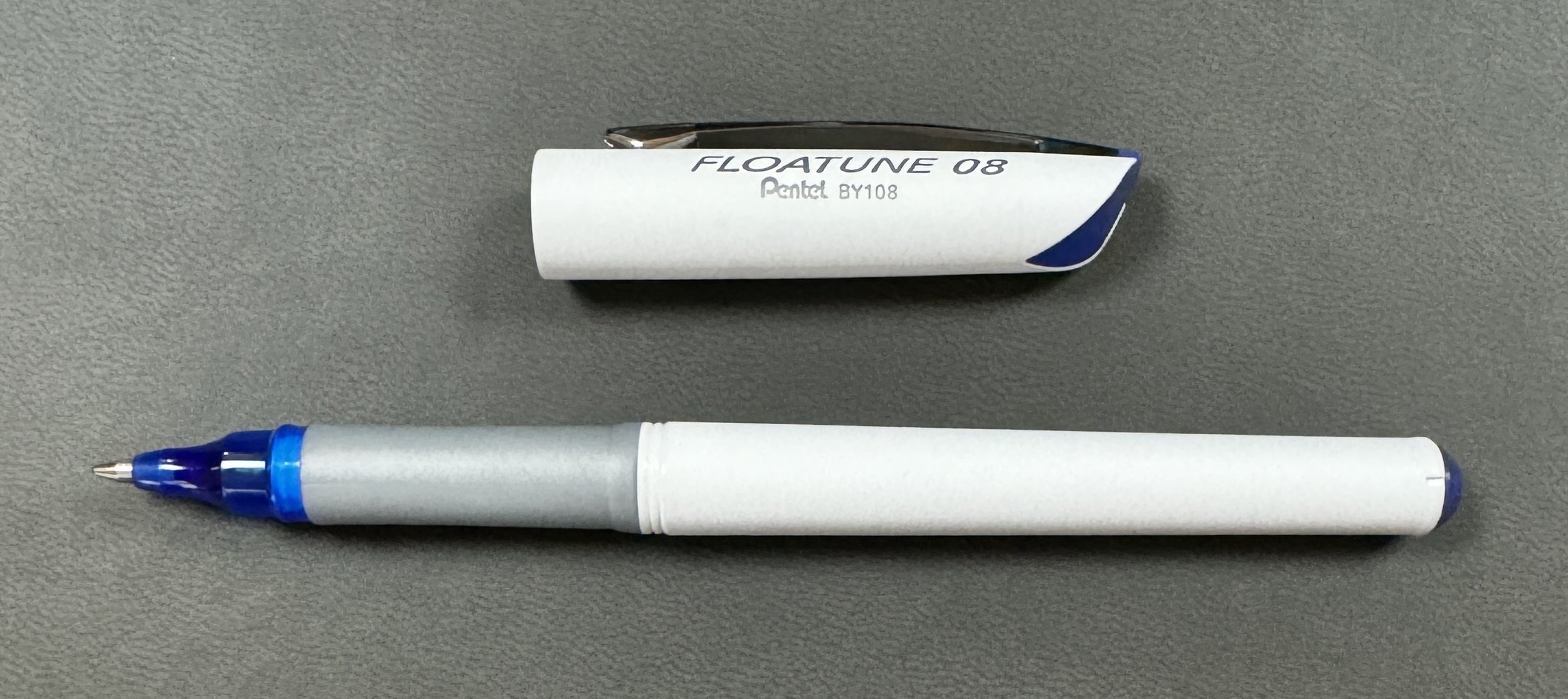
The Pentel Floatune is a recent pen release that has found its way on to big box retail store shelves. This category is always of great interest to me because one, they are widely available, and two, I want to know what is different about it. This is not an area where we see many new entrants - or at least new entrants that stick around for years at a time - so what is this pen all about?

For starters, the name. According to Pentel, the Floatune “enables your ideas to float down the stream of imagination.” This is due to the “synergy of a new water based ink infused with an oil-based lubricant and a finely tuned pen tip mechanism provides a smooth, floating-like writing experience.” Staying on theme, Pentel would like you to know that it also “floats across the page without skipping (unlike some pens,)” even on papers that matter most, such as “Greeting Cards, Receipts, Journals.”

Ok Pentel Marketing Department, you earned your keep this month!

Joking aside, this is information I want to see. Tell me what is different about your product, and why I should consider purchasing it. With the Floatune, the idea is that you will get smooth, wide, rich, skip-free lines on the page, and will look good doing it.

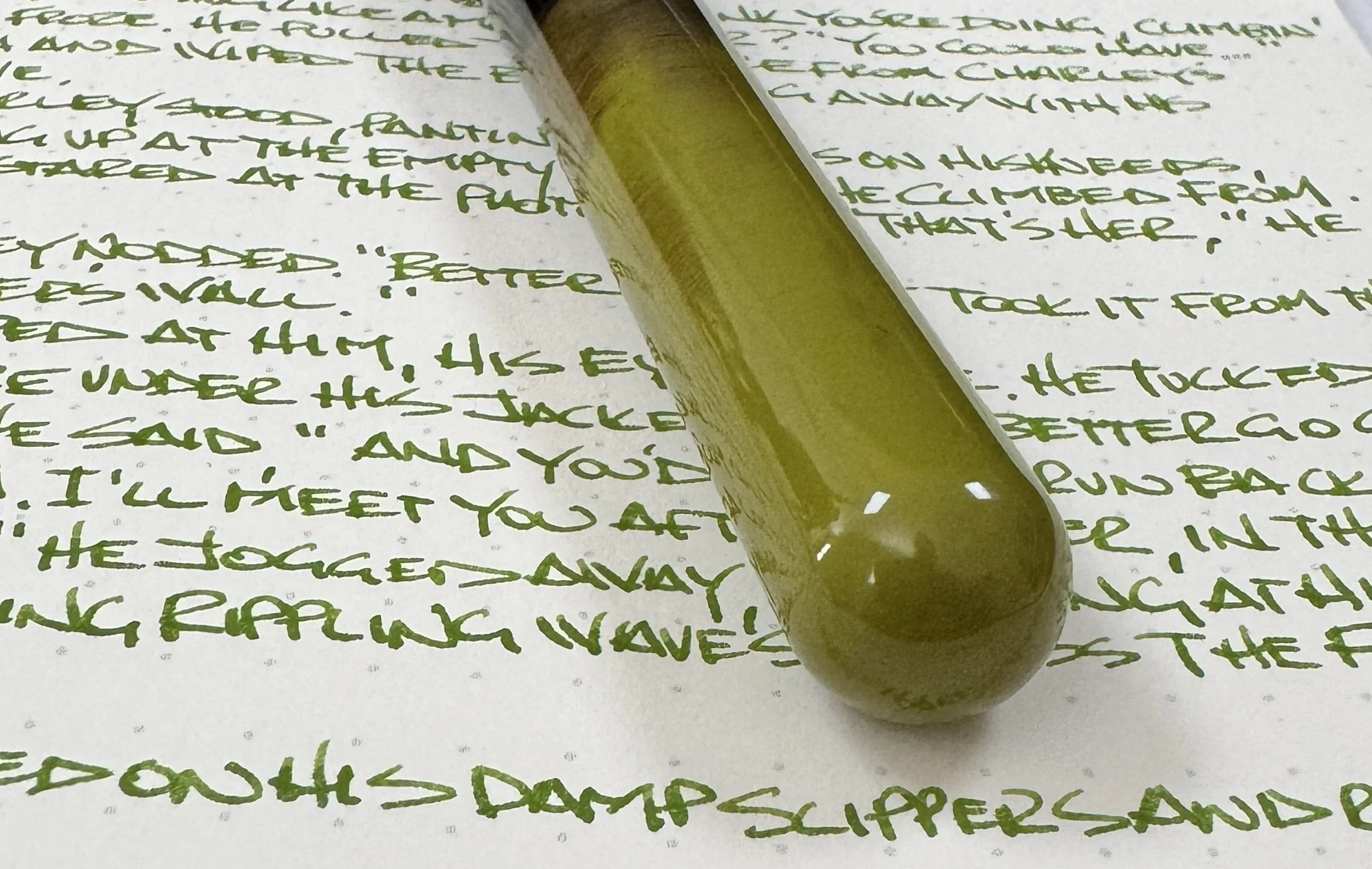
The key to Pentel’s marketing is the oil-infused water-based ink, and in my early testing, it is great. The best feature so far is the skip-free aspect of the line. It is solid, almost marker like, and yes, it floats - glides smoothly - across the page. The color is nice, and, oddly enough, feels like one of the most fountain pen adjacent standard inks I have used.

Top to bottom: Pentel Floatune 0.8 mm, Ajoto Pen with Schmidt P8127 0.7 mm, Lamy Safari Extra Fine Nib, Pilot Precise V5 0.5 mm, Uni-ball Vision Ultra MIcro 0.38 mm.

I did some comparisons with other water-based ink pens I use frequently, including my favorite Schmidt P8127 rollerball refill, and the Floatune held its own. By measurements, its 0.8 mm tip size is the widest I used, and I think even that sells it short. It is closer to a 1.0 mm line width on the page, or at least feels like that when writing. I would love to see the Floatune in 0.5 mm, similar to how Uni-ball brought their Vision rollerball all the way down to the Ultra Micro 0.38 mm size.

If the Pentel Sign Pen had a metal tip.

I used the Studio Neat Keepbook for testing because it is an absorbent page. Only the fountain pen ink bled through. The Floatune (top,) showed no feathering or bleeding.

But that’s just me, a proponent of fine lines. The Floatune may not be made for me, but it is a great choice if this is a category of pen you like.

The one hangup I have with the Floatune ties directly back to my friends at the Pentel Marketing department. This pen is made with “62% post-consumer recycled material,” but guess what? It is not refillable. Do not tell me your environmental bonafides when I have to throw away a complete $3 pen once I run out of ink. And you will run out of ink quickly at this level of ink output on the page.

Lines widest to finest.

Good stuff on the back of the page - no issues.

I think the Pentel Floatune is a good pen as long as it fits your needs going into the purchase. Lots of large-sized writing and notes? Perfect. Fine details? Not so much. I bought mine at JetPens, where they are $3 per pen, of $5.75 for a two-pack, in Blue, Black, or Red ink, and in 0.8 mm or 1.0 mm tip sizes.

Time will tell if this will be a new flagship pen for Pentel. My gut says no, especially when they have the comparable - and comparably better - Pentel Energy in their own lineup, but let’s check back in a couple of years and see where the Floatune is.

(JetPens provided this product at no charge to The Pen Addict for review purposes.)


Enjoy reading The Pen Addict? Then consider becoming a member to receive additional weekly content, giveaways, and discounts in The Pen Addict shop. Plus, you support me and the site directly, for which I am very grateful.

Membership starts at just $5/month, with a discounted annual option available. To find out more about membership click here and join us!

Posted on March 4, 2024 and filed under Pentel, Floatune, Rollerball, Pen Reviews.

IKKAKU by Nahvalur Gradient Urushi Fountain Pen Review

The story of Nahvalur as a brand has been an interesting journey, to say the least. As a stationery fan, it has been fun to see them begin with what many would consider an entry level fountain pen, continue to refine that same pen model over the years, and quickly escalate into new models, materials, and designs. Slow and steady has not been their mantra, and so far, it is working out.

The IKKAKU series, for example, is the pinnacle of their product range. Think Namiki, as it relates to Pilot - a sub-brand of the more well-known main lineup, where all bets are off as far as creativity and craftsmanship go. IKKAKU has already seen close to ten designs released, with the latest - the three pen Gradient Urushi Collection - launching earlier this month.

Each of the Cinnabar Red, Vermillion, and Scallion Green - the model I have been loaned for this review - go through a months-long creation process. Urushi lacquer art requires the repetition of coating, sanding, polishing, and drying dozens of times to end up with the finished product. I love the light, airy feel these pens and this process brings to my own writing experience.

I chose the Scallion Green model to review for two reasons: One, while each pen has a raden gradient sprinkled down the cap, it is most noticeable in this model, and two, the transition into the black grip section was the most visually appealing of the three models. Both Cinnabar Red and Vermillion have a much harsher transition, and on a pen defined by its gradient, I think it could be better represented into the section.

Speaking of gradients, the layering application of the urushi looks wonderful. As someone who owns a range of different urushi pens with different finish qualities, I appreciate this one as much as any. The Scallion Green color is darkest, and deepest, at the end of the barrel, and slowly gets lighter as it traverses down the barrel, ending with stray green brush strokes in black lacquer. The solid black then transitions into the aforementioned galaxy of raden, with the heaviest application near the top of the cap. All three pens follow this same pattern, with their respective colors.

The pen is fitted with a Fine 14K gold nib, manufactured in-house by Nahvalur. Combined with the feed, I have found the flow to be excellent, and would even call it a wet writer as it is currently set up. Obviously, there are specific ink and paper characteristics to consider, so your mileage may vary. The nib is soft, with a little bounce in it, so the lines are wide for a Fine nib, at least as compared to something like a firm steel Jowo Fine nib. The line width relates closely to the German manufacturers (Faber-Castell, Lamy, Pelikan,) more than anything else. The nib was smooth and properly aligned right out of the box, and I didn’t have to adjust it at all. I have enjoyed writing with this pen from the moment I inked it up.

While you will see rare instances of urushi lacquered pens with a piston-filling mechanism, that is an outlier, so Nahvalur uses the standard international cartridge/converter filling system. All of my urushi pens use a similar setup, and work well.

The final, and possibly most important, talking point of the IKKAKU Gradient Urushi pen is the price. At $699 for any of the three models, this is an expensive pen. That said, I believe it is priced fairly for the amount of time and the level of craftsmanship required to produce pens like these.

Nakaya Piccolo, left. Nakaya Portable, right.

Pilot Custom 743, top. TWSBI ECO, bottom.

If I were to break it down even further and focus on my personal value proposition for this pen, I’d want to see two changes to better justify adding this pen to my collection. First off, the grip section needs to be lacquered to match the barrel. This goes for the model I reviewed, but even more so, the other two models. Different brands handle this differently, and there is no wrong way, but it is something I would like at this price point. Secondly, I want a more substantial, and unique, clip design. I’m not a fan of this thin style of clip Nahvalur likes to use on many of their pens, and it stands out to me even more here. If IKKAKU is your premium offering, differentiate the clip somehow.

Red stripe ebonite base.

I like what Nahvalur is doing with their brand as a whole. A company who can make quality pens at every price point will always have my attention. I look forward to the continued experimentation of not only their standard pens, but with the IKKAKU lineup as well.

(Nahvalur loaned this product to The Pen Addict for review purposes.)


Enjoy reading The Pen Addict? Then consider becoming a member to receive additional weekly content, giveaways, and discounts in The Pen Addict shop. Plus, you support me and the site directly, for which I am very grateful.

Membership starts at just $5/month, with a discounted annual option available. To find out more about membership click here and join us!

Posted on February 26, 2024 and filed under IKKAKU, Nahvalur, Fountain Pens, Pen Reviews.

TWSBI 580ALR Black Fountain Pen Review

(Jeff Abbott is a regular contributor at The Pen Addict. You can find more from Jeff online at Draft Evolution and Twitter.)

TWSBI has been up to a lot over the last few years, including the amazing GO and Eco, but I've been sleeping on the 580 ever since the AL models were introduced. Aside from new colors, what could I be missing, right? Turns out, TWSBI have made some small improvements that make this old classic something to consider.

The TWSBI 580 has been around for years. It replaced the 540 with more reliable parts and slightly higher quality finish. Instead of offering colored acrylic materials like the 540, the 580 just adds in accents of color at the section, band, and a few other small places. With the introduction of the aluminum (580AL) models, it's been a regular cadence of fresh new colors every year. I still use the orange 580AL that I picked up almost 10 years (!!!) ago. The ALR models add a little something special to the already great 580: texture.

The Black TWSBI 580ALR I have looks awesome on my desk, and I really enjoy using it. Just like previous models, it has dashes of aluminum accents around the grip section, cap band, and piston grip. The differences in this model are that the aluminum is a matte finish, and the grip section has a microscopic milled surface that provides plenty of traction while still looking smooth. Every time I pick this pen up, I have to squint and try to make out the tiny lines that wrap around the diameter of the section. You can see them if you look close enough, but they're seriously small and provide an excellent amount of grip. This small change on the grip section has renewed my love for this classic pen that I discovered early on in my fountain pen journey.

Everything else about the design of the pen is the same as older 580s. The length and diameter are the same, the ink capacity is the same, and the fit and finish are great. I'm really digging the matte finish on these accents, and the size feels really good in my hand when writing. This is a workhorse, and the better grip elevates it to a different level of comfort and control.

The fine nib in my unit worked flawlessly out of the box. The line width is what I'd expect, and the flow is good. Like all demonstrators, you have a full view into the status of your ink supply, and the piston filling mechanism works great. The clip on this version is a bit stronger than my old 580AL, and that's a welcome change.

There's no mistaking this pen for anything other than a TWSBI, and that's before you even look for any branding. Looking a little close, there's a TWSBI on the front side of the cap band, and a DIAMOND 580 AL R TAIWAN on the reverse side. And on the top of the cap there's a lovely TWSBI logo jewel nestled inside some more of the same textured aluminum used on the grip section. Aside from this and the grip, the other aluminum bits are a smooth matte finish — no milled texture.

Overall, the 580ALR is a solid pen that builds on the success of the previous models. Honestly, when Brad sent me this pen for review, I wasn't really excited because I assumed it would be just like the 580AL that I've had for years. I was wrong, and I'm here to tell you that this small change that the 580ALR brings with it is enough to merit another look if you already have a 580AL, and it for sure merits some serious consideration if you haven't had the opportunity to pick one up yet.

The TWSBI 580 is a classic vehicle for getting into the piston-filler game at a great price, and TWSBI's quality is to a point nowadays where you'll get plenty of use out of the pen before anything breaks (assuming you treat it well). If black isn't your thing, there are many, many colors to choose from. Whatever color you pick, you'll be getting a solid pen that packs a ton of value, utility, and whimsy.

(Vanness Pens provided this product at a discount to The Pen Addict for review purposes.)


Enjoy reading The Pen Addict? Then consider becoming a member to receive additional weekly content, giveaways, and discounts in The Pen Addict shop. Plus, you support me and the site directly, for which I am very grateful.

Membership starts at just $5/month, with a discounted annual option available. To find out more about membership click here and join us!

Posted on February 21, 2024 and filed under TWSBI, Fountain Pens, Pen Reviews.