Posts filed under Pen Reviews

Opus 88 Mini Pocket Stripes Fountain Pen Review

Opus 88 Mini Pocket Stripes Fountain Pen Review

(Jeff Abbott is a regular contributor at The Pen Addict. You can find more from Jeff online at Draft Evolution and Twitter.)

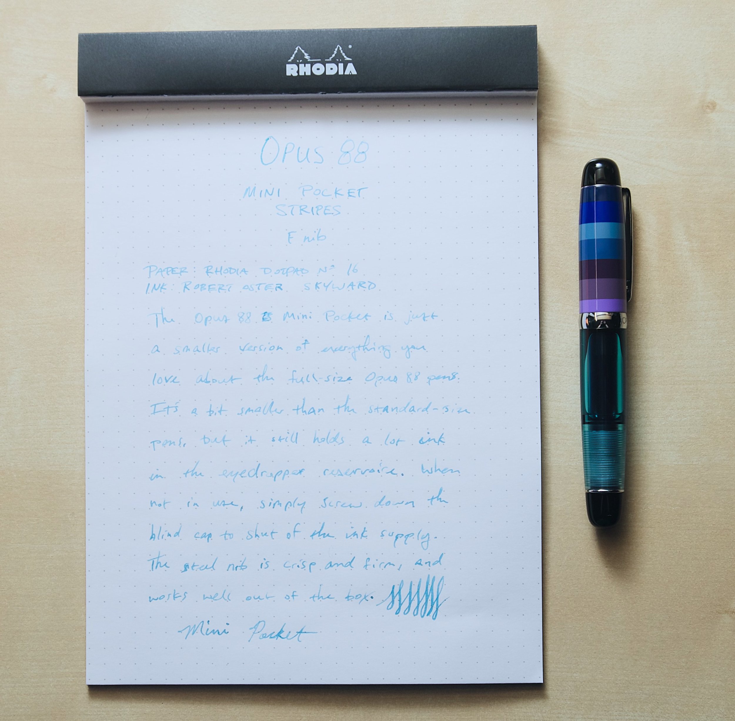
No matter how many fountain pens I accumulate, I'll have a soft spot for pocket fountain pens. They're under-represented in the grand scheme, and they're just so cute and utilitarian by nature. Normally, a pocket pen means you also have a smaller ink capacity, but that's not the case at all with the Opus 88 Mini.

The colorway I have is called Stripes, and I love the mixture of blues, greens, purples, and pinks that they incorporate into the materials. The pen is just 4.5 inches (11.8 cm) long when closed, and just 0.6 inches (15.4 mm) in diameter. Despite being so short, the diameter is actually a bit larger compared to other pocket pens I've used in the past. It's the same diameter and shape as a standard-size pen, which means it's really comfortable to hold.

Opus 88 Mini Pocket Stripes Fountain Pen

Uncapped, the pen is 4.25 inches (10.8 cm) long, and 5.5 inches (14 cm) when the cap is posted. The posted length is pretty much the same as a closed standard-size pen.

The best part about these dimensions (particularly the diameter) is how they translate to ink capacity. Like other Opus 88 pens, this one is also an eyedropper design, meaning it holds an astonishing amount of ink for its size. Holding between 2-3 ml of ink, this puts cartridge-converters to shame. Filling and cleaning is a simple task, and you also get the added security of the ink reservoir being shut off from the feed when the pen is closed.

Opus 88 Mini Pocket Stripes Fountain Pen Nib

The Mini uses a #5 Jowo steel nib, which fits the small nature of the pen quite well. Plus, the small nib allows the cap to be just a bit smaller as well. The fine nib in my unit works perfectly out of the box, and I've been really happen with how it writes. The nib is stiff and produces crisp line edges while still feeling smooth and consistent while writing. The feed does a great job of supplying the ink to the end of the nib. There's not much flex to this nib, but you can tease out a little line variation if you practice putting pressure on the nib while making downstroke marks.

Opus 88 Mini Pocket Stripes Fountain Pen Barrel

Going back to the materials and colors of the pen body and cap, I'm still so happy with my choice of the Stripes colorway. The body of the pen is fair simple — the blind cap and grip section are both polished black acrylic, but the body is made of a translucent blue/turquoise acrylic material that allows you to see the ink and inner workings of the pen along with the threads for the blind cap fitting. I love translucent colored materials, and this one is no exception. It's pure joy seeing ink slosh around in the body.

The cap also has a polished black finial, but the rest of the cap is made up of stripes of colors that go around the diameter of the pen. The sections aren't all the same size, which adds some visual interest and diversity. All of the colors they used in the cap are complimentary to the lovely aqua color of the body material.

To top off all the acrylic colors, the pen features silver trim that brings everything together. The clip is easy to use, but still stiff and strong enough to keep it secured to anything that fits in the opening.

Opus 88 Mini Pocket Stripes Fountain Pen Comparison

I've really enjoyed writing with this pen and carrying it around with me. It's not the smallest pocket pen, but it's still really cute and fun to handle. The grip section is a little on the small side for my fingers, but I get used to the size quickly once I write a couple of words. Overall, this pen is just another fantastic example of Opus 88 craftsmanship and aesthetics.

The Opus 88 Mini Stripes Pocket fountain pen is $79 and comes with your choice of EF, F, M, B, or 1.4mm italic steel nib. If the colors of the Stripes model aren't your jam, there are plenty of other options as well.

If you love the size of the Kaweco Sport but want a larger ink capacity, I think the Opus 88 Mini is a great option to think about. The pen is a solid performer with a massive ink reservoir, and the color options are super fun.

(Vanness Pens provided this product at a discount to The Pen Addict for review purposes.)


Enjoy reading The Pen Addict? Then consider becoming a member to receive additional weekly content, giveaways, and discounts in The Pen Addict shop. Plus, you support me and the site directly, for which I am very grateful.

Membership starts at just $5/month, with a discounted annual option available. To find out more about membership click here and join us!

Opus 88 Mini Pocket Stripes Fountain Pen Writing
Posted on March 19, 2025 and filed under Opus, Fountain Pens, Pen Reviews.

Sailor TUZU Adjust Fountain Pen Review

Sailor TUZU Fountain Pen

For a $44 fountain pen, I sure have a lot of thoughts on the Sailor TUZU. Some thoughts are straightforward (Does the TUZU provide good value?) while others are more complicated, such as if there is any benefit to its main feature.

Sailor TUZU Fountain Pen Converter

Ships with converter!

Let’s start here: what is the Sailor TUZU? It’s a fountain pen, with a twist. Literally. In short, the nib is designed to rotate around the barrel to better match your preferred writing angle. For a fountain pen, writing angle is everything. If not held at a certain angle, the nib on the page could feel terrible, or possibly not write at all. Sailor created a fantastic product page for the TUZU, which you can find here.

Sailor TUZU Fountain Pen Barrel

To assist with non-traditional writing grips and angles, the TUZU allows the user to rotate the nib in 10 degree increments. How? You unscrew the barrel, loosen the section ring, slide back the grip section, and rotate the nib to a new position. It’s quite simple, with guidelines to assist you in slotting the nib correctly in its new position.

Sailor TUZU Fountain Pen Band

How it works: Unscrew the barrel, and loosen the Silver section band.

Sailor TUZU Fountain Pen Slide and rotate

Slide the section back, rotate the nib as needed. In this case, I went one station (10 degrees - you can see the guide lines,) to the left.

Sailor TUZU Fountain Pen Rotated

Tighten it all back up and Profit!

All of this can happen with the pen inked, so feel free to twist and adjust accordingly. The grip is molded in a triangular-style and you can rotate it, too, to give you a more personalized writing experience.

Sailor TUZU Fountain Pen Grip

My grip and writing angle.

From a technical perspective, it works perfectly. From a writing perspective? I can’t say. Well, I can say if you have a traditional writing grip and angle like I do. But that’s not the purpose of this pen, so I enlisted a friend who could provide some insight if the TUZU offers any benefits to non-traditional grips and writing angles.

Say hello to Toga, from Toga’s Stationery Vagaries:

Hi, I'm Toga, and I have a wonky grip. I'm not too sure when exactly I developed this way of holding a pen. I'm fairly certain I would have been taught the standard tripod grip at school, but at some point it morphed into whatever the heck you'd call what it is now. I only realised it had changed when a customer asked me: "Why on earth do you hold your pen like that?" I couldn't give them an answer. My index finger rests pretty much where it should, the underside of the pen rests on the first knuckle of my middle finger, and my thumb hooks over the pen, resting on my index finger.

Toga's TUZU

Because of this rather "innovative" way of holding a pen, I don't tend to go for ones with triangular grips if I can at all help it. That being said, I do have a few with these grips, with varying degrees of aggressiveness. The more aggressive the grip, the more uncomfortable it is for me to hold.

That's where the TUZU comes in with its moulded grip that can be rotated in 10 degree increments. The moulding is less aggressive than a Lamy Safari, and even in its default position the TUZU is more comfortable for me to hold than said Safari.

I wasn't sure if the rotation gimmick was actually going to be useful for someone like me or not, so when Brad mentioned that he was looking for people with non-standard grips to help him with the review, I was happy to volunteer. After some trial and error finding the position that worked best for me (140° clockwise) I can confidently say that it absolutely is useful for people like me. In fact, it has surprisingly become one of the most comfortable pens I have. My index and middle fingers sit comfortably in the moulded sides while my thumb rests nicely over the rounded end that would usually be the underside of the grip. It's a fairly chonky pen, too, but manages to remain lightweight without feeling cheap, all of which add to the comfort levels for me.

However, a comfortable pen isn't much good if the rest of the writing experience is poor. I initially had some issues with the nib as the tines were too tight, making it extremely dry to the point of barely writing. Opening tines is something that I'm comfortable with doing, but it can be daunting for new users—the kind of users who Sailor have marketed this pen towards. That said, provided you've bought it from a reputable seller you'll be able to return the pen for a new one should you be unlucky enough to run into this problem.

Knowing Sailor, I imagine this will be a fairly uncommon occurrence. It didn't take much to get the pen writing as it should, just a little gentle spreading of the tines with brass shims was enough to get the ink flowing as it should, with the Fine nib giving a line slightly wider than a western Extra Fine. Despite being a steel nib, it has the "textured" feel that their gold nibs are famous for. Not quite to the same level, but it's definitely there. That's not something I've noticed on their other steel nibs before, but I've only used the Fude models so it may be different for them. I do enjoy the almost pencil-like feedback of Sailor's gold nibs, so I'm happy to find it present on this new steel nib Sailor developed for this pen.

So, the gimmick certainly works, but is it worth the money? I'd say the major competition for this pen is the Lamy Safari, as it's a similar size and also has the moulded grip section. The TUZU is $12-$15 more expensive than the Safari, which at this price point is not an insignificant premium to pay. Despite this, I would go for the TUZU every time. For one, I prefer the way it looks, but more importantly the TUZU is so much more comfortable for me to use. If you have a non-standard or rotated grip I believe you will have a far nicer writing experience with the TUZU. Thank you Brad for sending me the pen and letting me help with the review!

How cool is that? Thank you Toga!

Since everyone’s writing experiences differ, I thought it was important for this review to bring in someone who could actually use the main feature this pen was designed for. This type of insight is invaluable, and has me giving Sailor their due for helping fountain pen users have an experience that I might take for granted.

One bit from Toga’s talk that I wanted to elaborate on were his comments on the nib. My experience has been similar, but better in the fact that the nib has always written, but the tines are tight! That makes for an especially fine line from this Fine steel nib. It should come as no surprise to many long-time readers that I love it. This nib is a nail, and the only Sailor Steel nib I’ve ever enjoyed. If I was recommending the TUZU to a new user, I would recommend choosing either a Medium or Broad nib.

Sailor TUZU nib

Nails.

I’ll be interested to see if they take this redesigned LAMY-eqsue nib and feed into other entry-level products. I think it would do well, but is it Sailor enough for their more traditional pens, like the Compass?

What about the price point? $44 is more than fair for what Sailor has built, but at the same time, is the technology enough of a selling point to entice a new user to spend this much on a fountain pen? I think so, if they can get buying assistance, or have enough information available wherever they purchase to pen to take a chance on it.

TUZU Safari

Sailor TUZU vs. LAMY Safari.

For me personally, I love it, but am I choosing it over the Pilot Kakuno, Explorer, or Prera? How about the TWSBI ECO? The LAMY Safari or AL-Star? No to all of those, but maybe over some of Platinum’s entry level pens (Preppy, Prefounte, Plaisir,) purely because of barrel feel. As Toga alluded to, the TUZU is mostly comparable to the LAMY Safari. That’s one of my favorite pens of all-time, and also a pen that many people dislike due to the grip and/or design. In fact, I could see the TUZU becoming a pen favored by artists - like the LAMY Safari - because of how it is built, and the options and opportunities the nib angles could provide.

Will the Sailor TUZU be a long-term success? Only time will tell, but I think it is off to a good start. They are even launching a new barrel color, Translucent Violet, to the lineup this year, so it must be doing reasonably well. If nothing else, Sailor now has an entry-level fountain pen for people to consider, and one I think many users will be happy with.

(JetPens provided this product at no charge to The Pen Addict for review purposes.)


Enjoy reading The Pen Addict? Then consider becoming a member to receive additional weekly content, giveaways, and discounts in The Pen Addict shop. Plus, you support me and the site directly, for which I am very grateful.

Membership starts at just $5/month, with a discounted annual option available. To find out more about membership click here and join us!

Sailor TUZU Writing
Posted on March 3, 2025 and filed under Sailor, TUZU, Fountain Pens, Pen Reviews.

Colorverse vs Kakimori - Dip Nib Showdown

(Kimberly (she/her) took the express train down the fountain pen/stationery rabbit hole and doesn't want to be rescued. She can be found on Instagram @allthehobbies because there really are many, many hobbies!.)

I first reviewed the Kakimori dip nibs (along with several others) in my dip nib comparison article a while back, so I was very excited when I heard that Colorverse was coming out with their own version of the dip nib, called the Shuttle nib.

I am using the same methodology for the Colorverse Shuttle nibs as I did last time with the others:

  1. Ink - I am using Waterman Serenity Blue as a baseline for the swatches/writing samples. This is most nib grinders’ preferred ink of choice as it has consistent flow, does not stain and is good for vintage pens. I also picked a shimmer ink to see if it behaved differently. I capped and shook the vial between each test.
  2. Paper - I used a combination of a 68 gsm Tomoe River notebook, a 80 gsm Rhodia graph pad, and the standard sized Col-O-Ring cards made from 160gsm paper.
  3. Cleaning - I have used the steel Kakimori dip nib as my primary swatching tool for the past couple of years, so it has been rinsed/cleaned/wiped many times. I use tap water to rinse between uses.
  4. I use a syringe to gently shoot water downwards towards the tip of the nib.
  5. I do not dip the nib/holder into water and swish for cleaning, so I don’t get ink stuck inside the holder.
  6. Writing - Aside from the name of the dip nib, I tried to write the same text on the different papers so you can see how much writing I could get out of one dip. For the Colorverse nibs, I will write a line without an initial cleaning, so I can see whether it writes on first use. Then I will rinse/dry it before rewriting the line again.
  7. Swatches - I am making a broad line swatch as well as my typical Col-O-Ring swatches with both sets of nibs.

Note: After about 6 months of use, the Kakimori dip pen holder started allowing the dip nib to slide out of the ferrule (the “round thingy” that holds dip nibs in place). I showed a video to Kakimori, who ended up replacing the holder. Unfortunately, the replacement started doing the same thing some months later, so I stopped using that holder. I have also since misplaced it, so I don’t have any comparison photos of it next to the Colorverse holder.

Colorverse Shuttle Nib Box

The Colorverse Shuttle nib is packaged in a black box with holographic logo/design (right), which is then encased in a simple black box sleeve (left). The nib holder is similarly packaged but in a longer box (not pictured).

The Kakimori’s packaging (left) has a very different aesthetic. For lack of better words, I would say it feels more organic, while the Colorverse packaging gives off a very modern, space-like vibe, appropriate for its Shuttle namesake.

The hand marked check matches the rest of the Kakimori’s packaging aesthetic. Easy to see at a glance Colorverse’s brass or steel nib.

Before I get into the nitty gritty, let’s just get this out there ‘cause I know you’re dying to know if they are compatible with other holders. And the answer is YES! Both the Colorverse Shuttle and Kakimori dip nibs fit in standard ferrule nib holders, and yes, both will fit into the other’s nib holders as well! This is great news for folks who already have nib holders for the Kakimori or other dip nibs (neither will work in oblique nib holders).

Colorverse Shuttle aluminum nib in a Tachikawa holder, Kakimori steel dip nib in the Colorverse Shuttle holder, and Shuttle brass nib in a Speedball holder.

You can easily fit a Zebra G or pretty much any other standard dip nib in the Colorverse Shuttle holder.

There’s no denying that the shape of the Shuttle nib is similar to that of the Kakimori, but they are also a bit different. The Shuttle is a longer nib and has sharper channel grooves than the Kakimori. It is also more narrow and pointed, while the Kakimori is a bit broader and more “rounded”. Both of these differences factor into how the nib feels when using them at more extreme lower angles.

Colorverse Shuttle nib on the left, and the Kakimori nib on the right. Both are Brass and are in the Tachikawa holder, which has a standard dip nib ferrule.

Despite using a very light touch at more horizontal angles, the swatches still show “scratch marks” where the nib scratches the Col-O-Ring. I didn’t feel this quite as much on the much smoother TR 68 gsm paper, but neither performed quite as smoothly as the Kakimori.

The Colorverse Shuttle nib (Aluminum) in the Shuttle nib holder (also Aluminum.)

The Colorverse Shuttle nib holder has a ridged grip section, which is neither too smooth nor too sharp. It makes it easy to hold without your fingers slipping. It is slim with a bit of heft to it, unlike a traditional wood or plastic dip pen holder which is very light. As such, it can be a bit uncomfortable for long term writing if you prefer a lighter pen or more girthy grip section or both. This nib holder is the Large model and is 7.4”/187 mm. There is also a Small one which is ~5.6”/142 mm.

Thanks to technology and poor photo editing skills, here is an approximation of the Kakimori holder (left silver) with the Colorverse Shuttle holder (right center). The holders on the left/right sides are from Tachikawa and Speedball.

The Shuttle nib holder doesn’t look like anything more than a ferrule in a ridged-grip long nib holder. The grip actually unscrews itself from the rest of the “barrel”, revealing a brass ferrule which is still attached. When attached, this piece and the grip form a gap which holds the dip nib in place. This brass piece is also detachable from the holder, making cleaning easy if you somehow manage to get ink back there. Unscrewing the section also makes it easier to fit into shorter cases/pouches.

Grip section unscrewed from the nib holder. You can see that the piece that holds the ferrule is still attached to the rest of the holder. It would be cool if you can get grips with different materials, designs, etc.

You can unscrew the ferrule if you need to disassemble it further to put it in a small case or for further cleaning. I wonder if the ferrule is replaceable - that would have solved the problems with my Kakimori holder.

For the writing sample below, the first part was done with the Shuttle nib right out of the box without any rinsing or cleaning. I did a quick wipe with a napkin to ensure no particles would get in the ink.

Header with 4 lines of text before running out of ink. A simple rinse and wipe before a new dip gets an additional line of text. No problems writing cursive or print on the slightly textured Col-O-Ring card either.

Making my swatch line with the Aluminum Shuttle nib. There is less of a curvature of the Shuttle nib, so I had to use a very low angle in order to not cut the paper or make much thinner lines.

Writing samples on Rhodia 80gsm (left) as well as writing at some different angles

This was really hard to do towards the bottom of the page of a super thick notebook, especially for someone like me who is also used to writing at 75 degrees.

One of the things that differentiates the Colorverse Shuttle nib from the Kakimori nib is a small reservoir which stores a wee bit of ink so you don’t have to dip it as often. I dipped it a few times because I could see that it was a surface tension bubble as opposed to ink in the reservoir.

Ink in the nib reservoir.

After dipping and confirming ink was in the reservoir, I managed to write a bit more than 1 page of A5 slim, which is about 3-4x what I got from a non-reservoir dip.

The number of pages you get will depend on multiple things including writing angle (my steep angle meant that ink flowed down faster initially), and how the reservoir is oriented (I had it facing up, but in another writing sample, I rotated it almost face down and got a lot more/too much ink flow).

Like I did with the Aluminum nib above, there was no cleaning of the brass nib prior to first writing. Not gonna lie, I absolutely HATED my Kakimori brass nib, so I was pretty nervous about how the brass Shuttle nib would perform. No need for worry as it wrote right away with zero problems whatsoever!

Header with 5.5 lines of text vs Aluminum’s Header + 4. Clean, wipe and re-dip gets an additional 3.5 lines of text.

Swatch line and Rhodia samples. I had a bit more trouble writing on the Col-O-Ring than I did with the Aluminum nib, which surprised me.

Different angles on TR 68gsm and Rhodia. I rotated the nib a bit while writing at the 20 degree angle on top, hence the drastic line width compared to the Rhodia sample.

After dipping and confirming ink was in the reservoir, I managed to write a few lines more with the Brass nib than I did with the Aluminum nib.

In general, the two Colorverse nibs wrote similarly for me from 45-75 degrees (these were all done as “below reservoir” dips, aka, not super saturated, but with plenty of ink to write with). The widths were a bit more noticeable around 30 degrees and even more so when lower than that.

The angles are approximate and how much ink is left on the nib will also affect its width. Colorverse Brass (top), Aluminum, Kakimori Brass, Aluminum.

Both the aluminum and brass Shuttle nibs handled shimmer without any issues.

Alongside other dip nibs using the same Robert Oster Glistening Orange Rumble ink sample.

TLDR: If you don’t already have a Kakimori dip nib, the Colorverse Shuttle dip nib would be a good purchase, especially if you want to use it more for writing. I had a slight preference of the Brass because the line was just a wee bit thicker and held a bit more ink, though I probably would never use it for more a lot of writing (that’s what FPs are for, lol), But, I liked the Aluminum for writing on Col-O-Rings more than the brass. On smoother paper like Tomoe River, I liked either of Shuttle nibs a bit more than the Kakimori steel nib (and we all know how I feel about the Kakimori brass regardless of paper). However, given that my primary swatches are done on Col-O-Ring cards, the steel Kakimori feels smoother when making the large swathes of ink. You may like or dislike how either nib feels on different kinds of paper (like textured papers or watercolor paper versus Tomoe or Rhodia) or if you plan on using it for writing versus art, etc.

I would hands down get the Colorverse Shuttle nib holder over the Kakimori because I don’t have to worry about the nib eventually sliding out of the ferrule like what happened with 2 of their nib holders. Plus I like the ability to disassemble it in case of inky accidents.

The Colorverse Shuttle nibs cost $42 and $48 for the Aluminum and Brass, respectively. The nib holder in Aluminum costs $75 and $60 for the large and small, respectively, while the Brass holder is $85 and $67. They are priced similarly to their Kakimori equivalents. You can find the Colorverse Shuttle products on the Pen Realm website.

(Disclaimer: The two Colorverse Shuttle dip nibs and the nib holder were purchased from Pen Realm at the 2025 CA Pen Show. All of the other products are my own, including the Kakimori nibs and various holders.)

Posted on February 28, 2025 and filed under Colorverse, Kakimori, Dip Nib, Pen Reviews.