Posts filed under Pilot

Pilot Capless Decimo Fountain Pen Review

(Jeff Abbott is a regular contributor at The Pen Addict. You can find more from Jeff online at Draft Evolution and Twitter.)

The Pilot Vanishing Point has long been a point of discussion on the podcast, and typically polarizes users because of the unique shape and clip positioning. If you're a fan of the Vanishing Point, then you might be interested in the Capless Decimo from Pilot, as it's essentially the same pen with a smaller barrel diameter.

If, however, you don't care for the style or grip of the Vanishing Point, the Capless Decimo won't do anything for you since it uses the exact same grip. The clip is a little smaller, but not enough to make any difference in how it feels, and the larger issue remains the placement of the clip more than the size.

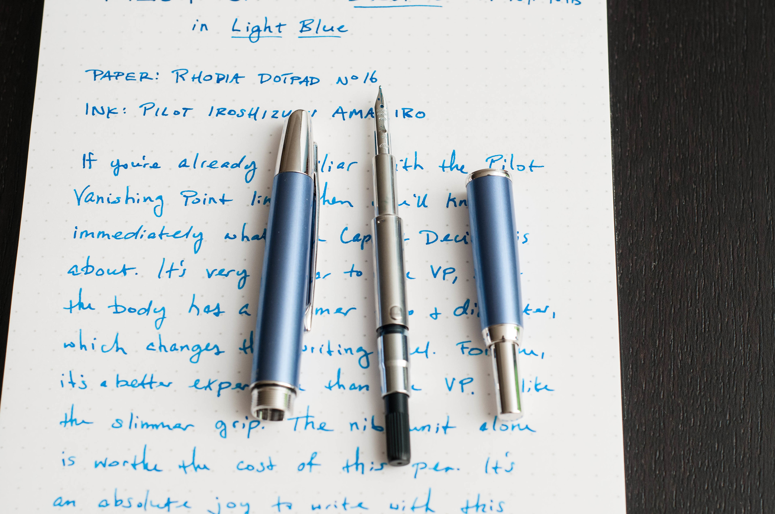
For me, I'm a huge fan of the Vanishing Point, and I was excited to try out the cousin based on the different barrel diameter and color options. My verdict? I prefer the Decimo over the standard Vanishing Point exclusively because of how it feels in my hand. That smaller diameter barrel hits the sweet spot for me. Luckily, the Vanishing Point and Decimo pens use the exact same nib units!

Appearance and feel

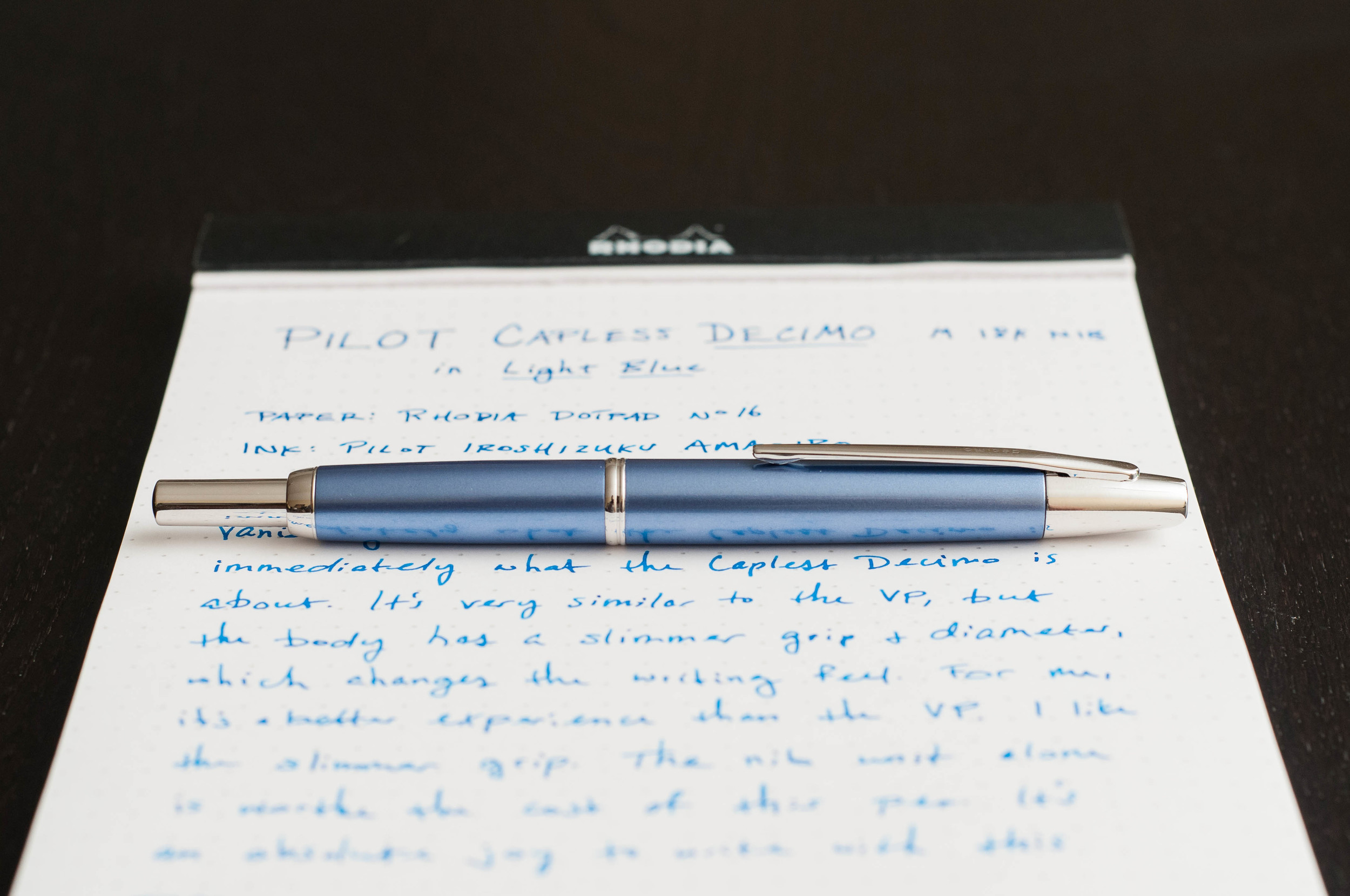
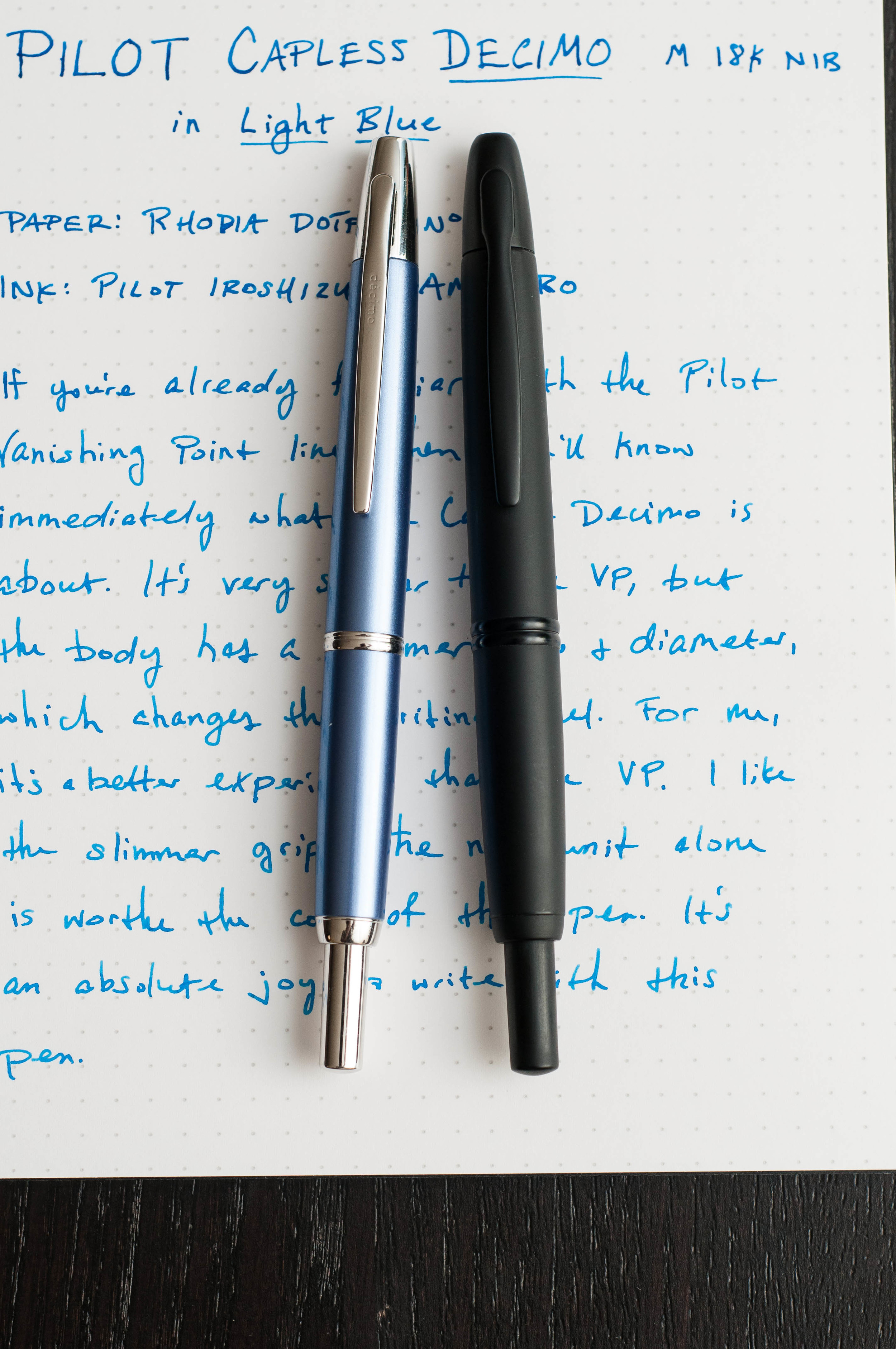
At first glance, the Decimo looks like a Vanishing Point, and vice-versa. It's difficult to tell them apart on their own, but there are a couple of factors that make it a bit obvious. For one, "decimo" is printed on the clip of the Decimo models, while the Vanishing Points only feature the "Pilot Japan" print on the barrel above the mid-section. The Decimo also includes this print in the same location. So, in a pinch — just look at the print on the clip to identify a Decimo.

Along with the printing on the clip, the clip has a slightly narrower shape than the Vanishing Point. It's more slim and matches the smaller diameter barrel perfectly. The tip of the pen looks a bit smaller than the Vanishing Point, but it's hard to tell from the naked eye. Apart from these differences, I can't find any others when looking at them side by side.

Weight-wise, the Decimo is a tad lighter. The Vanishing Point has long been a favorite pen of mine, and that doesn't change. But, I prefer to Decimo over the Vanishing Point because of how the Decimo feels in my hand when writing. It's a more enjoyable experience. That's not to say my Vanishing Point is annoying or negative — it's just not as enjoyable as the Decimo.

For me, the clip placement is perfect for how I grip pens, and it didn't take any adjustment since I was already accustomed to the Vanishing Point.

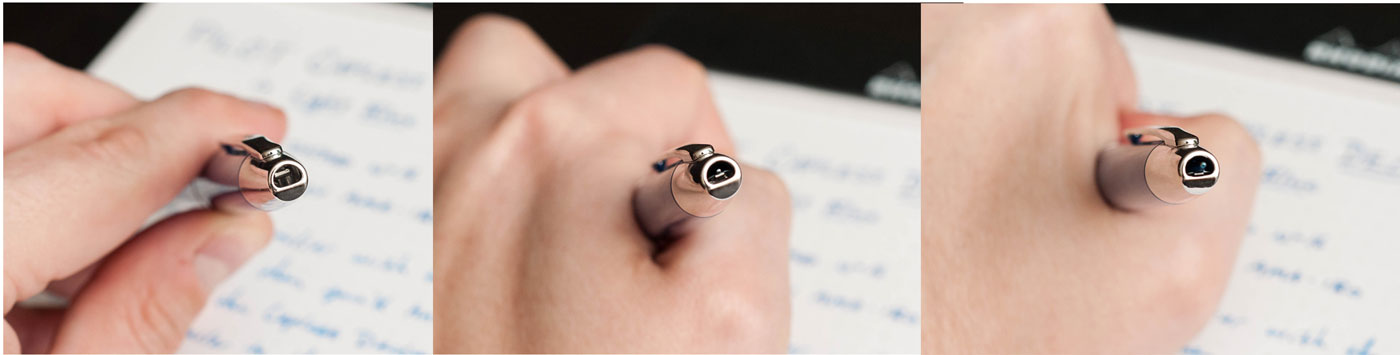
If you're unfamiliar with the Vanishing Point and Capless lines, the retractable mechanism is really well-designed. When the pen is retracted, there's a small door that closes on the inside of the tip to keep the nib from drying out. As you extend the nib, the door opens. In my experience, the pen never dried out after sitting for more than 5 days, and didn't have any hard start or skipping issues.

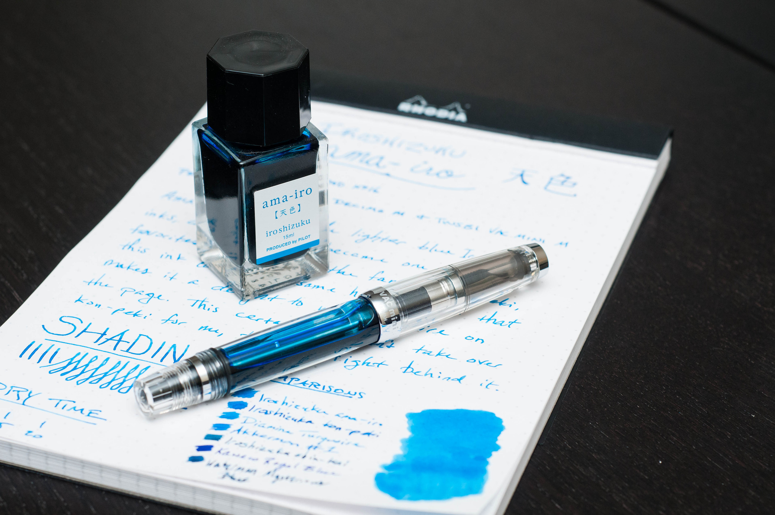
There are some unique colors in the Decimo line, but nothing out of the ordinary if you stay in the same price point. The Light Blue color that I received is nice, but it's not my favorite out of the full lineup. Although, the Iroshizuku ama-iro pairs very nicely with this body color — almost like they were made for each other.

Writing performance

I'm practically in love with the nib on this pen. It came outfitted with an 18k gold Medium nib unit that writes like a dream. I have one other 18k Medium gold nib from Pilot, and I've exclaimed my affection for that nib as well. Pilot continues to impress me with their out-of-the-box nib tuning and performance, and this Decimo is just another tick on the "winning" side for me.

The nib glides over all types of paper like satin over glass. The medium nib is wet enough to show off ink properties and provide a good amount of line variation, but still small enough for everyday use. There's a subtle amount of feedback in the nib when writing, but it's just enough to let you know that you're writing on paper instead of butter.

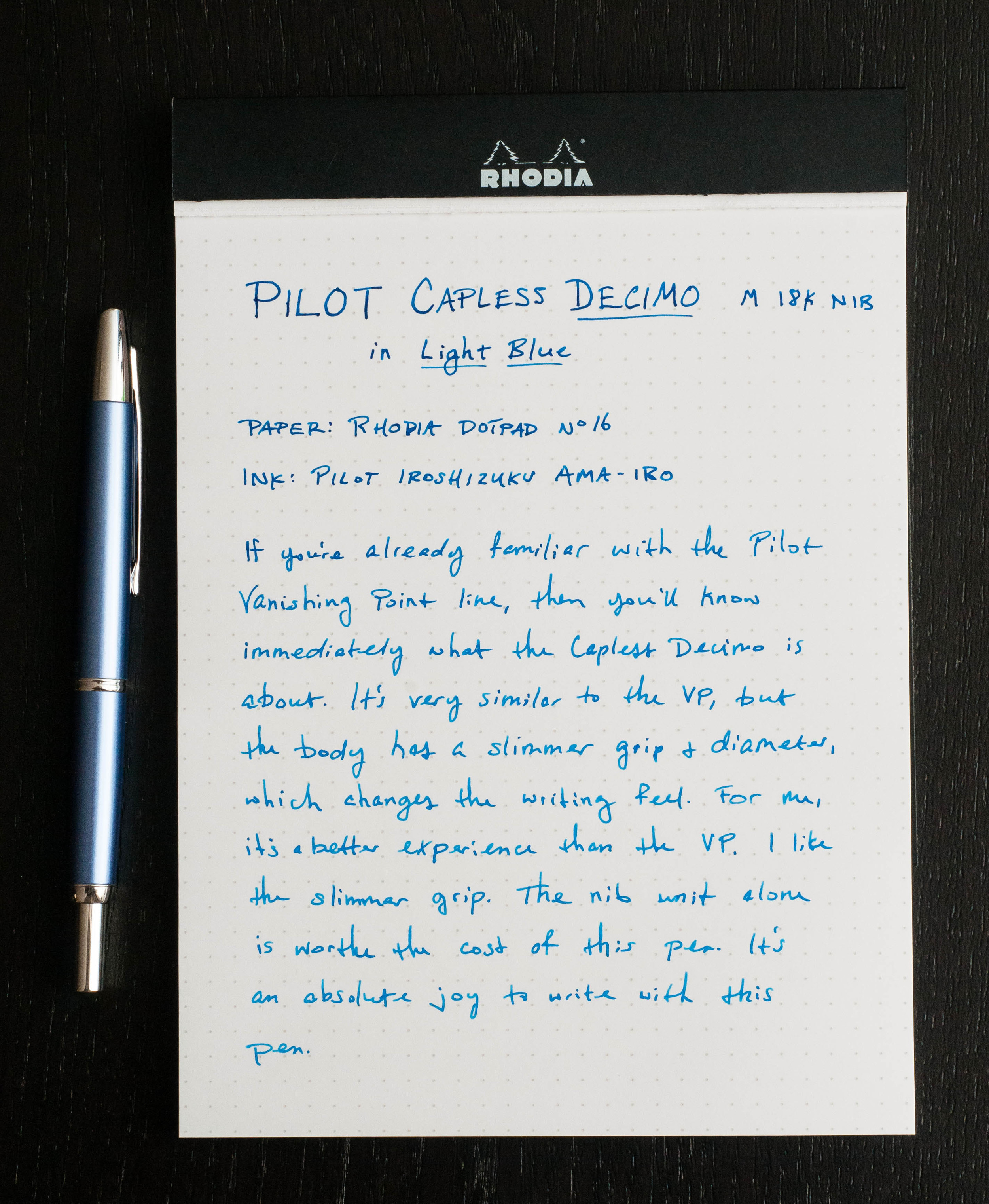
Of course, being a gold nib, it exhibits a small amount of flex if you apply pressure. It's not something I do often, but the added flourish is worth it in some occasions (even with my shabby handwriting).

I expected good things when I received the pen, but my expectations were exceeded immediately after I inked up the pen.

Conclusion

In summary, I love this pen, and I love the nib unit even more. I'm continually impressed by the Pilot brand, and this pen has been no exception. I really wish there was a readily-available version of this pen in a clipless model so that more people could enjoy the Vanishing Point and Capless lines. I'm lucky in that my grip happens to match up with the intended grip on the pen, but it's a shame that it makes it difficult or intolerable for other writers.

The Pilot Capless Decimocomes in Burgundy, Champagne, Light Blue, and Purple from Goldspot and retails for $140. And again, the nib units are compatible with both the Capless Decimo and the Vanishing Point.

(Goldspot provided this product at no charge to The Pen Addict for review purposes.)


Enjoy reading The Pen Addict? Then consider becoming a member to receive additional weekly content, giveaways, and discounts in The Pen Addict shop. Plus, you support me and the site directly, which I am very grateful for.

Membership starts at just $5/month, with a discounted annual option available. To find out more about membership click here and join us!

Posted on July 13, 2016 and filed under Pilot, Vanishing Point, Pen Reviews.

Pilot G-Tec-C Navy And Turquoise Review

The Pilot Hi-Tec-C is a pen that changed how many people think about pens. Artists and designers love the micro-tip sizes - all the way down to .25 mm - plus the needle tip which allows for good sight lines and ruler usage. It also changed the Kickstarter pen market, becoming the go-to refill when pens on Kickstarter first became a thing.

As famous as this pen is, it isn’t a good pen for many people. Over the years, the best word I have found to describe it is finicky. If you are willing to put up with some dry starts until the pen gets flowing, you will find one of the best pens on the market, especially for small writing or detailed artwork. If the output is not worth the initial frustration - and it does get very frustrating at times - you will swear this pen off for a lifetime, like many rightfully have.

The 0.3 mm black Pilot Hi-Tec-C is a personal favorite of mine, and the one I get the best and most consistent performance from. I love what my writing looks like with it, and it is a great sketching pen too. I always have one with me in either the basic grip barrel or in my Pen Type-B barrel.

Recently, Pilot has expanded their G-Tec-C lineup, which is the name of this line of pens outside of Japan, to offer more than the black, blue, red, green, and purple that formerly made up the G-Tec-C group. Navy and Turquoise are the two I chose to review because these ink colors have not been offered by this name in the original Hi-Tec-C lineup as best as I can remember.

I am very familiar with Pilot Hi-Tec-C Blue Black and Clear Blue, which I was guessing these two new colors would match, but they are different shades. Navy is much lighter than the Blue Black refill I have, while Turquoise is close to Clear Blue but ever so slightly darker.

The Navy 0.4 mm model wrote wonderfully throughout the entire review, through all of the stops and starts. The Turquoise model not so much. You can see how light the ink is at the start of some of the Turquoise lines, which is typical bad G-Tec-C performance. This is why I almost never recommend this pen without a pile of caveats.

That doesn’t stop me though. I’m stubborn, and the output gives me a line that no other gel ink pen can match. Maybe you will like it too, and hopefully these new G-Tec-C colors are around to stay for a while.

(JetPens provided this product at no charge to The Pen Addict for review purposes.)


Enjoy reading The Pen Addict? Then consider becoming a member to receive additional weekly content, giveaways, and discounts in The Pen Addict shop. Plus, you support me and the site directly, which I am very grateful for.

Membership starts at just $5/month, with a discounted annual option available. To find out more about membership click here and join us!

Posted on July 11, 2016 and filed under Pilot, G-Tec-C, Pen Reviews.

Pilot Iroshizuku Ama-iro Ink Review

(Jeff Abbott is a regular contributor at The Pen Addict. You can find more from Jeff online at Draft Evolution and Twitter.)

For the longest time, I thought Pilot Iroshizuku Kon-peki was my favorite blue ink from the Iroshizuku line. It's bright, has great shading properties, dries relatively fast, and looks great everywhere. I always shied away from Ama-iro because it looked too light — almost transparent. Well, I eventually cracked and decided to give Ama-iro a shot, and I'm really glad I did.

I've never used an Iroshizuku ink that I disliked, so I was sure that Ama-iro would be a nice ink that lacked the "wow" factor of others. The name translates to "Sky," which is very fitting given the light, bright blue hue. In my book, they could also call it "Bora Bora" because it looks like the clear blue waters of Indonesian island paradise.

Like I said, I didn't go into this ink thinking I would care for it. To my surprise, I was completely wrong. This is just another example that shows you should never assume anything. Immediately after inking it up, I was enamored with the light blue shade that had a beautiful shading behavior. In a matter of minutes, I went from "meh" to "love it."

What makes the Ama-iro so great? Well, the color. If you've used an Iroshizuku ink before, you know what to expect. It's an incredibly well-behaved ink with beautiful color characteristics, great flow, and pretty bottles. The Iroshizuku inks are my favorite of any other brand. That said, I was 100% sure that I would never find an ink that compares to my beloved Kon-peki, and I'm sure there are plenty of folks that hold that same opinion. Let it be known, this opinion has not changed, but Ama-iro is nipping at the heels of this special title. It's closing the gap with every stroke from my pen.

The sky can be different colors depending on weather conditions and what locale you're currently in. For me, this color reminds me of a clear, sunny day in Colorado — somewhere around 6,000 ft. elevation. They're clean, crisp, and rich with color. That's exactly what this blue is like. It's not just a flat light blue — it's rich and has amazing depth.

My favorite characteristic of this ink is its ability to shade to a medium blue. I've used the ink in several pens, and I love using it in wetter, broader nibs that can really show off the shading. It really is something to behold.

Another favorite feature of this ink is the dry time. I clocked it somewhere between 10 and 15 seconds when using a Japanese medium nib and a European medium nib. Not the fastest dry time, but definitely impressive.

Apart from that, all the other characteristics of this ink are in line with all the other Iroshizuku line. Great flow, easy to clean up, no bleeding or feathering, and minimal show-through.

If your favorite blue ink is Iroshizuku Kon-peki, you should give this ink a try. It's a great cousin to add to your collection for those days when you need some bright sky cheer.

JetPens sell this particular ink in two sizes: 50ml bottles and 15ml bottles. Pick up the smaller size if you aren't sure it's the right color for you! I hope you are as pleasantly surprised as I was.

(JetPens provided this product at no charge to The Pen Addict for review purposes.)

Posted on June 1, 2016 and filed under Pilot, Iroshizuku, Ink Reviews.