Posts filed under Pilot

Pilot Iroshizuku Fuyu-syogun Fountain Pen Ink Review

(Jeff Abbott is a regular contributor at The Pen Addict. You can find more from Jeff online at Draft Evolution and Twitter.)

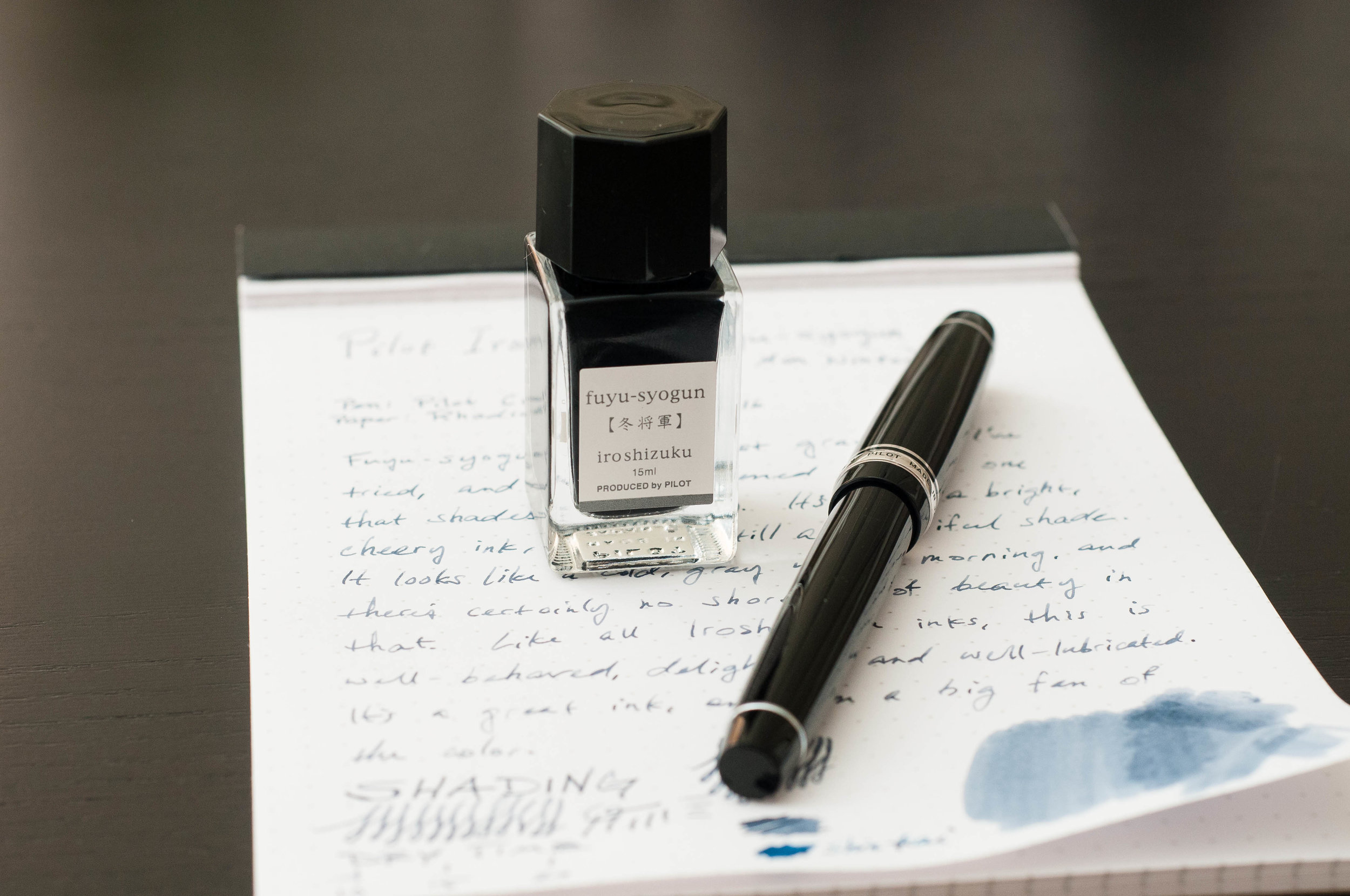
It might be 2017, but there's still a long stint of winter ahead for most of us. When I decided to order a bottle of Pilot Iroshizuku Fuyu-syogun, part of my reasoning was due to the wintery color of the ink. Another reason is that I haven't had any experience with gray inks of any kind. A few days later, it's in my pen and putting a smile on my face.

Being an ink from the Iroshizuku lineup, I knew to expect a well-behaved ink. I just wasn't sure about the color. Gladly, it's a very low-key blue-gray that shades nicely. It's not dreary at all. It's crisp and stoic like an early winter morning full of snow and clouds. Even though those conditions can be miserable, they can also be beautiful.

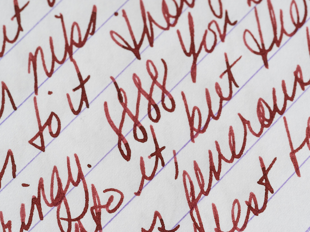
The color of Fuyu-syogun is gray with a heavy blue undertone. At times, the overall color can look like a pale, cold violet. When you look closely, it's unmistakably gray. The shading is the main reason your eyes want a second take. The blending and shifting of gray, blue, and violet make for some beautiful shading qualities. Even though the color is subdued, it stands out enough to possibly be a problem for regular office use. But, it's a tough call about how professional this ink is. It could pass in some office environments.

One minor setback for me is the lack of saturation I get in some of the lighter strokes with this ink. It's a minor complaint, and it pretty much disappears (the complaint, that is) when used in a larger or wetter nib. After trying the ink in a Kaweco EF and a Pilot F, I can say that I'll probably never use this ink in anything but a European medium nib or larger. Keep that in mind if you prefer inks with more potent saturation. Smaller nibs don't show off the nice shading this ink is capable of.

The last several inks I've tried have had relatively fast dry times. It's not something I've done on purpose, and it's not even a feature that I demand out of my inks. All the same, Fuyu-syogun dries rapidly. In my tests using a medium nib, it dried consistently between 10 and 15 seconds for normal writing. Fast drying inks are always a nice bonus.

Feathering, bleeding, and show-through are minimal with this ink. Given the light color saturation in most nibs, show-through isn't a concern for nearly any decent paper type. Even when I've tried this ink in a 1.5mm dip nib, I wasn't able to detect any feathering or bleed. Like all other Iroshizuku inks, it's well-behaved and predictable in this sense.

I ordered this ink from JetPens, and it's one of the Iroshizuku lineup that come in two sizes: 50ml or 15ml. I've recently been on a small bottle kick because of how easy they are to store. And even though 15ml is a lot less than 50ml, it still goes a long way in fountain pen terms.

This is a great ink, and a permanent favorite for me. It's my first gray ink experience, and I'm glad it's a positive one. If you're looking for a neutral, slightly-blue gray ink to try, give this one a look. With gray inks, you can choose from many different shades (from cold to warm, blue to brown), but this is a great place to start.

(JetPens provided this product at no charge to The Pen Addict for review purposes.)


Enjoy reading The Pen Addict? Then consider becoming a member to receive additional weekly content, giveaways, and discounts in The Pen Addict shop. Plus, you support me and the site directly, which I am very grateful for.

Membership starts at just $5/month, with a discounted annual option available. To find out more about membership click here and join us!

Posted on January 24, 2017 and filed under Pilot, Ink Reviews.

Pilot Juice Up Metallic And Pastel Gel Ink Pen Review

(Sarah Read is an author, editor, yarn artist, and pen/paper/ink addict. You can find more about her at her website and on Twitter.)

Pilot Juice pens were already a stationery favorite, and now Pilot has upgraded them to the Pilot Juice Up—with smoother flowing ink and a synergy tip that is a hybrid conical/needlepoint for strength and precision. The inks are water-based pigment inks with waterproof and fade-resistant properties. The Pastel and Metallic sets write on light or dark paper, as well as photos, making them perfect for scrapbooks, planners, notes, or other crafty projects.

The pastel set includes blue, green, orange, pink, violet, and white. The metallics are gold, silver, blue, green, pink, and violet. The 0. 4mm tips are smooth and precise and just the right size for writing in the ridiculously tiny grid of my planner.

The tip of the pen is metal; the grip is rubber-coated, but not squishy. It prevents slipping but provides no cushion. The grip matches the color of the ink, as does the band at the top of the click/clip unit, so you can tell what color of pen you're grabbing quite easily. This top band disappears when the pen is clicked down and the tip is extended, so you can tell at a glance if the tip is out or not. I don't care much for having the clip attached to the click. The clip is already a bit flimsy, and I worry that making it a moving part endangers it further. It's a soft plastic that doesn't feel like it will survive too much tossing into bags or being clipped to a notebook cover that is too wide. Why is the clip the Achilles heel of so many gel pens? I don't think I'm particularly mean to them, but so many seem to snap off after a while.

I have had some hard starts with all the pens, but a moment of scribble gets them going, and the flow after that is very decent. I might even have to attribute the hard starts to the extreme cold we're having this week. A number of my pens have been having issues getting going--I've been having trouble with that, myself! The tiny tips make them feel dry, but there's a good bit of ink being put down on the page.

With the exception of the white, obviously, they do a good job writing on both light and dark paper. Smooth papers definitely work better than those with more surface texture. The metallics look glittery in low light, and then ramp up to full sun-on-mirror bright in direct light.

The sets have a nice variety of well-coordinated colors, so they're great for using together for habit trackers, schedule coding, or notes. I'm particularly fond of the pastel orange. It's just like a creamsicle.

These haven't quite dethroned my Pilot Hi-Tec-C Maica gel pens, and I'm beginning to think nothing ever will, but I have been reaching for these every day and I'm definitely getting more colors.

(JetPens provided this product at no charge to The Pen Addict for review purposes.)


Enjoy reading The Pen Addict? Then consider becoming a member to receive additional weekly content, giveaways, and discounts in The Pen Addict shop. Plus, you support me and the site directly, which I am very grateful for.

Membership starts at just $5/month, with a discounted annual option available. To find out more about membership click here and join us!

Posted on January 12, 2017 and filed under Pilot, Juice, Pen Reviews.

If Ever There Was a Christmas Pen, This Is It: The Namiki Yukari Royale Vermillion

(Susan M. Pigott is a fountain pen collector, pen and paperholic, photographer, and professor. You can find more from Susan on her blog Scribalishess.)

Happy holidays to all the pen addicts out there! I’m certain we all asked for at least one fountain pen (or fountain pen related gift) for Christmas or Hanukkah, and I hope you all get what you wished for. Me? I asked for a Montblanc Rouge et Noir in Coral which I got in July and already reviewed. But I was a very good girl. I put it back in its box and am waiting to open it for real on Christmas day.

In the meantime, however, I wound up purchasing what I consider to be a true Christmas pen due to its vibrant red color: The Namiki Yukari Royale Vermillion.

The Namiki Yukari Royale is a large pen made of brass and coated with Urushi lacquer. The vermillion color is an intense, deep red that simply glows. The artist achieves this glow with a polishing method called Roiro Urushi Shiage (Non-oil lacquer finish). The artist polishes the pen with a special charcoal and then repeatedly rubs raw lacquer over it. The process can take as long as three months. (Source: Chatterly Luxuries).

The pen comes in some very impressive packaging, as you would expect at this price point (see below). There’s an outer golden-hued cardboard box. Inside is a large softwood box stamped with the Namiki logo. When you open this box, the pen and a large bottle of ink are nestled in plush red velvet. It’s a beautiful presentation, and it elicited a happy “ooooh” from me. Normally, I don’t care about packaging, but I appreciate a bit of pizzazz when I buy an expensive pen, and Namiki does pizzazz well.

The pen comes with some paperwork: a warranty card, a certificate of authenticity, and instructions for filling.

This is one elegant pen. It is made entirely of brass coated with urushi. The adornments are limited to a gold clip embedded in the cap (not around the cap) and a circlet of gold at the base of the cap.

The clip is engraved with the Namiki name, and on the top is a lot number.

The pen uses the Pilot Con 70 converter. Although it works well (it’s a push button converter), it is not my favorite filling system, mainly because it is almost impossible to get clean. That said, it is simple to use and it holds a respectable amount of ink (.9ml).

Because the pen is made of brass, it has some heft to it. It weighs 45 grams uncapped, so people who prefer light pens will probably find this pen too heavy. I, however, love the weight. When you pick this pen up, it feels substantial yet it is perfectly balanced. The barrel sits comfortably in the space between your thumb and index finger offering an effortless writing experience.

You can see how thick the barrel of the pen is.

The pen is about 150mm capped and 135mm uncapped. I would not advise posting this pen because it is already so heavy.

Of course, the most important quality of a fountain pen is the writing experience which is largely determined by the nib. This nib is a #20 in single-tone 18k gold with the Namiki logo and Mount Fuji engraved on it. It has a long oval breather hole. On the side of the nib the number 914 appears, which I think means the pen was manufactured in September of 2014.

The feed is red plastic coated in urushi. It is one of the few pens you can get with a matching feed. I love how the vermillion feed lends a unity to the overall aesthetic quality of the pen.

I chose a medium nib because Japanese nibs tend to be much finer than their Western counterparts. The medium writes smoothly with just a hint of feedback, but no scratchiness. The nib is not flexible, but it isn’t hard as a rock either. You can certainly press into it and feel its softness, but it doesn’t create line variation. The ink flows generously from the nib most of the time.

I flossed the nib to create more flow, and that seemed to help. However, sometimes I have to shake the pen a bit to get the ink flowing. I’ve been using Robert Oster Astorquiza Rot in the pen, but I need to try other inks to see if they have better flow. It may be my imagination, but Japanese pens seem to write better with Japanese ink.

One irritating thing I discovered about the Namiki is that when I unscrew the cap, the barrel tends to unscrew as well. I’m not sure what causes that, but I usually have to tighten the barrel before I begin writing.

Though some would say this pen’s design is boring and uninspired, I find it incredibly elegant. Its color is stunning but the pen remains zen-like because of its simplicity. As John Mottishaw writes on Classic Fountain Pens, “Perhaps this is what a haiku would look like if it took the shape of a fountain pen?”

I purchased this pen from Chatterley Luxuries after stewing for a long time over a Danitrio I had ordered previously. Bryant was very patient with me as I tried to decide between the Danitrio and the Namiki. Ultimately, I chose the Namiki and I’m very pleased with this pen. The retail price for the Namiki Yukari Royale is $1200. However, if you go to Chatterley Luxuries, they will email you their price which is significantly less than retail.

Pros

  • The Namiki Yukari Royale was a grail pen for me, and it has definitely earned its status in my view.
  • This pen is absolutely stunning both because of its gorgeous smokey-red color and simple, elegant design.
  • This pen feels amazing. The urushi lacquer warms to your hand, and even though the pen is heavy, it is perfectly balanced.
  • The nib is excellent, soft and smooth.
  • The converter holds .9ml of ink and is easy to fill.

Cons

  • This is a very expensive pen.
  • When you unscrew the cap the barrel unscrews as well which is rather irritating.
  • The Con 70 converter is difficult to clean.
  • I’ve had some flow issues with the pen, but I need to try it with some different inks. It’s just that Astorquiza Rot goes so well with the pen I’ve not wanted to change inks!
Posted on December 23, 2016 and filed under Pilot, Namiki, Fountain Pens, Pen Reviews.