Posts filed under Pilot

T. Wyitt Carlile Fountain Pen Wand Review

(Sarah Read is an author, editor, yarn artist, and pen/paper/ink addict. You can find more about her at her website and on Twitter. And her latest book, Root Rot, is now available for pre-order!)

Writing is inherently magical, turning abstract thought into a concrete object that someone else can read, absorbing that thought, sharing it. Whole lives and worlds conjured out of imagination. Magic! Then Wyitt comes along and is like, MORE MAGIC.

I was envious of everyone who got to play with the T. Wyitt Carlile Wand Pens at the Orlando Pen Show, and elated when Brad said he was sending one my way. Granted, I was a bit let down to discover that this is not, in fact, an enchanted pen that will complete my projects for me while I nap, but it is otherwise delightful.

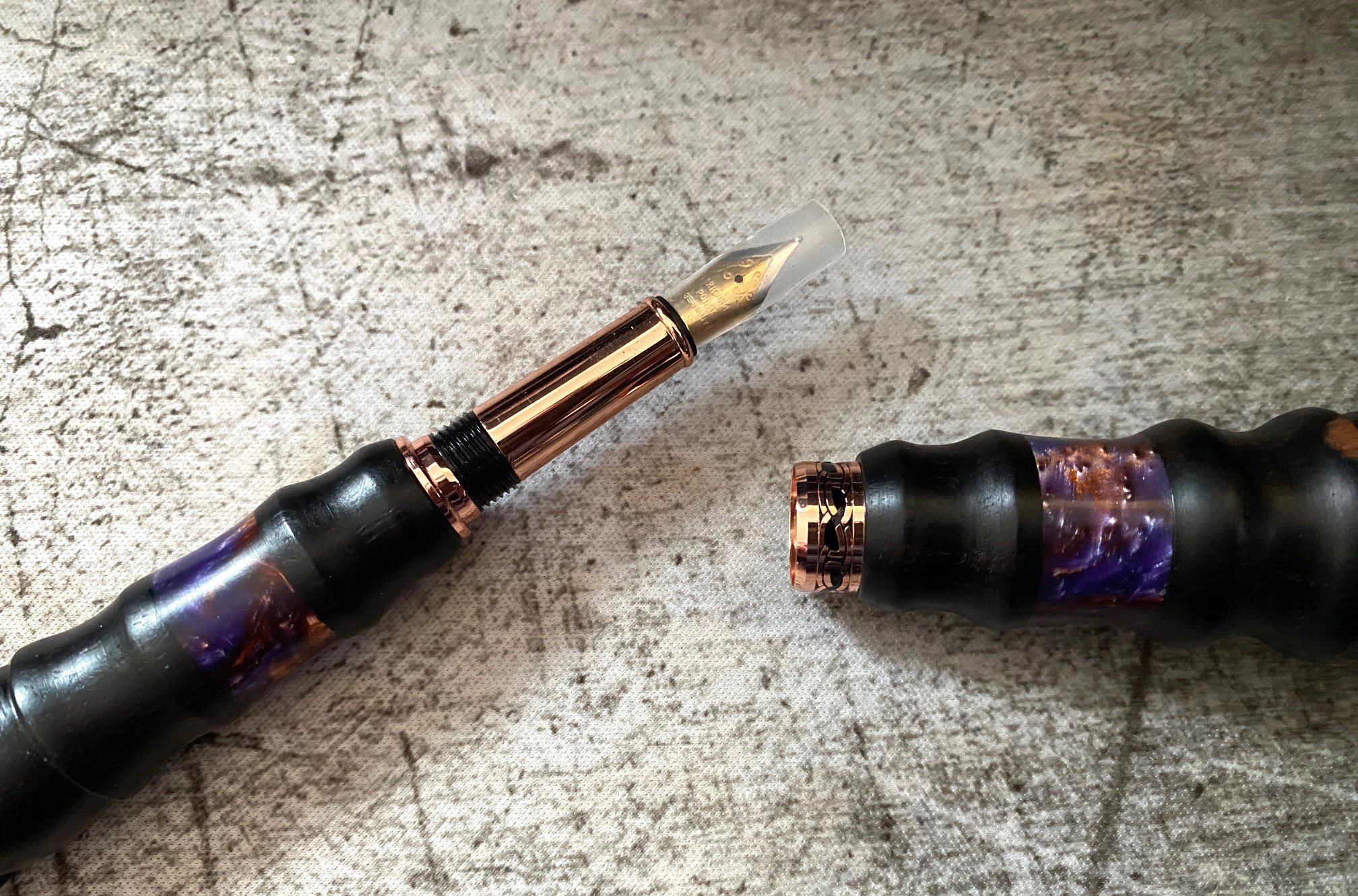
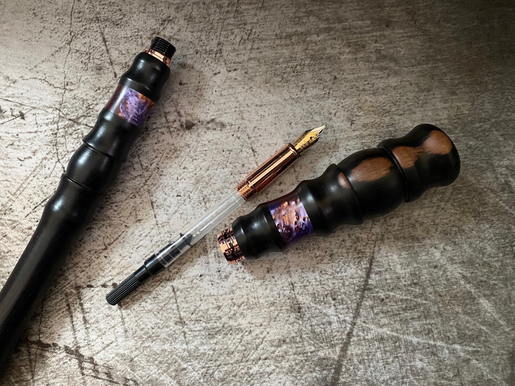
The body of the pen is made from beautifully turned dark wood that woodsy people will probably be able to identify in the comments (my best guess is ebony.) The wood is smooth and polished with very neat shaping that is comfortable to hold. Both the handle/cap and the pen body/wand have a purple-rose-orange-gold resin insert that shimmers with real (I assume) magic. Or sparkle, same difference. The cap band, grip section, and hardware are a rose gold color with some decorative engraving.

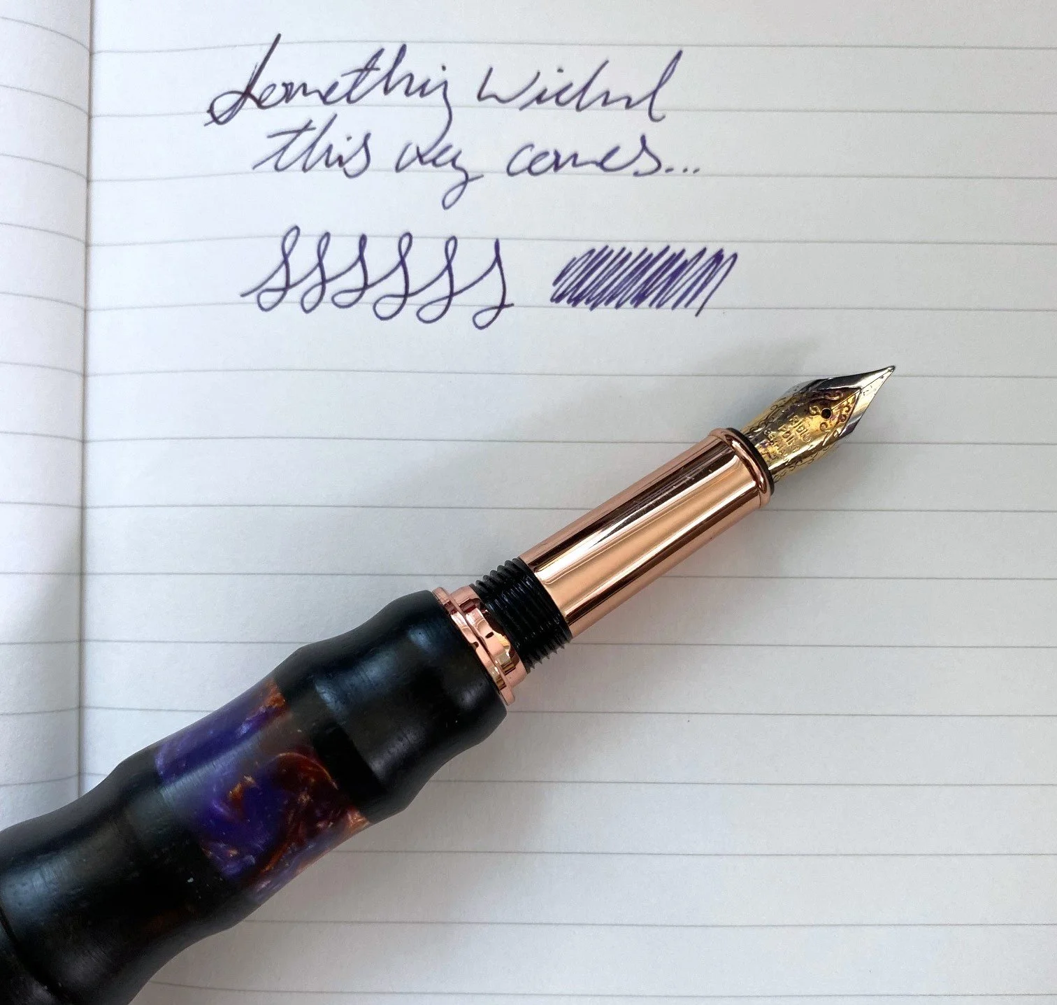
The nib is a fine #5 steel nib. The nib and hardware come from the fairly common kit suppliers used by pen turners, and past experiences have led me to expect a mediocre performance from these nibs, but I was very pleasantly surprised by the smoothness and excellent flow in this one. It's a true fine, with just the right amount of feedback, does not feel too dry, and has never skipped. I don't know if Wyitt tunes or adjusts the kit nibs at all, but this is definitely the best behaved kit nib I've used to date. A very nice writing experience.

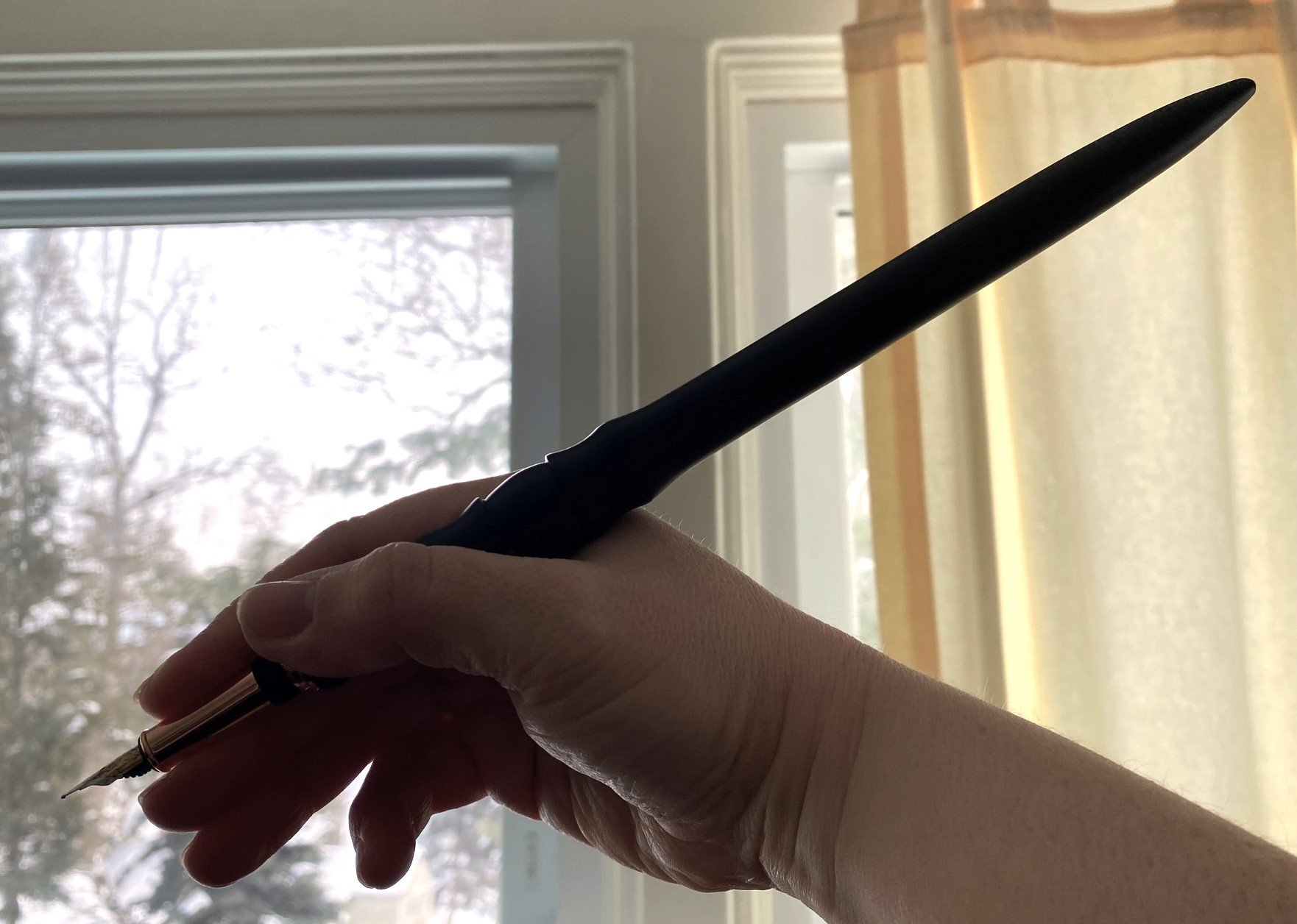
While the nib is lovely, the overall writing experience is a wee bit awkward just due to the hugeness of the wand pen. Practicality isn't the objective here--whimsy and style are the driving forces of this design. It's a statement piece, perfect for when you need to sign something with flair or turn someone into a newt. Or both at once.

The handle is the cap, so if you're holding it in proper spellcasting position, it's nib-down, and a wee bit of ink leaking can be expected, or a lot bit, if you're particularly enthusiastic. As a decorative and functional desk accessory, it works perfectly.

I love how fun these are. The fact that it also writes well is icing on the cake. I think this would be perfect for a book signing, or as an art piece for the magically inclined. It would be great for D&D players, LARPers, or anyone who conjures story from the air.

Wyitt sells his pens, wands, and wand pens on his website. The wand pens run from $130-$150, which is very fair, considering the craftmanship. They're all unique and gorgeous and I hope I'll get to see more of them in person someday.

(Brad purchased this pen from T. Wyitt Carlile at normal retail price at the 2023 Orlando Pen Show.)


Enjoy reading The Pen Addict? Then consider becoming a member to receive additional weekly content, giveaways, and discounts in The Pen Addict shop. Plus, you support me and the site directly, for which I am very grateful.

Membership starts at just $5/month, with a discounted annual option available. To find out more about membership click here and join us!

Posted on January 18, 2024 and filed under Wyitt Carlile, Fountain Pens, Pilot, Pen Reviews.

Reflections on Some Currently Inked Pens

(Kimberly (she/her) took the express train down the fountain pen/stationery rabbit hole and doesn't want to be rescued. She can be found on Instagram @allthehobbies because there really are many, many hobbies!.)

Despite being in this rabbit hole for 6.5 years, I continue to learn not just about pens, inks and all that, but about my preferences and habits. There isn’t a right or wrong way to be in this hobby and what works for someone may or may not work for you. For some reason during the past few weeks, a few of my currently inked pens were good reminders of lessons I’ve learned along the way.

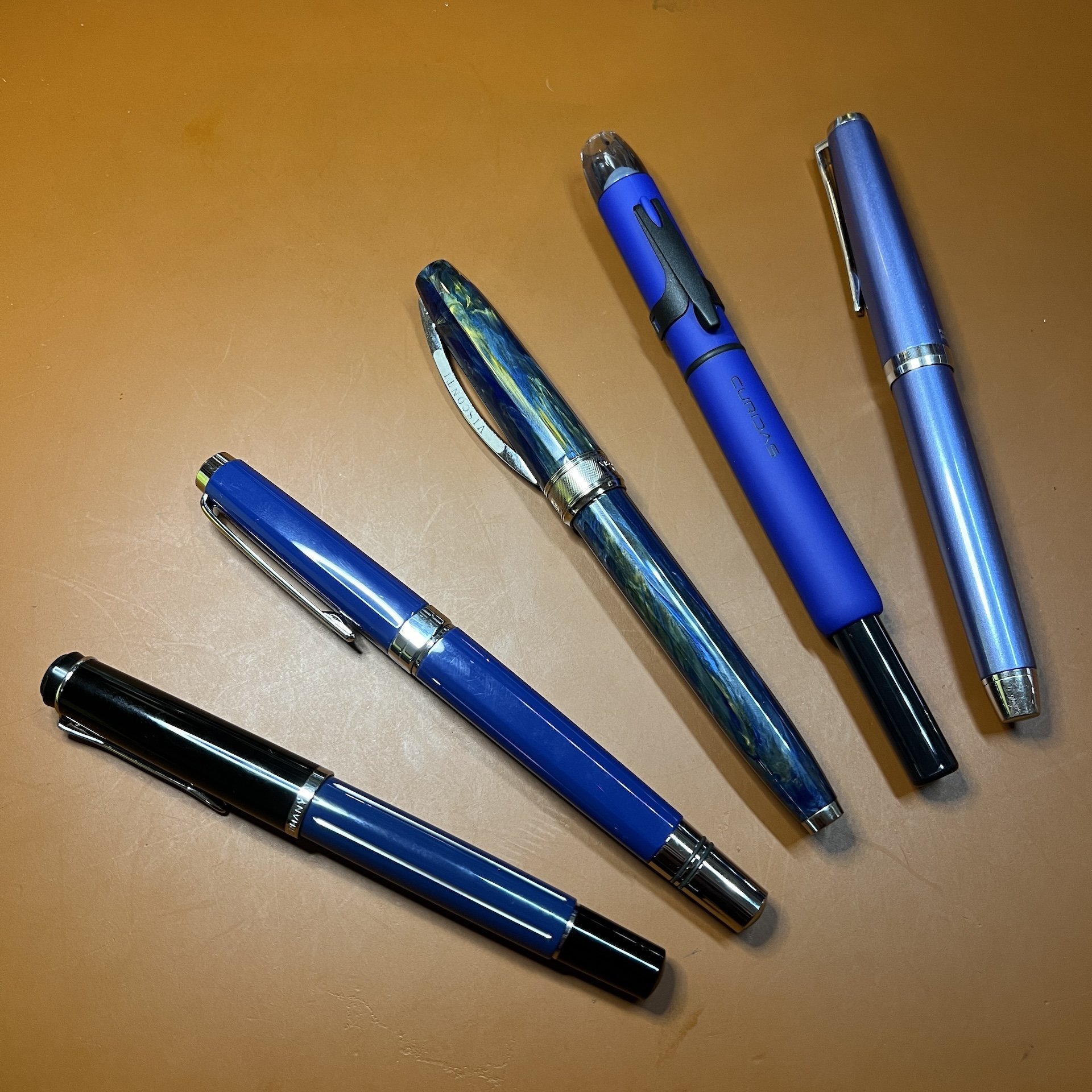
On the surface, there isn’t much that is similar among these pens, other than they all happen to be blue! (Bottom to top: Pelikan M215 Blue Stripe, TWSBI Classic Blue, Visconti Van Gogh, Platinum Curidas, Pilot Falcon/Elabo.)

Pelikan M215 Blue Stripe

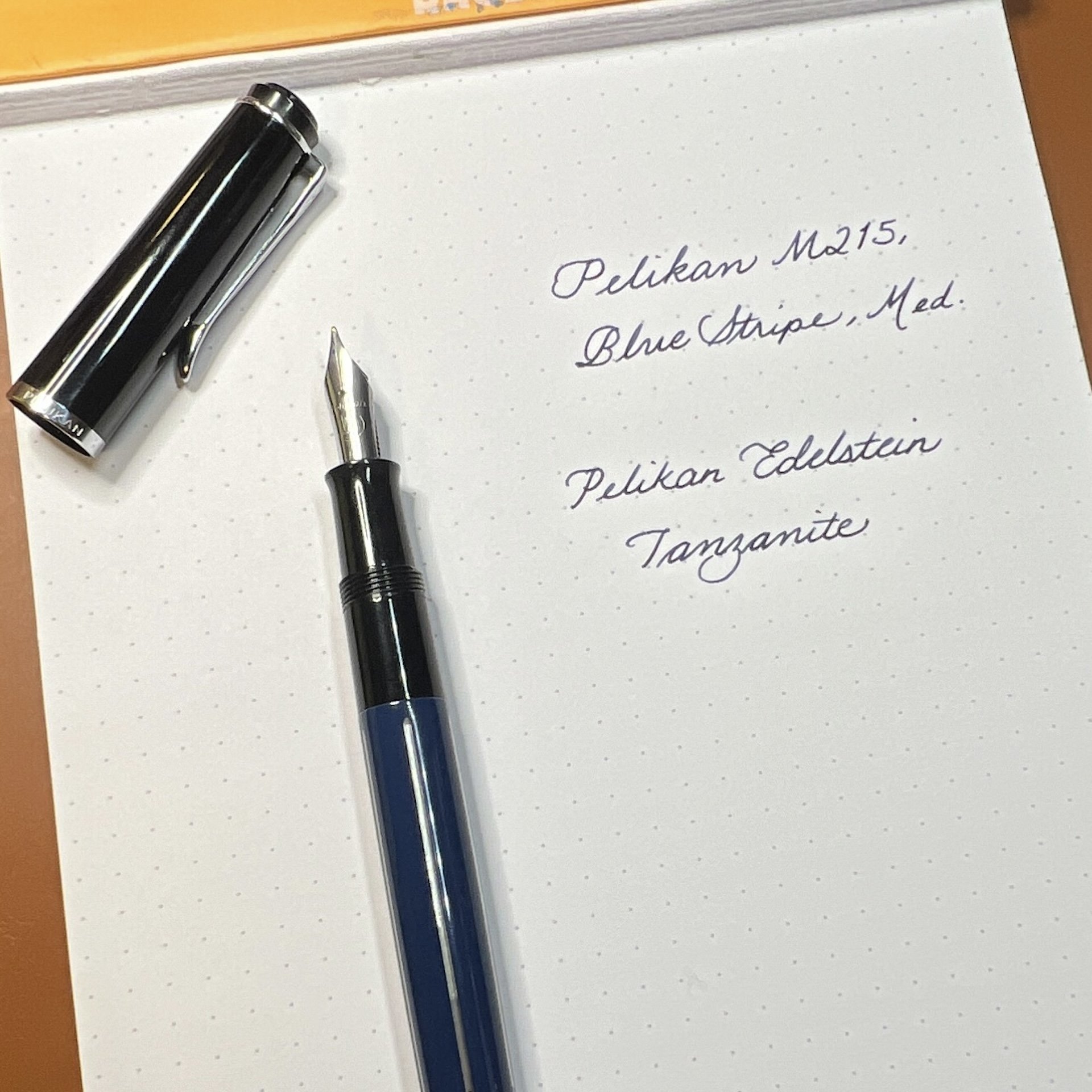
Hard to tell from this picture but there are silver colored stripes on the barrel of this pen.

  • Patience (and research), Grasshopper - I have wanted this pen for 3-4 years (maybe longer) and have seen it on eBay for very high/ambitious prices. And I am definitely not one for patience. But I also don’t want to overspend. Doing research ahead of time, including reaching out to folks who have better pulses on the Pelikan secondary market, made it easier for me to pounce on a listing that was finally in the right price range.
  • Inks & pen combinations matter - As I mentioned in recent ink reviews, inks behave differently in different pens (and also on different papers too). This M215 is currently inked up with Pelikan Edelstein Tanzanite, which is a lovely blue-black ink. Is it a shocker that this is a good matchup? No, not really, but I haven’t used this ink since I first tried it, gulp, way back in 2017, in a Lamy Safari. I absolutely hated the combination because it felt like writing with sand and I wondered if I should dump the ink out of the pen and get rid of the sample. What I didn’t know then, was that Lamy pens can be on the drier side and that Pelikan inks are also on the drier side (to compensate for their wetter nibs), so that combination was doomed from the start. What’s sad is that I was hesitant to try the ink again, even though I learned more about pens and inks since 2017. I’m glad I decided to try the ink in this pen, because it flows just perfectly from this pen, and it’s a great match colorwise, too. I’ve also since learned that it’s ok to empty out a pen if the ink just isn’t doing it for you. Life’s too short to write with a bad combination.

TWSBI Classic, Blue

  • Oldie but goodie - One of my first TWSBIs is the Classic, in Turquoise. I love the non-demonstrator look but I don’t really think about them as much because I usually want a demonstrator when I want to ink up a TWSBI. I needed to ink up a blue pen so I decided on the blue Classic. It had a Fine nib and even though Mediums are my usual jam, I just shrugged and inked it up anyway. Then I wrote with it and was shocked at how much I liked the Classic AND the fine nib. It is so easy to ink up the latest acquisitions and forget about the older pens (and inks). I try to balance that urge by having a mix of old and new pens in the “to-be-inked-next” tray. I do this with inks too. It’s like discovering a lost treasure.

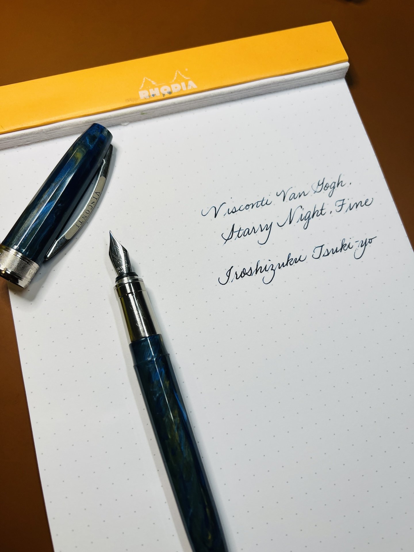
Visconti Van Gogh, Starry Night

  • It’s ok if looks are important - As a Van Gogh fan, and more specifically of Starry Night, I love this pen. Not because it is an amazing writer (I mean, it writes fine) but because looking at it makes me happy. It makes me think about my favorite piece of art and that makes me happy. People place different levels of importance on the nib vs the appearance and that’s one of the many wonderful things about this rabbit hole. My personal pen preference emphasizes looks over writing (probably 65:35 as long as the nib doesn’t write poorly). In the end, as long as you’re happy, whether it’s with the looks, the nib (or both), it’s a win in my book.
  • Oldie but goodie, this time with ink - I inked this up with an ink that I once loved but sorta put by the wayside (shame on me) - Iroshizuku Tsuki-yo. When everyone was raving about Shin-kai (cough cough, Bossman), I instead fell in love with Tsuki-yo. With all the deluge of inks that currently exist and continue to be released, it’s easy to get caught up in the latest “must-have ink”. I had forgotten how much I liked that ink and I’m glad I decided to use it again.

Platinum Curidas, Matte Blue

  • It is not a popularity contest - Not gonna lie, the Platinum Curidas is probably one of the more polarizing pens when it comes to looks, nock length, design, etc. And yet, I still love it. I have the original demonstrator finishes but I love this Matte Blue with black trim. The Medium steel nib gives me the perfect line width. Do I love it more than the Vanishing Points or Decimos? Probably not, but I still love it, even if it’s not for everyone, and that’s what matters.
  • Don’t judge an ink before using it - I bought a sample of Taccia Ukiyo-e Hiroshige-Ruri and after swatching it, I thought “yet another dark blue ink” and was glad that I hadn’t bought a bottle. After pairing it up with the Curidas though, I’m loving the richness of this blue ink, along with its subtle sheen that can even been seen on Rhodia, and am now adding it to my “bottles to buy” list. It’s another reminder that I shouldn’t judge an ink too quickly!

Pilot Falcon/Elabo, Metal Blue

  • They can’t all be winners - The Pilot Falcon (or Elabo in other markets) is a pen that has a fun, bouncy nib that can give some line variation, which I generally love, but there’s something about this one that isn’t doing it for me. I really like the plastic version of this pen with a Soft Fine nib, but I don’t think it’s the minimally- added weight. The Akkerman Delfts Blauw ink is flowing just fine so it’s not that. Maybe it’s the Soft Medium nib which feels blobby and almost squeaky. I really want to love it, but I don’t, so I think it’s better to part ways, than to have it stay in the collection untouched and unloved.
  • It’s hard saying goodbye - Despite everything I just wrote about the pen not being a good fit, it’s still really hard for me to decide to sell a pen. I just have to remember that someone else will enjoy it more than I do and that I can use the proceeds to get something else, like that bottle of Taccia Hiroshige-ruri :-)

None of these things are earth-shattering or new in any way, but I don’t usually have these revelations when I’m writing with my pens. So when they do pop up, it’s worth taking a moment to pay attention to what they’re trying to teach me.

Posted on November 17, 2023 and filed under Fountain Pens, Pilot, Pelikan, TWSBI, Visconti, Platinum.

Pilot Explorer Fountain Pen Review

(Jeff Abbott is a regular contributor at The Pen Addict. You can find more from Jeff online at Draft Evolution and Twitter.)

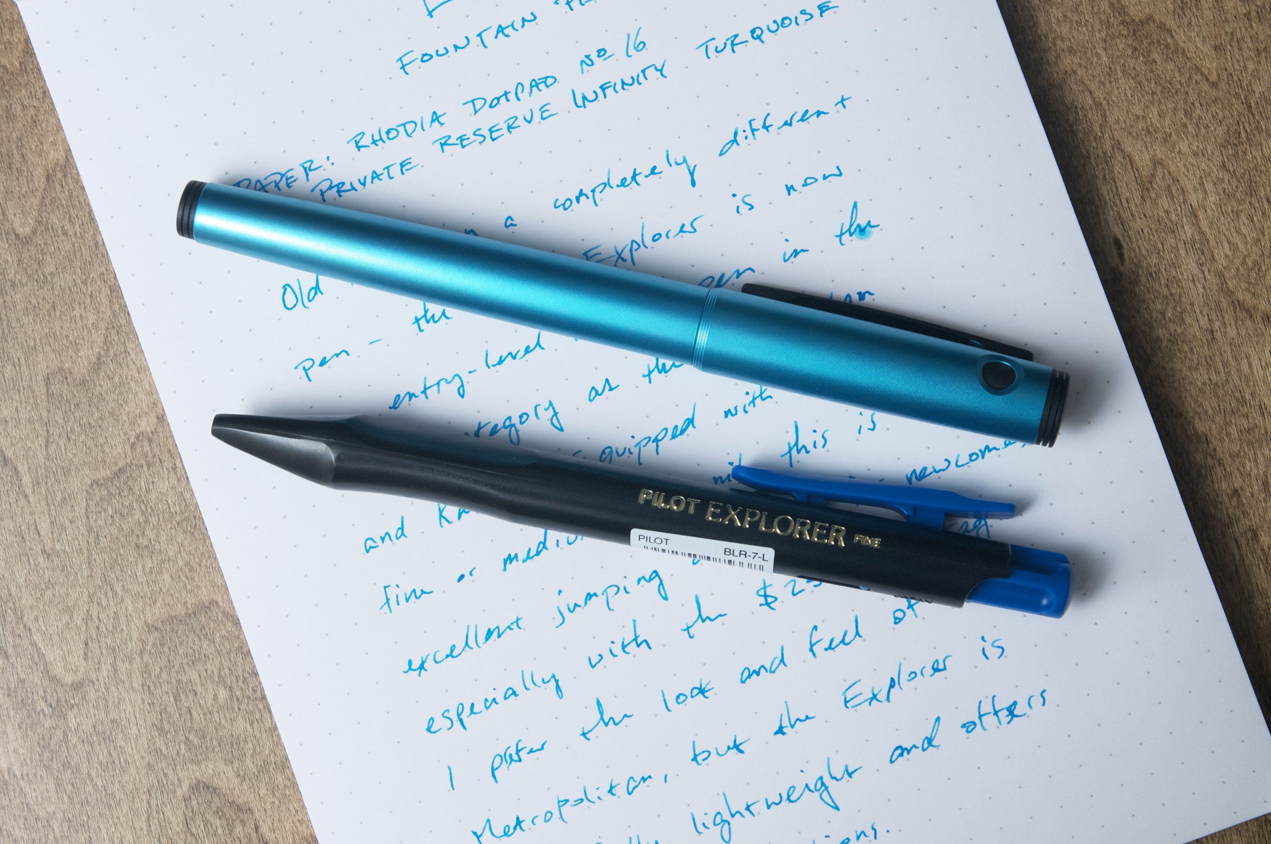
The Pilot Explorer fountain pen may have been around for close to five years now, but it still feels like a new release from Pilot. And even though it's been on the market for years now, I still automatically think of the OG Explorer when someone mentions "Pilot Explorer." In my mind, there's still only one Pilot Explorer, and it's a quirky, discontinued rollerball pen that is really hard to find nowadays. Because of this block in my brain, I compulsively refer to the fountain pen version as the "Pilot Explorer fountain pen" because my brain won't let me use the old name. If this is the kind of thing I have to look forward to as I continue becoming Old™, I guess bring it on? Or maybe be a little more creative with naming things? Either way, we're here to look at a fountain pen, and I'll leave my name judgments behind with this paragraph.

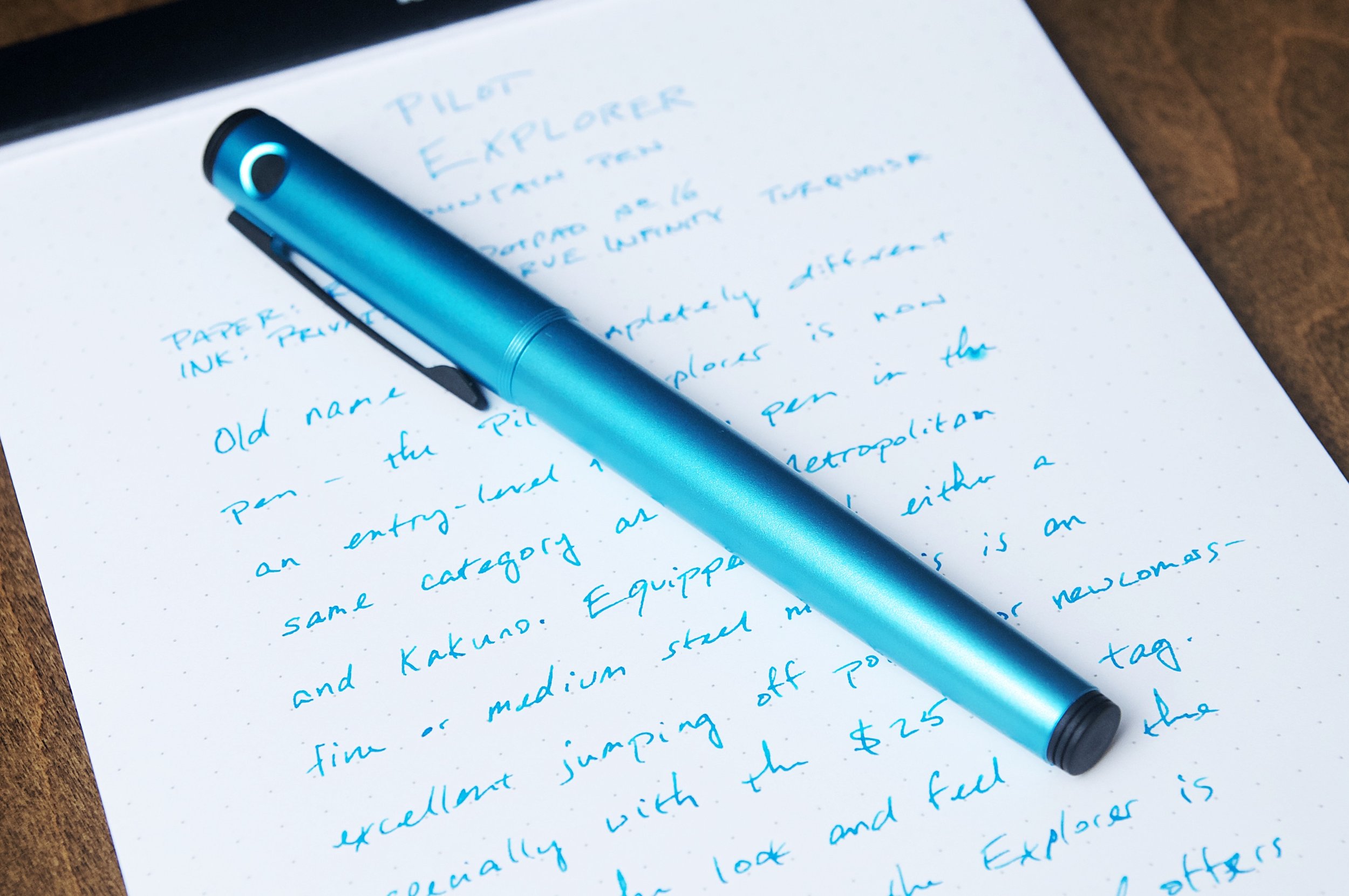
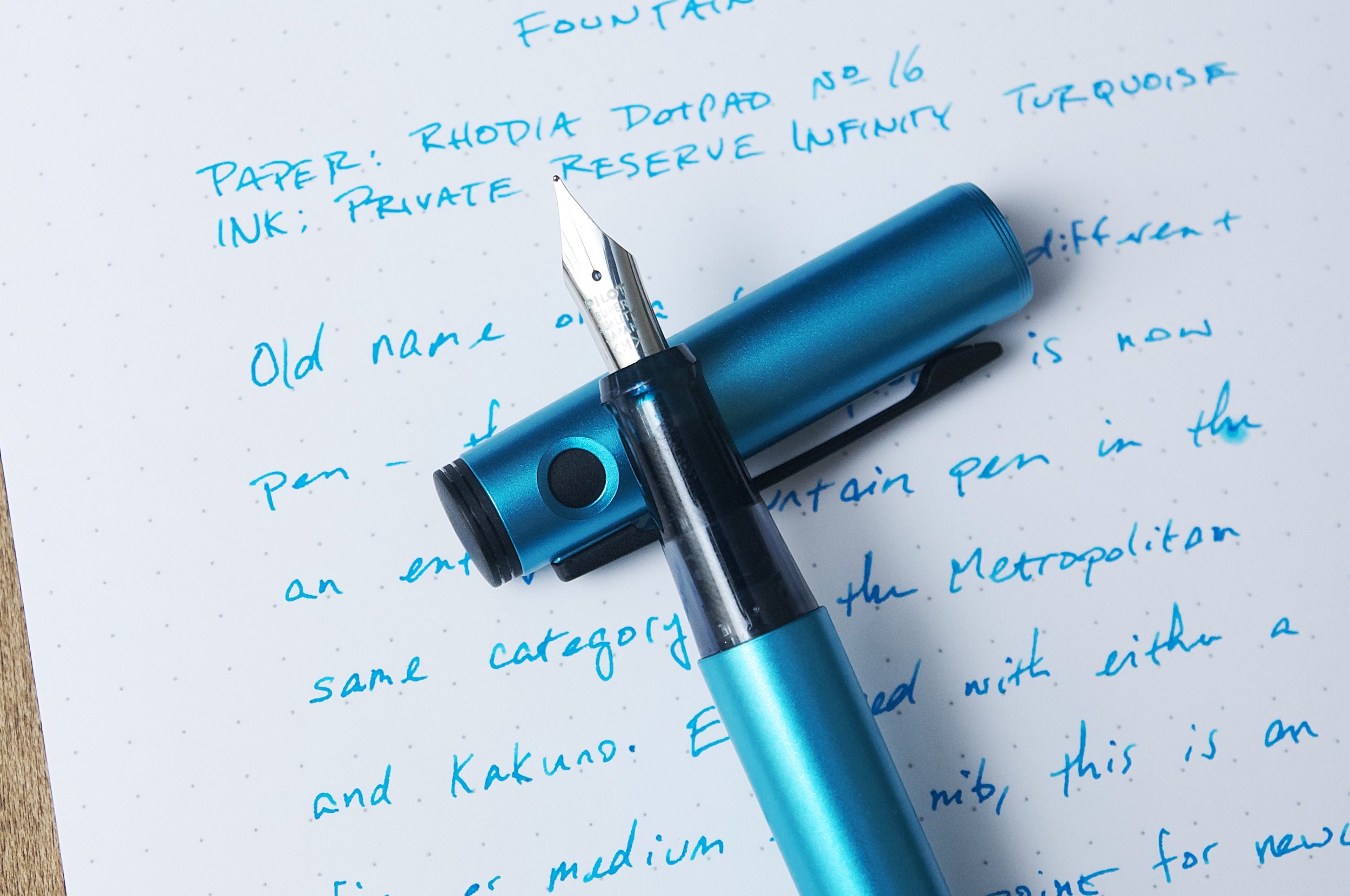
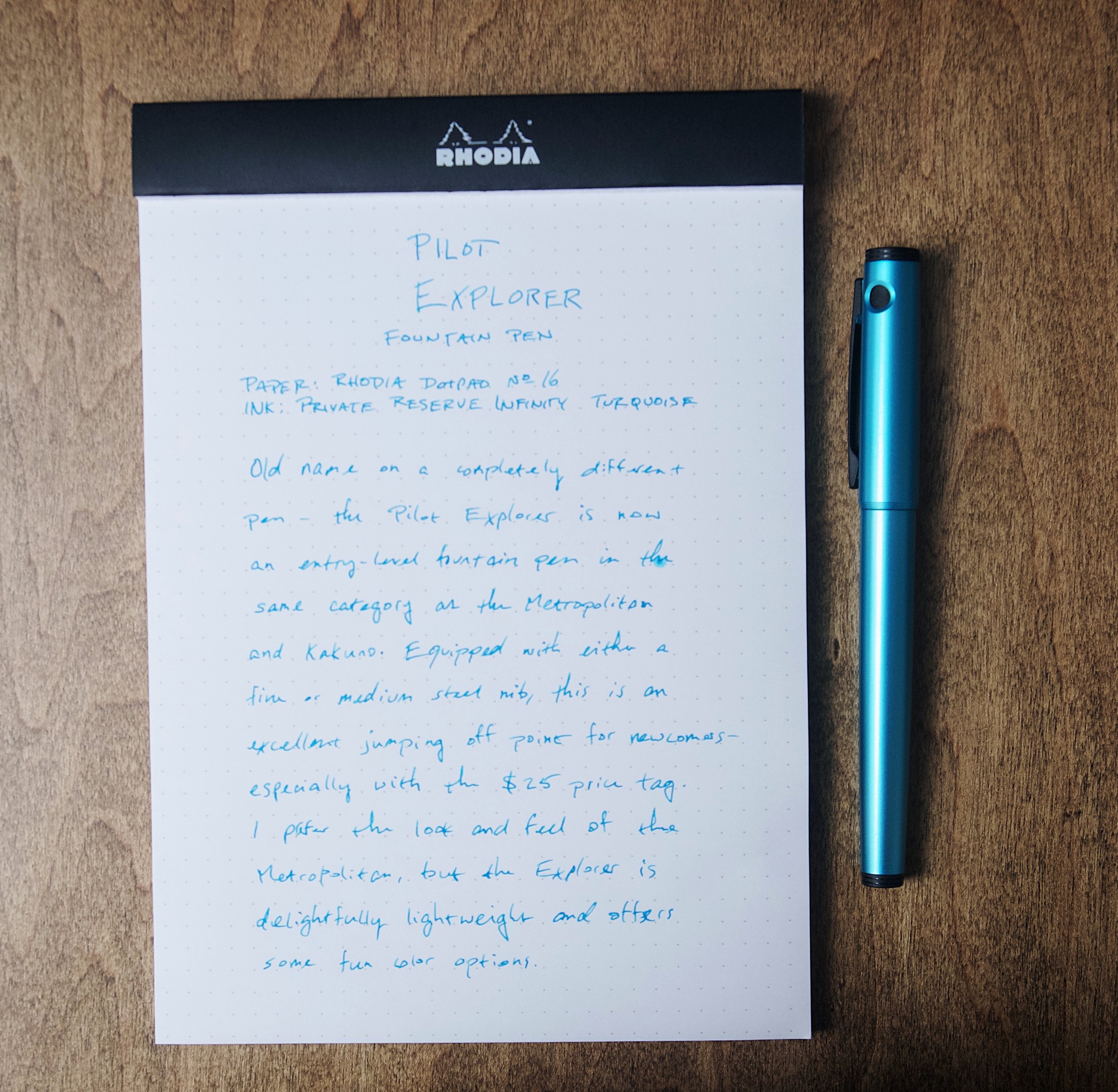
Kimberly actually looked at a similar variant of this pen back in March, so be sure to check that out for the demonstrator barrel and fine nib! The one I have the pleasure of using is from Vanness and it's the Turquoise colorway with a medium steel nib. I try to branch out from my preferences for turquoise and purple, but I also have a hard time saying no when turquoise or purple happen to be the only "interesting" color option for a product. That's what happened with the Explorer fountain pen, and I couldn't be happier with this finish color. The turquoise is delightful and has a little bit of metallic sparkle mixed in with the paint to give it a bit more visual interest. Pairing this up with a turquoise ink is a must (at least in my opinion). I chose Infinity Turquoise from Private Reserve because it was the easiest Turquoise for me to reach in my embarrassingly disorganized ink shelf, but I would have preferred using Pilot Iroshizuku ama-iro to satisfy the brand-on-brand OCD.

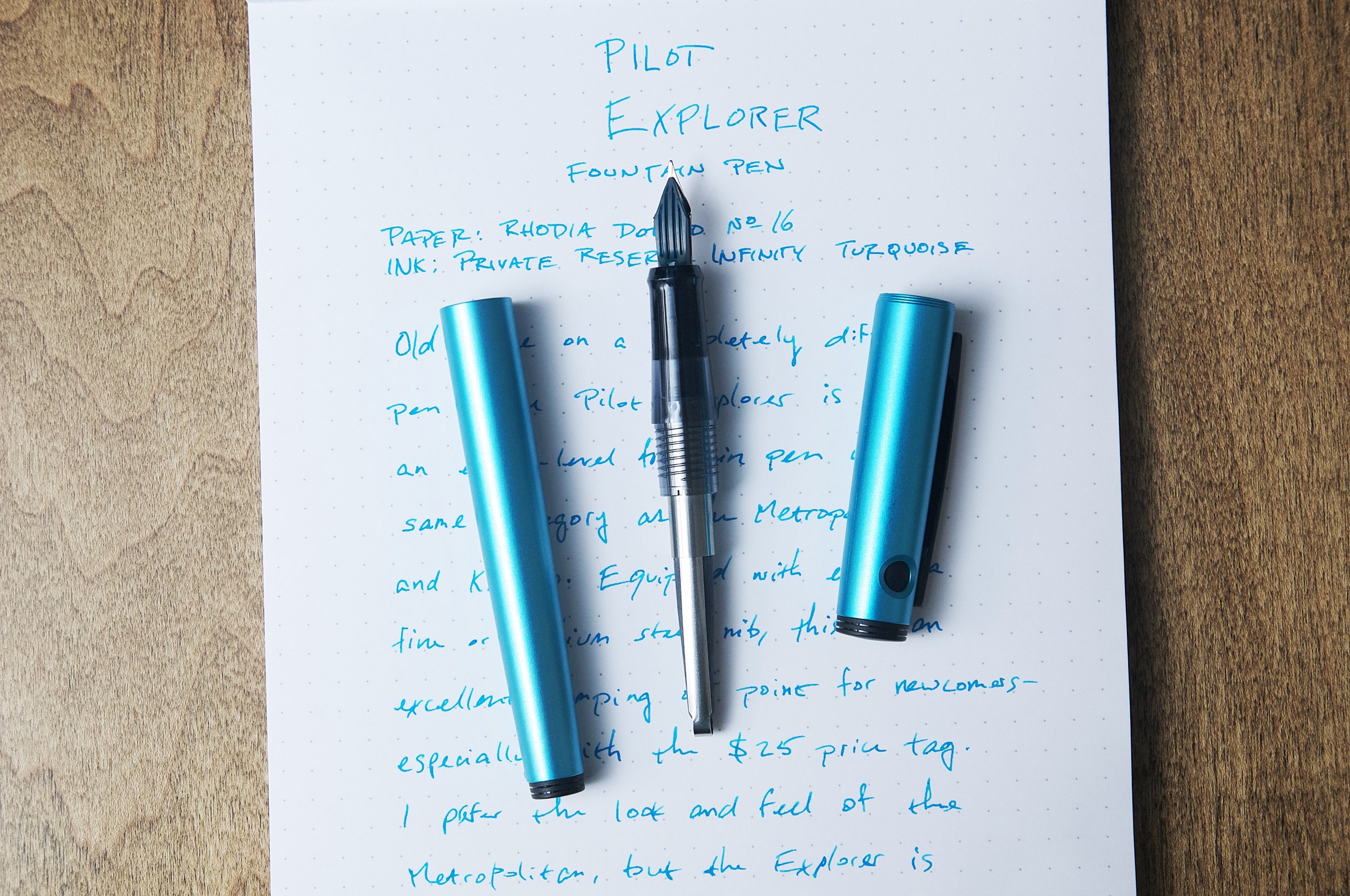
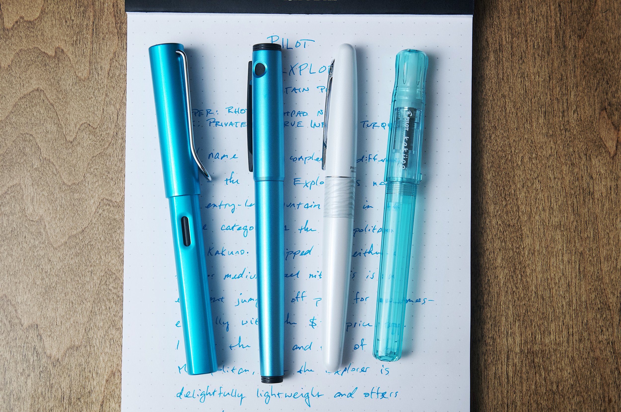
Moving on from the exterior color, there are few other details on the outside of the pen that make this a unique entry among Pilot's fountain pens. The matte black clip and finials provide a great contrast to the bright body color. There are a couple of black circle cutouts at the top of the cap, and I wish Pilot had skipped this part because it detracts from the overall look of the pen. There's also a large "Pilot" logo debossed along one side of the cap that also diminishes the overall feel of the pen. The Kakuno is the closest comparison for the Explorer fountain pen, and there aren't any large logos there, so I'm confused why Pilot chose to go all-in on the logo with this pen. The Metropolitan is also comparable in terms of price, and the only logo present on that pen is minuscule — there's a small Pilot stamped into the shoulder of the clip. Big differences!

Uncapping the pen is a smooth process. The cap snaps on/off from the grip section, which makes it easy to operate with one hand. The cap also posts securely on the back of the pen. There's a nice audible snap when putting the cap back on the pen so you know it's closed and ready to go.

The grip on this pen is similar to the Kakuno, but it's just a bit smaller in diameter. The translucent plastic is smooth, but still provides plenty of grip when using the pen.

Like the Kakuno, the Explorer fountain pen is entirely made of plastic, which makes it really lightweight. Contrast this to the Metropolitan, which is brass and aluminum, the writing experience is much different. I like using the Explorer fountain pen for longer writing sessions because it just disappears in my hand. I feel the same way about the Kakuno. I have no problem using the Metropolitan for extended periods, but I can definitely feel a difference in overall hand fatigue.

The steel nib on this pen is very similar to the Kakuno and Metropolitan. The medium size of this nib is a Japanese medium, which is close to a typical European fine. The nib is smooth and performs well out of the box — exactly what I've come to expect from Pilot, even on their lower-end pens.

The pen came with a squeeze cartridge converter (same one that is included with the Metropolitan), and also a black cartridge. At the price point, this is a nice inclusion. If it didn't come with a converter, I'd definitely add one to the order.

The Pilot Explorer fountain pen is a great entry-level option for new-comers, but also an excellent workhorse that can justify a place in any collection. The lightweight but durable material make it easy to use, and the price point is easy to accept at just $25. If the turquoise color isn't your thing, there are several other options as well. This makes a great first fountain pen for yourself or as a gift, but it's also a solid fountain pen to add to your collection. Just be aware that this isn't the first Pilot Explorer!

(Vanness Pens provided this product at no charge to The Pen Addict for review purposes.)


Enjoy reading The Pen Addict? Then consider becoming a member to receive additional weekly content, giveaways, and discounts in The Pen Addict shop. Plus, you support me and the site directly, for which I am very grateful.

Membership starts at just $5/month, with a discounted annual option available. To find out more about membership click here and join us!
Posted on October 25, 2023 and filed under Pilot, Explorer, Fountain Pens, Pen Reviews.