Posts filed under Sailor

Sailor Ink Studio 941 Review

Sailor Ink Studio fountain pen inks have been all the rage since the first pictures of the 100 inks in this collection hit the internet. The premise of this collection is to feature the 100 favorite inks from Sailor’s in-shop Ink Studio events, where customers were allowed to mix their own colors. According to Sailor, this final group was narrowed down from over 20,000 (!) creations.

Image via Sailor Japan.

And you think you have an ink problem?

I had been wanting to try out these inks myself, but aside from a few samples I had been given, I didn’t put in the effort to track them down. There was nothing I saw that felt must-have, but seeing that Sailor is my favorite ink brand, I knew I would dive in head first when the opportunity presented itself.

Opportunity to all in the US market came this summer, as these inks made their way into retailers hands. But there was a catch to ordering: You could not buy them online. Why the silly restriction? Your guess is as good as mine. So, you had to buy them in person at a shop or pen show, or call a retailer to place an order over the phone.

Fortunately, that restriction has been recently lifted, as you can now order Sailor Ink Studio inks online.

I bought mine in person on my recent visit to Dromgoole’s, where I went in with a list based on samples provided by Macchiato Man and Mountain of Ink, each of who swabbed all 100 colors. Pictures on a screen may never do inks justice, but I figured this was as good of a starting point as any.

My eyes trained on five colors:

450 - A dark/dusty purple.

731 - A hot pink with sheen.

767 - A yellowish green.

773 - A bright orange.

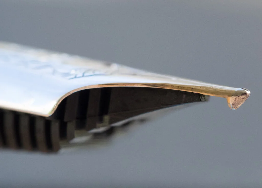
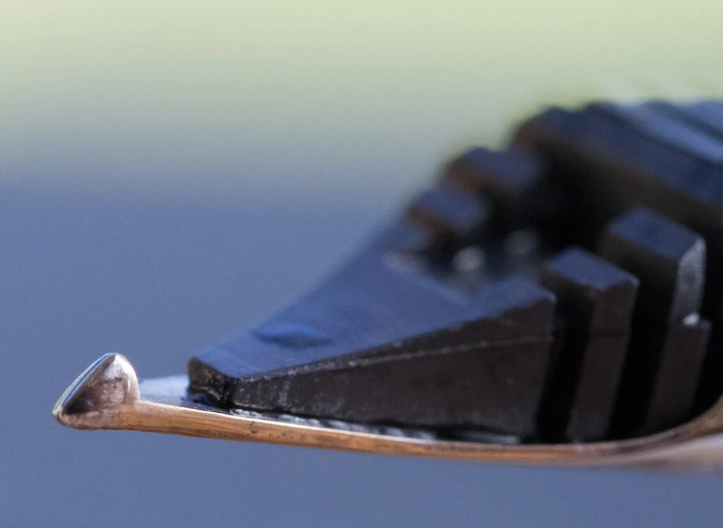
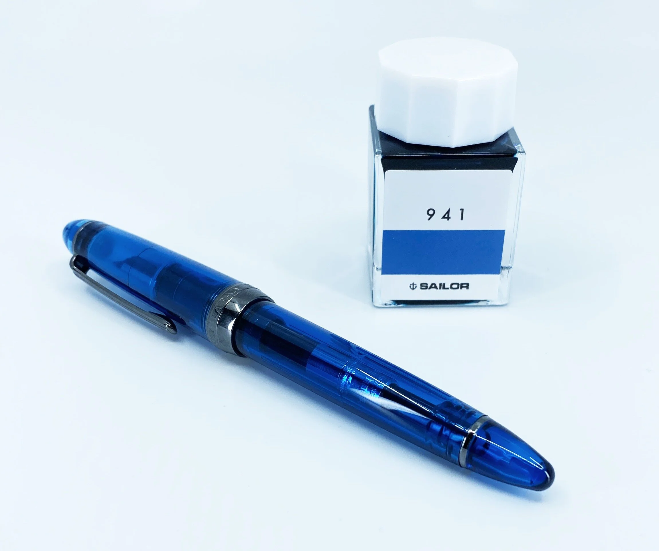
941 - A blue black with a slight teal undertone.

4 of the 5 came home with me, with 731 the only not available during my visit. All of these color choices are within my realm of likes, with no real outliers, like the hugely popular Sailor Ink Studio 123.

I plan on testing all of these inks out eventually, but 941 was the easy first choice. Not only is it part of one of my favorite color groups, it is a very close match to the Sailor 1911 4 a.m. fountain pen I purchased on the same trip. Matchy matchy!

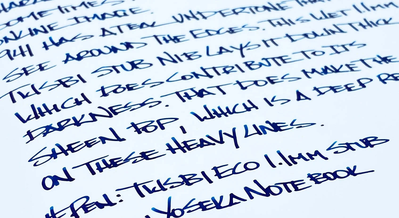
After a couple of weeks of use, I am very happy with the color and the performance. It’s a bit darker than I thought prior to seeing it in person, but not too dark to where you can’t tell the character of the ink. Lighter, brighter hues pop out on thinner lines, and it has a nice, dark red, sheen when dry. For a blue black ink, I find it quite fun.

Not that I would expect anything different, but standard Sailor ink properties apply, with good flow, lubrication, saturation, and a moderate dry time. They are also expensive, checking in at $18 for a 20 ml bottle. That may sound cheap, but it’s not, considering you can get 50 ml of the equally as great Pilot Iroshizuku for $20.

I went simple and straightforward with my initial choices, and while I am happy with them, I think next time I will experiment more and try some of the outlier inks that have made the Sailor Ink Studio lineup so popular.

(I bought this ink at a discount from Dromgoole's.)


Enjoy reading The Pen Addict? Then consider becoming a member to receive additional weekly content, giveaways, and discounts in The Pen Addict shop. Plus, you support me and the site directly, for which I am very grateful.

Membership starts at just $5/month, with a discounted annual option available. To find out more about membership click here and join us!

Posted on November 11, 2019 and filed under Sailor, Ink Reviews.

Happy Fountain Pen Day Sailor Pen Giveaway!

Fountain Pen Day is this Friday, November 1st, and to celebrate a little bit in advance, I have a great giveaway for you.

During my trip to Dromgoole’s last weekend, I picked up a Sailor 1911 Standard 4 a.m. Fountain Pen with a Zoom nib to give away this week. What better way to celebrate Fountain Pen Day than to give away a really cool one like this? Same rules apply as always, so read them below and enter away!

Posted on October 29, 2019 and filed under Sailor, Giveaways.

Sailor Pro Gear Classic Graphite Lighthouse with Zoom Architect Nib: A Review

(Susan M. Pigott is a fountain pen collector, pen and paperholic, photographer, and professor. You can find more from Susan on her blog Scribalishess.)

Long ago I owned a Pelikan M200 with a fine Architect nib (also known as a Hebrew/Arabic Nib). It was a lovely, delicate thing, ground by the great Richard Binder. But, when I originally ordered it I was young and naïve, new to fountain pens, and I didn’t realize that the fine nib would not give me the line variation I craved for Hebrew characters. I eventually sold the pen.

I’ve been itching to try a Sailor Zoom nib with an Architect grind, and I knew exactly which nibmeister I wanted to do it: John Mottishaw at nibs.com. Deciding on a Sailor pen for the nib was extremely hard (so many choices), but I eventually settled on the Sailor Pro Gear Classic Graphite Lighthouse. This surprised me a bit, because why would I want a “boring” gray pen when Sailor has so many bright, cheery colors? I don’t know. I liked the subtle color and the clear finials on both ends, and a more “sober” pen seemed somehow fitting for writing Hebrew.

Even though the Sailor Graphite Lighthouse is a North American exclusive, it comes in a basic Sailor box. The only thing differentiating it from a regular Sailor is a bookmark--woot?

The pen itself is a dark gray color with rhodium trim, which complements the color perfectly.

As stated earlier, the cap and barrel finials are clear, offering a special detail that makes the pen look unique. I just wish it lit up like a real lighthouse!

The Pro Gear Classic is a small to medium-sized pen--small if you don’t post it and medium if you do. It measures 5.1 inches/130mm capped, 4.5 inches/115mm uncapped, and 5.9 inches/150mm posted. It’s a light pen, weighing only 25 grams capped and 16 grams uncapped with the converter filled with ink. I usually like much larger pens, but for some reason I’ve gravitated towards Pro Gear Classics. I own several of them.

The real story with this pen is the nib. All Sailor nibs are gorgeous, with beautiful scroll work and the Sailor anchor inscribed above the gold content.

The Zoom nib is like an extra broad but with a triangular shape and lots of tipping. It’s the perfect choice for an Architect grind.

I asked John to make my Architect “forgiving,” so he smoothed it out more than a traditional Architect grind so I could use it to write cursive.

It’s absolutely perfect--smooth and juicy, but I can also get clean vertical and horizontal strokes for Hebrew and block letters.

Upside down the nib writes extra, extra fine. I’m unlikely to use the nib this way, but it’s a nice option if you want to write marginalia.

I inked the Graphite Lighthouse with Sailor Ink Studio 123, and the two pair together beautifully. I can write in my usual cursive style with this nib, and the pen simply floats over the paper.

I am absolutely thrilled with this pen and the Zoom/Architect nib. Even though the Pro Gear Classic Graphic Lighthouse is mostly sold out, you can, of course, order almost any Sailor with a Zoom nib from nibs.com and request an Architect grind. If you do block printing more than cursive, you’ll definitely want a classic Architect grind. But, if you’re like me and want an Architect that allows you to do cursive as well, just ask John for a more forgiving nib, and he will send you the perfect grind.

(I purchased the Sailor Pro Gear Graphite Lighthouse with my own funds.)


Enjoy reading The Pen Addict? Then consider becoming a member to receive additional weekly content, giveaways, and discounts in The Pen Addict shop. Plus, you support me and the site directly, for which I am very grateful.

Membership starts at just $5/month, with a discounted annual option available. To find out more about membership click here and join us!

Posted on October 4, 2019 and filed under Sailor, Fountain Pens, Architect Nib, Pen Reviews.