Posts filed under Sailor

Sailor x Nagasawa Kobe Affection Kyomachi Legend Blue - A Tale in 3 Acts

(Kimberly (she/her) took the express train down the fountain pen/stationery rabbit hole and doesn't want to be rescued. She can be found on Instagram @allthehobbies because there really are many, many hobbies!.)

I first saw the Sailor x Nagasawa Kobe Affection Kyomachi Legend Blue pens (phew, say THAT 3 times fast!) at the DC Pen Show a few months back. It is a beautiful blue pen with gold sparkles, but I’m on #teamflattops, so I was good and passed on them. Wallet saved! Then I saw them a few weeks later at the SF Pen Show and reminded myself that I already have a 1911 and that I didn’t need any more because, you know, #teamflattops. And since Nagasawa wasn’t attending any other US pen shows after SF, I and my wallet were safe. Or so I thought. I found out that Nagasawa partnered with Vanness Pens after the SF Pen Show to sell their products in the US. which meant that I saw the pens again at the Dallas Pen Show. And Joe Crace, The Gentleman Stationer kept posting pictures of the pens all weekend and tempting me with these beauties. Darn it, Joe! I couldn’t decide between the 1911S and the 1911L, but Lisa Vanness was kind enough to loan all 3 of them for a comparison review to help me decide.

Act I - Background & Introduction to the Characters

Nagasawa is a retail stationery company with several shops located primarily in Kobe, Japan. They are most known for the pen collaborations with brands like Platinum and Sailor, as well as their line of Kobe inks which are made by Sailor. There are stories behind the names of their pens and inks like “Koikawa Ipe” (their exclusive Decimo), which is named for Brazil’s national tree that was planted along the Koi River or “Tarumi Apricot” (Kobe ink #25), which is the color of the sunset when viewed from nearby Tarumi’s hills. And this pen is no exception. It is the first in the “Kobe Affection” series and is called “Kyomachi Legend Blue”, named for the Kyomachi area where the Kobe City Museum is located.

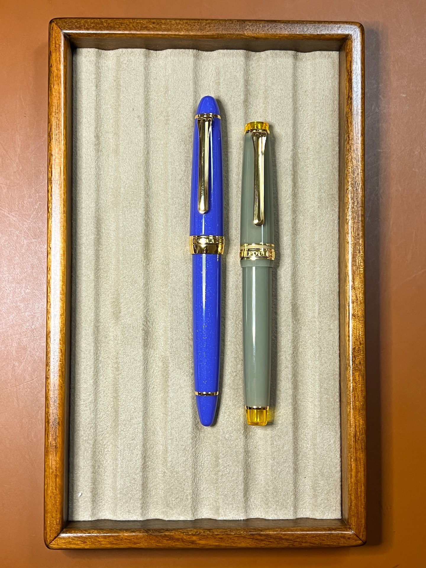
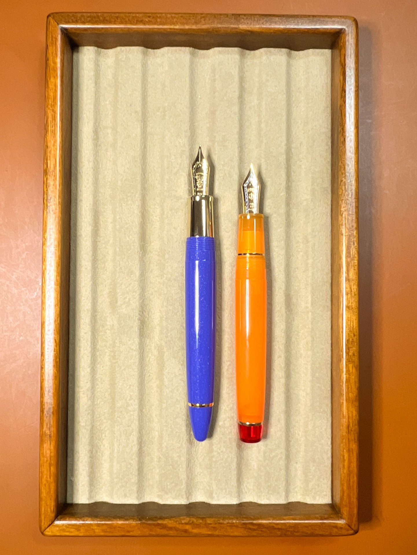
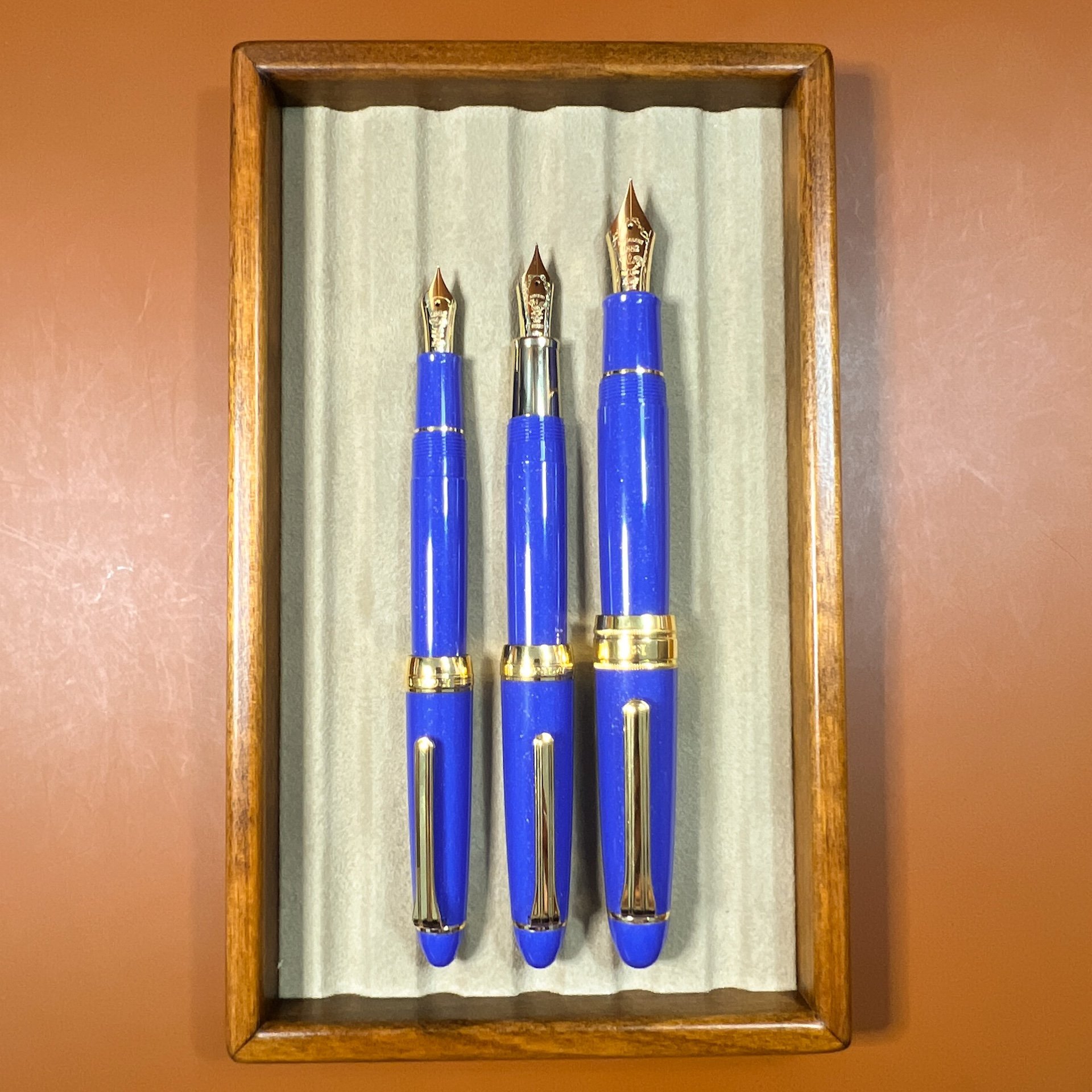
There are 3 models of the Kyomachi Legend Blue pens: Medium (what is more commonly referred to as 1911S), FL (aka 1911L), and Large (aka King of Pen or KOP). All 3 pens are slightly pointy, cigar-shaped pens, as opposed to their flat top Pro Gear counterparts. As there are already many articles out there on the various Sailor models, sizes and nibs, I will instead focus on this particular release. Since the pens are on loan, I won’t be inking them up and will only use them for comparison purposes.

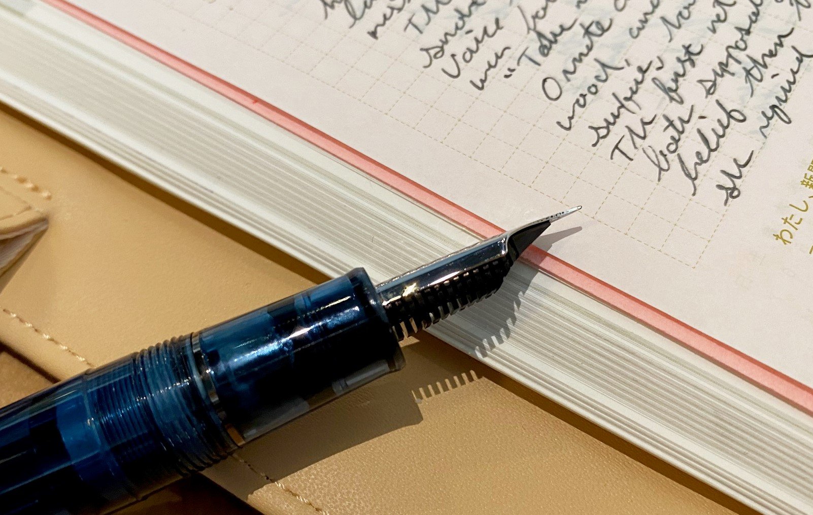
The Kyomachi Legend Blue is a beautiful blue pen that leans a bit towards periwinkle without being purple and has subtle, gold shimmer interspersed throughout. The pen has gold trim, including the cap band which has the Nagasawa name and “Pen Style Den” debossed around it. As with other Nagasawa exclusives, the weathervane is also engraved on these nibs.

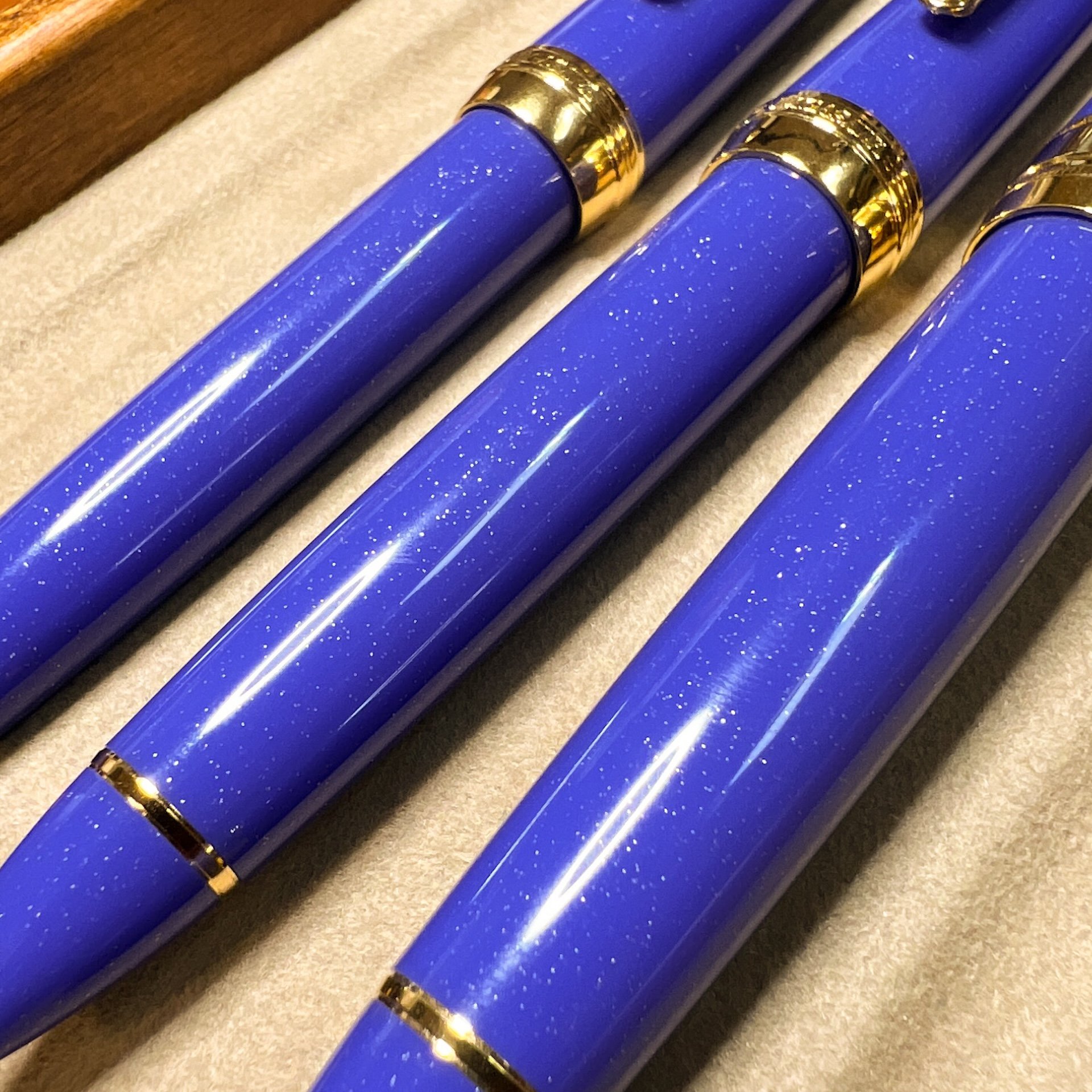
I love this beautiful (and difficult to photograph) material!
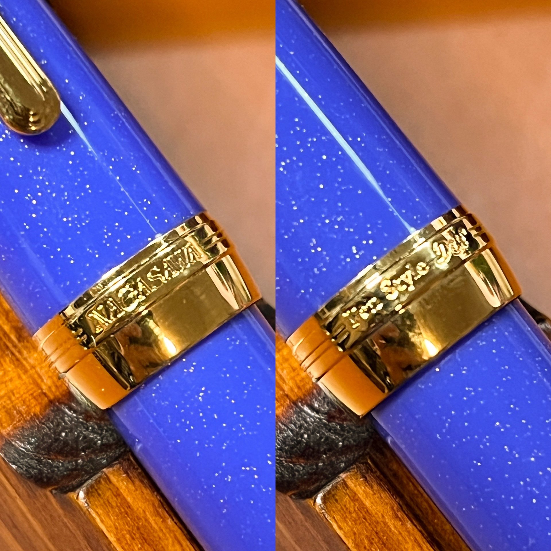
Nagasawa cap band.

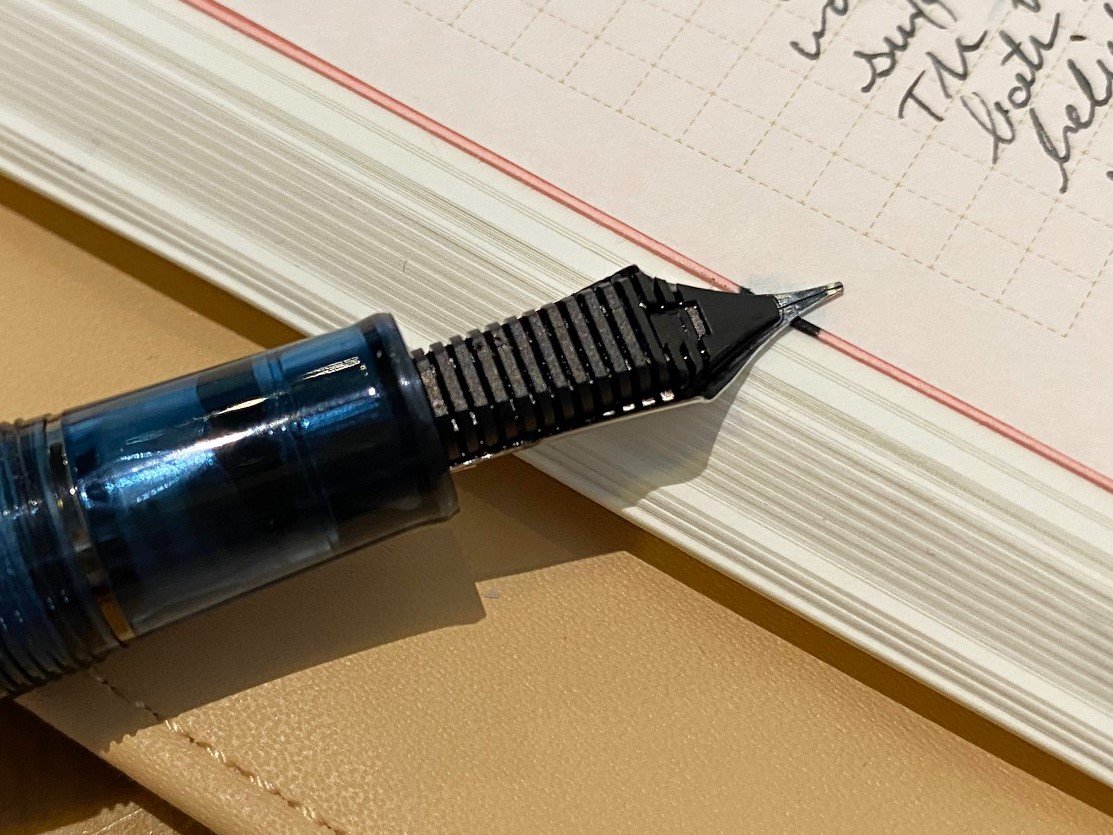
Kobe Weathervane on the nibs of the Kyomachi Legend Blue as well as the Platinum 3776 Apricot exclusive and Sailor PG Kounan Maroon exclusive.

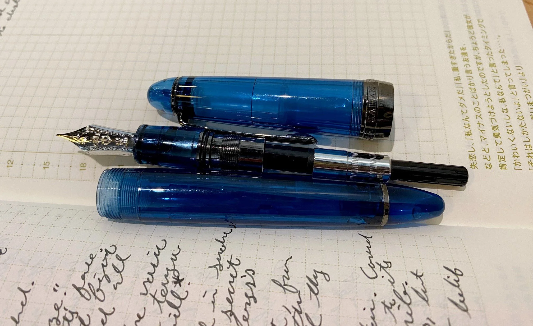
As with other Sailors, the Kyomachi Legend Blue 1911S has a 14kt gold nib (EF, F, MF, M, B, and Zoom); the 1911L (EF, F, MF, M, B, and Zoom) and KOP (M and B) both have 21kt gold nibs.

Act II - Main Story

The Kyomachi Legend Blue 1911S is a fairly slim and compact pen, though not as short as its Pro Gear Slim sibling, due to its pointed ends, which gives it a bit more length.

1911S and the Pro Gear Slim, Nuts.

The length difference is most noticeable when uncapped and unposted.

Caps were gently and barely posted. Length is much closer when posted.

1911S (top is just barely longer in hand – I didn’t notice the difference.

The 1911L is a bit longer and girthier than the 1911S and likewise, is longer than the Pro Gear due to the ends. Note that the 1911L Kyomachi Blue has a smooth, metal grip section which has a ledge at the nib end to prevent your fingers from slipping. I’m not sure why they chose to put the metal section on the 1911L but not the other two. I did not write with it, since it is a loaner, but it felt comfortable in hand. I don’t usually have issues with metal grip sections though.

1911L and the Pro Gear, Tequila Sunrise.

The KOP is the largest of the three and has the same grip section material like the 1911S. True to its name, the King of Pen is not a small pen. Aside from the pen being longer and girthier, the nib is also significantly bigger (longer and wider) than the others, where the difference is less noticeable. As such, folks like me who have steeper writing angles or smaller hands aren’t able to comfortably use the KOP (I’m also unable to use pens that have Bock 8, Pilot 30 or 50 nibs, etc. for the same reason). They only made 100 of these in the KOP size - the nibs are engraved with the number.

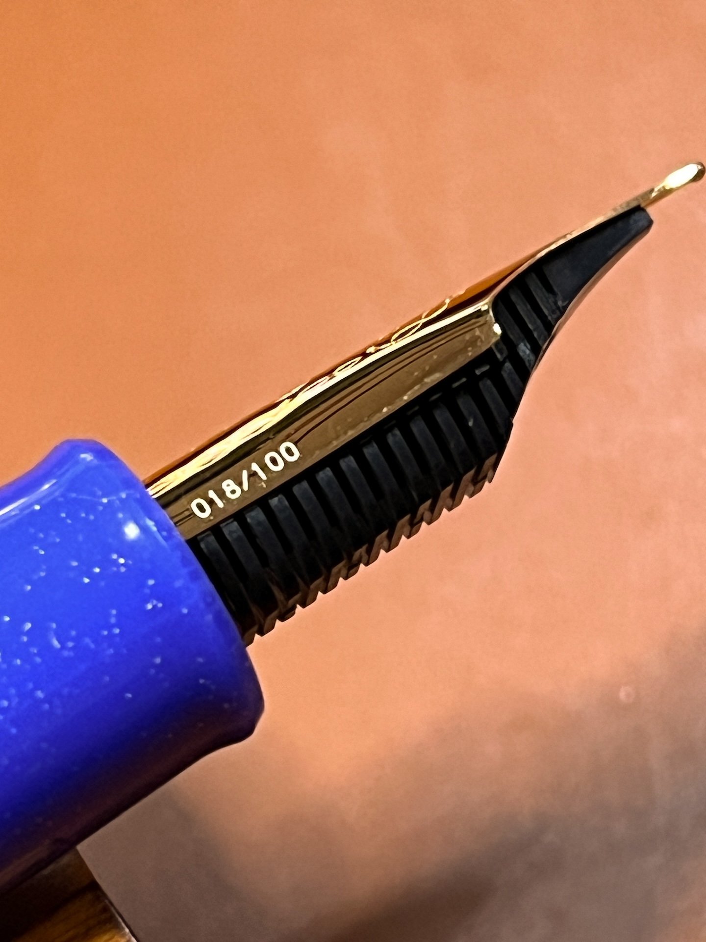
You can see that this is number 018/100.

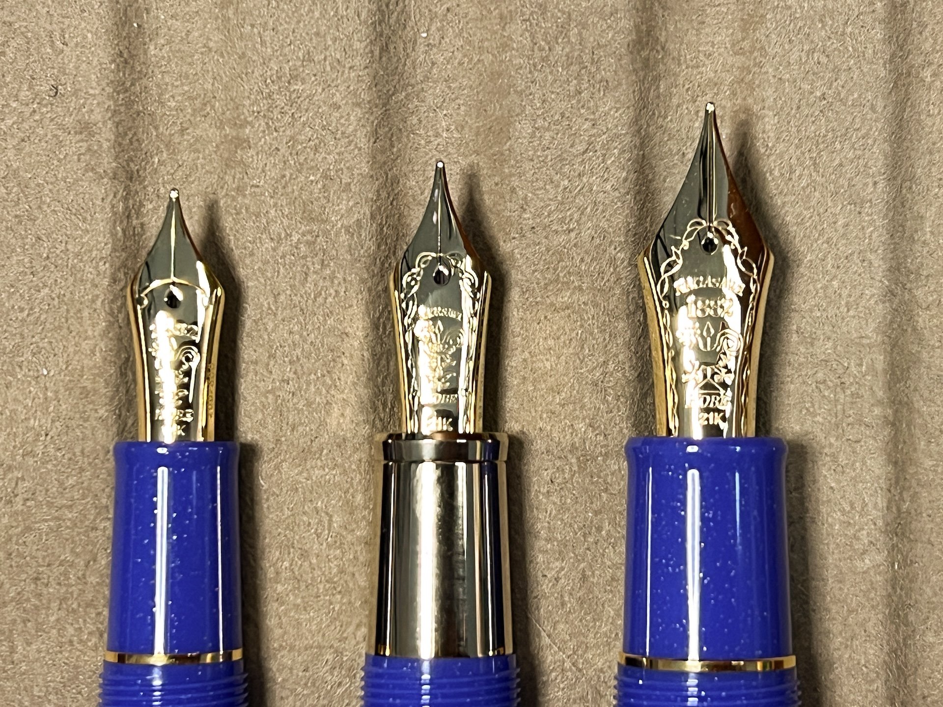
1911S, 1911L and KOP nib sizes - the KOP nib is significantly bigger/longer/wider than the other two.

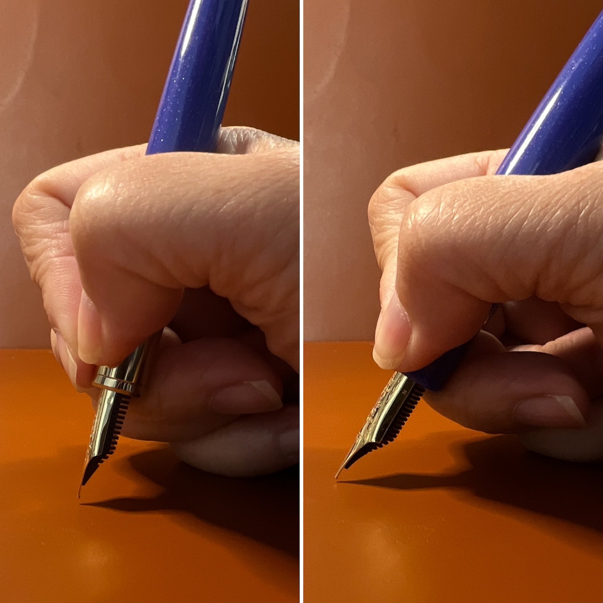
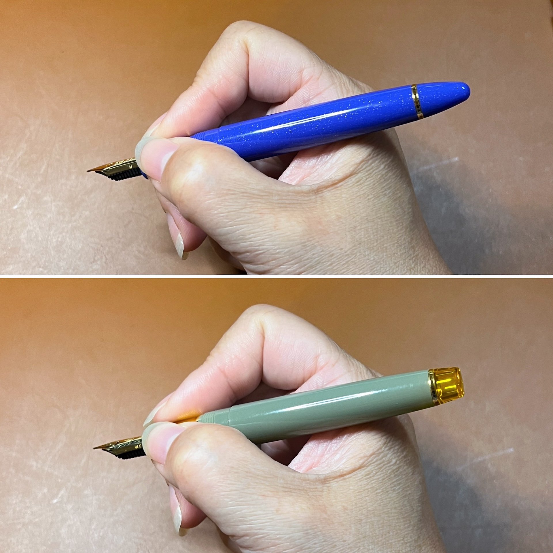
Left: This is my natural, steep writing angle with the 1911L. Right: Because I like to hold my pens close to the nib and also because of my not-big-enough-for-KOP-hands, I have to write at a lower angle in order for the longer nib to touch the paper. This feels very uncomfortable to me so thankfully the KOP is not a pen I can use/buy.

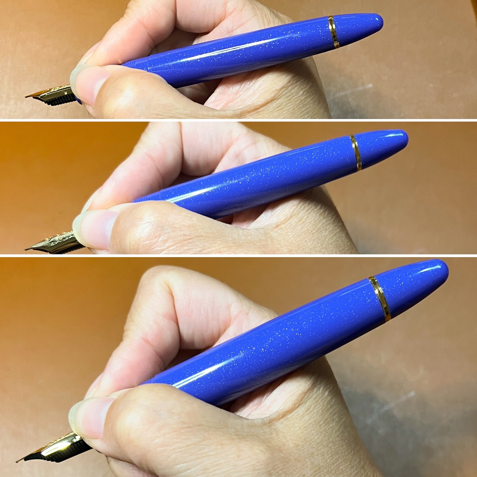
How each pen looks in my hand.

Here is the KOP next to similarly sized pens: Pelikan M800, Aurora 88, Visconti Homo Sapiens, Visconti Opera Master, Leonardo Momento Zero Grande, Pilot Custom 823, Montblanc 146, Platinum President.

Act III - Ending

While I liked how the metal grip section looked on the 1911L, it being a touch too pointy for me made it easier to pass. Maybe if the ends were more rounded, like on the Platinum 3776 or Pilot Custom 74, I would have considered springing for the 1911L. I did have to reach out to Lisa Vanness to get the 1911S because I just couldn’t resist this gorgeous blue pen. (I was good and sold the 1911S that I had so I could justify getting this one instead!)

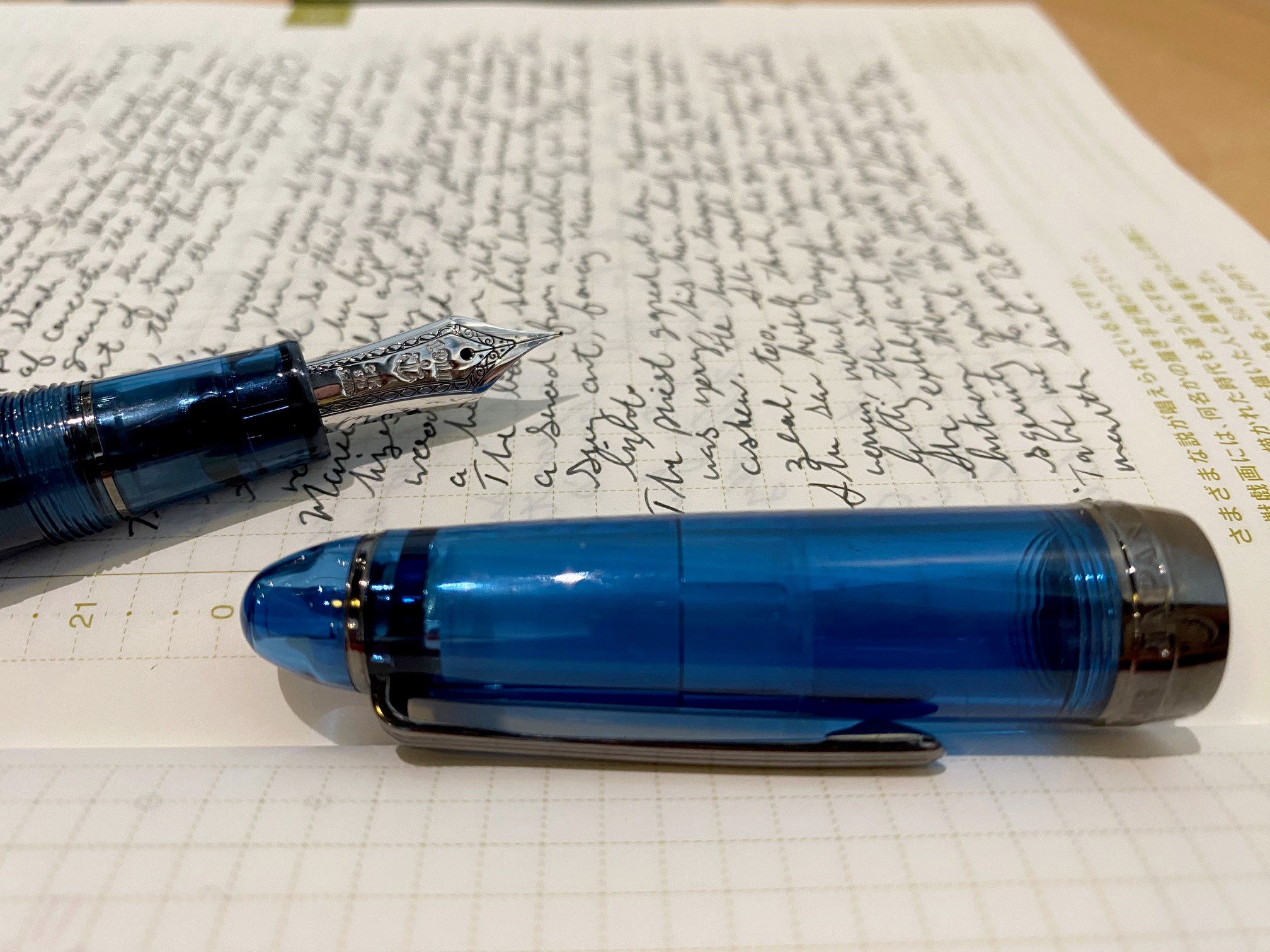
I picked Kobe #50 Kyomachi Legend Blue for the first inking due to the name. The ink was created before the pen, so it’s not the most perfect match colorwise, but it’s close enough. I think that next time I will pick Diamine Blue Flame which matches the pen color better as well as the gold shimmer in the barrel.

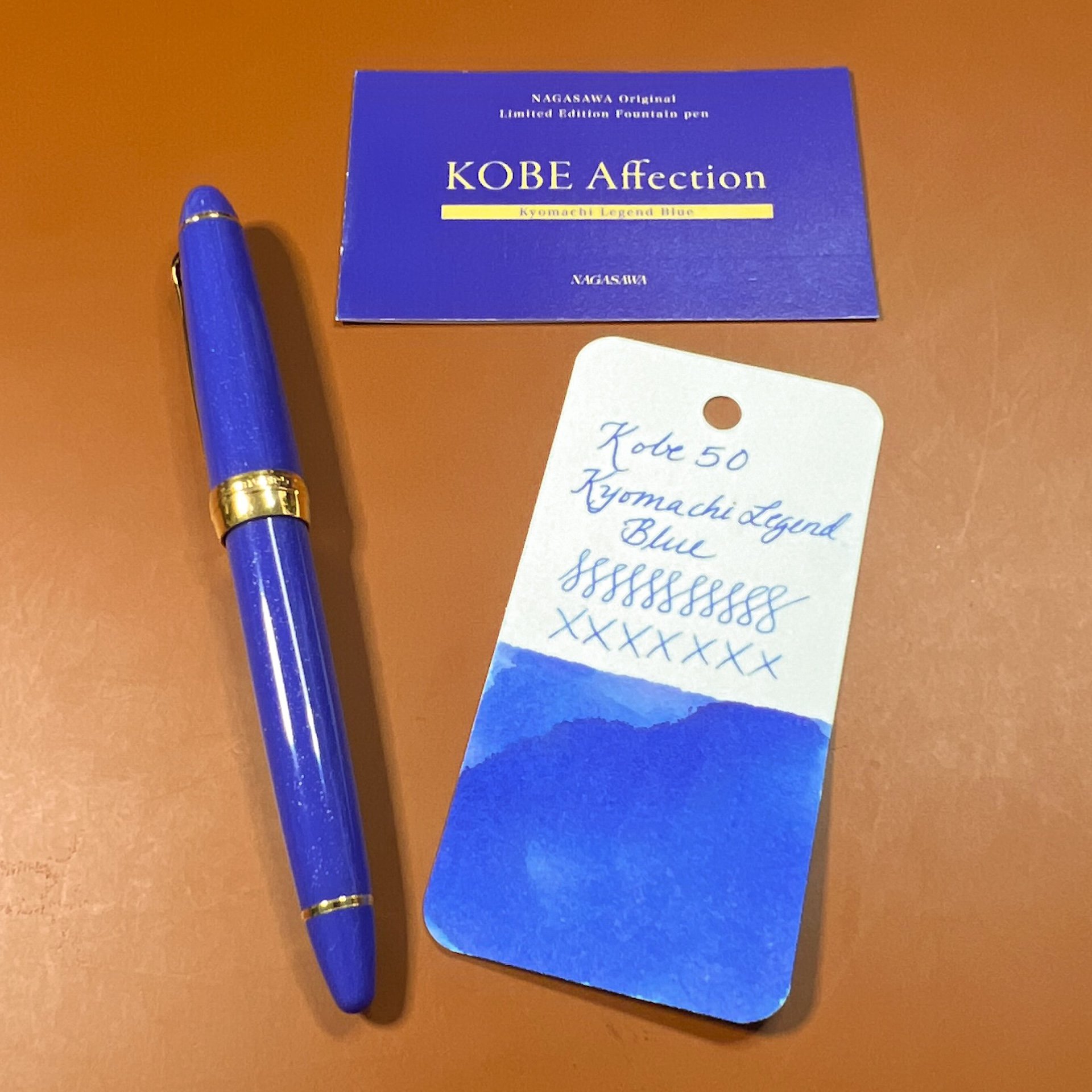
Sailor x Nagasawa Kyomachi Legend Blue 1911S and Kobe #50 Kyomachi Legend Blue.

All 3 pens, as well as the Kobe ink of the same name, are available for purchase at the Vanness Pens website. The 1911S sells for $300, the 1911L for $450 and the KOP for $880. Thank you to Vanness Pens for loaning the 3 pens for review and for letting me purchase the 1911S. 🙂

(Disclaimer: All pens were loaned to me for review, and I ended up purchasing the 1911S from Vanness Pens at a discount.)

Posted on December 15, 2023 and filed under Sailor, Fountain Pens, Pen Reviews.

Sailor Yurameku Zare Gokoro Ink Review

(Jeff Abbott is a regular contributor at The Pen Addict. You can find more from Jeff online at Draft Evolution and Twitter.)

The latest ink that I've been using in a couple of my pens is a dark brown ink from Sailor's Yurameku line called Zare Gokoro. This particular ink looks almost black when wet, but dries to a lighter shade that has some brown-black to dark brown hues that show through.

There are several Sailor inks in my collection, so I'm always excited to try something new from this Japanese brand. Zare Gokoro looks exciting due to the marketing copy that claims this "mysterious" ink changes color as it dries. How can you pass that up? I already have some inks in my collection that do this, but they're most iron gall inks. In this case, Zare Gokoro is a water-based dye ink. How does it stack up against the iron gall alternatives?

Like all Sailor inks I've used, this ink flows well, doesn't feather or bleed, and is incredibly consistent and easy to use. It's an incredibly slow ink to dry, though. In my tests, it takes at least 30 seconds to dry to the point where it doesn't easily smudge. For areas where more ink has pulled up in the valley of a direction change from the nib, it can take up to a minute to dry. This is a really slow drying ink.

I was really curious to see how the ink color changed as it dried, so that was the first thing I was focused on after inking up the pen. Sure enough, writing with the ink lays down a dark line that looks black to my eyes. I wouldn't even call it black-brown because I can't discern any brown while this ink is wet. Magically, the ink color lightens as the ink dries, revealing a dark brown with mild shading. In some areas, you can even detect some dark red or rust color. It's really fun to watch this transition happen as the ink slowly dries.

Since this is an ordinary water-based ink, it doesn't fare well when introduced to water. It doesn't wash away, but just a little bit of water rinses away the darkness of the ink and leaves behind a de-saturated blue color instead. You would be able to read what was on the page as long as the paper survived, but it might be difficult in some areas.

Overall, I was expecting more out of this ink. The color changing behavior was interesting since most inks get a little darker as the dry, not lighter. Iron gall inks also get a bit lighter as they dry, which is something I've always liked about them. It was one of their unique qualities aside from their water resistance. The super long dry time, lack of much shading, and the price all put me off this ink.

At $20 for a 20ml bottle, you're paying a premium for the Sailor name, and I don't think the price justifies the ink performance in this case. There are so many other interesting and well-performing inks on the market, so it's easy to point in almost any other direction here.

(JetPens provided this product at no charge to The Pen Addict for review purposes.)


Enjoy reading The Pen Addict? Then consider becoming a member to receive additional weekly content, giveaways, and discounts in The Pen Addict shop. Plus, you support me and the site directly, for which I am very grateful.

Membership starts at just $5/month, with a discounted annual option available. To find out more about membership click here and join us!

Posted on July 19, 2023 and filed under Sailor, Ink Reviews.

Sailor 1911L 4am Fountain Pen Review

(Sarah Read is an author, editor, yarn artist, and pen/paper/ink addict. You can find more about her at her website and on Twitter. And check out her latest book, Out of Water, now available where books are sold!)

Pen shows are a great place to try out the pens you have resisted buying for years, because it's so much easier to resist things online. And by "great" of course I mean dangerous, because it's so much harder to resist things in person. Especially when Brad says, "Hey, you were looking for one of these, right?"

In any case, I left the Chicago Pen Show with a Sailor 1911L 4am, and I'm very glad I did. As a habitual night owl who frequently greets the hour of 4am with pen in hand, that cool, blue glow of pre-dawn is like an old friend. The resin material of this pen matches that tone perfectly, and the gunmetal grey accents look elegant and moody. It's a gorgeous pen, and I coveted it when it was first released. I hesitated, though, because it was a limited edition and pricier than a standard Sailor, and I already have a number of lovely Sailors, and I didn't NEED it, and and and, etc. There was always an excuse. And then Sailor raised their prices, and even though this pen remained at the pre-rise price, I was feeling grumbly about the brand in general. So I kept resisting. Until Brad texted me at the Chicago Pen Show.

Brandon, of Rocky Top Pen Co., had a 4am at his table. It was used, but it also had a MF cursive italic nib grind by John Mottishaw, and he was selling it for $275--$37 under the retail price for a 1911L. While the pen is still available at many retailers in the smaller version for $220, that nib was calling to me. It's practically my favorite grind, and I don't own any other Mottishaw nibs. And that pen was right in front of me, then it was in my hand, then I put it down and walked away, and then I walked right back. Let's just call that the Pen Show Tango.

The pen has a 21k gold nib, and the CI grind on this MF nib is crisp and perfect. It shows just the right amount of character in the lines it creates, while still being both very fine and maintaining good flow. This nib is easily in my top three nibs that I own, maybe even the top one--though I'd need a Platinum showdown to confirm that. In any case, it's almost too good to write with, not because I'm afraid to use it, but because it's difficult to think about what I'm writing when I can't stop swooning over HOW I'm writing. That hasn't stopped me from using it every day since I bought it, though.

Perhaps this is more a review of the nib than the pen, as Sailor hardly needs my voice added to its chorus of praises, or maybe it's a review of the pen show experience, where you can find rare treasures and irresistible deals. But I wouldn't hesitate to recommend all three: The Sailor 4am, which you can still find in most online stores; Mottishaw nib grinds, which have utterly enchanted me; and attending pen shows, where resistance is futile.

This pen has seen two 4am writing sessions already. It will see several more in the coming weeks, as I'm in my heaviest deadline season. I'm very glad to have this aptly themed writing companion along for the ride.


Enjoy reading The Pen Addict? Then consider becoming a member to receive additional weekly content, giveaways, and discounts in The Pen Addict shop. Plus, you support me and the site directly, for which I am very grateful.

Membership starts at just $5/month, with a discounted annual option available. To find out more about membership click here and join us!

Posted on May 25, 2023 and filed under Sailor, Fountain Pens, Pen Reviews.