Posts filed under Van Dieman's

Van Dieman's Midnight Series Bonfire Night Ink Review

Van Dieman's Midnight Series Bonfire Night Ink Review

(Jeff Abbott is a regular contributor at The Pen Addict. You can find more from Jeff online at Draft Evolution and Twitter.)

After a long stretch of not trying any shimmer inks, I've now settled into a pretty extensive phase of almost exclusive shimmer ink usage. 80% of the ~ 6 pens that I have inked right now have some sort of shimmer ink in them. I don't think this will last forever, but it is certainly a fun detour from the normal inks I have in pens most of the time.

The latest shimmer ink on my desk is also from Van Dieman's Midnight Series. This series is made up of eight inks that are inspired from the "dark and sombre hues that come out when the sun has gone away." Bonfire Night is not one that I'd describe as a dark and sombre ink, though. This vibrant red ink is exactly what you expect when you're congregated around a large bonfire in the pitch-black night. It's bright and captivating as the sparks dance and the flames lick at the low sky. This ink does a great job of capturing the dancing flames due to the subtle silver shimmer that hangs out on top of the punchy red/orange ink.

Van Dieman's Bonfire Night

Like other Van Dieman's inks I've tried recently, this is one is well-behaved. It's a well-lubricated ink that dries within 20 seconds most of the time. I noticed that it did manage to bleed through a bit on Rhodia paper when I did an ink swab, but that's an edge case that most people aren't doing often. For normal writing with fountain pens, there's no bleed or feathering. The color stays vibrant and the shimmer does a great job at dispersing evenly as you write. With normal writing, the shimmer effect is much more subtle. If you look closely, you can see it very clearly in a line, but it's the random few bits that catch the light just right that draw your attention in. It's sparkly and delightful — brings a smile to my face every time.

Van Dieman's Bonfire Night

In places where the ink pools, the shimmer stays on top of the ink to create a magical pearlescent sheen once everything has dried. It's really difficult to catch with a photo because of how reflective it is. The shimmer is really good its job: reflecting light.

This is certainly a red ink, but it does have shades or orange in it. Plus, the silver shimmer on top of the ink adds to the orange hues. The small amount of shading that does show through is a great comparison to the red and orange colors seen in a flame.

Washing out this ink is incredibly easy. I was worried about it being difficult due to how shimmery it is when writing, but it was no trouble at all when it was time to clean up. The ink washed out easily and I was done flushing it in less than a minute. As far as inks go, it behaves with the best!

Van Dieman's Bonfire Night Swatch

It's not in stock currently, but when it's back in stock you can pick some up for the very reasonable price of $14.95 for 30ml. Of course, you can always pick up a small 4ml sample if you just want to try it out first.

Van Dieman's Bonfire Night is a bright and shimmery ink that really caught my fancy. It doesn't look like much in the bottle — I was worried it would be too thin and unsaturated. But after inking it up and using it for a while, I'm completely sold. It's such a vibrant and pleasing ink due to the warm red and orange tones paired with the silver shimmer that lays on top. Whether or not this shimmer ink phase sticks, this ink will stay in my collection just the amount of enjoyment I get from it.

(Vanness Pens provided this product at no charge to The Pen Addict for review purposes.)


Enjoy reading The Pen Addict? Then consider becoming a member to receive additional weekly content, giveaways, and discounts in The Pen Addict shop. Plus, you support me and the site directly, for which I am very grateful.

Membership starts at just $5/month, with a discounted annual option available. To find out more about membership click here and join us!

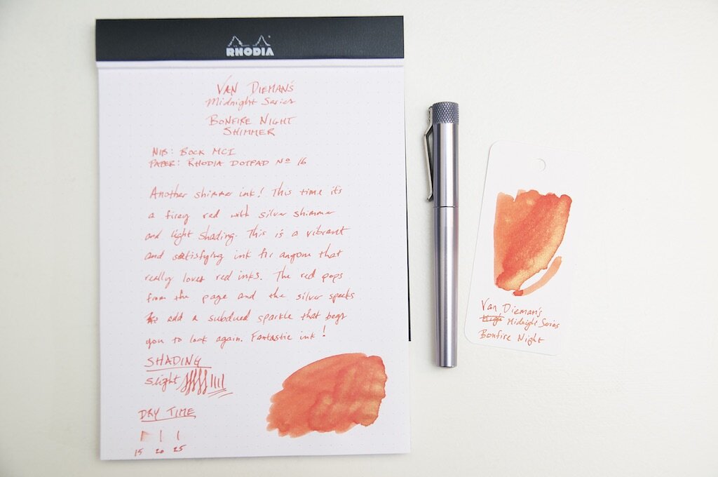
Van Dieman's Bonfire Night Writing
Posted on July 21, 2021 and filed under Van Dieman's, Ink Reviews.

Van Dieman's Midnight Series: Howl At The Moon Ink Review

Van Dieman's Midnight Series: Howl At The Moon Ink Review

(Jeff Abbott is a regular contributor at The Pen Addict. You can find more from Jeff online at Draft Evolution and Twitter.)

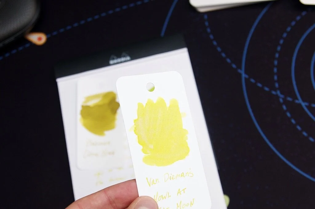
It's been quite a while since I've tried any shimmering inks, so the decision to try Van Dieman's Howl at the Moon is seriously overdue. All of the shimmering inks I've tried previously were of a darker variety, which creates a fairly obvious contrast between the ink color and the bright shimmery bits. Howl at the Moon is different because it's a pale yellow ink paired with a silver shimmer that sits on top. It's a subtle effect, but I've really been enjoying it.

I really enjoy the imagery that the marketing copy calls up to describe this ink:

Howl At The Moon is a silver shimmered dark yellow ink, inspired by the iconic image of a full yellow moon illuminating the night sky, silhouetting a lone alpha wolf, and uplifting the moods of everyone beneath.

I don't know if I'd agree with the dark yellow description, but I love the image of the moon and the wolf complementing each other in an idyllic midnight scene.

Van Dieman's Howl At The Moon

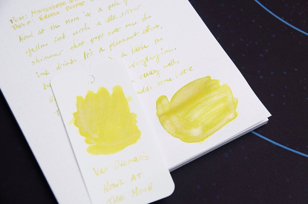
To my eye, Howl at the Moon is a pale, dusty yellow that inches toward a darker hue only when the ink pools up in certain strokes. It's certainly difficult to read on white paper, and I wouldn't mind if it was just a bit darker to improve the legibility. That said, I think it's a really pretty color. It's not one that I would write with routinely, but it's certainly an enjoyable change of pace and one that always makes me smile when I see it.

There's also a fair bit of shading that occurs if you're using a nib that's large and wet enough. In this somewhat dry 1.5mm stub nib from Monteverde, I get plenty of color variation between the thick, slow strokes compared to the quick, light strokes of different letters. The shading doesn't present as prominently when swabbing, so that shows it only has a limited capacity for color variation. The small amount of variation it does exhibit, however, is quite nice.

Van Dieman's Howl At The Moon Swab

A lovely ink is made better by the hidden mysteries is possesses. In this case, the silvery shimmer that surfaces under certain light. It's a tricky thing to catch — sometimes it only looks like a place where the ink ran thin, leaving only a hint of color behind. Change your angle of perspective just a bit, and the dusty yellow rushes back in. The silver shimmer creates such a dazzling effect in areas where the ink has pooled, and it creates a glittering starlight effect in normal handwriting. It reminds me of Moon runes in The Hobbit:

“Moon-letters are rune-letters, but you cannot see them,” said Elrond, “not when you look straight at them. They can only be seen when the moon shines behind them..." — The Hobbit by J.R.R. Tolkien

While the ink is completely legible regardless of whether moonlight is present, this subtle glimmer is such a delight in our mundane real world.

Van Dieman's Howl At The Moon Comparison

Aside from the color and shimmer, this ink is fairly standard in terms of how it behaves in the pen. It's easy to clean out, but I clumsily forgot that shimmer inks require a good shaking before inking up your pen! My initial impressions were along the lines of, "what shimmer??" But that's easy to fix by remembering to prepare the ink before drawing it into the pen. Without some gentle shaking, all the shimmery silver bits stay at the bottom of the container!

At $14.95 for a 30ml bottle, Van Dieman's Howl at the Moon is an excellent value. And, if you're not sure (or just don't want much), you can always opt for a small sample for a few bucks. It's not in stock at Vanness now, but definitely keep your eyes peeled for a restock if this is your sort of thing. I've really enjoyed my time with this ink and look forward to using it for special occasions!

(Vanness Pens provided this product at no charge to The Pen Addict for review purposes.)


Enjoy reading The Pen Addict? Then consider becoming a member to receive additional weekly content, giveaways, and discounts in The Pen Addict shop. Plus, you support me and the site directly, for which I am very grateful.

Membership starts at just $5/month, with a discounted annual option available. To find out more about membership click here and join us!

Van Dieman's Howl At The Moon Writing
Posted on June 30, 2021 and filed under Van Dieman's, Ink Reviews.

Van Dieman's Wilderness Series Ink: Devil's Kitchen Review

Van Dieman's Wilderness Series Ink: Devil's Kitchen

Van Dieman's is a totally new ink maker to me, and before I received several sample vials from Vanness to try out, I had never heard of them. It's fascinating now to see so many small ink shops popping up around the world offering so much variety and vitality to the fountain pen ink market. It was tough to pick one to start, so I really just picked one at random and came out with Devil's Kitchen — part of the Wilderness Series.

The Wilderness Series is a collection of ten inks that are, in the words of the creator, inspired by the "majestic, beautiful and ofttimes humbling wonders that await in the Tasmanian wilds." The description of Devil's Kitchen had me itching to try it out in a pen.

The Devil’s kitchen, where The Great Southern Ocean smashes into scattered inlets lining the Eagle Hawk Neck cliff face on the eastern side of the Tasman Peninsular, creating a violent churn and the rich vibrantly cool teal which inspires this colour. Tasmania’s wilderness of this caliber is breath-taking.

With a description like that, I can't decide if I want to try out the ink or plan a trip to Tasmania to see this in person.

Van Dieman's Devil's Kitchen Swab

Since traveling is a joke right now, I guess my decision is an easy one. Devil's Kitchen is a lovely dark teal with a great deal of green covering up slight hints of blue. There's a good amount of shading, but not so much to be dramatic. It's well-behaved and would look great on business papers and journals alike. Using this ink has been really enjoyable because of the slight amount of drama the murky shading adds to the page.

The ink is dye-based, which makes it more robust than your typical fountain pen inks. Despite that, the ink is still very well lubricated and flows quite nicely. I haven't had any issues with dry starts or scratchy nibs. Even after being capped for a while in a pen that usually has trouble regardless of what ink I'm using, it does just fine starting after being dormant for a few days.

Van Dieman's Devil's Kitchen Dry Time

There's no shimmer in this ink, but there's a rare sheen that I've only noticed a couple of times in areas that the ink has a chance to pool up significantly. The sheen is hard to detect, requiring perfect lighting and near impossible conditions — but it's there if the conditions are perfect.

I've really enjoyed using this ink over the past couple of weeks. I didn't expect much because I had never heard of Van Dieman's before, but the name has quickly rocketed to the top of my list. A 30ml bottle costs $12.95 from Vanness, but you can also pick up a small sample vial for under $3 if you're unsure. If, like me, you haven't heard of Van Dieman's yet, make sure to add it to your list when you're next in the mindset to do some ink shopping.

(Vanness Pens provided this product at no charge to The Pen Addict for review purposes.)


Enjoy reading The Pen Addict? Then consider becoming a member to receive additional weekly content, giveaways, and discounts in The Pen Addict shop. Plus, you support me and the site directly, for which I am very grateful.

Membership starts at just $5/month, with a discounted annual option available. To find out more about membership click here and join us!

Van Dieman's Devil's Kitchen Writing
Posted on March 10, 2021 and filed under Van Dieman's, Ink Reviews.