Posts filed under Wearingeul

Wearingeul Macbeth & The Phantom of the Opera - A Review, Part 1

(Kimberly (she/her) took the express train down the fountain pen/stationery rabbit hole and doesn't want to be rescued. She can be found on Instagram @allthehobbies because there really are many, many hobbies!.)

I was very excited when the Bossman picked up Wearingeul Macbeth and The Phantom of the Opera at this year’s Atlanta pen show for me to review, but only getting to it now. Sorry! To make up for it (and also because it’s fun), I decided to make this review a two-parter. Don’t worry, I won’t leave anyone hanging about how these two inks performed, so without further ado…

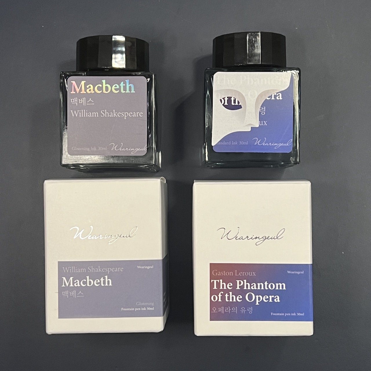
Wearingeul Macbeth (left) and The Phantom of the Opera (right) I love that the mask is a sticker than you can peel off, if you so choose!

For Macbeth, I used the clear TWSBI Go with a Medium nib and a TWSBI Swipe with a Medium nib for Phantom for the writing samples in the notebook. For the other writing samples, I used the Kakimori steel dip nib on the Col-O-Ring cards, as well as the 52 gsm, 68 gsm Tomoe River and Cosmo Air Light 75 gsm papers.

Macbeth is a medium grey ink with light purple shimmer. The included “swatch” is much more purple than the actual swatches.

Writing sample and swatch on 68 gsm Tomoe River Paper.

52 gsm TR paper.

Cosmo Air Light 75 gsm paper.

Writing sample and dry times on 68 gsm Tomoe River Paper.

Love the shimmer from this ink!

Chromatography didn’t travel very far and was mostly light grey with a little bit of pink.

Macbeth had an average flow, which was surprising, since grey inks can sometimes feel a little dry. It was well-behaved in the TWSBI Go with decent shimmer in my writing sample and no clogging. I had expected it to dry pretty quickly but it took ~40-50 seconds to dry on 68gsm TR. It would definitely dry faster like Rhodia, copy paper, Cosmo Air Light or with drier or finer nibs.

I don’t have a lot of grey inks, let alone many that were very similar to Macbeth, so I picked some that might be more readily available: Wearingeul Me in the Mirror (grey with silver shimmer), Montblanc Oyster Grey (cooler tone, less blue), Diamine Snow Storm (probably the most similar in color and shimmer), Iroshizuku Fuyu-Syogun (a bit too blue and too light but kind of close), Kiri-same (too brown).

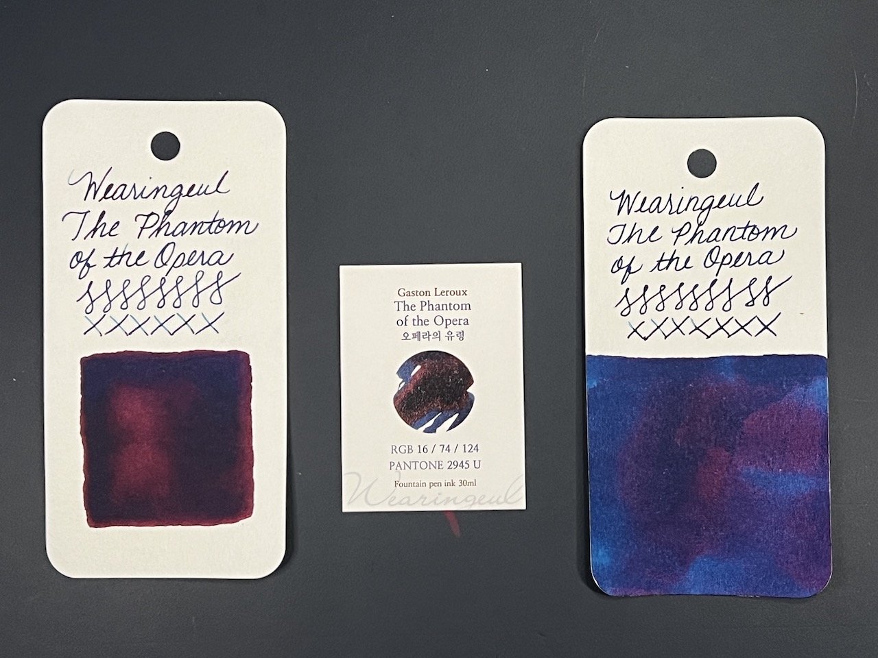
Phantom is a medium dark, slightly denim-leaning, blue ink with dark red sheen. It is not a super sheener but the wetness of the pen/swatch will influence how much red you get.

Writing sample and swatch on 68 gsm Tomoe River Paper.

52 gsm TR paper.

Cosmo Air Light 75 gsm paper.

Writing sample and dry times on 68 gsm Tomoe River Paper.

Closeup of the subtle red sheen around the edges.

Unlike Macbeth, Phantom’s chromatography traveled very far and probably could have kept going. It starts off as a purplish grey, transitioning to pink and then a bright blue/cyan.

The Phantom of the Opera had a much wetter flow, which you can tell by the broader line that the Swipe Medium nib laid down (the nibs are the same as the Go/Eco, but there can always be minor variations between nibs/feeds). I was expecting it to take much longer to dry, based on how much smearing there was at the 40-50 second mark but it was dry by 60 seconds. One of the annoyances of some sheening inks is that it could smear long after it has dried. But not so with Phantom. I smeared it with my (dry) finger several minutes after letting it dry, and again the next day (as I’m writing this) and there was no smearing!

Inks similar to The Phantom of the Opera:Pure Pens Westgate Hotel, Anderillium Flying Squid Blue, Fanyantan #24-B The Sea, Inkebara Midnight Blue (this and the remaining swatches are a bit lighter), KWZ Walk Over Vistula, Krishna Paakezah, Organics Studio Ralph Waldo Emerson Twilight Blue.

Wearingeul Macbeth and The Phantom of the Opera can be purchased for $20 and $21, respectively, for 30 ml at Dromgoole’s. Wearingeul keeps coming out with a lot of great inks, so I’m glad they are available in a reasonable 30 ml size.

That concludes this first part of my review of Wearingeul Macbeth and The Phantom of the Opera. Tune in again next time when we see what else is up my sleeve!

(Disclaimer: This ink was purchased from Dromgoole’s for a discount at the 2023 Atlanta Pen Show.)


Enjoy reading The Pen Addict? Then consider becoming a member to receive additional weekly content, giveaways, and discounts in The Pen Addict shop. Plus, you support me and the site directly, for which I am very grateful.

Membership starts at just $5/month, with a discounted annual option available. To find out more about membership click here and join us!

Posted on July 7, 2023 and filed under Ink Reviews, Wearingeul.

Wearingul Cheshire Cat Fountain Pen Ink Review

Wearingul Cheshire Cat Fountain Pen Ink Review

Finding a new ink to break into my regular writing rotation is not an easy task. I have a lot of inks, and even more particularness when it comes to picking out an ink to use on a regular basis. Some pens have specific inks tied to them-my Namiki Milky Way and Pilot Iroshizuku Tsui-yo, for example-while other inks are a favorite in a lesser used color category, like Akkerman #28 Hofkwartier Groen.

Wearingul Cheshire Cat Fountain Pen Ink

Since I purchased Wearingul Cheshire Cat late last year, I haven’t limited it to a single matchy matchy pen setup, but have actively looked to use it in as many pens as possible. That’s how much I’ve been enjoying it.

Cheshire Cat

Disney’s Cheshire Cat. (Image via Disney Wiki.)

Cheshire Cat, from South Korean ink maker Wearingul, features a mixture of magenta, fuchsia, pink, and purple shades, designed to mimic it’s mysterious Alice in Wonderland namesake. I find it colorful, yet extremely comfortable on the eyes. It’s not one of those searing hot pinks.

Wearingul Cheshire Cat Ink

Tested on Mitsubishi Bank Paper from The Paper Mind.

Performance-wise, it is a simple and safe color. It flows well while not being overly wet, dries quickly, has slight shading even in finer nibs, and has been easy to clean each time I’ve used it. That’s a good feature list in my book.

Wearingul Cheshire Cat Ink

Wearingul not only makes great inks, they tell good stories. Many of their ink creations are based on literature. Cheshire Cat isn’t the only Alice in Wonderland ink-there is the shimmery blue and gold Alice, and the deep green Mad Hatter, among others. There are more classic tie-ins with the Wizard of Oz, feature inks for women in Korean literature, and wild ink sets like Dr. Jekyll and Mr. Hyde. And lest we forget one of the greatest inky creations of all-time: Chicken ink!

I’m a fan of the stories Wearingul is telling, and an even bigger fan of the qualities of their ink. Cheshire Cat is by no means a groundbreaking color or formulation, but it doesn’t need to be for me to love using it. I look forward to adding a few more to my ink shelf ink the coming year.

(I purchased this ink from Goldspot at a discount.)


Enjoy reading The Pen Addict? Then consider becoming a member to receive additional weekly content, giveaways, and discounts in The Pen Addict shop. Plus, you support me and the site directly, for which I am very grateful.

Membership starts at just $5/month, with a discounted annual option available. To find out more about membership click here and join us!

Wearingul Cheshire Cat Ink
Posted on February 20, 2023 and filed under Ink Reviews, Wearingeul.

Wearingeul The Mind Fountain Pen Ink Review

Wearingeul The Mind Fountain Pen Ink Review

(Jeff Abbott is a regular contributor at The Pen Addict. You can find more from Jeff online at Draft Evolution and Twitter.)

At this point, I'm not surprised at all to have an in bottle in my hands from a company that I've never heard of before. In fact, it's pretty exciting because you can be pretty certain that whatever ink is inside will be both well-behaved and visually interesting. The fountain pen ink market is booming, and that's great news for us.

The latest ink to cross my desk is from a Korean company called Wearingeul. The Mind is part of an ink series that focuses on different literary figures. The Mind represents Natsume Sōseki, a Japanese author from the early 20th century. I haven't read any of his work, but this ink introduced me to his name, which means I now have several things in my reading queue. I'm a big fan of ink naming schemes that introduce you to other subjects.

Wearingeul The Mind Fountain Pen Ink

The Mind is a subdued purple ink with decent shading and a faint yellow sheen that looks great on paper. I'm not sure who did it first, but Wearingeul is another ink company that includes a Pantone code that corresponds to the ink hue. In this case, it's Pantone 5405 U. To my eye, this looks like a blue gray, which is really similar to the average color that I see from this ink on paper. There's a bit of shading and sheen that creates some hue variation, but it stays true to this main color.

This ink illustrates the duplicity and sordid mind of human. From pastel-toned violet, it ends in pastel blue with yellow color division.

It's a great color, but I struggle to see the violet. Maybe it's just my eyes, but it just looks blue gray to me. After holding some Pilot Iroshiku Fuyu-syogun next to this ink, I can't tell them apart! I might've just confused my brain, but whatever I did has had a permanent effect. Either way, it's still a fantastic color.

Wearingeul The Mind Fountain Pen Ink

The blue gray tones vary back and forth a bit with the ink shading, but the yellow sheen is what really interests me. It doesn't show up easily, and hardly ever at all in a normal nib. Swatching the ink is the best way to observe the sheen, but that's not really a normal way to use ink. If you use a large enough nib, you'll see a bit of shading, but not nearly as much as I'd like to see.

The Mind behaves really well in the pen. It starts smoothly, doesn't bleed or feather, and flows really well. It's pleasant to use and makes any good nib shine. The only area where this ink doesn't impress is dry time. This is a slow drying ink, coming in anywhere from 20 to 30 seconds. The Monteverde Omniflex nib I used for this test normally operates like a wet fine nib, so these times should be fairly comparable for a lot of different nib sizes. 20 to 30 seconds is a long time!

Wearingeul The Mind Fountain Pen Ink

Speaking of drying, that's where this ink lost some of its allure for me. The dry-on-the-page color is a dusty blue-gray like you see in the photos. When writing with this ink and while the ink is still wet, it does have more of a purple hue. I like the wet color a lot, and I wish it kept more of that after the ink dried.

The Mind comes in a 30ml bottle and runs for $20. If The Mind isn't to your liking, I suggest you look around at all the other colors they have to offer. There are some really beautiful inks in their collection that I'd love to try some day. I really look forward to what they come up with next.

(Goldspot provided this product at a discount to The Pen Addict for review purposes.)


Enjoy reading The Pen Addict? Then consider becoming a member to receive additional weekly content, giveaways, and discounts in The Pen Addict shop. Plus, you support me and the site directly, for which I am very grateful.

Membership starts at just $5/month, with a discounted annual option available. To find out more about membership click here and join us!

Posted on October 5, 2022 and filed under Ink Reviews, Wearingeul.