Posts filed under Wearingeul

Wearingeul Heimdall Fountain Pen Ink Review

Does anyone else feel like they need to go back to school to understand current ink naming conventions? I do, and I am here for it. Wearingeul is the current leader of the “what does that ink name mean” game, and Heimdall, from their World Myth Series, sent me scurrying to the internet to find out more.

In Norse Mythology, Heimdall is the god of light, and the son of one of the most prominent gods, Odin. Heimdall also had nine mothers … and that’s right about where my mythology lesson was done for the day.

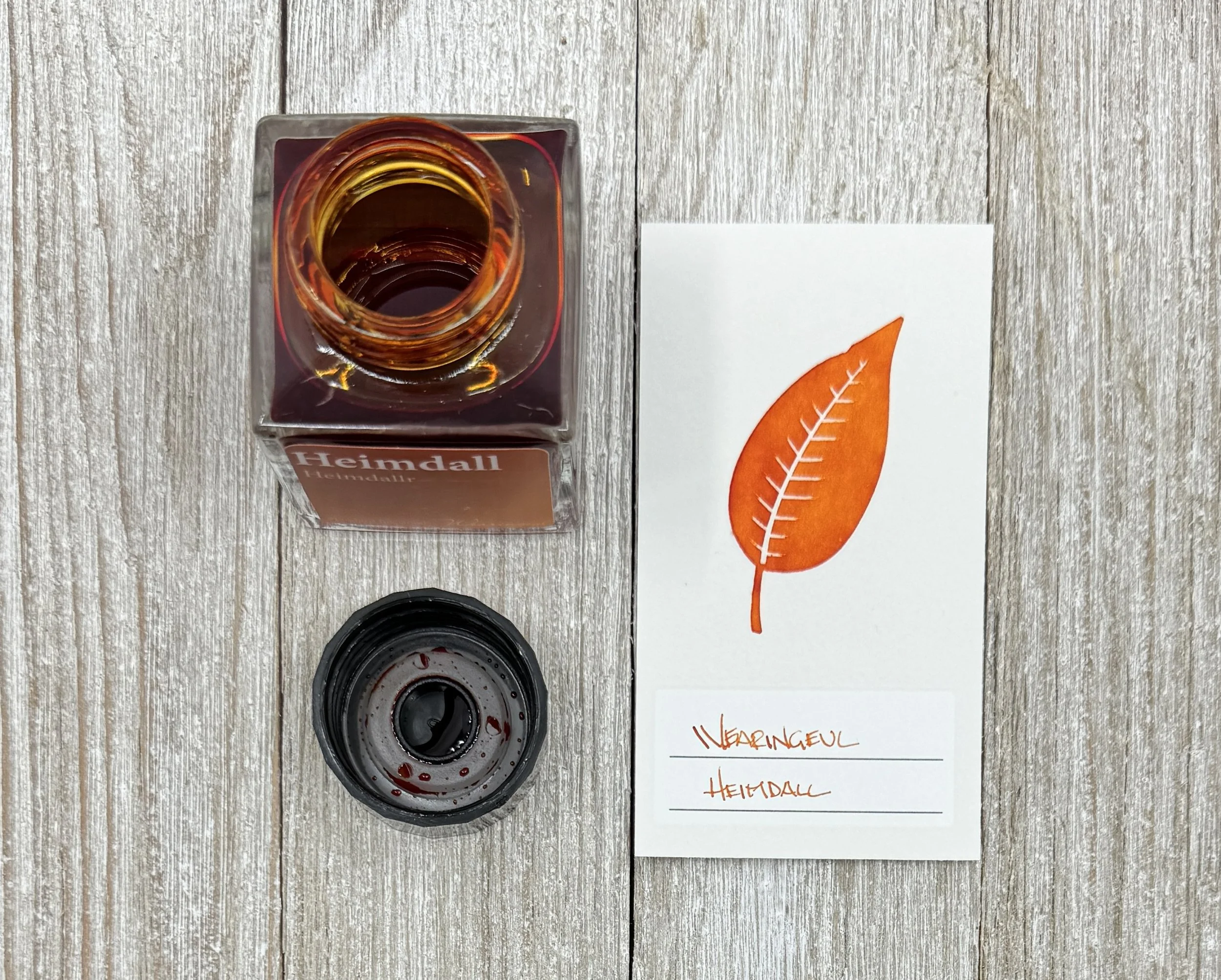
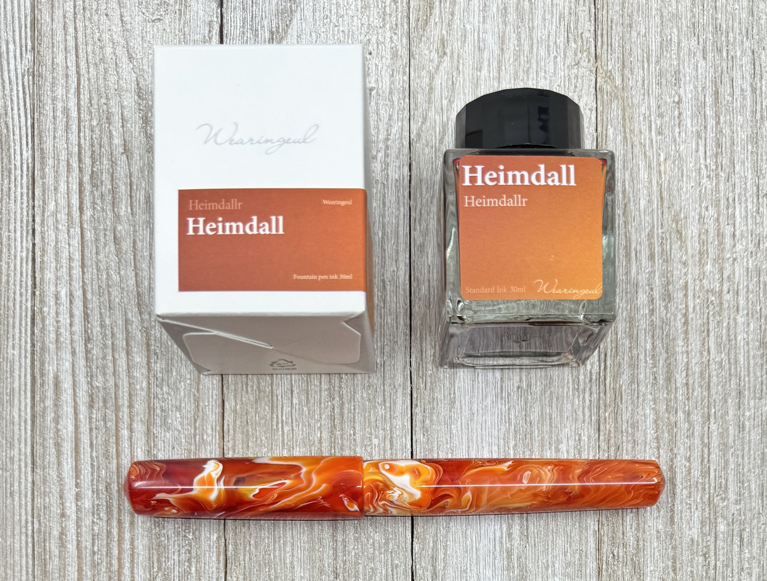
Light is something I can get behind, and this shade of Orange features a wide range of colors from yellow to red. It’s a bit more “fiery” in tone than a standard Orange, and to no one’s surprise, I am a fan.

I’ve been using Heimdall for several weeks and in several different nib sizes before inking it up in this 1.1 mm Jowo #6 Stub Nib for the review. One of the challenges with Orange inks is that they can be drier inks on the page, or dry up in the nib and make for harder starts. I’m happy to say that I’ve had zero nib issues with either dry writing or hard starts in a nib size range from XXF to this stub. It’s been a solid, consistent performer.

Pen: Carolina Pen Co. Charleston Slim. Paper: Original Tomoe River 52 gsm. Earworm: Len “Steal My Sunshine.”

Related to the dry time, I’d say it’s moderately quick on Sanzen Tomoe River, but not too fast. This adds up given the feel of the ink on the page I mentioned above. If you use a more absorbent paper it will dry quickly.

Paper: Sanzen Tomoe River S 52 gsm

Color-wise, it does lean a little red in the deepest applications of the ink, but the yellow levels keep it metered, and bright. I saw good shading with my 1.1 Stub, and even when using finer nibs I saw some color differentiation in my lettering. This is an all day writing Orange ink.

Speaking of color, Wearingeul does something cool for each of their inks by listing the RGB representation for those looking for a digital representation.

Wearingeul inks are not cheap at $22 for a 30 ml bottle in the case of Heimdall (other are up to $25,) but given how much I’ve enjoyed every ink I’ve tried from them, that is a price I’m happy to pay. I just wish I didn’t want every single one they have ever released!

(Vanness Pens provided this product at a discount to The Pen Addict for review purposes.)


Enjoy reading The Pen Addict? Then consider becoming a member to receive additional weekly content, giveaways, and discounts in The Pen Addict shop. Plus, you support me and the site directly, for which I am very grateful.

Membership starts at just $5/month, with a discounted annual option available. To find out more about membership click here and join us!

Posted on April 15, 2024 and filed under Ink Reviews, Wearingeul.

Ink Showdown: Dominant Industry Goryeo Celadon & Wearingeul Dewy Starlight

(Kimberly (she/her) took the express train down the fountain pen/stationery rabbit hole and doesn't want to be rescued. She can be found on Instagram @allthehobbies because there really are many, many hobbies!.)

When I was at the Atlas Stationer’s Fountain Pen Day event last November, I spent time flipping through their ink swatch binders and saw two inks that I couldn’t decide on: Dominant Industry Goryeo Celadon & Wearingeul Dewy Starlight (I will refer to them as Celadon & Starlight). Normally, I would have had to flip a coin but since the Bossman let me pick some inks for review, I thought, why not both?

Dominant Industry Goryeo Celadon (left) & Wearingeul Dewy Starlight.

Celadon (left) & Starlight bottles.

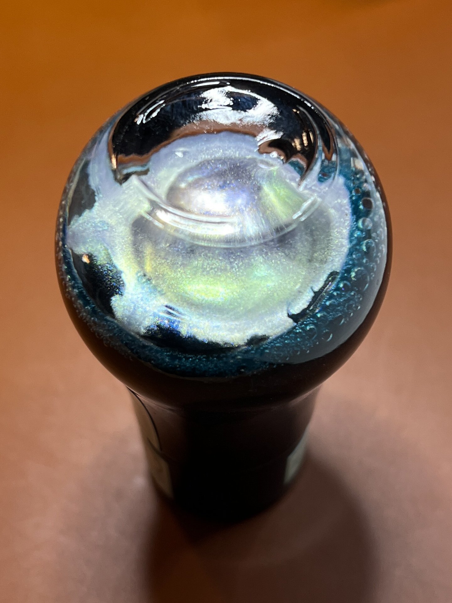
Celadon has an opalescent/silver shimmer.

Starlight’s shimmer is gold.

You’re going to think I am colorblind because the colors on the two boxes aren’t the same. Celadon has minty green packaging and Starlight is dusty blue.

As in the past, all swatches were done on Col-O-Ring cards using a Kakimori steel dip nib and the non-brush end of a paintbrush, while writing samples were done with a TWSBI Go with a Medium nib and a Lamy Vista with a steel Medium nib. The TWSBI Go is a wetter writer and the Lamy is a drier writer, so these two give me a good idea of how an ink will look from different pens. The notebook used for writing samples is from Endless Recorder with 68 gsm Tomoe River paper. Dry times may be a bit slower on 52gsm TR or with wetter nibs or faster on papers like Rhodia, copy paper, Cosmo Air Light or with drier or finer nibs.

Swatches of Celadon (left) and Starlight and now the difference isn’t as obvious as the packaging. Still, you can see that Celadon is a bit lighter and leans a little more green while Starlight is a bit more saturated (albeit barely) and a little more blue.

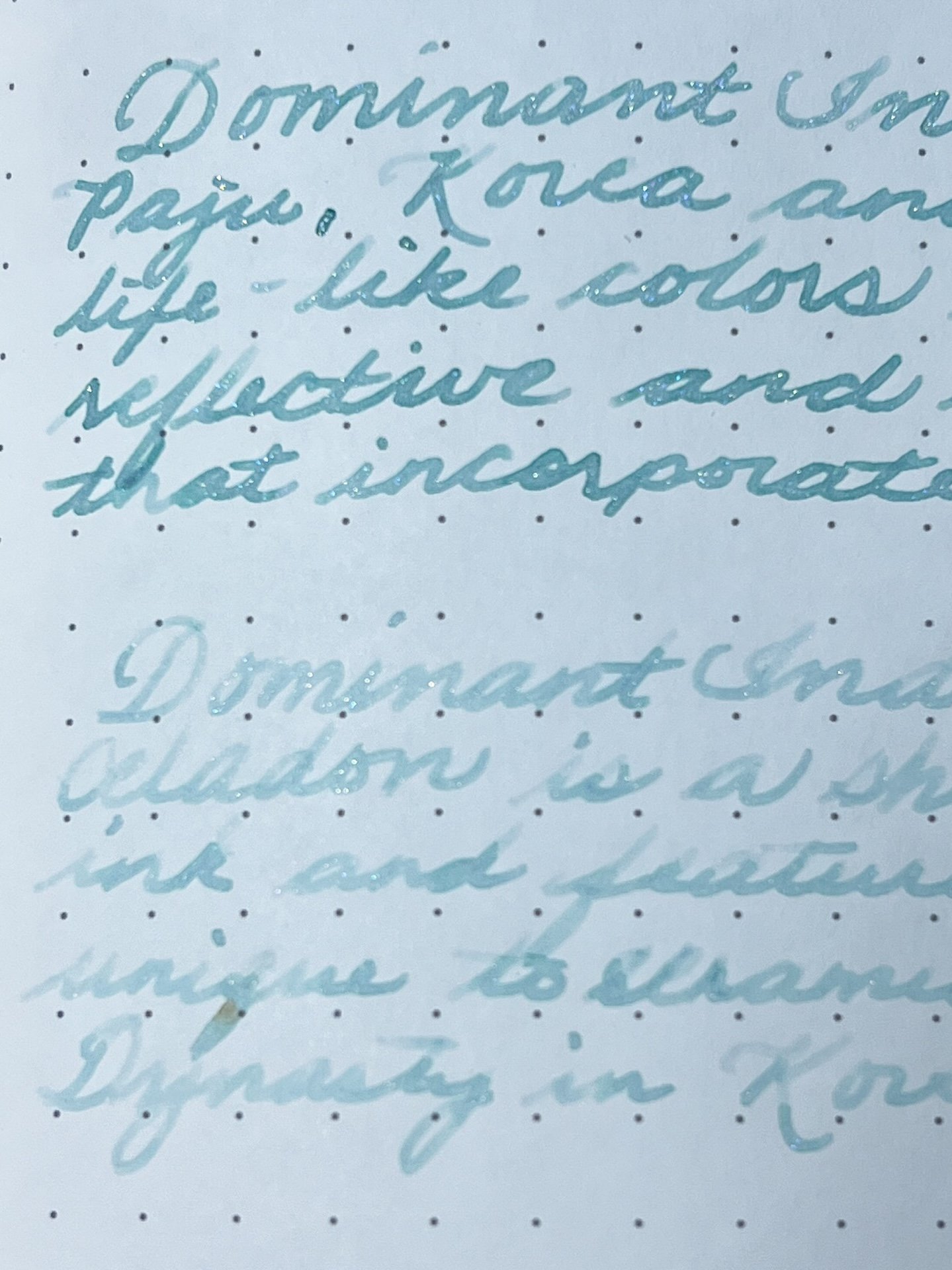
Celadon writing sample on 68 gsm Tomoe River Endless Notebook.

You can really see the difference between the Go and the Vista.

Celadon chromatography shows a bit of yellow near the line and faint blue shading above it, but that’s about it.

Celadon is a nice minty, muted pale green with opalescent silver shimmer in a wet writer like the TWSBI Go, but in the Lamy Vista, it is almost unreadable and there is barely any shimmer (I shake the bottle before filling each pen). The shimmer makes this ink look bluer than it really is.

Starlight writing sample on 68 gsm Tomoe River Endless Notebook.

Much like Celadon, Starlight is almost unreadable with the Vista.

The golden shimmer of Starlight makes this slightly bluer ink look greener than it really is. This is the opposite of Celadon which looks bluer because of the shimmer! This is probably why the two inks look much more similar when swatched than from the packaging. Like Celadon, Starlight is almost unreadably light in the Vista and hardly has any shimmer. The shimmer is much more pronounced in Starlight with the Go. Both inks had an average dry time of 30-40 seconds. The chromatography is subtle, with undertones of pink near the line and spreading out to light blue as expected.

Similar inks include Pennonia Zuzmo Lichen , Celadon, Sailor Ink Studio 162 , Starlight, Vinta Inks Perya, Pennonia Patina, Visconti Self Portrait, Wearingeul Wuthering Heights, Kobe 68 Nishimaiko Pearl Blue and Sailor Manyo Haha.

I don’t usually gravitate towards lighter inks so I don’t have any inks that are dupes but there are some similar ones like Pennonia Patina for Celadon and Vinta Perya for Starlight, though neither of them are shimmer inks.

And a little bonus - I decided to start using the Wearingeul swatch cards for my Wearingeul inks, so I decided to swatch Starlight on the Wearingeul Puppy Swatch Cards which I had ordered from Atlas.

Used the TWSBI Go to write the name of the Starlight ink.

I used the paintbrush to spread the ink over the design. Puppy looks like it should be named “Spot.” 🙂

After the swatch was dry, I wiped the puppy’s face and now we have a happy dog!

The cost of the two inks are comparable - you can get a 25ml of Dominant Industry Goryeo Celadon for $20 or 30ml of Wearingeul Dewy Starlight for $22.

Now that I’ve swatched and written with both inks, if I had to pick just one, I’d go with Wearingeul Dewy Starlight over the Dominant Industry Goryeo Celadon. The Starlight is slightly wetter (noticeable during swatching as well as writing), is a bit darker and therefore, easier to read, and it also has more shimmer. Both inks need a wetter pen/nib to really shine and the Lamy Vista showed that it definitely isn’t the right pen for either of these inks.

(Disclaimer: Both inks were purchased at a discount from Atlas Stationers during their Fountain Pen Day event and the swatch cards were ordered on my own, also from Atlas.)

Posted on February 9, 2024 and filed under Dominant Industry, Ink Reviews, Wearingeul.

Wearingeul Macbeth & The Phantom of the Opera - A Review, Part 3

(Kimberly (she/her) took the express train down the fountain pen/stationery rabbit hole and doesn't want to be rescued. She can be found on Instagram @allthehobbies because there really are many, many hobbies!.)

Yes, Part 3!! I know I originally said it would be a 2-parter but I bought more Wearingeul accessories and thought it would be fun to share using the Wearingeul Macbeth & The Phantom of the Opera inks from part 1 and part 2!

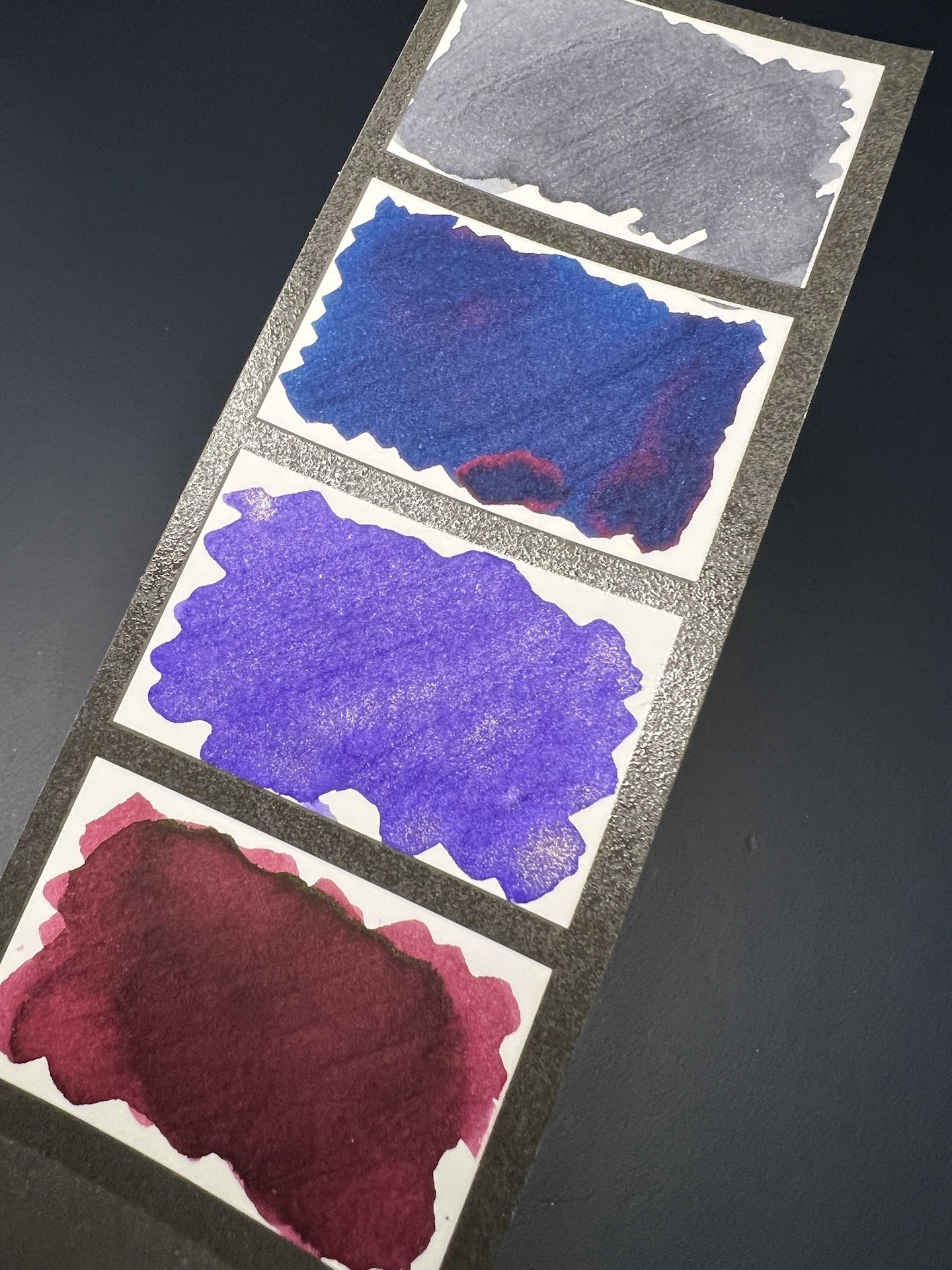
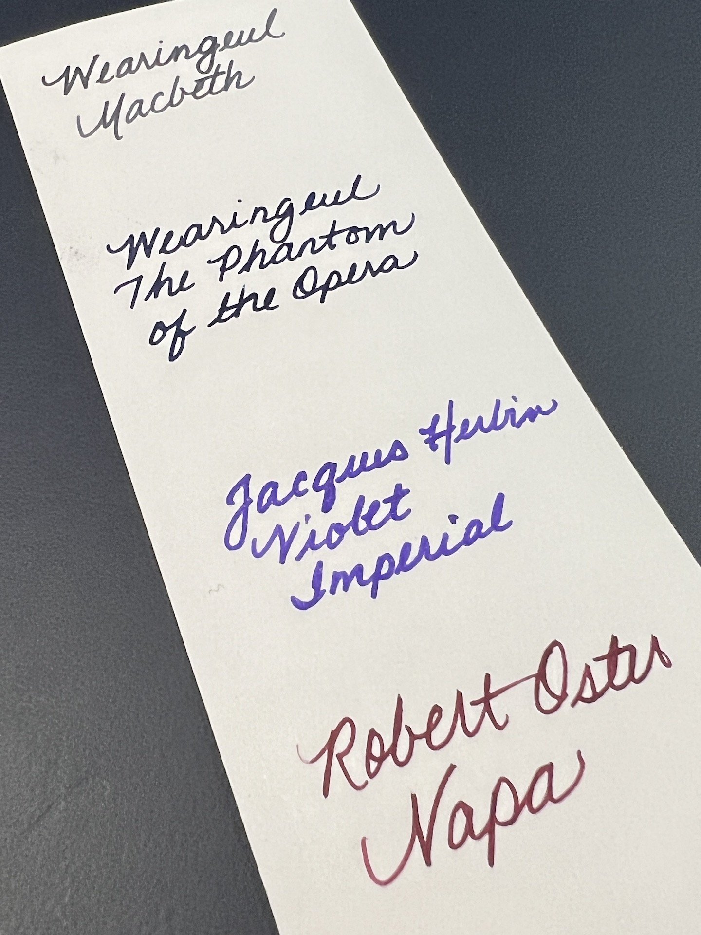
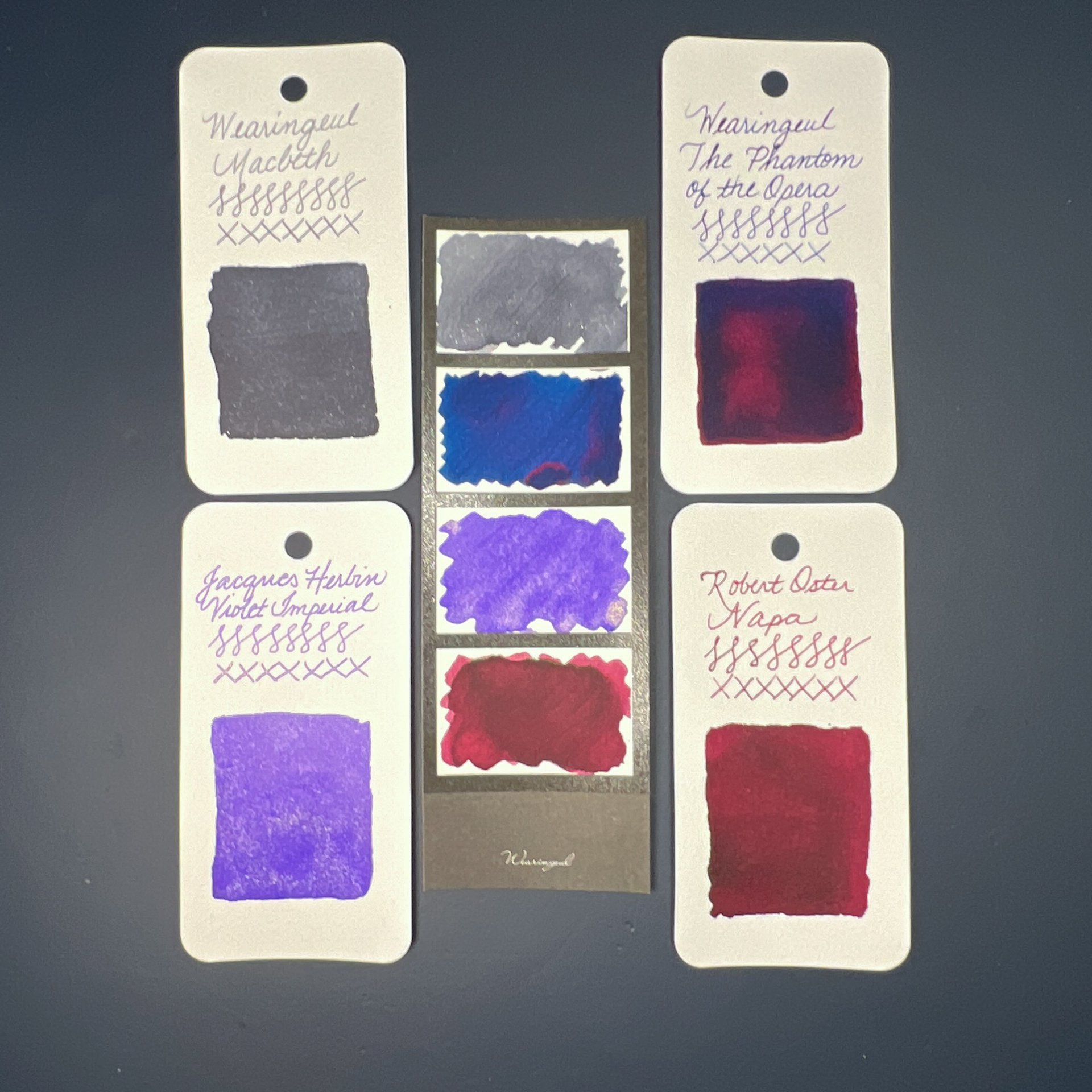
The Wearingeul Four Photos Color Swatch cards are available in white and black (which is being reviewed here). Like the Instant Film cards from part 2’s review, the Four Photos cards also have a shiny, textured border around the swatching area. They measure roughly 2” x 5.75” (50 mm x 150 mm).

Shading, sheen and shimmer all show up well on the card.

I wrote the ink names on the back and there was no feathering or bleeding.

Comparison of the Four Photos cards with the Col-O-Ring; once again, the swatches matched (the Phantom swatch was a thicker/wetter swatch so the color is a bit off on this Col-O-Ring swatch compared to the others.)

Like the Four Photos Color Swatch cards, the Impression Color Swatch Book and loose leaf sheets are made with 200gsm paper, so they have a nice thickness to them without feeling like cardstock. Both have the same bottle design on them but the Swatch Book pages have 9 slightly larger bottles with two lines beneath (3 rows of 3 bottles), while the loose leaf pages have 10 bottles with two lines to the right (5 rows of 2 bottles). In addition to the bottle design, Wearingeul also makes the loose leaf sheets with Rounds, Rectangles or Ink Vials. The paper is a nice bright white, showing colors that matched what I saw on my Col-O-Ring.

Swatches of Wearingeul Macbeth and The Phantom of the Opera on both the Swatch Book (top) and loose leaf, alongside Col-O-Ring Swatches (right.)

A few thoughts/observations:

  • The pages on the Swatch Book are NOT perforated, so if you prefer the 9 bottle layout but want loose leaf sheets, you’d have to cut them out yourself. Note: the paper on both are the same size, so if you cut out the Swatch Book pages, they will be narrower than the loose leaf sheets.
  • I liked having the lines so I could write straight but 2 fairly short lines isn’t enough for many ink names. It was barely long enough for “Wearingeul Macbeth”. I’m not sure if I would have preferred no lines (but then my writing would be crooked) or more lines and with slightly narrower spacing between them. The loose leaf layout, where the lines are to the right of the bottle, definitely would have a lot more room for another line.
  • I don’t know what to do with my loose leaf swatch page. The left margin isn’t very wide so I hesitate to use a hole punch. I wonder if Wearingeul has a binder for storing these sheets?

Wearingeul Four Photos Color Swatch Cards are available in black or white and are sold in packs of 30 sheets (4 swatches each) for $5. The 40-page Impression Color Swatch Book sells for $10.50. And lastly, the loose leaf Impression Color Swatch sheets are available in several designs and sells for $5 for a pack of 20 sheets. I like that all of these items are so reasonably priced that you can try a few different swatching items without breaking the bank.

Ok, I swear, I’m really done with this series! I hope you enjoyed the ink reviews and the various Wearingeul swatching products!

(Disclaimer: The Wearingeul Four Photos Color Swatch cards were purchased from Dromgoole’s for a discount at the 2023 Atlanta Pen Show. The Swatch Book was purchased from Vanness Pens and the Loose Leaf sheets from Pen Chalet - both of these are my purchases at regular price.)

Posted on August 4, 2023 and filed under Ink Reviews, Wearingeul.