Apica Wizard Notebook Review

(Jeff Abbott is a regular contributor at The Pen Addict. You can find more from Jeff online at Draft Evolution and Twitter.)

In the world of high-quality, affordable notebooks, you really can't go wrong. This is one of my favorite categories of notebooks because they provide so much value for the price. For just under $8, you can get a fantastic notebook that includes a sturdy binding, tough covers, and 70 sheets of high-quality paper.

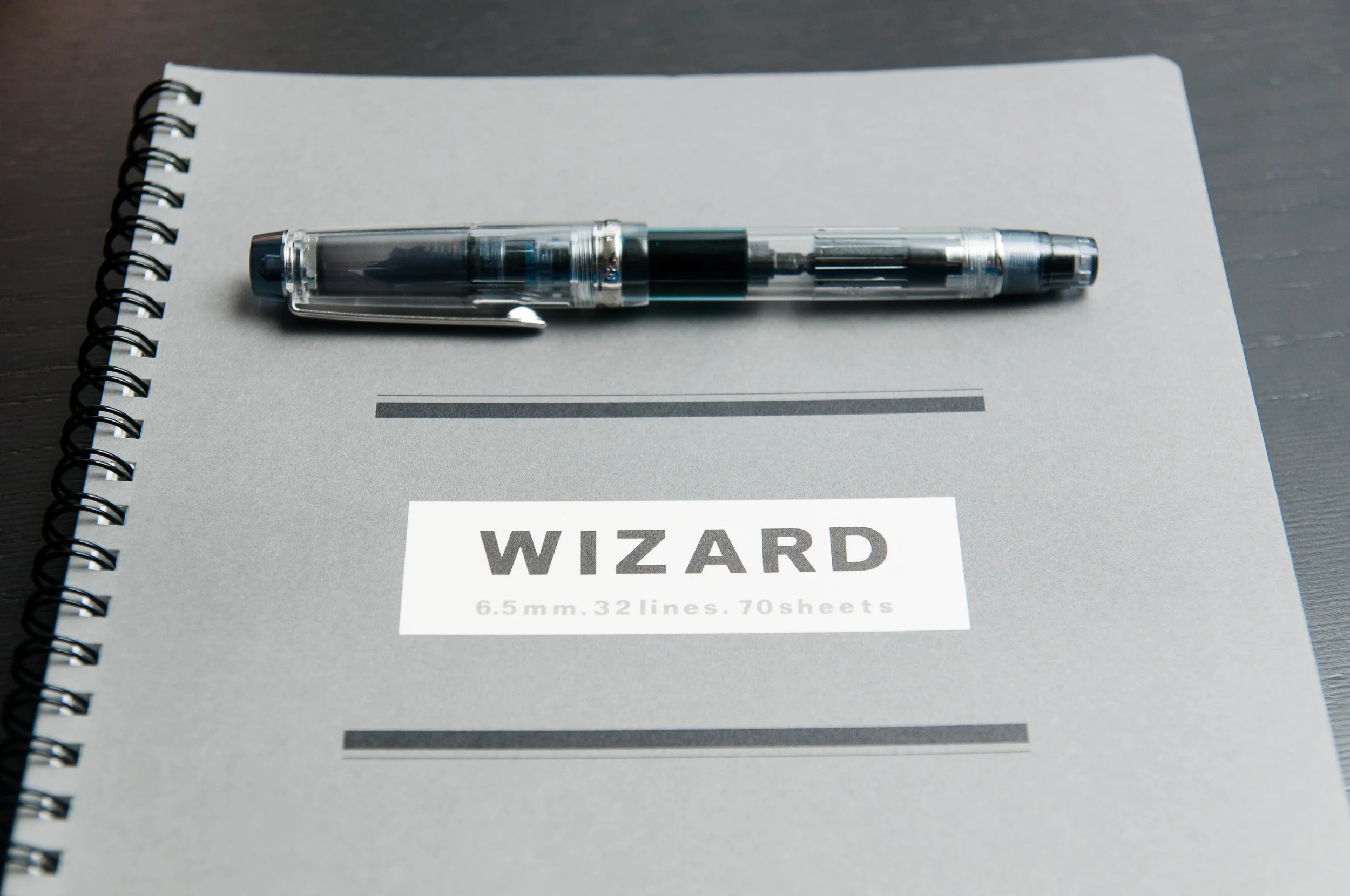
There are several comparable options in this particular market, but right now we're looking at the Apica Wizard notebook. This is a newcomer to JetPens, and it's a welcome edition. The only option you have is between gray or blue covers — both of which are subdued colors.

Look & Feel

The Apica Wizard has a sturdy feel to it. It features a twin ring spiral binding that can take a beating (although you could probably bend them if you stuff it into a bag with other large objects). The front and back covers are both made of a medium thickness card stock that will hold up to your average semester of commuting. It's not nearly as thick as something like a Doane Paper Idea Journal, but it's a sturdy thickness.

The first page features a blank line for a title, followed by an index table. Like most Apica papers, there's a "No." and "Date" area in the upper outside corner of each page, followed by 6.5mm-ruled light gray lines with a dot next to each 5th line. Nothing ground-breaking here — very standard.

The front cover has a unique design compared to most of these economical spiral notebooks. It's very simple and somewhat spartan, and doesn't come in overly pastel colors. I'm so accustomed to pastels or ornate designs on these notebooks that I'm not entirly sure if I like it or not. I think my subconscious appreciates the subdued, calm cover design. It's refreshing and still manages to pique your interest.

Paper

How's the paper do? Great. Like most Apica papers, it handles fountain pens with ease. It's not the smoothest paper, but it is very resistant to feathering and show-through. It's a fantastic work horse of a paper. There's a tad of ghosting when writing on the back of a page, but for my tastes it's completely bearable. If you're using a gel pen, pencil, or fine fountain pen, you'll hardly notice anything showing through.

Dry time for the paper is quick, probably because the paper tends to soak the ink up since it lacks a smooth coating on top.

When you consider the price for this notebook ($7.25 right now), there's really nothing to complain about with this paper. It's a fantastic deal if you tend to enjoy spiral-bound notebooks of semi B5 persuasion.

Overall

This is an easy notebook to recommend. If you need a notebook of the semi B5 size and don't mind lined paper, this is definitely worth your time and money. I also like that there's no difference between the blue and gray covers. A lot of notebooks use a color scheme to denote different line formats, blank, grid, etc. paper types. I like that the color option is simple here: just pick the one you like better (or both).

This is a fantastic notebook that packs a lot of value into 70 pages. Definitely give it a try!

(JetPens provided this product at no charge to The Pen Addict for review purposes.)

Posted on May 20, 2015 and filed under Apica, Notebook Reviews.

Celebrate 10 Years With Cult Pens (Sponsor)

Cult Pens - purveyors of pens, pencils, papers, inks and everything in between - turns 10 years old this week!

Since they started out much has changed, but one thing that has stayed constant is their mission statement: 'Sell Pens. Be Nice.'

New this month is another addition to their range of products that have been designed in-house. Following on from the success of their mini fountain pen - which was produced in collaboration with Kaweco - and their Deep Dark Inks - made for them by Diamine, Cult Pens now present their vision for the perfect mechanical pencil. Double-knock mechanism, strong metal barrel, lovely knurled grip and a useful pocket clip. Available in 0.5 and 0.7 lead sizes the cult pencil cannot be found anywhere else. For a limited time, the cult pencil is available with a free pack of Pentel's wonderful Ain Stein lead - stronger, darker and easier to erase than competing brands.

Cult Pens is also stocking the hot, new Kaweco Brass Sport lineup, which features a fountain pen, rollerball, ballpoint, and pencil. They also have loads of great deals on their Special Offers page.

A huge congratulations is in order for 10 great years of Cult Pens. My thanks to them for sponsoring The Pen Addict this week.

Posted on May 18, 2015 and filed under Featured Sponsor.

Sailor 1911 Standard Music Nib Review

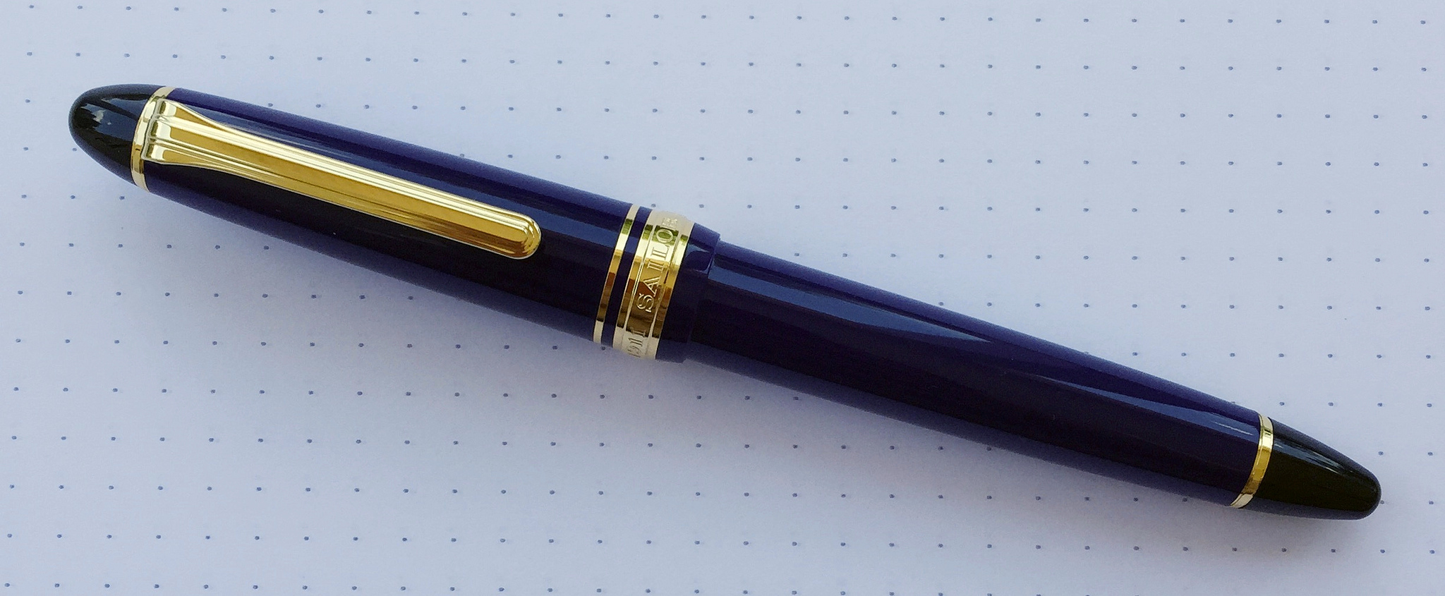
What is a music nib? That is a question I have wondered for years. I know generally what they are all about: A wider than normal nib suited well for writing musical scores. But how does it work, and most importantly, how will it work for me? Thanks to my friends at Goldspot Pens, I was able to get a Sailor 1911 Standard with Music Nib on loan to see what it is all about.

When you have a non-standard nib like a music nib, it becomes the singular reason you are buying the pen. The barrel feel and design are obviously important in the grand scheme, but they are secondary considerations to how the nib performs. As is the norm with all of Sailor's nibs, the music nib performed wonderfully.

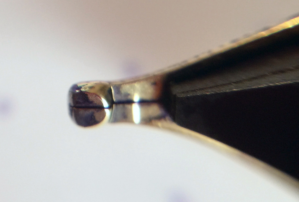
From a design perspective, the majority of music nibs are designed with two slits and three tines. This is to allow for big ink flow, which is a staple of music nibs. Sailors music nib is more traditional in that it has a single slit and two tines, but the tip of the nib is designed in such a way as to keep that same big ink flow. That was clear once I started writing with it using Sailor's Shigure ink. There were no issues putting this beautiful purple ink down on the page.

Top view

Top view

As I learned while researching this nib, music nibs are designed to hit the page more vertically than standard nibs, and at approximately a 90 degree angle. Picture your normal fountain pen writing grip where the nib hits the page at around a 45 degree angle. Rotate the pen in your hand counterclockwise (if you are a righty) until the nib hits the page at a 90 degree angle. Then move the barrel into a more vertical position instead of laid back as you would normally. Now become Mozart!

Side view

Side view

Once I realized this, well after my handwritten review mind you, all I could think of is isn't this what an architect grind is supposed to accomplish, without all of the angle adjustments? Wide horizontal strokes, thinner vertical strokes. Seems like it would do the trick. The thing is, no one uses a music nib for its named use these days anyway.

Bottom view

Bottom view

What the modern age of music nibs brings to the table is a thick, luscious line, perfect for large, sweeping writing. Big block lettering, cursive flourishes, and fancy styling. That's what this music nib is good at. Think of it as a chisel tip marker in a fountain pen nib. Go big or go home.

As I worked my way through this review my early prediction came true. It really is all about the nib. Sailor's 1911 barrel is excellent in its own right, with black, rounded ends set off by strongly colored resin barrels. I'm not a gold furniture guy but it's hard to argue how sharp these pens look.

Your writing style and planned use is the determining factor in purchasing a pen with a music nib. I've seen some amazing work with nibs like the one found in this Sailor. It's not a daily writer for me, but if I want to put some ink down on the page this is the way to go.

My thanks to Goldspot Pens for loaning me this pen for review. It will be heading back to its rightful home later this week, and I wish it safe travels!

Posted on May 18, 2015 and filed under Fountain Pens, Pen Reviews, Sailor, Music Nib.