We are big fans of Baron Fig notebooks around these parts, and their latest release is poised to be their best one yet.
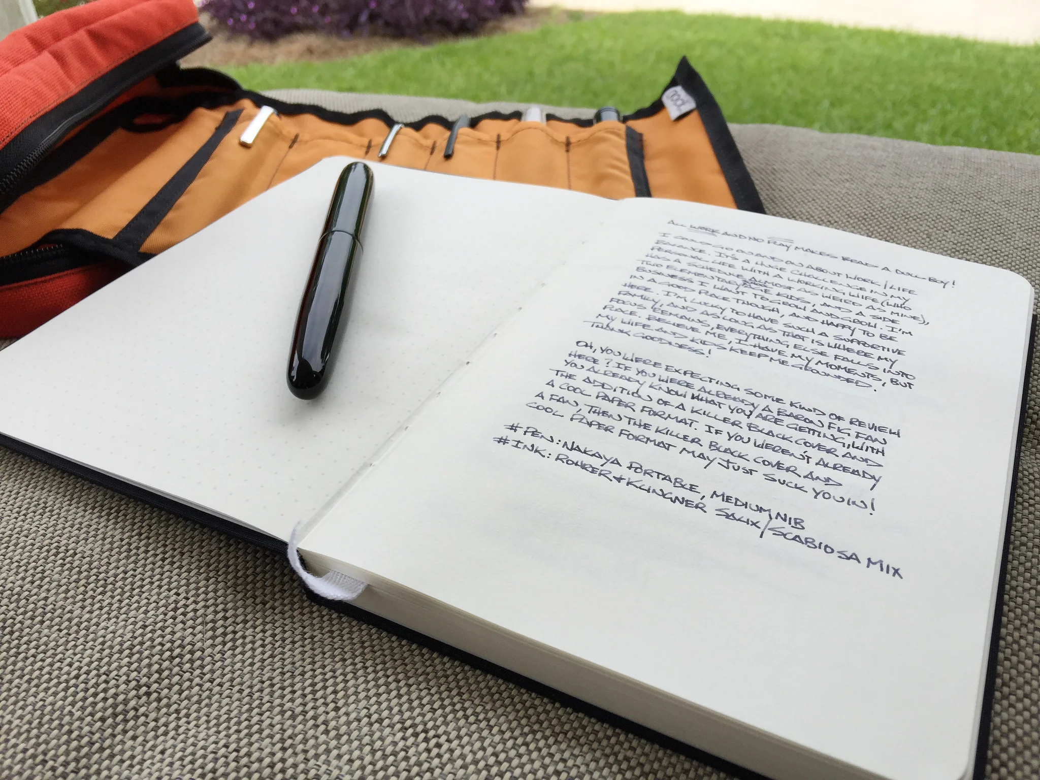
The Work/Play Limited Edition is designed with balance in mind. Every spread has a dot grid page on the left and a blank page on the right. This is a wonderful setup and a fantastic looking notebook that is sure to sell out quickly. Click here to buy yours today !
I was able to ask Baron Fig designer Joey Cofone a few questions on how the Work/Play edition came about:
1. What was the inspiration behind the design of the Work/Play edition?
Good question! We here at Baron Fig are huge proponents of balance. The Work/Play edition came from the desire to manifest that idea in a Confidant. Most would agree that being a hard worker is a valuable quality in a person, but we need to remember that it's equally important to be good at play. This edition reminds us to do both!
2. This is a limited edition, but do you see a black cover Confidant in the standard Baron Fig lineup at some point in the future?
Do you remember the Maker edition? We released it in March to celebrate our anniversary. It had a charcoal cover---and sold out in just a couple of days. That was a solid lesson for us, and I expect the Work/Play to go out in a similar fashion. I can't answer your question directly, but just know that I'm winking at you as I type this.
3. Finally, and this is a big one, why is blank on the right and dot grid on the left, and who had the final say in the decision?
We put a lot of effort into engaging the community, whether it be via email, Facebook, Twitter, or even in person. One particular thought we heard often was, "What if you put two paper types in one book?" It took a while to figure out how that could manifest, but I think we did a great job. In my mind dot grid represents Work and blank represents Play---each spread delivers a message of balance. Hope you enjoy!
The Pen Addict Review of the Baron Fig Work/Play Edition
I've been able to test out the Work/Play edition for the last two weeks thanks to my good friends at Baron Fig. It's a great release, and my favorite so far. The black linen cover alone would have me sold, but the addition of dot grid ruling on one side of the page and blank on the other sealed the deal. Add in a limited release and a wonderful presentation and you have the makings of something great.
From a usage perspective, gel ink pens and pencils of any variety are the standout writing instruments for the Work/Play edition. Gel ink goes on smoothly and colored inks retain their vibrancy. Pencils of all types are exceptional on this paper. There is slight feedback when writing, which is what you want with graphite for the utmost control.
Fountain pens have historically been hit or miss in Baron Fig's offerings. The batch I tested this time around has done better than any I have previously, with only one nib and ink pairing feathering and bleeding. Noodler's Dromgoole Blue Steel in a Franklin-Christoph fine cursive italic nib was the culprit, but then again, this ink feathers on nearly every paper I have tested it on. Other combos - Sailor Jentle Apricot in a Sailor B nib, Pilot Blue Black in a medium cursive italic nib, Platinum black in an EF Nakaya nib - had no feathering or bleeding issues at all. Still, your mileage may vary, especially with wide nibs and wet inks.
The biggest question I had about this edition is would I actually use both sides of the page as designed? I don't know that my brain functions in a way to be able to handle it, but it is done so well it makes me want to try. There is some ghosting on the pages (seen at the top of the above image), with one sides writing able to be seen on the back side of the page, but it is manageable. If you do write on both side of the page you are likely well aware of what type of pen works best for that task. Either that, or you just embrace the situation and write away.
I don't see any reason why the Work/Play edition won't be the most successful Baron Fig limited release yet. It has a lot going for it, including a great team behind the brand. I look forward to filling this book up and keeping a keen eye on what Baron Fig has in store for us all next.


