The Pen Addict Podcast: Episode 166 - Too Many Brians

Myke and I were honored to have Dr. Jonathon Deans from Fountain Pen Economics join us on this episode. We talked about Jonathon's background, how it lead to the blog, and several of the informative posts he has written since getting started earlier this year. We learned a lot during this episode and hope you do too!

Show Notes & Download Links

This episode of The Pen Addict is sponsored by:

lynda.com: An easy and affordable way to help individuals and organizations learn. Free 10-day trial.

Pen Chalet: use the code PENADDICT to save 10% on your order or click the ‘podcast’ link at the top of the website and enter the password 'penaddict' for even more savings, as well as your 10% off.

Squarespace: Build it Beautiful. Use code INK for 10% off.

Posted on August 4, 2015 and filed under Podcast.

TWSBI Precision Mechanical Pencil Review

Most people know TWSBI for their ever-expanding line of fountain pens, but did you know they make ballpoint pens and mechanical pencils too? I found it to be an interesting decision when TWSBI first introduced these items, but as I have come to expect from them they have created a high quality, fairly priced product.

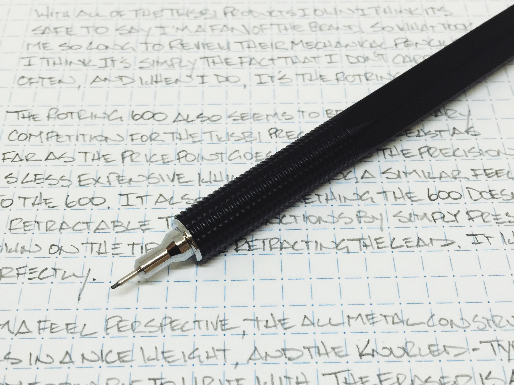
The model I received for review from JetPens is the TWSBI Precision Mechanical Pencil 0.5 mm with retractable tip. It is a full metal body pencil with a nice knurled-style grip, and a tip that retracts when pressing down on it and clicking the mechanism. It's a nice feature, although not one that is make or break for me personally. What is interesting though is that the retractable tip models are the exact same price ($25) as the fixed tip models. That is not something you see from other vendors. The retractable tip usually costs a premium.

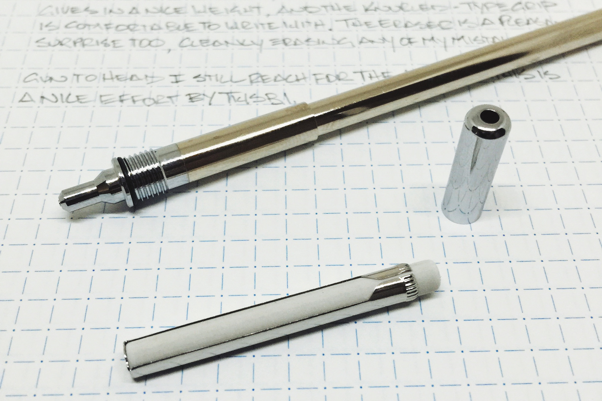
Writing with the Precision is a nice experience. It is well balanced, the knurling is tame, and the provided lead of unknown origin is smooth, dark, and not too soft. The eraser is one of the niceset I have used on a mechanical pencil, removing all traces of graphite easily and cleanly. And it is extra long, so it is far more useful than it's competition. TWSBI also ships extra leads and erasers with the pencil, which is a great bonus.

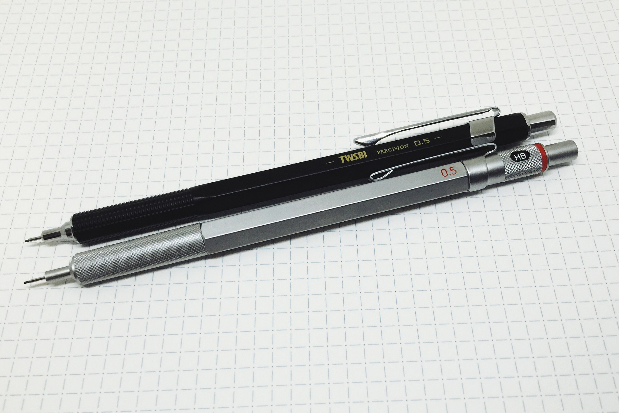
If you are a mechanical pencil fan, the comparisons to the Rotring 600 are inevitable. The TWSBI Precision is less expensive and has the added retractable tip option, but the Rotring 600 is widely considered to be one of the best drafting pencils ever made. There is something about its feel that is solid and dense, yet its light enough to allow you to glide across the page without knowing the pencil is there.

So yes, gun to my head I take the Rotring 600 over the TWSBI Precision, but that's just me. The TWSBI is excellent in its own right, and fits in nicely with its competition in this price range. I look forward to seeing what else TWSBI has up their sleeve in the non-fountain pen realm.

(JetPens provided this product at no charge to The Pen Addict for review purposes.)

Posted on August 3, 2015 and filed under Pencil Reviews, TWSBI, Mechanical Pencil.

Hobonichi Planner Review

(Susan M. Pigott is a fountain pen collector, pen and paperholic, photographer, and professor. You can find more from Susan on her blog Scribalishess.)

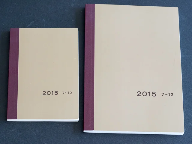
The Hobonichi planner is a Japanese diary/calendar made by Hobo Nikkan Itoi Shinbun. Originally only in Japanese, the planner is now available in English (but see below) and can be ordered through the Hobonichi (English) store. It comes in two sizes: the A6 Techo (5.8"x 4.1") and the A5 Cousin (8.3"x 5.8"). Unfortunately, only the Techo is available in English. Apparently the company offers the Cousin only in Japanese. The Hobonichi uses Tomoe River Paper, a high-quality, super-thin, fountain-pen-friendly paper, which is one of the reasons so many people love this planner.

The Hobonichi is quite a phenomenon in Japan, and excitement about it has spread to the United States. Not only are entire blogs dedicated to this planner, but you can find Facebook pages, Instagram accounts, and Pinterest pages all focused on the Hobonichi.

Last fall, I ordered a Hobonichi Techo 2015 (twelve month), complete with a Hobonichi cover, a plastic cover, and a few accessories. It arrived from Japan fairly quickly, and I opened the box with great anticipation. I wanted to love the Techo. But it was smaller than I expected. And although the cover was fun, I didn't like that the only way to keep it closed was by using a pen through the loops. I wasn't going to risk losing a fountain pen that way. Also, I could barely see the dates and the times, they were so small. I decided to sell the Techo and stick with my Midori Traveler's Journal.

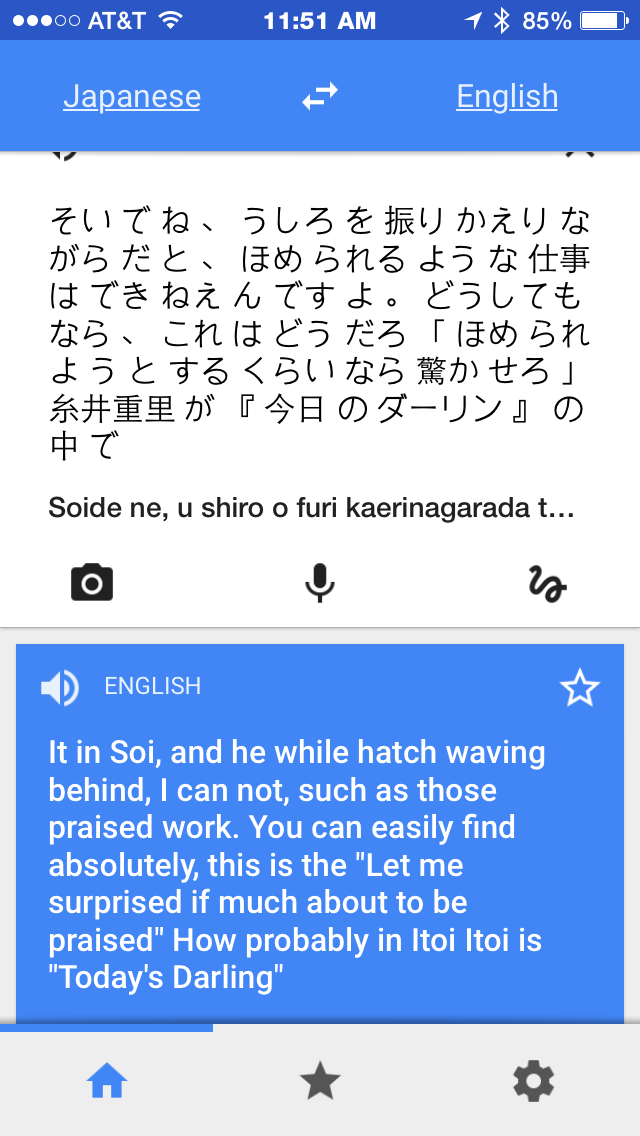
But, my fascination with the Hobonichi continued. When I found out that you could order July through December planners for around $16.00 (USD), I decided to give the Hobonichi a second try. But this time I opted for the Hobonichi Cousin in the A5 size. The six-month Hobonichi is only in Japanese, but I figured I could live with that and give Google Translate a try (spoiler alert: Google translate does a horrible job with Japanese).

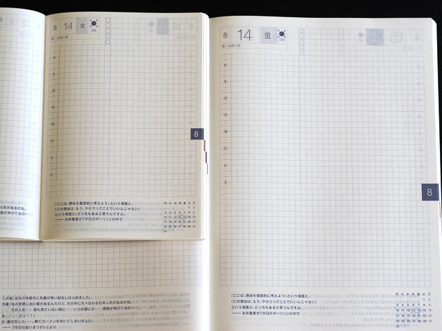
I accidentally ordered a Techo A6 instead of the Cousin and had to place a second order. But this gave me the opportunity to compare the Techo to the Cousin. You can see how much larger the Cousin is in comparison.

The Hobonichi planner is cardboard-bound and is sewn to lie flat when opened. The Hobonichi can be used as is or you can purchase a cover designed for it. The Hobonichi brand covers come in a variety of designs and include several inside pockets and attached bookmarks. To protect the exterior, you can order a plastic cover that fits over the planner cover.

The Hobonichi 2016 planner and covers will be available beginning September 1, 2015. The 2016 Techo planner comes in English, and if you order through the Hobonichi 1101 store the whole process is in English.

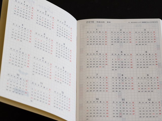
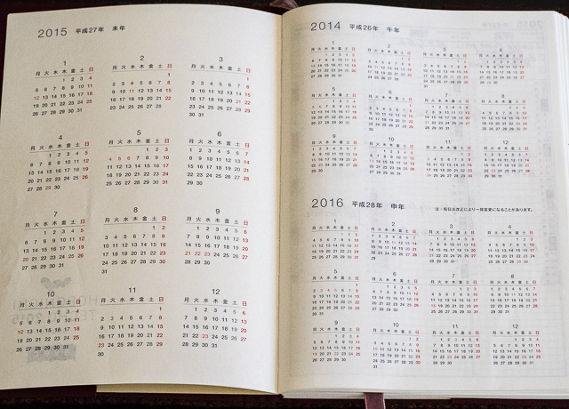
Both the Techo and the Cousin follow a similar format. The first two pages contain yearly calendars.

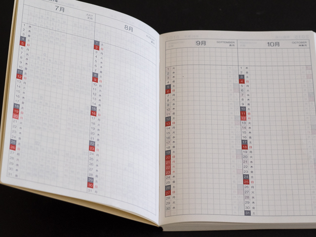
Monthly calendars in vertical format appear next. The nice thing about these vertical calendars is you can see several months at once.

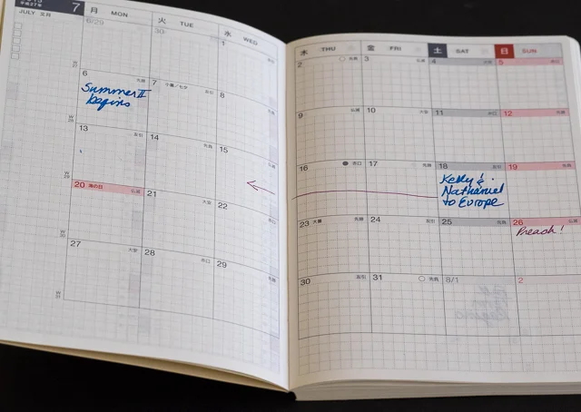
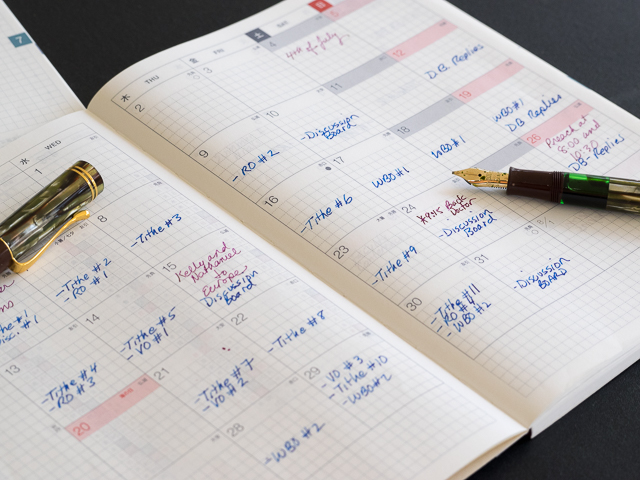
Next are monthly calendars. These monthly calendars start the week with Monday, which always confuses me because I'm accustomed to American monthly calendars which typically start the week with Sunday. I have to be careful that I'm on the correct day of the week when I write things in.

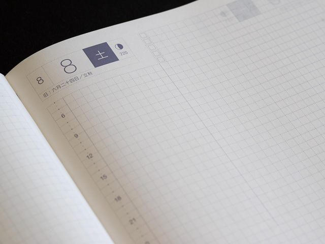
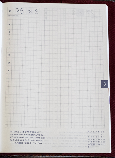
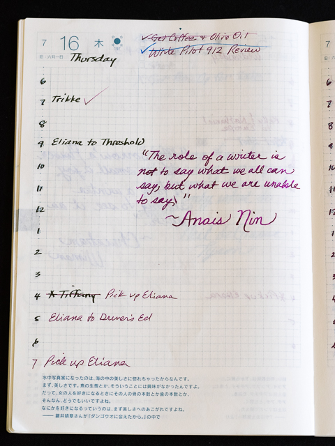
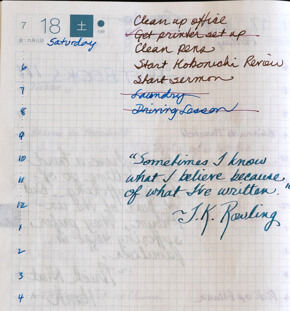
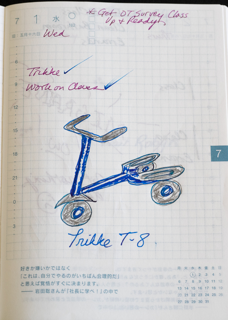
Next is a page for each day. In the upper left corner is the month number and the date. The days of the week are printed in Japanese in the six-month version, so I simply write the day in English in the space provided. On the top right are five check boxes next to which you can list to dos. Down the left-hand side is the time in three-hour increments using the 24-hour system.

On the bottom left is a quote in Japanese (in the twelve-month English Hobonichis the quotes are in English) and on the right is the calendar for the month with the current date circled.

The month date is also on the right margin in a specific color so that you can quickly flip to the correct month. You can see the colors on the edge of the planner.

The Hobonichi Cousin, for the most part, makes good use of its larger size. It includes three years instead of two on its first two pages.

The vertical month pages show six months instead of four. I like this because I'm a professor, and it allows me to see an entire semester all at once.

Cousin Vertical Month.jpg

However, instead of making the vertical month lines larger, the Cousin simply has extra space at the bottom. You can see that they basically reprinted the exact same size lines from the Techo rather than redesigning the page to use the extra space.

The month pages are much larger than the Techo, and the Cousin does a good job of taking advantage of this extra space.

The page-per-day format is another example of the Cousin being copied from the Techo. Why they didn't spread the timeline out so it uses all the space of the page, I don't know.

What I do is write the time in 1 hour increments over the numbers in the Cousin and that gives me almost twelve hours to plan my day.

The to-do section is the same size as the Techo. The only difference between the Techo and the Cousin on the day page is that the Cousin has more grid space for writing or drawing. I think they should have redesigned the entire page to take advantage of the larger size of the Cousin.

At the back of each Hobonichi are some pages with blank grid paper, followed by various pages you can use to plan your time table, list anniversaries or birthdays, list your favorite books or movies, keep ideas for gifts, list a few important addresses, and keep your own personal information.

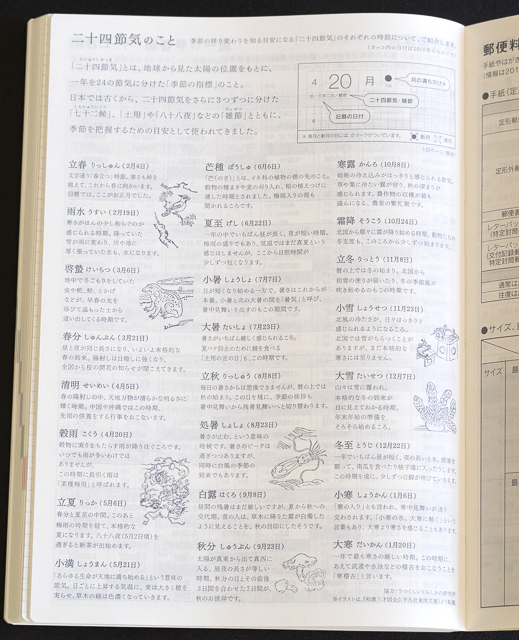
In addition there are several pages in Japanese containing instructions and various other information I can't read.

The Tomoe River paper used in the Hobonichi is wonderful. It is smooth, thin, and great with fountain pens. None of my fountain pens bleed through the paper, but show through is typical because of how thin Tomoe River paper is. If this is something that drives you crazy, you won't like the Hobonichi. It doesn't bother me at all. I love the feel and look of a well-used notebook.

Although the Techo is more popular because it is small enough to fit in one's purse or notebook, I much prefer the Cousin. Its larger size suits how I do planning, and even though I've had to make a few adjustments (like writing my own hours in the Japanese version), I love the paper and the design. I like that I can see the entire semester at a glance, each month at a glance, and then focus on each day. I'm committed to using the Cousin this summer and fall. I think it just might replace my Traveler's notebook.

People who are artistic use their Hobonichis like a sketch-diary where they detail each day with various drawings and watercolors. I tried to do this, but I can't draw well enough to make this practical.

Instead, I decided to practice my handwriting, so I write down a special quote each day.

Instead of buying a Hobonichi brand cover, I decided to get my Cousin cover from Esplanade London's Etsy Store. They use Harris Tweed for their covers. You can choose from a variety of patterns, and they offer covers for both the Techo and Cousin Hobonichis. I love my cover. It has pockets for my fountain pens and smaller notebooks and it looks so very British.

Planners and journals are extremely personal choices. Some people swear by their Midori Traveler's Journal whereas others love Filofax. Some prefer a simple spiral notebook or a cheap calendar from Staples. Many people love their Hobonichis. And some of us can't decide, so we collect multiple planners.

If you want to try out a Hobonichi, I'd suggest purchasing just the planner first. Don't go crazy, like I did, and get a Hobonichi cover and a bunch of accessories. Then you won't waste a bunch of money if you don't like the planner. A word of warning: the really cool Hobonichi covers sell out quickly, so if you decide you want one of those, you'll probably have to order one as soon as they become available in September.

Pros

  • Simple design with different views–yearly, monthly-vertical, monthly, and one page per day
  • Fountain pen friendly Tomoe River Paper
  • The Hobonichi yearly planner is not too expensive at around $22 USD (though covers and accessories can add to the cost)
  • Lightweight
  • Binding allows the planner to lie flat
  • Graph paper format allows for easy to do lists, writing, drawing, graphing

Cons

  • Tomoe River paper is thin and writing/drawing does show through
  • When it comes to keeping a calendar, people have different organizational styles and the Hobonichi format might not fit yours
  • No option for separate books for monthly, yearly, and daily calendars, as with the Traveler's Notebook. In other words, you can't rearrange the Hobonichi like you can some other planners.
  • The Cousin A5 size does not come in an English version (I am really bummed about this)
Posted on July 31, 2015 and filed under Hobonichi, Notebook Reviews.