J. Herbin Emerald of Chivor Ink Review

(Susan M. Pigott is a fountain pen collector, pen and paperholic, photographer, and professor. You can find more from Susan on her blog Scribalishess.)

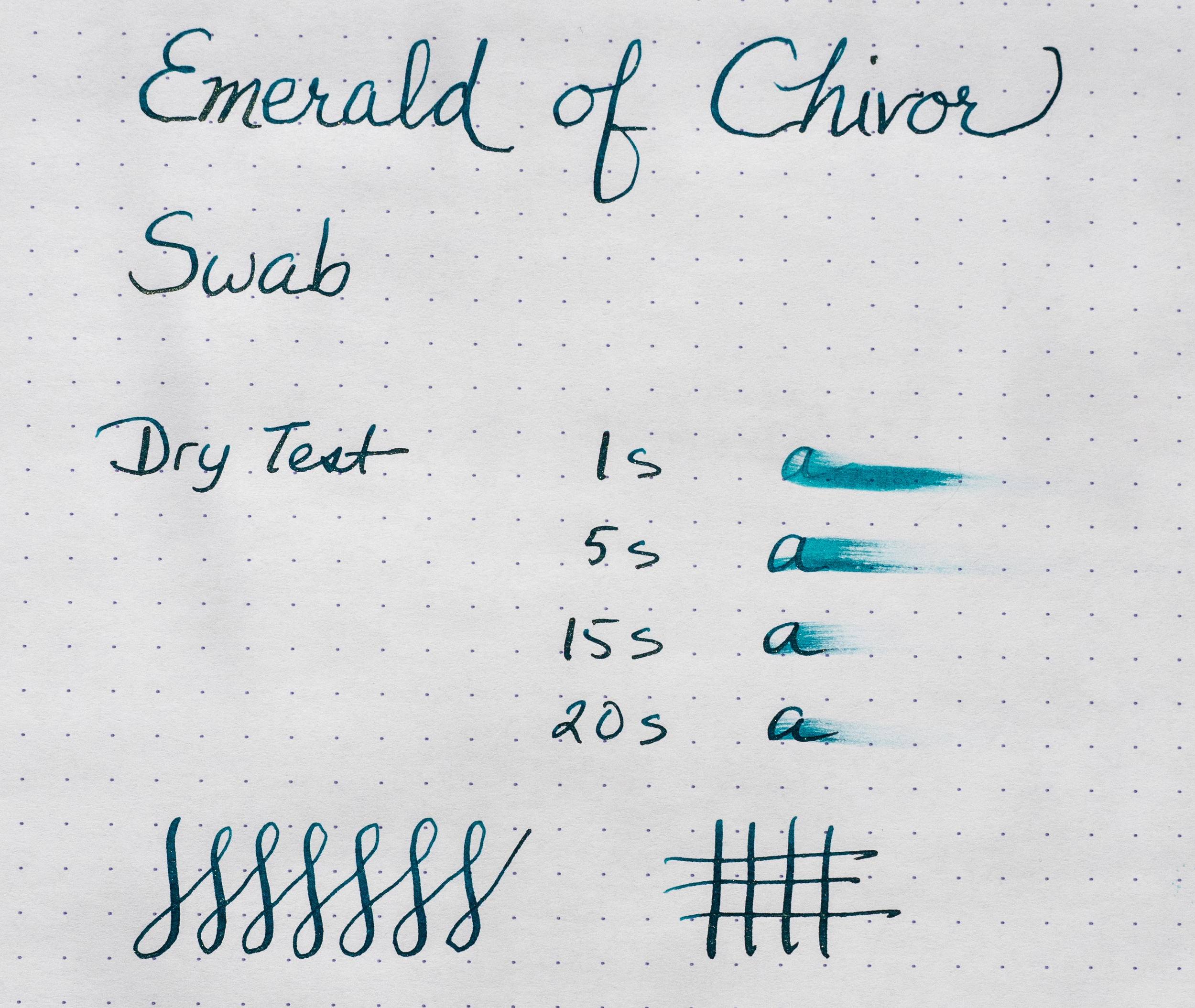
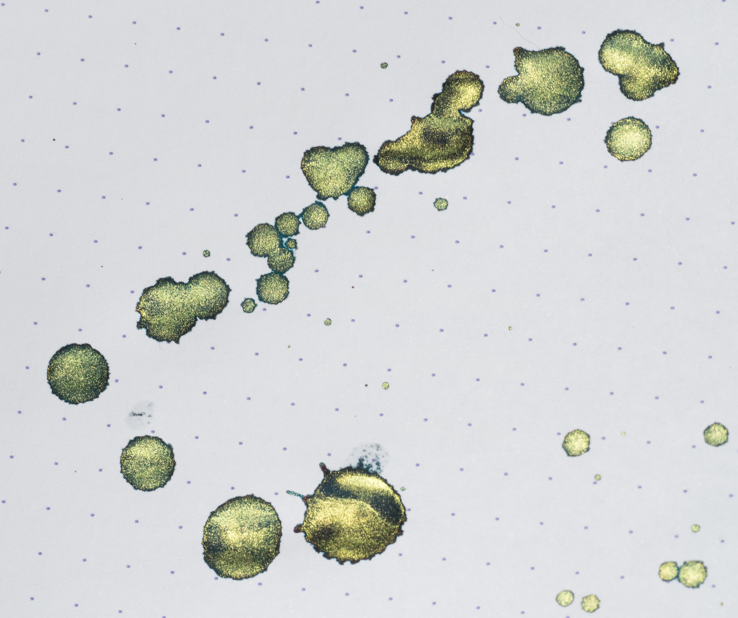
When J. Herbin first announced their newest 1670 collector's ink, the Internet went crazy–well, the fountain pen Internet went crazy. The photographs of the ink revealed a spectacular teal green with gold flakes and stunning red/pink sheen. I certainly had never seen anything like it before. Of course J. Herbin had already produced other 1670 inks with silver or gold flecks (Stormy Grey and Rouge Hematite), but Emerald of Chivor stands out because of its special sheening qualities.

As soon it was available, I bought a bottle from Anderson Pens for $26.00 plus shipping. I honestly didn't have high expectations for this ink. I bought the original formula Rouge Hematite and sold it. My bottle of Stormy Grey sits unused. The speckles just didn't show up consistently enough. Plus the red and grey colors weren't my favorites. But I'm a nut for blue and teal inks, so I knew I would like Emerald of Chivor even if the gold specks disappointed me. Plus, that fantastic sheen was so unique.

I've been writing with the ink for several weeks. It flows smoothly from my Pilot 912 with an FA nib. If I shake the pen gently before writing, the speckles appear pretty consistently. I'm impressed with how well the ink's sheen and flecks appear even with my fine FA nib.

I've also used calligraphy nibs to test the ink. Obviously broader nibs show off the ink even better than fine ones.

The ink is heavily saturated and it takes time to dry. So you have to be careful not to smudge it while you write. It isn't water fast, but it's so saturated, water doesn't completely erase it.

I haven't experienced any nib clogging. I've left the ink in my 912 for several weeks, and the nib writes perfectly each time. I wouldn't leave it in vintage pens for any length of time, however, just to be safe.

The thing that surprised me most about Emerald of Chivor is that the paper you use makes all the difference. On Clairefontaine Triomphe and Rhodia Dot Pad paper, the gold specks show up just fine, but there's no pink sheen.

But on Tomoe paper the ink shines like neon light. This is what made everyone go "Wow!" when they first saw this ink. I'm not sure why the pink sheen shows up on Tomoe but not on the other paper. You'll need to experiment the paper you use with Emerald of Chivor to find what brings out both the sheen and the sparkles.

Of course, to see these marvelous properties, you have to view the ink and paper in bright light, particularly bright sunlight. In ordinary light, the ink is a beautiful teal, and you can see some shimmer. But if you want an explosion of color, you need bright light.

The gold specks fall to the bottom of the bottle. You need to shake the ink well before filling your pen.

The gold specks fall to the bottom of the bottle. You need to shake the ink well before filling your pen.

Perhaps this ink is best used for special things like invitations and envelopes where calligraphy nibs best express its beauty. It's certainly terrific for every day use in finer nibs, but to fully appreciate this glamorous ink, you'll have to take your writing into the sunshine to see it sparkle. And that's not a bad thing. Everyone can use a little sunshine.

Posted on September 18, 2015 and filed under J. Herbin, Ink Reviews.

Pilot Acroball 4 Multi Pen Review

(Jeff Abbott is a regular contributor at The Pen Addict. You can find more from Jeff online at Draft Evolution and Twitter.)

It took me a while to give the Pilot Acroball a shot. I'm a fairly committed Uni-ballb Jetstream fan, and I just didn't have a need to try anything else. Fast forward a bit, and I'd heard enough good things about Pilot's hybrid ballpoint offering to give it a fair shake.

What I love about the Jetstream is how smooth and dark the ink is. It's a fantastic experience for a ballpoint, and it's also my go-to pen for ballpoint situations. They're work horses — dependable and well-made. So, that leaves Pilot with a lot of work to do from the start.

I decided to try one of the multi pens first so I could try several colors at once without having a lot of extra pen bodies lying around. Yeah, I could have ordered one pen with several different refills, but the multi pen is way more exciting. They always bring back the nostalgia of using a Bic 4 pen from childhood, except these write much better.

Look and feel

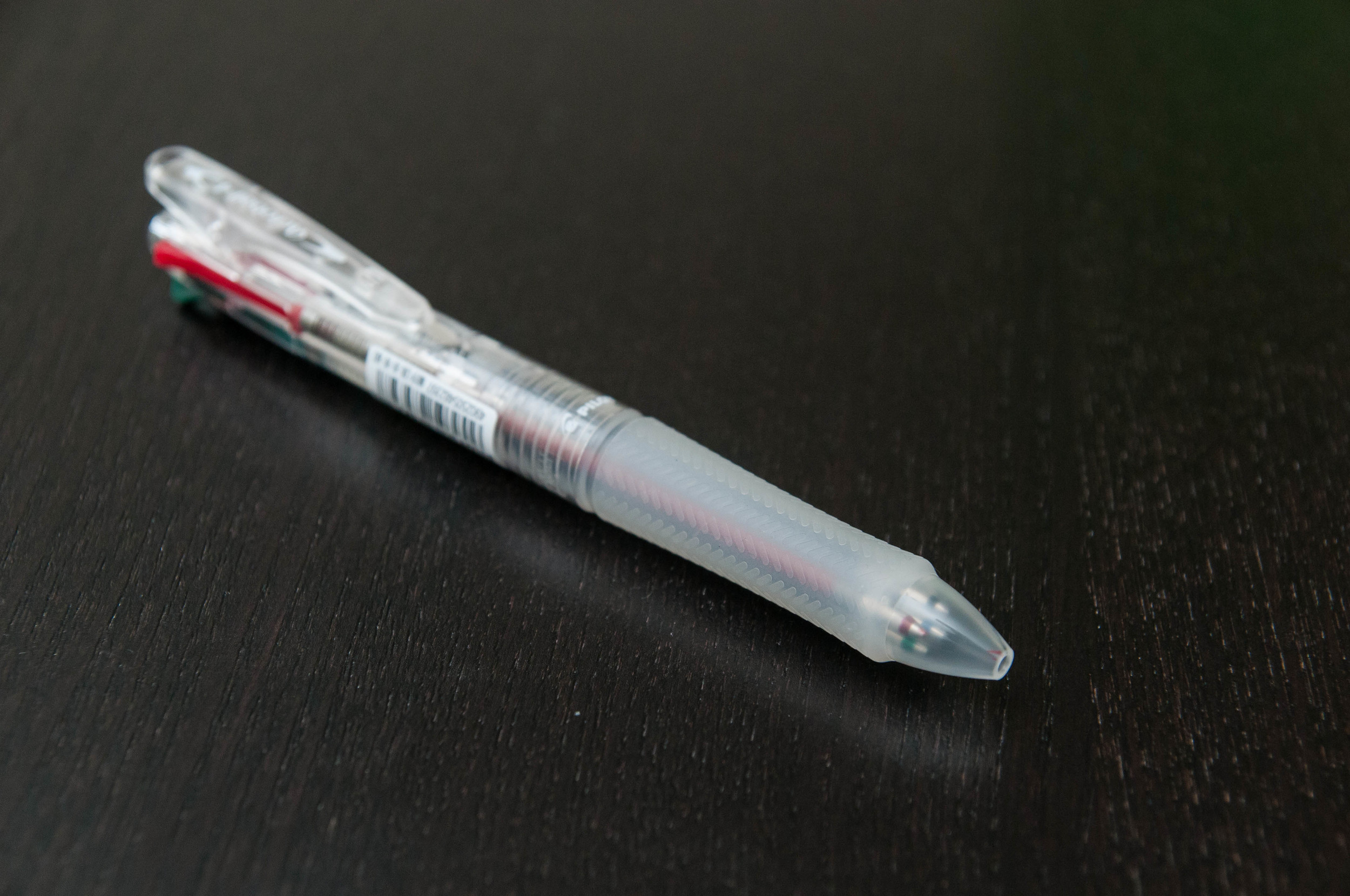
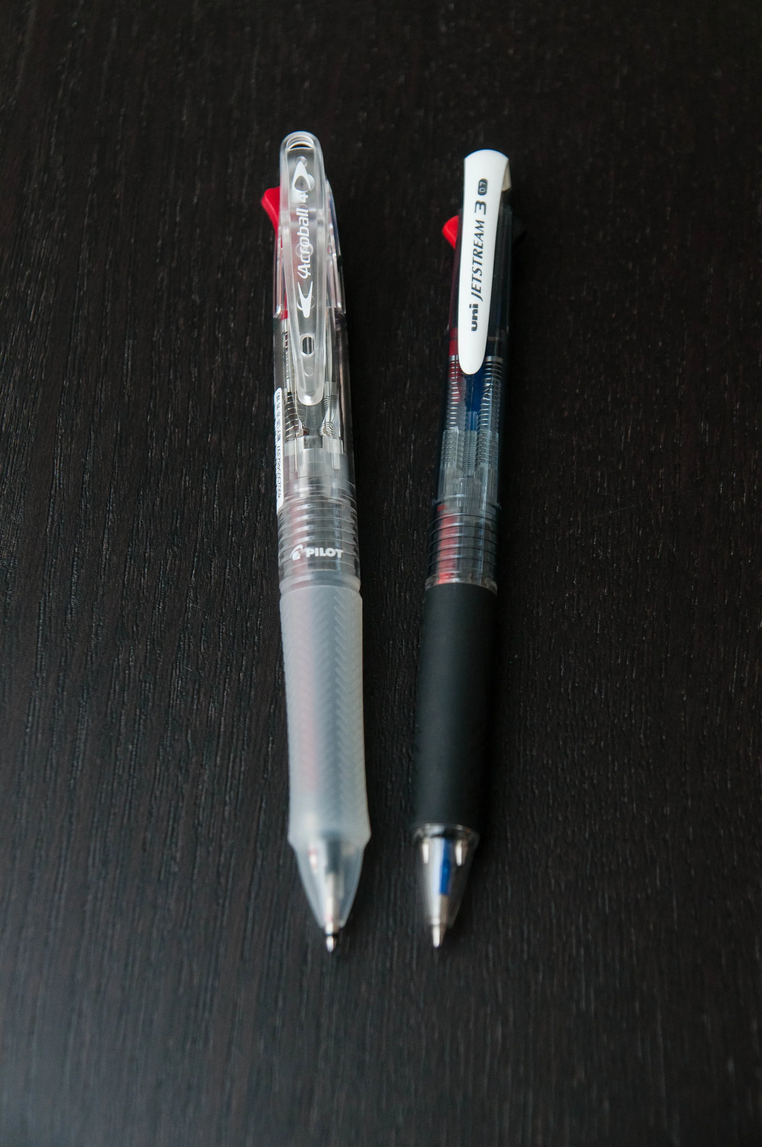
Let's take a look at the outside of the pen first. My first observation is the clip on the Acroball 4. It's a sturdy, spring-loaded clip that feels really nice. That's one thing about the Jetstreams that I don't care for: they have weak clips (especially in their multi pens). When I clip the pen to something, I don't want to worry about it falling off, and the Acroball makes me feel nice and safe.

Another thing that I love about this body is the grip. It's a fat, textured grip that feels good in my hand when writing. It also does a really good job of resisting lint and dust.

The "knocks" for each color are a bit weak, but that's normal for any multi pen. There just isn't much space to include high-quality, sturdy knocks for each cartridge. Yes, some more expensive multi pens have much more sophisticated designs that feel and work great, but they don't cost less than $10 like the Acroball 4.

I went with a clear body, which I'm really happy with. I have a soft spot for demonstrators, and this one fits the bill. There are a few other color options, but most of them feature a partially clear body. The colors only take over the grip and clip pieces on most options. The black one is just...black, and the blue one has a blue transparent body.

Writing

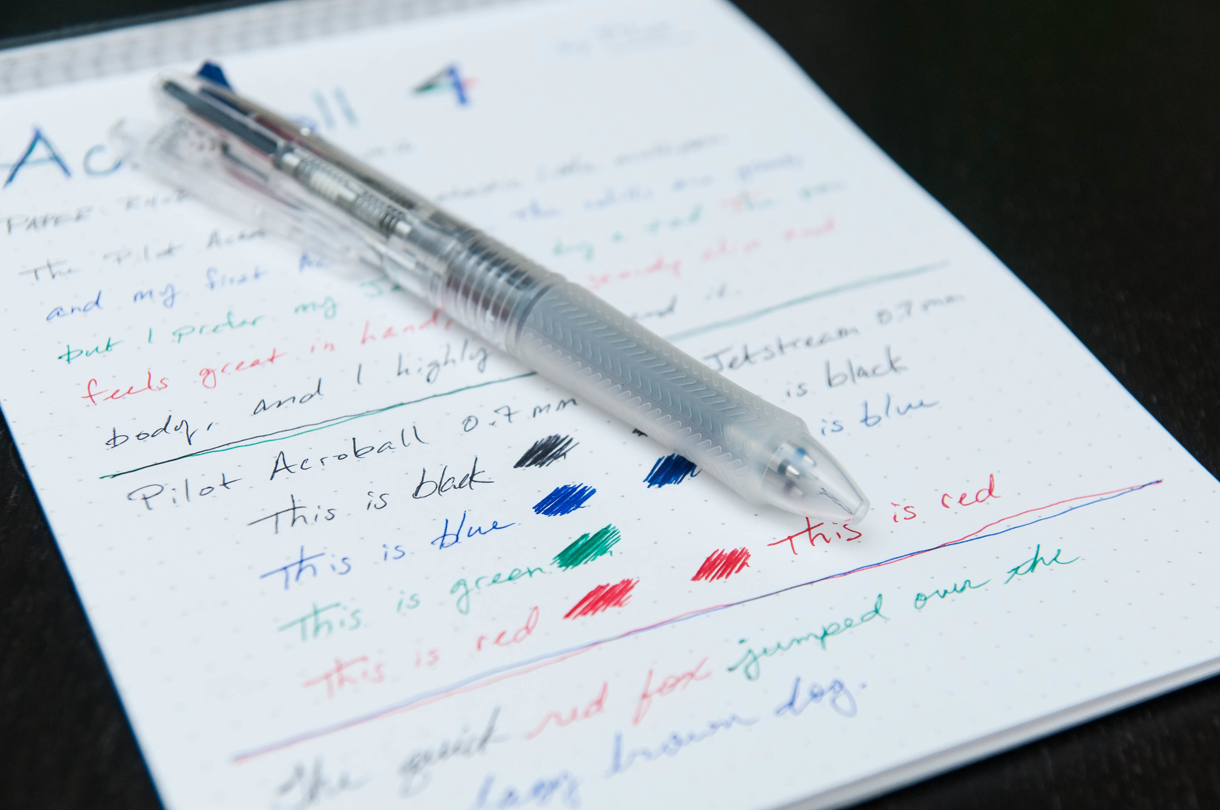
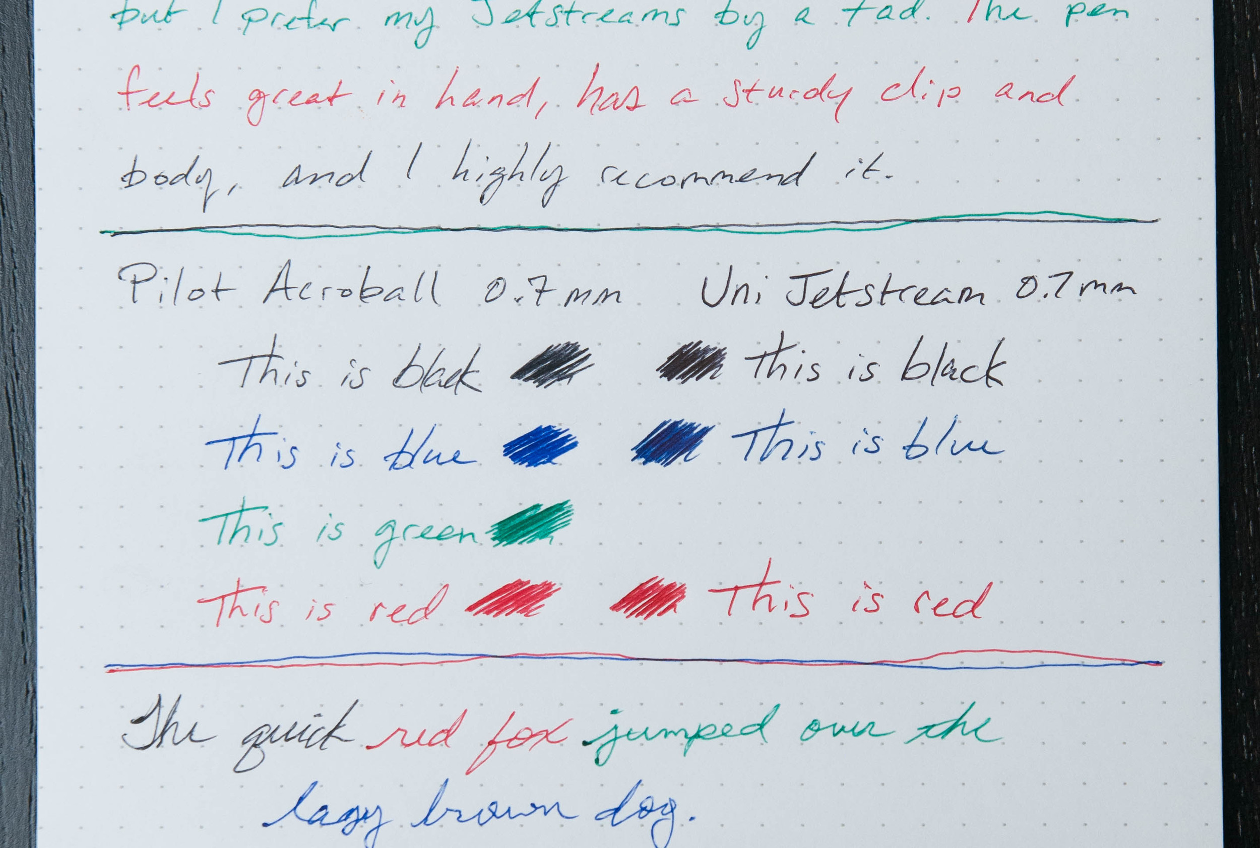
The Acroball is a great writer. Pilot has a really great cartridge here, and I'm happy to use it. But, it just isn't as nice as the Jetstream cartridges. In my experience, the Acroball skips a bit too much when compared to the Jetstream. The colors work well, but the black is a little lighter than I prefer.

To be honest, I can only notice this difference when writing with them on the same page. When I'm just using the Acroball, I don't notice any differences.

Another thing to note in my pen is that the green cartridge is exceptionally scratchy compared to the other 3. I'm not sure if I have a dud cart or if this is normal because of the color and properties of the ink. Who knows. All I know is that I don't use the green cartridge because of the scratchiness.

Overall

The Acroball is a fantastic pen that I highly recommend. Fortunately, this is a pen that most big-box retailers sell, so that means more people are being exposed to it. I'm happy it's out there, but I'm also more happy with my Jetstreams.

I chose the clear model of the Acroball 4, but there are also several other color options.

(JetPens provided this product at no charge to The Pen Addict for review purposes.)

Posted on September 16, 2015 and filed under Acroball, Pen Reviews, Pilot.