Tombow 2558 Pencil Review

I rarely find myself without a wooden pencil within reach these days.

That's quite a change, isn't it? I used to say this about fountain pens too, something along the lines of "I don't get it." Well, I'm starting to get it more and more, and I don't like being without a pencil. I may not use one every day - if fact I don't - but the comfort knowing the sweet smell of cedar is just an arms reach away is comforting.

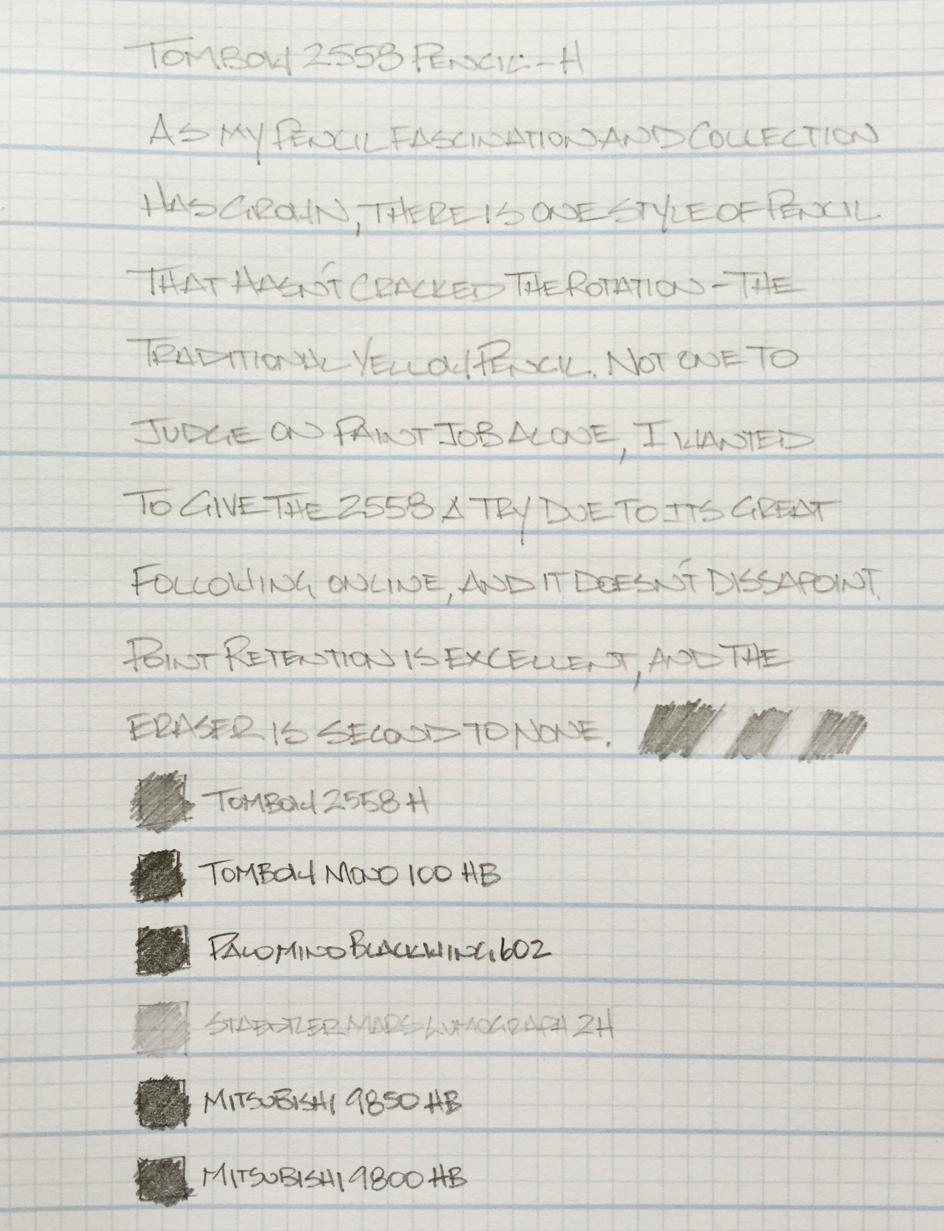
I'm still in the discovery phase in my pencil addiction. What I have found so far is that I like good point retention and a medium/dark line. I also like nice paint jobs and dipped ends (no erasers) but those things are far down the list compared to the first two items.

For example, my two favorite pencils right now are the Tombow Mono 100 HB and the Palomino Blackwing 602. The Mono taught me that 1. Pencils can be beautiful, and 2. Point retention is a thing. I could write and write and see only moderate wear in the graphite. Certainly much less than some random #2 pencil from my school days. The Blackwing 602 taught me about smoothness and depth of color. It really leaves an amazing line on the page and is a pleasure to write with.

Taking what I like about those two pencils, I wanted to start climbing up the H side of the hardness scale to find the best point retention in combination with the darkest graphite. The Tombow 2558 H seemed like a nice place to start considering how much I like the Mono 100.

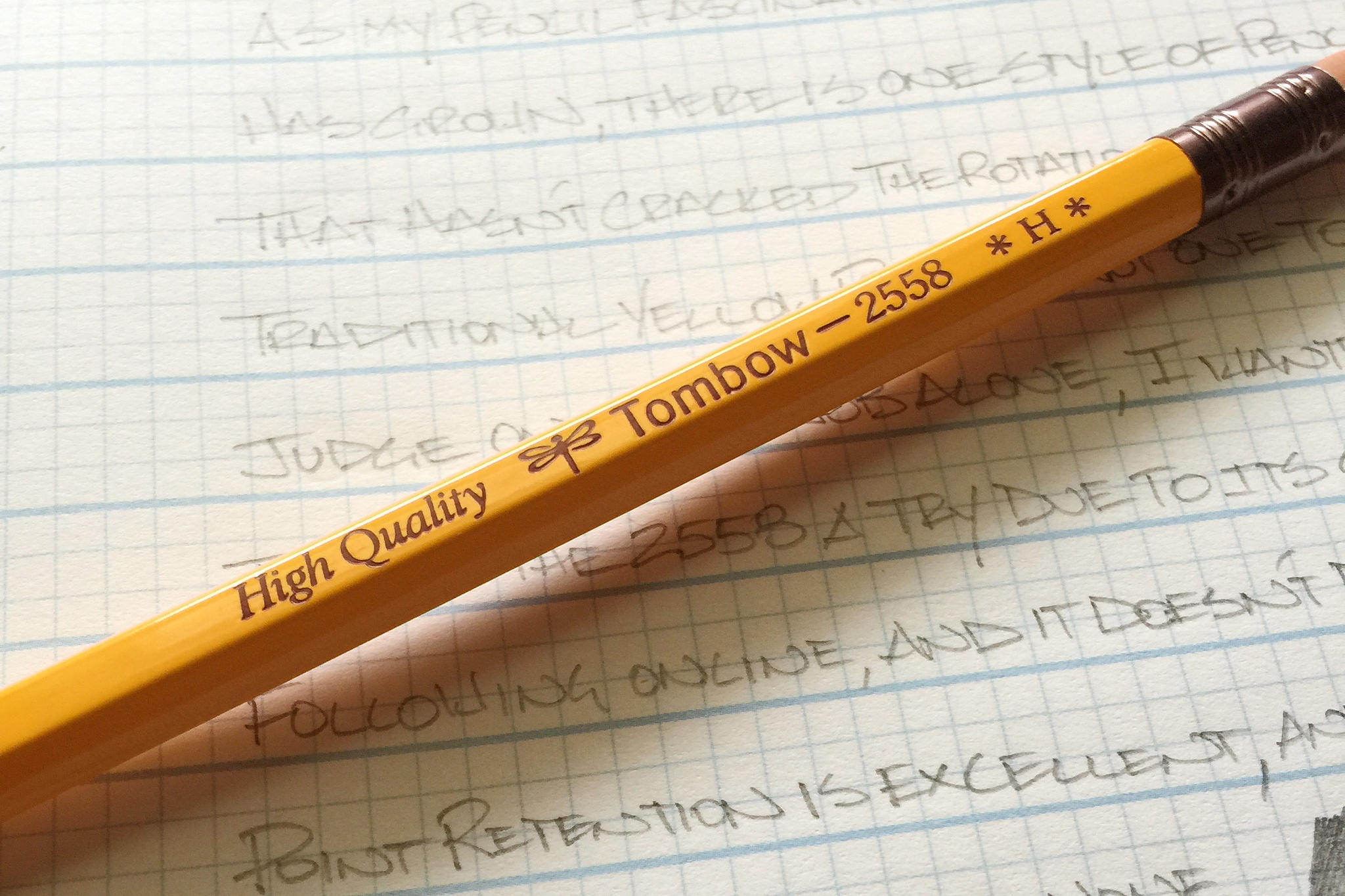
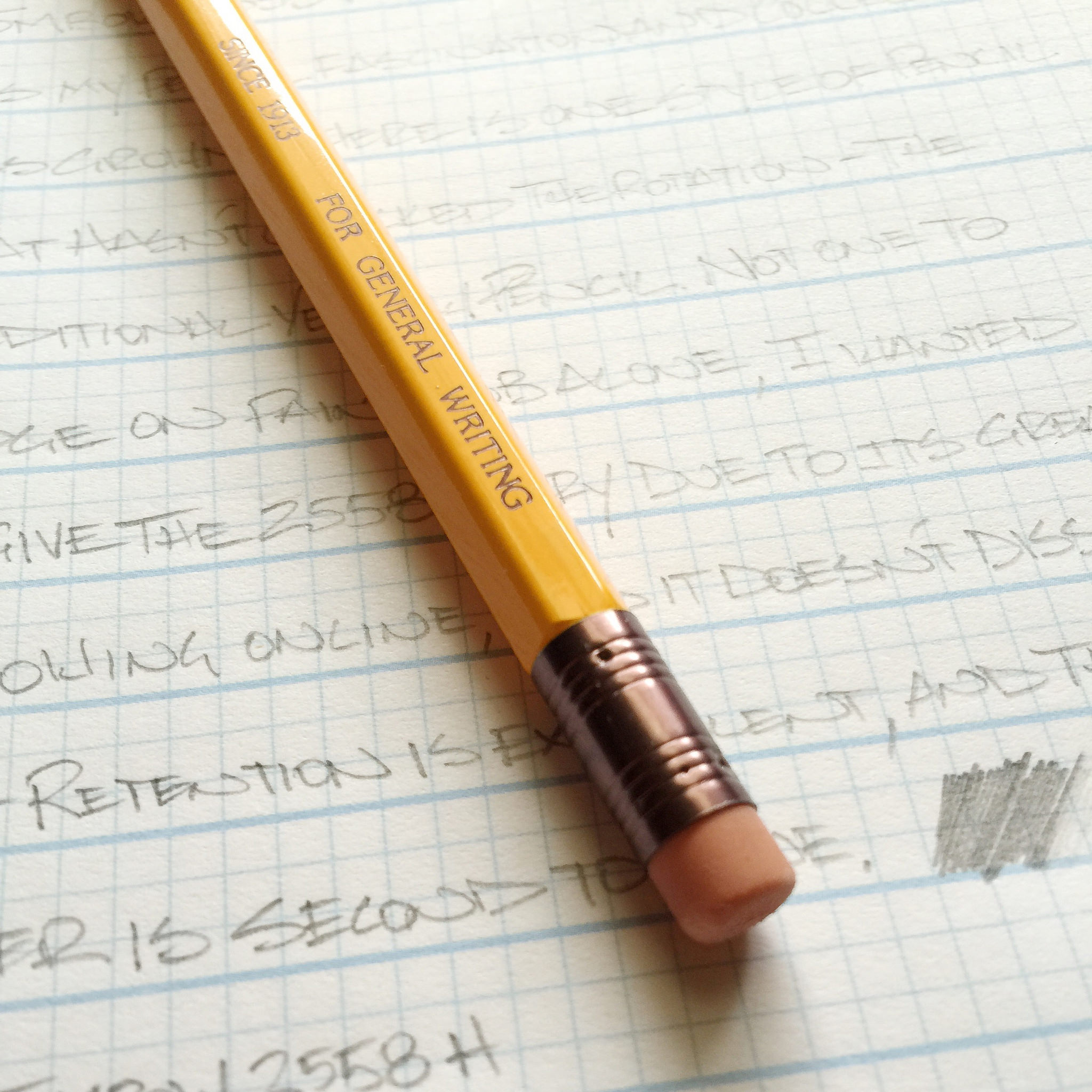
The 2558 is likely the most normal Tombow pencil going. It has that traditional yellow pencil paint job, standard size and shape ferrule, and a pink eraser. Put it in a pile with a bunch of first graders pencils and you may not be able to pick it out easily (although the ferrule has a sweet purple tint.) The looks of the pencil were a bit of a turnoff at first. Why buy something normal looking when their are so many better (for me) choices?

Fortunately, the graphite delivered what I was looking for in performance. It sharpened up well and the point held nicely through several writing sessions. Once you cross the HB middle line, the harder graphite cores are naturally lighter, and although this H is light, it is dark enough for me and how I like to write. I think I could go one to two grades harder in fact, although they are not available in this model.

While I'm not normally an eraser guy, the 2558 eraser is very nice. Probably the best I have used, although my sample size is admittedly small. It doesn't take much action to remove the graphite from the page, and the eraser bits roll up nicely for easy sweeping away.

The Tombow 2558 isn't going to knock off my favorite pencils any time soon, but every time I try something new (like this pencil), I learn more and more what my preferences are. Luckily for me, there are many more pencils to be tried.

(JetPens provided this product at no charge to The Pen Addict for review purposes.)

Tombow 2558 Review.jpg
Posted on September 28, 2015 and filed under Pencil Reviews, Tombow.

Visconti Homo Sapiens Bronze Age Fountain Pen Review

The Visconti Homo Sapiens Bronze Age fountain pen is one of my grail pens. It is one of those pens that catches your eye with its striking bronze embellishments and basaltic lava finish. There's nothing quite like it.

I held off ordering one for quite awhile, simply because the pen looked enormous and heavy. It is a big pen, measuring 5.75 inches, and it is weighty at 45 grams (both measurements are with the pen capped). Nevertheless, it balances perfectly in the hand. A seller on Fountain Pen Network offered this Homo Sapiens for an "I-can't-pass-this-by" price, so I bought it.

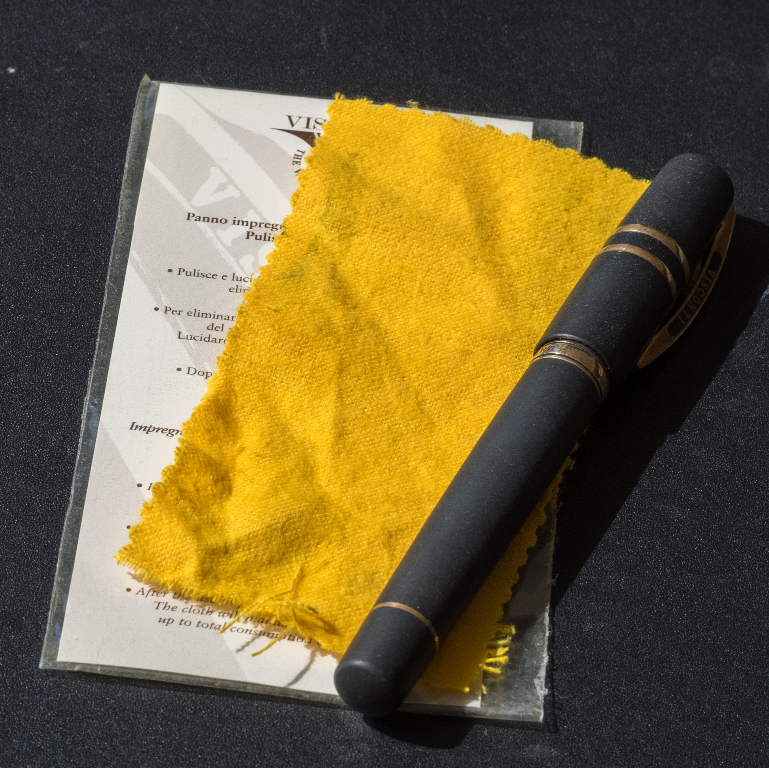
The packaging is sophisticated and suits the pen. The outer cardboard box is cream colored with the Visconti logo. Inside is a large, leather-like clamshell box. When you open it, the Homo Sapiens is encased in cream-colored cloth that contrasts nicely with the pen. The clamshell box has a slide-out drawer that contains information about Visconti pens and a polishing cloth for the bronze.

The cap attaches using Visconti's special "hook safe lock." I like the design and it's certainly quicker than unscrewing a cap, but I haven't found it to be all that "safe." The cap comes off too easily. I wouldn't trust it in a shirt pocket.

A removable bronze finial with the Visconti logo adorns the top of the cap. You can replace it with Visconti's "My Pen" system and choose your initials or a stone. I like the Visconti finial but might someday buy a stone just for variety.

Finial.jpg

In addition the cap is encircled by two solid bronze bands and the Visconti clip. The Visconti name is painted on both sides of the clip. I think they should have engraved it. If you want to attach the pen to a shirt pocket or papers the clip lifts easily.

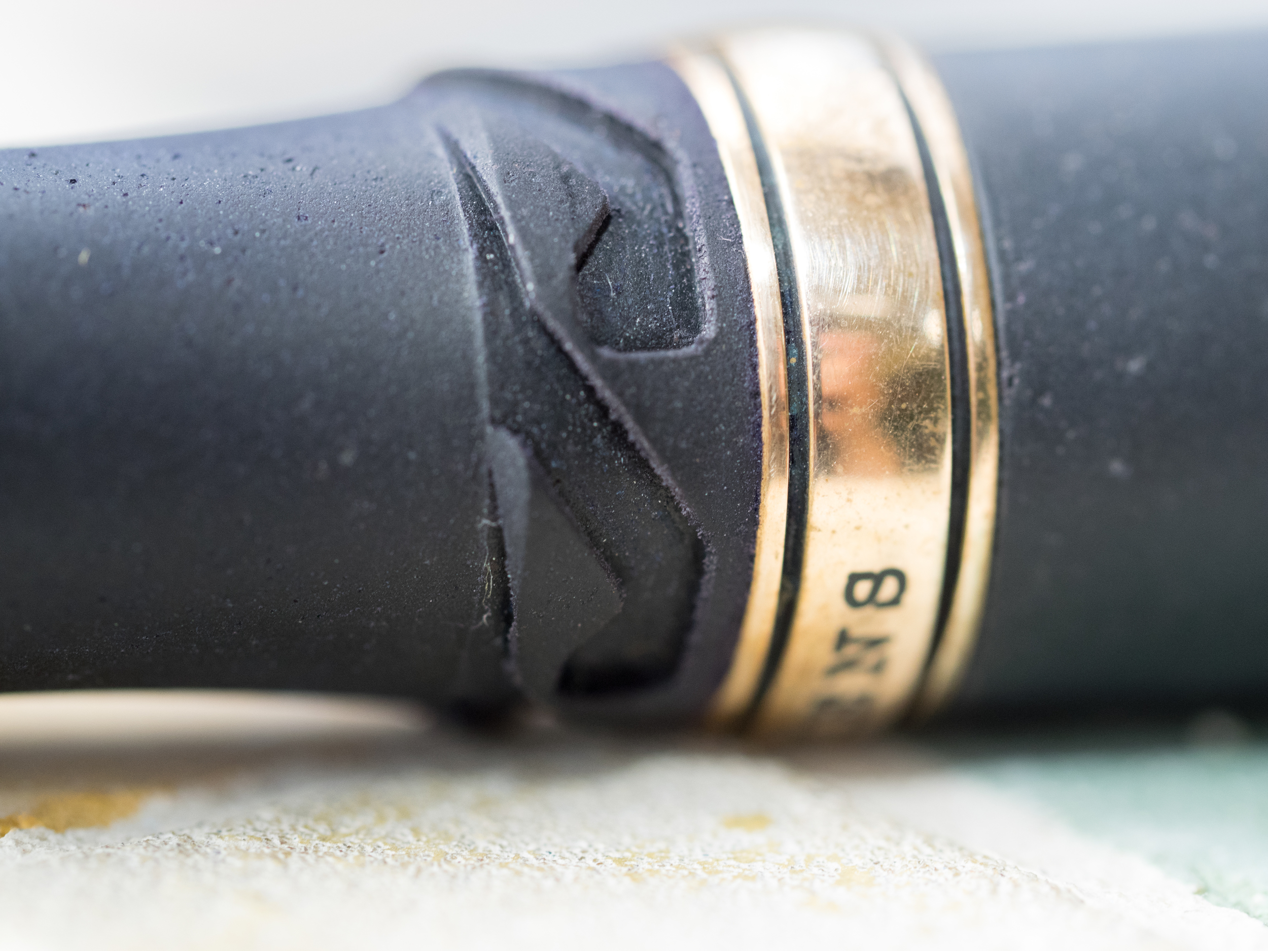
The barrel has two bronze bands. The top band is engraved with "Homo Sapiens." The letters are filled with black ink so they stand out nicely against the bronze.

The bottom band is slender and encircles the piston. It actually popped off when I was cleaning the pen. It's not hard to press it back into place, but I'm not impressed when bronze parts fall off.

The pen uses Visconti's high power vacuum filler system. It's simple to use. You unscrew the piston, pull to extend it, submerge the nib in the ink and push. I do this two or three times to make sure I get a good fill. Unfortunately, the Homo Sapiens does not have an ink window, so you don't know how much ink is in the barrel. And vacuum fillers are notoriously difficult to clean. When I changed ink for this review it took a half hour of plunging to get the water to run semi-clear.

My nib is a 23K palladium stub (1.3mm). It's a beautiful nib with scrollwork and the Visconti name. Visconti calls it a "dreamtouch nib" which means it writes without any pressure being applied. It is definitely a smooth nib. The stub lays down a thick, juicy line. But, I've experienced hard starts and skipping, which is disappointing considering the retail price of this pen ($695.00). I suspect I'll have to send it to a nibmeister to tune it and maybe turn it into an italic.

Over time, the bronze elements tarnish. In fact, I've only had the pen a few months and the bronze has tarnished substantially. I used the included polishing cloth before I took photos for the review. It got some of the tarnish off, but the bronze isn't as shiny as before. The cloth is thin and doesn't seem to work all that well. Some Homo Sapiens owners prefer the look of the tarnished bronze; I prefer it shiny.

The lava body is something you simply have to touch to appreciate. It's a mixture of basaltic lava from Mt. Etna and resin. The lava surface is smooth to the touch, but has tiny pits in it, giving the pen a matte look.

The material quickly warms to your hand. And, if your hand gets sweaty, the lava absorbs the moisture. I've read elsewhere that when you ink the pen you should wipe off any remnants on the grip quickly with a wet cloth so the ink doesn't get absorbed into the lava.

The Visconti Homo Sapiens is an iconic pen. It's unique and beautiful. I've read that Visconti nibs can be hit or miss, and mine definitely has some faults. But, after a trip to a nibmeister, I suspect this will be one of my favorite pens.

Pros

  • The basaltic lava composition of this pen is unique and wonderful to touch
  • The power-fill system works well, but it's hard to clean thoroughly
  • The nib is gorgeous and writes a wet, smooth line (but see below)
  • Although the pen is large it balances nicely in the hand
  • The matte black and bronze accents are striking

Cons

  • Some people might find this pen too heavy
  • There's no ink window, so you don't know how much ink is left or if you've gotten a good fill
  • The bronze appointments tarnish over time
  • The cap is easy to remove accidentally
  • My nib exhibits hard starts and skips occasionally
  • At retail price, this pen is very expensive
Posted on September 25, 2015 and filed under Visconti, Pen Reviews, Fountain Pens.

Word. Notebooks Giveaway Winners

I had many reasons I wanted to run a giveaway for the latest Word. Notebooks Mountain Edition. One, I like giving stuff away. Two, I wanted to see how the vote broke down between Blue and Black covers. The results, from 108 entries:

  • Blue - 82
  • Black - 18
  • Abstain - 8

I fully admit to leading the witness in my review, but I don't think you can argue with the results. Blue is the clear winner in the eyes of the reader!

The third reason I ran this giveaway is I was curious to know how many of you employed a bit of game thoery in your response. Knowing Blue was the likely overwhelming choice, did anyone choose Black because their odds of just winning something would be much greater? I'll probably never know the true answer, but seeing this is how my brain works drop me a note if you did.

Now, on to the winners:

Congrats Becoming Sleek and Matt! Get in touch via the Contact Page in the next week and I'll get the notebooks headed your way.

Posted on September 24, 2015 and filed under Word, Notebooks, Giveaways.