(Susan M. Pigott is a fountain pen collector, pen and paperholic, photographer, and professor. You can find more from Susan on her blog Scribalishess.)
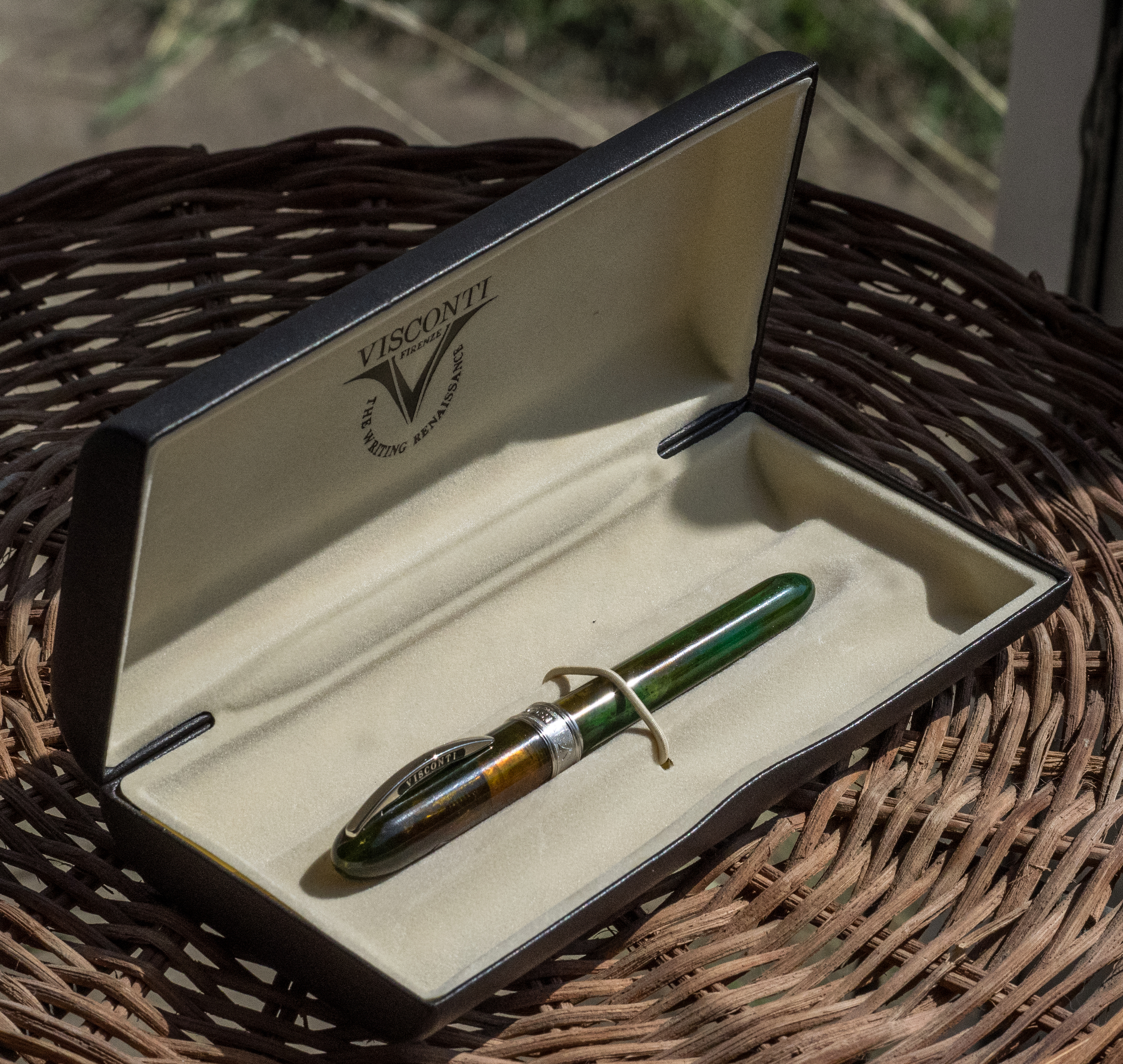
Goldspot Pens kindly loaned The Pen Addict a Visconti Van Gogh Midi in Green Musk to review. This fountain pen comes nicely packaged in a faux leather clamshell box.
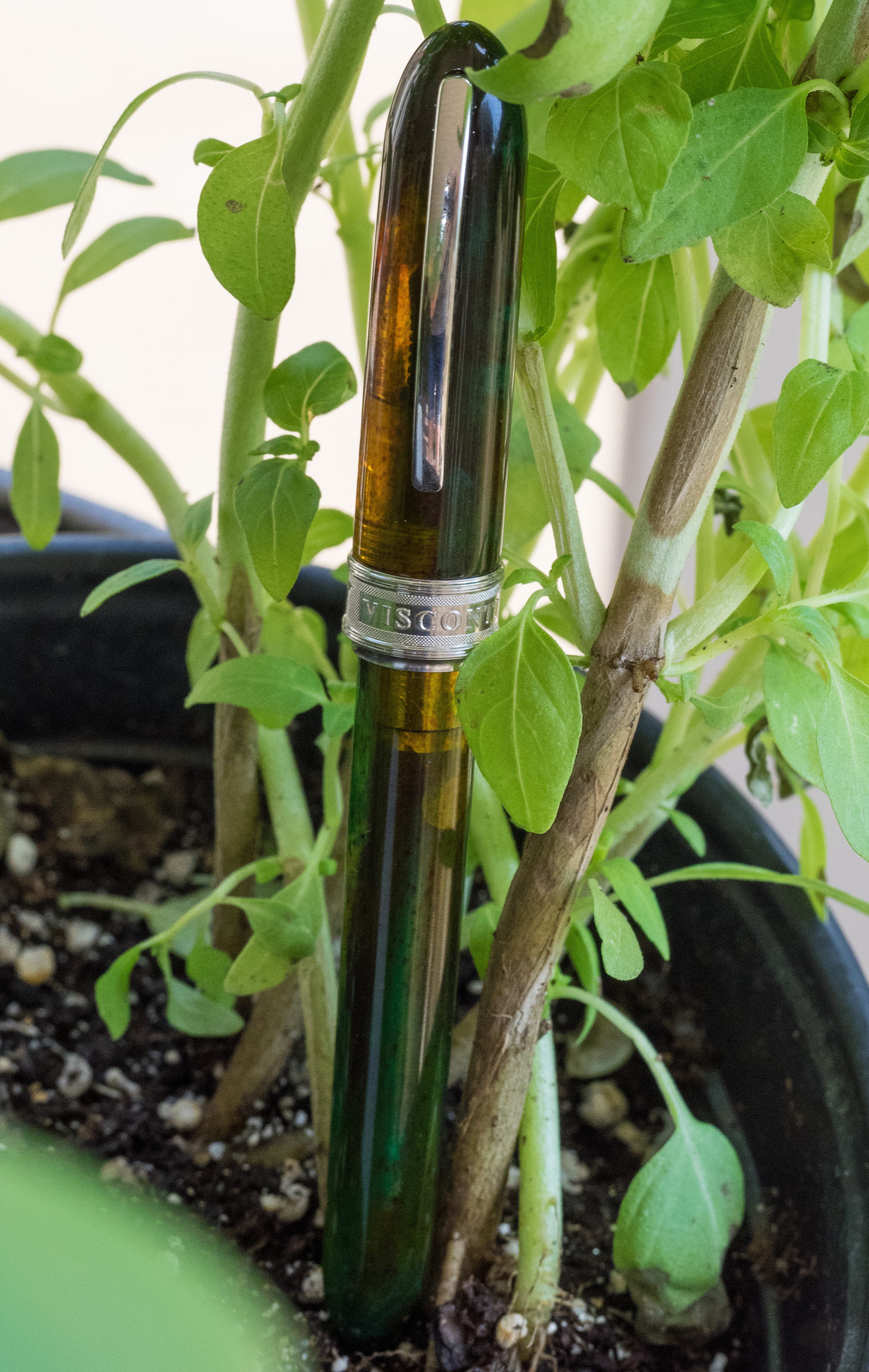
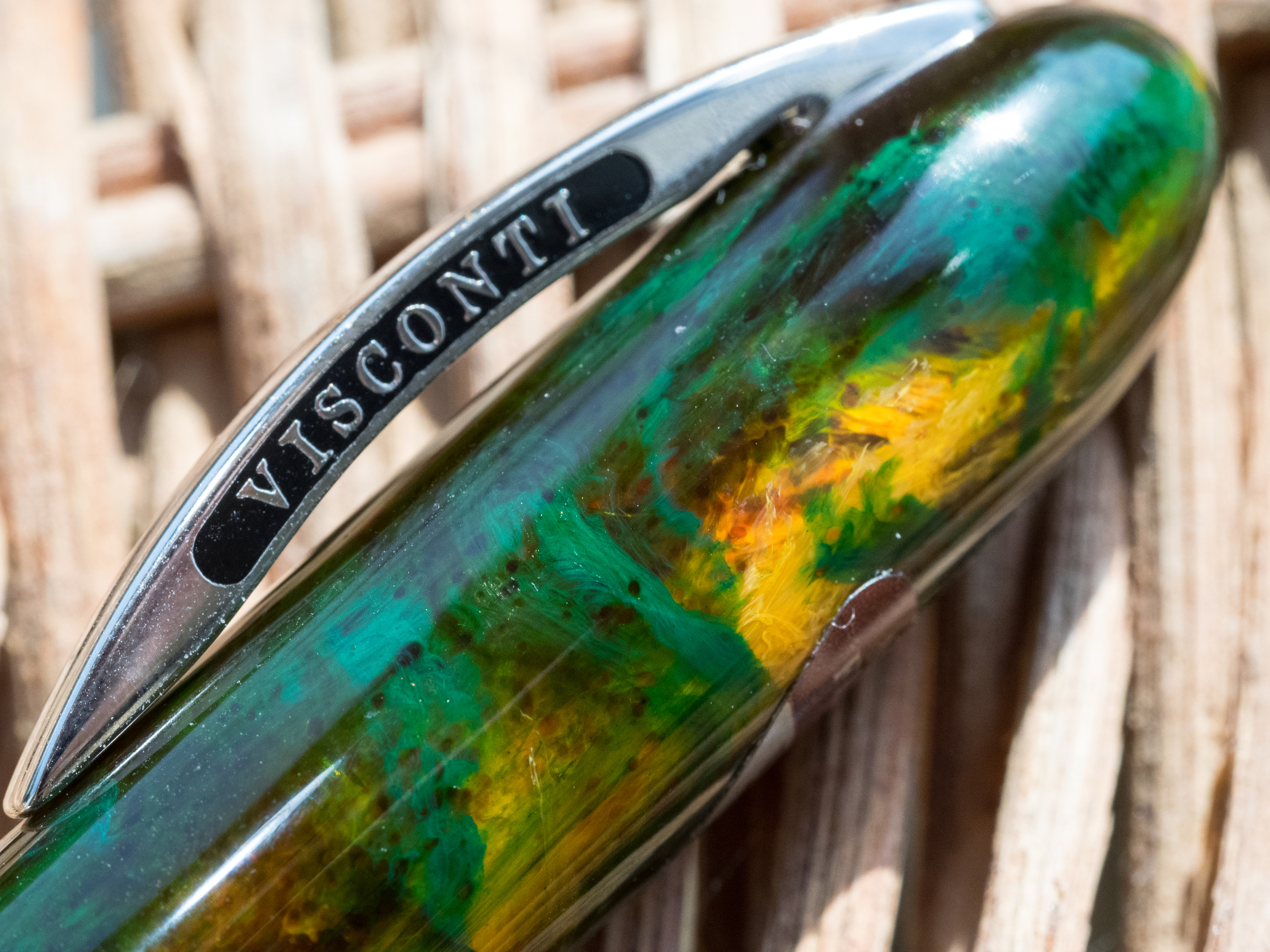
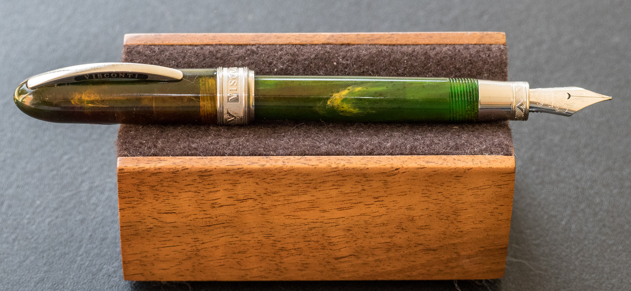
The pen is made of Italian resin that is semi-transparent. I really like the musk green color with its swirls of yellow, orange, and brown. The resin is stunning and changes with the light.
Rhodium-plated adornments accent the pen. The clip has the usual Visconti name on each side, and it is fully functional.
The cap is encircled at the bottom with a thick band that is engraved with "Visconti" and "Van Gogh" along with decorative texture.
They chose a strange font for "Van Gogh;" it almost looks like Comic Sans.
The portion of the grip nearest the nib is metal with similar engraved patterns.
One strange design element appears on the back side of the cap: a screw. Apparently, you can tighten or loosen the screw to increase or decrease the clip's tension (for a tighter or looser hold). On an otherwise beautiful pen, the screw, though practical, seems an inelegant aberration.
The pen is described as a "midi," but I find it to be a tiny pen, only 4.375 inches in length unposted and 5.5 posted. For comfortable writing, this is one pen you will probably need to post.
The pen is also small in diameter, and the metal is slippery, making it difficult for my fingers to find purchase. I have to hold the pen tightly which eventually results in hand cramps.
The Van Gogh comes with a medium steel nib that writes smoothly–when it writes.
Unfortunately, the nib on my pen performed quite poorly, exhibiting numerous hard starts, skipping, and simply running out of ink. I guess this is a feed problem that might be remedied by tweaking the tines. But, since this isn't my pen, I didn't feel the freedom to manipulate the nib or feed to see if I could get a better flow.
The barrel unscrews to allow you to insert an ink cartridge. This pen does not accept a converter. So, if you decide to order the Van Gogh, be sure to order ink cartridges as well.
For people with small hands or those who want an elegant pocket or purse pen, the Van Gogh Midi is an excellent choice, if you can get it to write consistently. Had the nib not been disappointing, I would have bought this pen for myself. It's absolutely beautiful.
The Visconti Van Gogh retails at Goldspot Pens for $174.95, and you'll need to add the cost of cartridges since only one is provided with the pen ($6.90 for 7 cartridges).
Pros
The Van Gogh is an elegant, small pen with gorgeous resin colors.
The rhodium-plated accents complement the pen nicely.
- The pen is light and can be comfortable for those who prefer thinner barrels.
- When the pen writes, it writes smoothly. The medium steel nib will be a good size for many people, but apparently no other sizes are available, nor are gold nibs offered.
- For those who like the convenience of cartridges over converters, this pen works well.
Cons
- The pen seems pretty expensive considering that it is so small, has a steel (rather than gold) nib, and only takes cartridges.
- I find a cartridge-only pen to be extremely limiting. I much prefer having the converter option so I can use my own bottled ink. Of course, you can refill cartridges with your own ink using a syringe if you wish.
- I found the pen uncomfortable to write with because of its narrow diameter and slippery grip. But that's just me. Others might find this pen extremely comfortable.
- Unfortunately, the nib on the loaner pen, though smooth, was fussy. It would not start without me priming it each time, even if I only paused for a moment while writing. In addition it skipped and sometimes stopped writing entirely. I suspect a little widening of the tines might fix this issue, but a pen priced over $100 should come with a nib that just works.
Thank you to Goldspot Pens for loaning me this pen for review.

