Bull & Stash "The Stash" Notebook Review

Bull & Stash has been on my radar since their Kickstarter campaign in 2014, and they reached out to me recently to see if I wanted to check out their notebooks. My answer was undoubtedly yes.

Upon first opening the package from Bull & Stash and taking hold of the notebooks, I noticed immediately how soft the leather is. It feels thick enough to make a shoe upper from, but is flexible enough to fold the leather back on itself and not leave a mark. The logo stamp in the lower right is a nice touch.

On the inside, the cover is filled with 50 pages of 60# paper, hole punched to fit through the Chicago screws punched through the back of the cover. Bull and Stash markets the paper on their website as bleed resistant, and I think that is being too generous.

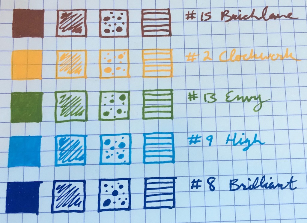
This paper is textured, so almost any water-based ink I tried instantly seeped into the page. Sometimes it didn’t bleed, like with the Schmidt P8127 rollerball, but almost any fountain pen nib and ink combo was a no go. You can see it with the drawing pens too, where if you aren’t moving your pen quickly across the page the ink starts to spread. Ballpoint, gel, and pencil were no issue. Pencil, in fact, was wonderful on this paper, and by far my favorite to use.

You could also solve any paper quality issues by punching your own.

The other issue I had is that the pages are not perforated. This would make a huge difference in functionality, allowing you to cleanly tear out pages while also solving the lay-flat issue. With two posts used to secure the paper, it tears out randomly. You can remove the pages cleanly by unscrewing the posts, but that will get old. If you don’t tear out or remove the pages, you end up with a huge bulk of sheets you have to hold down while working your way through the notebook.

Also, be careful tossing this notebook in a bag. The back side of the screws will rub up against and possibly scratch anything it comes in contact with. Like a MacBook Pro, for example.

This is a very divisive product for me, with almost no middle ground. I can see the leather and the layout being absolutely perfect for some people, while the paper quality and lay flat challenges being a non-starter for others. $50 for The Stash is completely reasonable, and $25 for the Travel Stash even more so. You will need to decide if and how this product fits into your arsenal before taking the plunge.

My thanks to Bull & Stash for sending me this products at no charge for the purposes of this review.


Enjoy reading The Pen Addict? Then consider becoming a member to receive additional weekly content, giveaways, and discounts in The Pen Addict shop. Plus, you support me and the site directly, which I am very grateful for.

Membership starts at just $5/month, with a discounted annual option available. To find out more about membership click here and join us!

Posted on September 26, 2016 and filed under Bull & Stash, Notebook Reviews.

KWZ Ink - Brown Pink: A Review

(Susan M. Pigott is a fountain pen collector, pen and paperholic, photographer, and professor. You can find more from Susan on her blog Scribalishess.)

A few weeks ago, I reviewed my first KWZ Ink - Honey. I purchased a whole bottle of that ink and still think it is fantastic. This week, I'm reviewing another KWZ ink color: Brown Pink. I purchased a sample of this ink from Vanness Pens for $2.00.

Brown Pink is an unusual color and that's why I wanted to try some. Although it's called "brown pink," the color looks more like dusty mauve rather than brown. Chromatography distributes the colors in two shades: pink and blue.

In my testing, I found the ink to be wet with fairly lengthy dry times.

The photograph makes the ink look more purple/pink than it is. It is a dusty mauve.

It shades well with flex nibs, but exhibits no shading with my medium Franklin-Christoph SIG nib. It is not waterproof.

I did some ink splats to check for sheen and found absolutely none with this ink. Although the ink actually looks brown in the splats it also seems very flat. I'm not sure how else to describe it other than "flat." The ink (in the splats) lies thick on the paper much like paint. Not all inks have sheen, so this isn't necessarily a negative strike against the ink. But I did find its flatness strange.

Like KWZ Honey, Brown Pink has a distinct odor to it. I explained the odor in my last KWZ review, so I won't reiterate that here other than to say that the smell is normal.

I like KWZ Brown Pink in spite of the fact that it is a muted, flat color. It is different from any other ink color I've tried. Most burgundy/plum inks are bright and showy. This one is understated, and that makes it unique and adaptable to most tasks. While I wouldn't use an ink like Iroshizuku Yama Budo for writing a business letter, KWZ Brown Pink would probably be acceptable. It's a great ink for journaling (I've used it quite a bit the last week in my journal and love how it looks on Tomoe River Paper) and general writing.


Enjoy reading The Pen Addict? Then consider becoming a member to receive additional weekly content, giveaways, and discounts in The Pen Addict shop. Plus, you support me and the site directly, which I am very grateful for.

Membership starts at just $5/month, with a discounted annual option available. To find out more about membership click here and join us!

KWZ Brown Pink on Tomoe River Paper

Posted on September 23, 2016 and filed under KWZ, Ink Reviews.

Derwent Graphik Paint Liner Review

(Sarah Read is an author, editor, yarn artist, and pen/paper/ink addict. You can find more about her at her website and on Twitter.)

When it comes to art supplies, Derwent is my personal favorite brand. I love their colored pencils, so I was super excited to test drive these Graphik Paint Liners. Past experiences with the brand set my expectations high, and I was overall pleased with this product.

The pens have a nice aesthetic to them. They come in a handy reusable pouch that is printed with a color guide and instructions. The body design is attractive and practical--they are sturdy but lightweight, and the see-through plastic allows you to see what color you're reaching for and how much pigment is left. It's also super fun to watch the paint slosh around inside. The grip sections are a little short and narrow, which may make them uncomfortable to hold after a while. And holding the pens farther back on the body didn't work very well, as the tips have a very specific sweet spot that requires a more upright angle.

The tips are .5 mm--fine for a paint pen. But they lay down a very wet line, so the end result is closer to a Japanese broad nib, in fountain pen terms. There is no paint in the tips to begin with (probably to keep them from drying out and clogging while stored), and this is where the instructions come in. Those of you familiar with paint pens probably already know this, but I'm a novice, so I referred to the illustrations printed on the package. To prime the tip, you must compress it for two seconds, then release it and wait for the pigment to flow into the tip, which takes about five to six seconds. Don't--hypothetically speaking, for example--wonder why the paint doesn't come right away and maybe hold the tip down for a bit longer and then OMG that's a lot of paint all at once.

The pigment itself is very well-behaved. It doesn't run or drip or bleed. I was astonished to see that not even the puddle I put down for my review doodle showed through the Rhodia paper. As I filled in the solid square, I thought I'd regret not using a page protector and assumed I'd have to scrap the page behind my work. But I almost have to hold the paper up to the light to see a shadow of the Graphik pigment. I also tested them on a colorful piece of cardstock. Most (but not all) did well there. The "snow" color, for example, doesn't show at all on white paper and was weak and milky on colored paper. I suspect it may work best as a highlight on top of other layers of pigment. The metallic silver (#20, fox) creates an almost mirror-like effect on either paper.

After setting the pens aside for a few days, only the yellow (#2, clockwork) became problematically dried out and clogged. You can see in the colored paper swatches that it struggled a bit at first. I expect that, after longer naps, the pens may need a strong cup of tea before they can party. Or just to be cleaned up a bit and re-primed.

I can see these paint liners being used to make some awesome art. The bold colors and tonal greys make me think instantly of contemporary comics and modern graffiti-like portraits. If you dive in, be sure to share what you make--I'd love to see it!

(JetPens provided this product at no charge to The Pen Addict for review purposes.)


Enjoy reading The Pen Addict? Then consider becoming a member to receive additional weekly content, giveaways, and discounts in The Pen Addict shop. Plus, you support me and the site directly, which I am very grateful for.

Membership starts at just $5/month, with a discounted annual option available. To find out more about membership click here and join us!

Posted on September 22, 2016 and filed under Derwent, Paint Pen, Pen Reviews.