

Review yesterday, giveaway today! The Notsu To-Do List cards have been a great addition to my desk setup, especially knowing that I can use any pen or pencil with them. I’m giving away one set of the Notsu To-Do List Card Case With 50 Cards, so read the rules below and enter away!
Notsu To-Do List Cards and Case Review
“Where are all of the fountain pen friendly note cards?”
As an avid note card/index card user (I use those terms interchangeably,) I’ve always been on the lookout for a card that performs well with all pens, including fountain pens. And yes, at Nock Co., Jeff and I made some of the best there have been. Unfortunately, the paper we used was long ago discontinued, and the search for the next needle in the haystack has stopped - for now.
So where does that leave us? Are Exacompta cards the only choice? They have been a recommendation from me and others for years - and still are - but your choices are limited. I moved into the Foglietto system a couple of years ago, but they are now out of business (selling paper goods is brutal - as me how I know!) Analog cards, by Ugmonk, are beautiful, but only average for fountain pens. Shockingly, the Kraft card is the most ink friendly, which I love.
As you can tell, I have a thing for cards, as does Kimberly, who did all of the reviews linked above.

New note cards are few and far between, but my eyes are always peeled to try something new. New is what I found at the recent Atlanta Pen Show in the form of Notsu, carried by my friend Joe at The Gentleman Stationer. What’s funny is that I didn’t notice them on my first pass at his table, when I was focused on picking up some ink and Traveler’s Notebook inserts. But on second glance I saw them, and saw Joe’s writing samples, and inquired as to their fountain pen friendliness. He assured me they were, and one test line later, I confirmed that was the case.
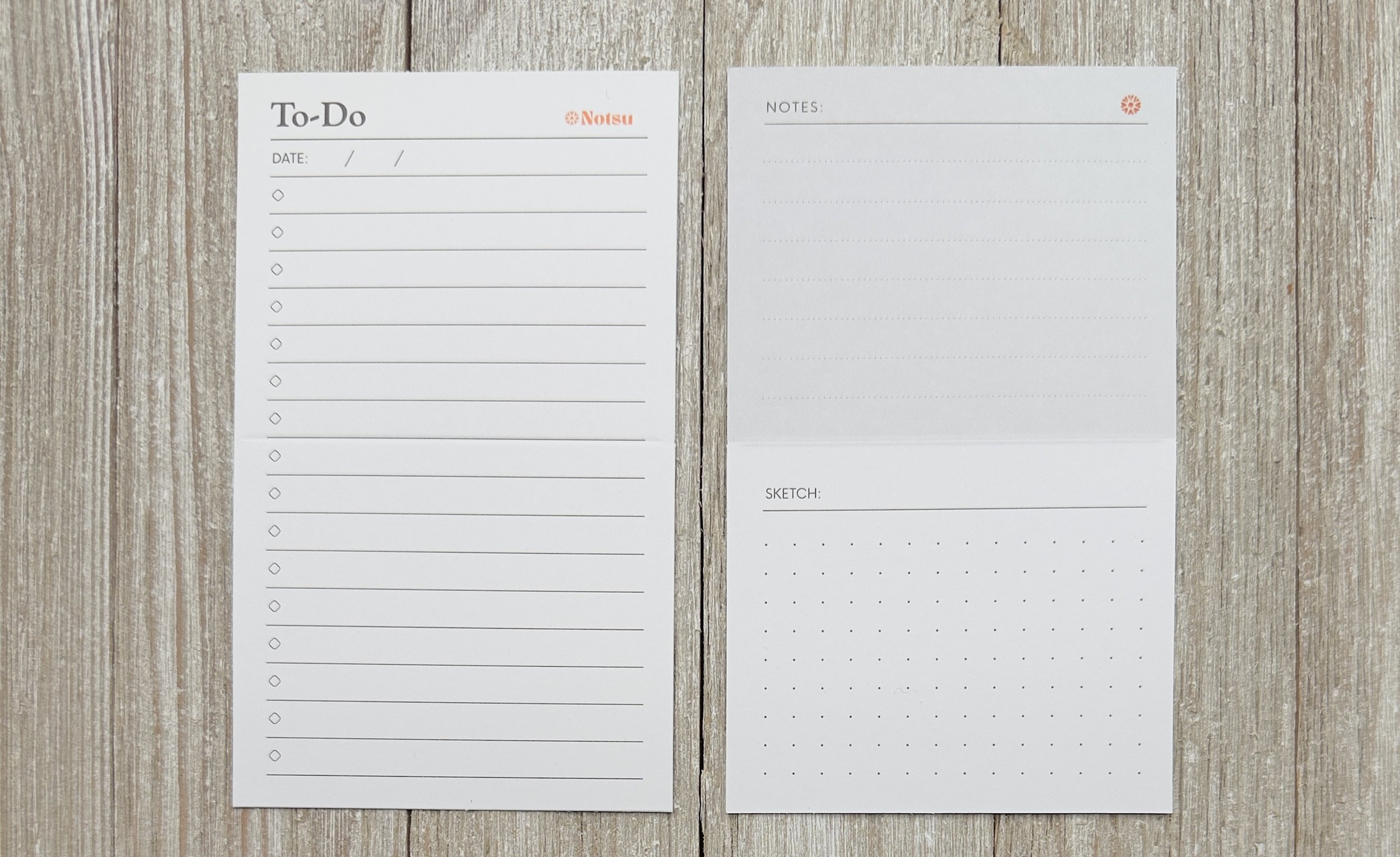
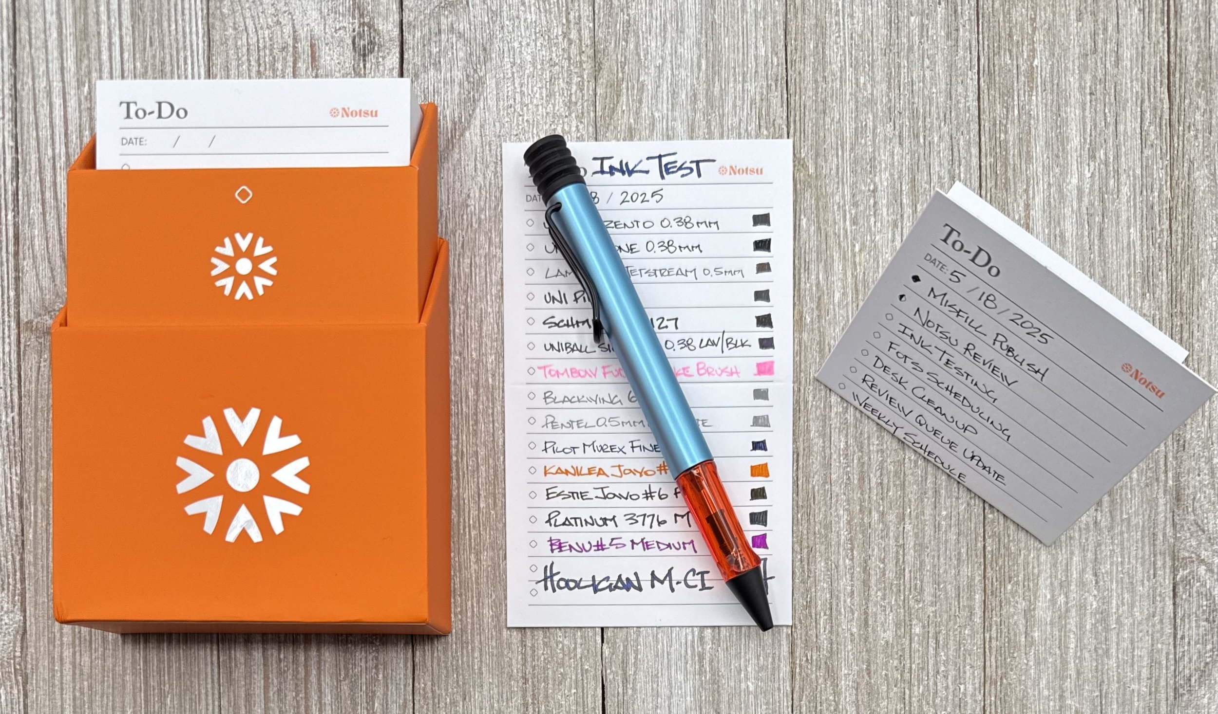
The design of the Notsu To-Do List Card is purposeful. The front of the 3”x5” card is where you list goes, with 16 lines and boxes for any tasks you need to handle. There is a date line at the top, and room for another header above that, next to the Orange Notsu logo. Flip the card over, and you are met with Notes section on the top, using faint dotted lines, and a Sketch section on the bottom, with a 5 mm dot grid. I often like to segment and separate my cards, so this is a nice framework to work with for someone like me who uses one card for multiple things.

On top of those design elements, Notsu has done something extra for this specific product. Cards made for the accompanying Card Case (and specified refills,) are scored in the middle, allowing you to easily fold the card, or display it as part of the magnetized card case setup. This is a great option for those of you who will use these cards at your desk, or need an extra visual of the tasks at hand.

No feathering, bleed, or ghosting. These cards are thicc!
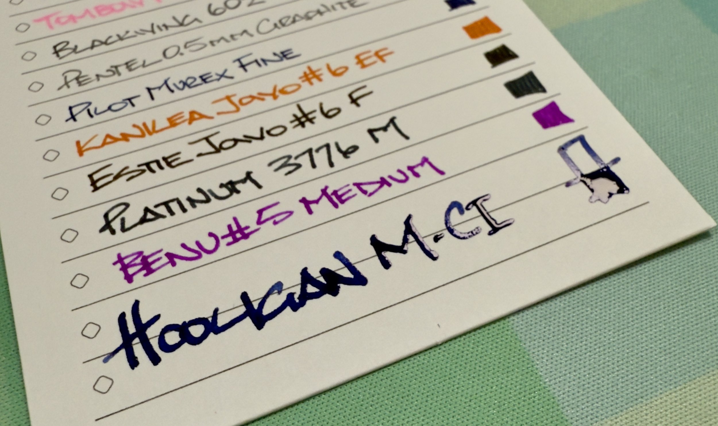
I took this pic when writing so you can see how much ink these cards handle without issue. You won’t see a lot of ink characteristics (shading, sheen,) but the page is smooth for all types of nibs.
“But Brad, I don’t need all of that nonsense. How about a simple card?” Notsu has you covered there, too, with their Dot Grid Index Cards. I haven’t tested those yet, but they use the same card stock as used in their other sets, so assumedly they are equally as nice. I’ll pick some up soon.
My final word on Notsu: Great quality, fun layout, absolutely usable with fountain pens. What’s not to like for a note card user? Even the price is nice. My review set, the Notsu To-Do List Card Case with 50 Cards, is $11.99. Refill packs of 50 To-Do cards run $8.99, as do the standard corner Dot Grid Card 50-pack (Rounded corners are $11.98 for the same quantity.) I think that is all fairly price for a nice card like this. and I look forward to using them frequently.
(I bought this pack from The Gentleman Stationer at the Atlanta Pen Show at regular price. Joe then gave me a second pack for free to give away tomorrow, so stay tuned!)
Enjoy reading The Pen Addict? Then consider becoming a member to receive additional weekly content, giveaways, and discounts in The Pen Addict shop. Plus, you support me and the site directly, for which I am very grateful.
Membership starts at just $5/month, with a discounted annual option available. To find out more about membership click here and join us!

Misfill, Drive-By Edition

Each week in Refill, the Pen Addict Members newsletter, I publish Ink Links as part of the additional content you receive for being a member. And each week, after 10 to 15 links, plus my added commentary on each, I'm left with many great items I want to share. Enter Misfill. Here are this weeks links:
— Ink Swatch Wednesday: Drive-By Swatching (Cheryl Lindo Jones)
— Van Dieman’s Wineglass Bay (Inkcredible Colours)
— Pen Porn: Stanford Pen Studio Intwana Seahorse (Rachel's Reflections)
— The Best Bright Gel Pens? Papermate's Inkjoy Brights & Metallics! (Inkdependence)
— Fountain Pen Review - Kakimori Frost Fountain Pen in Violet (The Well-Appointed Desk)
— Remarkable 2 Review (Everyday Commentary)
— Stunning combination of materials from Rob's Penworks (Figboot on Pens)
— January-April 2025 in Stationery (A Gathering of Curiosities)
— My Spring Cherry Blossom Stories - Falling Gently (The Penguin Post)
— 167 Backstage Passes (Dennis Cooper Blog)
— Ink Review #2769: Taccia Sketch Earth Blue (Mountain of Ink)
— Tom’s Studio Fountain Pocket Pen (dapprman)
— Irasutoya: the best-known illustrator in Japan, that you’ve probably never heard of (It’s Nice That)
— Gilded Fish: Illustrations from Histoire naturelle des dorades de la Chine (1780) (The Public Domain Review)
Want to catch the rest, plus extra articles, reviews, commentary, discounts, and more? Try out a Pen Addict Membership for only $5 per month!


