(Sarah Read is an author, editor, yarn artist, and pen/paper/ink addict. You can find more about her at her website and on Twitter.)
This is the first time I've used a DesignWorks notebook, and the experience was a bit mixed. There are some features I love about it, and some that didn't work very well for me.
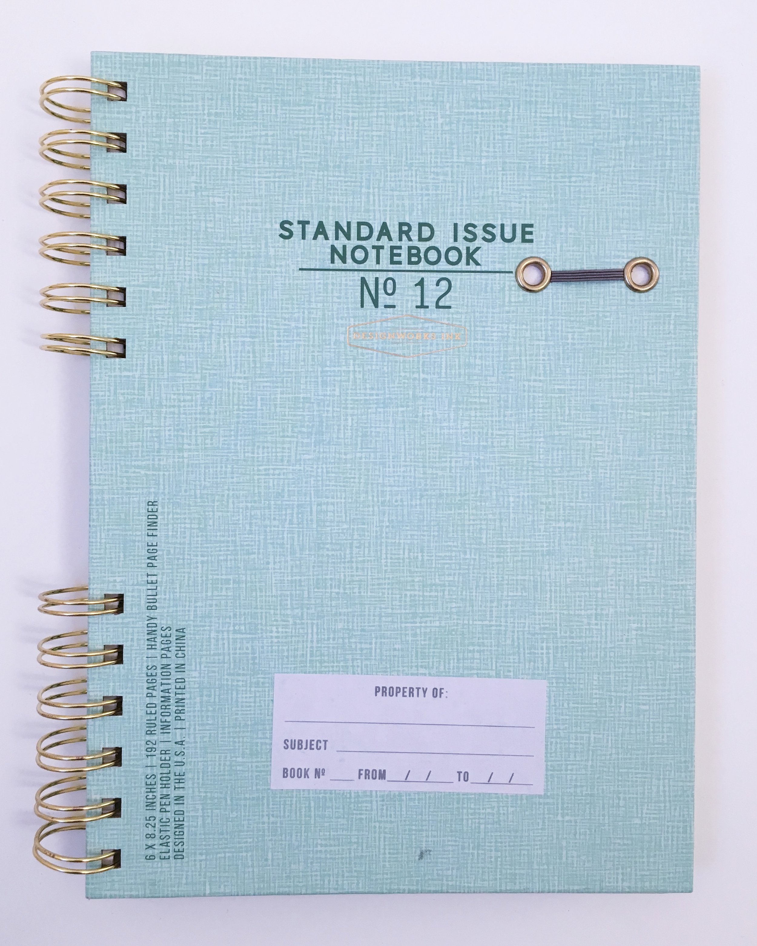
The DesignWorks Standard Issue Notebook is a hardcover, spiral-bound notebook. The spiral is twin-ring, brass colored and is only bound at the top and bottom third of the book. The rings are wide--about an inch in diameter. They're already starting to bend a bit after only light carry--so they're already beginning my primary pet peeve of ring-bound books. They also tend to snag at the cover or pages when I'm closing the book. Of course, the rings allow the book to lay flat or fold over on itself--so there are upsides, too.
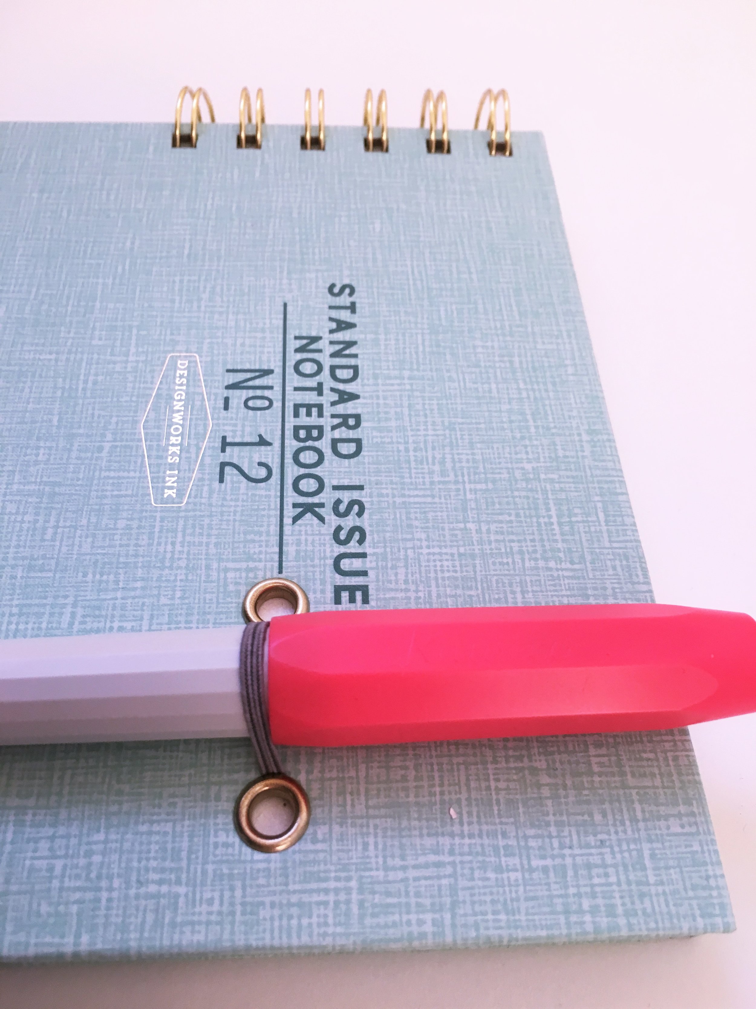
The front cover has a pale green crosshatch pattern, the logo, and a sticker label. The sticker on mine is crooked, which drives me a bit crazy. There's also a list of the notebook's specs printed directly on the cardstock. It's useful information to have, but I don't particularly like having it printed on the front. At the upper right is a narrow elastic band that serves as a pen loop. This is one of the features I like. It's not quite stretchy enough to handle a very wide pen, but most will fit fine. One advantage to the wide rings is that you can hide another pen in there if you need to color-code on the go.
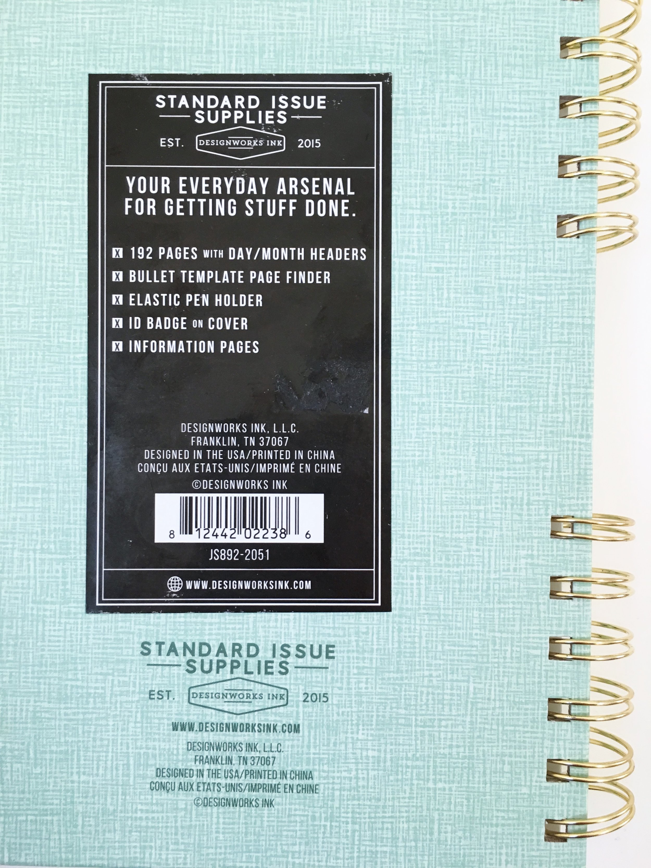
The back cover has another crooked sticker that repeats the notebook specs, and the company info. The inside front cover has room for all your contact info and a map of the time zones. The inside back cover has conversion charts. The notebook comes with a removable stencil ruler that has all the marks and icons you need for planning or bullet journaling. The stencil is definitely my favorite feature of the book. It's sturdy and handy, and I think I'll be using it long past when this notebook is full.
There are 192 lined pages that have the months and day numbers listed across the top. The left margin has a column for your bullet icons. The rest is pretty open form--it's not too restrictive of a layout, so it could be used as plain lined paper as well. The pages aren't perforated, so if you need to remove one, it will have the dreaded fuzzy edge.
When I first felt the paper, I thought it would probably be a pencil or ballpoint-only notebook. But the performance totally surprised me. There was light show-through, but no bleed-through for any fountain pen I tried with it. Huzzah! It showed shading nicely, too. The dry time was very long with wetter inks, though. Overall, I'm thrilled with its performance. It's also acid-free, which is always a plus.
When it comes down to it, I don't love the binding, cover, or attention to detail with this product. But the paper is lovely enough that I'm definitely going to check out some of their clothbound books. All their products seem more than fairly priced, especially for good paper. As tempting as the nice paper in this books is, I can't get past my pet peeves with the cover and binding. I'll probably hand this one on to the kids, and they will likely use it for nefarious planning. Except the stencil. I'm keeping that part.
(Vanness Pens provided this product at no charge to The Pen Addict for review purposes.)
Enjoy reading The Pen Addict? Then consider becoming a member to receive additional weekly content, giveaways, and discounts in The Pen Addict shop. Plus, you support me and the site directly, for which I am very grateful.
Membership starts at just $5/month, with a discounted annual option available. To find out more about membership click here and join us!


