
(Susan M. Pigott is a fountain pen collector, pen and paperholic, photographer, and professor. You can find more from Susan on her blog Scribalishess.)
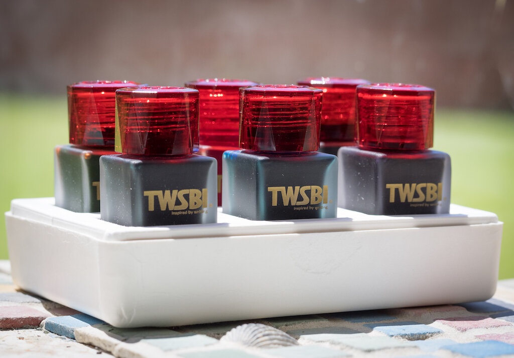
TWSBI’s 1791 Limited Edition Ink Set contains six 18ml bottles of ink. The colors in this series are based on descriptions in the novel, Dream of Red Chambers by Cao Xueqin. The novel, which was first printed in 1791, is considered one of China’s great pieces of classical literature.

An illustration by Sun Wen from the novel. You can see many of the colors of the ink set in this painting. (Public Domain)
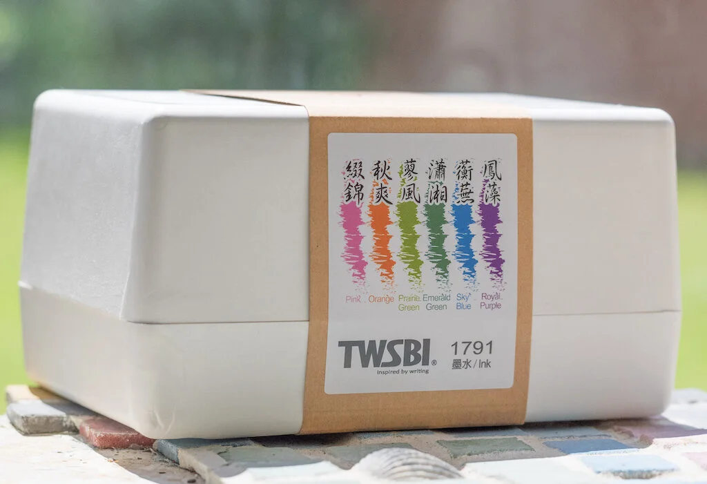
The set comes packaged in a white two-piece box. Although the box is cardboard, it is nicely made and provides storage for the inks (if you don’t have another means to store them).
Each 18ml bottle is made of frosted glass (a really nice touch) and the red caps with the TWSBI logo are faceted.

Unfortunately, the bottle openings are quite small, so you won’t be able to ink pens with large nibs (unless they are converter fillers).

The six colors in the set are Pink, Orange, Prairie Green, Emerald Green, Sky Blue, and Royal Purple.

Pink

TWSBI’s Pink is a true bubblegum pink, at least on white Rhodia paper (see below). On the Col-o-Ring card, which has more texture, the ink exhibits a bit more character and shading. It reminds me of ballet shoes and is reminiscent of J. Herbin’s Rouille D'Ancre (especially where the ink pools), though TWSBI’s color is much brighter and isn’t nearly as dry.
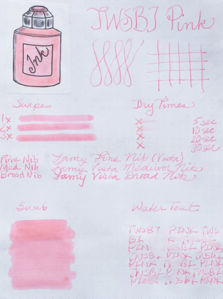
In testing on Rhodia paper, the ink demonstrates no shading and is quite flat (no sheen). Even though it is a light color, it shows up well in fine, medium and broad nibs. This ink dries quickly (within 20 seconds) but it doesn’t feel dry when you write with it. It is not waterproof.

Chromatography reveals that there’s not much complexity to Pink--just a bit of lavender and lots of pink.
Midori Cotton paper and a ruling pen show off Pink’s ballet-shoe vibe, with lots of shading and a bit of darker pink around the edges.
TWSBI Pink is probably not a color for everyone. But, if you are a pink lover you will like this ink, especially on paper with some texture to it. If you were smart and didn’t sell your pink Pelikan M600 (like . . . um . . . me), this would be a terrific color for that pen. If, like me, you’re not a fan of J. Herbin’s Rouille D'Ancre because it’s so dad-gum dry, then this might be an alternative. Unfortunately, since it’s a limited edition color, you’ll need to stock up if you really like it.
Orange

TWSBI’s Orange is a vibrant true orange ink. It doesn’t have any sheen to it, but in flexy or italic nibs, it offers good shading. You can see the shading in the swirls on the Col-o-Ring card.

On Rhodia paper, Orange looks fabulous. It’s like a gorgeous New Mexico sunset and is just as colorful in fine nibs as it is in broad ones. But, you’ll get some nice shading in broader nibs. This ink is moderately wet, but dries completely within 30 seconds. It is not waterproof.

TWSBI Orange is comprised of pink, apricot, orange, and deep orange colors as you can see in the chromatography.
The glorious shading of TWSBI Orange is demonstrated with a super large ruling nib and Midori Cotton paper.
Although I love this color, you have lots of options for great orange inks. I wouldn’t buy the set just to get this color--besides, if you really adore it, you can get the limited edition inks in single bottles ($7.50 for 18ml at JetPens).
Prairie Green

Prairie Green is almost a fluorescent green color. It’s definitely vibrant and reminds me of Easter grass. Depending on how wet your nib is, the color ranges from a Granny Smith apple green to a pale new leaf green (see the swirls on the Col-o-Ring card). You can get some great shading with flexy or italic nibs, but there’s no sheen.

The fluorescent nature of this ink really shows up on white Rhodia paper. The color is pretty flat on this paper, probably because Rhodia is so smooth. If you’re into Kermit green ink, you’ll love this color. It’s a bit dry and looks best in wider nibs. Like the other TWSBI inks, it is not waterproof.

Chromatography reveals that Prairie Green is comprised mainly of yellow, a bit of green, and a tiny blast of blue.
A ruling nib and Midori Cotton paper show this ink at its best. It has excellent shading and pooling qualities.
Green is one color I use rarely (mainly because I don’t have many green pens). I find TWSBI Prairie Green to be a bit too light for my tastes. I like Kobe University Town Fresh Green much better.
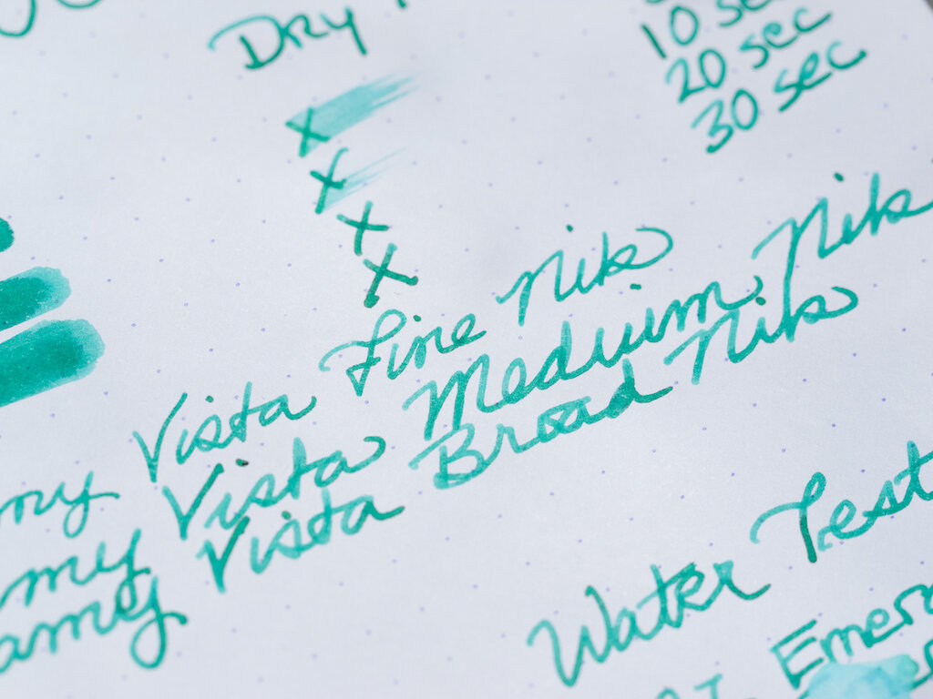
Emerald Green

Emerald Green is an intriguing color. It’s not really what I consider “emerald green.” It’s sort of a deep turquoise color whereas emerald green, in my mind, is a much truer green. This ink offers excellent shading and a rich burgundy sheen.

The color is quite nice on Rhodia paper, though you don’t get the sheen. Still, you can see some shading even with regular nibs. This ink dries quickly and is not waterproof.
Emerald Green is comprised of light blue, green, and dark blue as you can see in the chromatography. Where that burgundy sheen comes from, I don’t know.
Emerald Green is simply glorious when used with a wide nib. Both shading and sheen shine through.
Out of all the colors in the TWSBI 1791 set, Emerald Green is my favorite. It seems to be the most unique, and I love how it looks in all nib sizes and on smooth and textured paper.
Sky Blue

Sky Blue is another vibrant color in the 1791 set. It definitely captures the color of the sky on a clear day (at least a clear day in Colorado where you’re closer to heaven. Texan skies never look like this). Like Emerald Green, Sky Blue offers both shading and burgundy sheen.
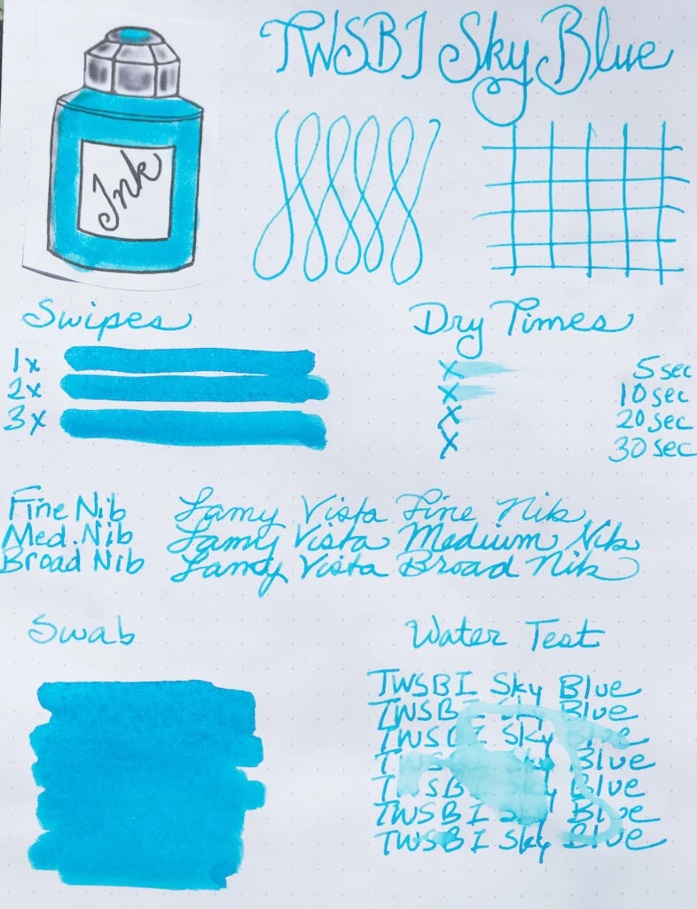
On white Rhodia paper, Sky Blue is flat (not much shading and no sheen), but it still stands out just because it is so vibrant. It’s a little more wet than some of the other colors, but still dries within 30 seconds. It looks great in all nib sizes but is not waterproof.

There’s not much variation exhibited in the chromatography test for this ink. But chromatography clearly doesn’t tell all of an ink’s secrets--where does that burgundy sheen come from?
Once again, Midori Cotton paper and a ruling pen reveal the shading properties of this ink, though this time the sheen isn’t as evident.
Sky Blue is my second favorite color in the TWSBI 1791 ink set. It’s a gorgeous color with lots of character. I want to go back to Durango where the skies look just like this . . . .
Royal Purple

Royal Purple is another super flashy ink--almost fluorescent, like Prairie Green. This is not a deep purple, but is rather a pink-purple. The ink is fairly flat, offering little shading, but it has fantastic gold sheen.

On white paper you can definitely see the pink/purple hue of the ink. It is vivid in all nib sizes and is quick to dry but not waterproof.

Royal Purple’s pink tones come through clearly in the chromatography test. This color is mostly pink, with some magenta and a splash of turquoise.
I’m not a big fan of this color. I prefer purples to be deep and dark, so the fact that this ink is lighter and pink-embued makes it less appealing to me. But, hey, this might just be the perfect ink for Brad’s Leonardo Lavande (discussed in his ink review here).
You can purchase the TWSBI 1791 Ink Set from JetPens for $36.00. Or, if you like one or two colors in particular, you can order them separately.
(JetPens provided this product at no charge to The Pen Addict for review purposes.)
Enjoy reading The Pen Addict? Then consider becoming a member to receive additional weekly content, giveaways, and discounts in The Pen Addict shop. Plus, you support me and the site directly, for which I am very grateful.
Membership starts at just $5/month, with a discounted annual option available. To find out more about membership click here and join us!


