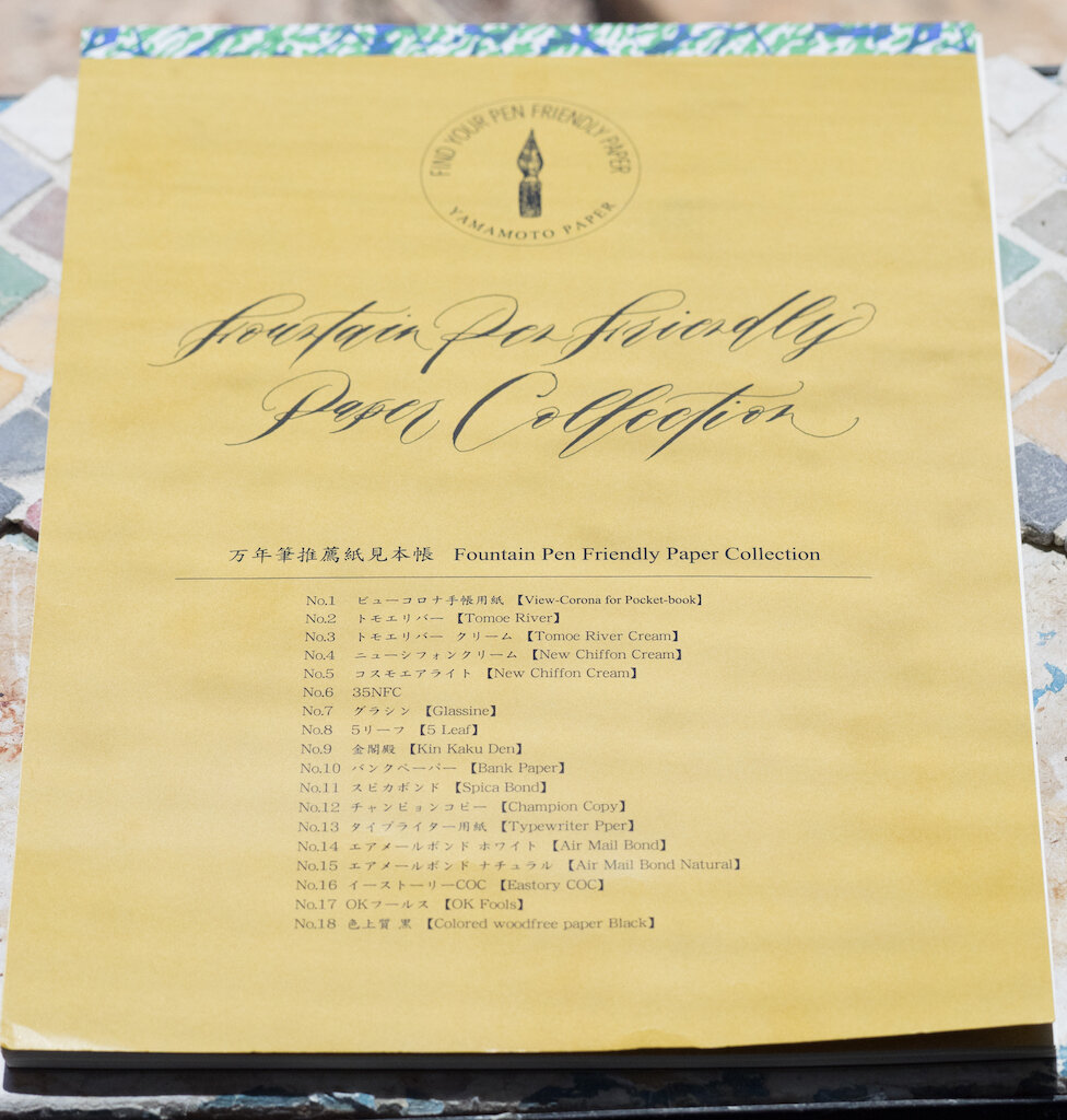
Last week I posted part 1 of my review of the Fountain Pen Friendly Paper Collection by Yamamoto Paper. If you didn’t get a chance to read it, please start with part 1, because it gives background about the paper collection and discusses which pens and inks I used.
This week I will continue my review of the remaining nine papers in the collection.
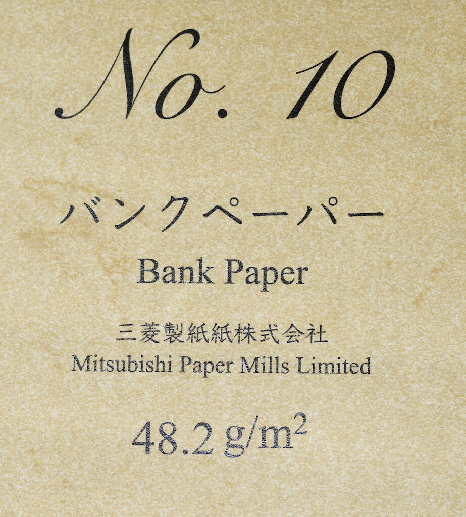
No. 10 ~ Bank Paper (48.2 gsm)
Bank Paper was developed by Mitsubishi Paper Mills in 1960 for use as bank ledger paper. It was developed to provide a smooth writing experience using a broad range of writing instruments, along with durability for use in an office environment. . . Bank Paper is a unique blend of several types of pulp and cotton, developed specifically to prevent any see-through and [to provide] consistent texture for dual-sided use. The “Three Diamonds” watermark is Mitsubishi Paper Mill’s stamp of assurance for their high quality manufacturing. Our fountain pen tests showed quick dry times, accurate color reproduction, and no bleed through.
Bank Paper is thicker than Tomoe River paper. It is smooth, but not glassy, having just enough texture to give you some feedback when you’re writing, but not so much that you feel like pulp is getting in the tines.
This paper exhibits see through but absolutely no bleed through, so it would make an excellent alternative for those who do not like Tomoe’s thinness.
Ink dried quickly on this paper, and both sheen and shading were excellent. Happily, this paper is available at JetPens in Life brand packets of 100 sheets (nearly A5 sized) for $19.50.
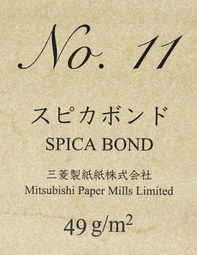
No. 11 ~ Spica Bond (49 gsm)
Bond Paper is known for its strength and durability, and is used in checks, stock certificates, and important business documents. For the most sensitive prints, copper plates were hand carved and pressed onto Bond Paper. The copper plates were stored in safes to prevent theft and forgery. Mitsubishi Paper Mills Bond Paper was first manufactured in 1921. Spica Bond is a variation that was released in 1970 exclusively for Takeo Paper. It is believed to be modeled after the Speaker Bond Paper that was manufactured back in the 1940s. The manufacturer added a unique watermark to the paper to indicate their confidence in its quality.
Spica Bond Paper has character. It contains 25% cotton and feels a bit like parchment paper. It is wonderfully smooth, but has just a bit of texture to it (I’m assuming this is due to the cotton), so it is a delight to write on.
The paper is thin and ink does show through but I experienced no bleed through.
Ink dries quickly on Spica Bond, so you don’t have to worry about smearing, and both shading and sheen come through well on this paper. It is the perfect paper for watercolor, ink drawings, and journaling. Musubi, maker of incredibly beautiful journals, offers this paper in a hand-bound, special edition journal(200 pages) costing around $115-120 depending on exchange rates.
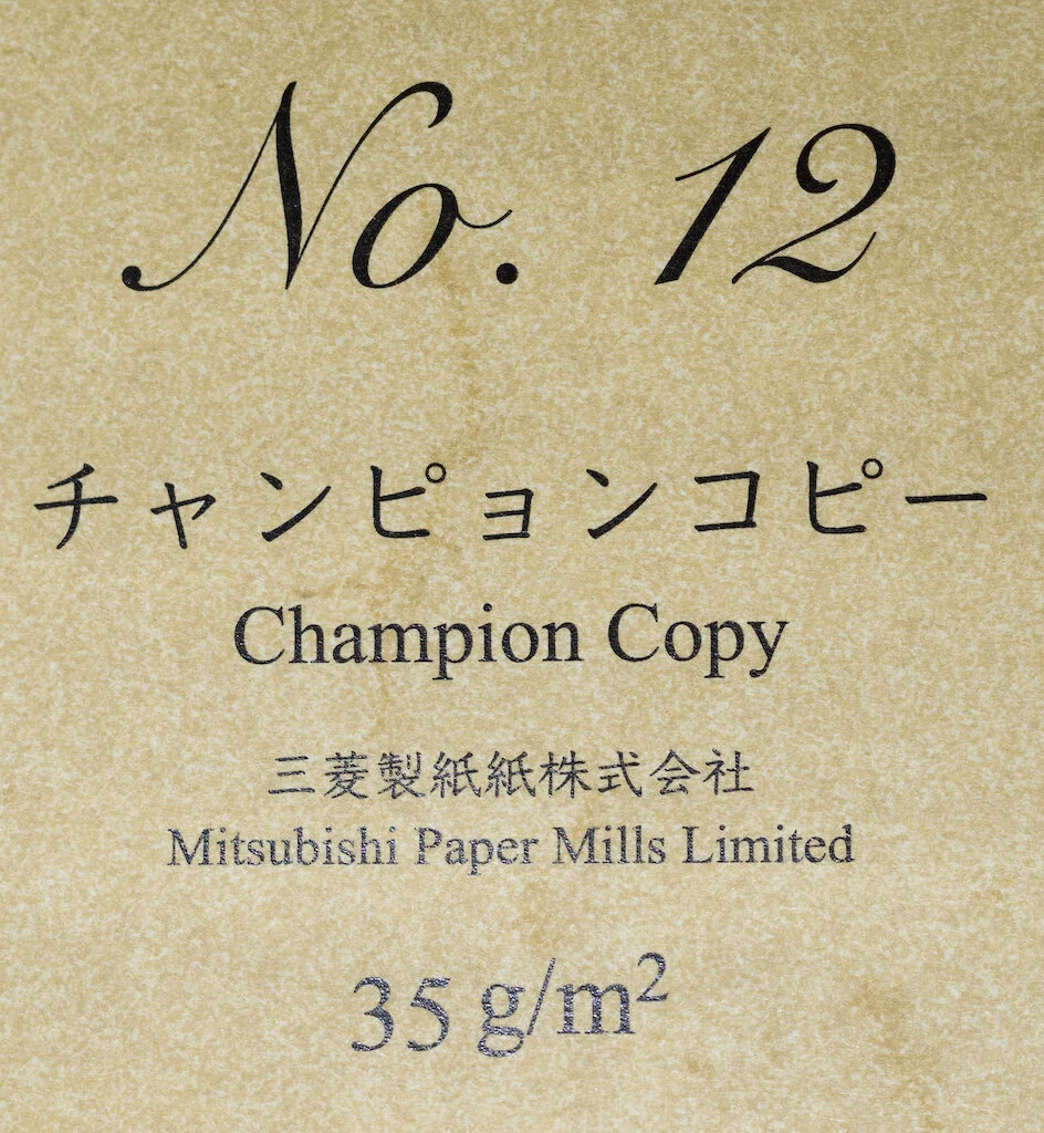
No. 12 ~ Champion Copy (35 gsm)
Diazo copying (blueprinting) is a printing process where the original document and photosensitive paper [are] pressed together, upon which light is shined through to burn the text onto the photosensitive paper. Very thin paper is needed for this process. However, the thinner the paper, the less durable the paper becomes and becomes difficult to handle. Mitsubishi Paper Mills Champion Copy was developed to produce a paper that is durable but has high see-through. It also offers high printability for letterpress and offset-printing. Our fountain pen tests showed fast dry times, good color reproduction, and no bleed-through. This paper is made using old equipment at the Takasago factory in Hyogo prefecture.
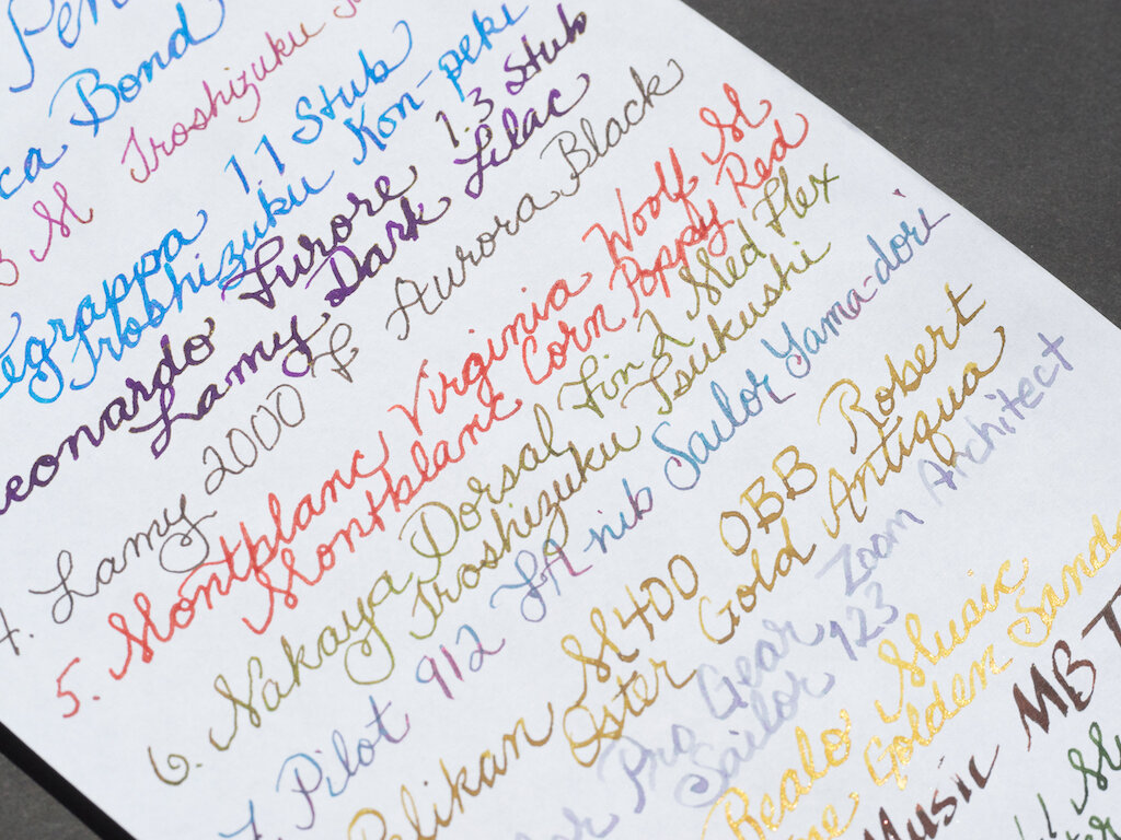
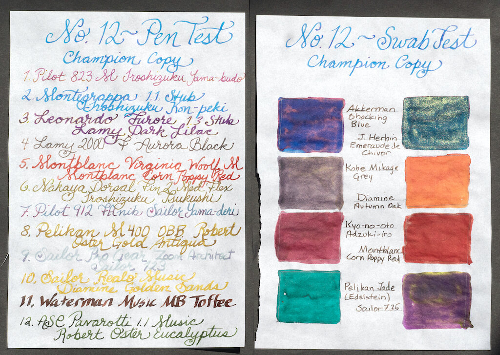
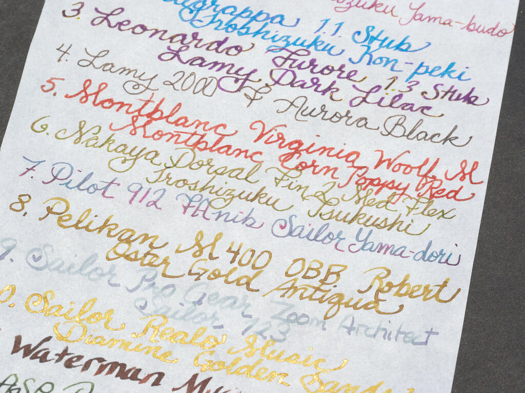
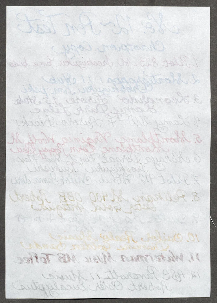
Champion Copy Paper reminds me very much of Tomoe River paper with slightly more texture (Champion is only 35gsm compared to Tomoe’s 52gsm). It displays both shading and sheen well.
Like Tomoe, it is very thin and ink shows through quite visibly. I noted a bit of bleed-through with my wettest nib (the Waterman Music inked with Montblanc Toffee).
Champion Copy Paper is a terrific writing paper, but, as far as I can tell, it’s not readily available. I couldn’t find a company that uses it for notebooks or even loose sheets of paper. Since it is so similar to Tomoe River paper, your best bet is simply to purchase Tomoe instead.
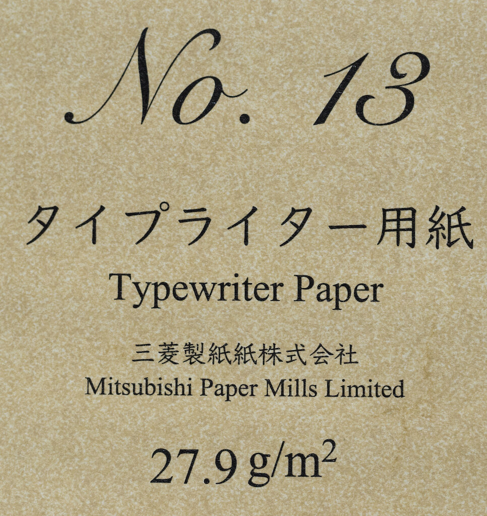
No. 13 ~ Typewriter Paper (35 gsm)
It is important for Typewriter Paper for copy with carbon paper to be thin and durable. Genta Yoshii (1826-1908) is known as the father of modern Japanese thin paper making. The Typewriter paper for copy he developed in the early 1900s was very popular in America. Mitsubishi Paper Mills Typewriter Paper was also developed to handle the strong strikes from the typewriter keys while still being thin. You are able to stack five sheets of this paper with carbon copy sheets in between in a typewriter and still get crisp letters on all sheets. It handles ink well and has good printing qualities. Our fountain pen tests showed short dry times, good color representation, and no bleed-through. This paper is produced using old equipment at the Takasago factory in Hyogo prefecture. It has the level of quality that would be difficult to reproduce using modern mass-production equipment.
Typewriter Paper feels exactly like the thin paper I remember using with carbons in the old days of typewriters (yes, I’m that old). It’s very thin and a bit slick, especially when you’re writing with wetter inks. Ink dries quickly, however, so you don’t have to worry about smearing.
The paper is thin, so show through is quite evident, and my wetter inks bled through as well.
As with Champion Copy Paper, I am unsure how ordinary folks could get access to this paper. I was unable to find a website for Takasago Paper Factory, and I don’t know if any companies use this paper in notebooks or paper packets.
Nos. 14 and 15 ~ Air Mail Bond White and Air Mail Bond Natural (61.7 gsm)
This is high quality stationery paper that has laid lattice marks and a brand logo watermark. While the laid lattice marks are a design reproduction of traditional screen patterns, it shows how the laid patterns were imprinted on the paper when the pulp was sifted over the screens. This Air Mail Bond reproduces the elegance of traditional hand-made paper through these design elements. In this case, the watermark is added using a dandy roll during the manufacturing process. Our fountain pen tests showed short dry times, good color, reproduction, and no bleed-through.
Air Mail Bond is one of the most interesting papers in the collection. In addition to the watermark, you can also see (and feel) the laid lattice marks (light, gray horizontal lines in columns). Although the lattice marks are simply reproductions of the lines created when paper was drained on screens long ago, their presence makes this paper look and feel unique.
For my tests, I cut the vertical page in half and wrote horizontally on each half page. Because of this, I could feel the laid lattice marks against my nibs as I wrote. This wasn’t problematic, nor did it feel as though my tines were being disturbed in any way, it was just . . . different. In the swab tests, you can see the lattice marks underneath the ink. Ink dries quickly on this paper, and it displays both shading and sheen well, though not quite as visibly as untextured paper.
Air Mail Bond comes in both white and natural (cream) versions. This paper looks and feels luxurious, and it definitely does not disappoint when you write on it. Even though it is only 67 gsm, it feels much thicker (perhaps due to the lattice marks). There’s very little show through and absolutely no bleed-through on this paper.
Air Mail Bond is one of my favorite papers in the collection because it is quality stationery that is fountain pen friendly. I particularly love the texture provided by the lattice marks.
The description in the Yamamoto collection doesn’t indicate where this paper is produced. I found something called “Basildon Air Mail Paper,” but I’m not at all certain that it is the same. I would love to have a stash of this paper for writing letters . . . . Maybe having some would inspire me to actually write letters. Hmmmm.
No. 16 ~ Eastory COC (“Thin Type”)
This paper was developed by Mr. Ken Uchihiro of Kyoto Kami Shoji, a paper distributor based in Kyoto. He was moved by a 2013 newspaper article commenting on the resurgence of handwriting in the digital age. It was developed with the goal of producing a paper that was smooth for a great writing experience, had no feathering nor bleed-through, fast drying, and can be used on both sides. Through a long trial-and-error process with Oji F-tex, came about Eastory COC. Our ink tests with blue and black Sailor and Platinum inks showed no feathering nor bleed-through. Very wet reddish-pinkish J. Herbin inks showed slight feathering and bleed-through. We recommend writing with medium or finer nibs. We really like the roughness that travels through the pen-tip when writing.
Eastory COC is a lovely textured paper that provides just enough sensory feedback that you can tell you’re writing on something special. Ink absorbs immediately, so you don’t have to worry about smudging as you write. This is one of those papers that is simply a pleasure to write on with any nib and any ink. Because the ink absorbs into the paper, it does not display much (if any) sheen. But colors are vibrant and shading is beautiful.
The paper is thin, but substantive enough that there’s not much show through and absolutely no bleed-through.
In my opinion, Mr. Uchihiro succeeded in his quest to create a smooth, great writing experience with Eastory COC. As far as I can tell, the only source for this paper is Yamamoto Paper Company, but they are on hiatus right now. I’m going to ration my few pages of this paper for something special.
No. 17 ~ OK Fools (81.4 gsm)
OK Fools was the first Fool’s Cap paper produced in Japan by Ohtori Paper. In Japan, the term “Fools Paper” has long been used to refer to high-end writing paper. British Fool’s Cap paper was first imported into Japan in the late 1800s. The popular Japanese version was produced at the Oji Ogura Factory, where the name OK comes from. While the current iteration is being made by Nippon Paper Industries Yatsushiro Factory, they have kept the OK name for brand recognition. Our ink tests with blue and black Sailor and Platinum inks showed no feathering nor bleed-through. Very wet reddish-pinkish J. Herbin inks showed slight feathering and bleed-through. We recommend writing with medium or finer nibs.
OK Fools is indeed a high-end writing paper. Like Air Mail Bond, it has lattice marks but you can’t feel them with your fingers. The paper is quite smooth with a tiny bit of texture, and ink dries quickly. Writing on this paper is pleasurable, and it shows off shading quite well. Sheen is less noticeable, but you can see a little where the ink has pooled.
OK Fools is one of the thickest papers in the Yamamoto collection. Although there’s virtually no show through, my wetter inks did bleed through a tiny bit, which surprised me.
Although I couldn’t find a source for Nippon Paper’s version of OK Fools, I did find Fools Cap notebooks by Tsubame Paper on JetPens. This is a must-have paper for me.
No. 18 ~ Colored Woodfree Paper Black (“Thick Type”)
When you write with a fountain pen on black paper, you sometimes see different colors appear from what you are used to seeing. Red inks may reveal yellow colors, and blue inks may reveal red colors. This is because some of the reflective particles of the ink get absorbed by the paper. Have fun experimenting with the various inks you have.
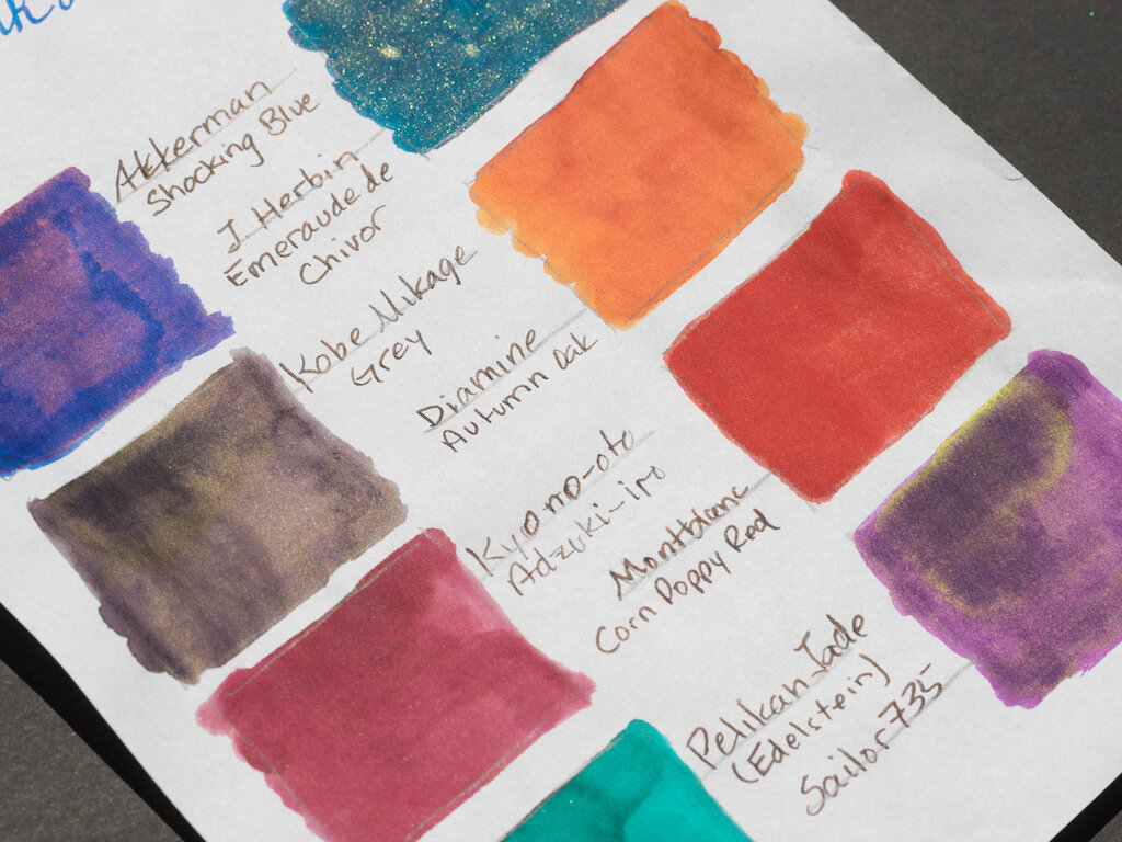
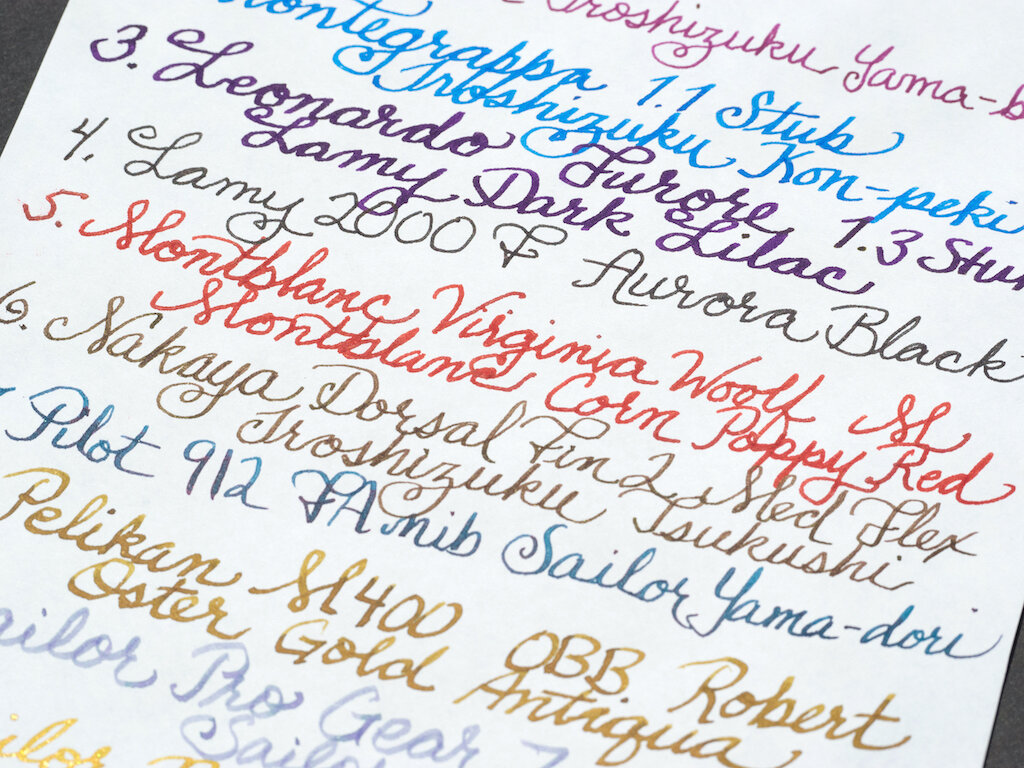
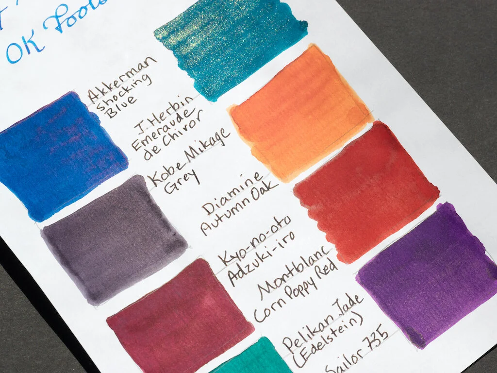
Wow! This paper is super interesting. It feels more like cardstock than paper, but it’s definitely not like construction paper--it’s much smoother and doesn’t have the pulpy feel of construction paper. Writing on black paper is sort of like writing with invisible ink. I tried my best to keep my lines straight, but I couldn’t see what I was writing until after I wrote it and the sheen came out. I was surprised at how well sheeny inks did with the black paper. In fact, the sheen inks wrote better than Diamine Shimmer ink, which I thought would show up quite well. Brown, gold, and green inks were almost invisible, and Sailor 123 disappeared completely. On the other hand, most of the ink swabs displayed remarkable sheen with the exception of Diamine Autumn Oak and Pelikan Jade.
This paper is thick enough that you wouldn’t expect bleed-through, so I didn’t take a photo of the reverse side. However, I can actually make out a few places where ink bled through, namely Montblanc Corn Poppy, Sailor Yama-dori, and Diamine Golden Sands. Show through is obviously not a problem with black paper.
I enjoyed trying out this black paper with various pens and inks. I honestly didn’t expect to see anything at all, assuming that the ink colors would be absorbed by the paper. This isn’t a paper I would use regularly, but it is a nice addition to the collection because of the magic created when various inks interact with black paper.
Conclusion
I have had so much fun reviewing the Fountain Pen Friendly Paper Collection. The experience helped me realize what a rut I’ve gotten into when it comes to paper. I stick to what I know: Rhodia, Tomoe River, and Midori. These are excellent papers, but the Yamamoto Collection exposed me to paper with different textures, absorbencies, thicknesses, and, for lack of a better term, “finger-feel.”
My favorite papers in the collection are:
- No. 4, New Chiffon Cream
- No. 5, Cosmo Air Light
- No. 11, Spica Bond
- Nos. 14-15, Air Mail Bond White and Natural
- No. 16, Eastory COC
- No. 17, OK Fools
Unfortunately, one of the downsides to specialty paper is lack of accessibility. I’ll have to wait for Yamamoto’s Etsy store to reopen in order to purchase some of my favorites, and others (like Eastory COC) may never be easily available to the general consumer.
I highly recommend the Fountain Pen Friendly Paper Collection by Yamamoto to all pen addicts. There’s just something exquisitely sensuous about handling these papers and writing on them. We’re deadened to the sound, smell, and feel of paper because we plow through it so quickly printing documents on copy machines. But writing paper is different. The tactile nature of pen, paper, and ink invites us to use all our senses, to slow down, to touch, to hold the paper to the light, to smell it, to hear it crackle. We remember the simple pleasure that comes from putting pen to paper.
The Fountain Pen Friendly Paper Collection by Yamamoto is currently available at JetPens for $39.50.
(Yamamoto Paper provided the Fountain Pen Friendly Paper Collection to Pen Addict at no cost for review purposes.)
Enjoy reading The Pen Addict? Then consider becoming a member to receive additional weekly content, giveaways, and discounts in The Pen Addict shop. Plus, you support me and the site directly, for which I am very grateful.
Membership starts at just $5/month, with a discounted annual option available. To find out more about membership click here and join us!

