(Jeff Abbott is a regular contributor at The Pen Addict. You can find more from Jeff online at Draft Evolution and Twitter.)
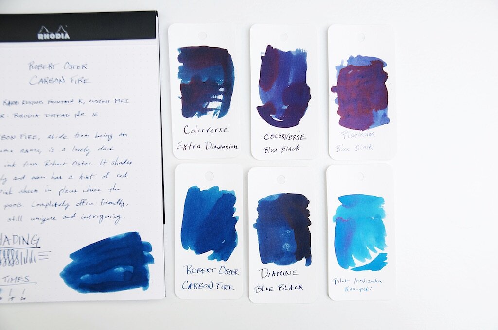
Over the past few months, I've definitely had a thing for trying new blue black inks. While I'm not tired of blue blacks, I decided it was time for something a little different. But don't get too excited — this next ink is just a shade or two brighter than the typical blue black. Despite being a close cousin of blue black, Robert Oster Carbon Fire is a spectacular dark blue that has just enough brightness to really lift my spirits.
While going through my ink and swatch collection to find comparable inks to Carbon Fire, I realized that I really don't have much at all in the blue spectrum that falls between bright, happy blue and blue black. Carbon Fire is the perfect dark blue that has an obviously blue hue while also being dark enough to seem "professional." To me, this is the color that most defacto "blue" that comes in gel, ballpoint, or rollerball refills. But, Carbon Fire has some extra qualities that set it apart from regular old navy blue.
For one, I'm a big fan of the amount of shading in this ink. It's not an intense level of shade between different blues, but it's enough that you can see it with small nibs. Of course, the larger the nib, the more pronounced and beautiful the shading becomes. I love an ink that has a good amount of shading, and Carbon Fire really does the trick for me.
Another hidden quality that I've only been able to coax out when using this ink with a medium cursive italic (or anything larger) is a very subtle sheen. It's so subtle and hard to detect that I can't decide if it's more of a red or pink sheen. Despite being subtle, it's somehow quite deliberate when you're looking at the ink color as a whole. It's difficult to describe. The subtle sheen adds a level of intrigue to the ink because you can't quite put your finger on what makes the ink something a bit more than a standard blue ink. It's not shimmery, it's not glossy...what is it?! These were my internal questions while I was testing this ink. Only by holding the paper at the right angle against the light does the sheen show itself for what it is. It hides beneath the navy surface and adds a pleasant je ne sais quoi to an otherwise ordinary ink color.
If you like ink colors that exhibit mysterious qualities, this ink is right up your alley.
Aside from the color, shading, and sheen, this ink is standard fare for Robert Oster. It's not dry, but not too wet. It's smooth when writing and behaves well in the pens I've tried. It dries in a fairly standard 15-20 seconds depending on how large and wet the nib is. I couldn't detect any feathering or bleeding, which is also something I've come to admire with any Robert Oster ink.
I picked up Carbon Fire as a sample because I was intrigued by the name and thought the online swatch example was unique for a dark blue ink. I'm glad I followed the intrigue, because I might have found a new favorite ink.
You can pick up your own bottle of Robert Oster Carbon Fire from your favorite ink retailers for around $17 (Vanness, Pen Chalet, Goldspotand JetPens to name a few).
Enjoy reading The Pen Addict? Then consider becoming a member to receive additional weekly content, giveaways, and discounts in The Pen Addict shop. Plus, you support me and the site directly, for which I am very grateful.
Membership starts at just $5/month, with a discounted annual option available. To find out more about membership click here and join us!


