(Kimberly (she/her) took the express train down the fountain pen/stationery rabbit hole and doesn't want to be rescued. She can be found on Instagram @allthehobbies because there really are many, many hobbies!.)
I jumped at the opportunity to test 14 of Pilot’s #15-sized 14K gold fountain pen nibs on the Pilot Custom 743, and wanted to see which ones would be my favorites. Note that the S (Signature) and MS (Music) nibs are not available in the Custom 743, but the S nib is available on the Custom 823. The main difference between the 743 and 823 is that the former takes cartridge/converter while the latter is a vacuum filler. Both utilize the same size 15 nib and feed.
Side note: August sees the two of the largest US pen shows (DC and San Francisco), so you should try the nibs for yourself at the Pilot USA tables and let me know which ones are your favorites! But if you can’t, read on!
The Custom 743 (as well as 823) has a size 15 nib, while the 912 (and 742) have size 10 nibs. I have several pens with size 10 and 15 nibs, but I don’t have them all (nor do I want to, for now ;-) ) so I was curious to see if my favorites from the size 10 would translate to size 15. I had limited time with these pens (as they needed to be taken to different shows), which is a good thing because this would end up being a 10 page article, lol. I decided to follow a similar approach as the Bossman did in his writeup of 15 of Pilot’s nibs in the Custom Heritage 912.
A few things to keep in mind:
- I am right-handed but have a “stupid steep” writing angle - 75 degrees isn’t uncommon for me, while most people have a 45-50 degree angle.
- I tend to write primarily in cursive, and occasionally in print (but not like the Bossman’s block print), typewriter font and calligraphy-esque styles like Copperplate and Italic. My go-to nib size from any maker/country/region is Medium. I also prefer broader nibs as well as stubs/italics. I rarely reach for Extra Fine.
- Pilot asked that I dip these pens instead of inking them up, which I don’t think is the best way to test the flow in the nibs. I dipped, then dragged the tip across the ink bottle so there wouldn’t be blobs of ink on the page.
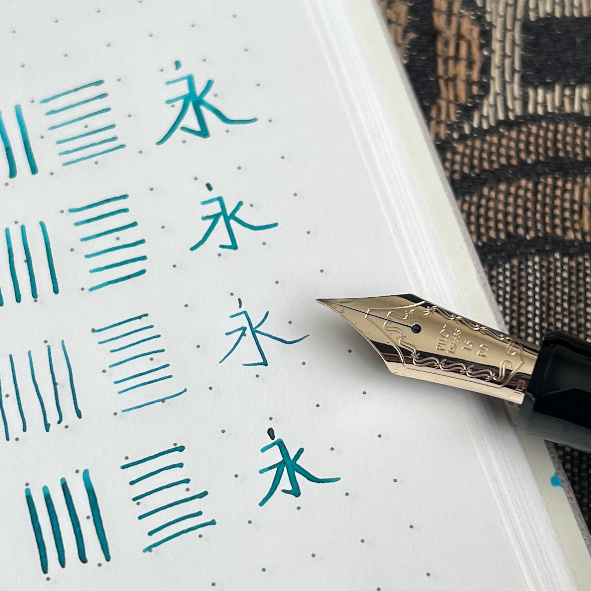
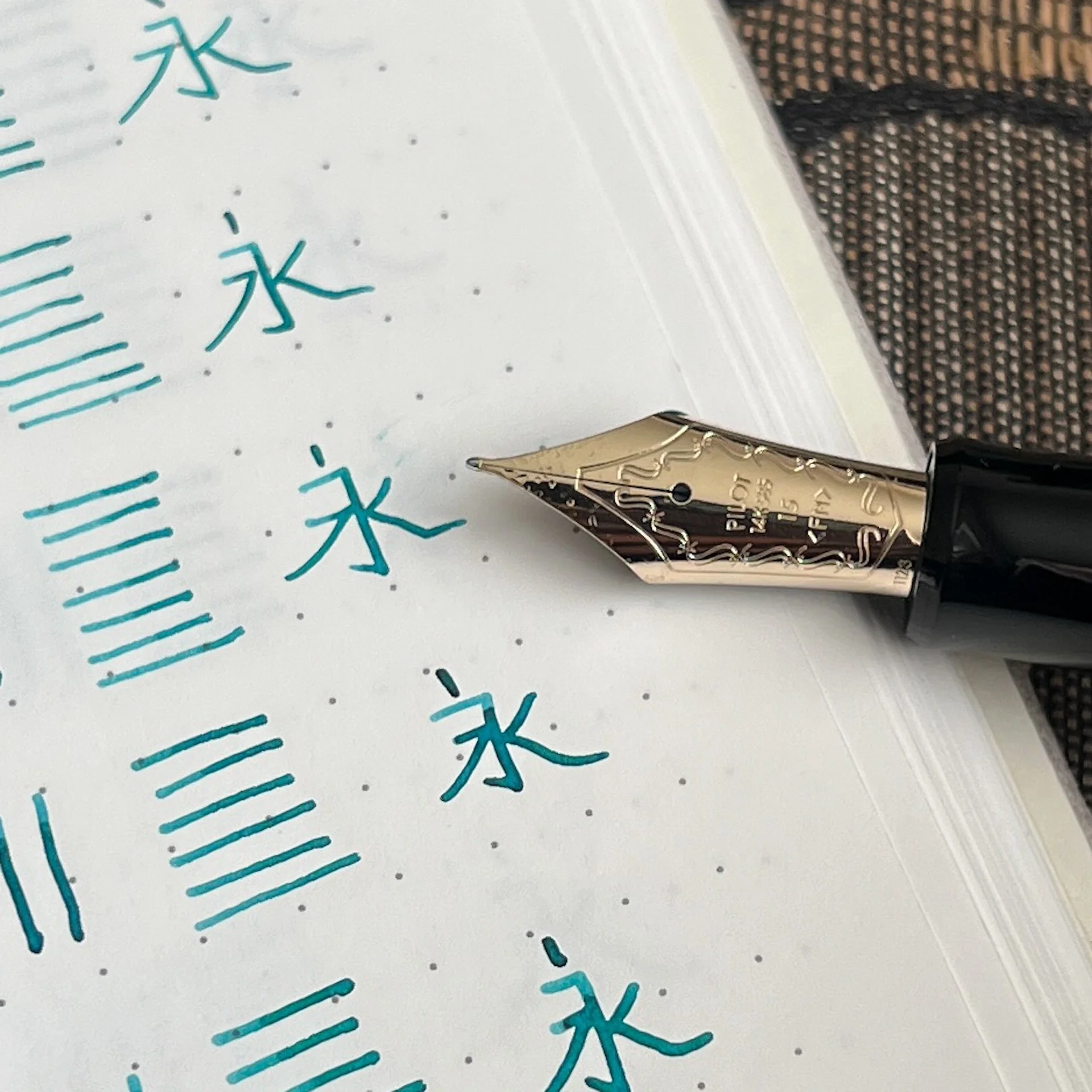
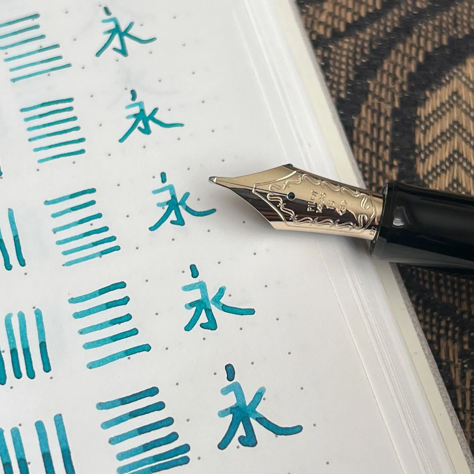
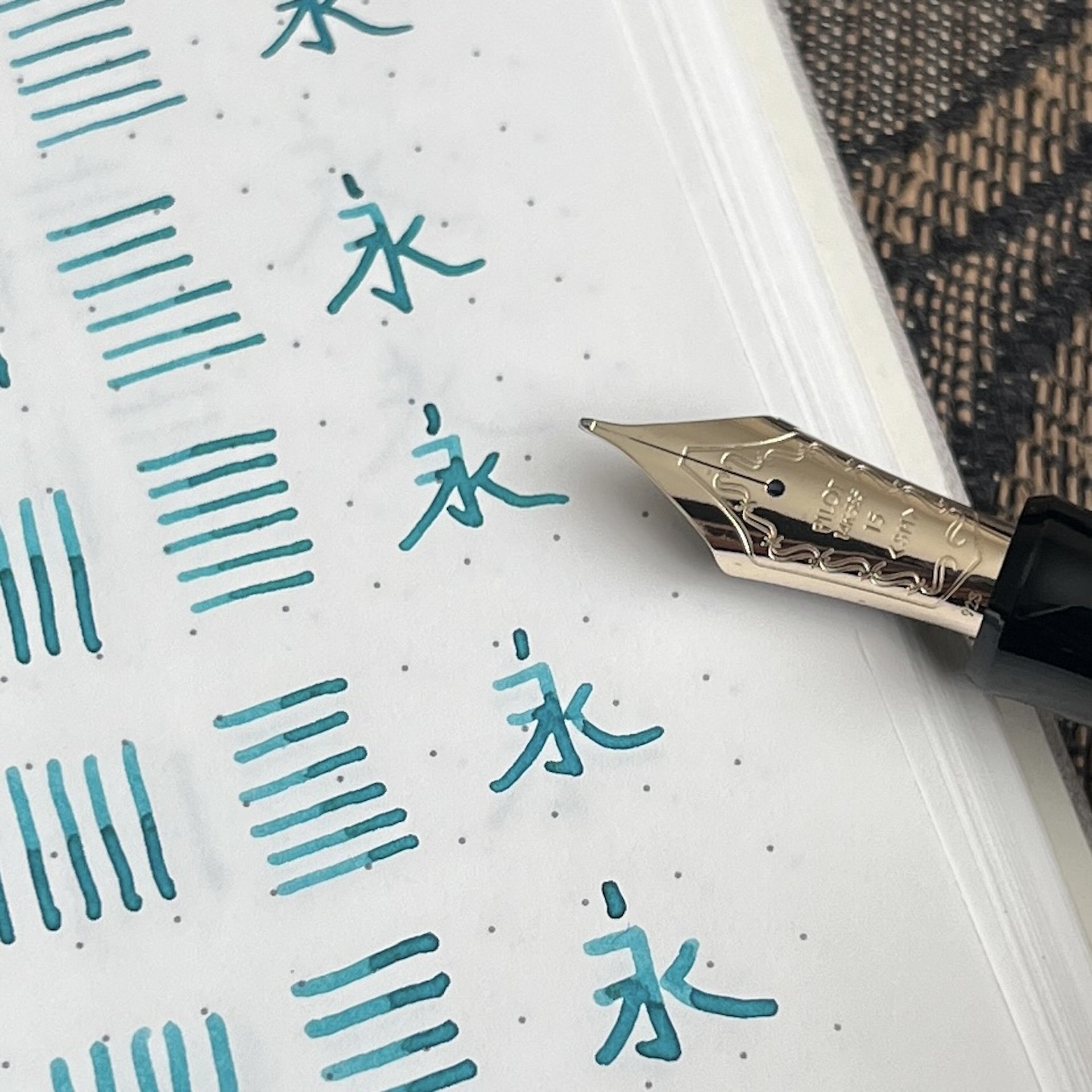
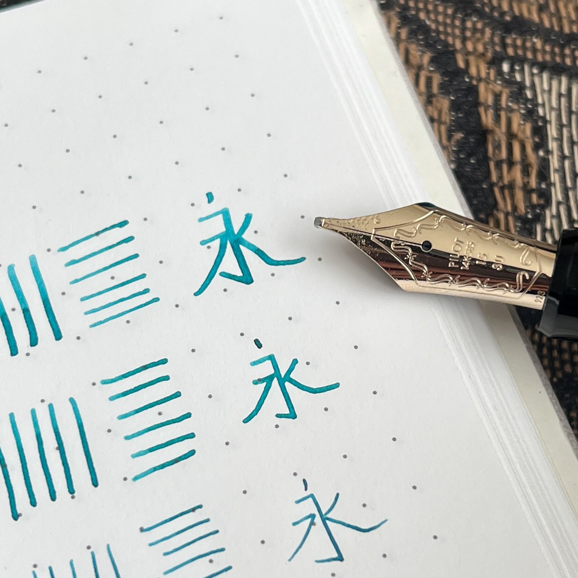
- All of the writing samples were done in the Maruman Bodoni A5 Notebook I was given a bottle of Iroshizuku Sui-gyoku, which had been dipped into with a variety of other Iroshizuku inks (it’s pretty common for tester pens to get dipped into different bottles during shows), so the ink color might not be 100% accurate.
- My Chinese teachers from high school would be shuddering, but hey, it’s accurate, just not beautiful. The character means “always” or “forever”.
- Thank you Pilot USA for sending these 743s so I could do a nib showdown!
- Last but not least, I mostly followed Brad’s formatting but I did not read his ranking so I wouldn’t be biased.
Hey, Bossman! I have a new title! Can I get a raise now?
My aging eyes were so happy to be on #teamsticker even if the stickers didn’t all align with the front of the nib.
Based on writing samples of all of these nibs, do you think you can tell which ones I will like more than others? Also, sorry, I can’t seem to get my columns straight, shrug, lol.
14. Posting
Given that I tend to dislike extra fine nibs and I have a very steep writing angle, this nib was my least favorite to use. It felt like I was writing on the top of the nib, with it almost curving backwards on the paper. The original idea behind the nib was to write on postcards, which had limited space and therefore the extra fine line allowed you to fit more words. The angle of the nib also made it very stiff, unlike their regular and soft nibs, so you could also write on multiple sheets, like with carbon paper (does anyone remember what that is?) or forms in duplicate/triplicate.
That’s one heck of a fine line from the Posting nib.
You can see the downturn of the Posting nib, which gives it a firmer writing experience as well as a drier line.
13. Extra Fine
Admit it, you knew this was coming. I don’t hate EF nibs, I just really don’t prefer them most of the time from any brand. That said, I definitely liked it more than the PO nib because I can still write with the nib at my high angle.
Extra Fine.
12. Fine
This may seem to be the next logical choice but it was a little harder than I expected it to be because of the next two in the list. The Fine is a great smooth nib if you need to make fine lines - I just don’t like fine lines as much.
Fine.
11. Coarse
Goodness gracious, this is practically a Sharpie! It wrote like butter but I didn’t love it because I don’t have big handwriting. With my usual writing, the lines would end up running into each other. That said, this would be a great platform for a nib grind which is why I ranked this higher than the F.
Of COARSE this is a fun nib if you need a thicc line.
10. Soft Fine
I liked this more than the Fine because the slight bounce from the softer nib gives it an almost imperceptibly wider line and ever so slight line variation (more from the release of pressure than from adding pressure). That said, it’s still a bit too fine for me.
Soft Fine, you were almost number nine!
9. Waverly
Unlike the Posting nib, the Waverly was designed with a slight upturn on the tip of the nib, which makes it much more pleasant for folks who “push” their nibs, like lefties. As a rightie, I didn’t really notice the difference as it still wrote with a smooth, slightly broader than Fine Medium line. I’m sure I’d rank this much higher if I was a leftie, but since I’m not, I’d pick any of the remaining nibs instead of trying to hunt this one down.
The Waverly’s upturn is more noticeable from the side.
8. BB / Double Broad
Am I giving everyone whiplash going back and forth between the extreme nib sizes? I liked the not-quite-as-insane width of this nib compared to the Coarse but it is still too broad for my everyday use. As with the Coarse nib, this would also be a great canvas for a nib grind.
This BB has one too many Bs for me.
The bottom seven were fairly easy to pick but the top seven were much harder to choose from, so I used two criteria to help me decide: (1) what would be a better everyday writer for me and (2) what nib would I pick to buy next.
7. Fine Medium
This one was REALLY hard for me to put in this spot, but having owned this nib in both the size 10 and 15 sizes, I have come to accept that while it is a great writer, it is, say it with me, just a bit too fine. It is a very practical size for every day but this inkophile wants to lay down more ink, and go through fills quickly and this FM is too fine to do that.
FM, I loved you so much, I got Masuyama to make my 823 M into an FM, but alas, you’re too fine for everyday now.
6. Medium
Yep, my go-to nib size, Medium, barely made the top half of this list! It is such a nice and smooth writer that I wish I had more size 15 M nibs (I have had one ground to an FM and another ground to a Cursive Italic).
Medium is 6th because I’d rather get one of the other remaining nibs first, it’s not cuz I don’t love you.
5. Broad
I am shocked that I don’t have any Broad nibs in either the 10 or 15 size, though I do have it in a VP nib and it’s glorious. This would be a great ink layer-downer nib without having an overly broad line and as such would be a great addition.
Broad. It me.
4. FA or Falcon nib
Not to be confused with the Falcon pen (aka Elabo), the FA nib has cutouts on the side of the nib that gives it the ability to flex a bit. It is not like vintage flex, more like semi-flex. The size 15 FA is actually stiffer/firmer than the size 10 FA, and gives slightly less line variation than the 10. I have both and prefer the 10 FA because I do like to slow way down and write in a Copperplate-like style when using it. Even though I already have one, I wouldn’t turn down another FA if it were to cross my path.
You can see the cutouts from the top of the FA nib.
A better view from the side.
3. Soft Medium
I don’t have this nib and I want it. I love the slight bounce that this gives over the Medium, but it also makes the line a touch wider too. I could have easily swapped the M and SM spots but this one ranked higher because I don’t have one. Yet.
Soft Medium, I need this so much.
2. Stub
As someone who occasionally likes to do italic calligraphy, as well as write cursive with stub nibs, I was really curious to see how Pilot’s stub nib would feel. I absolutely loved writing with it! It is a fairly smooth stub, unlike Pilot’s sharper steel nibs like the ==CM== (Calligraphy Medium) which are more like italics. The only reason this is ranked second is because this wouldn’t be as practical for me as an everyday writer.
Stub, where have you been all my life?
1. Soft Fine Medium
I have the SFM in size 10 and absolutely love the nib so I wondered if the size 15 would elicit a similar response and omg, yes, it does! The slight softness of the nib makes the line a bit broader than the regular FM, which means it is the perfect width. I really enjoyed writing with this nib and am waiting for the right pen to show up with this nib in it!
Soft Fine Medium, I knew I loved you in size 10 and now I know I love you in size 15.
And there you have it, my ranking of the size 15 nibs from the Pilot Custom 743 collection! I can’t wait to see what the Bossman thinks when he gets his hands on the set. Size 15 nib throw down, coming to a TPA near you!
It’s the circle of life, I mean, nibs!
Oh, one more thing, this article also marks my 3 year anniversary of writing for The Pen Addict! Thank you so much to Brad “The Bossman” Dowdy for giving me this opportunity and not giving me the boot (yet)! And a heartfelt thank you to all of you for reading, commenting and encouraging me - it really means a lot! Onwards to more wordy articles, hahaha!


