(Kimberly (she/her) took the express train down the fountain pen/stationery rabbit hole and doesn't want to be rescued. She can be found on Instagram @allthehobbies because there really are many, many hobbies!.)
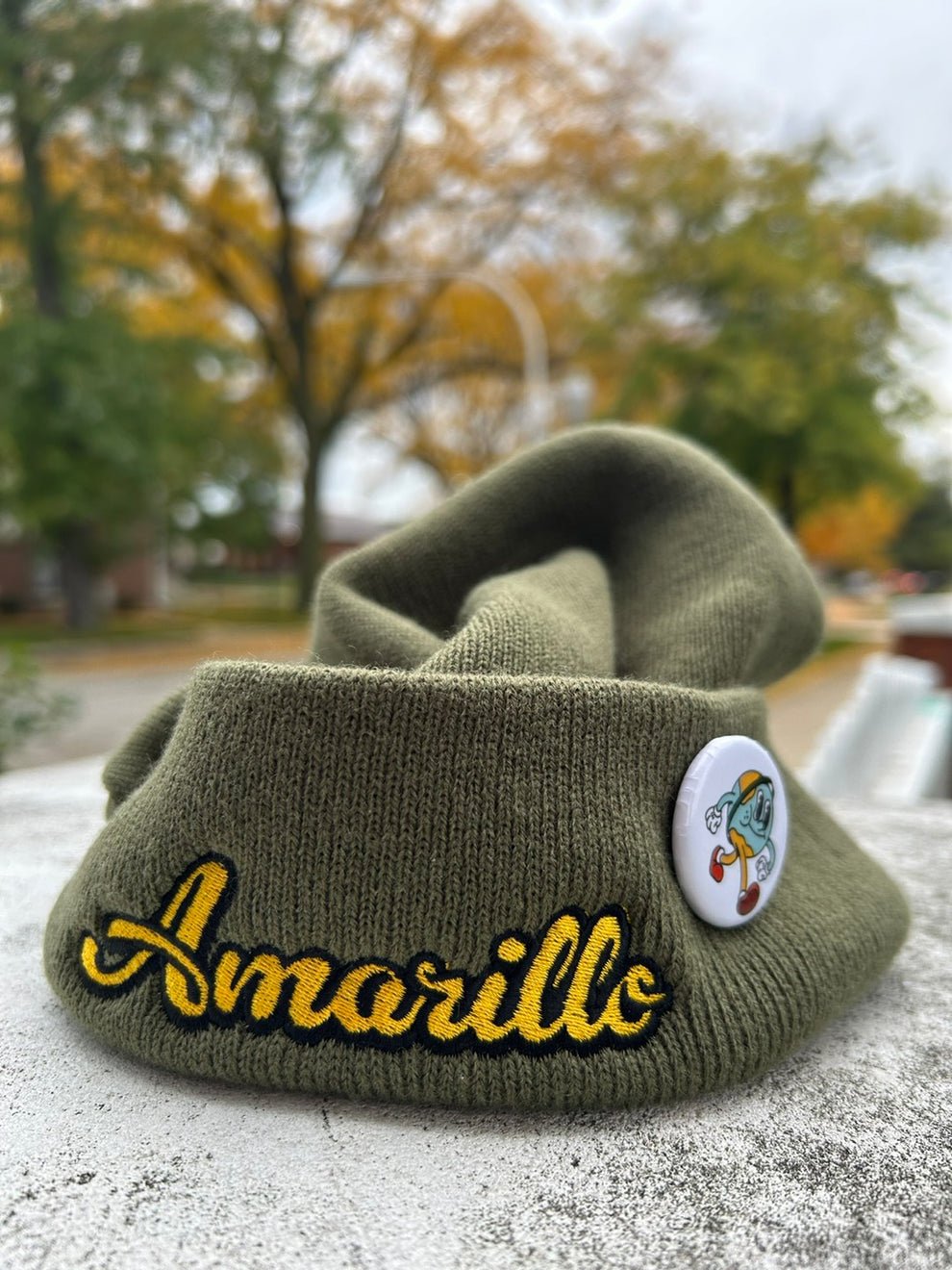
I know, I know, I just did an ink review a couple weeks ago - Sugar Turtle Studio’s Slowpoke inks - but I just got these from the Bossman at the Philly Pen Show and I just HAD to check them out asap! These aren’t the first inks with Amarillo Stationery’s name on it (they’ve collaborated with Pennonia for three inks) but this is their first private label release, which is exciting.
The Amarillo Vibes set of inks launched a few weeks ago on January 13, 2025 and come in 30ml glass bottles. Despite the bottles looking like those of Birmingham Pen Company, Erick Gama (the guy behind Amarillo Stationery) confirmed that the inks are NOT made by them. Good luck getting him to spill the beans!

Rotating the boxes gives you a fun look at the inspiration behind these inks!

The boxes don’t have the ink names on them, but there are colored swatch stickers to identify them.

I love the doodle art on the bottles!

Here are the bottles with their Col-O-Ring swatch cards.
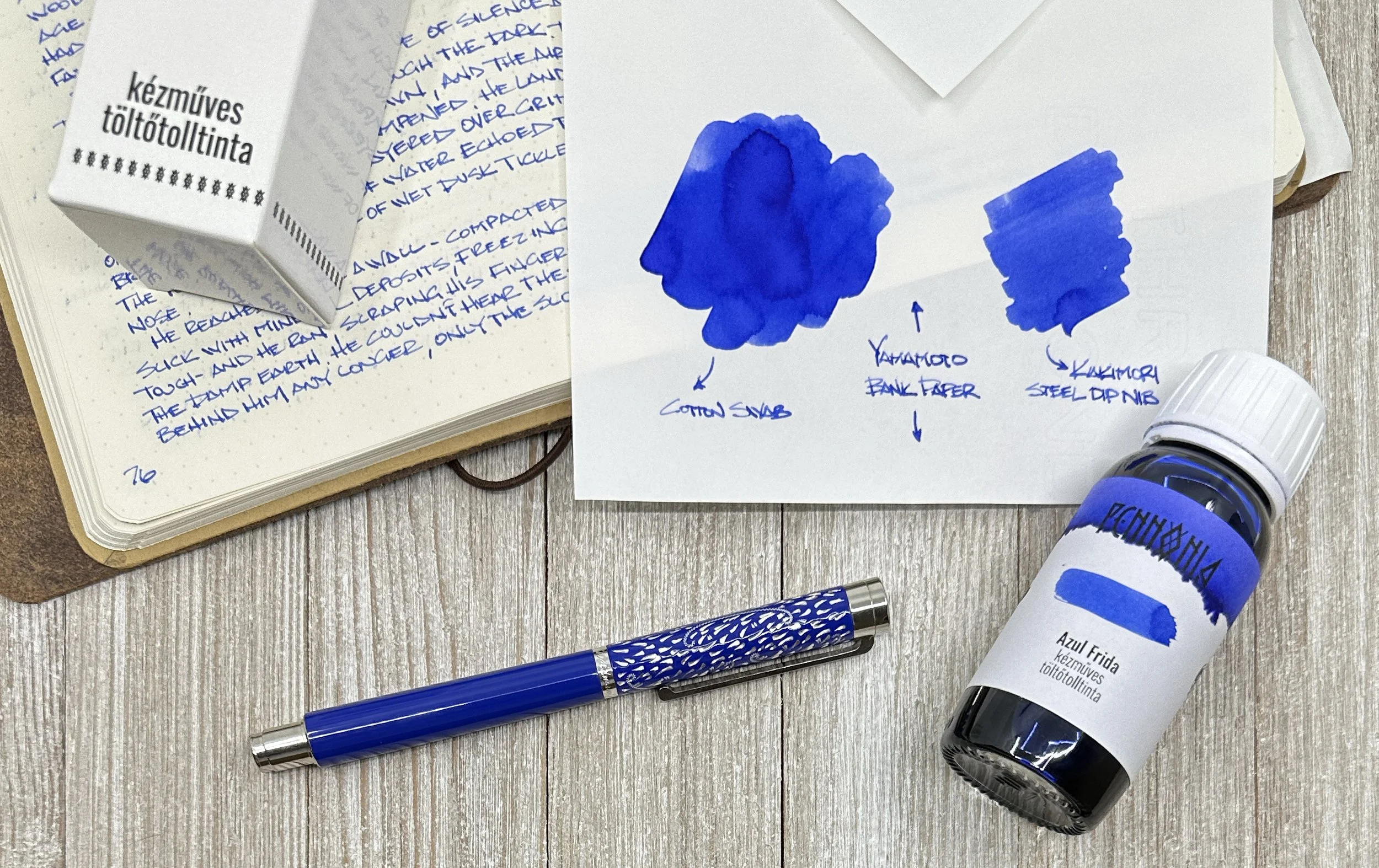
As in the past, all swatches were done on Col-O-Ring cards using a Kakimori steel dip nib, while writing samples were done with a TWSBI Go with a Medium nib and a Lamy Vista with a steel Medium nib. The TWSBI Go is a wetter writer and the Lamy is a drier writer, so these two give me a good idea of how an ink will look from different pens. The notebook used for writing samples is the Endless Recorder with 68 gsm Tomoe River paper. Dry times for the Vista are shown with “(V)” and the Go will be below that and might also be shown with “(T)”. Dry times may be a bit slower on 52gsm TR or faster on paper like Cosmo Air Light, Rhodia, copy paper, or with drier or finer nibs, etc.
The Amarillo Vibes series includes Blue Suntan, Teal Waistband, Toasty Joggers, and Urng Kicks (pronounced like a mix “urn” and “orange”). I will admit that it took me way too long to figure out where these names came from (this is what I get for not reading the posts and listings until I started swatching, lol).

Amarillo Blue Suntan Amarillo Blue Suntan is inspired by Amarillio’s “skin”, which is a light-to-medium dusty blue. It has nice shading, especially in drier pens.

Writing sample of Blue Suntan on 68 gsm Tomoe River Endless Notebook.

You get a bit more shading from the drier-writing Vista compared to the wetter Go. As expected, the ink is a bit darker and a touch more saturated in the Go, but the main color is still the same. (Some inks can look very different in drier/wetter pens.)

Blue Suntan’s chromatography has both light blue and grey tones. There is just a wee hint of pink just above the ink line.

Inks similar to Amarillo Blue Suntan: Kyo-no-oto 07 Hisoku (closest in color but is a drier ink), Graf von Faber-Castell Deep Sea Green (which is less green than the name implies), Kobe 68 Nishimaiko Pearl Blue and Colorverse Tar Heel (a bit too light), Sailor Mayo Koke (too green and too dark.)

Amarillo Teal Waistband.
Teal Waistband takes its inspiration from Amarillo’s teal equator belt. It is slightly darker and greener compared to Blue Suntan.

Writing sample of Amarillo Teal Waistband on 68 gsm Tomoe River Endless Notebook. The writing is a bit more teal, while the swatches are more green.

Like Blue Suntan, Teal Waistband is a bit darker and slightly more saturated with the Go, but the underlying teal color is the same.

Hard to believe how bright the turquoise is on the strip. The hint of yellow gives the ink its slight greenness, but the amount of pink was definitely a surprise. I wasn’t able to see any of the pink in the writing samples or swatches.

Inks similar to Amarillo Teal Waistband: Waterman Harmonious Green (too green), Jacques Herbin Vert Metropolitain (touch too green and dark), Wearingeul Tick Tock Croc and Diamine Velvet Emerald were the closest, and Iroshizuku Sui-goku (a bit too bright.)

Amarillo Toasty Joggers on 68 gsm TR. Toasty Joggers is described as “yellow/brown color with a hint of pink”, but depending on the light, can look a bit orangey too.

Writing sample of Toasty Joggers on 68 gsm Tomoe River Endless Notebook. It is a very readable yellow/brown, even in a drier pen like the Vista, but might be a touch on the light side for a Japanese Fine or Extra Fine.

The Vista shows a bit more yellow than the Go, which shows it a bit more brown leaning. The pink isn’t obvious like a sheen or chromashader, but more as an undertone.

A mix of yellow and brown, but the chromatography is also showing that “hint of pink”, which can give it a bit of a dusty orange feel.

Inks similar to Amarillo Toasty Joggers: Jacques Herbin Tour Eiffel and Franklin-Christoph Honeycomb were the two closest, Diamine Three Kings (too yellow) and Tono & Lims Toyoma (too light and not quite brown enough.)

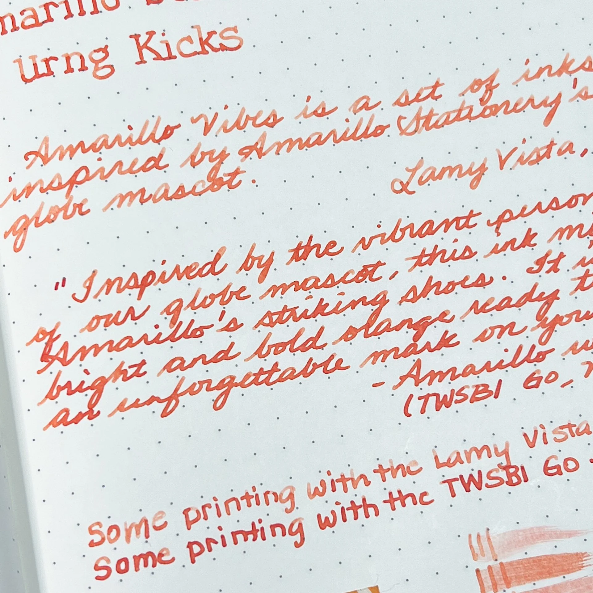
Amarillo Urng Kicks on 68 gsm TR.
Urng Kicks is inspired by Amarillo’s shoes and is described as “a bright and bold orange”.

Writing sample of Amarillo Urng Kicks on 68 gsm Tomoe River Endless Notebook.
Unlike the other inks, Urng Kicks is a fair bit lighter with the Vista than the Go, with shading prominent in both print and cursive. It looks a bit more coral in the Vista’s drier nib, and more of a red-orange with the Go.

A fair amount of pinkish red and a bright streak of yellow at the top.

Inks similar to Amarillo Urng Kicks: Van Dieman’s Golden Nugget Pumpkin (a bit too red and saturated), Bungubox Omaezaki Sunset (the closest), Diamine Celebration (good match colorwise but too light). It was hard to find matching inks as others were either too orange, too red, or too pink.

Swatches of Blue Suntan, Teal Waistband, Toasty Joggers, and Urng Kicks on 52 gsm TR in a 2021 Hobonichi Weeks.

Swatches on 68 gsm TR in the Endless Recorder.
All 4 inks behaved well and wrote nicely. Dry times weren’t bad at all, but I did expect Blue Suntan and Urng Kicks to dry faster than they did, given how much shading it had from the Vista. Toasty Joggers was the fastest to dry around 30 seconds, while the other two were 45-60 with a wet writer.
The Amarillo Vibes ink series is currently available on the Amarillo Stationery website for $18/bottle (shipping is not included.)
(Disclaimer: Thank you to Erick Gama of Amarillo Stationery for providing these inks for review. All other inks and notebooks are my own, including the Amarillo patch and sticker which I bought from their website last year.)