(Kimberly (she/her) took the express train down the fountain pen/stationery rabbit hole and doesn't want to be rescued. She can be found on Instagram @allthehobbies because there really are many, many hobbies!.)
I first reviewed the Kakimori dip nibs (along with several others) in my dip nib comparison article a while back, so I was very excited when I heard that Colorverse was coming out with their own version of the dip nib, called the Shuttle nib.
I am using the same methodology for the Colorverse Shuttle nibs as I did last time with the others:
- Ink - I am using Waterman Serenity Blue as a baseline for the swatches/writing samples. This is most nib grinders’ preferred ink of choice as it has consistent flow, does not stain and is good for vintage pens. I also picked a shimmer ink to see if it behaved differently. I capped and shook the vial between each test.
- Paper - I used a combination of a 68 gsm Tomoe River notebook, a 80 gsm Rhodia graph pad, and the standard sized Col-O-Ring cards made from 160gsm paper.
- Cleaning - I have used the steel Kakimori dip nib as my primary swatching tool for the past couple of years, so it has been rinsed/cleaned/wiped many times. I use tap water to rinse between uses.
- I use a syringe to gently shoot water downwards towards the tip of the nib.
- I do not dip the nib/holder into water and swish for cleaning, so I don’t get ink stuck inside the holder.
- Writing - Aside from the name of the dip nib, I tried to write the same text on the different papers so you can see how much writing I could get out of one dip. For the Colorverse nibs, I will write a line without an initial cleaning, so I can see whether it writes on first use. Then I will rinse/dry it before rewriting the line again.
- Swatches - I am making a broad line swatch as well as my typical Col-O-Ring swatches with both sets of nibs.
Note: After about 6 months of use, the Kakimori dip pen holder started allowing the dip nib to slide out of the ferrule (the “round thingy” that holds dip nibs in place). I showed a video to Kakimori, who ended up replacing the holder. Unfortunately, the replacement started doing the same thing some months later, so I stopped using that holder. I have also since misplaced it, so I don’t have any comparison photos of it next to the Colorverse holder.
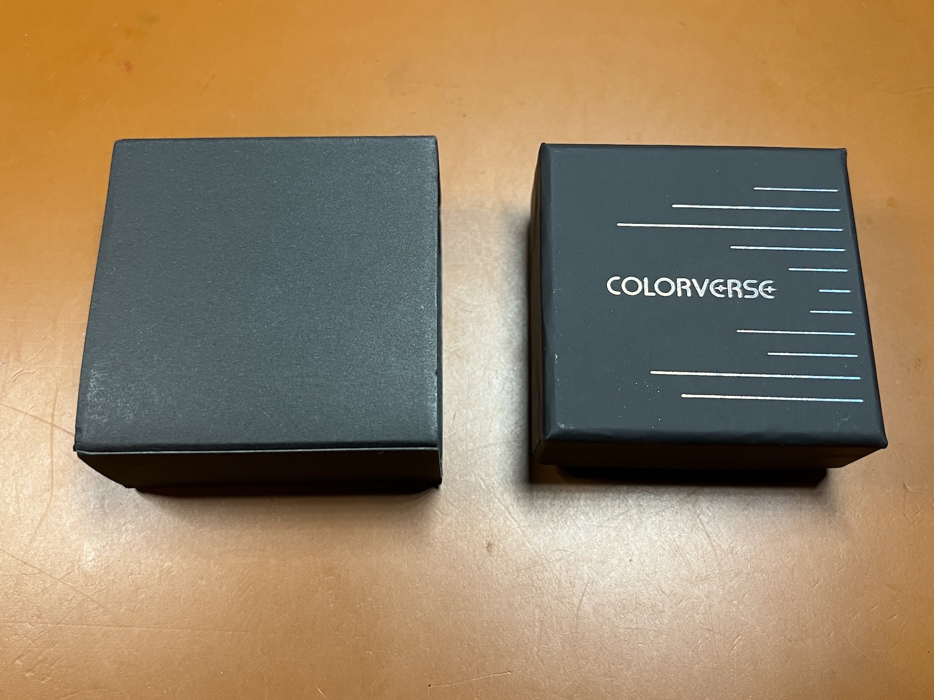
The Colorverse Shuttle nib is packaged in a black box with holographic logo/design (right), which is then encased in a simple black box sleeve (left). The nib holder is similarly packaged but in a longer box (not pictured).

The Kakimori’s packaging (left) has a very different aesthetic. For lack of better words, I would say it feels more organic, while the Colorverse packaging gives off a very modern, space-like vibe, appropriate for its Shuttle namesake.
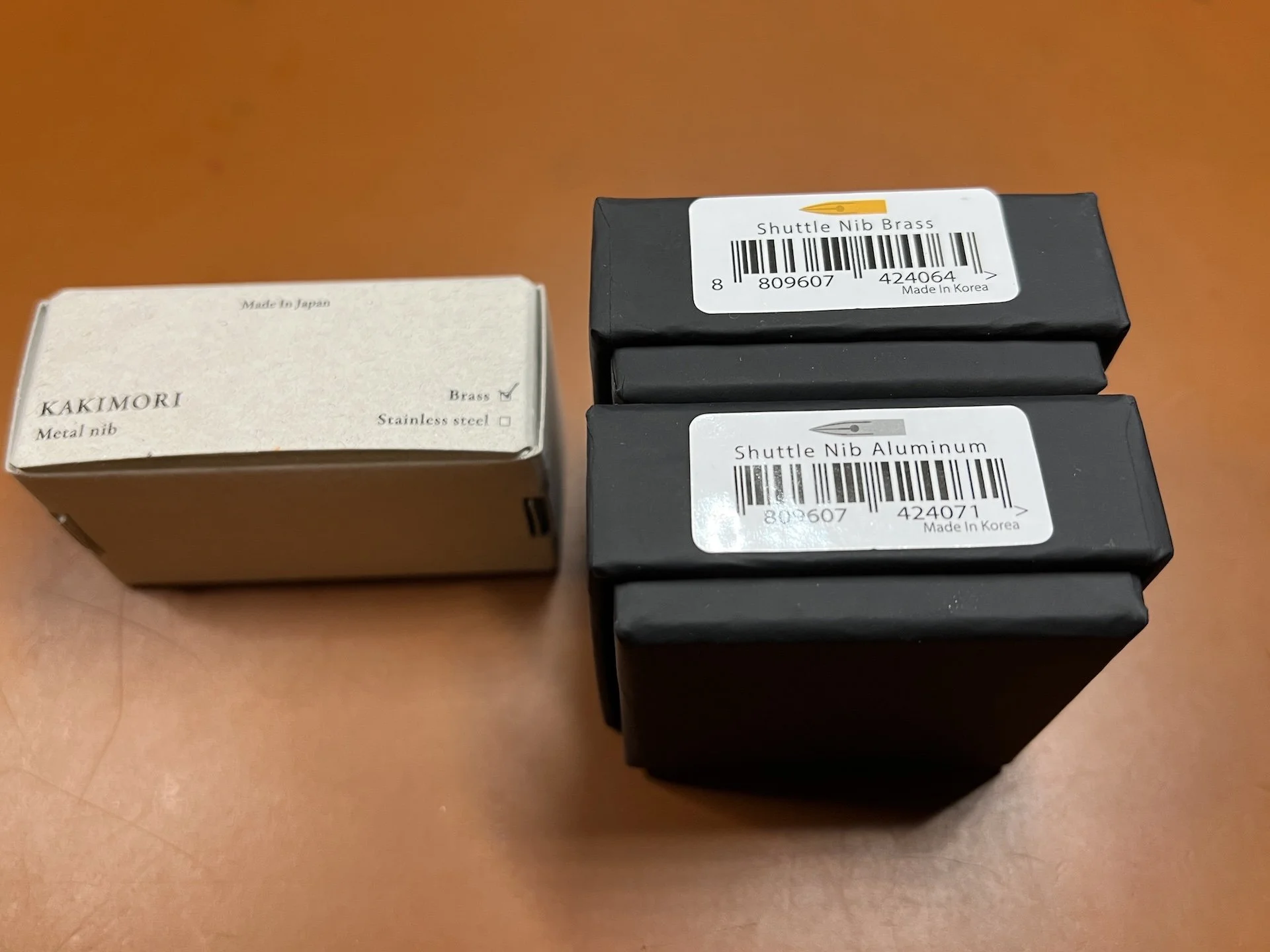
The hand marked check matches the rest of the Kakimori’s packaging aesthetic. Easy to see at a glance Colorverse’s brass or steel nib.
Before I get into the nitty gritty, let’s just get this out there ‘cause I know you’re dying to know if they are compatible with other holders. And the answer is YES! Both the Colorverse Shuttle and Kakimori dip nibs fit in standard ferrule nib holders, and yes, both will fit into the other’s nib holders as well! This is great news for folks who already have nib holders for the Kakimori or other dip nibs (neither will work in oblique nib holders).

Colorverse Shuttle aluminum nib in a Tachikawa holder, Kakimori steel dip nib in the Colorverse Shuttle holder, and Shuttle brass nib in a Speedball holder.

You can easily fit a Zebra G or pretty much any other standard dip nib in the Colorverse Shuttle holder.
There’s no denying that the shape of the Shuttle nib is similar to that of the Kakimori, but they are also a bit different. The Shuttle is a longer nib and has sharper channel grooves than the Kakimori. It is also more narrow and pointed, while the Kakimori is a bit broader and more “rounded”. Both of these differences factor into how the nib feels when using them at more extreme lower angles.
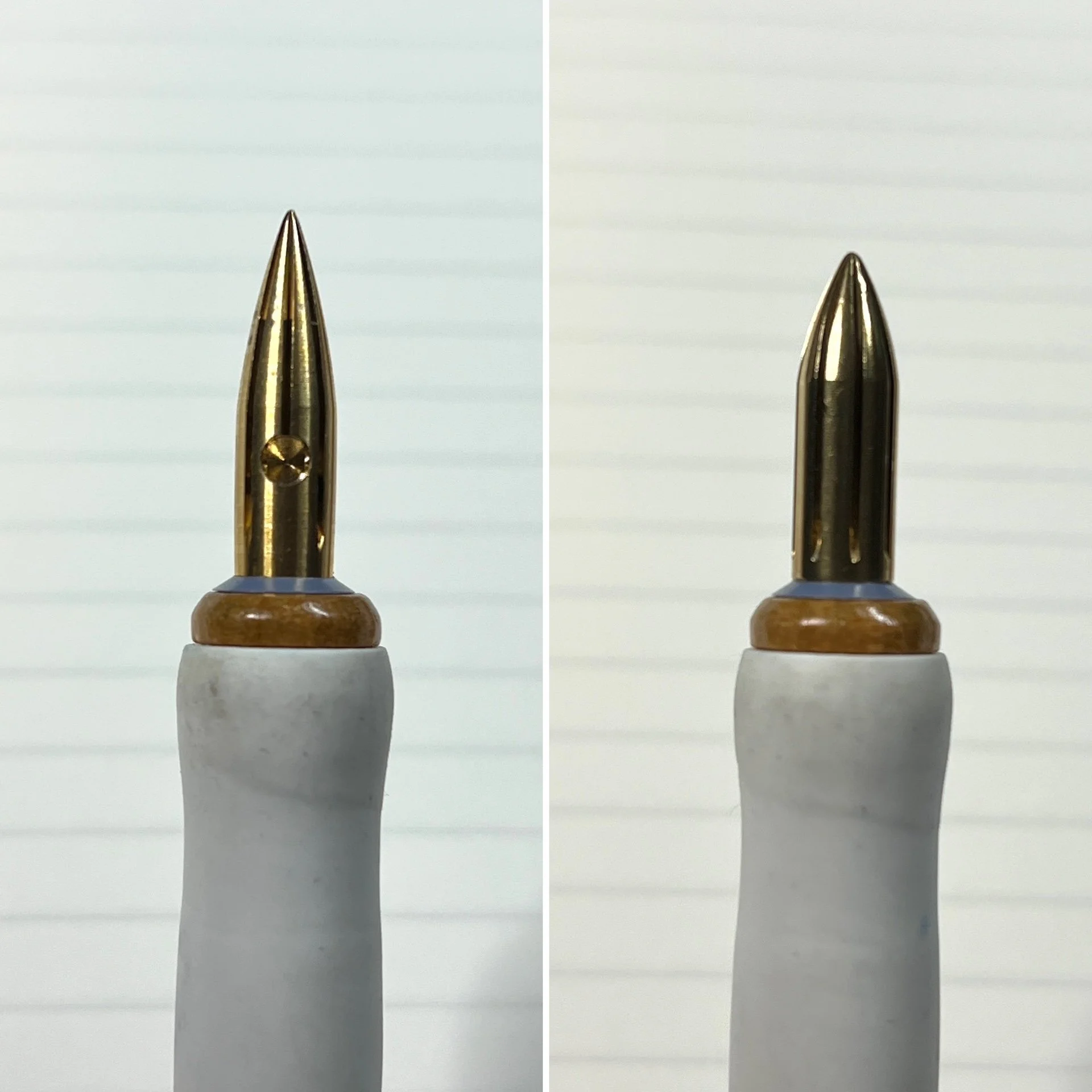
Colorverse Shuttle nib on the left, and the Kakimori nib on the right. Both are Brass and are in the Tachikawa holder, which has a standard dip nib ferrule.

Despite using a very light touch at more horizontal angles, the swatches still show “scratch marks” where the nib scratches the Col-O-Ring. I didn’t feel this quite as much on the much smoother TR 68 gsm paper, but neither performed quite as smoothly as the Kakimori.

The Colorverse Shuttle nib (Aluminum) in the Shuttle nib holder (also Aluminum.)
The Colorverse Shuttle nib holder has a ridged grip section, which is neither too smooth nor too sharp. It makes it easy to hold without your fingers slipping. It is slim with a bit of heft to it, unlike a traditional wood or plastic dip pen holder which is very light. As such, it can be a bit uncomfortable for long term writing if you prefer a lighter pen or more girthy grip section or both. This nib holder is the Large model and is 7.4”/187 mm. There is also a Small one which is ~5.6”/142 mm.

Thanks to technology and poor photo editing skills, here is an approximation of the Kakimori holder (left silver) with the Colorverse Shuttle holder (right center). The holders on the left/right sides are from Tachikawa and Speedball.
The Shuttle nib holder doesn’t look like anything more than a ferrule in a ridged-grip long nib holder. The grip actually unscrews itself from the rest of the “barrel”, revealing a brass ferrule which is still attached. When attached, this piece and the grip form a gap which holds the dip nib in place. This brass piece is also detachable from the holder, making cleaning easy if you somehow manage to get ink back there. Unscrewing the section also makes it easier to fit into shorter cases/pouches.

Grip section unscrewed from the nib holder. You can see that the piece that holds the ferrule is still attached to the rest of the holder. It would be cool if you can get grips with different materials, designs, etc.

You can unscrew the ferrule if you need to disassemble it further to put it in a small case or for further cleaning. I wonder if the ferrule is replaceable - that would have solved the problems with my Kakimori holder.
For the writing sample below, the first part was done with the Shuttle nib right out of the box without any rinsing or cleaning. I did a quick wipe with a napkin to ensure no particles would get in the ink.
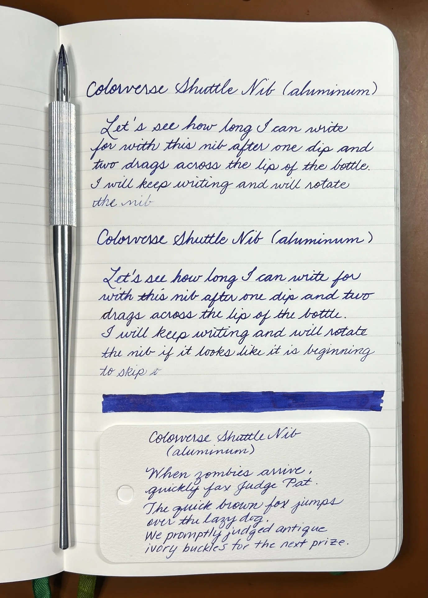
Header with 4 lines of text before running out of ink. A simple rinse and wipe before a new dip gets an additional line of text. No problems writing cursive or print on the slightly textured Col-O-Ring card either.

Making my swatch line with the Aluminum Shuttle nib. There is less of a curvature of the Shuttle nib, so I had to use a very low angle in order to not cut the paper or make much thinner lines.

Writing samples on Rhodia 80gsm (left) as well as writing at some different angles

This was really hard to do towards the bottom of the page of a super thick notebook, especially for someone like me who is also used to writing at 75 degrees.
One of the things that differentiates the Colorverse Shuttle nib from the Kakimori nib is a small reservoir which stores a wee bit of ink so you don’t have to dip it as often. I dipped it a few times because I could see that it was a surface tension bubble as opposed to ink in the reservoir.

Ink in the nib reservoir.

After dipping and confirming ink was in the reservoir, I managed to write a bit more than 1 page of A5 slim, which is about 3-4x what I got from a non-reservoir dip.

The number of pages you get will depend on multiple things including writing angle (my steep angle meant that ink flowed down faster initially), and how the reservoir is oriented (I had it facing up, but in another writing sample, I rotated it almost face down and got a lot more/too much ink flow).
Like I did with the Aluminum nib above, there was no cleaning of the brass nib prior to first writing. Not gonna lie, I absolutely HATED my Kakimori brass nib, so I was pretty nervous about how the brass Shuttle nib would perform. No need for worry as it wrote right away with zero problems whatsoever!

Header with 5.5 lines of text vs Aluminum’s Header + 4. Clean, wipe and re-dip gets an additional 3.5 lines of text.

Swatch line and Rhodia samples. I had a bit more trouble writing on the Col-O-Ring than I did with the Aluminum nib, which surprised me.

Different angles on TR 68gsm and Rhodia. I rotated the nib a bit while writing at the 20 degree angle on top, hence the drastic line width compared to the Rhodia sample.


After dipping and confirming ink was in the reservoir, I managed to write a few lines more with the Brass nib than I did with the Aluminum nib.
In general, the two Colorverse nibs wrote similarly for me from 45-75 degrees (these were all done as “below reservoir” dips, aka, not super saturated, but with plenty of ink to write with). The widths were a bit more noticeable around 30 degrees and even more so when lower than that.

The angles are approximate and how much ink is left on the nib will also affect its width. Colorverse Brass (top), Aluminum, Kakimori Brass, Aluminum.
Both the aluminum and brass Shuttle nibs handled shimmer without any issues.
Alongside other dip nibs using the same Robert Oster Glistening Orange Rumble ink sample.
TLDR: If you don’t already have a Kakimori dip nib, the Colorverse Shuttle dip nib would be a good purchase, especially if you want to use it more for writing. I had a slight preference of the Brass because the line was just a wee bit thicker and held a bit more ink, though I probably would never use it for more a lot of writing (that’s what FPs are for, lol), But, I liked the Aluminum for writing on Col-O-Rings more than the brass. On smoother paper like Tomoe River, I liked either of Shuttle nibs a bit more than the Kakimori steel nib (and we all know how I feel about the Kakimori brass regardless of paper). However, given that my primary swatches are done on Col-O-Ring cards, the steel Kakimori feels smoother when making the large swathes of ink. You may like or dislike how either nib feels on different kinds of paper (like textured papers or watercolor paper versus Tomoe or Rhodia) or if you plan on using it for writing versus art, etc.
I would hands down get the Colorverse Shuttle nib holder over the Kakimori because I don’t have to worry about the nib eventually sliding out of the ferrule like what happened with 2 of their nib holders. Plus I like the ability to disassemble it in case of inky accidents.
The Colorverse Shuttle nibs cost $42 and $48 for the Aluminum and Brass, respectively. The nib holder in Aluminum costs $75 and $60 for the large and small, respectively, while the Brass holder is $85 and $67. They are priced similarly to their Kakimori equivalents. You can find the Colorverse Shuttle products on the Pen Realm website.
(Disclaimer: The two Colorverse Shuttle dip nibs and the nib holder were purchased from Pen Realm at the 2025 CA Pen Show. All of the other products are my own, including the Kakimori nibs and various holders.)