(Kimberly (she/her) took the express train down the fountain pen/stationery rabbit hole and doesn't want to be rescued. She can be found on Instagram @allthehobbies because there really are many, many hobbies!.)
As you may recall, I have a love/hate affair with ink swatching. It’s one of those activities that I desperately need to do because I am so behind in swatching. Once I get started though, it ends up being a relaxing activity that I enjoy and I like discovering what inks are exciting me even if they are “old” bottles/samples that I’m finally getting around to swatching. As such, I like to try all the different tools out there for swatching inks, so up for today is the Dominant Industry Ink Muddler.
The Dominant Industry Ink Muddler comes in a simple box labeled “Ink Muddler” and the tagline “For Glitter Fountain Pen Ink”. A bit of kraft-like paper and a strip of washi tape protects the Muddler in the box.
The Muddler has a small column of pliable clear plastic (silicone, perhaps?) that protects the glass tip.
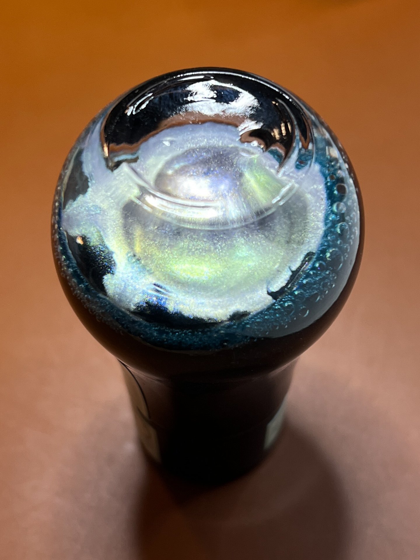
On one end of the Muddler is a spiral glass tip, as is common with most glass dip nibs. On the other end, I expected a round ball of glass, but instead, the DI Ink Muddler is more of a flattened glass disc.
The Muddler’s glass tip.
The flat side of the Muddler.
Rotate the Muddler 90 degrees and you’ll see that this end isn’t a round ball of glass but it’s flat.
The Muddler wrote right out of the box, with no issues (looking at you, Drillog and Kakimori brass dip nibs). It does take a little practice to figure out how many “drags” across the bottle top to make sure you don’t get too much/little ink. I had to remember to be more careful than usual, since I’ve been using the Kakimori steel dip nib for the past couple of years.
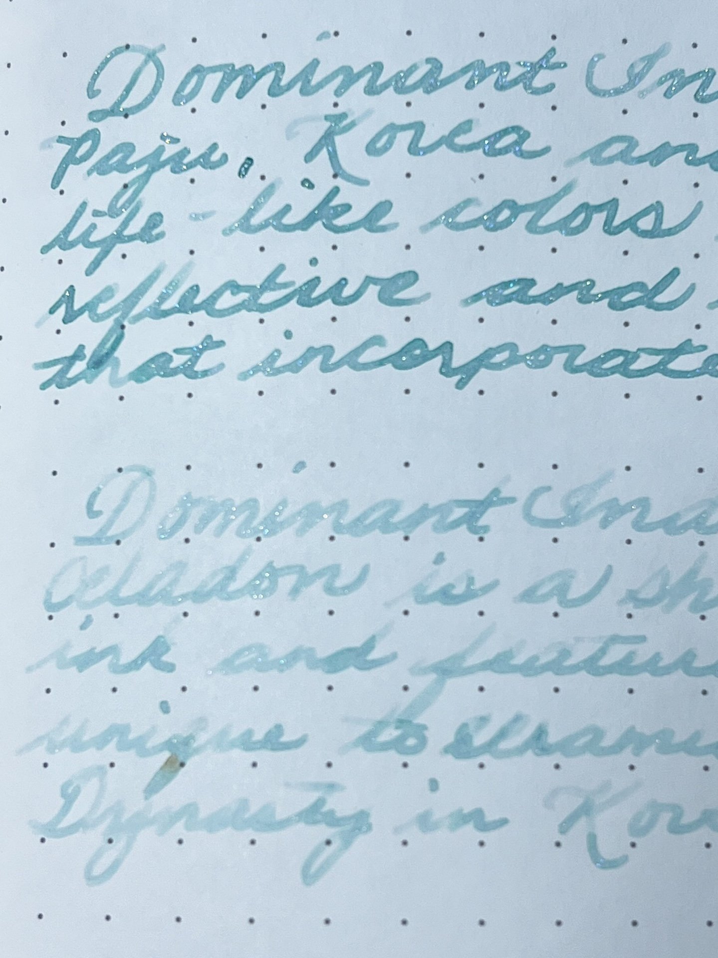
I probably could have used another drag across the bottle top since this first bit of writing is a bit saturated.
Using the muddling end to make an ink swatch. Pretty straight forward for this kind of swatching.
It’s a little difficult to be precise with the Muddler. The glass distorts what you see, so you can’t really tell where the ink meets the paper. As such, I couldn’t quite get my lines to be on the dots like I can with the Kakimori.
I had a little more trouble making these swatches in my Endless Recorder, dot-grid notebook, especially since you can’t really control how much ink gets laid down. You can see how much ink got dumped at the beginning of that lower line.
With practice, it became easier to figure out how much ink you can put on the Muddler end so it wasn’t too inky. (The above swatches were my first attempts using the Muddler).
Aside from the first entry, where I used the Kakimori steel dip nib as usual, the remainder of the swatches and writing samples were done with the Muddler. The squiggly swatch lines could sometimes be done in one dip, and sometimes 2-3. (Part of that depends on how wet/dry/sticky/watery the ink is, as well as how much I may have gotten in a dip.)
I had no issues using either the writing end or the muddling end with a variety of inks, including shimmer, sheening, saturated, or shading inks. Aside from the Dominant Industry inks in the above photo, I also swatched a few other random ink from other brands with no issues either. (There was really nothing interesting to report, so no photos.)
The Muddler is little, and that’s saying a lot coming from someone who doesn’t post their Kaweco Sports. It’s also very slim.
Here are some other items to compare against: Tennessee Red wood pencil, Schmidt K5 converter, Ink Muddler, uncapped and unposted Kaweco AL Sport, Kakimori steel dip nib in Kaweco clutch lead holder, Sailor Hocoro dip pen/nib.
I kid you not when I say that the Ink Muddler isn’t much bigger than a standard international converter. It is similar in girth (except for the Muddler end, of course). Even the pencil is girthier than the Muddler. If you have larger hands or a lot of swatching to do, the Muddler might be uncomfortable if you don’t like slim and short writing implements.
One of the things I both liked and disliked about the Ink Muddler is that it is two tools in one. I liked it because it meant I had a writing end and a swatching end (or ink mixing end). But I also disliked it because I have to rinse and flip between writing and swatching. I have a multi-step process for swatching (2 Col-o-Ring cards, swatch and writing sample in the Endless Recorder and more recently, in the Hobonichi weeks too). This meant that I had to do all of my writing on different cards/papers, clean the dip nib, flip it around, and then do all the swatching. This would be an improvement over the old days when I used to use a glass dip nib for writing samples and a separate tool (the non-brush end of a cheap paint brush) for the swatching. But now that I’ve switched to the Kakimori in the Kaweco clutch lead holder, I already have a tool that does both.
The other thing about this all-in-one tool is that the dip nib is much more susceptible to getting damaged. This is partly because (1) glass dip nibs are fragile in general (certainly more so than a metal dip nib), (2) being on the same piece of glass as the muddling end means that you have to flip it around to use the other end and therefore, more chances to knock it into things, and (3) the shortness of it means the tip is sticking out when you’re using the muddling end (again, higher likelihood of accidentally hitting something). Or worse, it’s poking you in the hand if you have larger hands.
Thought I’d try to mix up the shimmer in this Dominant Industry Tanzanite, but as you can see, I’d have to grip it by the nib end in order to reach the bottom of the bottle.
Since I already have a swatch/writing sample tool that I really like, the Dominant Industry Ink Muddler wouldn’t be my top choice, but I do prefer it over other “traditional” dip nibs that are only meant for writing samples. I would like this a lot more if it was longer (at least by another inch or so) and a little girthier. I’m not sure if It would make a huge difference for me if the muddler end was a round ball of glass or not. Given its small size and fragile nature, it would be nice if it came with something more protective than paper and a box - I have to wrap it and put it back in the box when I’m not using it because there’s nothing to protect it otherwise. I don’t trust that it wouldn’t break in a pen sleeve in my pen bag.
The Dominant Industry Ink Muddler retails for $12, which is pretty affordable. You can find it at Pen Chalet.
(Disclaimer: The Dominant Industry Ink Muddler was purchased from Pen Chalet at a discount. All other products, including the Pen Chalet exclusive Dominant Industry inks were purchased by me over the years.)
Enjoy reading The Pen Addict? Then consider becoming a member to receive additional weekly content, giveaways, and discounts in The Pen Addict shop. Plus, you support me and the site directly, for which I am very grateful.
Membership starts at just $5/month, with a discounted annual option available. To find out more about membership click here and join us!


