(Sarah Read is an author, editor, yarn artist, and pen/paper/ink addict. You can find more about her at her website and on Bluesky. And her latest book, The Atropine Tree, is now available!)
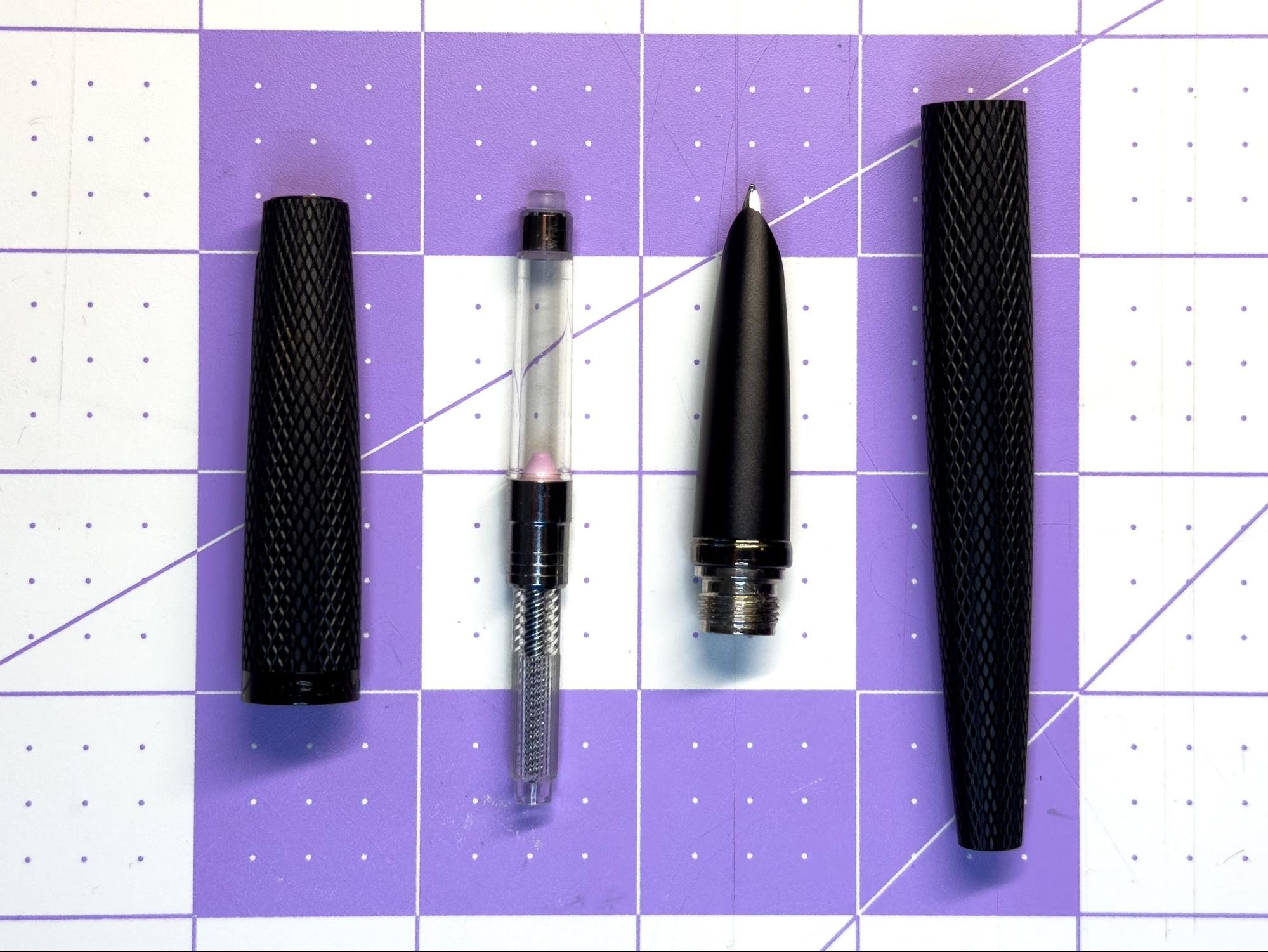
Minimal and lightweight, the Kakimori Frost Fountain Pen is an excellent, budget-friendly version of the classic cigar pen. It's just a little larger than pocket-sized, so it's comfortable to hold and travels well, and it has that elegant silhouette that's so popular with high-end pens like Namiki and Nakaya--but for a fraction of the cost.
The body of the Kakimori is made of polycarbonate plastic. It's very light, but feels sturdy. The finish has a frosted texture that's smooth but easy to grip. The body is fully transparent, though the frost effect softens the view of the converter inside the pen. In this dark Moss color, it looks like antique glass. It's also available in Purple, Red, and Clear.

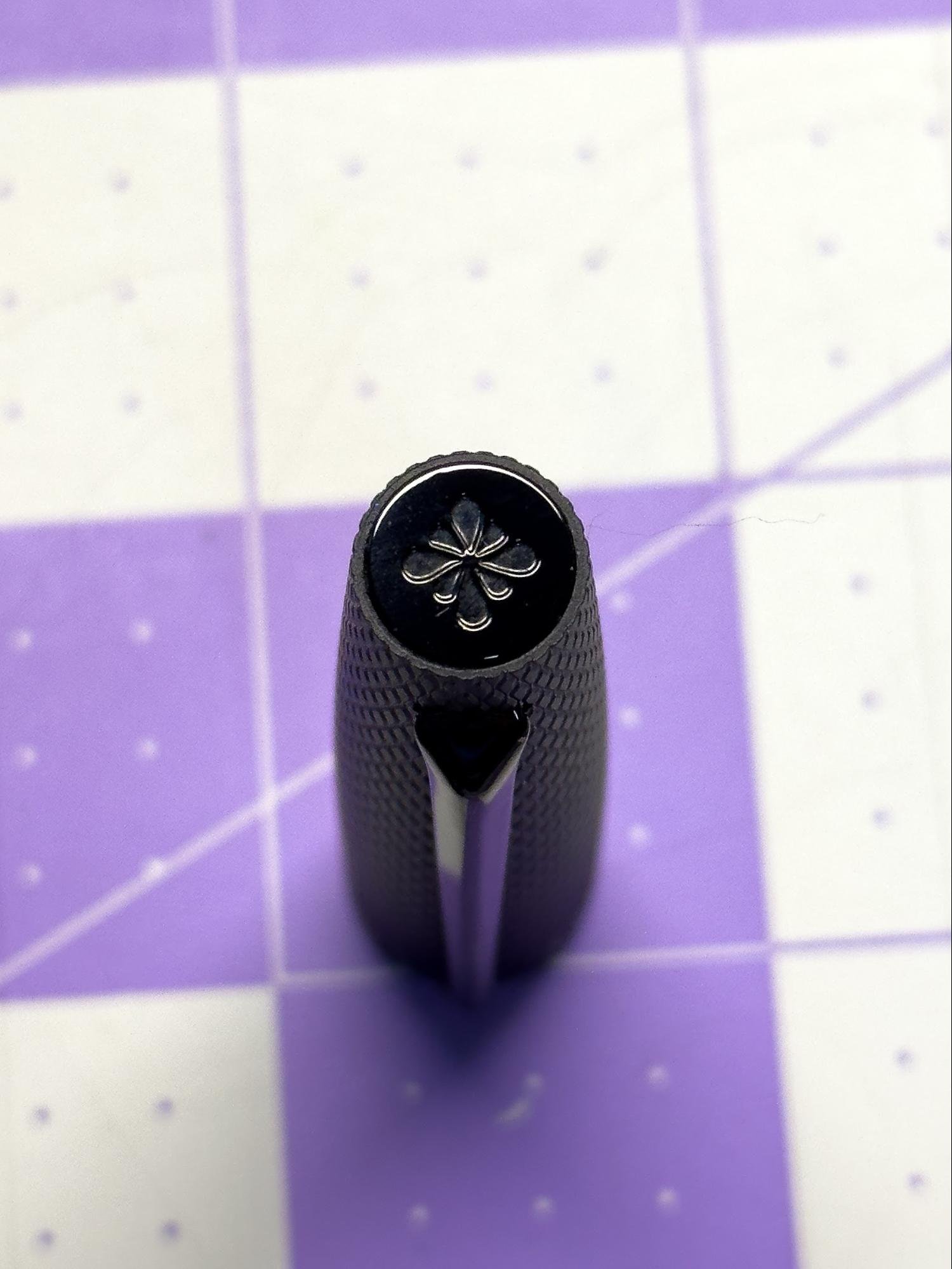
Both of the pen's ends are rounded, and the cap unscrews from threads in the center. The pen has a long, narrow grip section that slopes gently toward the nib, and there's a fairly large step-up to the body of the pen from the threads. It doesn't interfere with writing, however, as it's set fairly far back from the grip. The cap does post, though I found the posting to be a little wobbly and insecure. The cap did fall off the back when writing once. However, the pen is long enough that it doesn't need to be posted for comfortable writing. There is no roll-stop, though, so the cap will have to be looked after, if it's not posted.

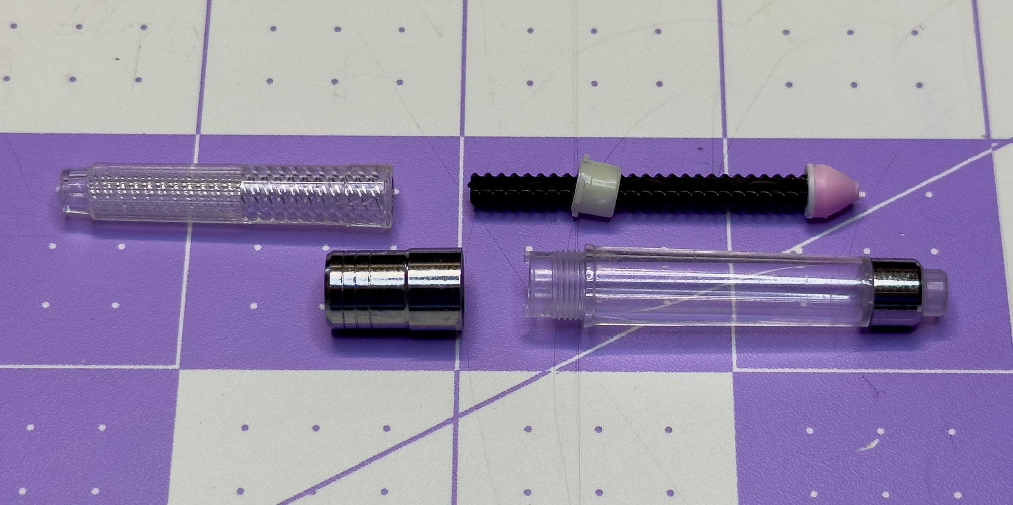
The pen takes a standard international cartridge or converter (it comes with a converter, but no cartridge). It looks like it should be usable as an eyedropper pen, but its specs say not to, so I'm not. For now. The steel nib that came with the pen performs wonderfully. I got a Fine nib, and it writes a nice fine line that flows well and has never skipped on me, despite a rather feverish writing session in a coffee shop where I wrote under the influence of too much caffeine. It really is a pleasure to write with, and it's lived in my notebook pocket for several weeks now.

One of the nicest things about this pen, though, is that it's reasonably priced. At $58 on JetPens, it's nicely in that "nice gift" (for yourself or someone you love) price range. It's not cheap, but it's not giving the same sticker shock that most fountain pens do these days. And for how it feels and writes, I'd say it's underpriced. It comes in a simple, triangular cardboard box with no frills, which is my personal preference, so they also get bonus points for the eco-friendly packaging.

The only beef I have with this pen is that it's going to force me to make some tough decisions as I evaluate my pen collection. Because I only need so many cigar-shaped plastic pens. And this one? It writes better than several of my fancy, collectible, expensive ones. But I don't have to make that tough decision today. Today, I'm taking this pen to a cafe to write.
(JetPens provided this product at no charge to The Pen Addict for review purposes.)
Enjoy reading The Pen Addict? Then consider becoming a member to receive additional weekly content, giveaways, and discounts in The Pen Addict shop. Plus, you support me and the site directly, for which I am very grateful.
Membership starts at just $5/month, with a discounted annual option available. To find out more about membership click here and join us!