(Kimberly (she/her) took the express train down the fountain pen/stationery rabbit hole and doesn't want to be rescued. She can be found on Instagram @allthehobbies because there really are many, many hobbies!.)
At the 2026 Chicago Pen Show, Tori Woods of Stationery Universe released her First Blossom collection. Inspired by the blooms in her neighborhood, she collaborated with Papier Plume to make these inks a reality. And like a dingbat, I kept forgetting to buy the First Blossom inks. Thankfully, she was at the St Louis Pen Show, and so was the Bossman, which means free ink for me! That also means I gotta earn my keep, so let’s get to it!
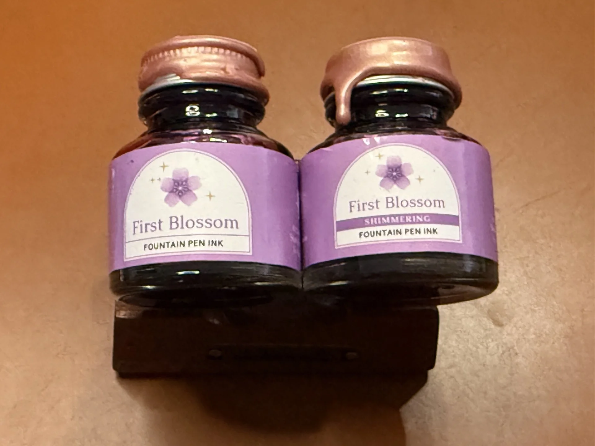
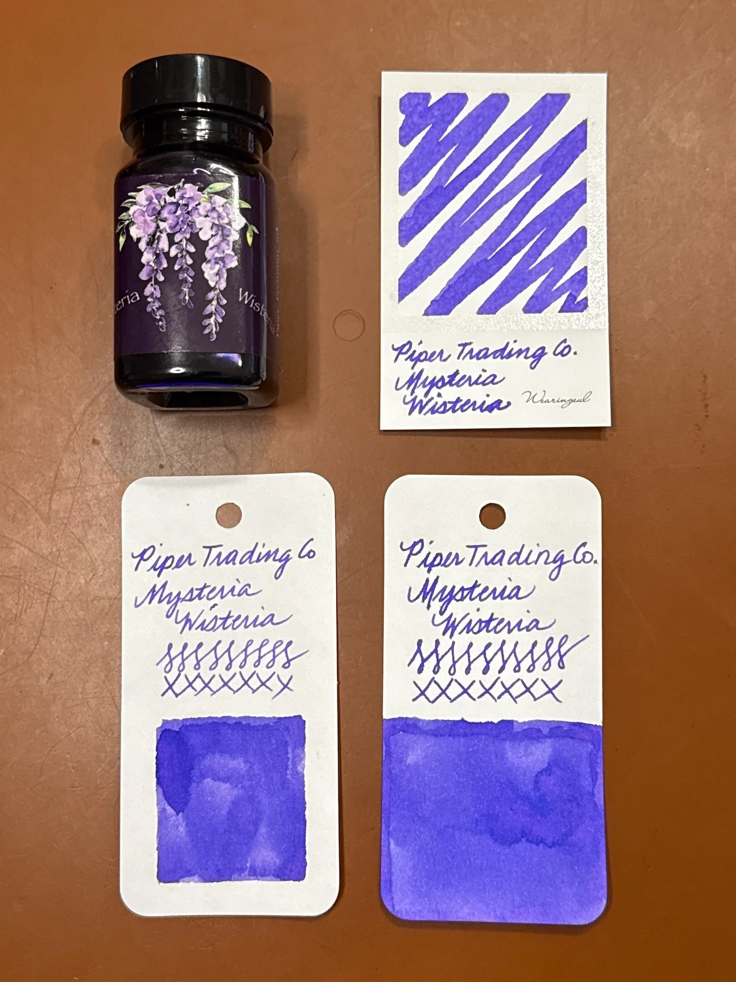
Papier Plume x Stationery Universe First Blossom and First Blossom Shimmering.
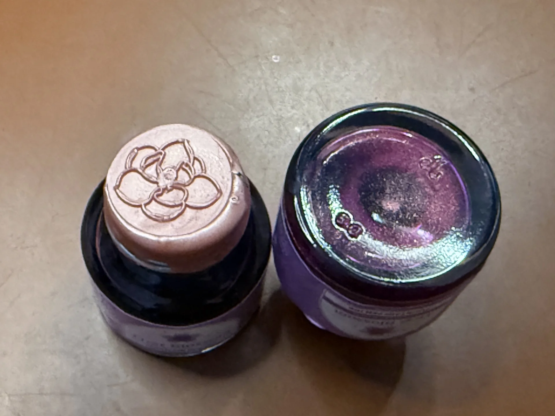
I love that Papier Plume dips the caps in wax and uses a wax seal on top! The one on the right is the Shimmering one - even with a rapid flip, the shimmer dispersed pretty quickly.
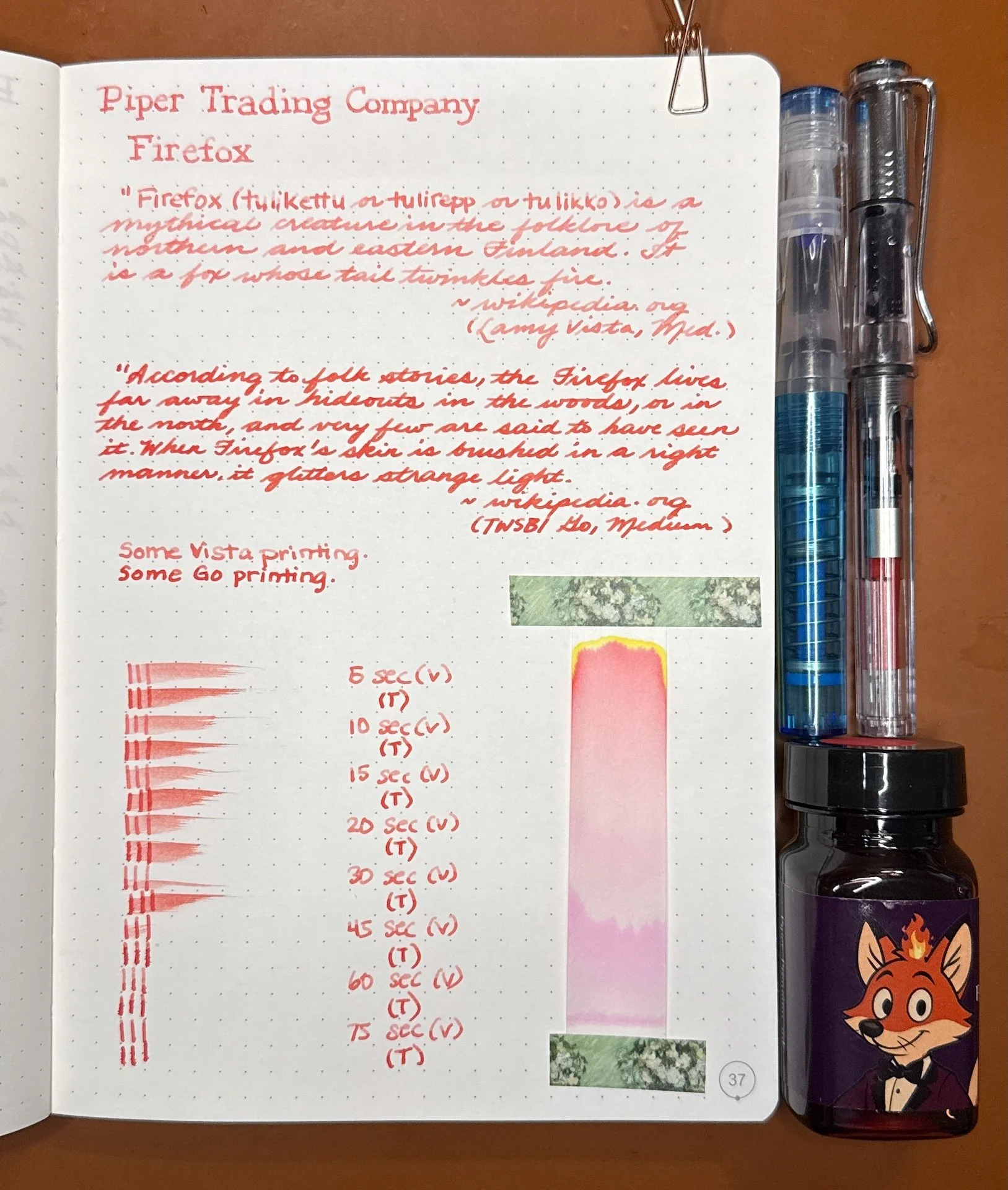
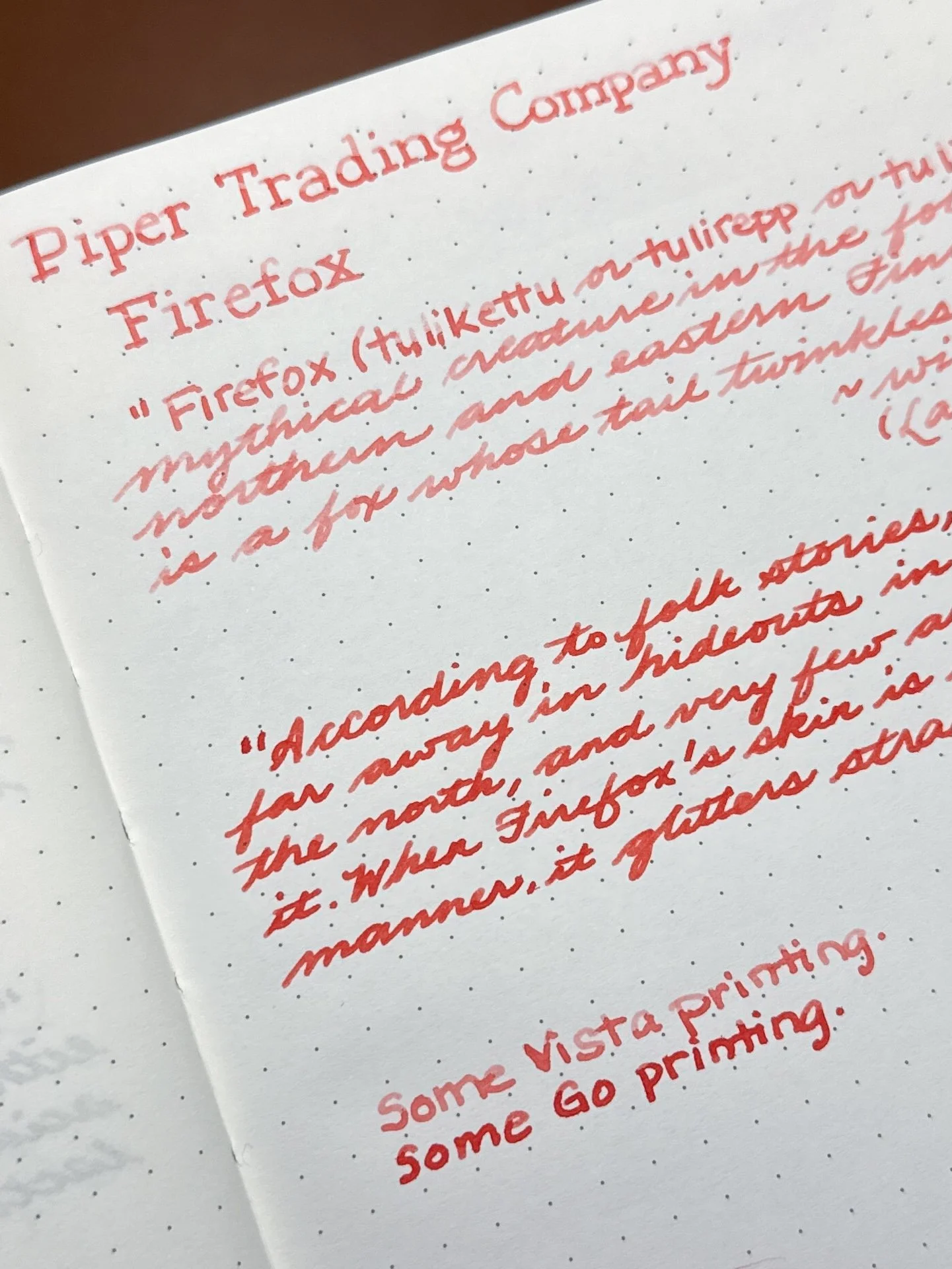
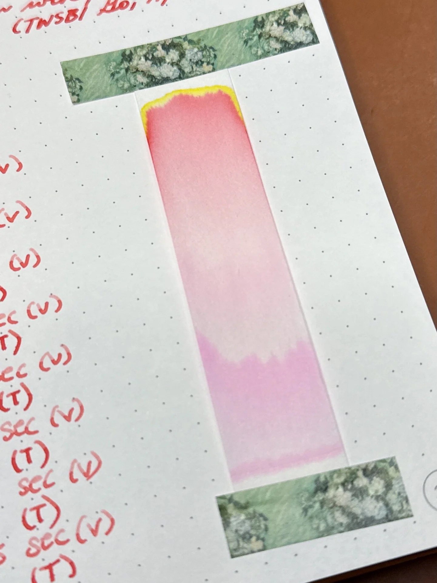
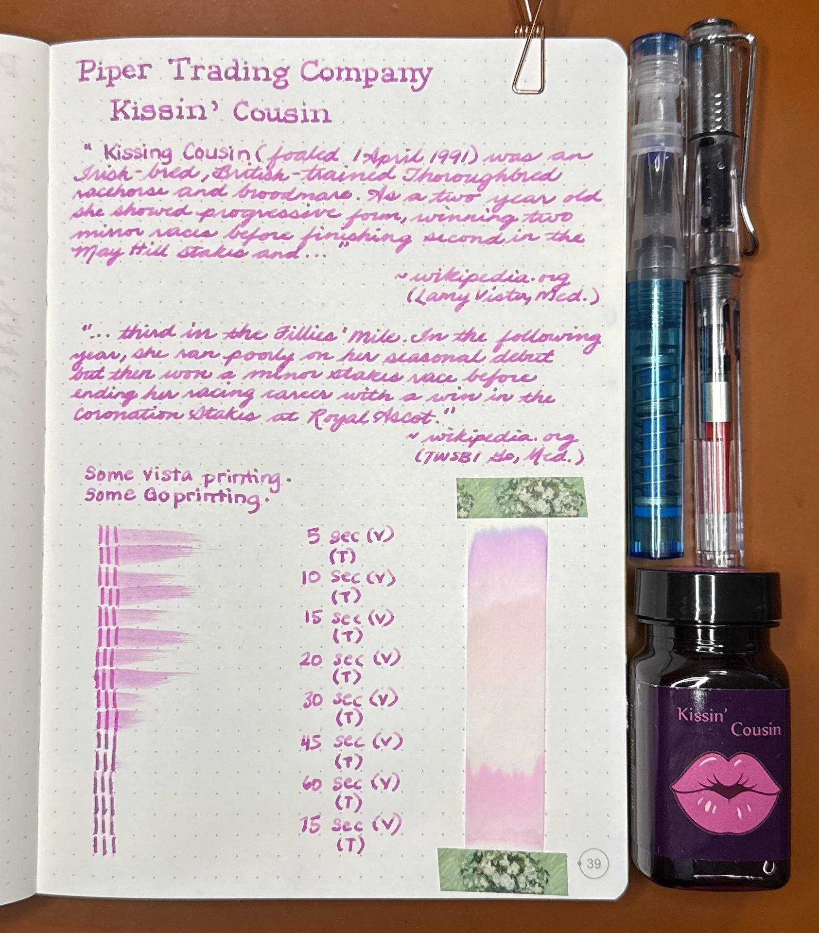
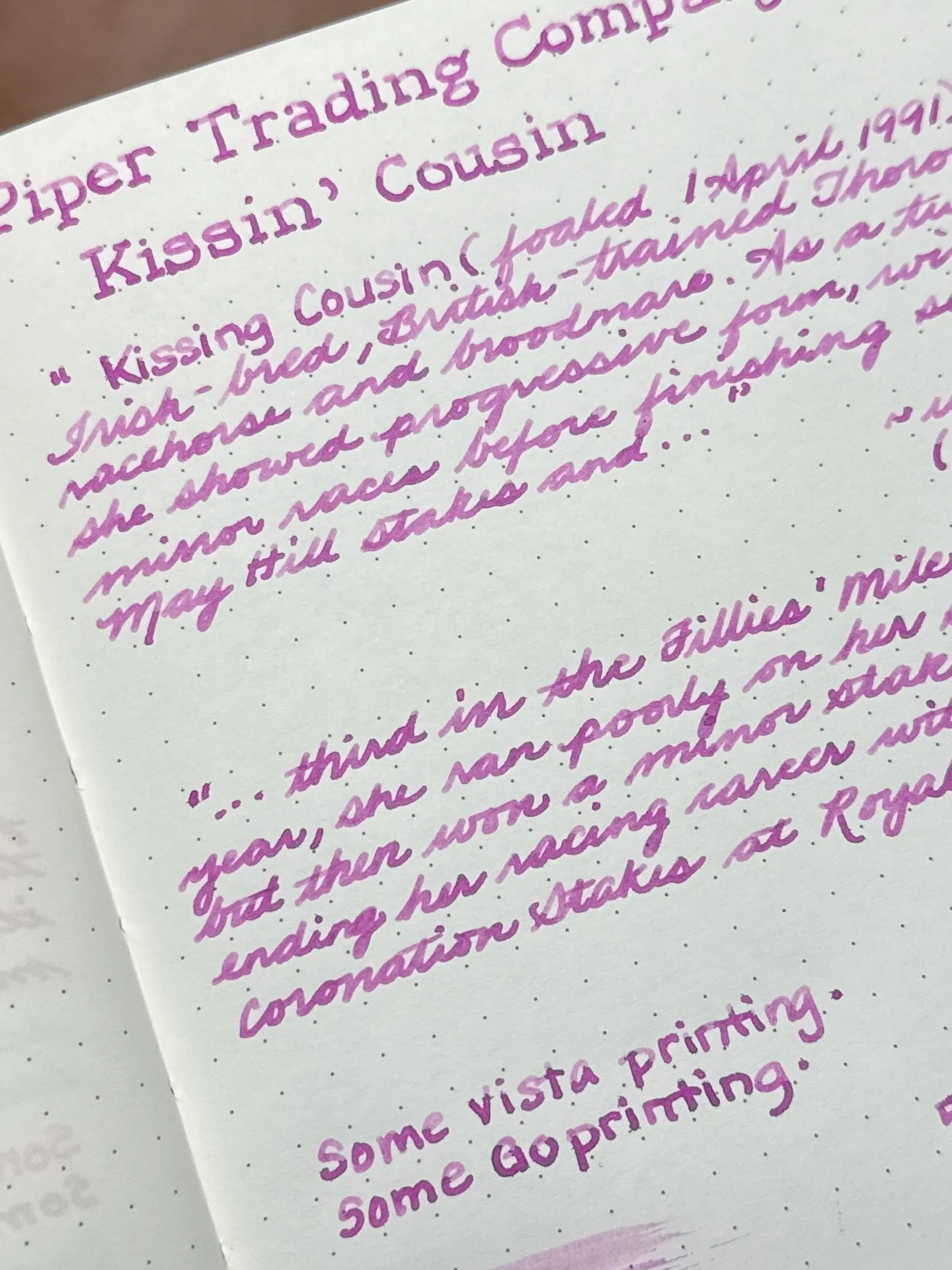
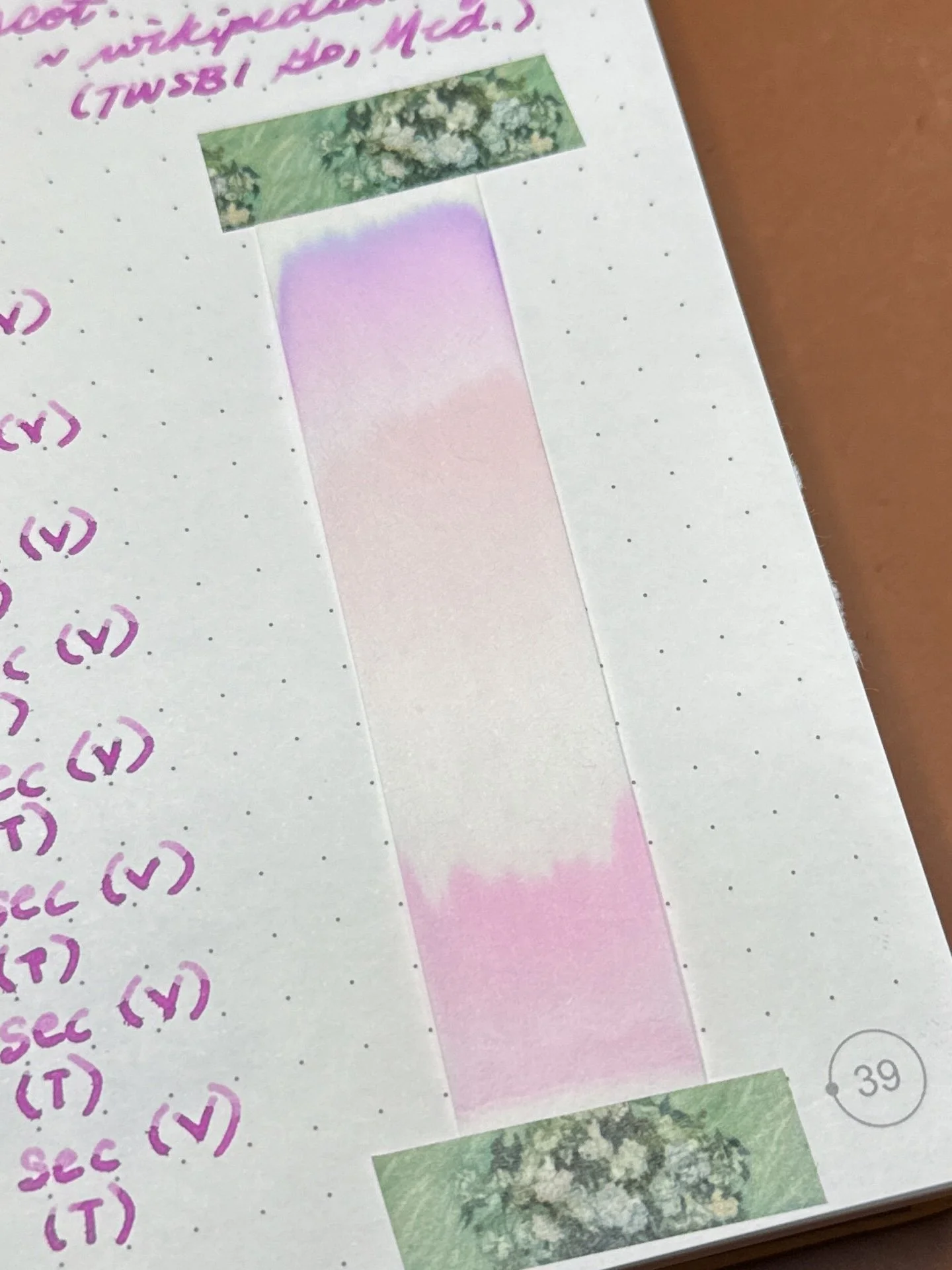
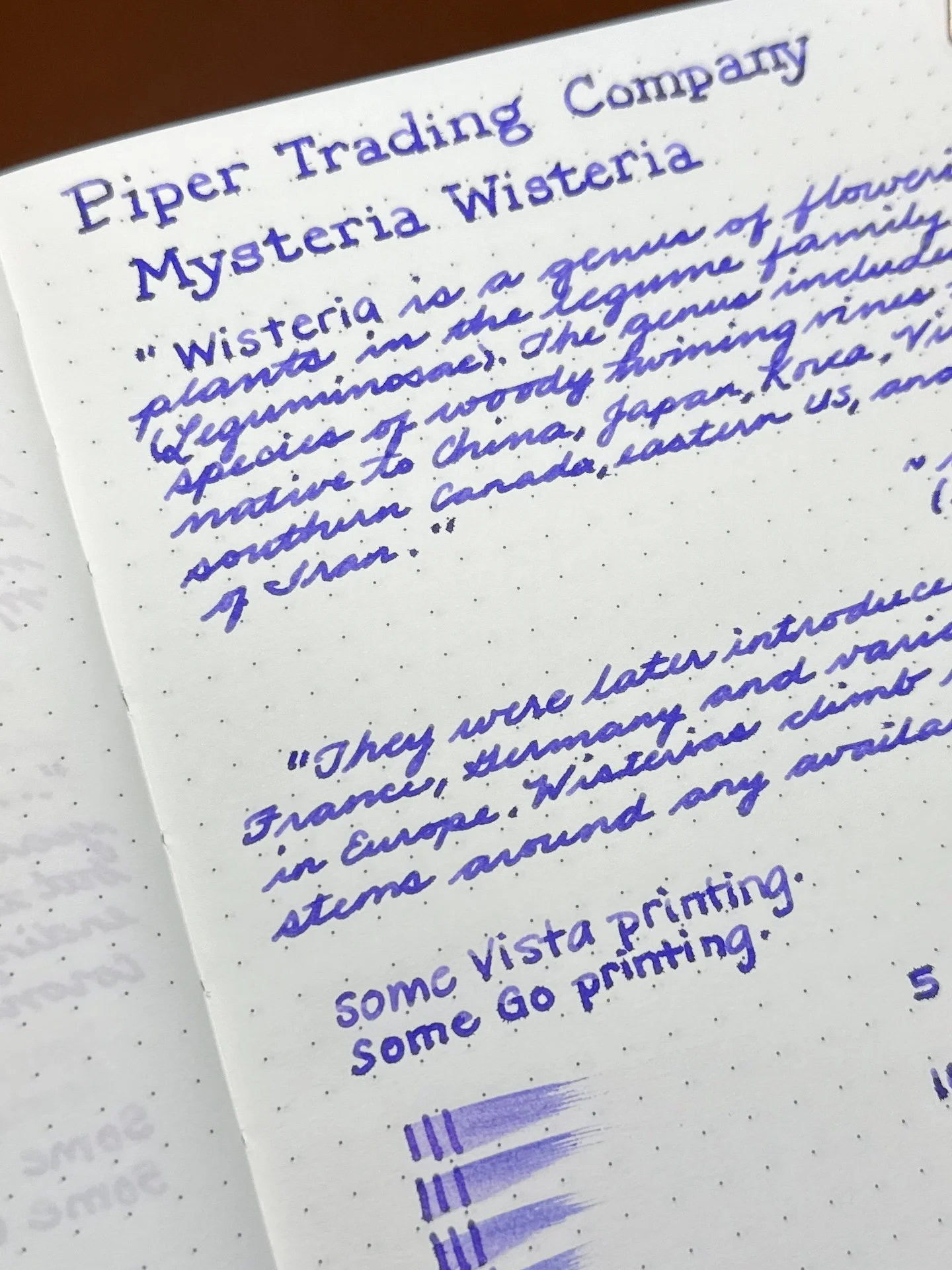
As usual, all swatches were done on Col-O-Ring cards and also Wearingeul Instant Film Color Swatch cards, using a Kakimori steel dip nib and writing samples were done primarily with a Lamy Vista with a steel Medium nib and a TWSBI Go with a Medium nib. The notebooks used for writing samples are from an Odyssey Notebook, with 68 gsm Tomoe River paper. Dry times for the Vista are shown with “(V)” and the Go will be shown below that with a “(T)”. Dry times may be a bit slower on 52gsm TR or faster on more absorbent papers like Rhodia, copy paper, Cosmo Air Light, or with drier or finer nibs.
Side note: Photographing inks is not easy. My photo editing skills are mediocre at best, so I prioritize swatch/writing sample accuracy over paper or background color accuracy. Even then, it doesn’t always work out – it could look great in the Lightroom app, and then less great when I export to my phone, or great on phone, and less great when I upload to the Bossman’s Dropbox, etc.
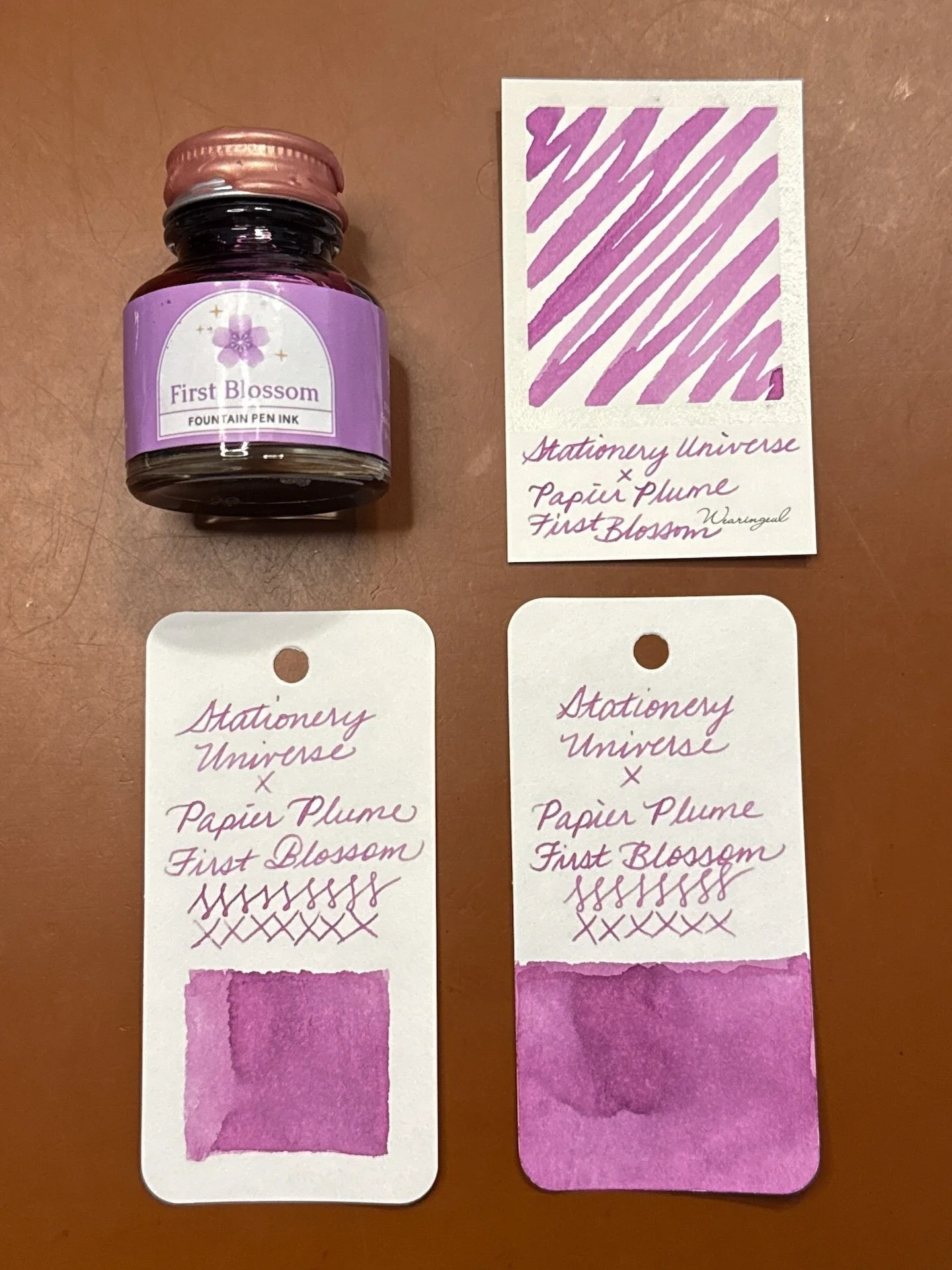
First Blossom and swatches.
First Blossom is an ink that is difficult to describe: pinkish purple, or purplish pink, or purple leaning muted hot pink, maybe muted magenta? Either way, it is a lovely color. In the TWSBI Go, the line is more saturated while the drier Vista shows off a bit of the shading. There was no sheen from either pen. It had average to fast dry times in both pens.
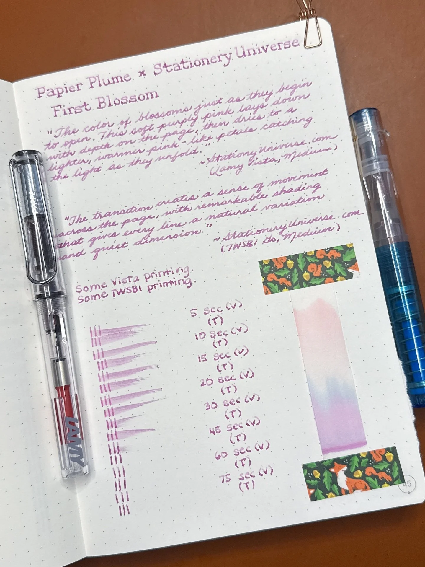
First Blossom writing sample.
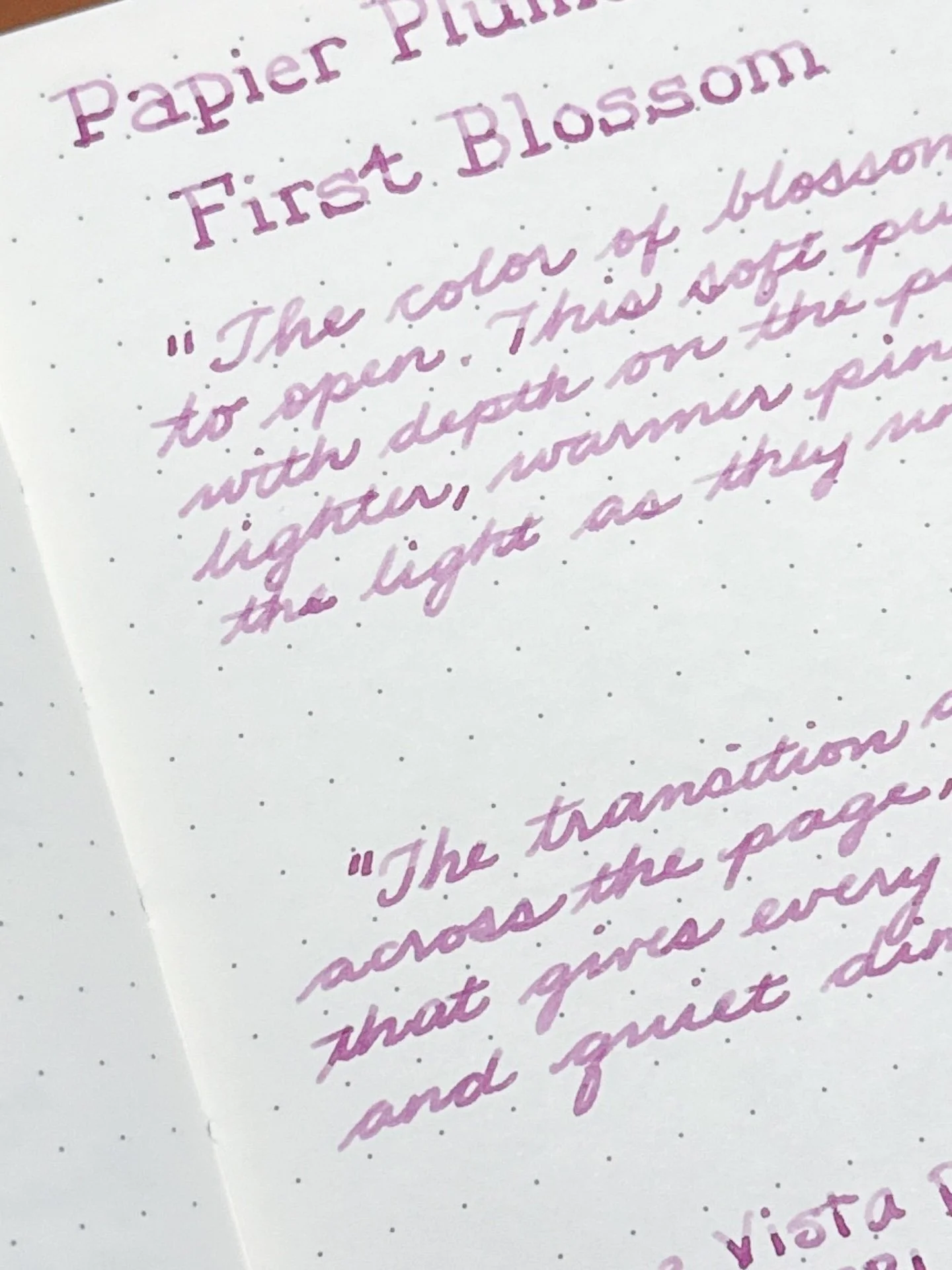
You can see the First Blossom’s shading from the Vista (top) versus a slightly more saturated writing sample from the Go.
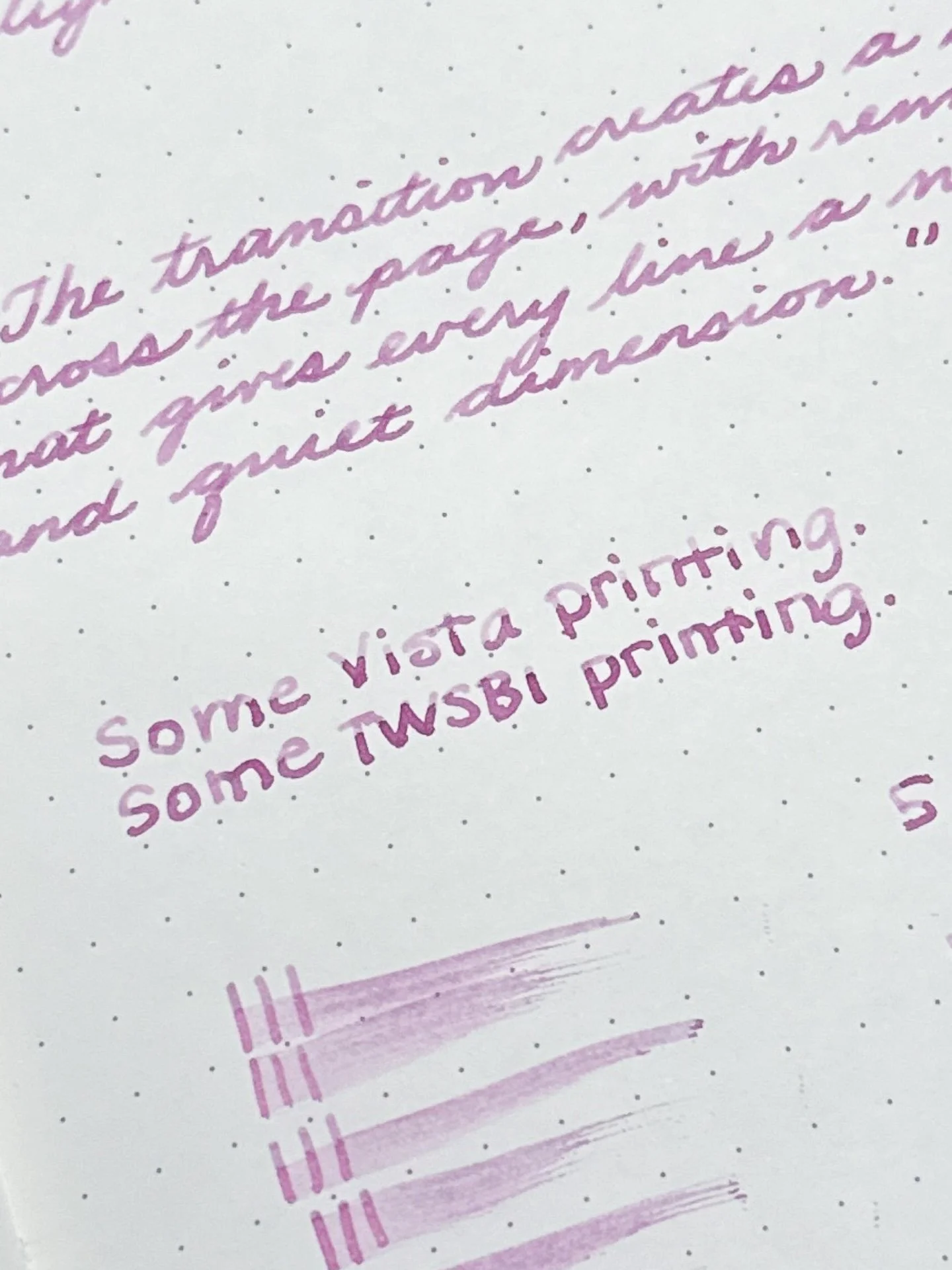
You get more shading when printing due to the pooling of ink at the bottom/end of the stroke. As you can see, there is shading from both pens, with more showing from the Vista than the Go.
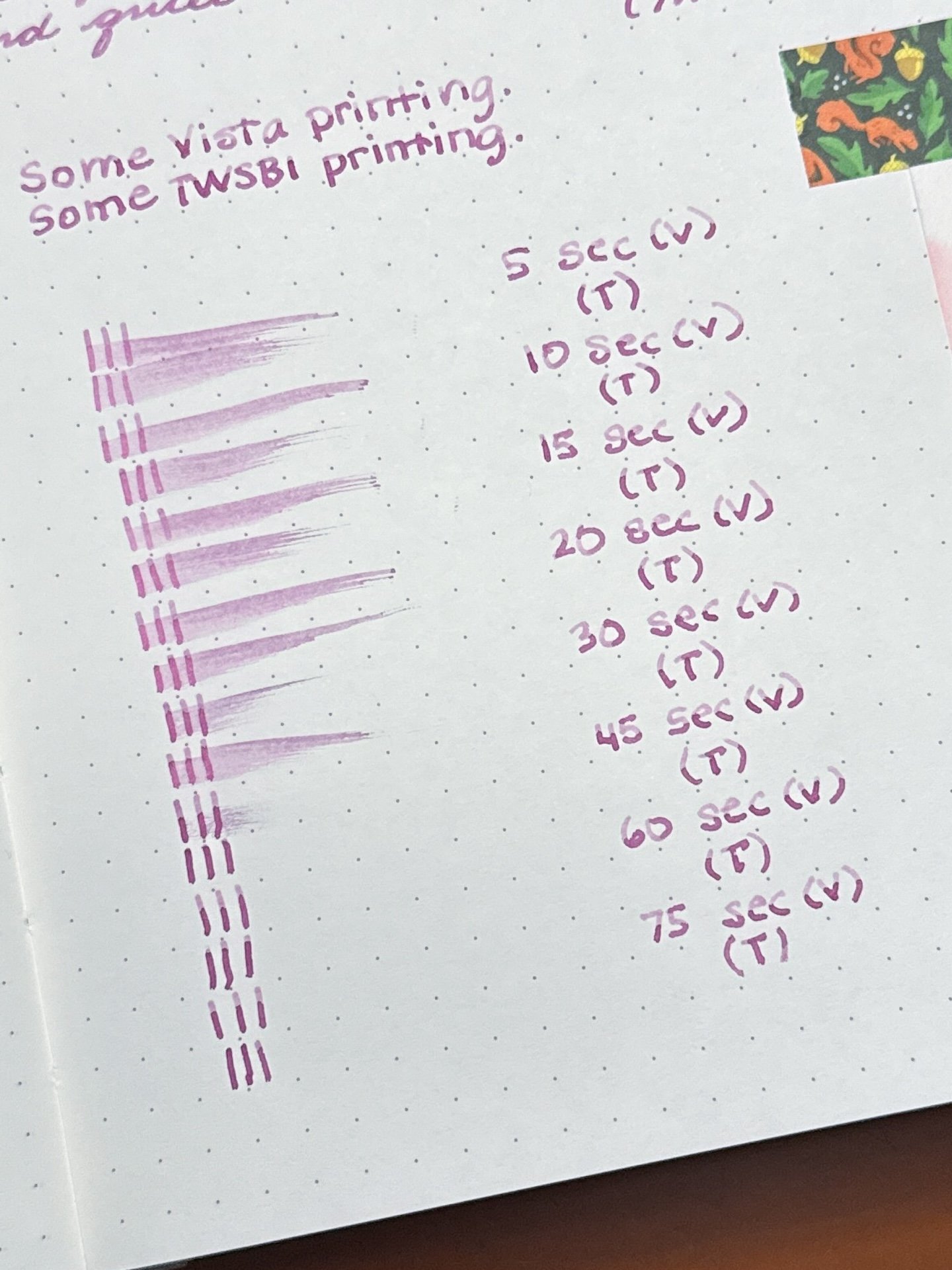
Pretty fast dry time for First Blossom. I was surprised that the ink dried a little faster from the Go initially, but both were dry in around 30 seconds.

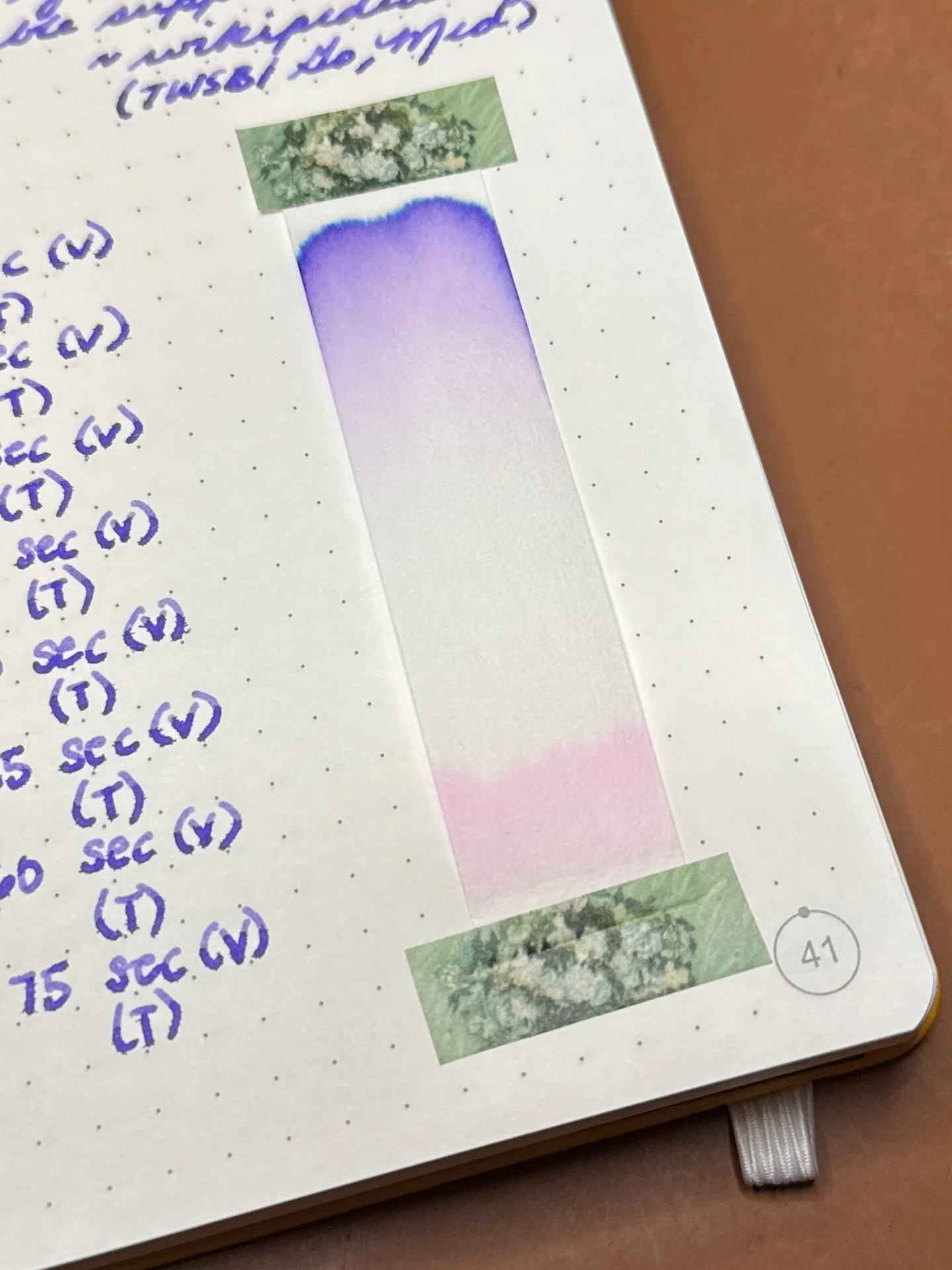
Chromatography from First Blossom - a colorful spread of magenta/purple at the base, to blue, then to a peachy pink up top.
I will save the comparison photos for later since the two inks have the same base, the only difference being shimmer vs none.
First Blossom Shimmering and swatches.
First Blossom Shimmering has the same base color ink as the above First Blossom, but with the addition of rose gold shimmer particles. Lamy Safari-based pens, like the Vista, can be a bit ink-stingy with their nib/feeds (one of the reasons why they tend to lean drier compared to other pens) - this has the added effect of making shimmers less obvious in the Vista writing sample. Friction-fit TWSBIs like the Go, Eco, Swipe, have a more generous flow, resulting in more shimmer flowing onto the paper. The rose gold shimmer, while lovely, is subtle and difficult to see against the pink-toned ink, and was very difficult to photograph. You need more heavy-handed swatching to get the shimmer to show through.
The parts that look like white specks in the upper middle section are actually the shimmer particles. There are a few random specks throughout this swatch.
Some more impossible-to-photograph flecks of shimmer.
First Blossom Shimmering writing sample.
First Blossom Shimmering doesn’t shimmer much from the Vista (top) and is occasionally there from the wetter Go. As with the non-shimmering version, the shading is more noticeable from the drier Vista.
Printing with the First Blossom Shimmering. Same difference in shading as above.
Shimmer PSA: As with any shimmer in any pen, periodically “rotate” the pen nib up and down, so the shimmer particles have a chance to disperse. If your feed looks saturated with shimmer, or seems to be clogging the feed, you can try to gently flood the feed with ink (either by gently twisting the converter or piston, or lightly pressing the spring or button, if applicable) and then retracting the converter/piston/spring/button to “suck up” the shimmer particles back into the converter/barrel. Always do this over a sink or paper towel, not over your precious writing or art 🙂
This time the TWSBI’s dry times took longer than the Vista, no idea why.
Chromatography from First Blossom Shimmering - Same chromatography as above - magenta to blue to peachy pink.
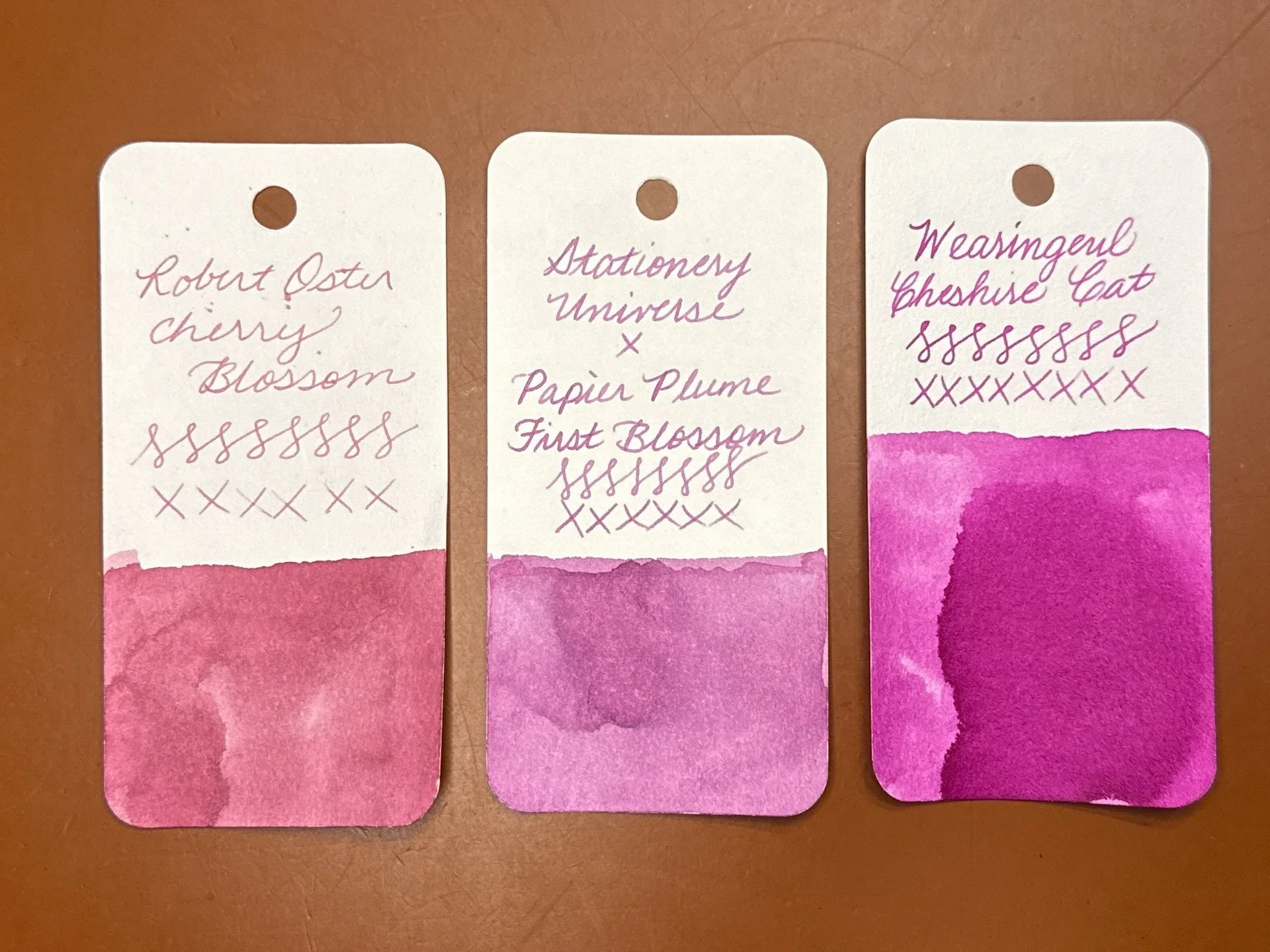
When I said that I didn’t know what color First Blossom is, I wasn’t joking. I looked through the Pinks in my Col-O-Rings and my Purples (where the Magenta swatches typically are) and neither really fit the bill. Robert Oster Cherry Blossom (representing dusty pinks) and Wearingeul Cheshire Cat (on team magenta) were close but no cigar.
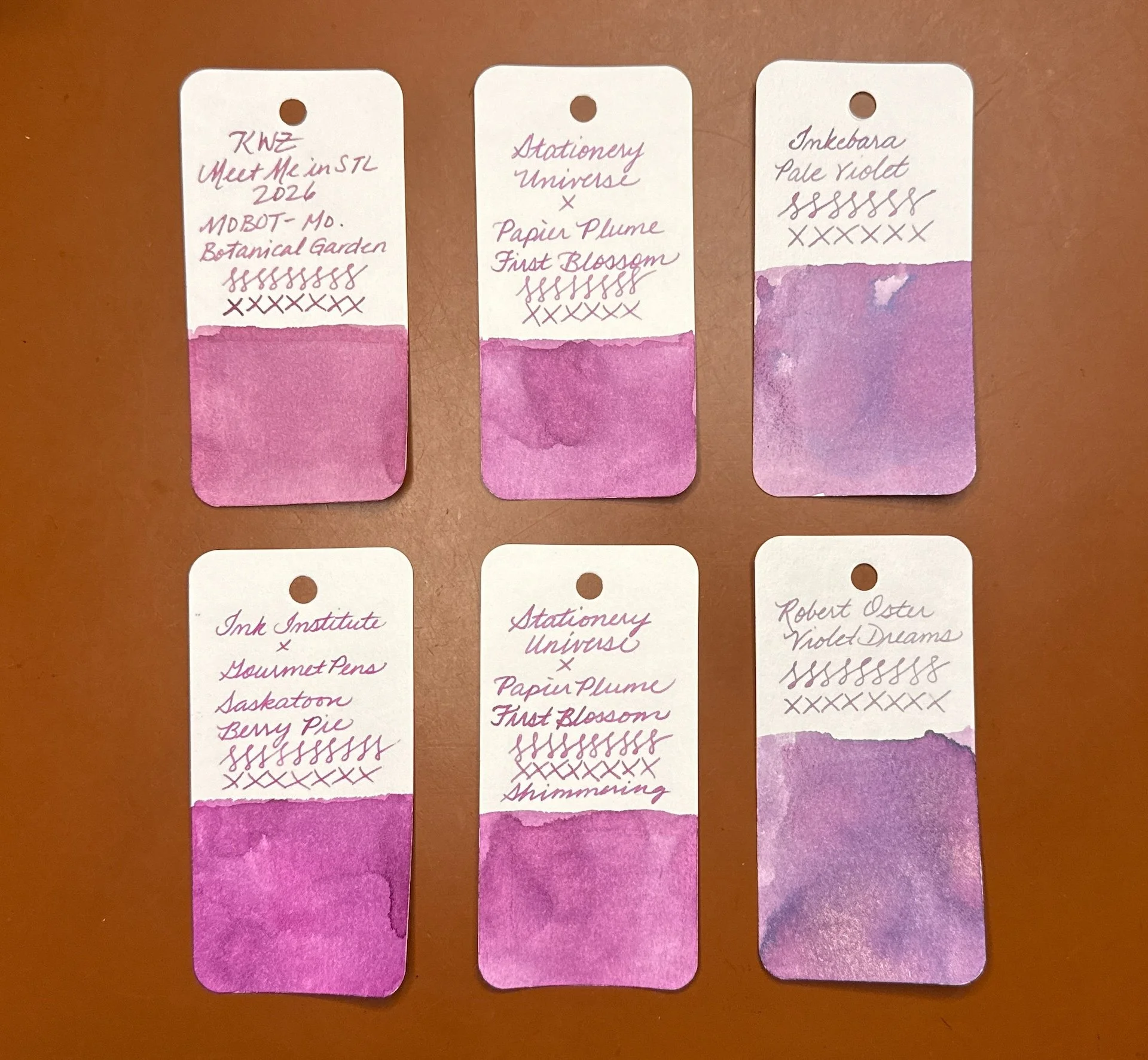
Here are some inks from both the pink and magenta/purple parts of the spectrum that kinda look similar to First Blossom (top middle) and First Blossom Shimmering (top middle): KWZ Meet Me in St. Louis 2026 MOBOT (Missouri Botanical Garden) (fairly close match but a bit too dusty pink), Inkebara Pale Violet (too purple, but I do love this color), Ink Institute x GourmetPens’ Saskatoon Berry Pie (too purple and too bright, but probably the closest otherwise), and Robert Oster Violet Dreams (too purple).
Both of the inks generally behaved well, though they are a touch on the dry side, so I recommend using them with wetter pens if you want a more saturated line and especially if you want to see more of the shimmer. Both inks also cleaned out easily. I like seeing how different pens can produce similar but different results with the same ink.
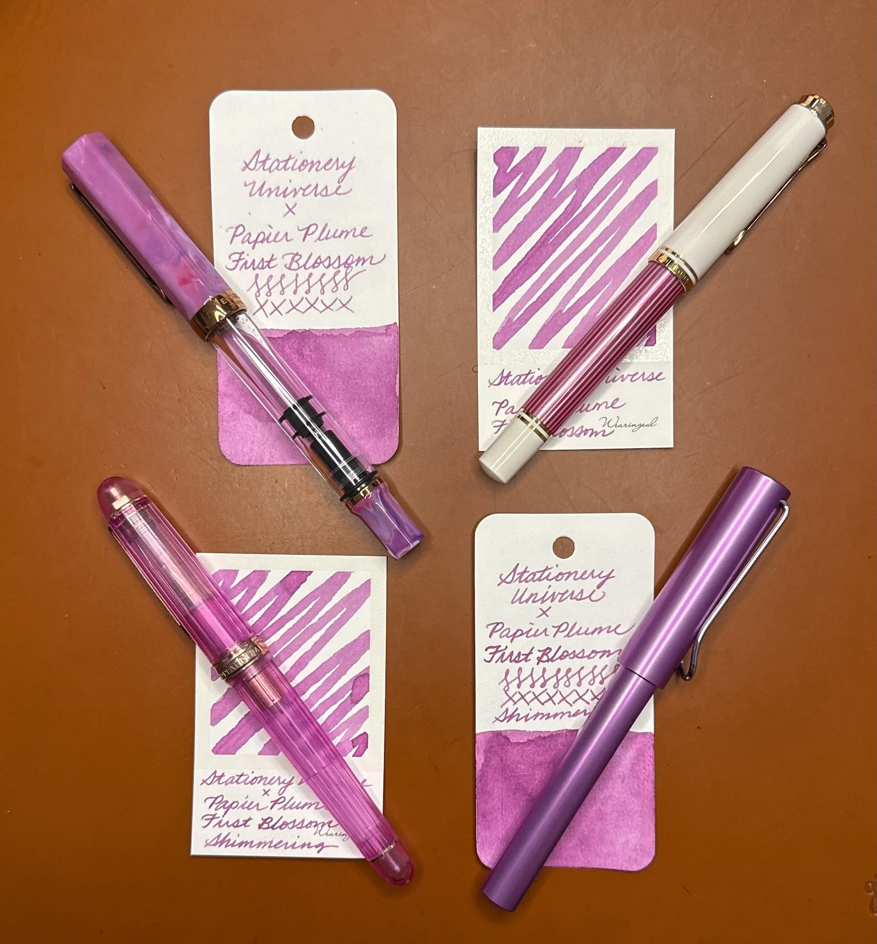
Some pens I’d match with these inks (clockwise from upper left): TWSBI Fluorite, Pelikan M600 Pink, Lamy AL-Star Lilac, Platinum 3776 Nice Lilas. (I’m currently leaning towards inking Shimmering in the TWSBI since I have a juicy Broad nib in it.)
The 30 ml ink bottles of the Stationery Universe First Blossom ink cost $13/bottle for non-shimmer and $15 with shimmer. Definitely worth checking out if you like this unique color!
(Disclaimer: These inks were purchased at the 2026 St. Louis Pen Show from Stationery Universe at regular price.)