Posts filed under Sailor

Sailor x Dromgoole’s Apricot Jam & Mint Jelly Ink Review

(Kimberly (she/her) took the express train down the fountain pen/stationery rabbit hole and doesn't want to be rescued. She can be found on Instagram @allthehobbies because there really are many, many hobbies!.)

I was super excited to see this Dromgoole’s Instagram post about their inky collaboration with Sailor and next thing I know, a set of the inks shows up in the mail for review! How awesome is that?!

This is Dromgoole’s first ink with Sailor and they are named Apricot Jam and Mint Jelly. Just a reminder that, despite their tasty sounding names, the inks aren’t meant for eating/drinking :-). These two inks were launched this past Saturday on October 19, 2024 and come in 20ml square glass bottles like the Sailor Shikiori and 50 States series.

Sailor x Dromgoole’s Apricot Jam (top) and Mint Jelly - I love the cute artwork!

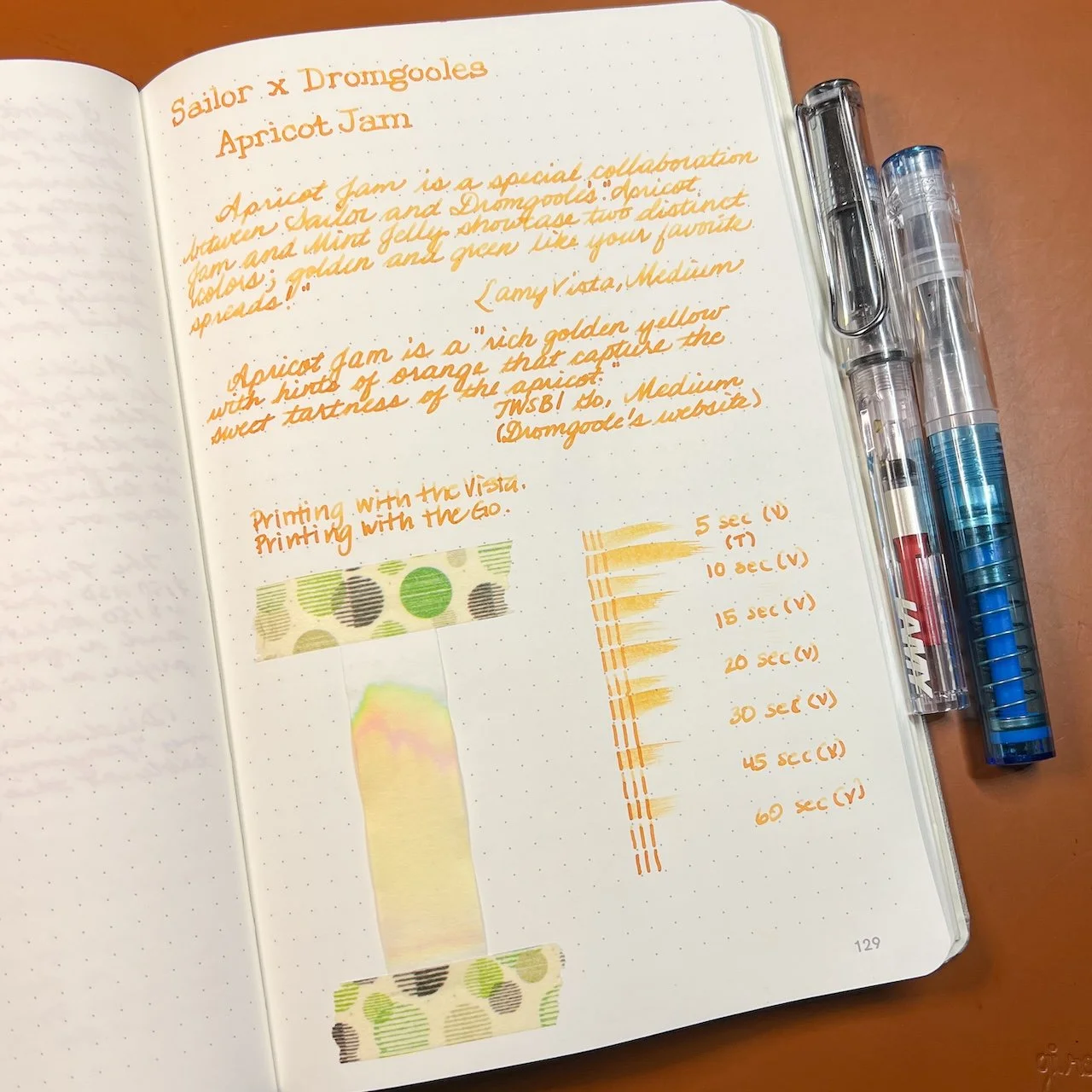
As in the past, all swatches were done on Col-O-Ring cards using a Kakimori steel dip nib, while writing samples were done with a TWSBI Go with a Medium nib and a Lamy Vista with a steel Medium nib. The TWSBI Go is a wetter writer and the Lamy is a drier writer, so these two give me a good idea of how an ink will look from different pens. The notebook used for writing samples is the Endless Recorder with 68 gsm Tomoe River paper. Dry times for the Vista are shown with “(V)” and the Go will be below that and might also be shown with “(T)”. Dry times may be a bit slower on 52gsm TR or faster on paper like Cosmo Air Light, Rhodia, copy paper, or with drier or finer nibs, etc.

Apricot Jam is described as a “golden yellow with hints of orange”, but it is more orange with wetter pens. Even in drier pens, like the Lamy, the orange is more than just a hint. It’s also not a bright orange (like Sailor Apricot or Kin-mokusei), but more of a golden orange with a tinge of brown. It is a readable ink whether you use it in drier or wetter pens. The ink dried pretty quickly as well.

Writing sample of Apricot Jam on 68 gsm Tomoe River Endless Notebook.

You get more shading from the drier-writing Vista compared to the wetter Go. The ink is quite a bit lighter when writing in cursive too.

Apricot Jam’s chromatography definitely had a lot of yellow, with a bit of pink (giving it the orange color), but what surprised me the most was the edge of green and turquoise at the very upper edge!

Inks similar to Sailor Apricot Jam: Callifolio Inti (very close but just a hint of brown in person), Nahvalur Mango Sorbet, Robert Oster 2023 CA Pen Show Sunset, Robert Oster Ng Special ‘16, KWZ El Dorado.

Mint Jelly is described as “shades of minty green” but when I swatched it, I was surprised at the color and double checked it against the IG post to make sure I had the right color. I also checked the box/bottle art which matches the ink. I had expected more of a light/pastel green or a bright spring green since that’s what Google says mint jelly looks like. The Mint Jelly ink, on the other hand, is more of a light but moody/dusty green.

Writing sample of Mint Jelly on 68 gsm Tomoe River Endless Notebook.

The ink is much lighter with the Vista than the Go, especially with cursive vs print.

I did this chromatography twice because that blue-gray line did not want to budge and I wanted to make sure I didn’t make a mistake! There is just a hint of yellow that moved up a little, which gives this ink its greenish color.

Inks similar to Sailor Mint Jelly: Pennonia Zuzmo Lichen (a bit too green and peachy). Kyo-no-oto 08 Urahairo (also too green, but probably the closest), Troublemaker Sea Glass (too dark), and the remaining 3 - Sailor Ink Studio 162, Troublemaker Petrichor, Colorverse December 7, 1787 - were too blue.

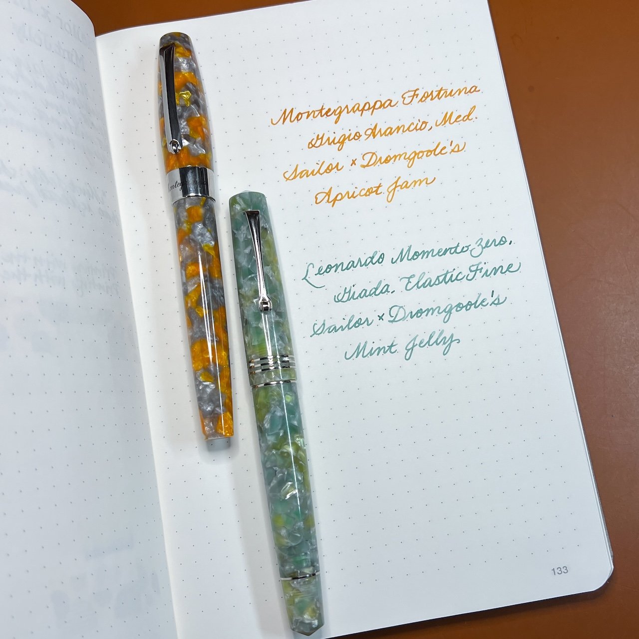
Sailor x Dromgoole’s Apricot Jam and Mint Jelly inks on 68 gsm TR.

Both inks had just a wee bit drier than average flow, with Mint Jelly a touch drier than Apricot Jam. As expected, the dryness is more noticeable in the Lamy. Both Apricot Jam and Minty Jelly had similar dry times around 30 seconds (or faster). Apricot Jam was fine in both pens but I didn’t love Mint Jelly from the Lamy. It was a very nice color in the Go though. I really like that both of these aren’t the typical orange and green inks that are out there and I especially love that they are lovely shaders too.

I inked up the Montegrappa Mia, Grigio Arancio, Medium nib with Apricot Jam, and paired the Leonardo Momento Zero, Giada, Elastic Fine nib with Mint Jelly.

Only 500 bottles of each color were made with no current plans for restocking. Apricot Jam and Mint Jelly are currently available on their website or in store for $20 each (shipping is not included). I hope there will be more inky collaborations to come!

(Disclaimer: Thank you to Dromgoole’s who provided these inks at no charge for review purposes. All other inks and notebooks are my own.)

Posted on October 25, 2024 and filed under Sailor, Ink Reviews.

Sailor x Tinterías Cilantro and Refried Beans - Round 3 of Inky Goodness

(Kimberly (she/her) took the express train down the fountain pen/stationery rabbit hole and doesn't want to be rescued. She can be found on Instagram @allthehobbies because there really are many, many hobbies!.)

After my reviews of the first two Sailor x Tinterías inks and the second set, I couldn’t wait to get the third batch of the Deliciosa inks. I practically pounced on Jeffrey Coleman at the Chicago show to snag a set. (Jeffrey produces Tinterías, a Spanish podcast about pens, ink and stationery. You can find him on Instagram as @drcoleman1102 and also through the podcast account @tinteriaspodcast.)

This third batch of inks continues the Deliciosa theme of food-based ink names - Cilantro and Refried Beans. Just a reminder that, despite their yummy sounding names, the inks aren’t meant for eating/drinking :-). These two inks were launched in September 2023 and come in 50ml square glass bottles like the Sailor Manyo series.

As in the past, all swatches were done on Col-O-Ring cards using a Kakimori steel dip nib, while writing samples were done with a TWSBI Go with a Medium nib and a Lamy Vista with a steel Medium nib. The TWSBI Go is a wetter writer and the Lamy is a drier writer, so these two give me a good idea of how an ink will look from different pens. The notebook used for writing samples is from Endless Recorder with 68 gsm Tomoe River paper. Dry times for the Vista is shown with “(V)” and the Go will be below that and might also be shown with “(T)”. Dry times may be a bit slower on 52gsm TR or faster on paper like Cosmo Air Light, Rhodia, copy paper, or with drier or finer nibs, etc.

Cilantro is a medium spring green, not too bright or yellow, but also not a kelly green either - more like a grassy green. Refried Beans is a little harder to describe - it’s a medium light brownish orange, or maybe it’s an orangey brown. Search for images of refried beans, especially ones that are more orange in tone, and you’ll have an idea of what inspired this ink color.

Writing sample of Cilantro on 68 gsm Tomoe River Endless Notebook. You get a bit more shading from the Vista compared to the Go, which leaves a slightly more saturated line. Note that I had two “swipes” for the Go’s 30 second test because I accidentally let the timer go too far the first time, oops.

I was surprised at (1) how much yellow was present and (2) how “bunched up” the remaining pink, green and turquoise colors were. Thinking that maybe the colors would separate out more if I gave it more room, I repeated the test on a 4” strip of chromatography paper with the same results (so no picture.)

Inks similar to Sailor Cilantro: Robert Oster Forest Green (a bit too yellow/olive), Ferris Wheel Press Moonlit Jade (similar color in writing sample, but also has shimmer), Akkerman Dutch Masters 10 Van Huysum’s Sapgroen (too bright and too yellow), and Robert Oster Green Lime (a bit too “regular green.”)

Writing sample of Refried Beans on 68 gsm Tomoe River Endless Notebook. As with Cilantro, there is more shading from the Vista than the Go. Note that I had two “swipes” for the Go’s 45 second test because I accidentally swiped 15 seconds too early, oops, I did it again 🙂.

What was really neat to see is the bit of chromashading effect of Refried Beans from the Vista which is difficult to capture in photos.

Even though the swatches make the ink look slightly brownish, it’s actually a pink undertone that makes this different from many orange inks. I was also surprised to see the hint of green and turquoise at the very top.

Inks similar to Sailor Refried Beans: Robert Oster Brisbane (too yellow), Robert Oster Antelope Canyon (good color match but a bit darker), Montblanc James Purdey & Sons Single Malt (a touch too red), Robert Oster Campfire (similar to Antelope Canyon but a touch too brown.)

Both inks had average flow, although Refried Beans felt a wee bit drier than Cilantro. What was even more surprising was that Refried Beans took longer to dry, even though it felt drier when writing. I was surprised at how quickly Cilantro had dried, even in the TWSBI Go, since it is a darker ink. I think that Sailor Cilantro would work well in most pens and nib sizes, while Refried Beans might not be as readable in very fine or dry nibs. The Medium nib from the Lamy Vista is probably about as fine as I would go, unless I was using a gusher of a pen like a Pelikan, which is what I will probably use next time. Also, the Refried Beans ink really needs paper like Tomoe River or Cosmo Air Light to show off the subtle chromashading.

Sailor Deliciosa Inks

The Deliciosa line of inks on 68 gsm TR.

These inks, as well as the last two, are currently still available for purchase on the Tinterías website. They sell for $30 each (shipping is not included). I don’t know if there will be more inks coming up but if they are, I’m going to get my inky lil hands on them!

(Disclaimer: Inks were purchased directly from Jeffrey Coleman at the 2024 Chicago Pen Show at regular price. All other inks and notebooks are my own.)


Enjoy reading The Pen Addict? Then consider becoming a member to receive additional weekly content, giveaways, and discounts in The Pen Addict shop. Plus, you support me and the site directly, for which I am very grateful.

Membership starts at just $5/month, with a discounted annual option available. To find out more about membership click here and join us!

Posted on September 13, 2024 and filed under Sailor, Ink Reviews.

Did Less, Swatched More, First Impressions

(Kimberly (she/her) took the express train down the fountain pen/stationery rabbit hole and doesn't want to be rescued. She can be found on Instagram @allthehobbies because there really are many, many hobbies!.)

In the vein of last week’s article where I drastically reduced the number of steps to swatch inks, I am happy to report that I have made progress! From the first of January until last week, I had swatched 7 inks (and yes, that included the ones I did for reviews). Since last week, drumroll please, I’ve swatched 20, yes TWENTY, more inks!!! Woohoo!

As you may already know, I like to be matchy matchy with my pens and inks (black, white, clear, silver, and gold pens are the exceptions). Which means I usually start with “what general color pen do I want to use”, then I go through my swatches to find the best match, which is either an exact match, if possible, or slightly lighter or darker depending on mood. Occasionally, I like to go the other route and start with an ink that I really want to use and then pick the pen after. Don’t worry, I’m neither reviewing nor inking up all 20 inks because that would take too long; instead I’ll share some first impressions. Who knows, maybe some of these will jump out and demand to be inked!

A few things to note: (1) Some of the pictures are at an angle because the shimmer showed up better than with head-on photos, (2) even with angled pictures, shimmer is hard to pick up in photos, (3) the picture below has a different colored mat than the other swatches, hence the vastly different background color, and (4) a lot of these are Wearingeul swatches because that’s what I bought samples of and happened to trade with a friend.

Look at all these swatches - I am SO happy to be over the swatching slump!

Here are the 20 inks that I swatched in the past week, sorted roughly by color:

-- Montblanc Le Petit Prince, Rose Burgundy - I knew that I would be inking up a LPP pen since I am nearing the completion of writing out the book, but I had to make sure it matched the pen first. It is a nice shade of burgundy with a hint of copper sheen on very wet swatches. I can’t wait to use it!

-- Wearingeul Anna Karenina - This is a rich red, but not quite burgundy, ink that also has red shimmer and a touch of green sheen on wet swatches. Pretty color but I don’t need to ink up any more red pens right now.

A bit hard to see the shimmer near the bottom.

-- Wearingeul Anne of Green Gables - Yes, this is a red ink, which I was not expecting. Yes, I know that the gables are green but still, it messes with my mind. The ink is actually named “Lucy Maud Montgomery”, and is a bright red ink with some greenish-gold sheen. Off the top of my head, it reminds me a bit of Iroshizuku Momiji.

Anne of Green Gables shows up as a bit more orange than in real life but you can still see the gold sheen in the swatch.

-- Wearingeul Wendy Darling - I am so glad I got a sample of this because I would be a little annoyed with myself if I bought a whole bottle. It is a really pretty, but extremely light, pale, borderline invisible, pastel blue ink with hints of pastel pink, and has silver and turquoise shimmer. I don’t know how readable it is, especially after seeing Kelli’s review from Mountain of Ink, but I’m kind of tempted to put it in a wet Pelikan, but not now, as there are too many other colors that are catching my eye.

Wendy Darling is way too light at any angle.

-- Robert Oster Romeo & Juliet - Ooh, now this one is different, especially from Robert Oster, who isn’t typically known for chromashading. This one is a dusty blue with grey shading that is visible in swatches and I suspect, fairly visible with a wetter pen on Tomoe River and similar papers. This is definitely a contender for “ink it up”!

I really want to see Robert Oster Romeo & Juliet on some Tomoe River!

-- Wearingeul Tinkerbell - Another ink from Wearingeul’s Wendy & Peter collection, this is a light muted, dusty green ink with pearlescent (silver? gold? both?) shimmer and is surprisingly readable. Not my usual jam but that might make it a contender as well?

Wearingeul Tinkerbell looked more readable than I expected.

-- Wearingeul Tick Tock Croc - Also from Wearingeul’s Wendy & Peter collection, Tick Tock Croc is a slightly teal leaning green ink. It looks alright, but it’s not jumping out at me. And yes, silly me forgot to get Peter Pan and Captain Hook.

-- Inkebara #236 Sand - A warm yellow-brown that has some green chromashading in wetter swabs. I’ve got a lot of brown inks in pens right now but this is definitely high on the list for the next light brown pen inking.

The “line” near the light part of the swatch is where there’s some green in Inkebara #236 Sand.

-- Sailor Moroccan Mint Tea - This ink is a touch darker than the Inkebara Sand and doesn’t seem to have the green hint to it either. I’m very curious to see how it compares to Sailor x Tinterias Homemade Tortilla.

-- Diamine Tobacco Sunburst - Part of the Gibson Les Paul series of inks from Diamine, Tobacco Sunburst is a medium golden brown. I wasn’t expecting much but was pleasantly surprised at the golden tone and how nicely it shades. Again, if I didn’t have so many browns inked up already …

-- KWZ x Newcastle Pen Show, Newky Brown - A kind friend surprised me with this ink and I am over the moon because I loved drinking Newcastle in my (much) younger days and I also love KWZ ink! This is a darker reddish/orangish brown ink that could potentially show some nice shading in a drier pen.

-- Franklin-Christoph Bronze Age - Was anyone surprised that I bought this one? Me neither. The color isn’t one that instantly grabs me but it is more interesting than the photo shows - it is a darker chocolate brown that has very slight green undertones, like patina’d bronze.

-- Wearingeul 20,000 Leagues Under the Sea - Ooh, this is a pretty royal blue ink with gold shimmer. I am VERY curious to see how this compares to Pelikan’s Ink of the Year, Golden Lapis, which looks quite similar (I can’t wait to get my bottle). This is a contender since I will be need to ink up a mid-toned blue soon.

The shimmer is much more pronounced in real life.

-- Wearingeul Iaros Orna Eperanto - This is a darker, richer blue with gold shimmer and a hint of red sheen in wetter patches. It reminds me of a shimmery Diamine Blue Velvet.

-- Lamy Pink Cliff - One of those instances where I can’t get past the name because it’s not remotely pink. Not a contender for near-term inking but I will be curious to see how it compares to Lamy Blue Black, which is a favorite.

-- Wearingeul Frankenstein - A slightly blue-leaning, royal purple ink with a hint of copper sheen? Yes, please, but is it unique? Not so much, but I still love the color!

-- Color Traveler Miyoshi Pione Purple - A little moodier and more red-leaning purple than Frankenstein, this is right up my alley, but I’m looking at 8 pens with purple ink right now, so this one has to wait a bit. I’m curious to see if it sheens or has shading properties on TR paper.

Oops, accidentally added an extra “L” in my Color Traveler Miyoshi Pione Purple swatch.

-- Wearingeul Persephone - Ok, Wearingeul, I love this one. Dusty purple with purple shimmer? Yeah, short list. I don’t care which purple pen I have to clear out to make room for this one.

Don’t see purple shimmer that often!

-- Wearingeul x EndlessPens, The Black Cat - My witch-crazed friend shared a sample of this one with me and I’m glad that it’s not a “plain black ink” but has a subtle purple and grey tint to it, as well as some pink (?) shimmer. Not in any rush to put black inks in any pens but this one could pass for almost purple-black.

-- Wearingeul Hades - I got a sample of this because I was hoping it would be more blue, but it’s really a dark black ink with blue shimmer, which is kinda cool.

One of the few ways to get me to use a black ink is to put shimmer in it!

So, out of these 20 swatches, which ones am I most eager to ink up?

Top 3 picks:

Montblanc Rose Burgundy - I already knew this was going into a pen, so maybe this is an unfair pick.

Montblanc Le Petit Prince, Rose Burgundy ink with the Le Petit Prince, Red Planet pen.

Robert Oster Romeo & Juliet - the chromashading looks promising

Robert Oster Romeo & Juliet pairs pretty well with S. T. Dupont D-Inital in Shark Blue.

Wearingeul Tinkerbell - This one is giving me all the feels and I don’t know why.

It’s like Wearingeul Tinkerbell and Sailor Pro Gear Slim, Solar Term, Fuki were made for each other!

Honorable mentions:

  • Inkebara #236 Sand - I wanna see how this ink shades on TR or Cosmo Air Light paper.
  • Wearingeul Persephone - I know, I said shortlist but there are too many purple pens inked up!

There you have it, some (relatively) quick thoughts on 20 different inks. Now to write some more pens dry so I can start using these inks, and get back to swatching!

(Disclaimer: All inks are my own, either purchased from various retailers at recent pen shows including Jimmy Dolive, Franklin-Christoph, and Vanness Pens, or samples swapped with a pen friend.)

Posted on May 24, 2024 and filed under Ink Reviews, Robert Oster, Lamy, Sailor, KWZ, Montblanc, Wearingeul.