Posts filed under Spoke Design

Spoke Design Clickstream Review

(This is a guest Post from Sam Alpert. Sam is a geologist, gamer, and general lover of all things with good, clean design. See more from Sam on Instagram @samalpert.)

Brad won’t write this so it falls to me.

If you’re reading this blog you’re probably aware of Spoke Design, Brad’s collaboration with engineer extraordinaire Brian. If not, check it out, they make awesome stuff.

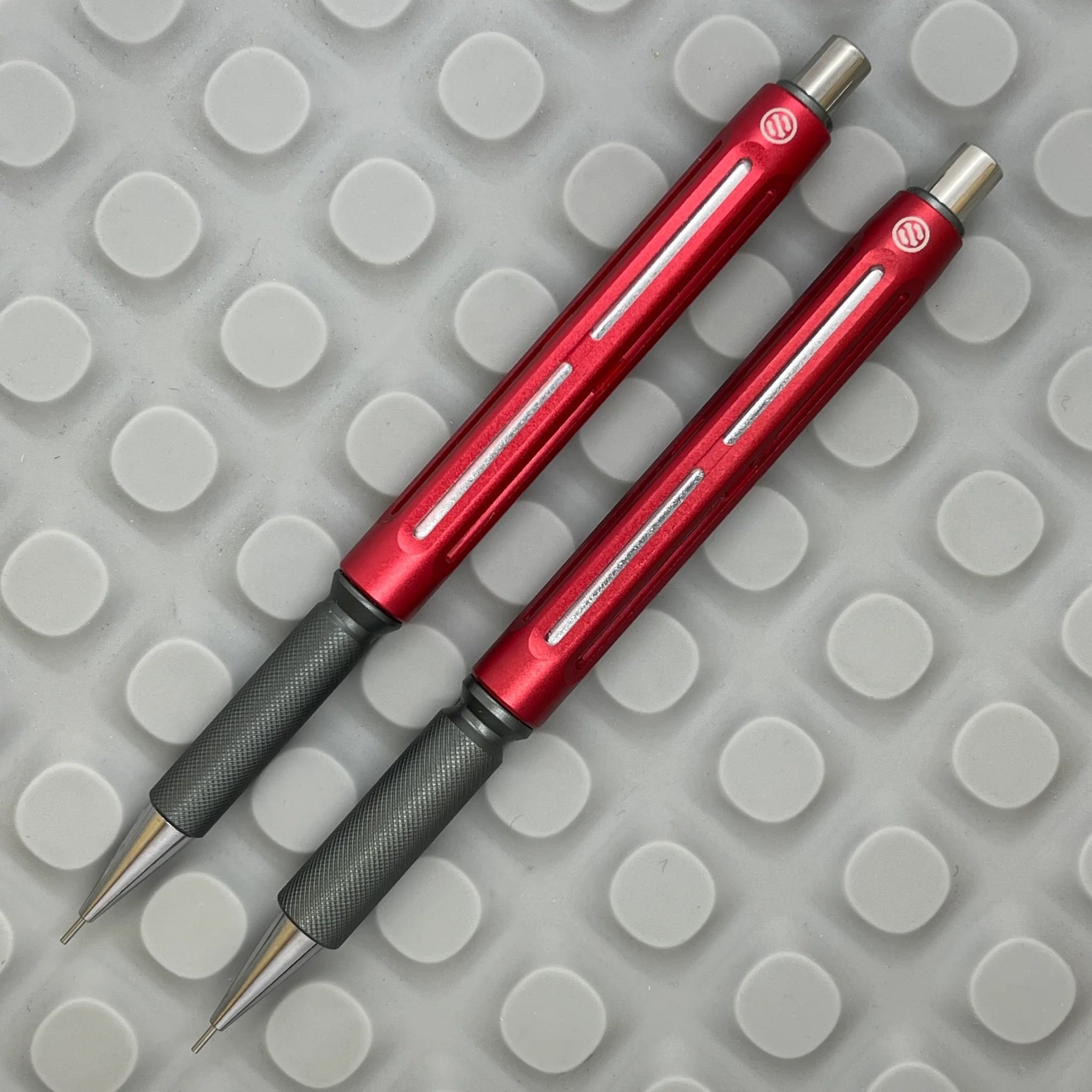
They recently released a new pen called the Clickstream. Here it is in all its glory:

Spoke Clickstream

So why would the person who made the pen and runs the website need a review of his own pen? Because this one is different. This one is exceptional, even in a lineup full of home-run designs, this one stands head and shoulders above the rest; Brad won’t say that though, so I will.

What makes it so good? Let me tell you.

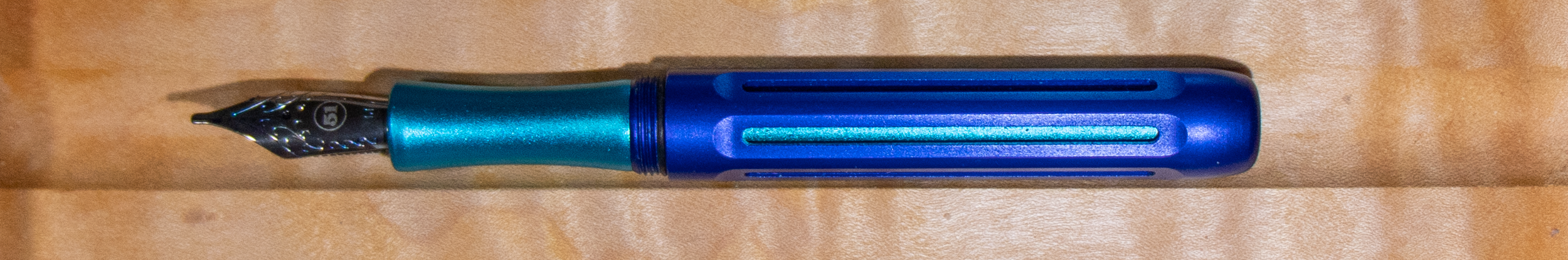
First, the shape. Classic, with the Spoke Design cutouts that mark their design language giving it a modern flair. The taper is perfect. I like a narrower grip in my pens, this has a sweet spot for everyone. Narrow at the tip, wider just behind it. No clip interrupting the clean curves, but flattened on six sides to prevent rolling. There’s something here for everyone, without compromise.

Second, the click. It’s incredible. The pen ships with a Soft, Medium, and a Hard spring - I immediately installed the Hard and never looked back. I love a good thunk when I click a pen, and the mechanism they chose for the Clickstream delivers. And again, if you prefer a more Pilot G2-esque click the Medium spring is there for you.

Spoke Clickstream Comparison

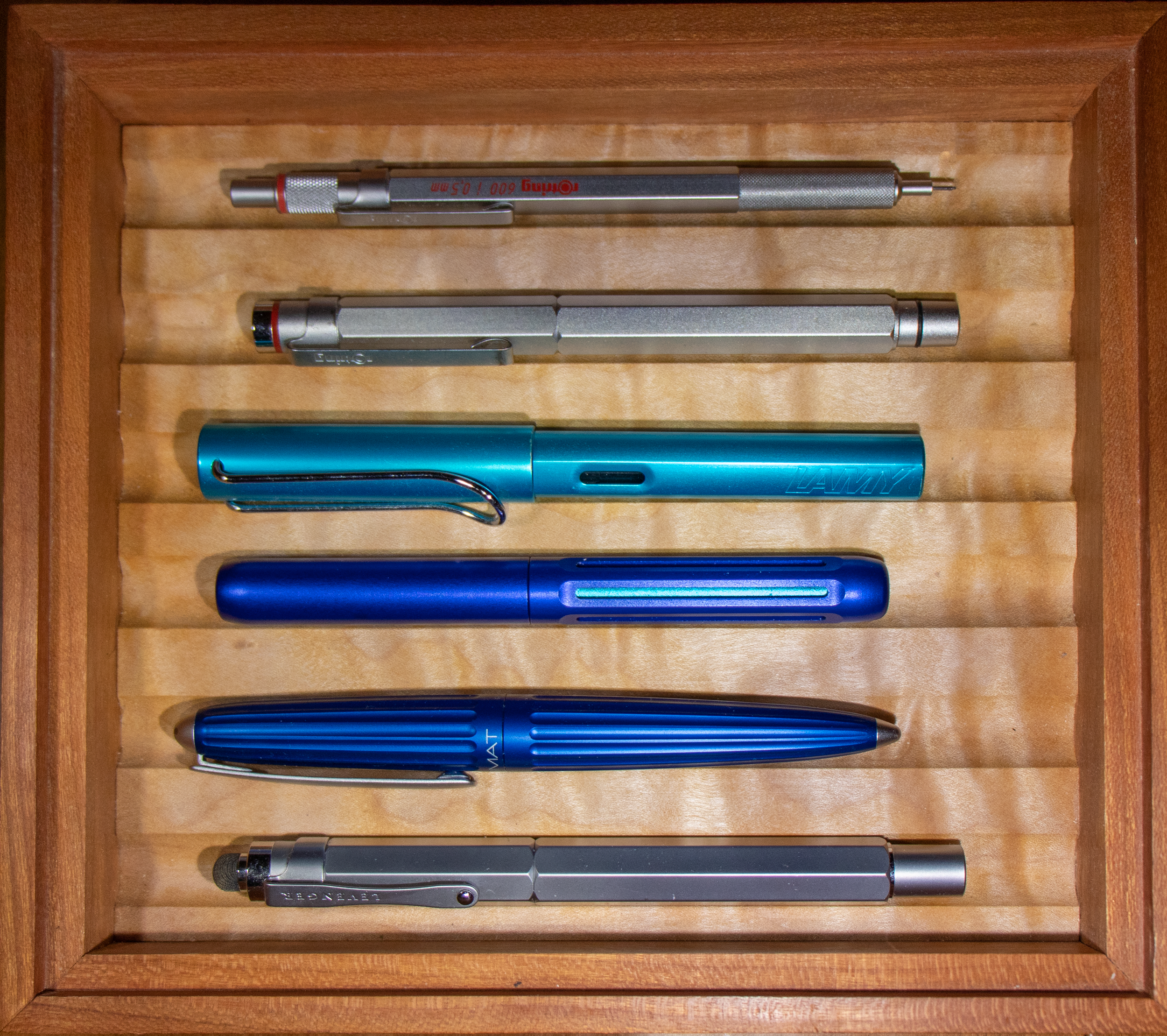
Obligatory lineup compared to some other great pens. Top: Tactile Turn Slim Bolt Action Ti. Bottom: Cortex edition Studio Neat Mark One.

Third, the material. I chose sand blasted titanium, the most popular choice according to Brad, and I can see why. I have had plenty of pocket knives with this setup, but something about having it on a pen gives it new life. The sandblasting adds just enough texture to the pen to give it a nice, tactile feel, without being rough. Additionally the weight of the titanium is just the best. While the aluminum body version has amazing colors, I’m here for the perfect weight that the titanium brings.

I’ve had many (read dozens) of machined pens come and go, both from Spoke design but also from many others including Tactile Turn and Karas Pen Co. just to name a few. None of them came close to the full package that the Clickstream brings to the party. They all had some minor quibble (too wide, too textured, loose tolerances) that I just can’t find on the Clickstream.

Spoke Clickstream G2

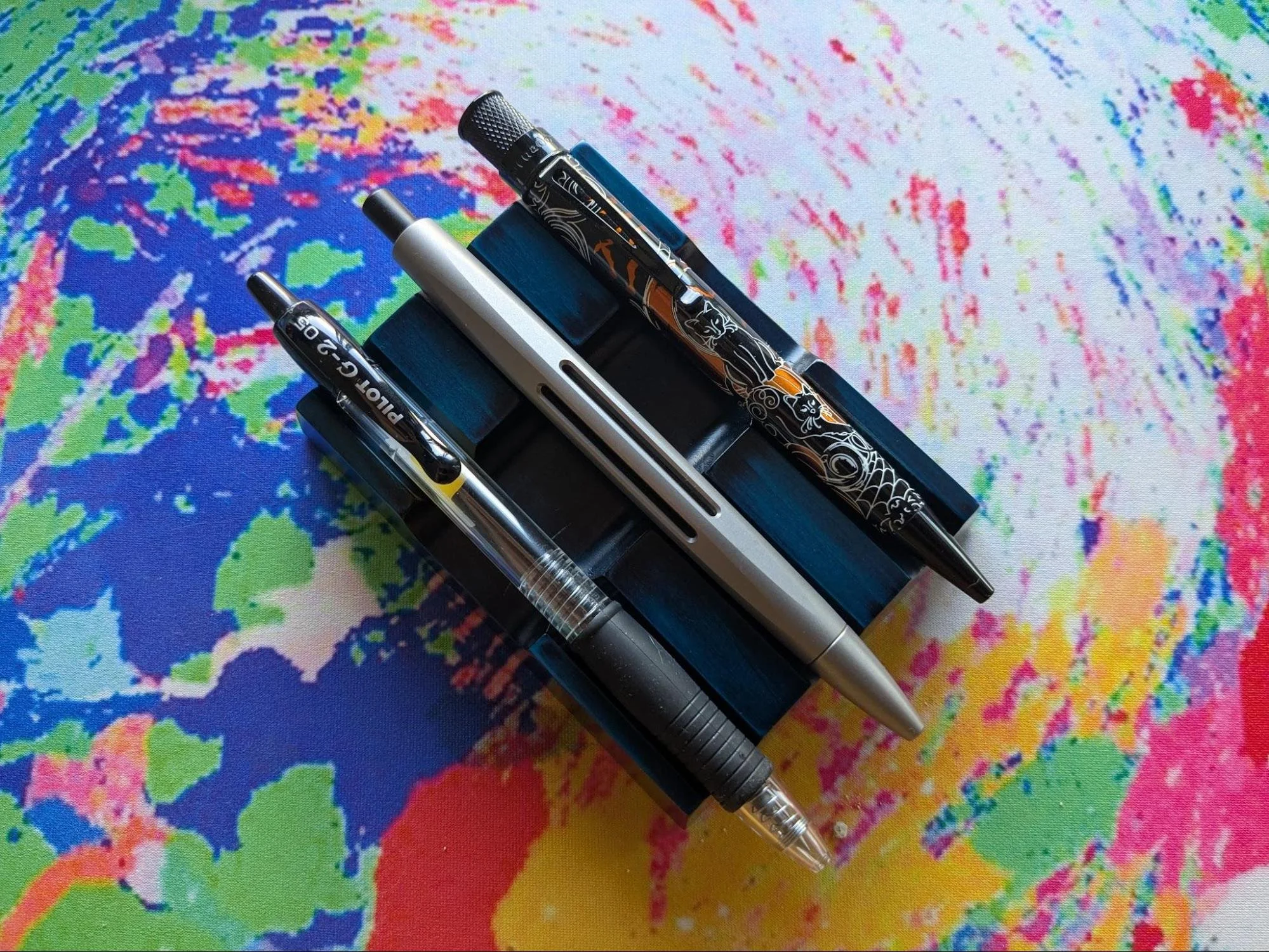
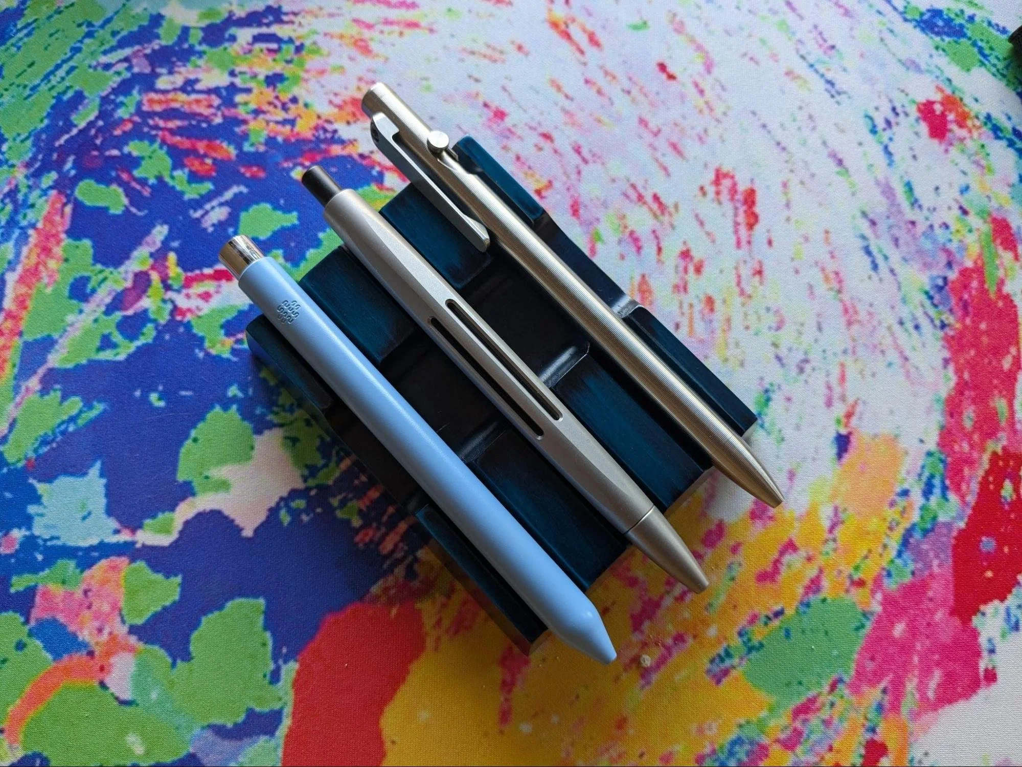
The essential comparisons: Top: Retro 51 Tornado Halloween edition. Bottom: Pilot G2.

The pen ships with either a Schmidt Easyflow 9000 or Ohto Flash Dry refill, but accepts any Parker-style refill (so if you want to spring for the now exorbitantly expensive uniball Jetstream refills you can,) just don’t forget the spacer that ships with the pen to install on the refill, this is part of the secret that takes the tip rattle out of the equation for this pen.

If you absolutely need a clip, or hate all the refill options then I agree, this isn’t the pen for you. But for anyone who just loves a good pen, this could easily be my one pen I use for the rest of my life. It’s that good.

The Spoke Clickstream is $69 for Aluminum, and $89 for Titanium models, and can be found at SpokeDesign.com.


Enjoy reading The Pen Addict? Then consider becoming a member to receive additional weekly content, giveaways, and discounts in The Pen Addict shop. Plus, you support me and the site directly, for which I am very grateful.

Membership starts at just $5/month, with a discounted annual option available. To find out more about membership click here and join us!

Posted on February 5, 2025 and filed under Spoke Design, Pen Reviews.

In the Footsteps of the Pen Addict - Choosing a Spoke Icon

(Note from Brad: Since I wouldn’t review this pen myself, my friend Diane asked if she could step in and tackle a product I had a direct hand in making. This is her review below. Thank you Diane!)

In early 2021, Spoke Design introduced not one but 3 fountain pens - the Icon, Axle and Axle S. All 3 designs are available in a variety of mix and match color combinations.

Right away I wanted to get at least one of these pens, but. which? I loved all 3, and it took time to narrow down the choices. Despite its cuteness, I managed to eliminate the tiny Axle S because of its cartridge-only filling system. While the Axle’s tool-like aesthetic was appealing and I liked the threaded posting, I found the Icon the most intriguing with its open 6-slotted barrel revealing a contrasting inner sleeve. Soon after the release, alternative grips including a knurled version were added for the Icon only.

For a while I held out for a pen show where I could evaluate the models in person, but over a year passed with no pen shows attended by Spoke.

I had decided that I wanted the knurled grip and sleeve in the same color, with a surprise color contrast to the cap and barrel. Of all the knurled grip colors, I liked the cyan best. That just left the choice of cap and barrel color.

I found the gunmetal or silver combination with cyan too conservative; the purple and cyan, on the other hand, seemed too gaudy.

Time passed, and the unfinished business of choosing an Icon remained. Meanwhile the colors slowly sold out and my choice was made - cobalt blue and cyan.

First impressions

The pen arrived securely packed in foam-line tin within a Spoke Design logo box,. In the website photos, the Icon looks like a chunky, heavy pen. In fact it’s smaller than I expected and also at 23.6g capped, it weighs about the same as a Lamy Safari, substantially less than most of the pens I use daily. There are benefits to lighter weight and benefits to substance. The option of brass grip and insert may allow the pen to be customized to be heavier if that’s preferred.

Spoke Icon Comparison

From the top: Rotring 600 pencil; Rotring Newton; Lamy Al-Star; Spoke Icon; Diplomat Aero; Levenger L-Tech.

Fitting a new pen into my life When taking handwritten notes in meetings, I like a pen with an efficient, geometric, logical appearance; unconventional but not flamboyant. I also have a dread of a pen drying up while uncapped, so I like to use either a snap cap or a retractable. My go-tos are Rotring Newton, Diplomat Aero, Pilot Vanishing Point and Platinum Curidas, all with EF nibs. My heptagonal, F nibbed Levenger L-Tech could be a runner up here as it channels the Rotring design aesthetic; although it’s not a snap cap, it can be uncapped in less than a full turn.

For daily ephemeral work notes and sketches, I use my notetaking pen du jour, something else from rotation, plus a stub or architect with a different colored ink for accents and separators.

When flying, I value pens that don’t dry out if left unused for a while as I believe this makes them more resistant to air pressure changes and leaking. Kaweco Al-Sport, Schon DSGN pocket 6, Esterbrook Estie and Platinum 3776 have served well here; the retractables stay at home.

For home note-taking and journaling, abalone and crazy resins are welcome as well as modern flex nibs, stubs and italics.

Viewed through this lens, the Spoke Icon has the logical, geometric aesthetic that I like for the office. It wrote instantly and did not leak after 2 flights with 2 weeks of non-use over the holidays. In the months since obtaining the Icon, it has been a daily driver for work and home.

Usability

Unlike its Axle siblings, the Icon is not designed to post. At first glance the cutouts look like they are there to provide roll stop behavior. They don’t - the pen rolls easily and when placed on a desk, defensive measures are necessary.

The Icon’s barrel has an o-ring that prevents it from unscrewing on its own, and attempts to unscrew the cap don’t cause the barrel to come undone. The cap thread does not make contact with fingers while in use. One downside is that the cap has a single thread and takes over 3 full rotations to undo. While this provides for a moment of quiet meditation when uncapping the pen, it makes it a less than ideal choice for meeting notes.

Grip choices

There’s a special fatigue caused by writing with a slippery pen. The mental energy required to keep control of the pen is not available for the thought processes involved in writing. The first time I picked up a pen with a knurled grip, I experienced an unexpected peace and increased focus.

Until the Icon, I only had two knurled grip writing instruments - a Rotring 600 pencil and the Rotring-inspired Levenger L-Tech fountain pen. I received all 3 available grip variants with my Icon and rated each on the following factors:

Grip Comfort - 1 minimum, 5 maximum, higher is better.

Slip vs grip - 1 slippery, 5 grippy, higher is better.

The Icon’s concave grip scored 5; it is one of the most comfortable grips I have ever used. However, it scored 2 on the slip versus grip scale, being slippery both longitudinally and rotationally.

The Icon’s groove grip scored 3 for comfort and 4 for slip vs grip; longitudinal slip is gone but rotational slip remains.

The Icon’s knurled grip scored 4 for comfort, dropping a point relative to the concave, and a perfect 5 for grip.

While the Levenger L-Tech also scored 4 + 5 due to its knurled grip, both the Rotring Newton and Diplomat Aero have unforgiving straight slippery grips, scoring 2+2 = 4 each.

Retractables have their own grip comfort challenges, which I see as a necessary compromise for retractable functionality, so I won’t rate them here.

The knurled grips are clear winners in this highly subjective evaluation. The surprise is just how badly I rate two of my go-to pens in comparison.

Spoke Icon Concave Grip

Spoke Icon Concave Grip.

Spoke Icon Groove Grip

Spoke Icon Groove Grip.

Filling

The Icon uses standard cartridge / converter filling and with the barrel sleeve in place, there’s no ink window. The sleeve can be removed with the available tool in order to replace it with a different color. Removing the sleeve completely gives a view of the ink level in the converter, at the expense of the flash of contrasting color from the sleeve. It’s worth noting that the sleeve is open ended, so if the cartridge or converter were dislodged, ink could escape from the barrel. This is also a consideration for the Lamy Safari and Al-Star; I have never had it happen with either. The main downside of the knurled grip is that when filling from an ink bottle, ink may get into the knurled texture and is then hard to remove. Even when it seems to be gone, tiny amounts of ink remain and transfer to fingers when writing. There are many ways to avoid this - rinsing the grip after filling, syringe-filling the converter, filling the converter from the bottle or from a TSWBI inkwell - and I’m happy to use these methods in return for the knurled grip.

Nib Heaven

The nib is always the most important part of any pen and yet in this case, also the least important. Since the Icon takes a standard Jowo #6 nib unit, any other Jowo #6 will fit, giving access to needlepoint, stub, fine cursive italic, modern semi-flex, architect and more from a variety of sources.

The Spoke Icon is available with a standard Jowo #6 nib unit in EF, F, M and B, all engraved with the Spoke logo. I selected the Jowo #6 EF somewhat reluctantly as I already have several in other pens. I have come to think of the Jowo #6 EF as Heaven - every time I come back to it, I marvel at its precise, clean line, reliability and ease of use. But it’s Heaven by the Talking Heads - the ennui of perfection.

Conclusion

The Spoke Icon is everything I hoped it would be. Its clean but unconventional design suits me both at work and at home. It sparks joy when its cyan accents flash through the barrel cutouts or appear when the cap is removed. Its knurled grip allows me to focus on writing. Its nib is perfect and also easily replaced. And I can live with the 3 turns to remove the cap.

As I made arrangements to get the Icon’s nib tailored to UEF and obtain a reverse architect / engineering nib, I reflected on one of my all-time favorites - the gold fine cursive italic in the Lamy Dialog, purchased from the Pen Addict during a previous herd-thinning event.

For me, this is all that’s missing from the Spoke Icon - it would be great to be able to order a Spoke pen pre-sprinkled with Pen Addict nib magic.

(I received the Spoke Icon at no charge in return for this unbiased review.)

Posted on March 2, 2023 and filed under Spoke Design, Fountain Pens, Pen Reviews, Guest Post.