Posts filed under Colorverse

Colorverse Rainy Day Ink: A Review

(Susan M. Pigott is a fountain pen collector, pen and paperholic, photographer, and professor. You can find more from Susan on her blog Scribalishess.)

Colorverse “Joy in the Ordinary” is a series of inks dedicated to finding happiness in the simple things of life, such as taking a coffee break, sitting in the shade, sleep (ah, sleep), and a rainy day. In Abilene, rainy days are so rare that just the thought of one makes me long for petrichor and the growl of thunder. Alas, I’ll just have to enjoy the ink called Rainy Day instead.

Rainy Day is a misty blue ink that evokes the dark smudges of rain clouds on the horizon. I absolutely love the shade because it’s not like most blue inks--verging toward green or purple. Instead, it’s a greyish-blue, the color of well-washed denim and just as soft. Although it offers some shading (especially in wider nibs), it does not have any sheen.

The ink is pretty consistent in color across various kinds of paper, including Rhodia white. It looks good in fine, medium, broad, and stub nibs, but the wider the nib, the more you’ll see the shading. This ink would easily become a favorite for me if it weren’t so dry. Unfortunately, even in a stub nib it feels like you’re writing with graphite. It is not a waterproof ink.

Chromatography reveals several colors in Rainy Day: yellow, peach, pink, lavender, and light blue.

As I said, the shading properties of Rainy Day really come out in wider nibs. I used my ruling pen on Midori Cotton paper and achieved some terrific contrast and pooling.

You can purchase Colorverse Rainy Day in a 30ml bottle for $13.75 from JetPens. I like this color so much, I’m going to try Vanness Pens’ White Lighting to see if I can get it wet enough to use every day.

(JetPens provided this product at no charge to The Pen Addict for review purposes.)


Enjoy reading The Pen Addict? Then consider becoming a member to receive additional weekly content, giveaways, and discounts in The Pen Addict shop. Plus, you support me and the site directly, for which I am very grateful.

Membership starts at just $5/month, with a discounted annual option available. To find out more about membership click here and join us!

Posted on May 1, 2020 and filed under Colorverse, Ink Reviews.

Colorverse Joy in the Ordinary Coffee Break Ink Review

(Sarah Read is an author, editor, yarn artist, and pen/paper/ink addict. You can find more about her at her website and on Twitter. And check out her latest book, Out of Water, now available where books are sold!)

The Joy in the Ordinary series from Colorverse is truly delightful, as a theme. What would astronauts miss when in space? Lots of lovely earth things, like hot coffee--the inspiration for Colorverse Coffee Break. I love a good warm brown ink, and this one is well up in the ranks with some of my favorites.

The packaging, as with any Colorverse ink, is so charming that you're inevitably smiling before you even set eyes on the ink itself. The box is fully decorated with delightful illustrations. When all the different colors are lined up, the illustrations on the outside of the boxes form one continuous scene. I don't know any other company that puts this much thought into their presentation, and I totally love it.

The ink bottle itself is an egg-shaped blown glass 30ml jar. The front is flattened where the label goes. It's a cute bottle, as all Colorverse bottles I've seen to date are. It's a practical shape, too, allowing for easy pen filling, even when the ink starts to run low. The smaller size bottle helps to keep the cost down, as well. This bottle retails for $13.75, which seems just right.

The ink itself is a nice warm brown. It leans a bit yellow, I think. This isn't a black coffee, or a creamy latte coffee. This is more like the weak coffee you get in a hotel lobby at 3am. But I dig it. Chromatography shows a lovely split between an almost purple-mauve, fading into pink, to coral, to bright yellow. It's easy to see where all that warmth is coming from. And Colorverse remains the most surprising brand when it comes to chromatography tests.

It has quite a lot of shading, ranging from a dry grass color to a rich chocolate. It's well balanced between wet and dry. It doesn't feel like a wet ink, but doesn't have the drag of dry ink, either. The dry time on it is decent, between 20 and 25 seconds. There is almost no water resistance to this ink at all. The slightest splash washes it clear away. A bit ironic, since the thing that most people seem to spill on their writing is coffee.

As far as comparisons go, I can't say that this ink is unique. There are a lot of similar colors out there. The closest in my swab collection is J. Herbin Lie de The--a funny naming convention coincidence. The J. Herbin is a little bit cheaper than this Colorverse, but I strongly prefer the Colorverse bottle.

I really like this new series from Colorverse. Their previous offerings are all excellent, but the larger sets they come in often exceed my ink budget. These smaller singles at affordable prices are just what I needed from this line. And while the colors so far aren't anything wild, they perfectly capture their theme of joy in the ordinary.

(JetPens provided this product at no charge to The Pen Addict for review purposes.)


Enjoy reading The Pen Addict? Then consider becoming a member to receive additional weekly content, giveaways, and discounts in The Pen Addict shop. Plus, you support me and the site directly, for which I am very grateful.

Membership starts at just $5/month, with a discounted annual option available. To find out more about membership click here and join us!

Posted on February 6, 2020 and filed under Colorverse, Ink Reviews.

Colorverse Apollo 11 50th Anniversary First Moon Landing Limited Edition Ink Set Review, Part 2

(Sarah Read is an author, editor, yarn artist, and pen/paper/ink addict. You can find more about her at her website and on Twitter. And check out her first novel, The Bone Weaver’s Orchard, now available where books are sold!)

In my last review, I covered the lovely contents of the Colorverse Apollo 11 limited edition ink set. It's a very droolworthy, if pricey, gift set of inks that has won my heart but not my wallet. This week, I'll talk more about the individual inks included with the set.

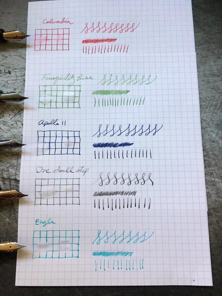
Apollo 11, the large bottle of blue-black ink is the primary feature of the set. It goes down very dark and dries to a slate-navy color. It's decently lubricated and shows lovely shading even with a fine nib. In a water test, the blue color washed away but the grey tone remained behind, both when the water was wiped away and left to soak, so it may have a little bit of water resistance. This is a great workhorse ink. It's formal enough to be professional, but has enough character that it's still a joy to write with.

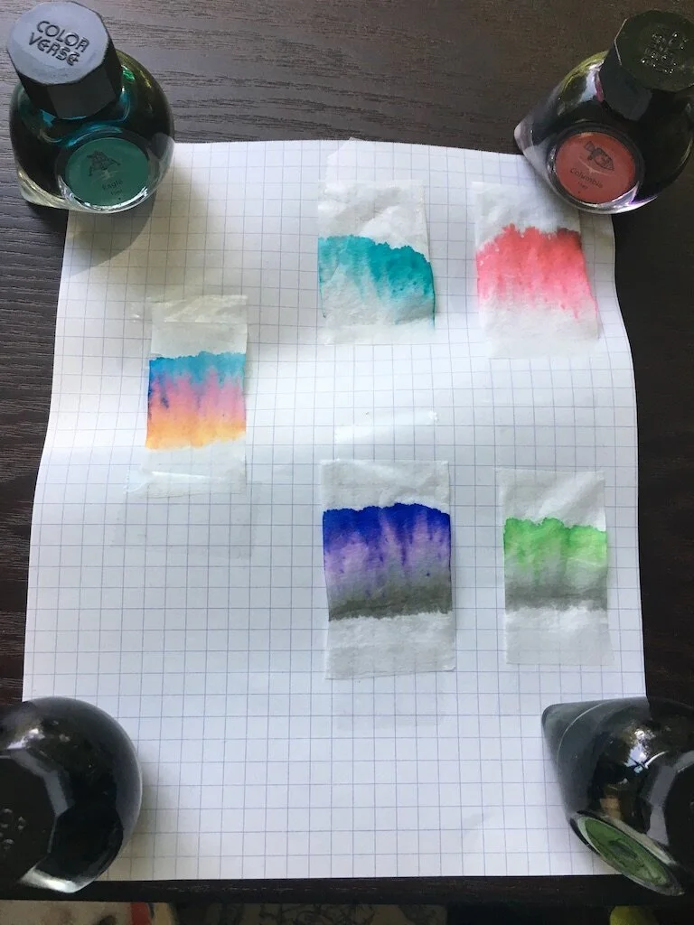
One Small Step is the mysterious grey that splits into orange, pink, and teal in chromatography. A touch of that character shows on the page, where I honestly can't tell if it's a warm color or a cool color. This one feels drier, but shows phenomenal shading. Its lighter color appears like a graphite line, and it pools to almost black. With a stub nib, the effect is almost ghostly and I adore it so much.

Columbia is the pinky-red ink of the set. It has a fantastic tone, though it doesn't show much character on the page. There's a small bit of shading, but it's mostly a flat color. It washes away completely in water. Do you remember the wee red hot candy hearts at Valentine's Day? This ink looks like those taste. Spicy and sweet at the same time.

Eagle is a pale sky teal. It's the driest ink of the batch, with a tendency to dry out in the feed. It's also a bit pale, so it might be tricky to read at times. It doesn't show much shading, but there is some. It washes away completely in water. The color itself is beautiful, but it's probably the one I'll use least from the set. I think it's perfect for highlighting something or for decorative notes, but it isn't a staple color.

The last color of the bunch is Tranquility Base, a beautiful grey-green that has a soft matcha tone to it. It is nicely wet, shows a lot of shading, and the grey notes remain behind when water is applied. Like Eagle, it's a bit pale for everyday use, but its darker tones are grass-green and easier to read. It's more of a Spring green than a Winter green, and it makes me think of light teas and Easter grass.

I think what appeals to me most about this selection of colors is that it perfectly suits the way I write. It has everything I need, all in one box. I'll be drafting in Apollo 11, interjecting thoughts or questions to myself in Eagle, making proof marks in Columbia, adding research notes in Tranquility Base, and inserting new text with One Small Step. I already write this way, to keep my manuscripts color-coded as I draft and re-draft. I just never expected to be handed a kit that anticipates my needs so well. Admittedly, I could have assembled a similar kit myself just from what's on my ink shelf already--which is why I'd likely not shell out the cost of this one--but I really do like the individual characteristics of these inks. I think One Small Step is easily the best grey in my collection, and I have a feeling I'll be lamenting the tiny size of this bottle before long.

My final thoughts are: if you love this, grab it. You won't regret it at all. And if you find it at a good deal, it's definitely worth picking up. For any shade of ambivalence, it's not worth the price. Though... it does come with stickers, if that sways you.

(JetPens provided this product at no charge to The Pen Addict for review purposes.)


Enjoy reading The Pen Addict? Then consider becoming a member to receive additional weekly content, giveaways, and discounts in The Pen Addict shop. Plus, you support me and the site directly, for which I am very grateful.

Membership starts at just $5/month, with a discounted annual option available. To find out more about membership click here and join us!

Posted on October 10, 2019 and filed under Colorverse, Ink Reviews.