Posts filed under Colorverse

Colorverse Johannes Kepler Mini 3 Bottled Ink Set: A Review

Colorverse Johannes Kepler Mini 3 Bottled Ink Set Review

(Susan M. Pigott is a fountain pen collector, pen and paperholic, photographer, and professor. You can find more from Susan on her blog Scribalishess.)

The Colorverse Johannes Kepler Mini 3 Bottled Ink Set contains three 5ml bottles of dye-based fountain pen ink honoring Kepler, the famous astronomer and mathematician. The three inks in the set are called "Conjecture," (for Kepler's mathematical theorem on sphere packing) "Planetary Motion" (for Kepler's three laws) and "Somnium" (for Kepler's novel about a dream involving daemons and the moon).

Colorverse Johannes Kepler Colors

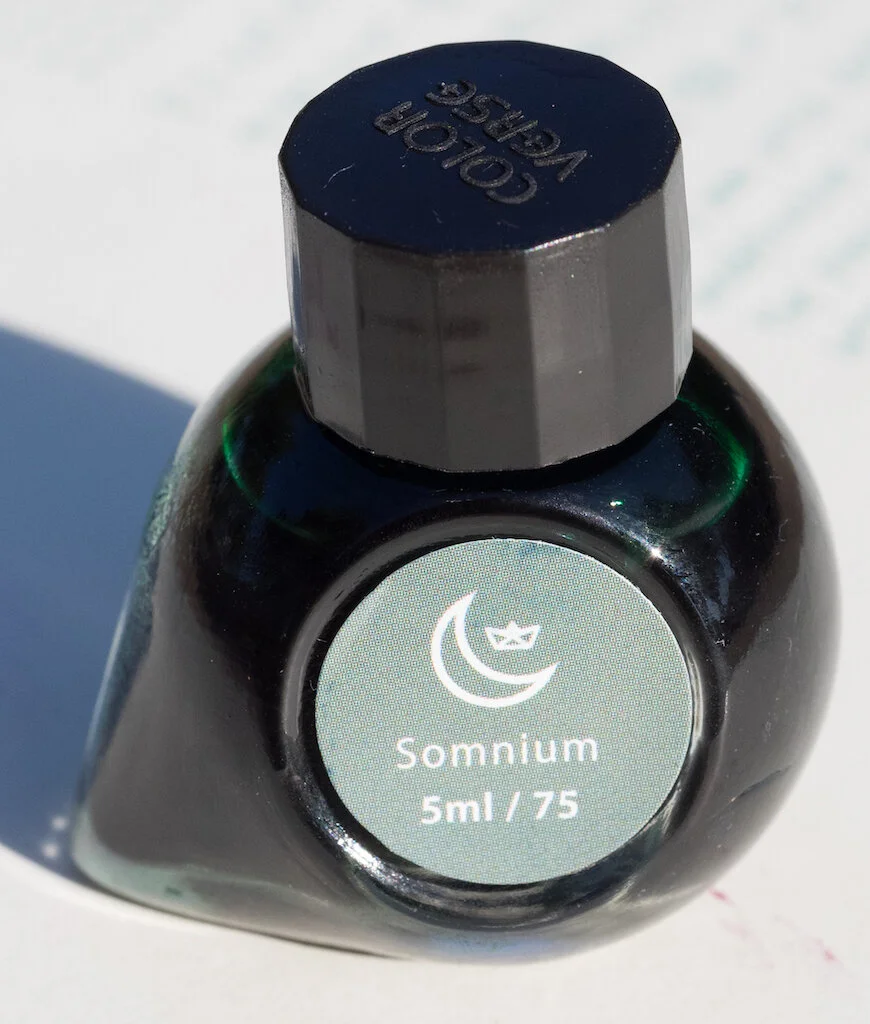
The 5ml bottles are tear-drop shaped and adorable.

Colorverse Johannes Kepler Bottle

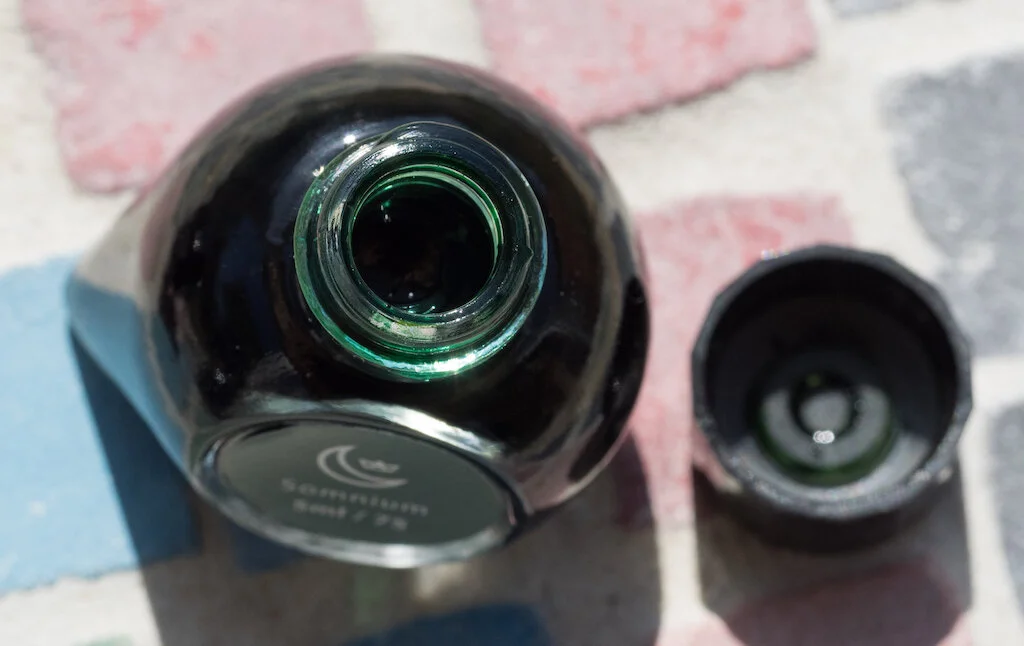
That said, the bottles aren't very practical. The opening is only .7mm, so you cannot insert nibs into it. A mini-pipette comes with each bottle. You can fill converters and eye-droppers with the pipette but not piston-filled pens.

Colorverse Johannes Kepler Bottle Opening
Colorverse Johannes Kepler Pipette

Conjecture

Colorverse Johannes Kepler Conjecture Bottle

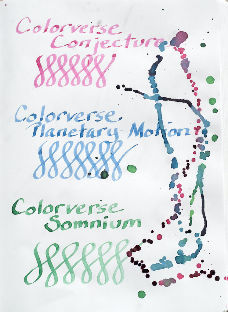
Conjecture is a wine colored ink with fair saturation. It exhibits little shading and no sheen on Rhodia paper, and it is not waterproof. Although my dry times test shows the ink smearing after 30 seconds, I think that's because a bit of ink had pooled. The ink is actually quite dry.

Colorverse Johannes Kepler Conjecture Rhodia

The Col-o-dex card also shows some shading but no sheen. I had to soak up the ink splats with a paper towel because sunlight was fading (and I needed to take my photos), so it's possible that ruined any sheen effect.

Colorverse Johannes Kepler Conjecture Colodex

Most interesting is the chromatography. This ink has a surprising bit of yellow-green in it along with pink and magenta. The yellow-green actually shows up in my water test (see above), but it wasn't evident in any of my writing, swatches, or splats.

Colorverse Johannes Kepler Conjecture Chromatography

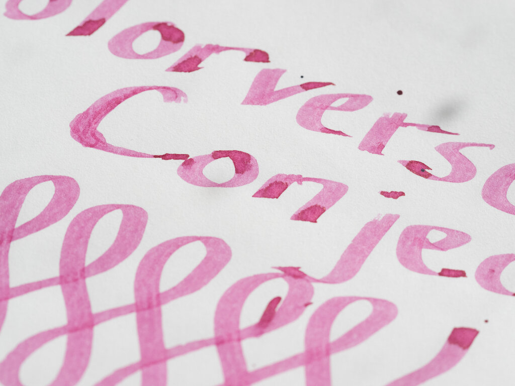
Because the bottle is so small, I wasn't able to test the ink with my ruling pen. I opted instead for my widest Pilot Parallel pen (2.4mm). In this wider nib (which I dipped) the ink seems much lighter--more of a cherry blossom color than wine. Shading is much more evident in a wider nib.

Colorverse Johannes Kepler Conjecture

Planetary Motion

Colorverse Johannes Kepler Planetary Motion Bottle

Planetary Motion is a denim blue color. It has a bit of shading but no sheen and dries quickly. It is not waterproof, but when water is mixed with it, you can see the purple and teal undertones of the ink.

Colorverse Johannes Kepler Planetary Motion Rhodia

The Col-o-dex card shows off the shading of the ink. Again, it does not have any sheen (maybe due to my paper-towel blotting) but a bit of teal is visible in the splats.

Colorverse Johannes Kepler Planetary Motion Colodex

The various dyes in Planetary Motion come out clearly in the chromatography: teal, turquoise, light blue, lavender, and purple.

Colorverse Johannes Kepler Planetary Motion Chromatography

Testing on Midori Paper with the Pilot Parallel 2.4mm demonstrates decent saturation and shading.

Colorverse Johannes Kepler Planetary Motion

Somnium

Colorverse Johannes Kepler Somnium Bottle

Somnium is a jade green color with a tiny bit of shading. It has low saturation except in swabs. It dries fairly quickly and is not waterproof.

Colorverse Johannes Kepler Somnium Bottle Rhodia

On the Col-o-dex card, the ink looks rather flat, with just a tiny bit of shading with the fine nib. Again, because I had to blot the splats, I don't know if there's any sheen with this ink. If there is, it's quite small.

Colorverse Johannes Kepler Somnium Bottle Colodex

Chromatography reveals different shades of green in this ink: olive green, light green, and blue green.

Colorverse Johannes Kepler Somnium Chromatography

The Pilot Parallel pen brought out some good shading in Somnium.

Colorverse Johannes Kepler Somnium

I found all three Colorverse inks in this set to be quite dry, especially in the fine nib I used to do longer writing samples. The colors are understated, and I'm not enthusiastic about any of them. They are much more interesting in the Pilot Parallel nib, so I suggest using wide nibs for these inks.

Colorverse Johannes Kepler Writing
Colorverse Johannes Kepler Writing Pilot Parallel

You can buy the Colorverse Johannes Kepler Mini 3 Bottled Ink Set from Goldspot Pens for $19.50. Keep in mind that you'll need to use these inks in pens that are either eye-droppers or cartridge/converters. You could also transfer the ink to a sample bottle in order to fill a piston-based pen.

(Goldspot Pens provided this Colorverse Ink Set to Pen Addict free of charge for review purposes.)


Enjoy reading The Pen Addict? Then consider becoming a member to receive additional weekly content, giveaways, and discounts in The Pen Addict shop. Plus, you support me and the site directly, for which I am very grateful.

Membership starts at just $5/month, with a discounted annual option available. To find out more about membership click here and join us!

Colorverse Johannes Kepler Ink
Posted on October 23, 2020 and filed under Colorverse, Ink Reviews.

Colorverse Office Series Blue Black Ink Review

Colorverse Office Series Blue Black Ink Review

(Jeff Abbott is a regular contributor at The Pen Addict. You can find more from Jeff online at Draft Evolution and Twitter.)

I've been on quite a blue black ink kick lately, and the latest contender in this list is from Colorverse. Part of their Office Series, their take on Blue Black is what I consider to be a traditional, middle-of-the-road interpretation of this classic color. In short, I love it and think it's something you should try out if you're in the market for a blue black ink for your favorite pens.

Colorverse Office Series Blue Black Ink

When it comes to blue black inks, there can actually be quite a bit of variation and differences of interpretation in terms of color. Some blue black inks may be so dark that you can barely make out any blue, while others take on a dusty blue or denim hue. Those are two opposite ends of the spectrum, but you can also see hints of purple or gray in some inks, as well as some red sheen in some cases. This is great in terms of variety, but it can also be frustrating if your idea of a blue black ink doesn't match up with the ink manufacturer's vision.

Colorverse's blue black is what I consider to be a definitive example of a true blue black. People will surely disagree with this statement, but that just goes to show that colors are incredibly objective perceptions that vary across all human beings. This blue black ink has a dark and luxurious tone while also being obviously blue. You don't have to look too closely to detect the deep blue, and it also doesn't have any stray colors that creep out in the light strokes and bright light. It's true to itself and the name given to it. It's not the most exciting color, but it's a beautiful example of a classic ink color.

Colorverse Office Series Blue Black

So, getting into the specifics of this particular ink, the first thing I noticed when using this ink (besides the color!) was how smooth it feels on the page. I've been really impressed by all of the Colorverse inks I've tried before, and this one is no exception. Ink flow is smooth out of the nib, and it lays down evenly on the page without letting too much out at a time. And, even the ink flows easily, it doesn't go crazy on more absorbent papers and feather out across the uncoated paper fibers. It's well-behaved, and I feel comfortable using it on any kind of paper — fancy or ordinary.

There isn't any visible sheen with this ink, and there also isn't a lot of variation in color or shading. It's a no-nonsense ink that works well and doesn't offer any frills. There's a reason that Colorverse included this in the "Office Series," and that's totally okay. There's a place for vibrant, loud inks in the same way there's a place for more subdued and "boring" colors. This ink will fit in great at the workplace (remember when we were around other people and could talk about pens and inks?) but also looks great in a Field Notes or bullet journal. There's enough visual interest in the color and ink properties to make it better than other similar inks.

Colorverse Office Series Blue Black Swab

One area where this ink really surprised me is the dry time. In most cases, and even when using it with a wet medium cursive italic nib, the ink was dry by around 12 or 15 seconds. Larger glops took a little longer (in the 20-second range), but on average there wasn't much time involved before the ink was smudge resistant.

I've really enjoyed using this ink, and it's quickly raced to the top of my list of favorite blue blacks. If you're curious in trying out a blue black ink, this is an excellent place to start. At $13.50 for a 30ml bottle, it won't break the bank, and you can even order a 4ml sample vial to try out if you're not sure you want to commit to the full bottle. Give it a shot in your next order with Vanness!

(Vanness Pens provided this product at no charge to The Pen Addict for review purposes.)


Enjoy reading The Pen Addict? Then consider becoming a member to receive additional weekly content, giveaways, and discounts in The Pen Addict shop. Plus, you support me and the site directly, for which I am very grateful.

Membership starts at just $5/month, with a discounted annual option available. To find out more about membership click here and join us!

Colorverse Office Series Blue Black Review
Posted on September 9, 2020 and filed under Colorverse, Ink Reviews.

Colorverse Rainy Day Ink: A Review

(Susan M. Pigott is a fountain pen collector, pen and paperholic, photographer, and professor. You can find more from Susan on her blog Scribalishess.)

Colorverse “Joy in the Ordinary” is a series of inks dedicated to finding happiness in the simple things of life, such as taking a coffee break, sitting in the shade, sleep (ah, sleep), and a rainy day. In Abilene, rainy days are so rare that just the thought of one makes me long for petrichor and the growl of thunder. Alas, I’ll just have to enjoy the ink called Rainy Day instead.

Rainy Day is a misty blue ink that evokes the dark smudges of rain clouds on the horizon. I absolutely love the shade because it’s not like most blue inks--verging toward green or purple. Instead, it’s a greyish-blue, the color of well-washed denim and just as soft. Although it offers some shading (especially in wider nibs), it does not have any sheen.

The ink is pretty consistent in color across various kinds of paper, including Rhodia white. It looks good in fine, medium, broad, and stub nibs, but the wider the nib, the more you’ll see the shading. This ink would easily become a favorite for me if it weren’t so dry. Unfortunately, even in a stub nib it feels like you’re writing with graphite. It is not a waterproof ink.

Chromatography reveals several colors in Rainy Day: yellow, peach, pink, lavender, and light blue.

As I said, the shading properties of Rainy Day really come out in wider nibs. I used my ruling pen on Midori Cotton paper and achieved some terrific contrast and pooling.

You can purchase Colorverse Rainy Day in a 30ml bottle for $13.75 from JetPens. I like this color so much, I’m going to try Vanness Pens’ White Lighting to see if I can get it wet enough to use every day.

(JetPens provided this product at no charge to The Pen Addict for review purposes.)


Enjoy reading The Pen Addict? Then consider becoming a member to receive additional weekly content, giveaways, and discounts in The Pen Addict shop. Plus, you support me and the site directly, for which I am very grateful.

Membership starts at just $5/month, with a discounted annual option available. To find out more about membership click here and join us!

Posted on May 1, 2020 and filed under Colorverse, Ink Reviews.