Posts filed under Ink Reviews

PenBBS 404 Fountain Pen Ink Review

PenBBS 404 Fountain Pen Ink Review

Let's go ahead and address this right up front. I'm calling PenBBS 404 “Ink Not Found.” As a life long-computer nerd, this is the way. This is the only way. I was even the proud owner of a 404 area code in Atlanta, which is what the real O.G.’s had prior to the proliferation of 770 and 678 prefixes. But Ink Not Found? That's just too good to pass up.

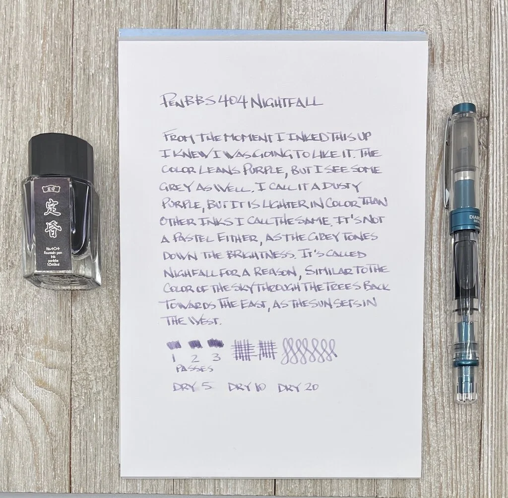
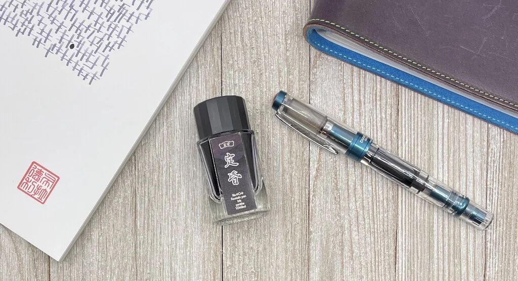
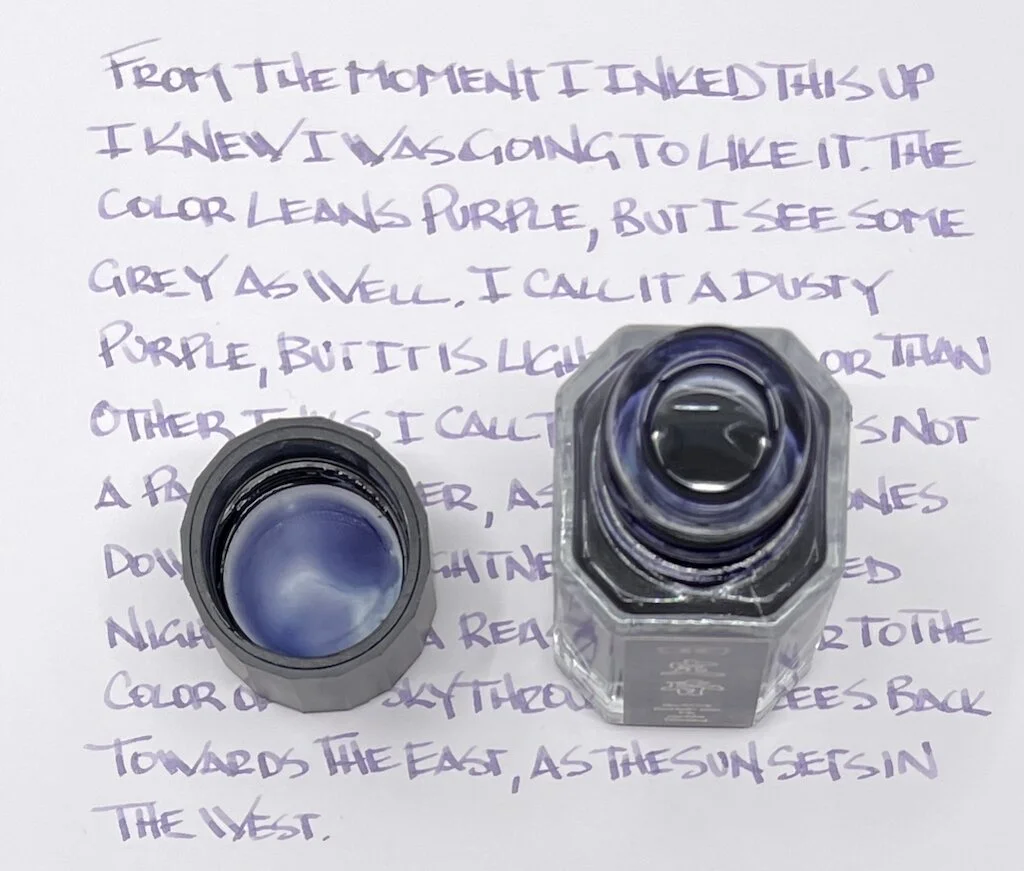
The real sub-name of this ink is Nightfall, which is pretty darn good I must admit. It's a shade of purple reminiscent of dusk, and a color range I'm generally fond of. This one is no exception, and has jumped up quickly into my frequently used inks.

PenBBS 404 Fountain Pen Ink

I first snuck it in to my Benu Pen Euphoria review a few months ago. The pen was certainly the star of the review, but that was my first go with 404, and I was smitten.

Nightfall is a light-colored ink, without a deep color saturation you see with many inks. Normally, I prefer that color depth, but something about this ink has grabbed me. It is dark enough to use in wide or narrow nibs, and fun enough to wonder what color it really is.

PenBBS 404

If you told me this was a grey ink, you wouldn’t get much argument from me. In fact, the most comparable ink it reminds me of is Sailor Chu-shu, which is mostly a grey ink, but leans purple. I’d say 404 is a purple that leans grey.

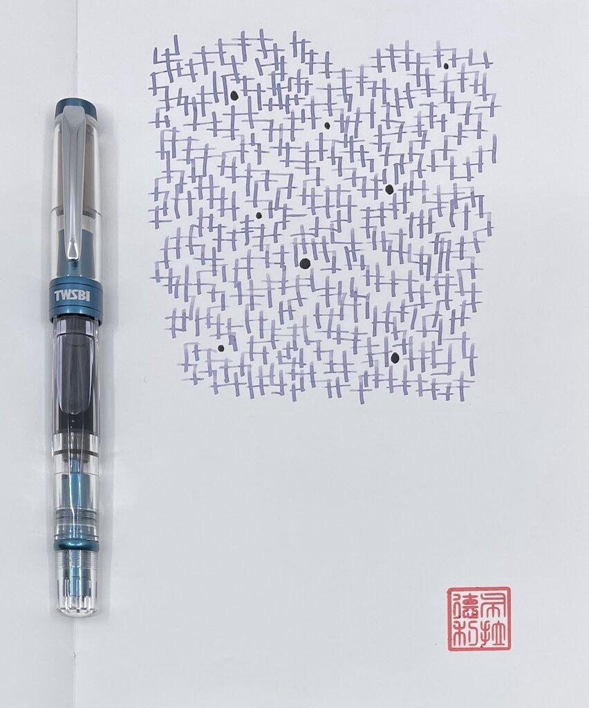
With this lighter color I do still see some shading. It’s subtle, but when the ink dries I see a mix of light and lighter lines. It looks best with a lot of text on the page. Speaking of drying, it dries ultra fast. There was barely any smear on my five second test on Clairefontaine Triomphe paper. The thinness of the ink helps with that. It’s not a dry ink, but isn’t very lubricated either.

PenBBS 404 Review

I added PenBBS 404 to a Vanness Pens order on a whim. At $8 for a 15 ml bottle it is a good enough price to take a chance on (I’m not much of an ink sampler,) and you won’t be stuck with a big bottle you won’t use. This is also my first PenBBS ink and review, and I’ll certainly be looking for more to try out soon.

(I purchased this ink at a discount from Vanness Pens.)


Enjoy reading The Pen Addict? Then consider becoming a member to receive additional weekly content, giveaways, and discounts in The Pen Addict shop. Plus, you support me and the site directly, for which I am very grateful.

Membership starts at just $5/month, with a discounted annual option available. To find out more about membership click here and join us!

PenBBS 404 Drawing
Posted on February 15, 2021 and filed under PenBBS, Ink Reviews.

Robert Oster Carbon Fire Ink Review

Robert Oster Carbon Fire Ink Review

(Jeff Abbott is a regular contributor at The Pen Addict. You can find more from Jeff online at Draft Evolution and Twitter.)

Over the past few months, I've definitely had a thing for trying new blue black inks. While I'm not tired of blue blacks, I decided it was time for something a little different. But don't get too excited — this next ink is just a shade or two brighter than the typical blue black. Despite being a close cousin of blue black, Robert Oster Carbon Fire is a spectacular dark blue that has just enough brightness to really lift my spirits.

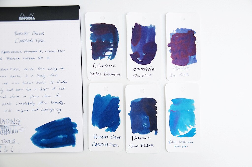
While going through my ink and swatch collection to find comparable inks to Carbon Fire, I realized that I really don't have much at all in the blue spectrum that falls between bright, happy blue and blue black. Carbon Fire is the perfect dark blue that has an obviously blue hue while also being dark enough to seem "professional." To me, this is the color that most defacto "blue" that comes in gel, ballpoint, or rollerball refills. But, Carbon Fire has some extra qualities that set it apart from regular old navy blue.

Robert Oster Carbon Fire Ink Shading

For one, I'm a big fan of the amount of shading in this ink. It's not an intense level of shade between different blues, but it's enough that you can see it with small nibs. Of course, the larger the nib, the more pronounced and beautiful the shading becomes. I love an ink that has a good amount of shading, and Carbon Fire really does the trick for me.

Another hidden quality that I've only been able to coax out when using this ink with a medium cursive italic (or anything larger) is a very subtle sheen. It's so subtle and hard to detect that I can't decide if it's more of a red or pink sheen. Despite being subtle, it's somehow quite deliberate when you're looking at the ink color as a whole. It's difficult to describe. The subtle sheen adds a level of intrigue to the ink because you can't quite put your finger on what makes the ink something a bit more than a standard blue ink. It's not shimmery, it's not glossy...what is it?! These were my internal questions while I was testing this ink. Only by holding the paper at the right angle against the light does the sheen show itself for what it is. It hides beneath the navy surface and adds a pleasant je ne sais quoi to an otherwise ordinary ink color.

Robert Oster Carbon Fire Ink Comparison

If you like ink colors that exhibit mysterious qualities, this ink is right up your alley.

Aside from the color, shading, and sheen, this ink is standard fare for Robert Oster. It's not dry, but not too wet. It's smooth when writing and behaves well in the pens I've tried. It dries in a fairly standard 15-20 seconds depending on how large and wet the nib is. I couldn't detect any feathering or bleeding, which is also something I've come to admire with any Robert Oster ink.

I picked up Carbon Fire as a sample because I was intrigued by the name and thought the online swatch example was unique for a dark blue ink. I'm glad I followed the intrigue, because I might have found a new favorite ink.

You can pick up your own bottle of Robert Oster Carbon Fire from your favorite ink retailers for around $17 (Vanness, Pen Chalet, Goldspotand JetPens to name a few).


Enjoy reading The Pen Addict? Then consider becoming a member to receive additional weekly content, giveaways, and discounts in The Pen Addict shop. Plus, you support me and the site directly, for which I am very grateful.

Membership starts at just $5/month, with a discounted annual option available. To find out more about membership click here and join us!
Robert Oster Carbon Fire Ink Swab
Posted on January 27, 2021 and filed under Robert Oster, Ink Reviews.

Van Dieman's Ink Sample Review, Part 3

Van Dieman's Ink Sample Review, Part 3

(Sarah Read is an author, editor, yarn artist, and pen/paper/ink addict. You can find more about her at her website and on Twitter. And check out her latest book, Out of Water, now available where books are sold!)

Here is the final installment of my trove of Van Dieman's ink samples. I saved these three for last, because they looked like my kind of colors and they had cool names, which is very important to me in ink. While an ink color name might have nothing to do with its performance, it gets me every time.

Van Dieman's Eclipse
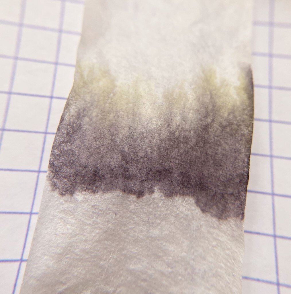
Van Dieman's Eclipse Chromatography

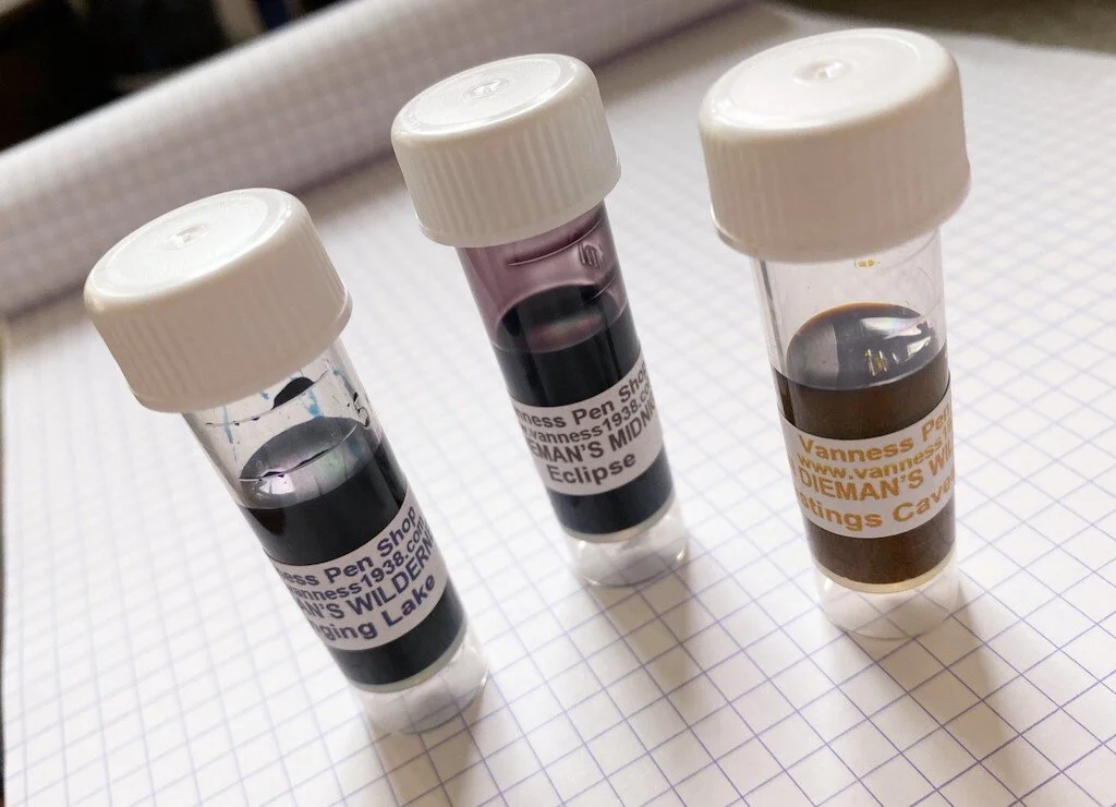
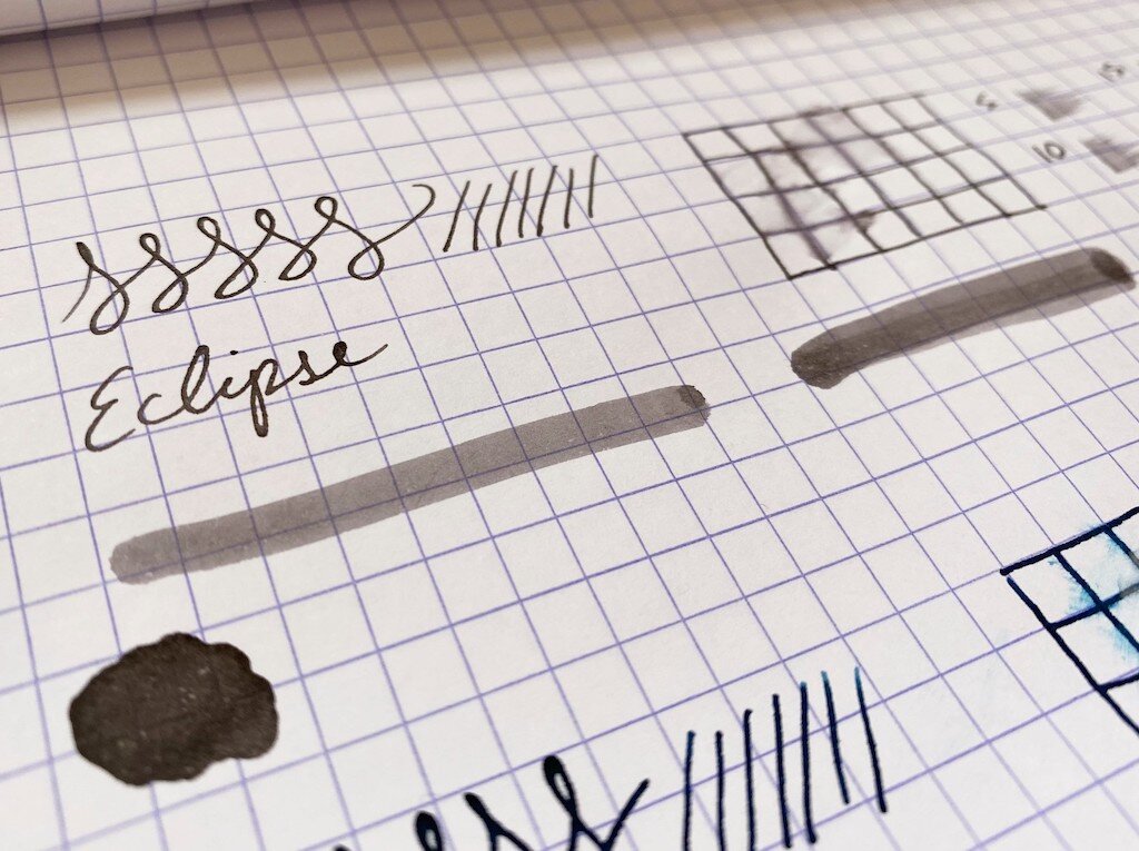
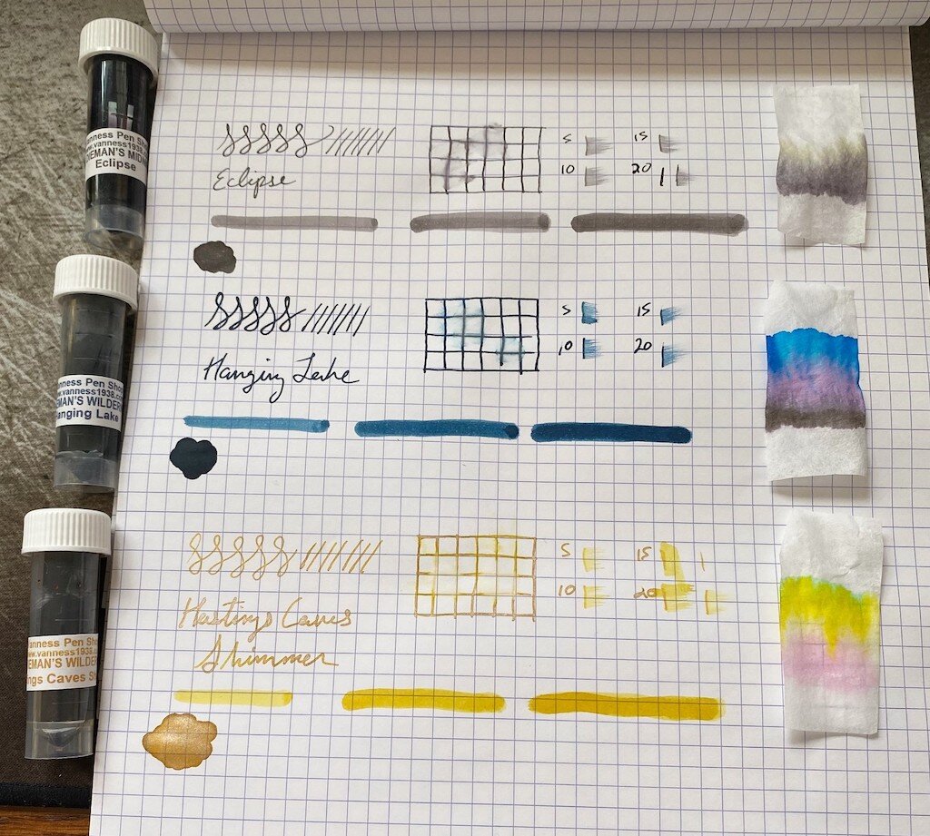
First up is Eclipse. Looking at the sample, one might ask, "Is it grey? Brown? Purple?" And really, the answer is yes. I love mysterious colors that can't quite be pinned down, and this one has some great complexity to it. It's like a warm, smokey color that doesn't come across well in pictures. The chromatography shows a bit of its character, especially in that gold hue that gives it its warmth. This ink behaved very well, though it had a longer dry time. It doesn't show much shading, but it does have a little bit of water resistance. By far its best characteristic is its way of looking like completely different colors in different lighting.

Van Dieman's Hanging Lake
Van Dieman's Hanging Lake Chromatography

Next is Hanging Lake, a gorgeous, slightly ominous navy. This is a very saturated color, rich and deep, with some great complexity. Grey, rose, and cobalt blue show up in the chromatography. It also has a long dry time, but it does show some shading on longer pen strokes. It was quite water resistant in the drip test, with all lines still visible, regardless of whether the water was dabbed or wiped away. This is a very professional looking blue. With its ability to withstand spills, it would be great for office or school use.

Van Dieman's Hastings Lake
Van Dieman's Hastings Lake Chromatography

Last but not least is Hastings Caves Shimmer. Like the shimmers I tested in part one, the particles in this ink require regular, vigorous agitation to remain suspended. They settle quickly and need some encouragement to disperse themselves back into the liquid. But once that is achieved, it's a really gorgeous color. The ink itself is a gold tone, with brass-colored shimmer that gives it an antique gold look. Chromatography shows a surprising progression, from pale pink to saffron yellow, to a touch of almost teal that I can't really explain. The shimmer is very pronounced in the lines, so long as you make sure to agitate the ink before writing. Like the other shimmers, I'd recommend using this in a pen that can be easily and thoroughly cleaned, because those particles settle like river sediment and I'd be a little worried about what they might do to a feed. This color did not have any water resistance, and had a long dry time.

Van Dieman's Hastings Lake Swirl

My biggest takeaway from this line of inks is that the creators are dedicated to complex color recipes. Chromatography isn't usually this exciting, but every sample was like a fireworks display, with surprising colors creeping out of each of them. While I think some of the samples are better suited to fountain pens than others, there are some fantastic, unique colors in this lineup. With all the ink colors out there in the world, I'm always amazed when a new one arises, with no look-alikes. This is a great line for experimenting with some fun, new tones.

(Vanness Pens provided this product at no charge to The Pen Addict for review purposes.)


Enjoy reading The Pen Addict? Then consider becoming a member to receive additional weekly content, giveaways, and discounts in The Pen Addict shop. Plus, you support me and the site directly, for which I am very grateful.

Membership starts at just $5/month, with a discounted annual option available. To find out more about membership click here and join us!

Van Dieman's Ink Samples
Posted on January 21, 2021 and filed under Van Dieman's, Ink Reviews.