Posts filed under Paper Reviews

Foglietto Memo Cards and Archive Box Review

(Kimberly (she/her) took the express train down the fountain pen/stationery rabbit hole and doesn't want to be rescued. She can be found on Instagram @allthehobbies because there really are many, many hobbies!.)

I saw these cool Foglietto Memo Cards on Brad’s Twitch stream a while back and bugged the Bossman to send these to me for review. Even though I’m not a big index card user, I’ve embarked on a mission, albeit a very slow one, to find fountain pen-friendly index cards since our beloved Nock Co. index cards aren’t available anymore (sniff sniff).

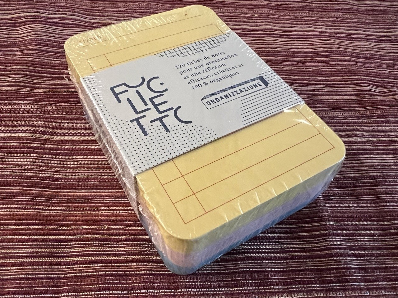
Despite its Italian name (Foglietto means leaflet in Italian), Foglietto is actually a French stationery company that started in 2019 and their products are now sold in many European countries as well as North America. Up for review today is a pack of the Foglietto A7 Memo Cards and the Archive Box in Terracotta.

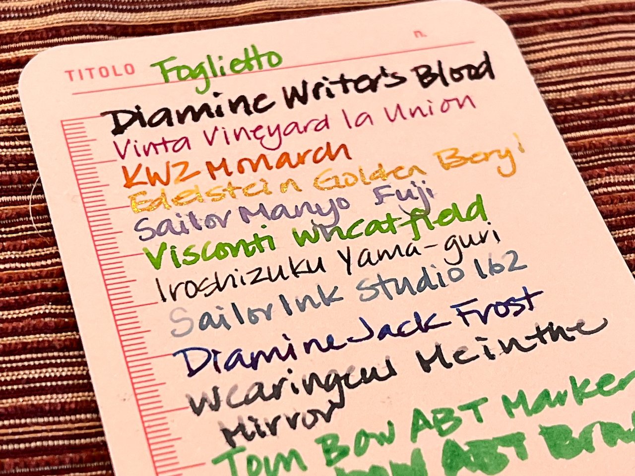
Each pack of A7 note cards contains 120 cards (this pack has 40 each in yellow, pink, and blue). They also come in a variety of styles like dot grid, grid, to do, blank, mixed, etc. The pack I have is the Organizzazione (which means Organization in Italian). The tops of each of the cards says “Titolo” (Title) and each color has a different layout. The yellow card is a to-do list, pink is plain with metric measurements on the side/bottom and blue is dot grid.

Foglietto Memo Cards

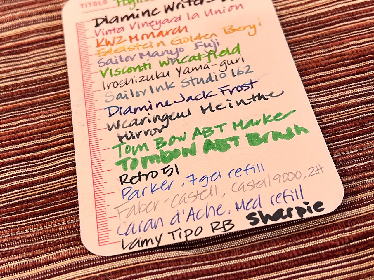
The cards are 260 gsm so they have a nice heft to them; slightly thicker than the typical index card, thinner than a playing card. There is a slight texture to them which I noticed with my finer nibs (like the Sailor 21k Fine). Overall, the cards held up moderately well to fountain pens, though the notoriously wet Diamine Writers Blood feathered quite a bit. Shimmer and shading were pretty much unaffected but the sheen of Diamine Jack Frost was diminished on all the cards (and Rhodia too). I was surprised to see a little of the chromashading properties from Sailor Manyo Fuji, especially on the yellow card. There was also zero ghosting or bleedthrough, not even from a Sharpie.

Foglietto Memo Cards

It really did not like the wet Diamine Writers Blood, but look at the purple and blue shading of the Sailor Manyo Fuji!

Foglietto Memo Cards

Standard pens and markers did fine on the cards. Even the pencil was readable.

Foglietto Memo Cards

The pink held up to the Diamine Writers Blood better than the yellow.

Foglietto Memo Cards

My least favorite color card to write on was the blue because the colors are much flatter and my 2H pencil was almost impossible to read on it. While FP inks did pretty well, none of them had problems with other writing implements either. And while FPs are my preferred instrument of choice, I was surprised to find that I enjoyed using the Lamy Tipo and Retro 51 rollerballs the most on these cards.

Foglietto Memo Cards

I didn’t love the inks on the blue cards.

Foglietto Memo Cards

And the pencil is almost unreadable.

Foglietto Memo Cards

Color comparison against Rhodia 80 gsm DotPad.

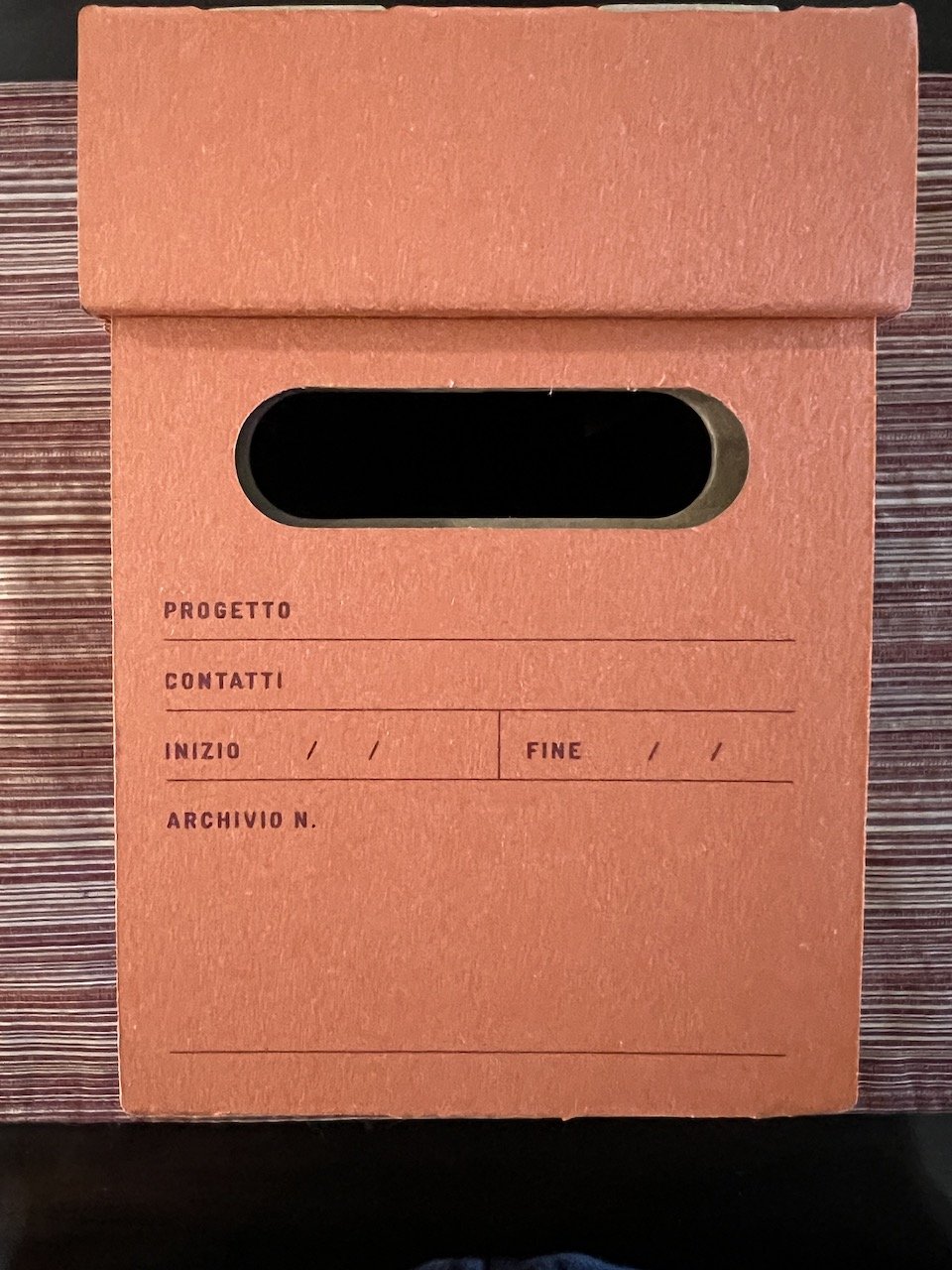
The Archive Box is made from cardboard, measures 118mm x 80mm x 200mm (~4.75”x 3.5” x 8.5”) and stores about 4 packs of A7 note cards. It comes in other colors including grey and green and costs 10GBP (~$12 USD).

Foglietto Storage Box

Different sides of the Archive Box.

Foglietto Storage Box

It is a lightweight box; you can see where it was dinged from mild usage.

Pros:

  • Fairly FP-friendly
  • No ghosting or bleedthrough
  • Good variety of card options
  • Box is fairly sturdy for being lightweight

Cons:

  • Finer nibs (especially anything finer than Japanese Medium) may catch on the cards
  • Wetter inks will likely bleed
  • Blue cards made ink colors look duller and pencil was harder to read
  • Price is a bit steep for 120 cards (18GBP or ~$22USD). For context, a pack of 80 larger Hamelin cards costs ~$7 and a 100 pack of 5x3” index cards from Exacompta costs ~$4.

Neutral:

  • Card sets seem to be sold in multi-colored packs. This may be good if you like a mix of colors or an annoyance if you only like or want certain colors.

Overall, these cards work well, and while they are pricey, they have a neat aesthetic to them, especially when paired with the Archive Box.

(Disclaimer: The Foglietto cards and archive box were purchased from Nero’s Notes at regular price for review. All other products used are my own.)

Posted on January 13, 2023 and filed under Foglietto, Notecard, Index Card, Paper Reviews.

Yamamoto Paper Cosmo Note Notebook Review

Yamamoto Paper Cosmo Note Notebook Review

(Sarah Read is an author, editor, yarn artist, and pen/paper/ink addict. You can find more about her at her website and on Twitter. And check out her latest book, Out of Water, now available where books are sold!)

The Yamamoto Paper Cosmo Air Light is known for its ability to make inks look their best, but every time I use it, I'm surprised at how well it works. Inks stand out so well on this paper that it makes me want to keep writing, even when I've run out of things to write.

This notebook from Yamamoto packages that experience in a nice, no-fuss minimalist book that ticks all of the boxes for a paper enthusiast.

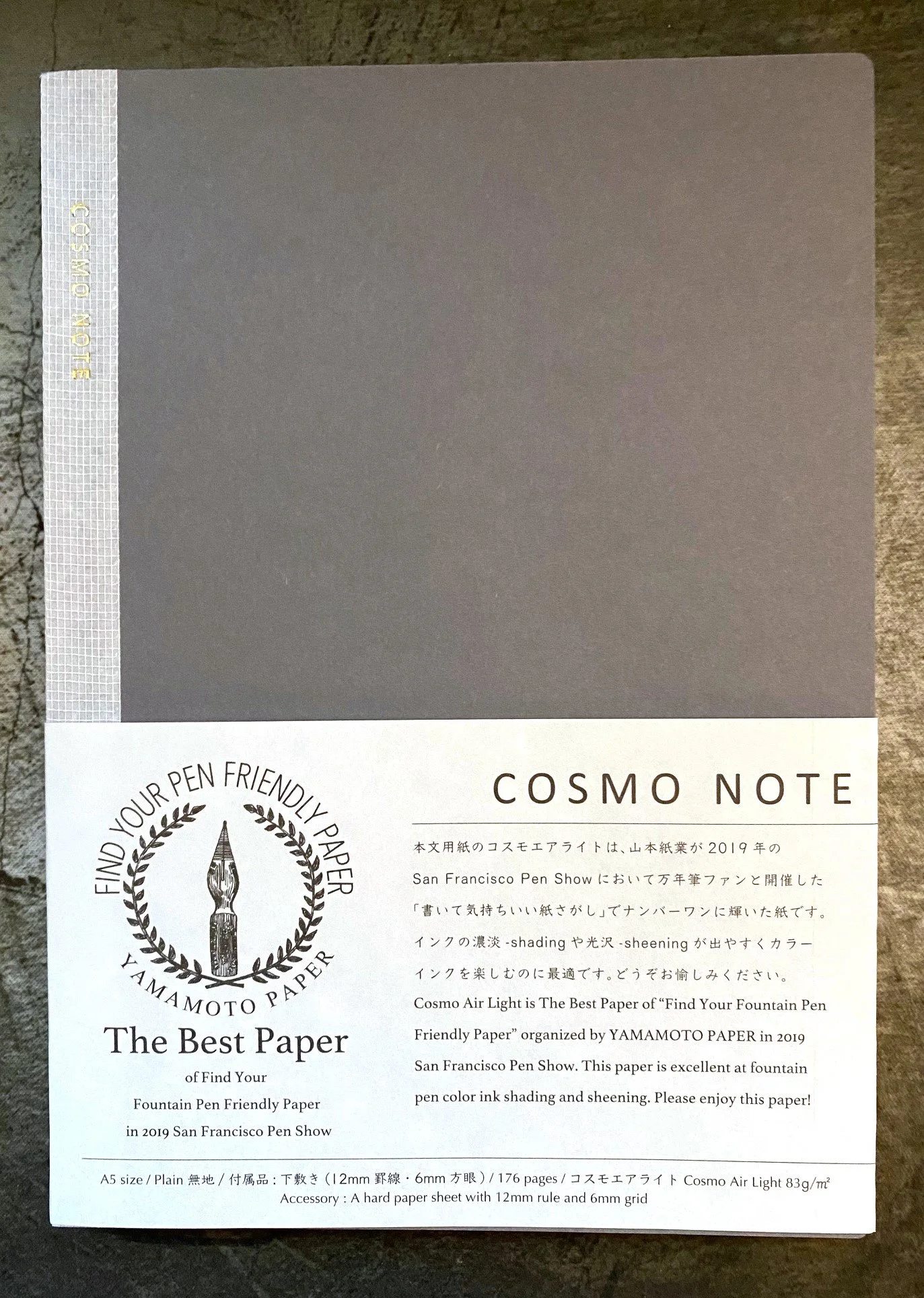
Yamamoto Paper Cosmo Note Notebook
Cosmo Air Light

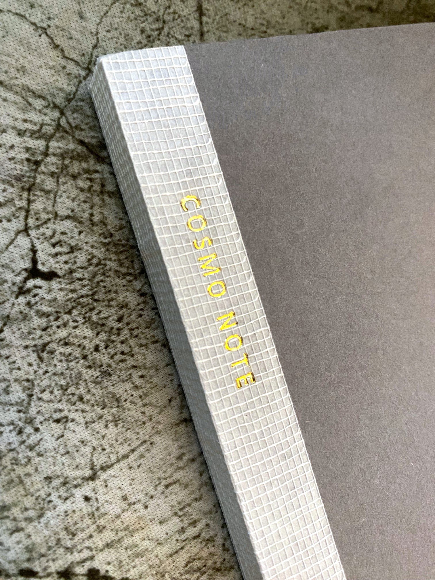
The cover is a plain, grey cardstock that is flexible but sturdy enough to be a writing surface when needed. It's begging to be decorated with stickers, washi, or your own artwork. The spine is bound with a fabric tape with a minimalist brand stamped into the fibers. The sewn binding allows it to lay flat after a bit of training.

Insisde there are cardstock endpapers, and then 176 pages of excellent plain paper. There are no lines or words or numbers--it's just an open world of possibility. There is a line guide sheet included, which offers a 6mm grid or 12mm line if held behind the page you're using. This way, every page can be exactly the format you need, whether you're sketching, writing, or taking notes.

Cosmo Air Light

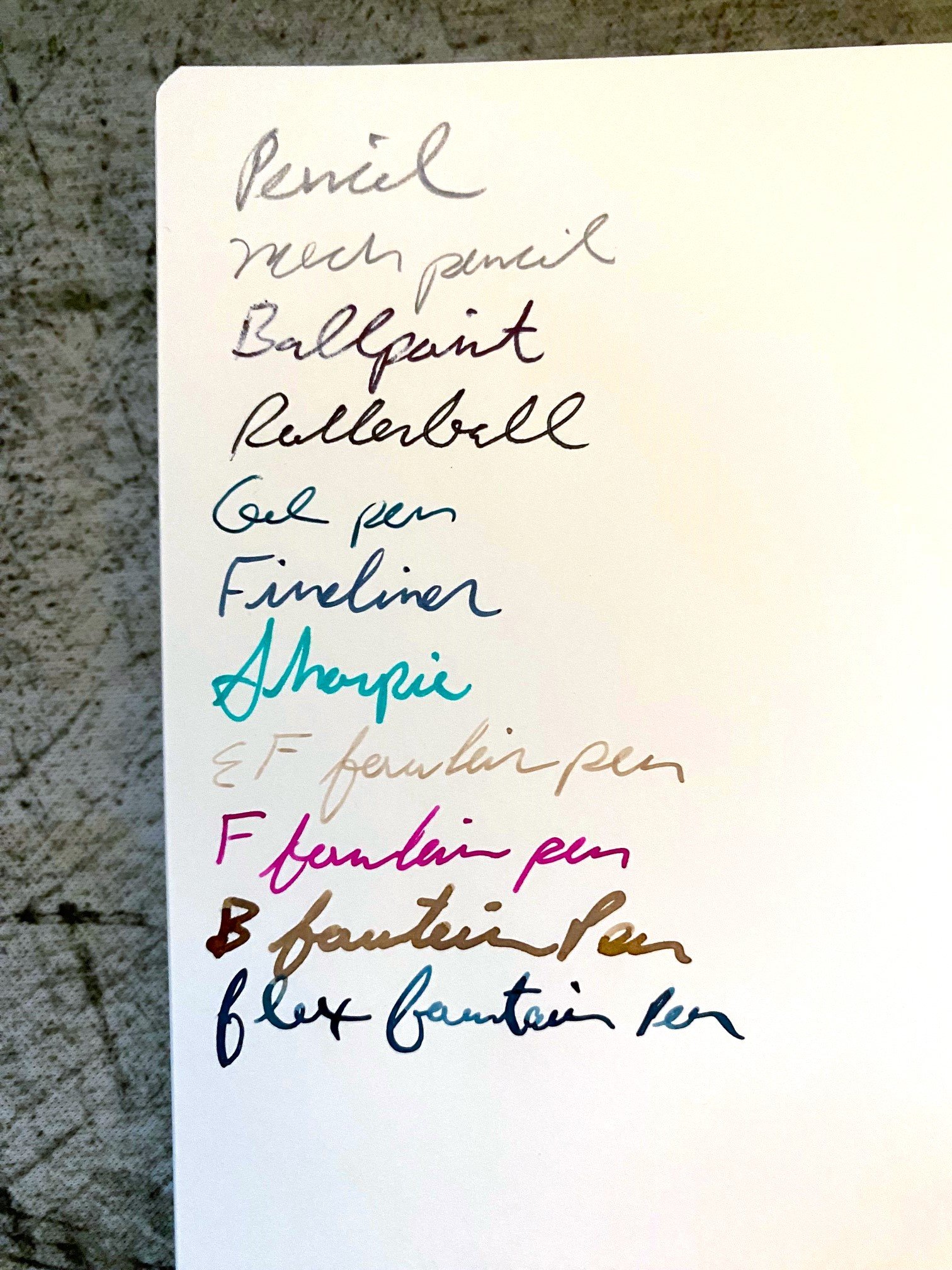
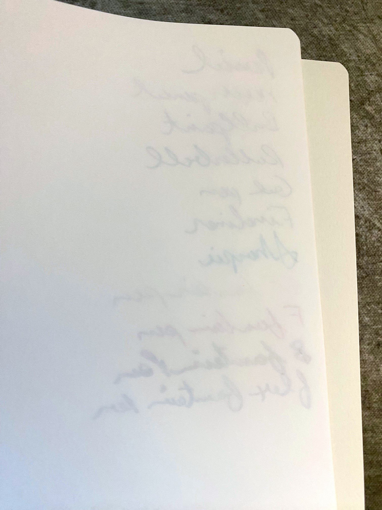
The paper is what really makes this notebook. Not everyone likes the texture of Cosmo Air Light (Brad), but there's no denying the way it makes ink stand out. If you want to show off shading or sheen, this is the best option out there, in my opinion. The cushy texture of the page is exacerbated by fine point pens, but medium and broad tips glide over it with no problem at all, which are generally what one uses when showing off ink properties, anyway. It also works fabulously with pencil, ballpoint, rollerball, gel, fineliners, even Sharpie--pretty much anything you want to write with. It's a finer, 83gsm paper, so there is ghosting, but not even the Sharpie bled through--not even a dot. The paper does have a long dry time, though, so patience or a sheet of blotting paper are required.

Cosmo Air Light

I've really enjoyed using this notebook. There's nothing extra about it--it's just a plain cover holding together a generous chunk of very nice paper. It's not too "nice" to use. The minimalism is inviting and utilitarian, and I find I keep reaching for it.

It's not inexpensive at $21, especially for a softcover notebook. But you do get a good page count for that price, so I don't think it's asking too much. There are certainly less expensive notebooks with paper that is almost as good, but the emphasis is on "almost." This is paper for ink lovers. Ink lovers with lots of writing to do.

(This notebook was purchased from Yamamoto Paper at the 2022 San Francisco Pen Show at regular price.)


Enjoy reading The Pen Addict? Then consider becoming a member to receive additional weekly content, giveaways, and discounts in The Pen Addict shop. Plus, you support me and the site directly, for which I am very grateful.

Membership starts at just $5/month, with a discounted annual option available. To find out more about membership click here and join us!

Cosmo Air Light
Posted on December 15, 2022 and filed under Yamamoto, Cosmo Air Light, Paper Reviews.

Currently Inked on Ayush Paper and Sakae TP Iro-ful

(Kimberly (she/her) took the express train down the fountain pen/stationery rabbit hole and doesn't want to be rescued. She can be found on Instagram @allthehobbies because there really are many, many hobbies!.)

I have been meaning to try Ayush Paper after getting a pad for review from Vanness Pens and then last week I just got a sample of Sakae’s new paper and I thought, it’s a sign! Let’s try them both out! I’m not going to go into the Ayush Paper too much since Susan already wrote an excellent review of it last year. But, just so I wasn’t biased, I deliberately did not read it until I finished using it.

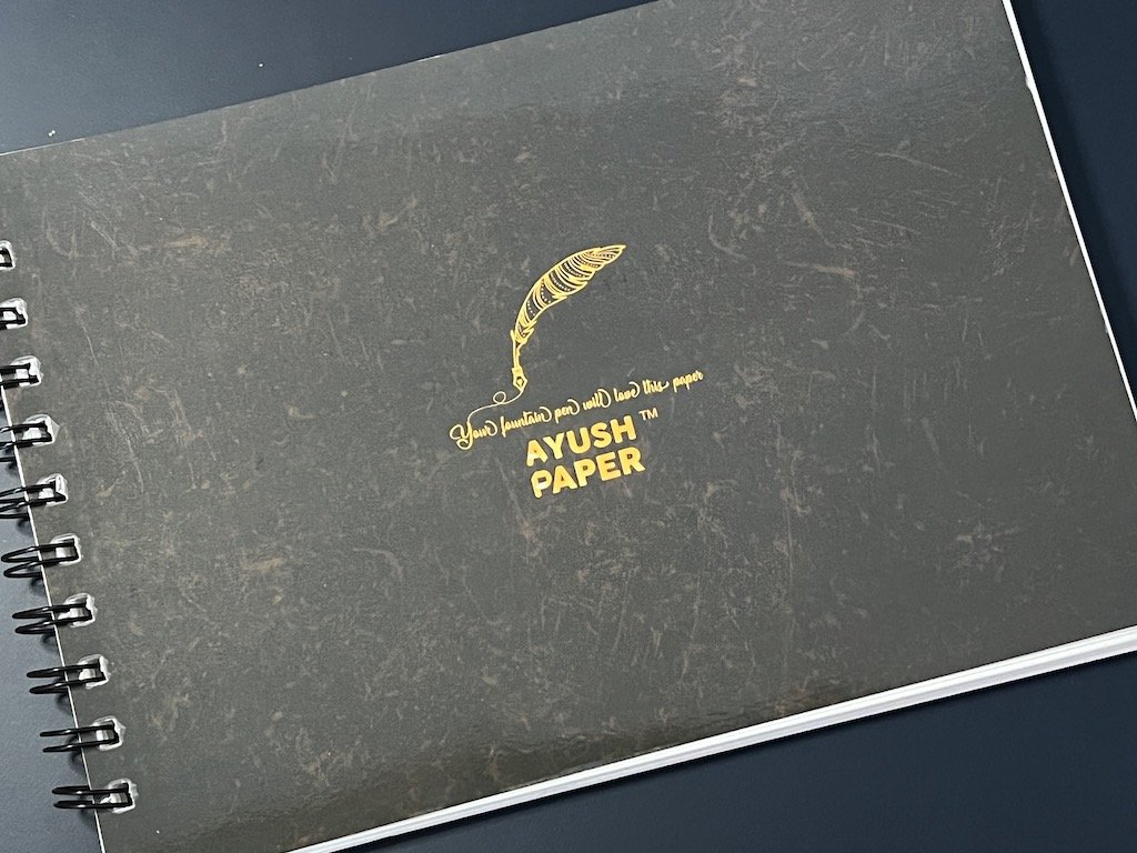
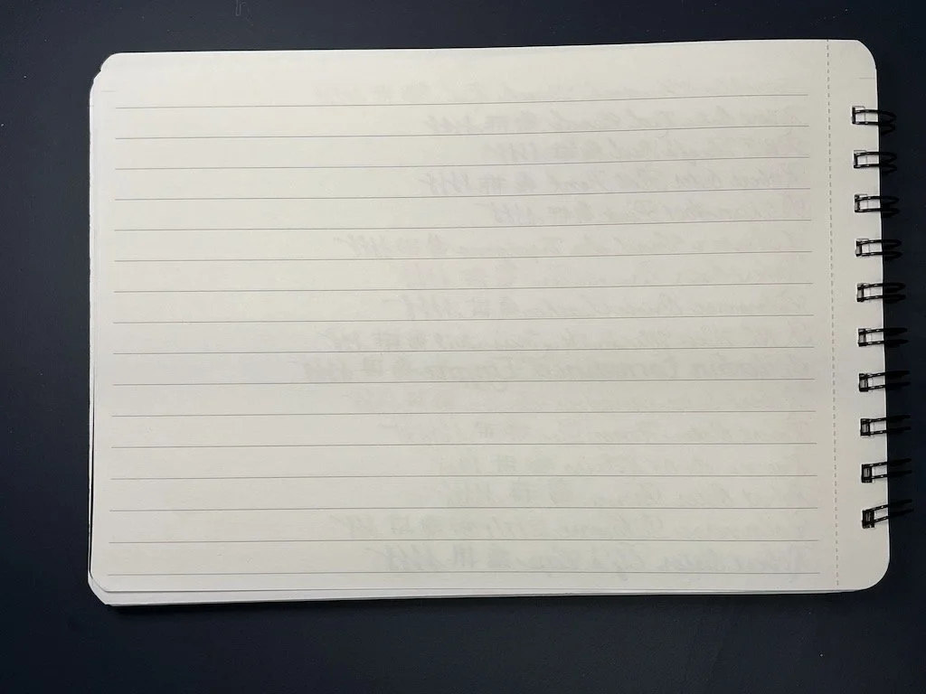
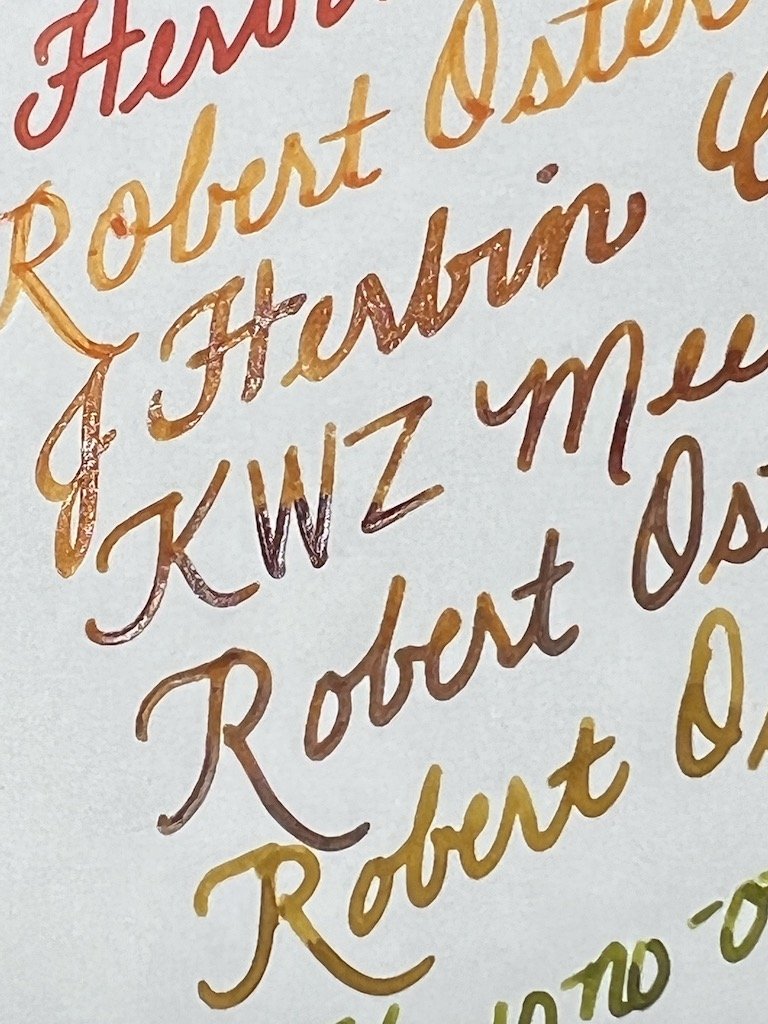
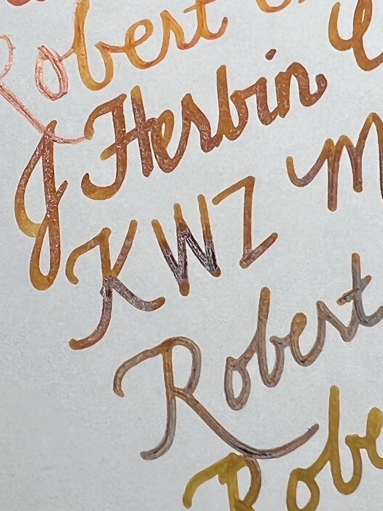
The Ayush Paper I used for this review is from an A5-sized, lined, 100gsm paper that is spiral bound in a landscape orientation. The paper held up well to 32 different pens/inks, ranging from near needlepoint to broad nibs, stubs and even flex. There was no feathering, ghosting or bleedthrough on the other side which means you can definitely use both sides. The paper has a slight toothy texture to it, without any of the nibs catching on the paper. Shimmer from J Herbin Cornaline d’Egypte presented no problems, and both saturated and shading inks looked great on Ayush Paper. I was a little surprised to see some of the subtleties in inks like Robert Oster Bronze, which I had always assumed was “just” an olive green ink, but it actually shows a touch of brown on this paper. Sheen was also not a problem and showed up nicely.

Ayush Paper

Why yes, my fountain pens did love this paper!

Ayush Paper
Ayush Paper
Ayush Paper

Shimmer and shading inks both look great on this paper.

Ayush Paper

No ghosting or bleedthrough either, even with the super wet flex.

I repeated the same exercise on Sakae TP (Technical Paper, not toilet paper, for those of you who are 12 and had that same initial thought as I did, lol) Iro-ful. Sakae’s Iro-ful webpage doesn’t have a lot of information on it, but says that it will perform well with color, vibrancy and showing off sharp lines. In addition it also has a “softer, gentler texture”, but softer and gentler than what, I have no idea. Iro-ful is 75gsm paper and is available in A4 and A5 loose sheets with a notebook currently in the works.

While writing on the Iro-ful, I couldn’t help but think that the sensation felt familiar. It definitely did not feel like Tomoe River, but rather, it felt slightly squishy, and it instantly reminded me of the Pen Addict Review (P.A.R.) that Brad did recently about Cosmo Air Light from Yamamoto Paper. In it, he said:

Describing Cosmo Air Light is challenging, because it feels like each single page is made from layers: firm on both sides, squishy in the middle.

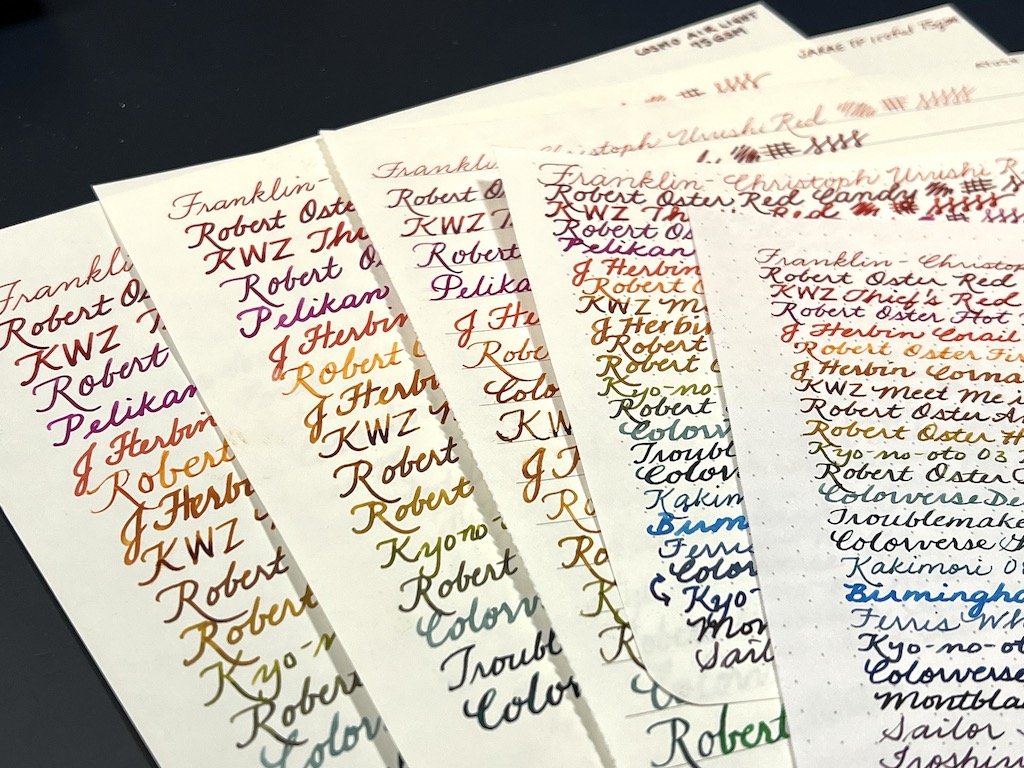
And that is the same sensation I felt when writing on the Iro-ful. It is definitely fountain-pen friendly, produced nice lines and handled sheening, saturated, shading and shimmer inks like a champ with no ghosting or bleedthrough. I hadn’t intended to compare this to Cosmo Air Light 75 gsm but its similarity in feel to Iro-ful compelled me to find how similarly they handled fountain pens.

Sakae TP Iro-ful

A playful design for the Iro-ful paper.

Sakae TP Iro-ful
Sakae TP Iro-ful

The Iro-ful 75 gsm paper holds up great to a variety of inks and nibs.

Sakae TP Iro-ful

Move along, nothing to see here (on the back.)

Sakae TP Iro-ful

Both shimmer and shade look good on this paper.

Sakae TP Iro-ful

Sheen also looks good, I mean, look at that LDL!

Cosmo Air Light

Cosmo Air Light 75 gsm behaving just as well as the Iroful.

Cosmo Air Light
Cosmo Air Light

Both feel very similar to the touch in terms of weight and texture/smoothness. I was easily able to use a guidesheet under both papers. The color of the paper is also very similar - slightly off-white. My writing felt and looked the same on both papers. If I didn’t know better, I would have guessed they are the same paper, though CAL is ever so slightly smoother than Iro-ful, but both feel slightly rougher than Tomoe River but less so than the Ayush.

Just for funsies and because I really needed to write some of these pens dry, I also wrote on Rhodia 80gsm Dotpad as well as 68 gsm Tomoe River paper. Here are some comparison photos.

Rhodia Dot Pad

Rhodia DotPad.

Tomoe River 68

68 gsm Tomoe River.

Tomoe River 68
Paper Whiteness

Rhodia is the whitest paper of the bunch, followed very closely by white TR 68, then Ayush and both the Cosmo Air Light 75 and Iroful being the most off-white without being cream.

Writing samples

I just love all this color!

If you really like Tomoe River, whether 52 or 68 gsm, you may not enjoy the Ayush paper as much because it is (1) a fair bit thicker and (2) has some slight tooth to it. I think it works best for medium and broader nibs as well as those that are more “buttery” because of the toothiness, which can help your nibs feel like they aren’t sliding all over the place. And for different reasons, if you are a TR fan, you may also not enjoy the Sakae TP’s Iro-ful (or Yamamoto’s Cosmo Air Light) because it isn’t as smooth as TR and has a bit of a squishy feel to it. Both Ayush and Iro-ful are great additions if you are more paper-agnostic like me and are happy to discover more options for good, fountain-pen friendly paper that show off ink properties well.

Ayush Paper is available in different sizes, formats and in dot, lined and blank formats, with most prices in the ranging from $7 to $17 USD range. Sakae TP Iro-ful will be available soon (if it isn’t already) on the Vanness website in 100 - A5 looseleaf sheets or 50 - A4 sheets for $14 and $15 respectively

(Thank you to Vanness Pens who provided both the Ayush Paper and Sakae TP Iro-ful at a discount to The Pen Addict for review purposes. The other papers were purchased by me years ago.)

Posted on June 24, 2022 and filed under Ayush Paper, Sakae, Paper Reviews.