Posts filed under TWSBI

TWSBI Diamond 580 ALR Prussian Blue with Mark Bacas Predator Grind: A Review

TWSBI Diamond 580 ALR Prussian Blue with Mark Bacas Predator Grind: A Review

(Susan M. Pigott is a fountain pen collector, pen and paperholic, photographer, and professor. You can find more from Susan on her blog Scribalishess.)

Last week I reviewed the TWSBI Diamond 580 in Smoke and Rose Gold with an EF nib. So, why, you might ask, am I reviewing another 580 this week? Well . . . first, because the Prussian Blue has some distinct stylistic differences from the 580 in Smoke and Rose Gold, and second, because this 580 boasts a specialty grind by Mark Bacas.

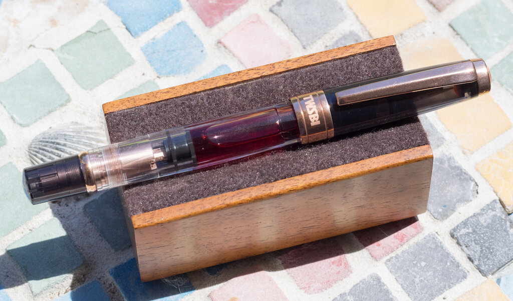
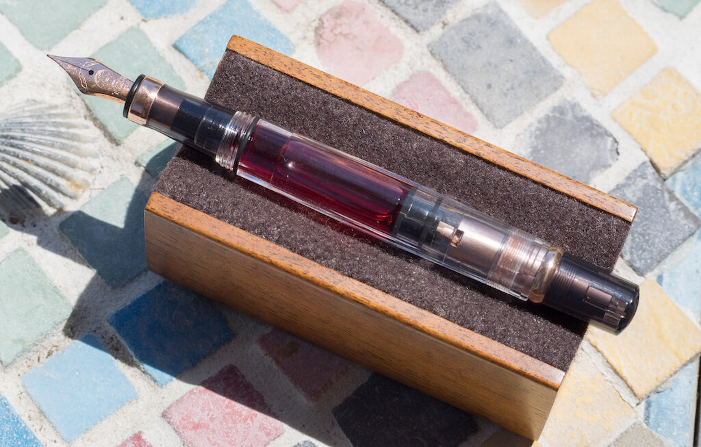
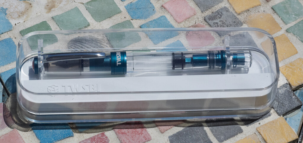
I’ll start by discussing the Prussian Blue version of the Diamond 580 and how it is distinct from the Smoke and Rose Gold. The Prussian Blue arrives in the same plastic TWSBI box.

TWSBI Diamond 580 ALR Prussian Blue Review

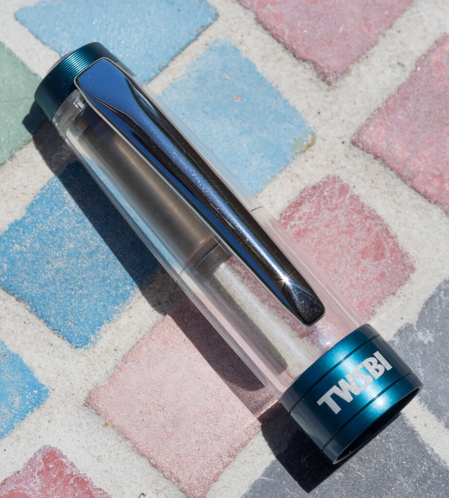
The aluminum trims on the pen have a dark teal matte finish which is still shiny but in a subtle way.

One thing I don’t like about this version of the 580 is that the clip is plain silver rather than the gorgeous Prussian blue color. I wish they had matched the clip like they did on the Rose Gold.

TWSBI Diamond 580 ALR Prussian Blue Cap

Unlike the Rose Gold 580, the cap finial and grip are machine-grooved. This gives the finial a special look and provides texture on the grip for your fingers.

TWSBI Diamond 580 ALR Prussian Blue Finial
TWSBI Diamond 580 ALR Prussian Blue Grip

Although the Prussian Blue is the same size as the Rose Gold 580, it weighs slightly less: 27 grams capped, with no ink, 17.9 grams inked and unposted. The grip diameter is just a smidge larger at 11 mm. Like the Rose Gold 580, Prussian Blue holds 1.8 ml of ink and is a piston filler.

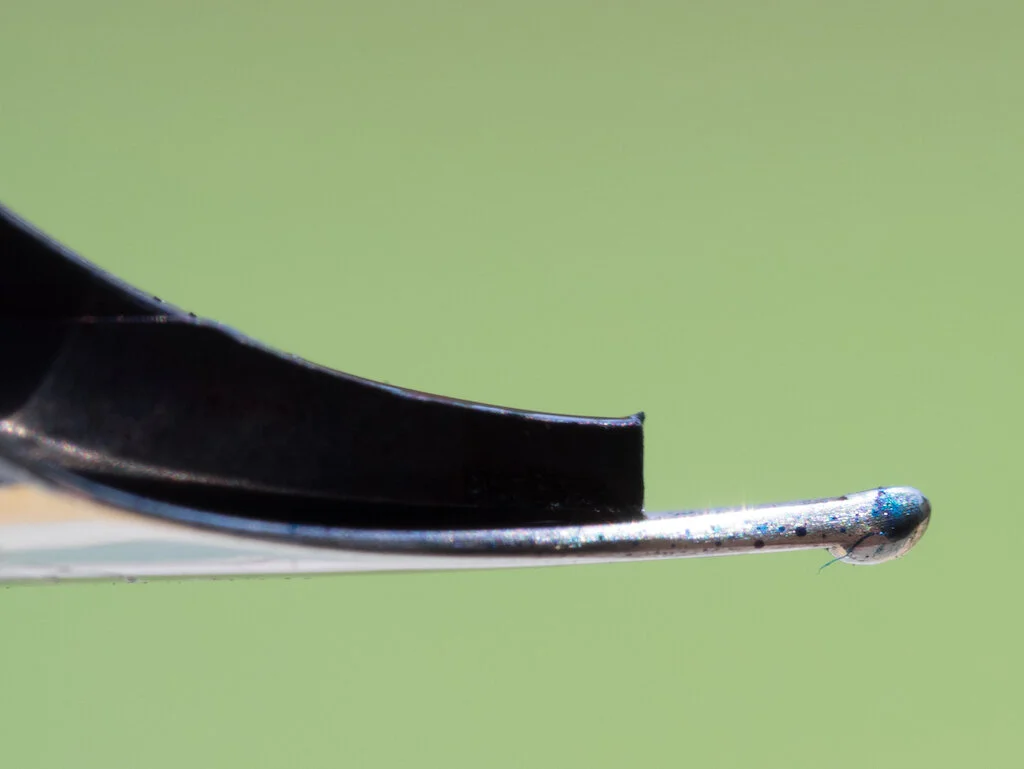
I purchased my TWSBI Diamond 580 in Prussian Blue from Mark Bacas (nibgrinder.com) and requested a Predator grind. The Predator is created from a broad nib. It is ground so that when the pen is held normally, you get an extra fine line. When you hold the pen upside down, you get a medium to broad line. It is similar to a Sailor Cross Concord but without the doubled nib.

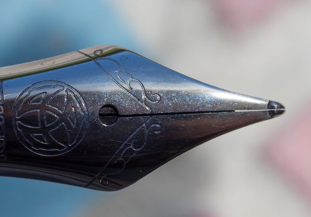
Here are several photos showing the Predator grind from various angles:

Marc Bacas Predator Grind
Marc Bacas Predator Grind Nib
Marc Bacas Predator Grind Side View
Marc Bacas Predator Grind Side Upside Down
Marc Bacas Predator Grind Front

This nib grind is so much fun! The EF point is smooth and creates lovely delicate lines. Writing examples follow:

Marc Bacas Predator Grind EF Point
Marc Bacas Predator Grind EF Lines

The B point offers substantive line width (it’s not so broad that its unusable for writing) and you can use it for both cursive and print writing.

Marc Bacas Predator Grind B Point
Marc Bacas Predator Grind B Lines

I created a mandala using this nib and Sailor Yama-dori ink. It’s really great for artwork because you can create super fine lines and use the other nib side for broad lines or for filling in.

Marc Bacas Predator Grind Mandala

The fact that you can get this grind on a TWSBI 580 with its huge ink capacity makes this nib more practical than the Sailor Cross Point (which only comes on Sailor pens with tiny converters). Plus, it’s almost impossible to find Sailor Cross Point nibs anymore, and if you can, they are very expensive.

You can purchase this pen from Mark Bacas for $60 (if he still has some in stock; if not, he carries other TWSBI models). The Predator grind is an additional $50.

(I purchased this TWSBI Diamond 580 in Prussian Blue with the Predator grind with my own funds.)


Enjoy reading The Pen Addict? Then consider becoming a member to receive additional weekly content, giveaways, and discounts in The Pen Addict shop. Plus, you support me and the site directly, for which I am very grateful.

Membership starts at just $5/month, with a discounted annual option available. To find out more about membership click here and join us!

Predator Mandala
Posted on July 3, 2020 and filed under TWSBI, Nib Grind, Mark Bacas, Pen Reviews.

TWSBI Diamond 580 Smoke and Rose Gold Fountain Pen: A Review

TWSBI Diamond 580 Smoke and Rose Gold Fountain Pen: A Review

(Susan M. Pigott is a fountain pen collector, pen and paperholic, photographer, and professor. You can find more from Susan on her blog Scribalishess.)

I own several TWSBI fountain pens, from the TWSBI Mini to the Eco to the 580, and all of them have been excellent. I’ve enjoyed the different colors that TWSBI offers (usually leaning towards the blue ones, of course), but I don’t think I would have considered the TWSBI Diamond 580 in Smoke and Rose Gold for myself. The photographs I’ve seen didn’t make the color combination look all that interesting. I am so glad JetPens sent the Smoke and Rose Gold for review, because this is a gorgeous fountain pen in person. I hope my photos can do it justice.

TWSBI Diamond 580 Smoke and Rose Gold Fountain Pen Review

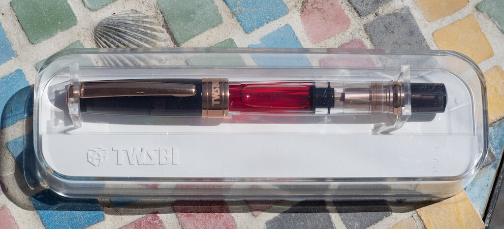
The pen arrives in typical TWSBI packaging--a brown outer cardboard box and an inner plastic display case. (Um . . . the pen doesn’t really arrive already inked--I forgot to take pictures of it before I inked it!)

TWSBI Diamond 580 Smoke and Rose Gold Fountain Pen Packaging

Nestled beneath the white plastic stand you’ll find a TWSBI branded wrench (for removing the piston mechanism for cleaning and lubing) and a tiny bottle of silicone gel.

TWSBI Diamond 580 Smoke and Rose Gold Fountain Pen Tools

The 580 is a medium-sized pen, measuring 5.5 inches/140 mm capped, 5.1 inches/130 mm uncapped, and 7 inches/177 mm posted. The grip diameter is 10.4 mm. Un-inked and capped, the pen weighs 30 grams. Unposted and inked it weighs 18.2 grams, so it’s a fairly heavy pen due to the metal piston and trims. I find it well balanced and comfortable unposted. Posted it becomes too unwieldy.

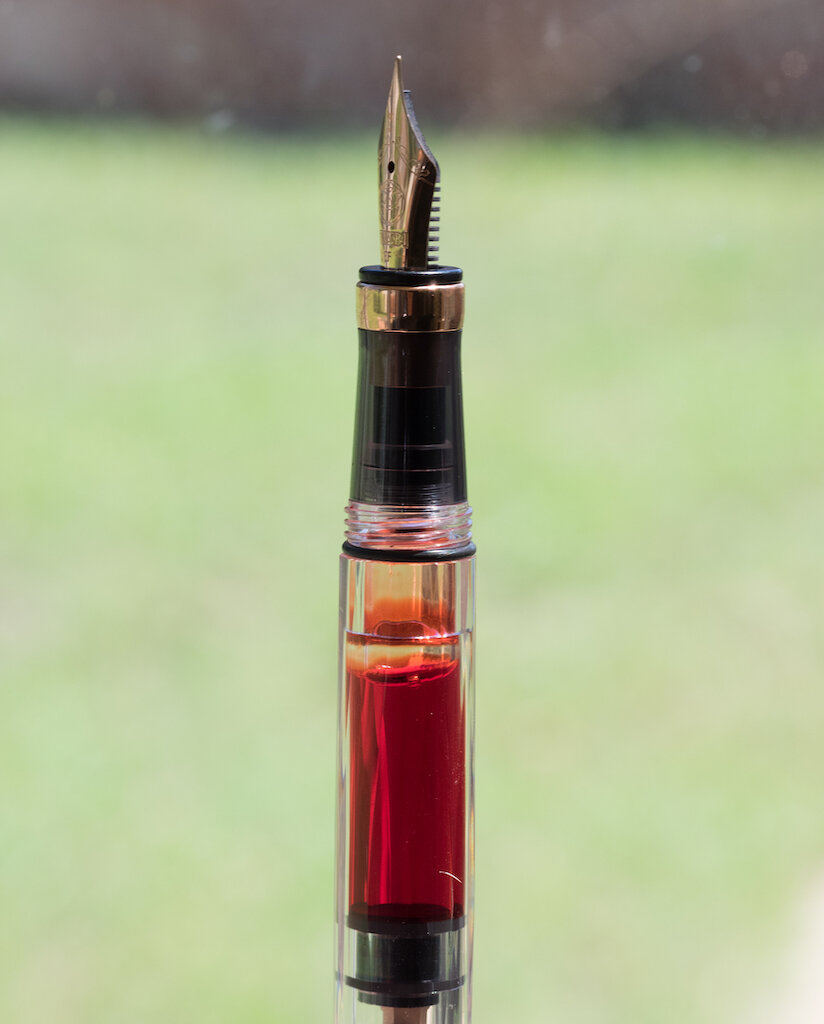
The pen is quite beautiful with rose gold trims from top to bottom--even the inner piston mechanism is rose-gold plated.

TWSBI Diamond 580 Smoke and Rose Gold Fountain Pen Piston

The cap, grip, and piston knob are translucent smoke colored--and this is really what makes the rose gold stand out. The faceted barrel is clear allowing your ink color to show through.

TWSBI Diamond 580 Smoke and Rose Gold Fountain Pen Cap
TWSBI Diamond 580 Smoke and Rose Gold Fountain Pen Grip

The only thing that detracts from the beauty, in my opinion, is the red TWSBI finial on the cap. There’s just something about bright red that clashes with rose gold, but I realize that changing the finial color to please me probably isn’t a priority for TWSBI.

TWSBI Diamond 580 Smoke and Rose Gold Fountain Pen Finial

The 580 is a piston filler that holds a glorious 1.8 ml of ink. Originally, I inked my pen with Robert Oster Sushi, and I loved how the ink complemented the rose gold on the pen. I switched over to Bungubox 4B for this review to test the pen with a wetter ink.

TWSBI Diamond 580 Smoke and Rose Gold Fountain Pen Ink

My pen came equipped with an extra fine nib. I’m more of a stub/italic gal, but this EF nib writes smoothly and I’m enjoying using a much more delicate nib point. The nib is steel with rose gold plating. It is decorated with some scrollwork, the TWSBI logo, the TWSBI name, and the nib size.

TWSBI Diamond 580 Smoke and Rose Gold Fountain Pen Nib

Although I haven’t had any problems writing with the nib, my macro shots reveal tines that look misaligned--almost twisted.

TWSBI Diamond 580 Smoke and Rose Gold Fountain Pen Nib Close-up

Maybe this is just due to some extra tipping left behind on the top of one of the tines, making them look misaligned. I’m not sure.

TWSBI Diamond 580 Smoke and Rose Gold Fountain Pen Nib Macro

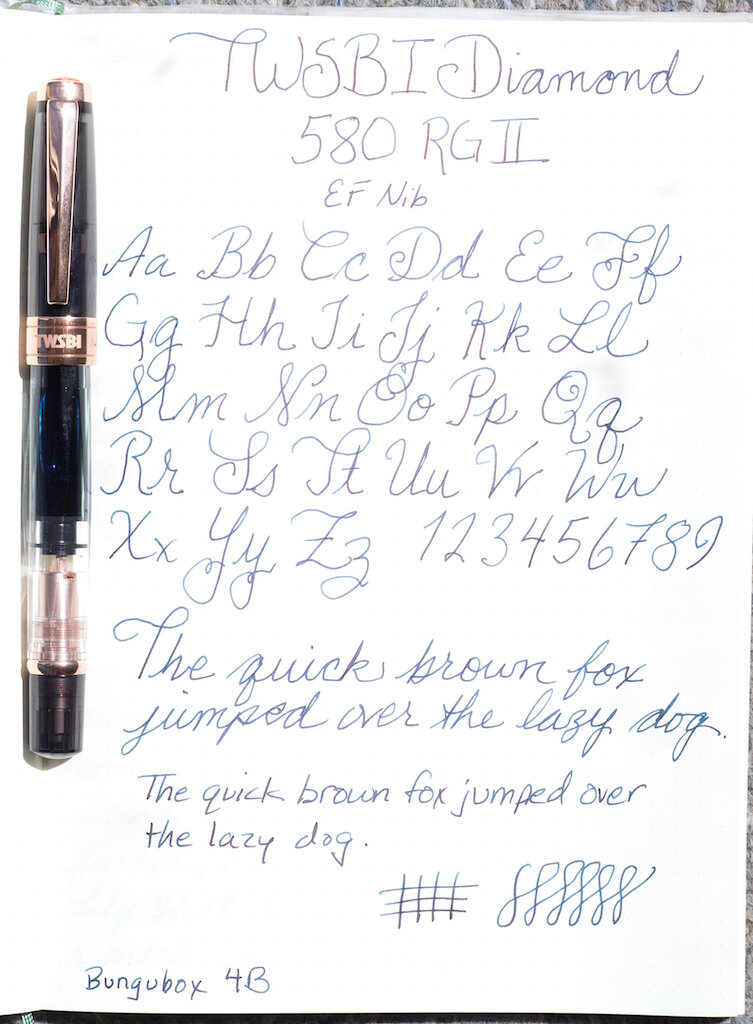
Inked with Bungubox 4B, the nib writes a smooth line, obviously without any line variation due to the fineness of the nib.

TWSBI Diamond 580 Smoke and Rose Gold Fountain Pen Writing
TWSBI Diamond 580 Smoke and Rose Gold Fountain Pen Macro Writing

Writing long passages was pleasant and trouble free. I encountered no hard starts, scratchiness, or skipping despite the strange looking tines.

TWSBI Diamond 580 Smoke and Rose Gold Fountain Pen Writing Close-up

The EF nib was perfect for creating this delicate mandala (pictured also in last week’s review of Robert Oster Sushi ink).

TWSBI Diamond 580 Smoke and Rose Gold Fountain Pen Mandala

As I said at the beginning of the review, I have not experienced any problems with my TWSBIs so far. I think these pens are a terrific value for the price, and they are built solidly. However, I know from reading other reviews and discussions on fountain pen forums that quality control can be an issue for TWSBI fountain pens. Some customers complain about cracks in the plastic, poor nib quality, scratches, and other issues (such as unhelpful customer support). I hope that most TWSBI customers have a positive experience with the brand, as I have.

You can purchase the TWSBI Diamond 580 in Smoke and Rose Gold from JetPens in EF, F, M, B, and 1.1 stub for $87.00. As of this writing, JetPens is currently out of stock in all nib sizes, but you can ask for a restock notification.

(JetPens provided this product at no charge to The Pen Addict for review purposes.)


Enjoy reading The Pen Addict? Then consider becoming a member to receive additional weekly content, giveaways, and discounts in The Pen Addict shop. Plus, you support me and the site directly, for which I am very grateful.

Membership starts at just $5/month, with a discounted annual option available. To find out more about membership click here and join us!
TWSBI Diamond 580 Smoke and Rose Gold
Posted on June 26, 2020 and filed under TWSBI, Fountain Pens, Pen Reviews.

TWSBI 1791 Limited Edition Ink Set: A Review

(Susan M. Pigott is a fountain pen collector, pen and paperholic, photographer, and professor. You can find more from Susan on her blog Scribalishess.)

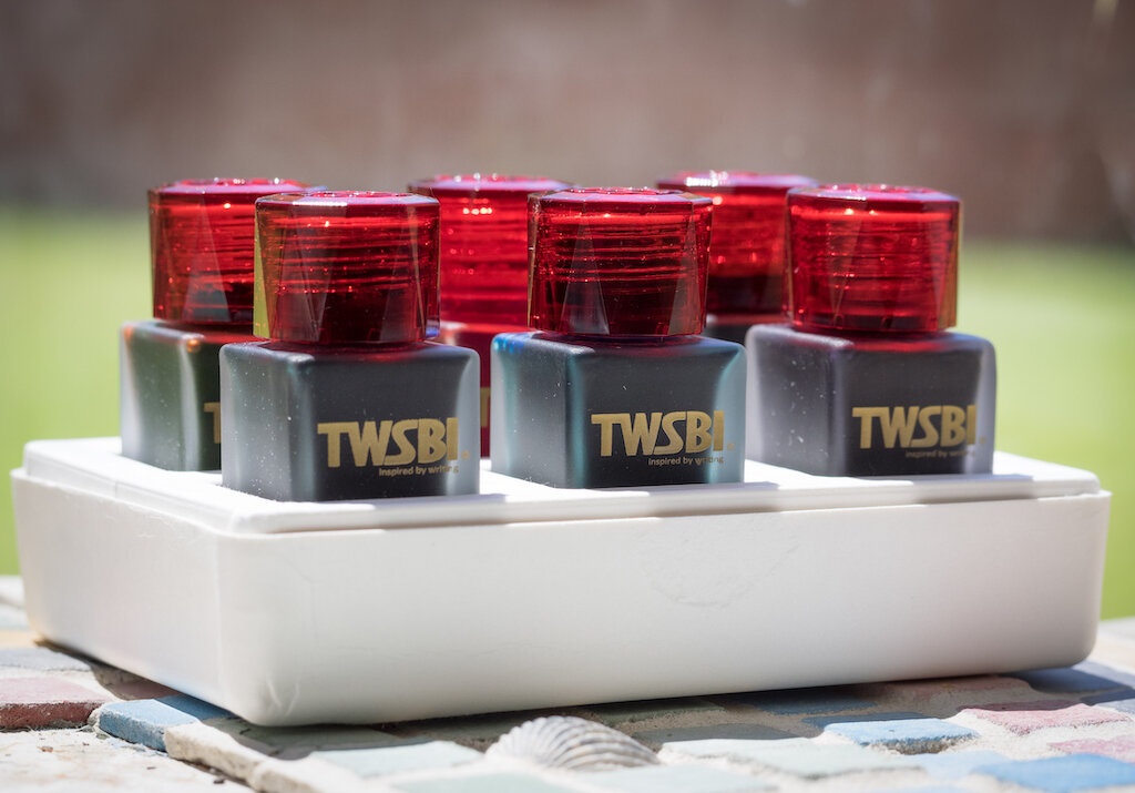
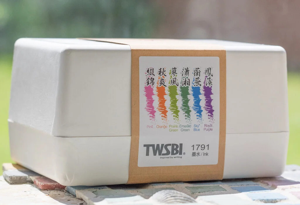
TWSBI’s 1791 Limited Edition Ink Set contains six 18ml bottles of ink. The colors in this series are based on descriptions in the novel, Dream of Red Chambers by Cao Xueqin. The novel, which was first printed in 1791, is considered one of China’s great pieces of classical literature.

An illustration by Sun Wen from the novel. You can see many of the colors of the ink set in this painting. (Public Domain)

The set comes packaged in a white two-piece box. Although the box is cardboard, it is nicely made and provides storage for the inks (if you don’t have another means to store them).

Each 18ml bottle is made of frosted glass (a really nice touch) and the red caps with the TWSBI logo are faceted.

Unfortunately, the bottle openings are quite small, so you won’t be able to ink pens with large nibs (unless they are converter fillers).

The six colors in the set are Pink, Orange, Prairie Green, Emerald Green, Sky Blue, and Royal Purple.

Pink

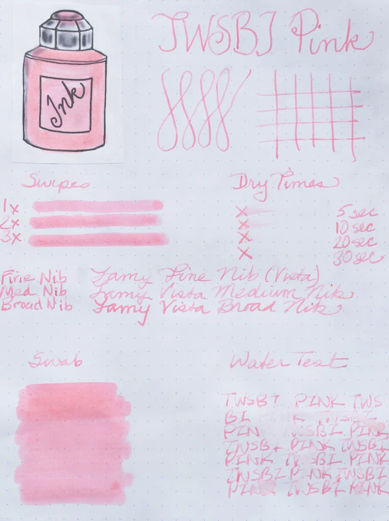
TWSBI’s Pink is a true bubblegum pink, at least on white Rhodia paper (see below). On the Col-o-Ring card, which has more texture, the ink exhibits a bit more character and shading. It reminds me of ballet shoes and is reminiscent of J. Herbin’s Rouille D'Ancre (especially where the ink pools), though TWSBI’s color is much brighter and isn’t nearly as dry.

In testing on Rhodia paper, the ink demonstrates no shading and is quite flat (no sheen). Even though it is a light color, it shows up well in fine, medium and broad nibs. This ink dries quickly (within 20 seconds) but it doesn’t feel dry when you write with it. It is not waterproof.

Chromatography reveals that there’s not much complexity to Pink--just a bit of lavender and lots of pink.

Midori Cotton paper and a ruling pen show off Pink’s ballet-shoe vibe, with lots of shading and a bit of darker pink around the edges.

TWSBI Pink is probably not a color for everyone. But, if you are a pink lover you will like this ink, especially on paper with some texture to it. If you were smart and didn’t sell your pink Pelikan M600 (like . . . um . . . me), this would be a terrific color for that pen. If, like me, you’re not a fan of J. Herbin’s Rouille D'Ancre because it’s so dad-gum dry, then this might be an alternative. Unfortunately, since it’s a limited edition color, you’ll need to stock up if you really like it.

Orange

TWSBI’s Orange is a vibrant true orange ink. It doesn’t have any sheen to it, but in flexy or italic nibs, it offers good shading. You can see the shading in the swirls on the Col-o-Ring card.

On Rhodia paper, Orange looks fabulous. It’s like a gorgeous New Mexico sunset and is just as colorful in fine nibs as it is in broad ones. But, you’ll get some nice shading in broader nibs. This ink is moderately wet, but dries completely within 30 seconds. It is not waterproof.

TWSBI Orange is comprised of pink, apricot, orange, and deep orange colors as you can see in the chromatography.

The glorious shading of TWSBI Orange is demonstrated with a super large ruling nib and Midori Cotton paper.

Although I love this color, you have lots of options for great orange inks. I wouldn’t buy the set just to get this color--besides, if you really adore it, you can get the limited edition inks in single bottles ($7.50 for 18ml at JetPens).

Prairie Green

Prairie Green is almost a fluorescent green color. It’s definitely vibrant and reminds me of Easter grass. Depending on how wet your nib is, the color ranges from a Granny Smith apple green to a pale new leaf green (see the swirls on the Col-o-Ring card). You can get some great shading with flexy or italic nibs, but there’s no sheen.

The fluorescent nature of this ink really shows up on white Rhodia paper. The color is pretty flat on this paper, probably because Rhodia is so smooth. If you’re into Kermit green ink, you’ll love this color. It’s a bit dry and looks best in wider nibs. Like the other TWSBI inks, it is not waterproof.

Chromatography reveals that Prairie Green is comprised mainly of yellow, a bit of green, and a tiny blast of blue.

A ruling nib and Midori Cotton paper show this ink at its best. It has excellent shading and pooling qualities.

Green is one color I use rarely (mainly because I don’t have many green pens). I find TWSBI Prairie Green to be a bit too light for my tastes. I like Kobe University Town Fresh Green much better.

Emerald Green

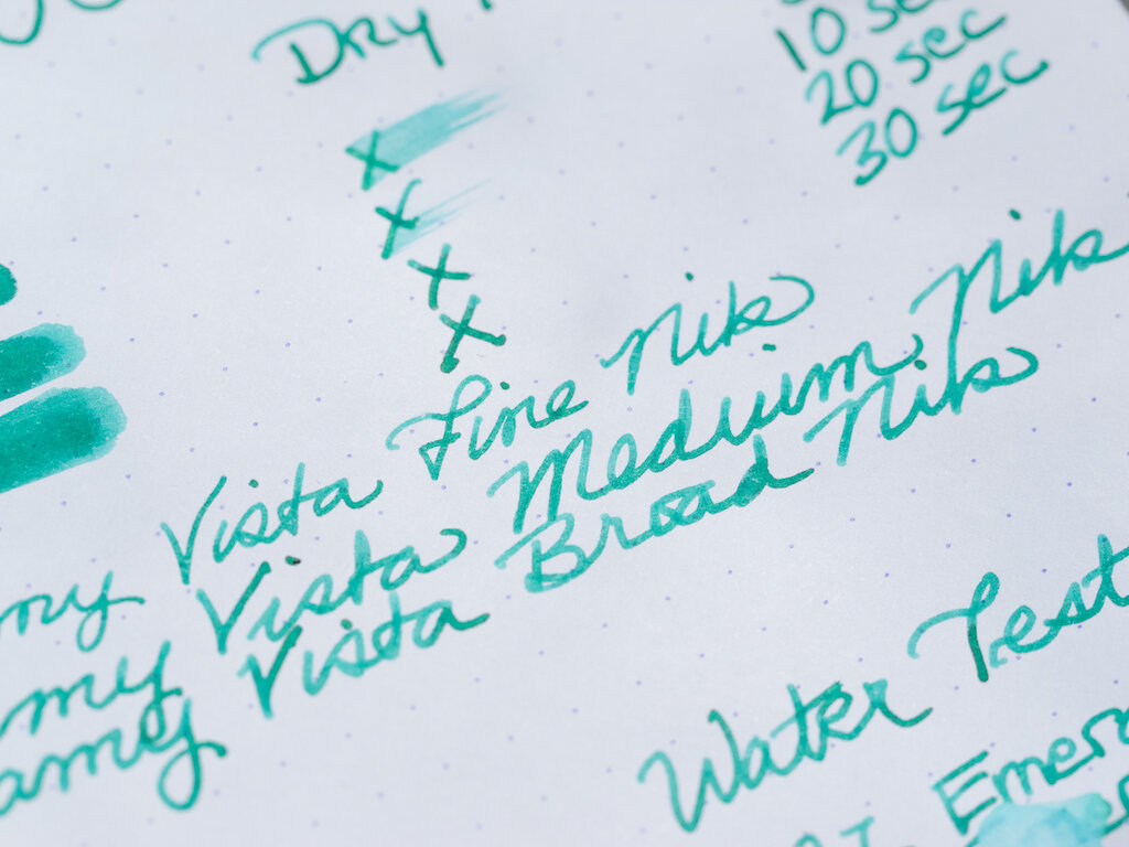
Emerald Green is an intriguing color. It’s not really what I consider “emerald green.” It’s sort of a deep turquoise color whereas emerald green, in my mind, is a much truer green. This ink offers excellent shading and a rich burgundy sheen.

The color is quite nice on Rhodia paper, though you don’t get the sheen. Still, you can see some shading even with regular nibs. This ink dries quickly and is not waterproof.

Emerald Green is comprised of light blue, green, and dark blue as you can see in the chromatography. Where that burgundy sheen comes from, I don’t know.

Emerald Green is simply glorious when used with a wide nib. Both shading and sheen shine through.

Out of all the colors in the TWSBI 1791 set, Emerald Green is my favorite. It seems to be the most unique, and I love how it looks in all nib sizes and on smooth and textured paper.

Sky Blue

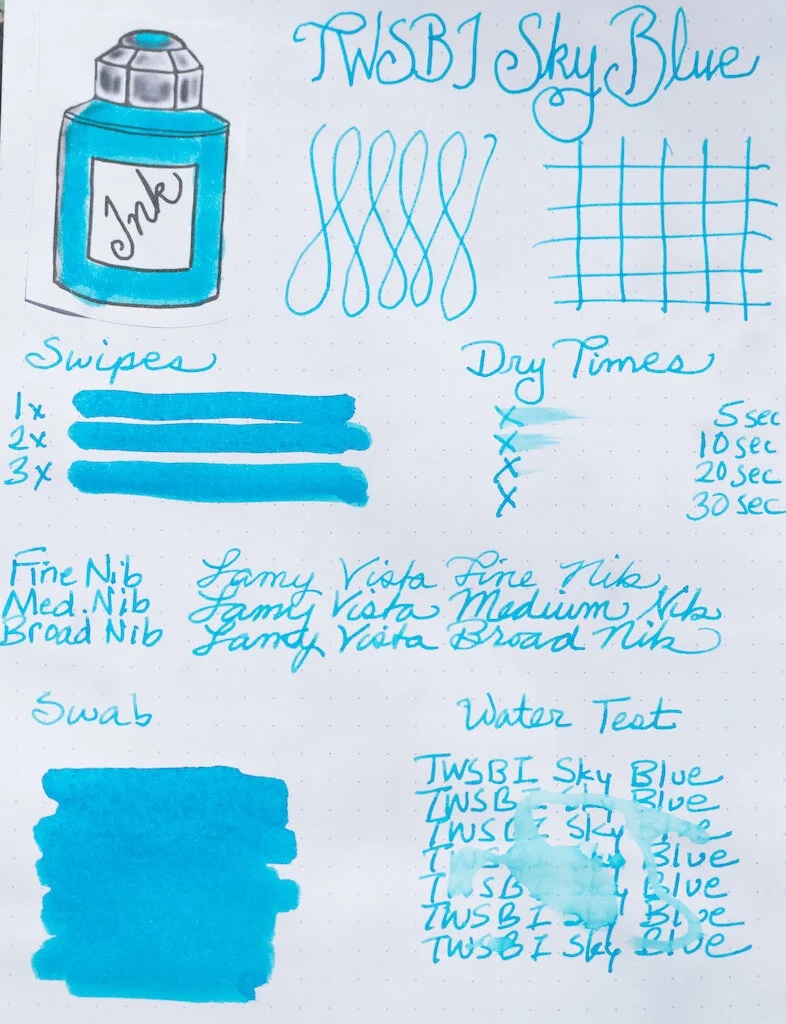
Sky Blue is another vibrant color in the 1791 set. It definitely captures the color of the sky on a clear day (at least a clear day in Colorado where you’re closer to heaven. Texan skies never look like this). Like Emerald Green, Sky Blue offers both shading and burgundy sheen.

On white Rhodia paper, Sky Blue is flat (not much shading and no sheen), but it still stands out just because it is so vibrant. It’s a little more wet than some of the other colors, but still dries within 30 seconds. It looks great in all nib sizes but is not waterproof.

There’s not much variation exhibited in the chromatography test for this ink. But chromatography clearly doesn’t tell all of an ink’s secrets--where does that burgundy sheen come from?

Once again, Midori Cotton paper and a ruling pen reveal the shading properties of this ink, though this time the sheen isn’t as evident.

Sky Blue is my second favorite color in the TWSBI 1791 ink set. It’s a gorgeous color with lots of character. I want to go back to Durango where the skies look just like this . . . .

Royal Purple

Royal Purple is another super flashy ink--almost fluorescent, like Prairie Green. This is not a deep purple, but is rather a pink-purple. The ink is fairly flat, offering little shading, but it has fantastic gold sheen.

On white paper you can definitely see the pink/purple hue of the ink. It is vivid in all nib sizes and is quick to dry but not waterproof.

Royal Purple’s pink tones come through clearly in the chromatography test. This color is mostly pink, with some magenta and a splash of turquoise.

I’m not a big fan of this color. I prefer purples to be deep and dark, so the fact that this ink is lighter and pink-embued makes it less appealing to me. But, hey, this might just be the perfect ink for Brad’s Leonardo Lavande (discussed in his ink review here).

You can purchase the TWSBI 1791 Ink Set from JetPens for $36.00. Or, if you like one or two colors in particular, you can order them separately.

(JetPens provided this product at no charge to The Pen Addict for review purposes.)


Enjoy reading The Pen Addict? Then consider becoming a member to receive additional weekly content, giveaways, and discounts in The Pen Addict shop. Plus, you support me and the site directly, for which I am very grateful.

Membership starts at just $5/month, with a discounted annual option available. To find out more about membership click here and join us!
Posted on April 17, 2020 and filed under TWSBI, Ink Reviews.